
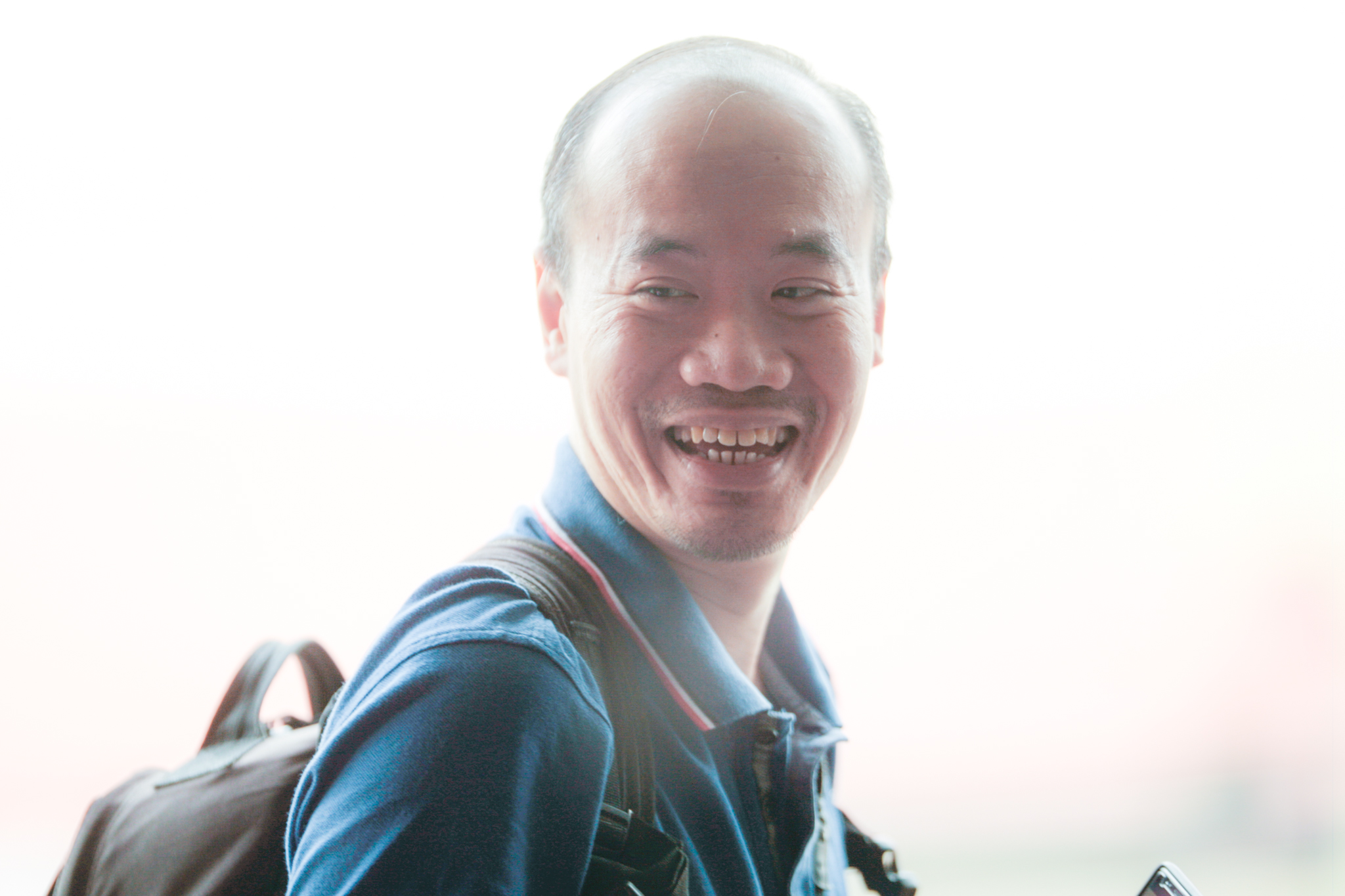
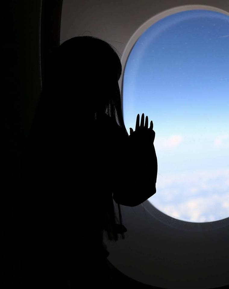
Perspective
 200mm f8 vs 24mm f8

More lighting stuff
Natural light
Natural light + Profoto B2 flash
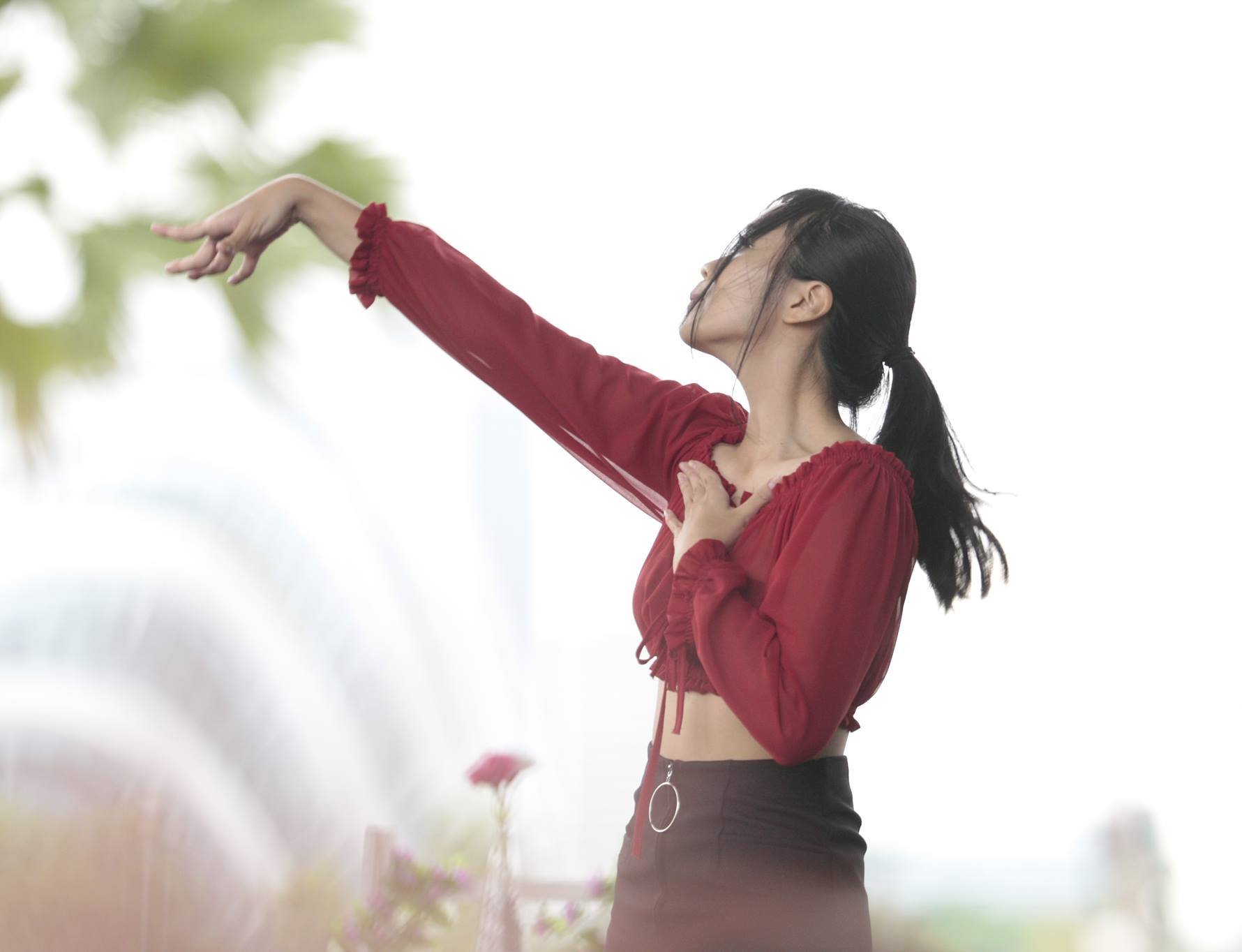
Lighting
Harsh light diffused through a dirty window + reflected off friend’s head

Fluorescent light, NTU
Direct afternoon light
Afternoon light + reflector 
Cold room light
Morning light diffused through blinds + flash
Natural light, late afternoon
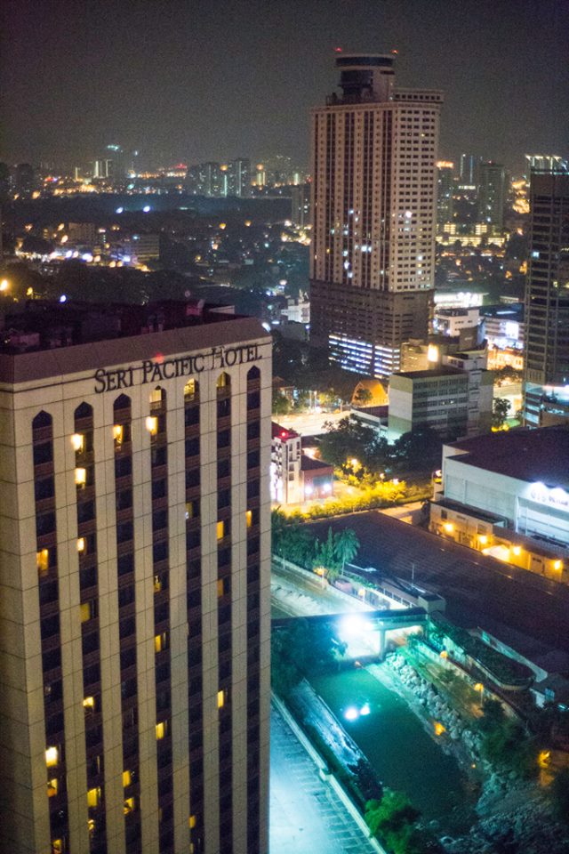
Mix of LED, neon and streetlamps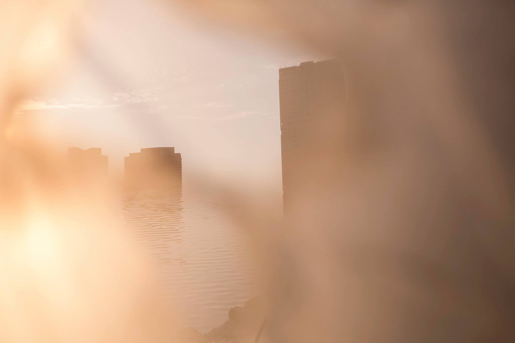


Eco Park thingo


Assignment 1 – Deja Vu


Original at the bottom, c. 2000 when Empress Place was being renovated. Image differs a little in perspective due to different lens used, the earlier photo was probably with a 35mm, the recreated photo was with 24mm on 1.3x crop, and the original photo was taken at a lower height.
Protected: dear leader
Zine – Final
A zine is a small circulation of self-published work that may or may not consist of original work, and reproduced cheaply. It may be either print, or hand-written, though the formal is used more commonly.
I had many ideas for this project, though upon consultation with Mimi, I decided to limit my scope a little tighter. It could have been even more limited, as the outcome was still rather broad.
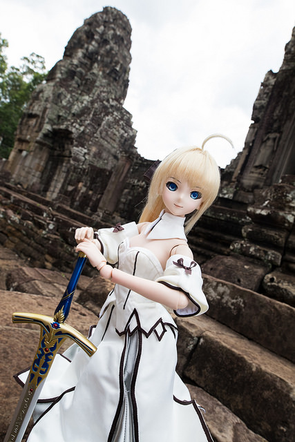
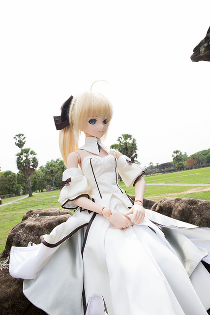
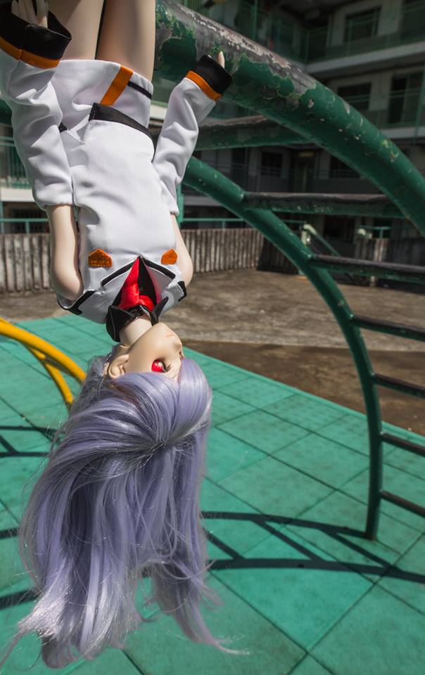
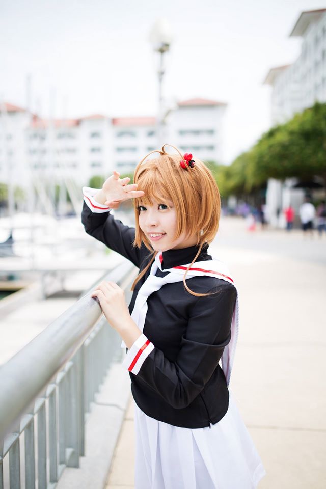
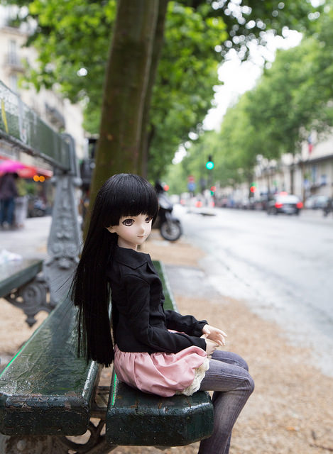
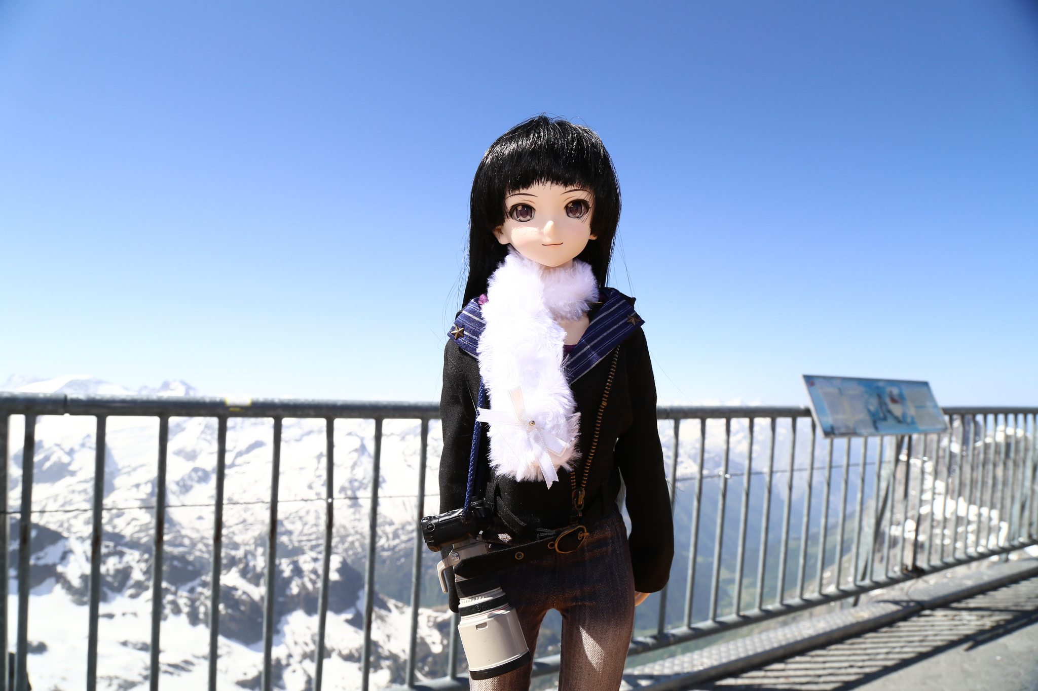
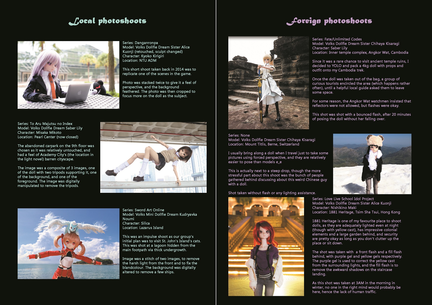
The initial idea was to do a travelogue, similar to series such as Lonely Planet or Globe Trekker, based on locations that I had travelled to, except that it was from the point of view of a smaller object, in this case, a doll.
Image on the left was taken atop Mount Titlis, Switzerland. The other was taken in Paris, France.
The initial layout was planned in the following manner:
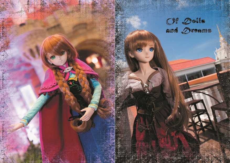
Page 1 and 8: Cover
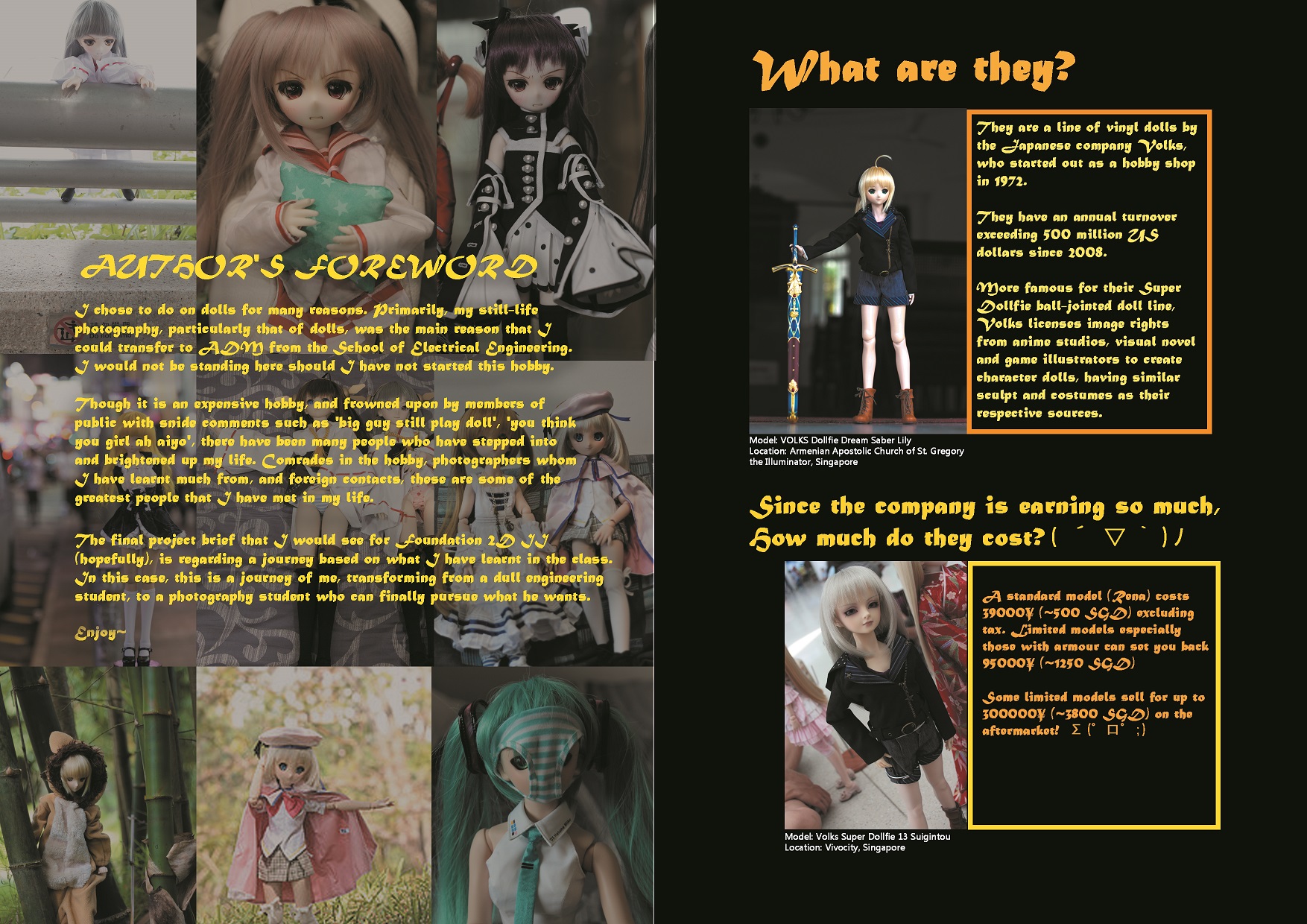
Page 2: Author’s foreword
Page 3: Description
Page 4: Information
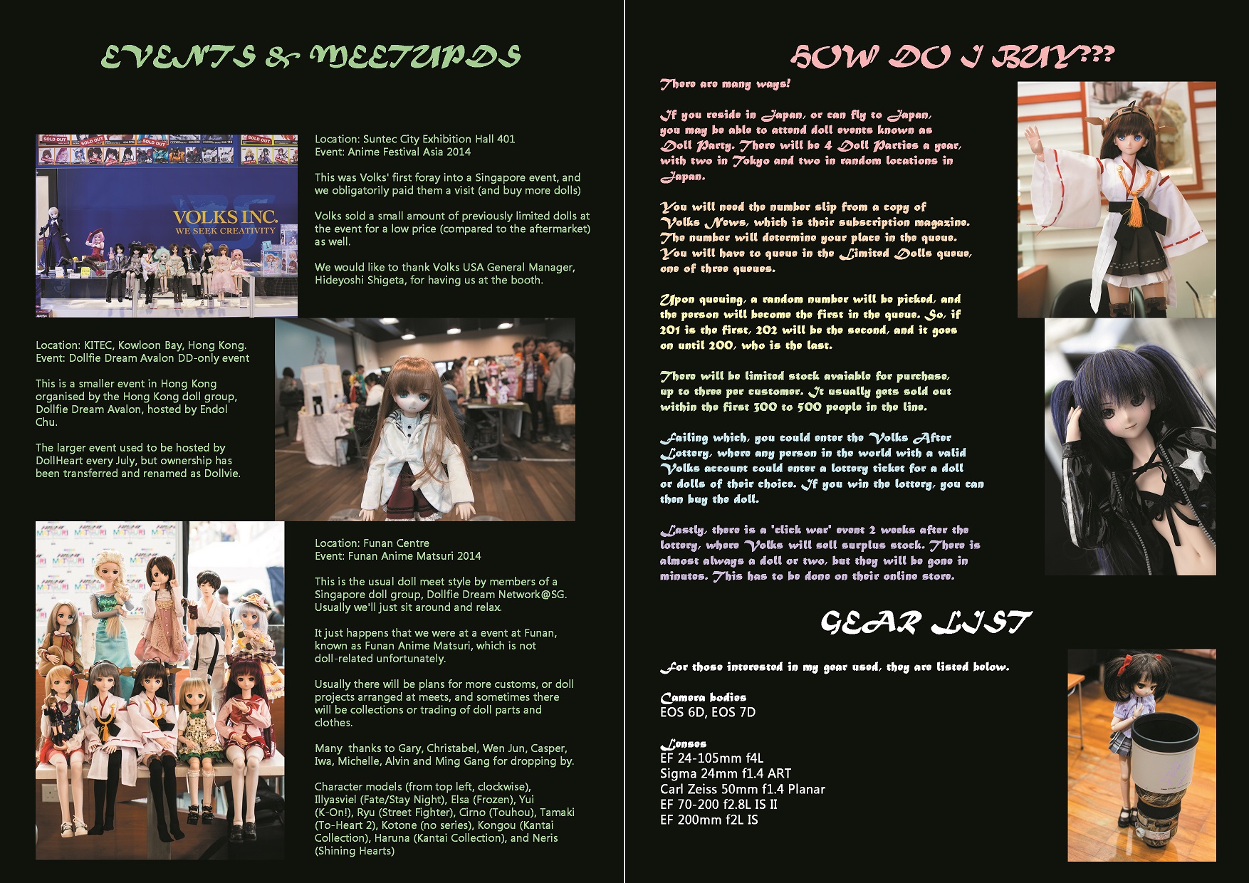
Page 5: Explanation, how to get dolls
Page 6, 7: Different photoshoot locations and recommendations
However, upon discussion with two graphic design friends, they recommended that the photoshoot locations be shifted to the background (Page 2, 7), and the explanation and foreword be located at pages 3 and 6 respectively, so that it would be the first thing that potential readers see when they open up the zine.
The zine was designed to be a booklet for doll events, organised not only locally, but in foreign locations, and hence, the information must be striking, and catch attention. It was designed to be cheap (~50 cents per booklet on 80 gsm paper, full colour), and accessible. Gloss paper was rejected as it was prone to scratching for some particular reason, and the colour was not as attractive.
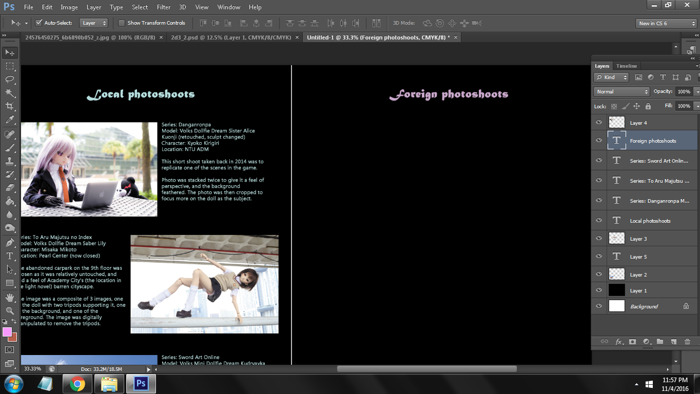
The image was primarily done in Adobe Photoshop CS6, as my Photoshop CC and InDesign were locked due to issues with Adobe Creative Cloud. A faint white line of 2px diameter was included in the center of the image, this is to facilitate folding and stapling of the zine upon printing completion.
As InDesign was not available, adjustment and alignment of pictures took a significant amount of time, as it had to be adjusted pixel by pixel.
The font choice was MT Script and Microsoft Tailue. Tailue gives a gentler feel than Arial (too broad), and not as boring as Times New Roman. MT Script gave a slight ‘exotic’ feel to the text, though on hindsight, it should have been replaced with another font, as the font itself was not the easiest to read, and was particularly large for its size.
Final product:
On hindsight, I should not have boxed up the text as it looked awkward. The bleed was an issue as well, as the printing shop that I had visited had a larger than usual amount of bleed, causing the zine to change in dimensions; the top part had to be trimmed to accommodate the excess bleed in the lower part.
Next, I should have maintained a colour scheme, and used a similar background such as that in the author’s foreword page. Though vibrant, I felt that it was too inconsistent.
Finally, I would like to thank Mimi for her efforts in imparting graphic design knowledge to us. Though I am not the most active in class, nor do I have a good attendance (oops), I have learnt a lot of tips and techniques in this class that I would definitely put to future use.
Visual Response – Reflection
Title of Visual Response artwork: Rockstar Buddha
Team Members: , Du Huizhong, Li Peng, Mak Han Feng, Tan Zhuo Hui
Reflection:
This project has been an eye-opener. As some of my group members may have mentioned, it is very interesting to have a visual response with historical context and commentary, rather than the usual social or ethical commentaries. Rarely do we have the chance to compare, contrast and examine the different impact from the point of view of the same religious icon across history.
Our first session of brainstorming resulted in everyone agreeing with the modernisation of Buddhism, primarily targeted at youths. Buddhism is the largest religion in Singapore (2010 census), with Christianity coming second. However, Christianity has succeeded, in a sense, Buddhism, in approaching youths, and evangelising them. We initially thought about drawing Buddha in a chibi/anime style, or marketing Buddha as a potential form of merchandise. After consultation, we decided to expand on our initial idea instead, as the latter had too large of a scope and we did not have enough time to complete it in detail.
Then, we looked at City Harvest’s approach to evangelising the youths. By sheer misfortune, I have been there once to observe a large scale worship, and the constant brainwashing by the pastor. The pastor insists to bring everyone who has ‘slid away from God’ back, and you can feel the fanaticism and zeal in the congregation. I left the event with my Sikh friend after a middle-aged lady insisted loudly that Sikhism is witchcraft. Rude.

Protoss Zealot from the Starcraft series, may or may not have been modelled after Christian zealots found everywhere.
Though in spite of them being downright rude and oblivious to other religions, the methods that they have used to approach youths was successful. Large concerts, film productions, even inviting actors or stars to church events brought around huge crowds of youths. In an approximate 17500-member turnout, around 38% are youths, which is quite a large number.
In conjunction with Huizhong, and with valuable input from Zhuo Hui and Li Peng, we manipulated photos of large worships, specifically ‘rock-concert’ style worship sessions. 
Preliminary design, colour manipulated to suit the red and yellows evident in Tibetan buddhism.
Final design by Huizhong and yours truly. The colour was manipulated from bright blue and purple to a yellow tone to fit in with the theme, and colour of the Shakyamuni Buddha of the Thekchen Choling temple. The Buddha was edited to look like a hologram, similar to Vocaloid concerts, which consists of live band performances, except that the singer is actually a hologram or projection of a Vocaloid character, with sound banks sampled from actual voice actors. Vocaloid is created and maintained by Crypton Future Media.

One of the Vocaloid software’s mascot and voice bank, Vocaloid2 Hatsune Miku at a concert in Tokyo, Japan. Her voice is sampled from Saki Fujita, who has voiced characters in anime series such as Sora no Otoshimono and Shingeki no Kyojin.
The images ‘Budd’ and ‘Ha!’ were edited to look like they were shown from large projection screens, similar to how Christian rock concerts would show either lyrics of their songs, or cliched pictures of scenes of the Bible.
After the finalisation of the project, I thought that it looked pretty good. Should we have more time, we could have designed an actual light show or hologram, which would have added to the impact of our final project.
Personally, I felt that the final project was very interesting, though we were a little short on time. The lack of restriction meant that different groups could explore and research on niche topics. However, there is a small issue with this, being that we could only choose an object from a local museum or religious site. This ended up with slightly more Buddhist objects, as they were (in my opinion) the most accessible.
I would like to thank Prof. Sujatha for making this semester’s lessons interesting and entertaining, and we hope to see you again in the near future.
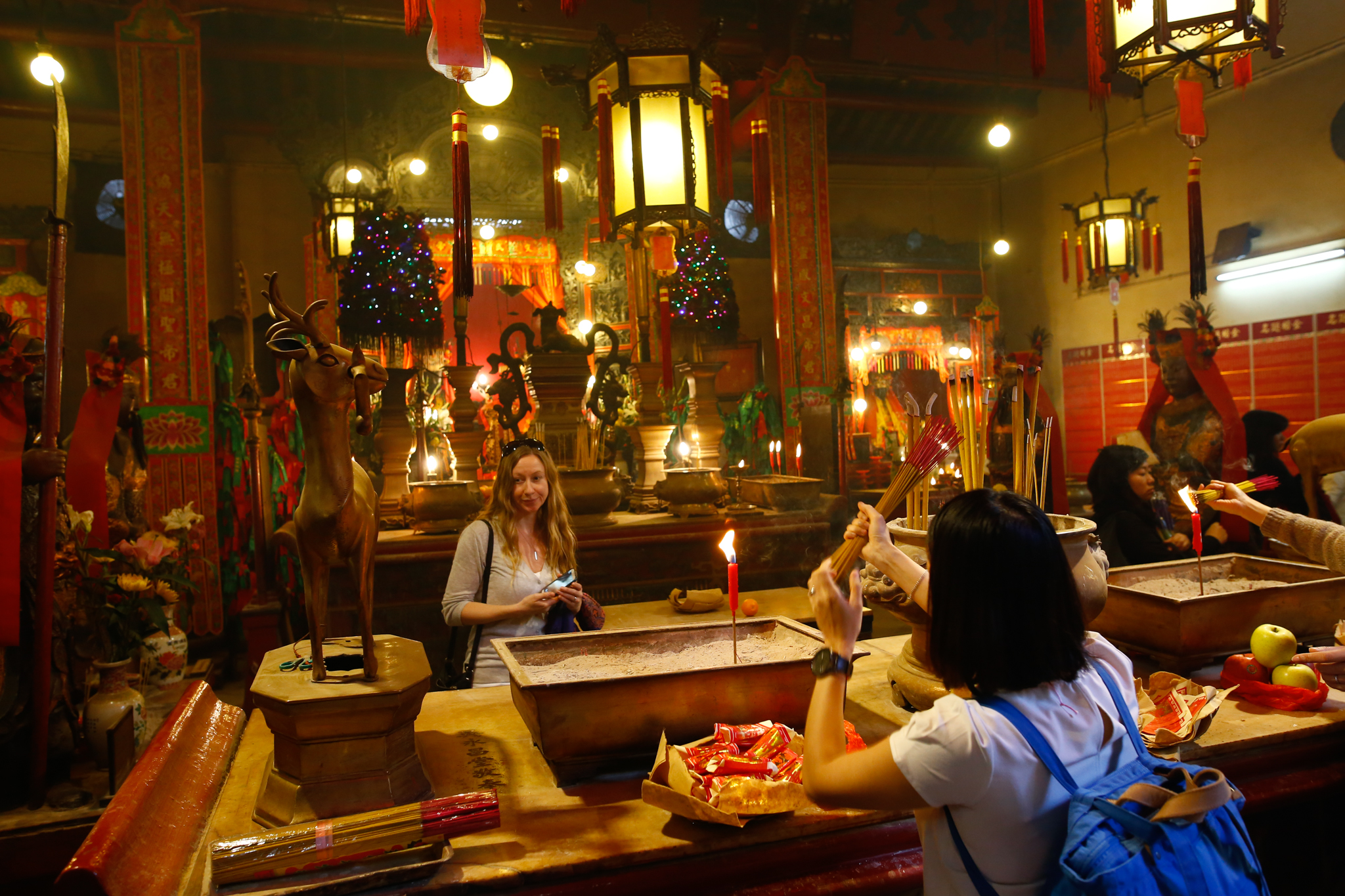
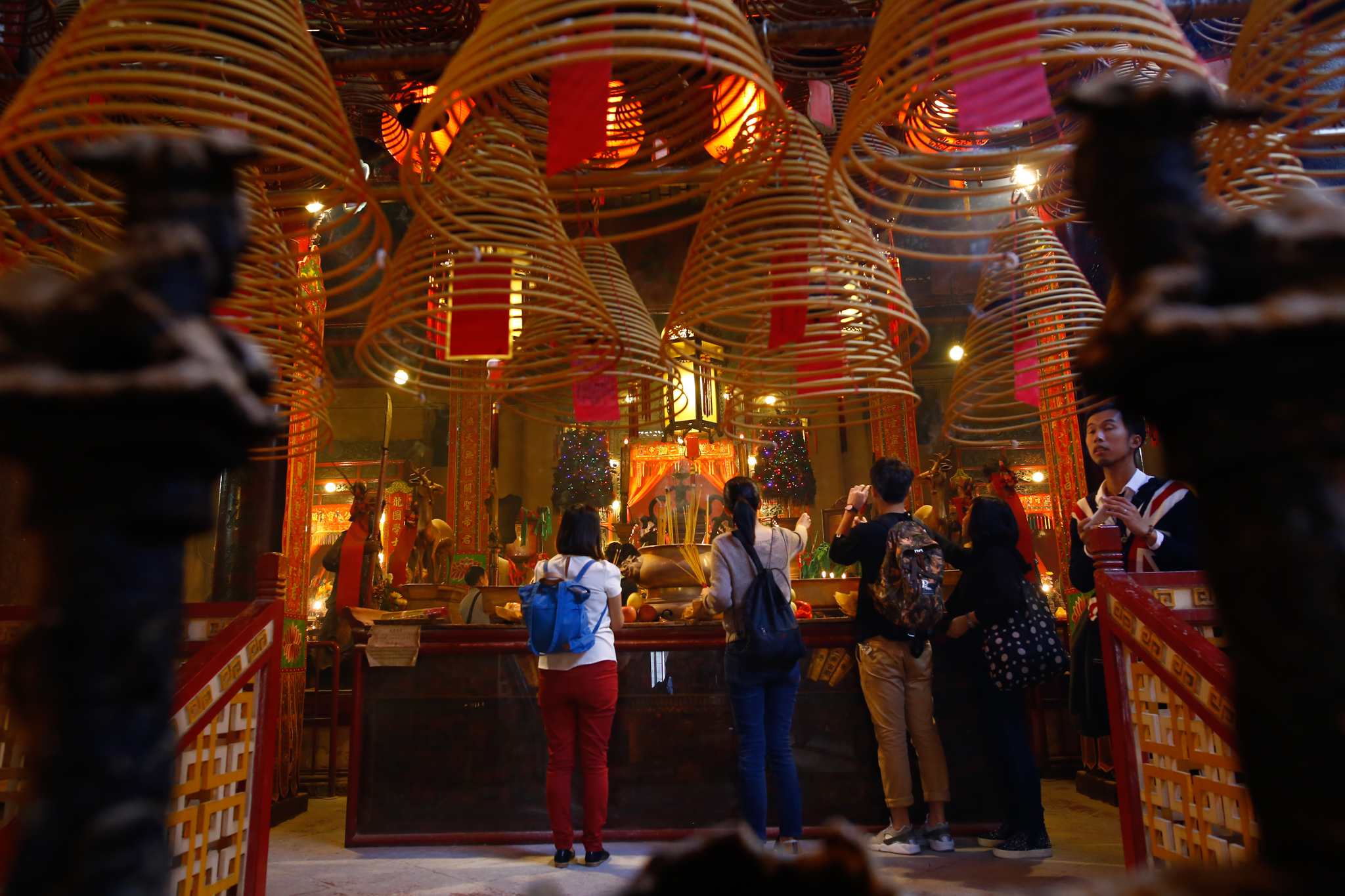
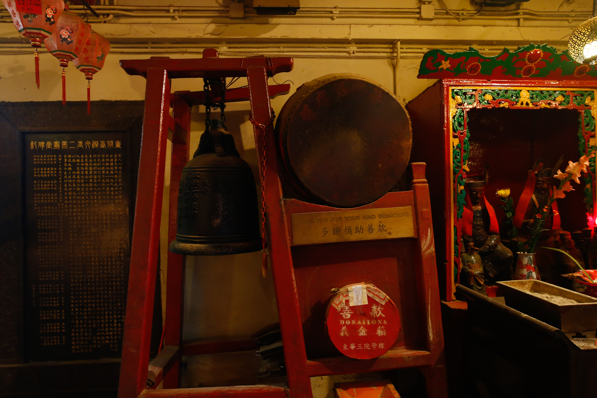
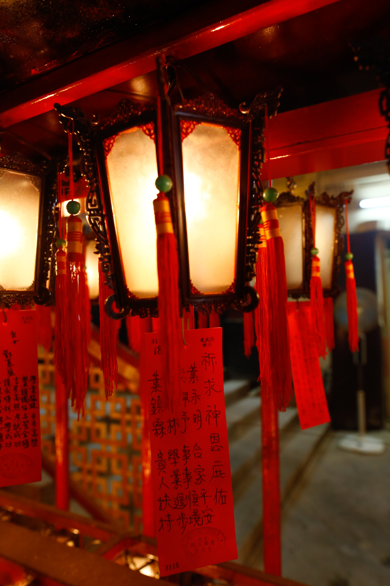
Man Mo Temple
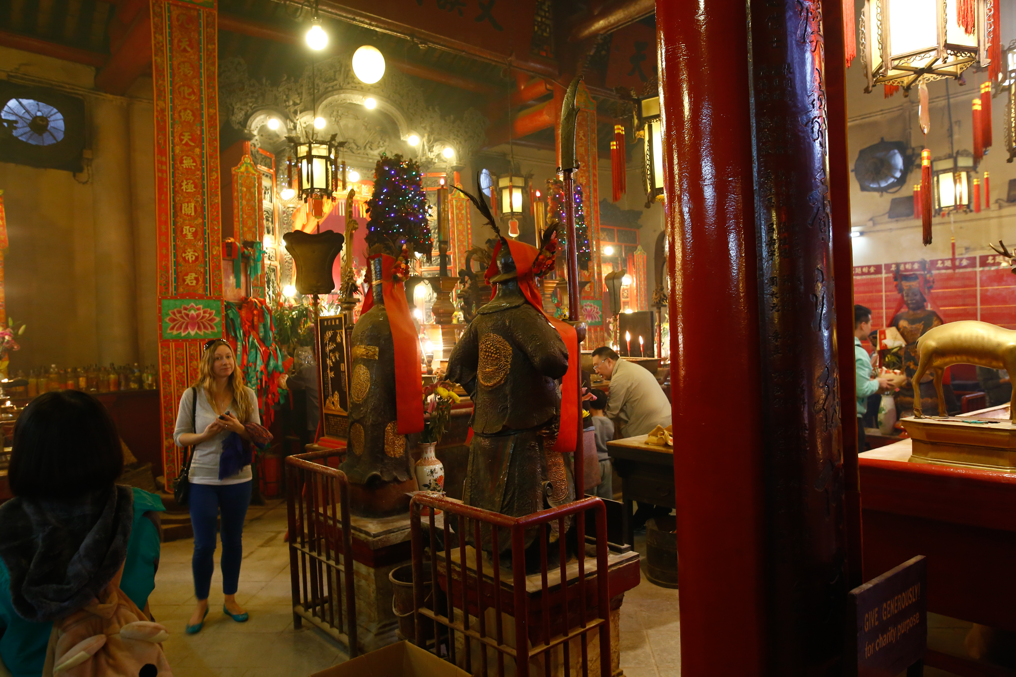
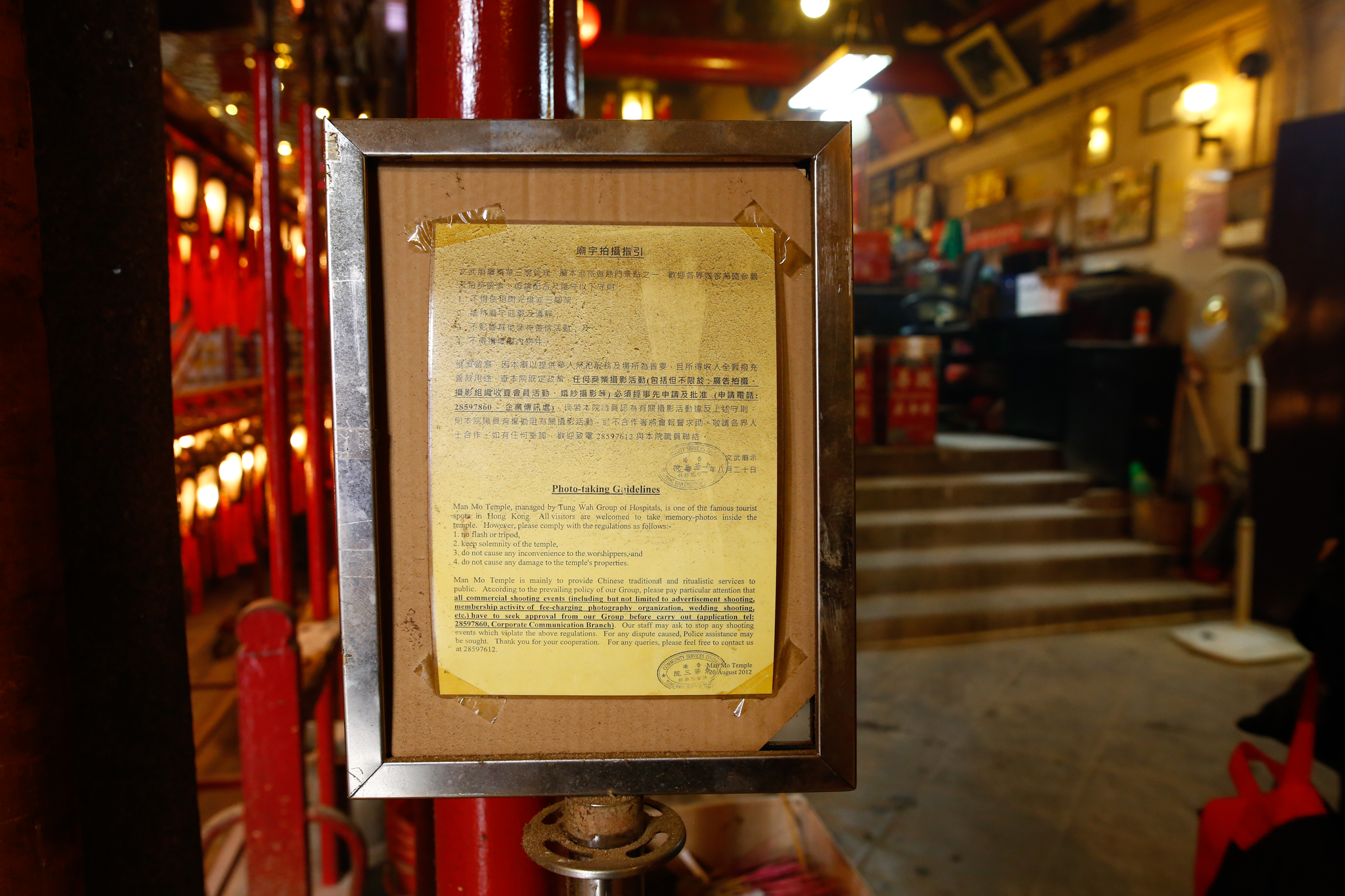
Went to visit Man Mo Temple in Hong Kong while on a trip cut short thanks to Foundation classes during recess week, as apparently it is the fault of Chinese New Year to fall on working days. Mostly pictures, will add more comments if necessary.
This temple is dedicated to both the God of Literature (Man) and the God of War (Mo), hence the name. It was built in 1847, and gazetted as a historic monument in 2009. The temple complex also involves different wings for worship of different gods as well.
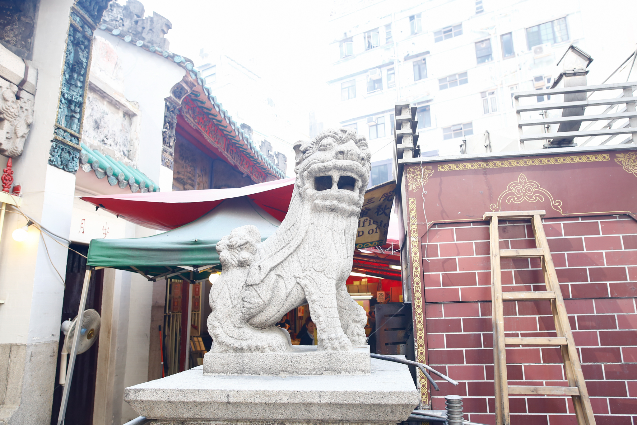
The entrance to the temple has an obligatory stone lion.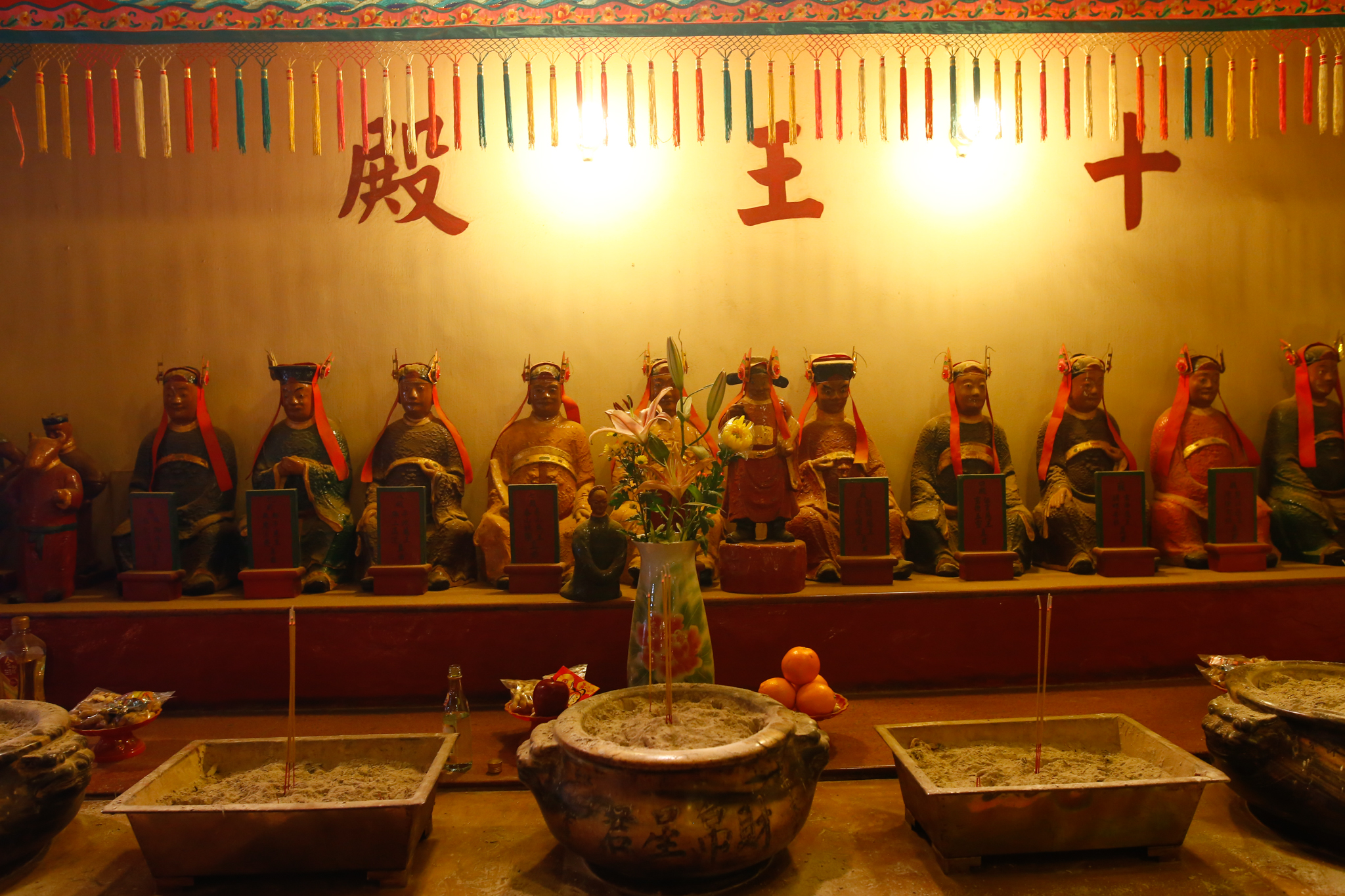
Shrine dedicated to the ten kings in charge of Hell in Chinese mythology.
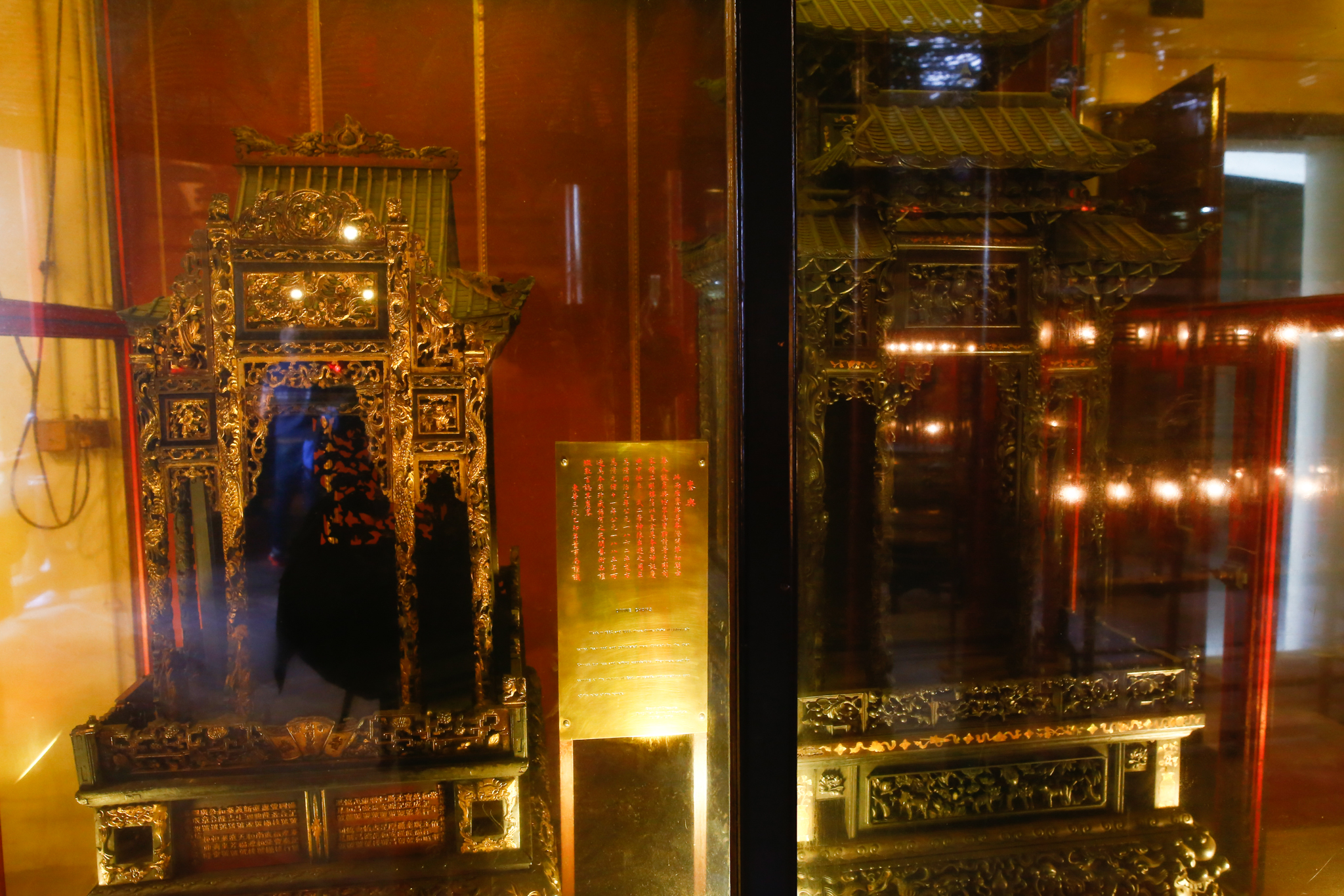

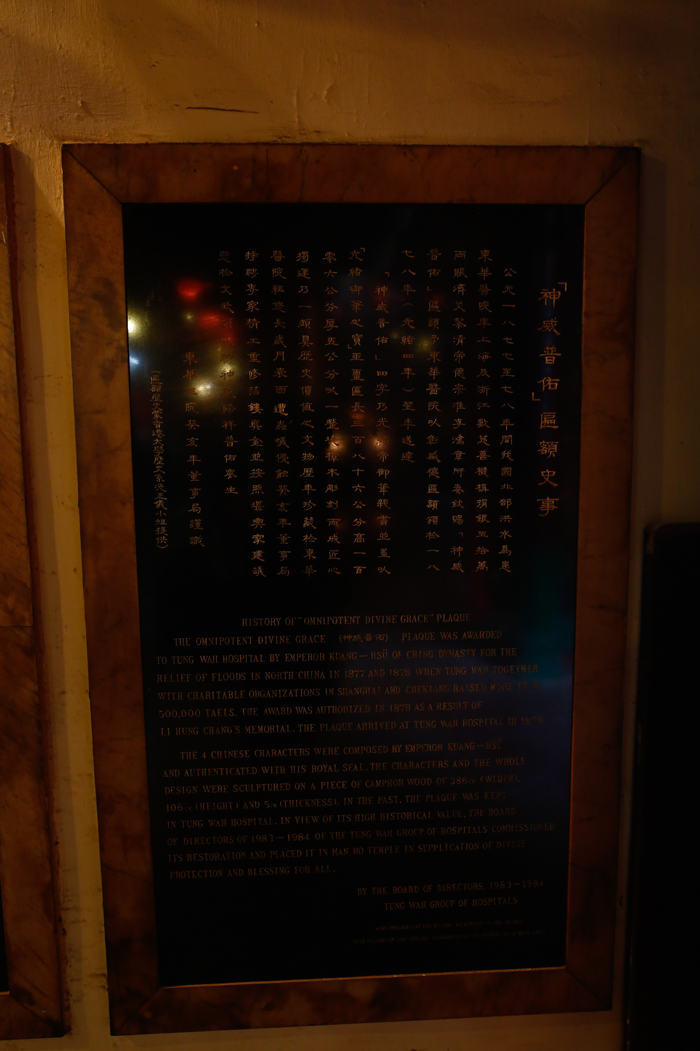 Some plaques awarded by the reigning Chinese Emperor in 1877-78
Directions to this place:
Most convenient way is to take bus 26 from Pacific Place (nearest to Admiralty MTR), and drop off near the temple.
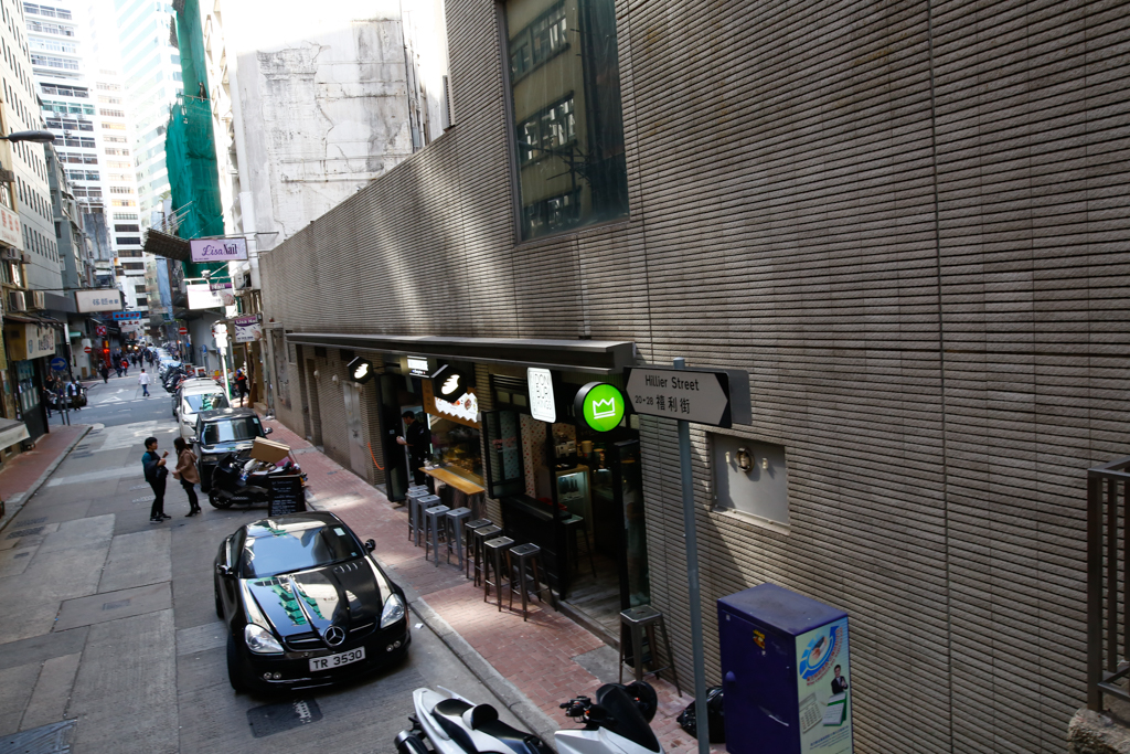
You can walk from Central MTR exit D2 (not recommended), or from Sheung Wan MTR (closest for walking)
Exit from exit A2 from Sheung Wan MTR, then head for Hillier St. across the road. There will be another road junction, where the straight road ahead is Mercer St. Head slightly to the right to follow Hillier St., and continue past Burd St. and Jervois St. until you reach Queen’s Road Central.

Turn right and walk towards Mcdonalds, then cross the street to reach Ladder St., near Lok Ku Road.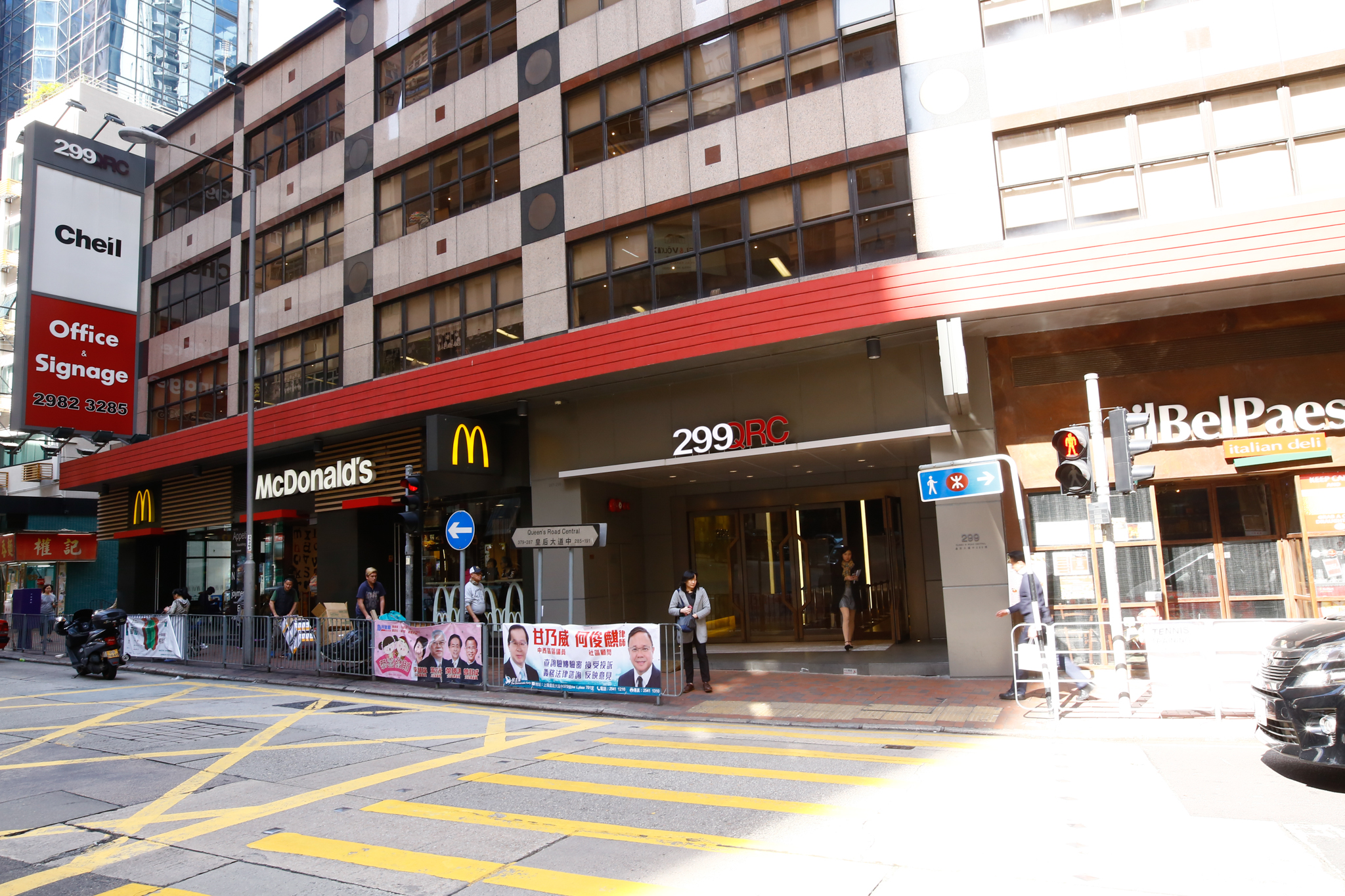
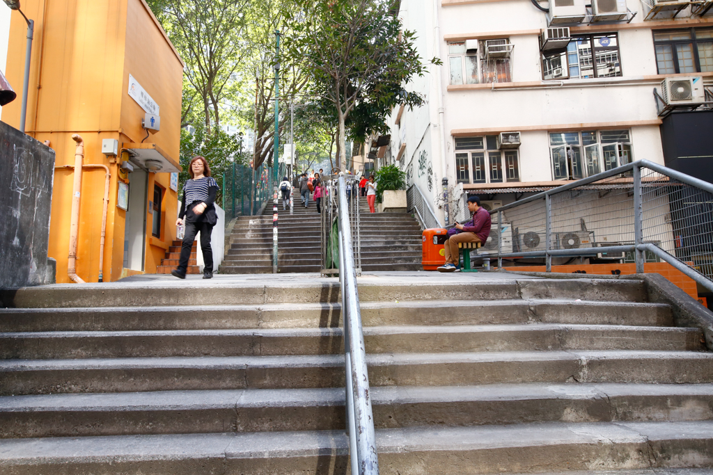
Just climb up the stairs, cross the road (with tons of touristy traffic), and you’re there.
For me, I went the long way by heading on to Bonham Strand from Admiralty, then headed up Aberdeen St. from Wellington St. The cafes and view there is good, though you will have to climb one of the steepest streets in Hong Kong. We then headed down Hollywood Rd to the temple.
Approx 10-15 min walk from Sheung Wan MTR, and 20-25 min from Central MTR.
P.S.: OSS doesn’t seem to be optimized for image uploading, and images seem to be compressed like a Singaporean in a peak hour MRT train carriage.