
View part I of my process here and the final outcome here!
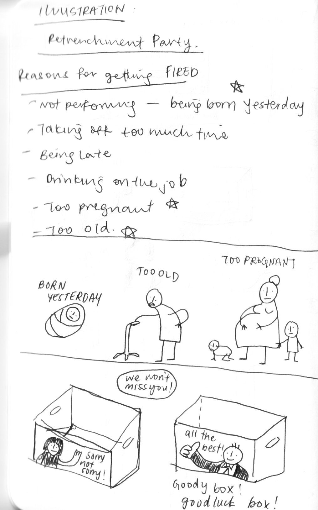
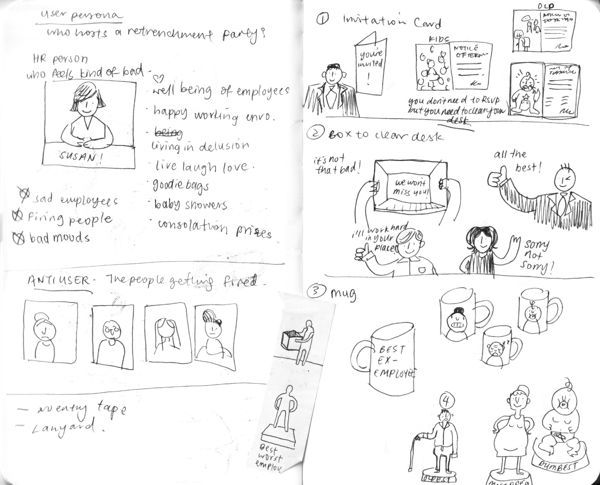
Target Employee Groups
- Employees who keep getting pregnant (too pregnant)
- Employees that have reached the senior years (too old)
- Employees who are too inexperienced (too young/born yesterday)
To go along with the terrible and insensitive theme of the Retrenchment Party, I decided to aim the party at employees who unjustly fired. Really bad, completely based on stereotypes, I don’t entirely support these reasons! But funny…
Initial Sketches

Colour Scheme

- A little on the nose, but using the visual language of the Pink Slip
- Overall, the colour palette references a pastel triadic (primary) colour scheme – playful, childlike, cheerful
- The light blue suggests a corporate entity – steel, glass
- Bright yellow is a fun and cheerful colour
Invitation Card

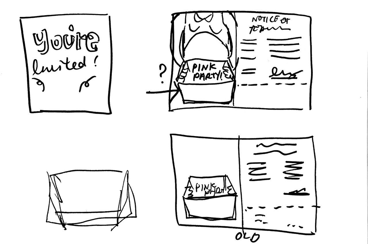
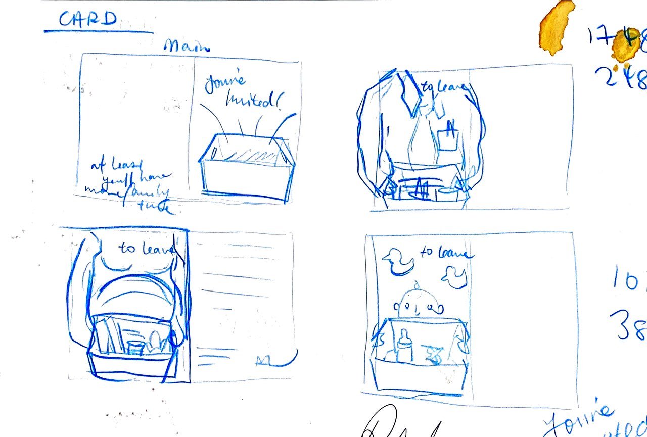


Cover
I wanted to play on the idea of the box used to clear one’s desk after they have been fired. It still remains unassuming and could suggest a gift box instead. The explosion out of the box is aimed at looking exciting and festive but is actually based on actual fire. I wanted to take advantage of this pun but not in a super literal sense.
The type I chose for “You are invited” is IBM Plex Serif in Regular. I decided against handwritten type as I enjoyed the juxtaposition of the formal font against the hand-drawn image.
“You are invited!” is continued in the open spread with “to leave.” Bait and catch!

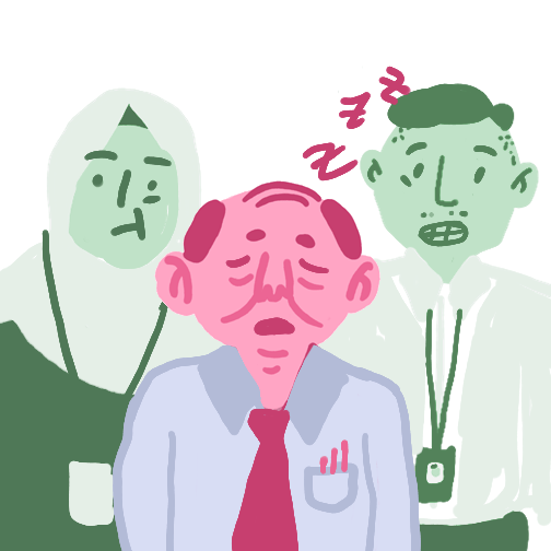
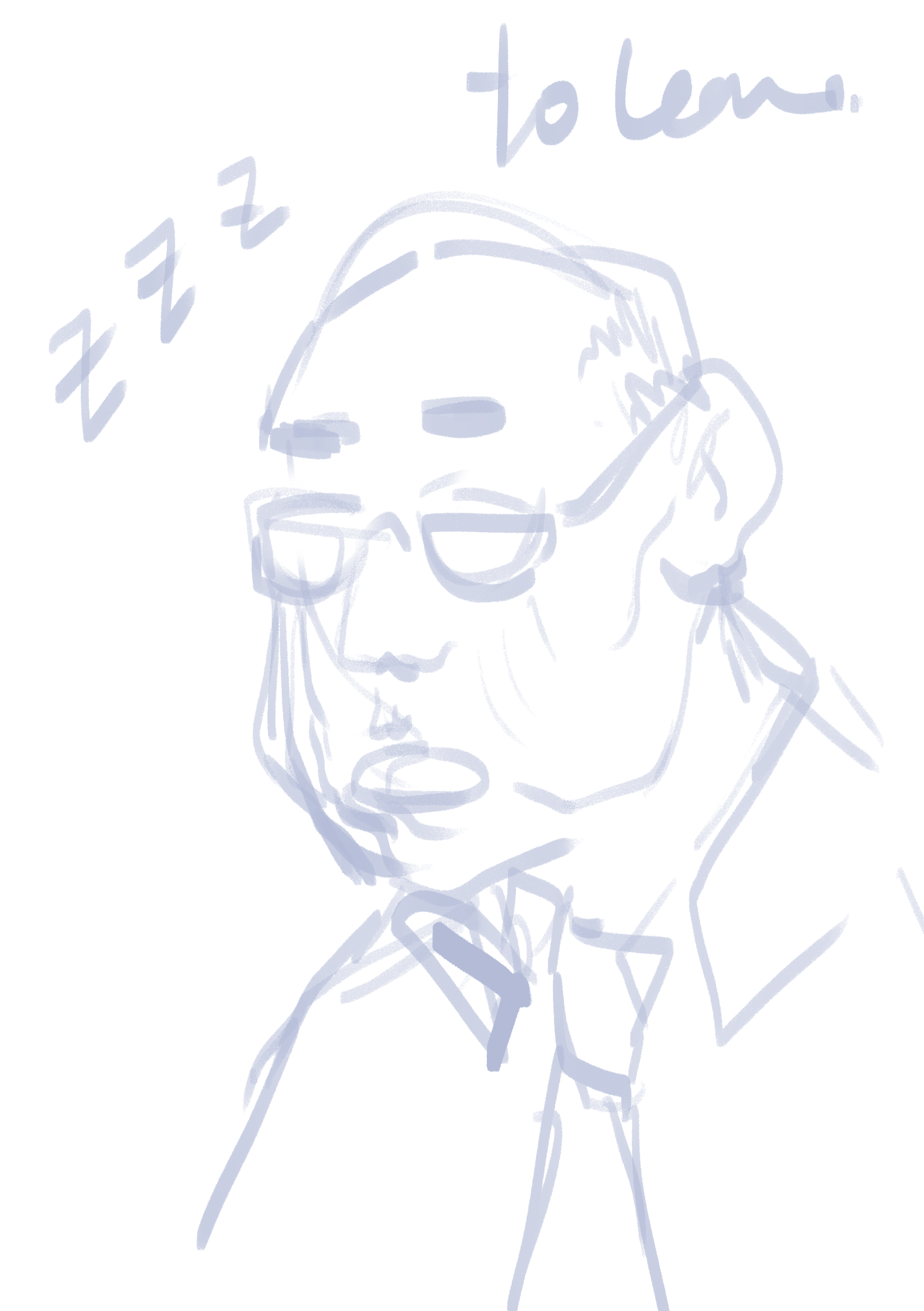
Too old spread:

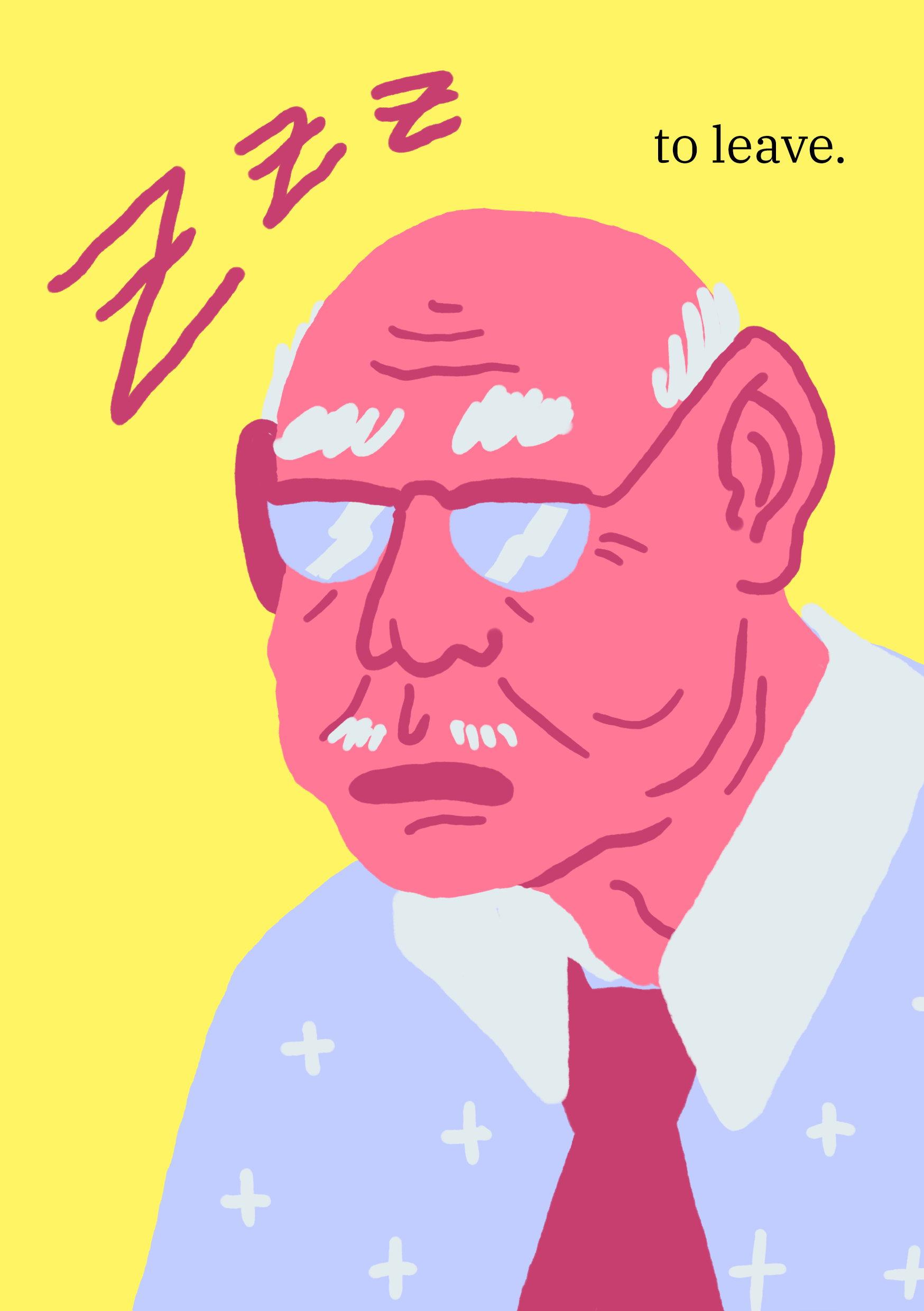
- Instead of cutesifying an old man, I felt that is was more effective to draw up a more representative portrayal.
- Wrinkles, balding, white hair, old-fashioned shirt and spectacles
- The old man is sleeping because he is old! He should be FIRED!
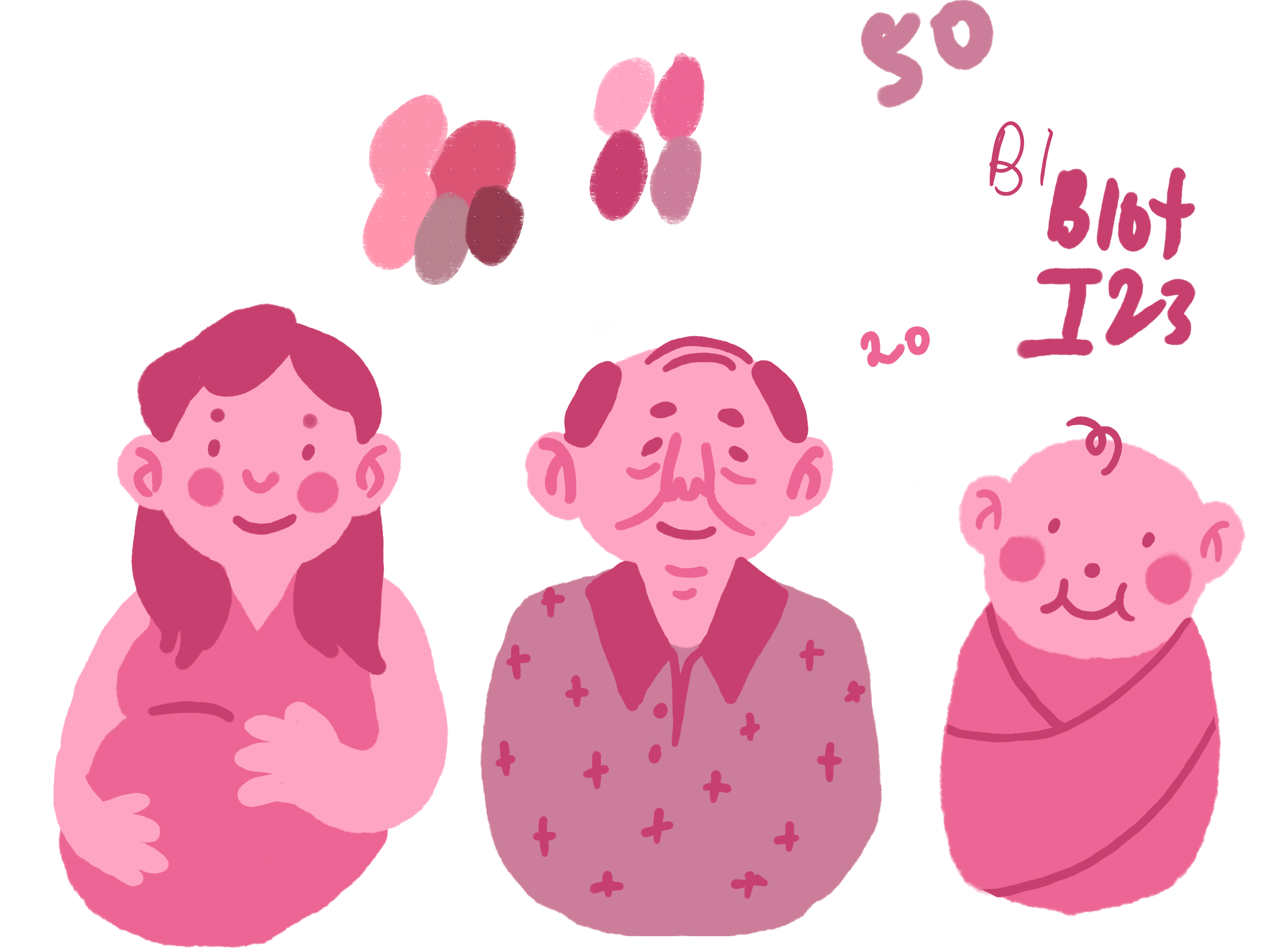
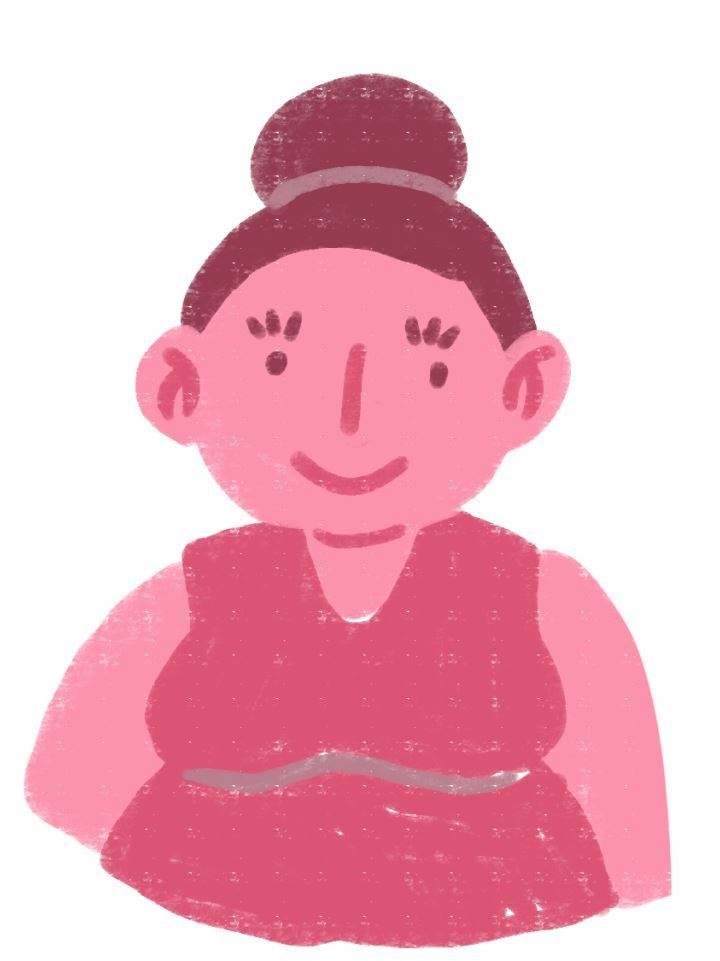
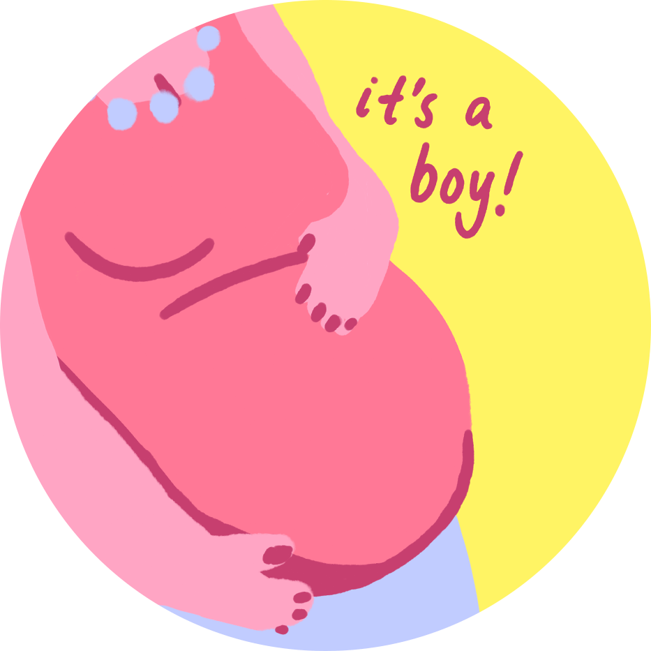
Too pregnant spread:
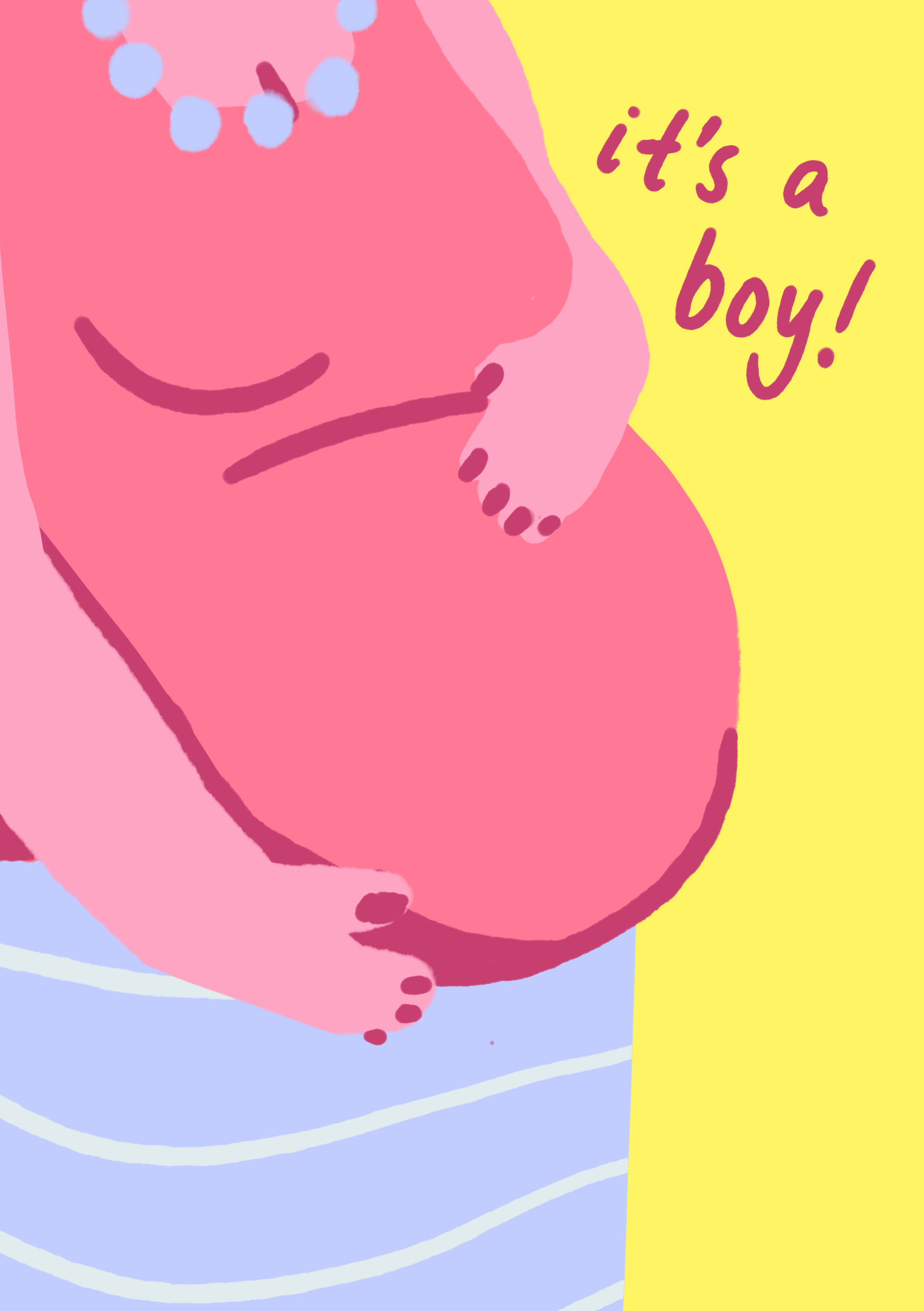
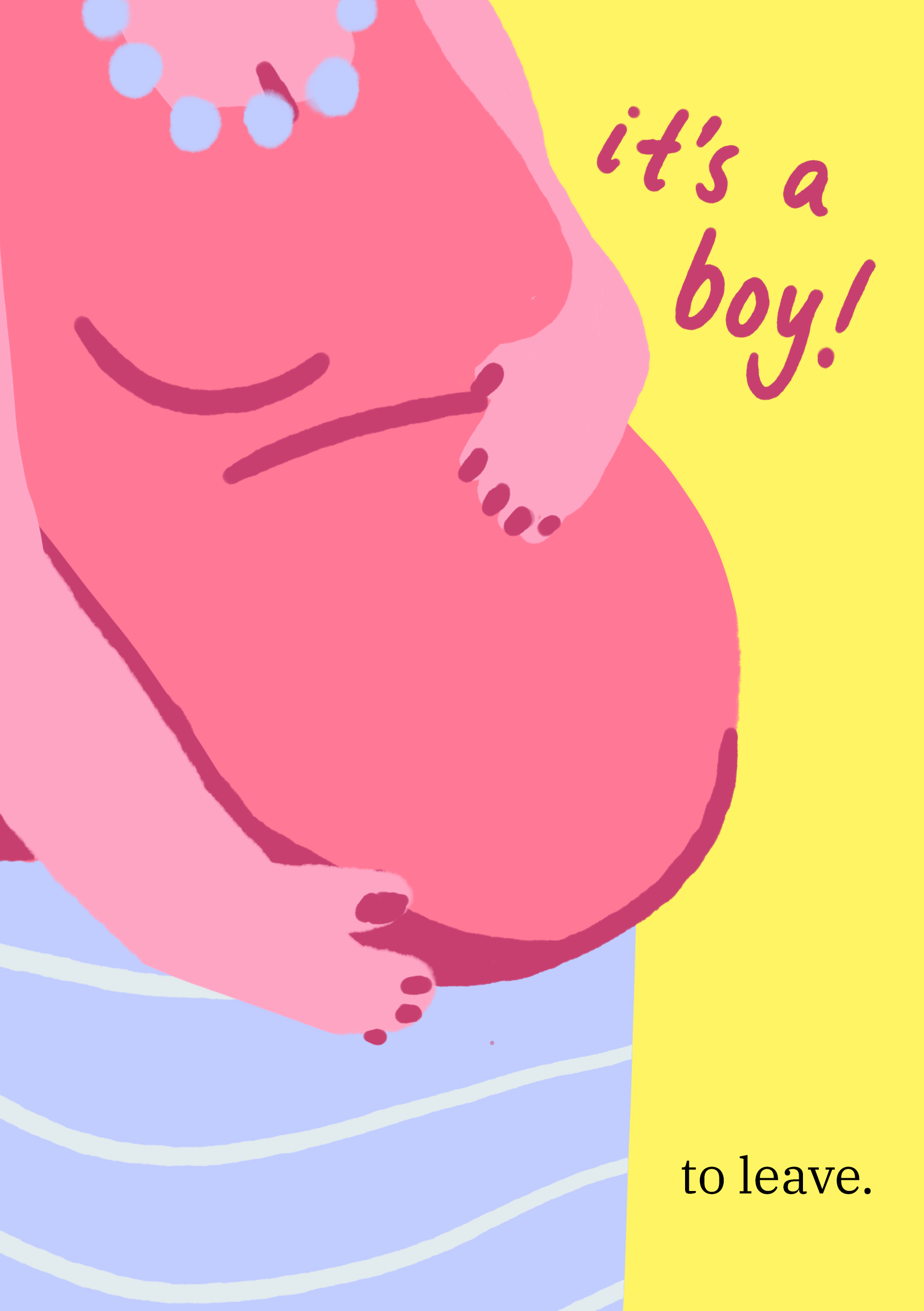
- Focus on the pregnant belly! Pregnant hand pose!
- Maternal, comforting, soft, roundness to the form
- This is Mary’s 3rd baby in her 4 years! Too much leave! FIRED!
Too young spread:
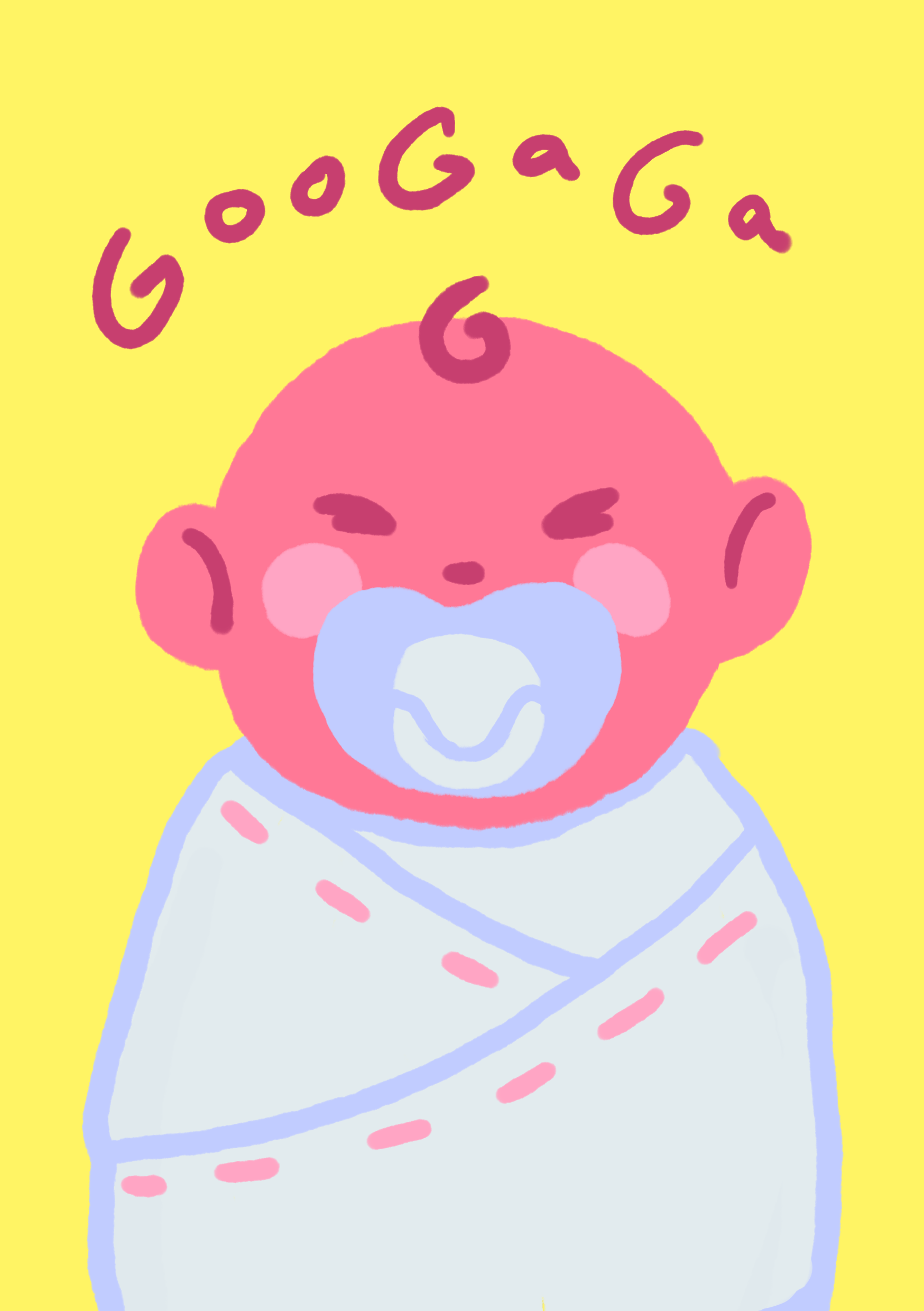
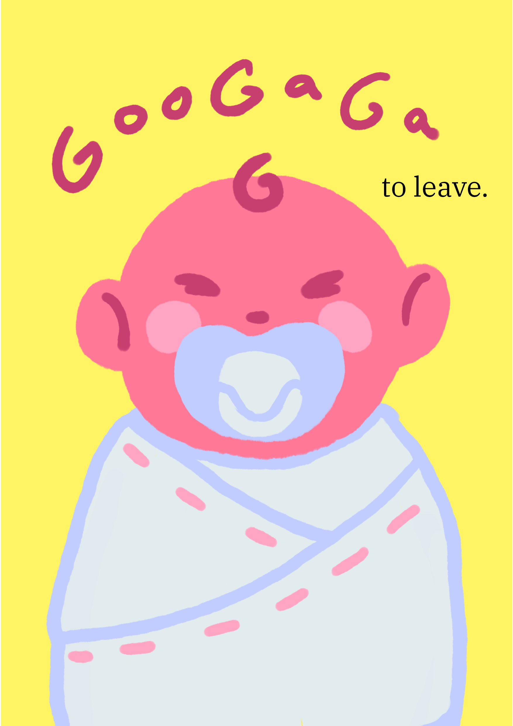
- The most exaggerated card
- Playing on being “born yesterday”
- Bundled up baby with a binky
- Fran can’t do anything by herself and needs to be hand-fed everything. FIRE HER!
Facing Page:

To really push the theme of juxtaposition, I was advised to have the invitation turn into a full on termination notice rather than have it half-half. I referenced an employee termination template to craft my pink slips. (The invitation to the retrenchment party is mentioned in the last paragraph.)


Mug


For the “Best Boss” replacement, I chose to put “Best Ex Employee” with heavy emphasis on the EX! This would be on the out-facing side of the mug (if held by the right hand) to tell the whole world that: hey, I may have been fired, but I was the best!

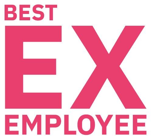
I decided to shrink the “Best” in the end to really remind the gifted that they are no longer employed at the company.
The type used is IBM Plex Sans in Bold to go along with the corporate formal theme. Mugs with words on them are usually Sans serif as they are easier to read as display fonts and are clear and can get the message through from across the room.


For the otherside, I adapted the characters from the invitation cards to fit into circles.


Initially, they were just overlayed onto the mugs, but I did not like how the large wrap distorted the designs. Circle icons were a good compromise and they suited the roundness of the mugs.
Lanyard


The lanyard was interesting to design as traditionally they are split into sections that are repeated as a pattern throughout the strip. There are two sides that can have different prints.
I decided to go with a general lanyard for every retrenched attendee at the party so everyone can match!
The zigzag explosion shape recalls that in the invitation card. The hand-written type is supposed to soften the blow of getting fired while being insulted and labelled.
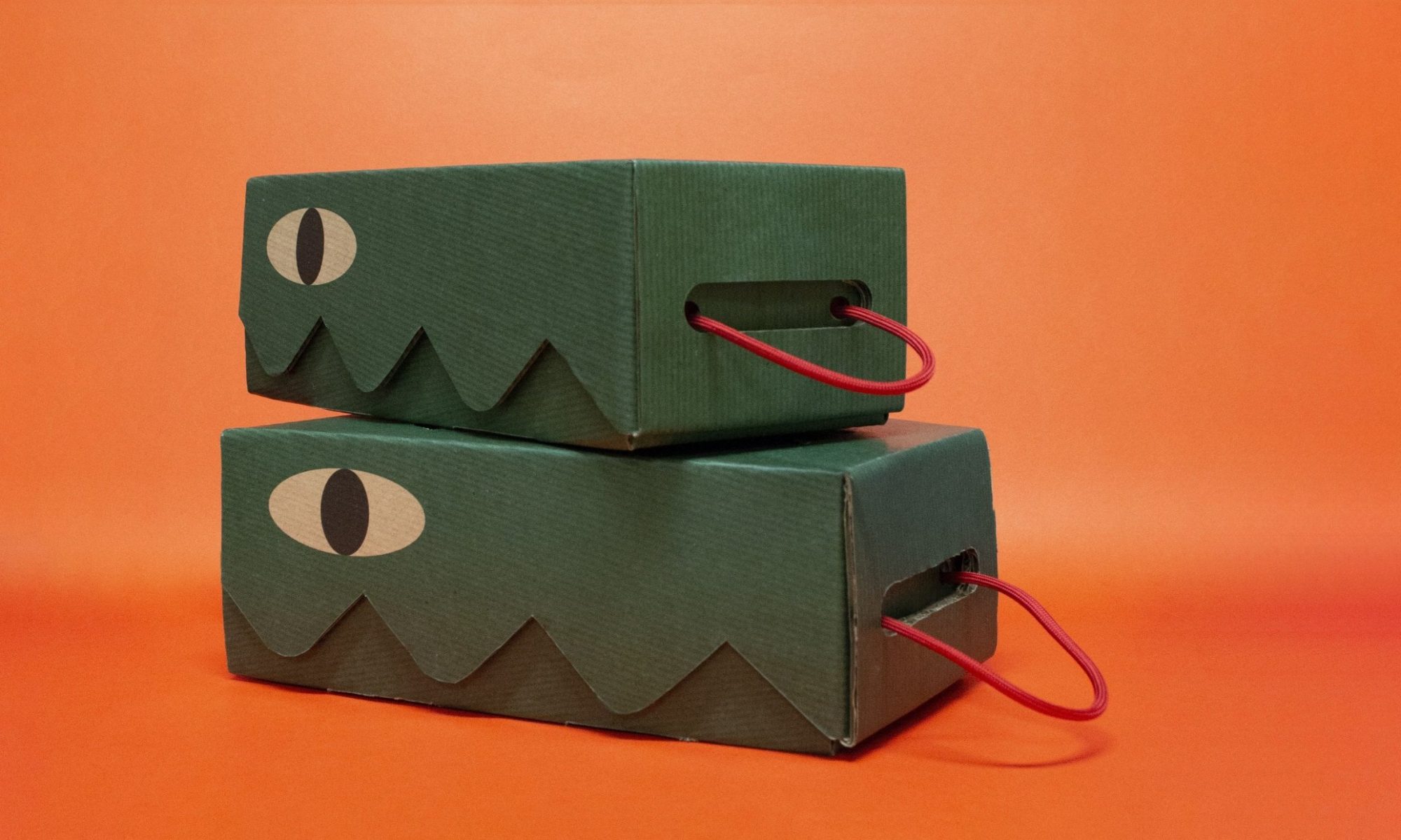
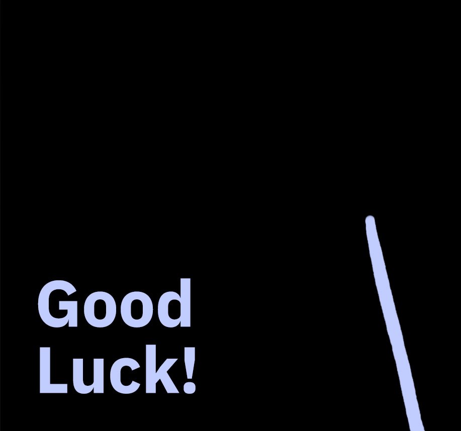
Box

For the box, I wanted to go with something different, something that really showed to corporate coldness of retrenchment – but still in the party mood.

I wanted to add encouraging phrases that mean nothing to someone that just got fired to really rub it in.
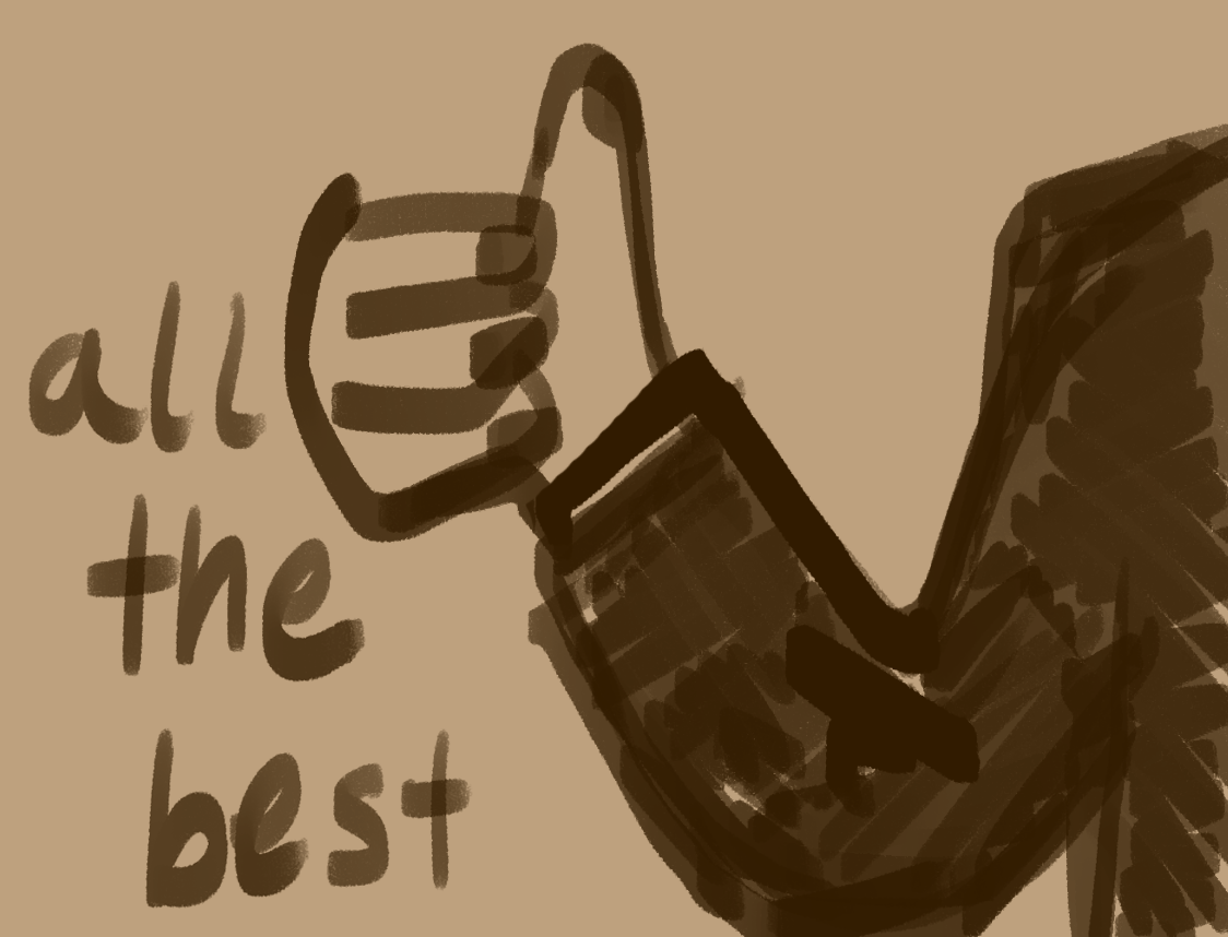
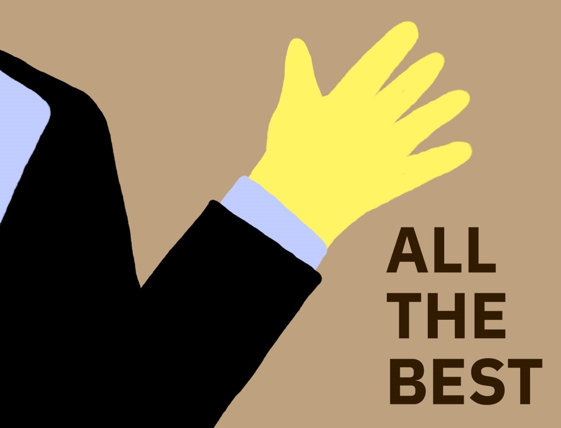
A faceless hand giving a thumbs-up or wave to show the impersonal and apathetic attitude of a boss to a retrenched employee. The suit jacket and shirt suggest someone at a higher position on the corporate ladder.


Extending the design so it wraps across the faces of the cardboard box.
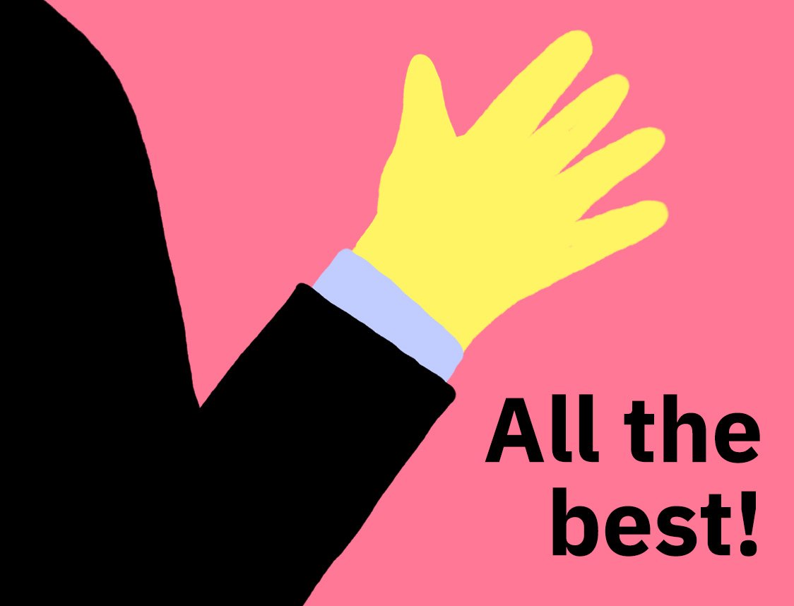
- Typeface: IBM Plex Sans in Bold for continuity and detached, corporate formality
- Back-facing, faceless boss: cold and uncaring
- Waving hand: condescending
- Pink: pink slip
Overall, I feel like the illustrations are cohesive in style and they applied a fun and light-hearted way. I felt a lot of accomplishment when I finally got into the groove with the colour palette and style of the entire project and a huge sigh of relief when all my mockups were done.
Hopefully, all that translated into the final products! I do actually want that lanyard…
You can view my final outcome here!