Research
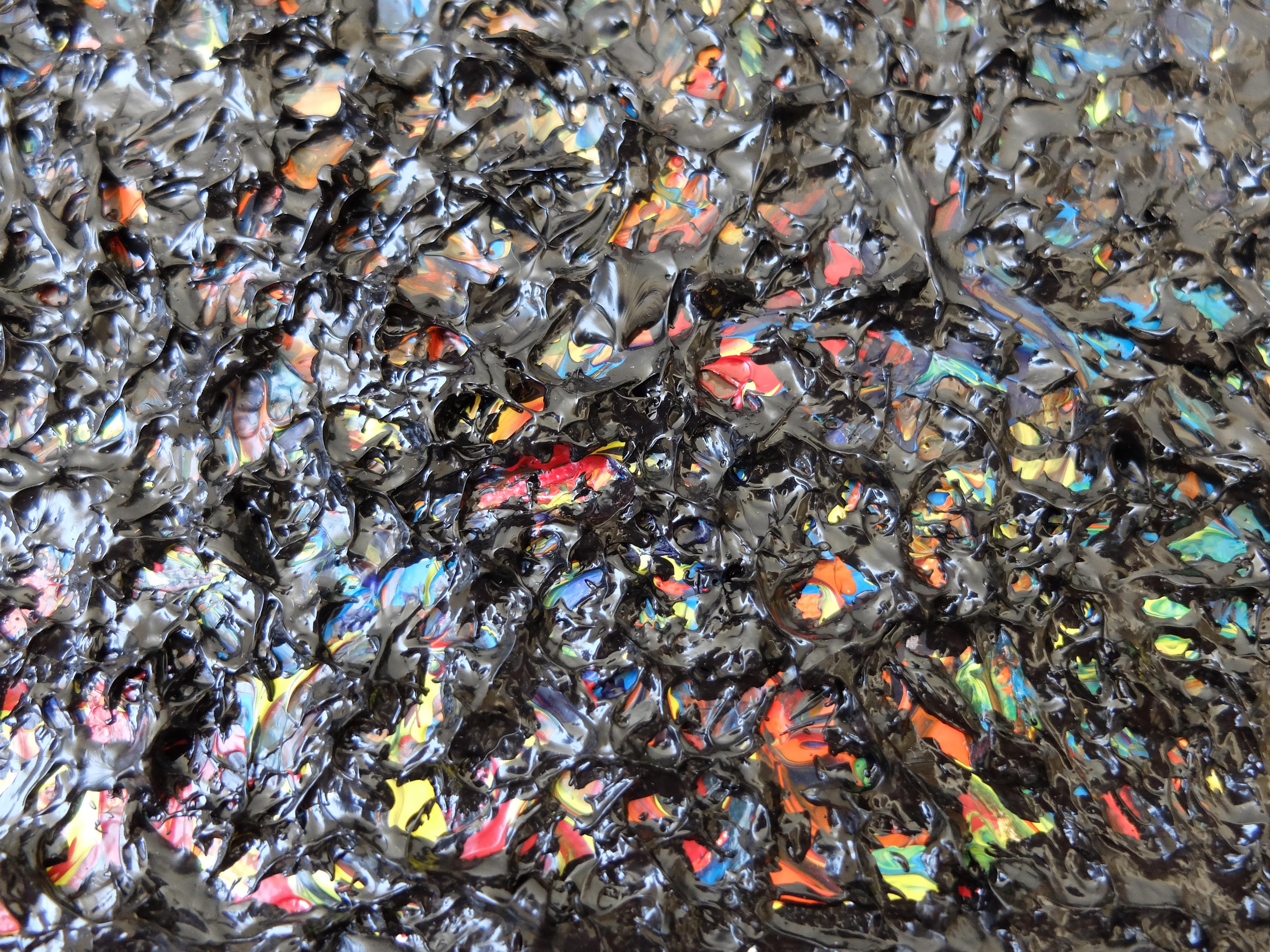
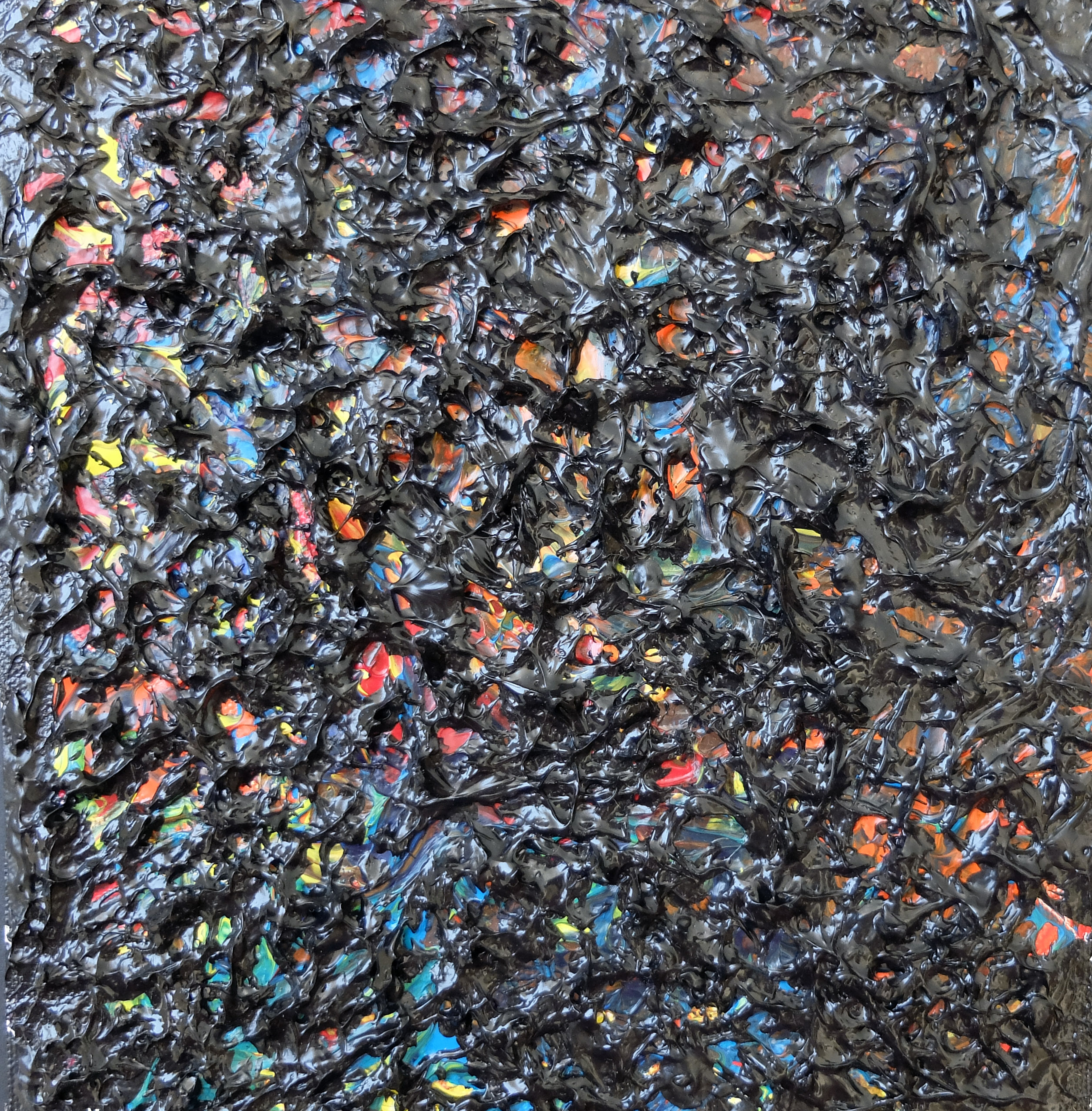
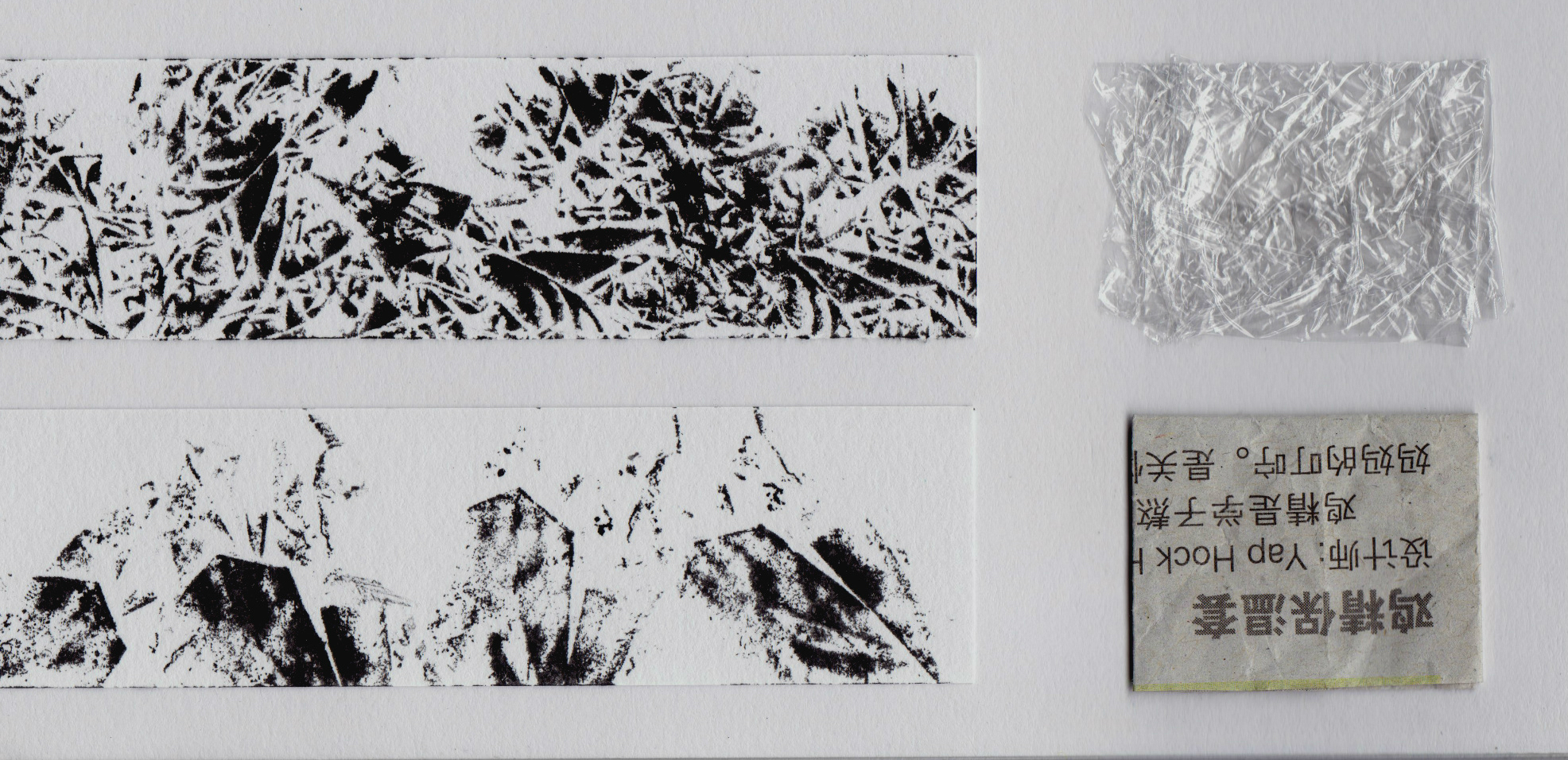
1 Fragile
The word ‘Fragile’ means something that is weak, brittle and breakable. For example glass. For this strip, i experimented with stamping crumpled newspaper and plastics to create to create the shattered/cracked glass effect.

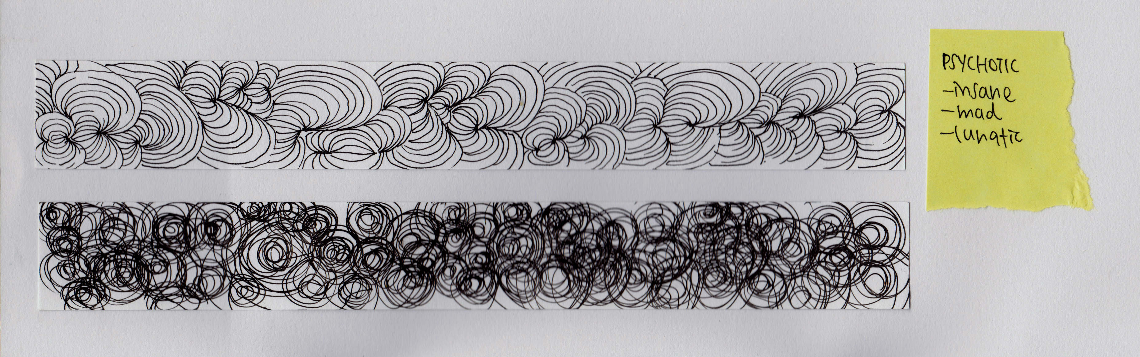
2 Psychotic
According to the dictionary, ‘Psychotic’ means insane, mad and lunatic. Thus, i used repeated and intersecting curves in a messy and disorganized way to depict that mad state of mind.
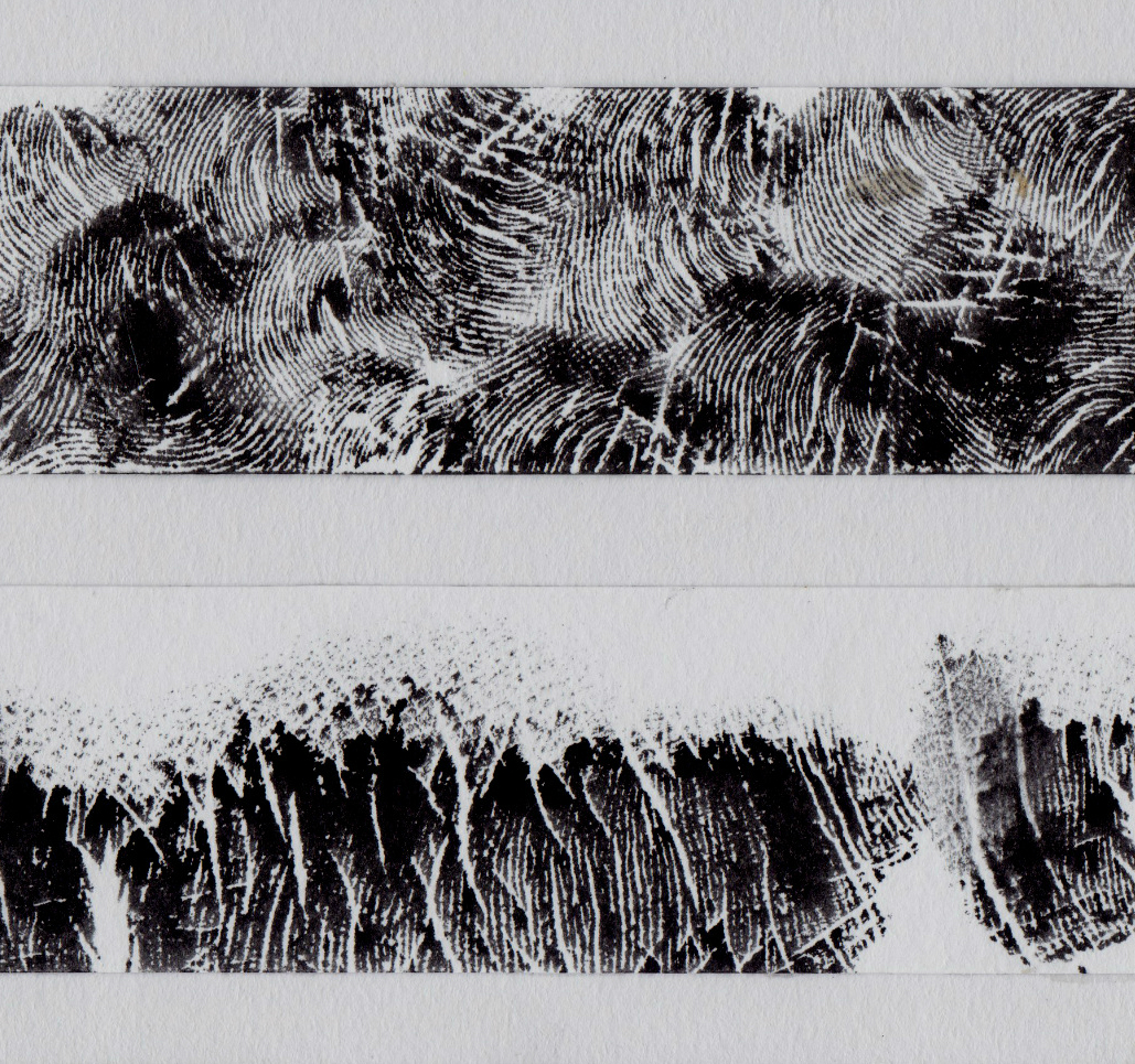
3 Anxious
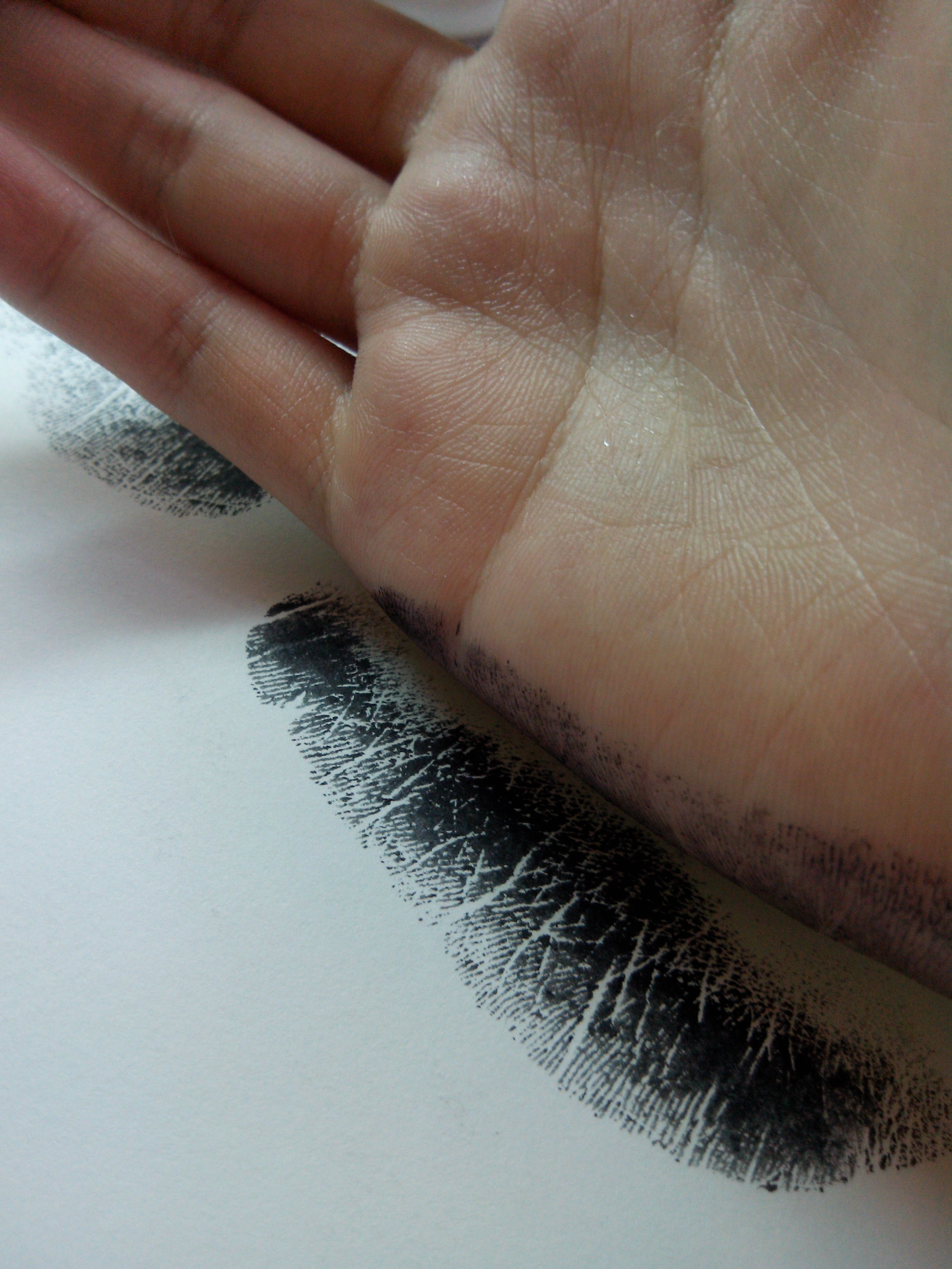
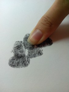
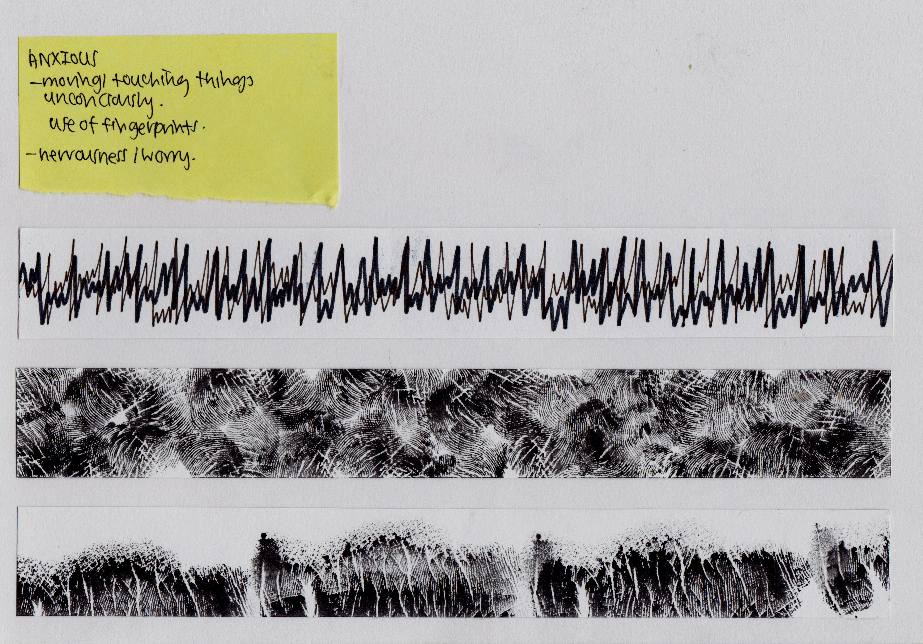
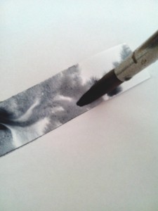
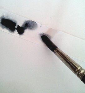
‘Anxious’ suggests nervousness and worry. When i feel anxious, i tend to move and touch things unconsciously. Therefore, i used my hands to create this work. For the first strip, it depicts the anxious heartbeat pattern.
The second one is created by stamping my fingerprints in different directions to show the unease mind when one is anxious.
Lastly, i stamped using the sides of my hands leaving spaces between each stamps to suggest the empty mind when one is anxious, being unable to think of anything.
Surprisingly, the lines on one’s hands have interesting curves and sudden intersecting lines, which depict that disrupted thought process.

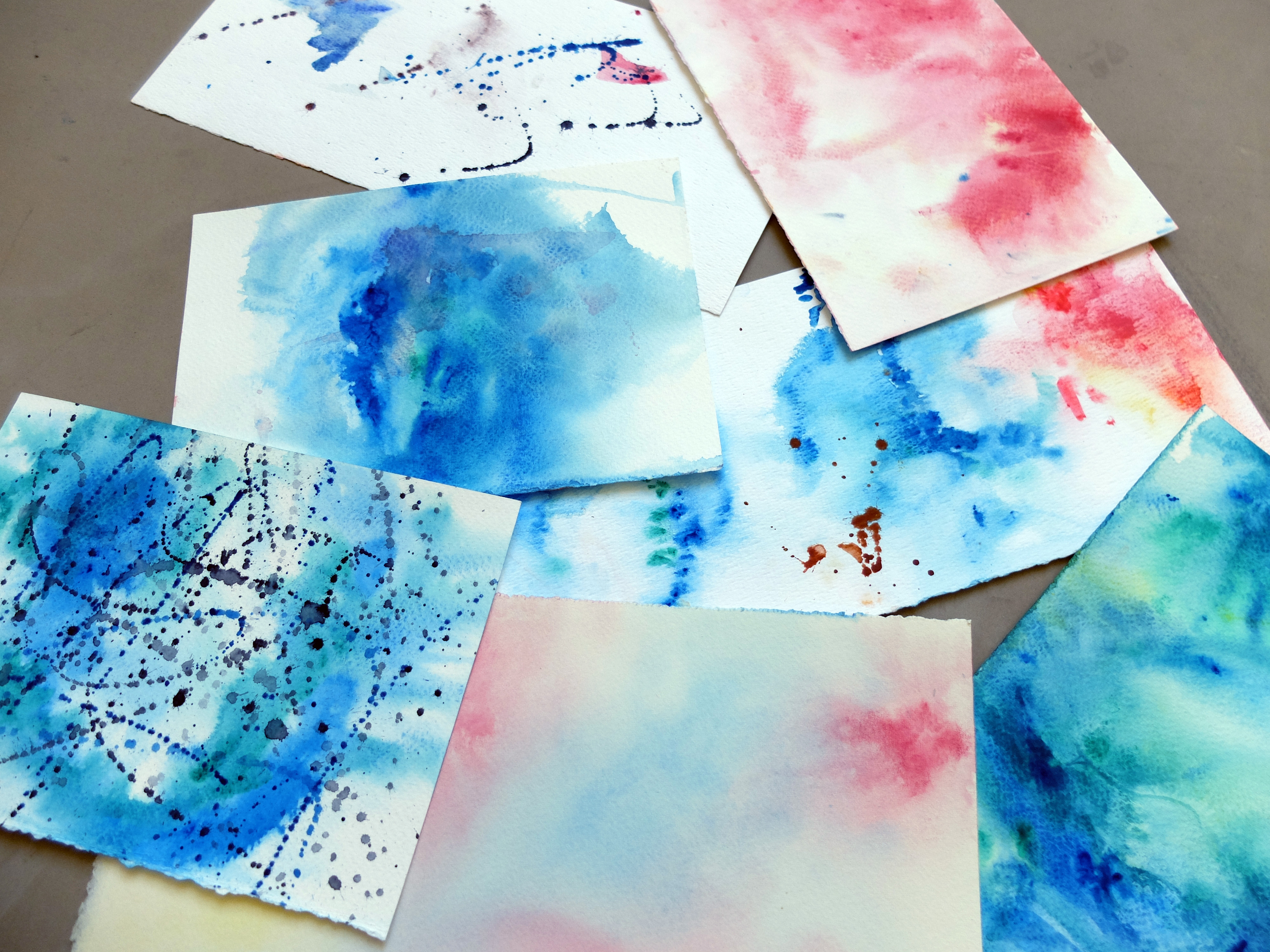
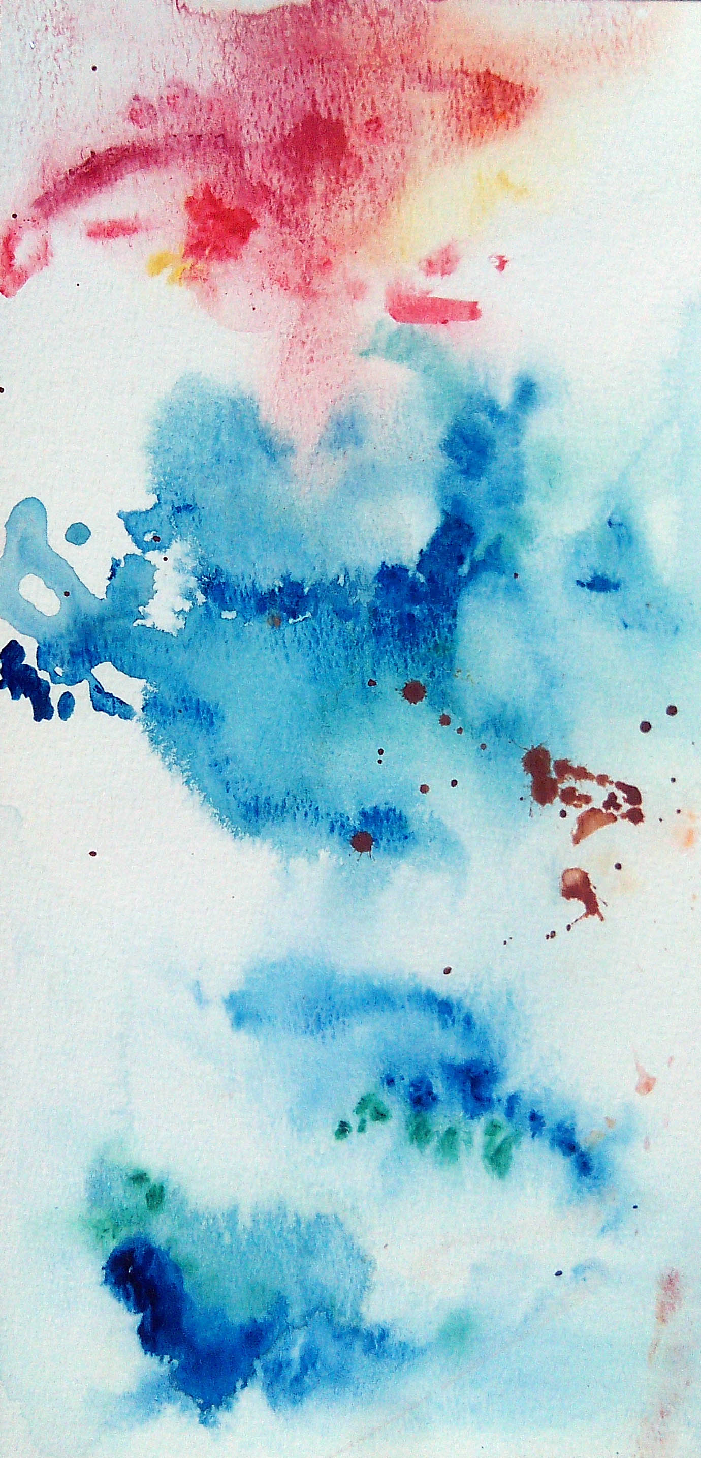
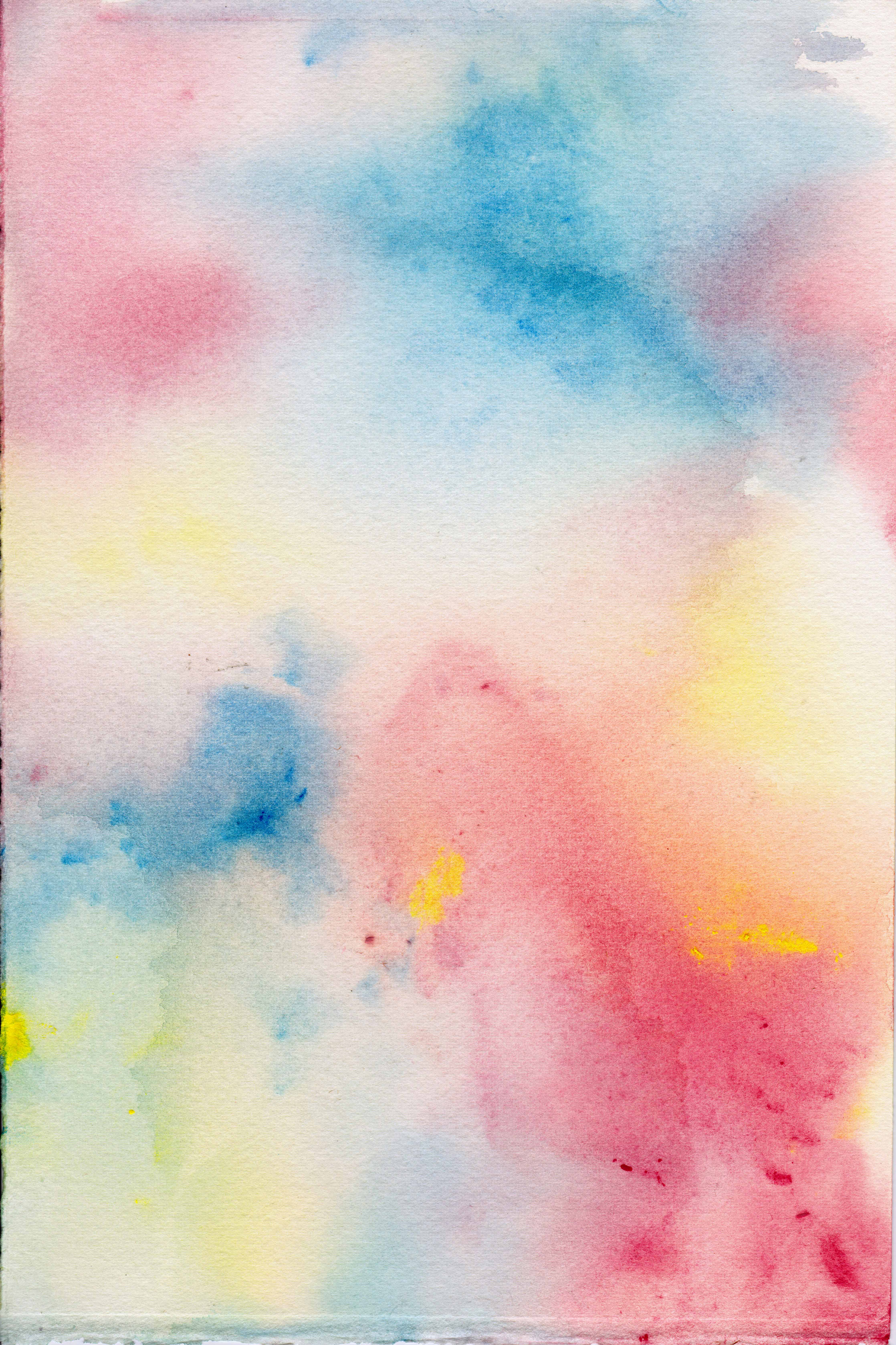
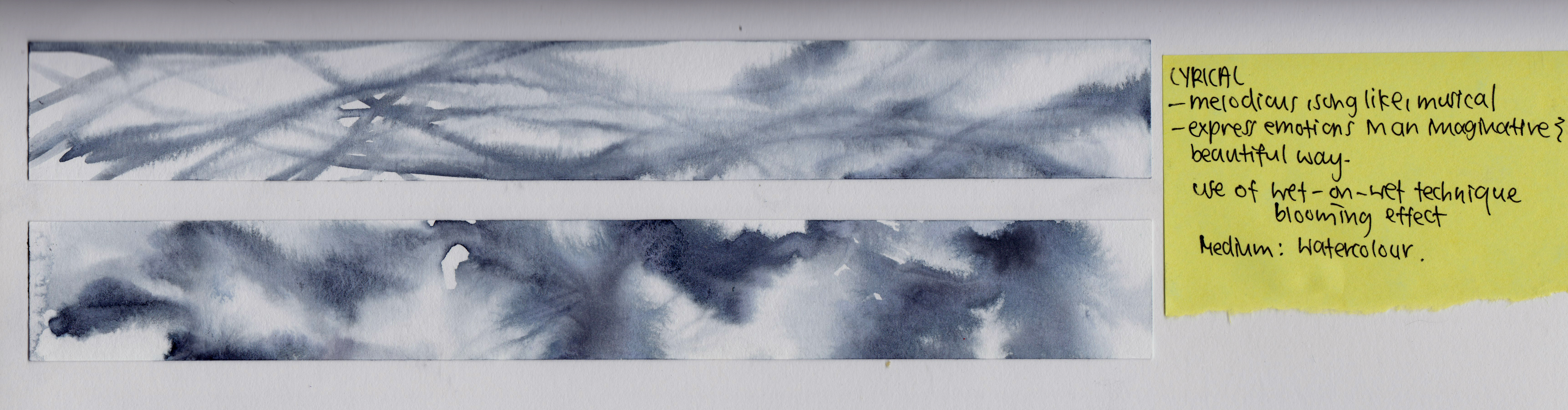
4 Lyrical
This emotion has the meaning lyrical, song-like and musical. To express this, i used the wet on wet technique of watercolours to allow the natural flow of the colours on water. For the first strip, i drew line strokes on the wet layer of plain water. The second one, i dip paints onto the wet layer, allowing a blooming effect.
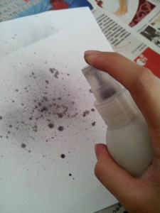
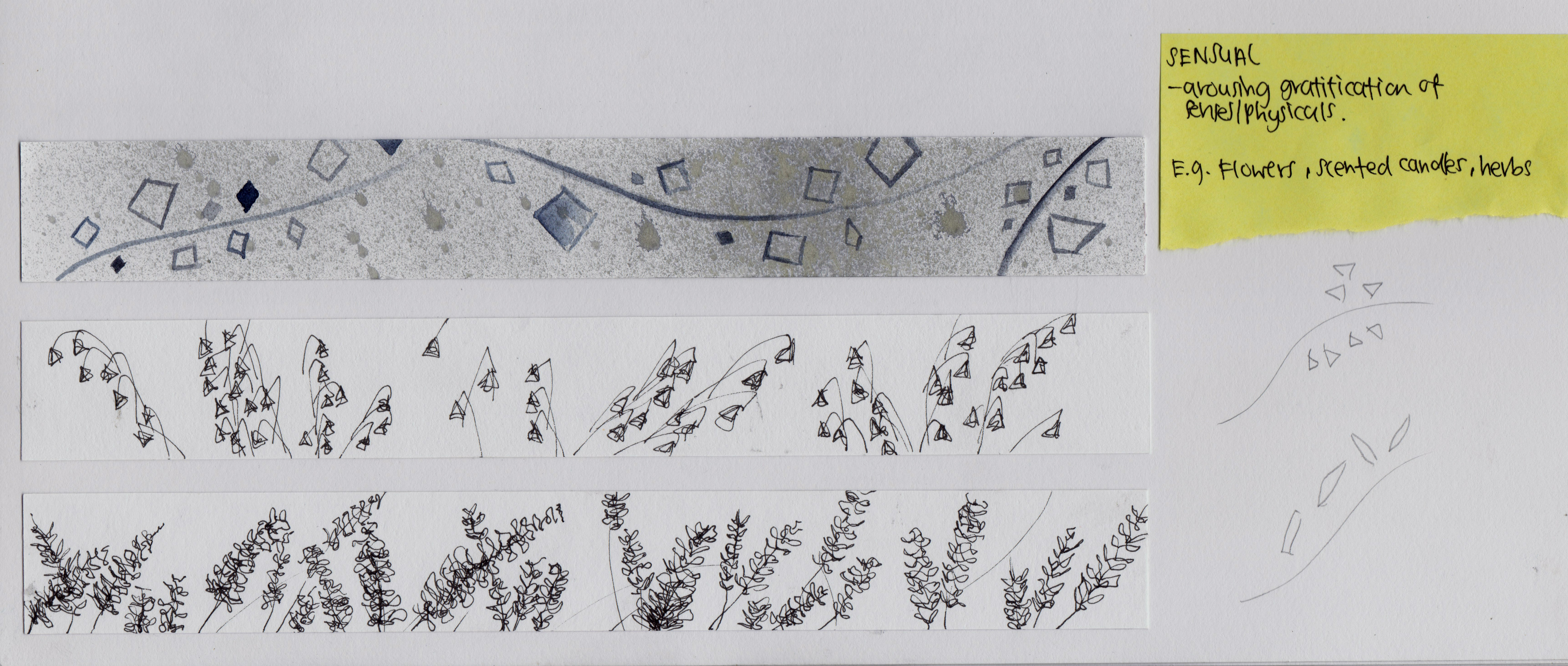
5 Sensual
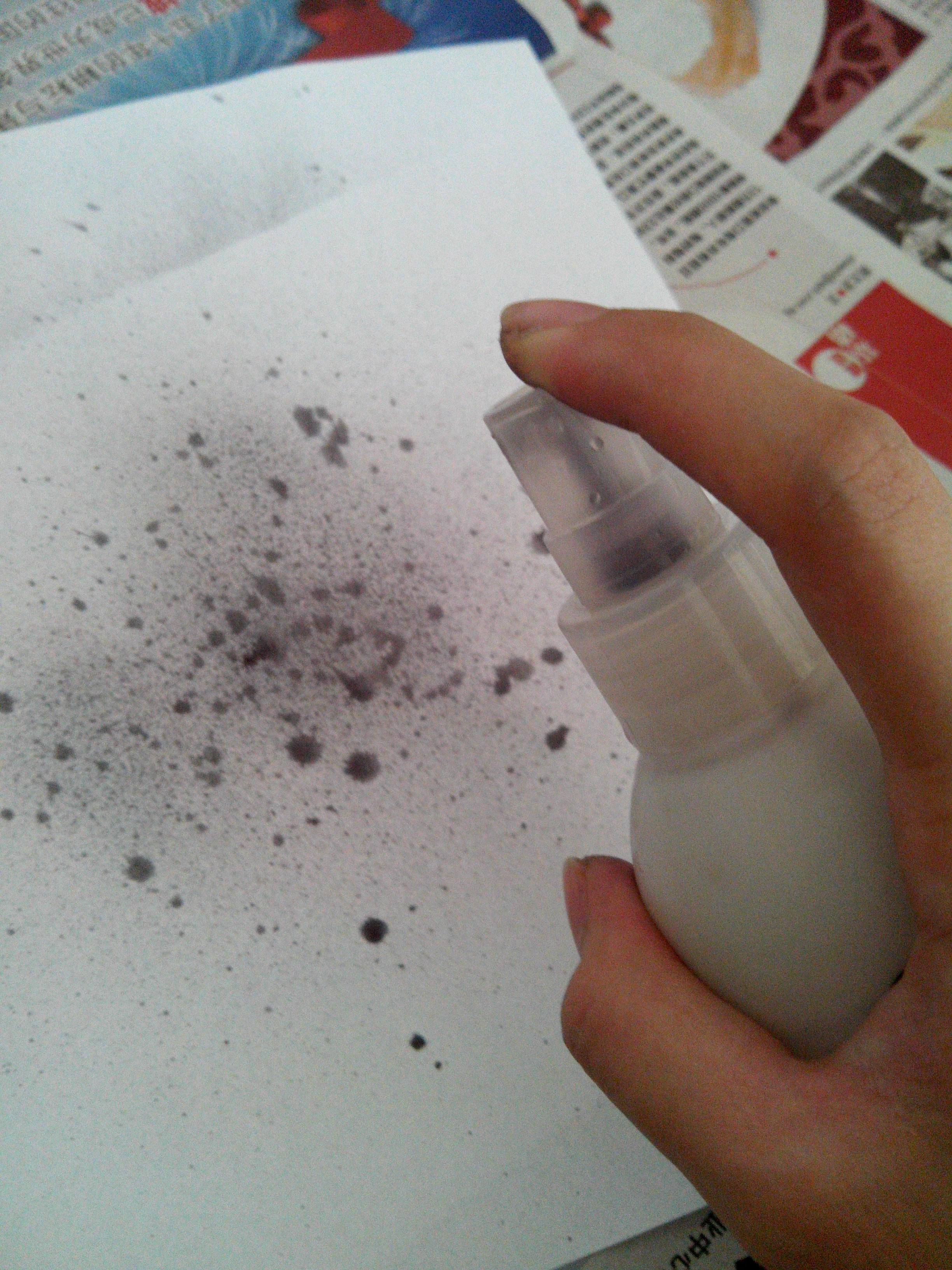
The emotion ‘sensual’ means arousing the gratification of senses and physicals. Some objects that have this ability are flowers, scented candles, perfumes and herbs. At first, i tried to draw flowers like lavender and lilies, but turned out being too representational. Thus, i simplified them into simple lines as branches and little squares and triangles as petals. The background is created by spraying paint, similar to the action of spraying perfume.
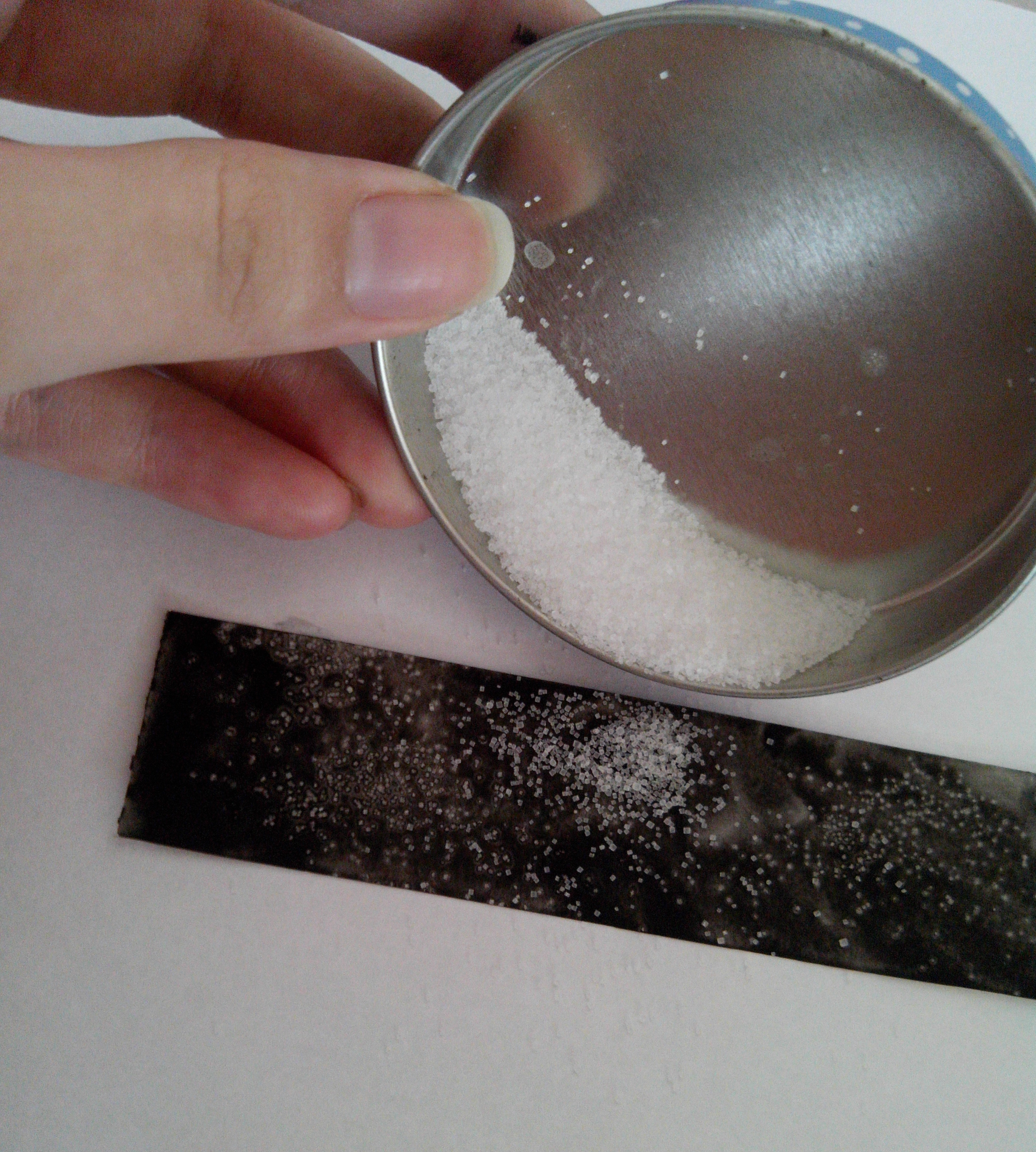
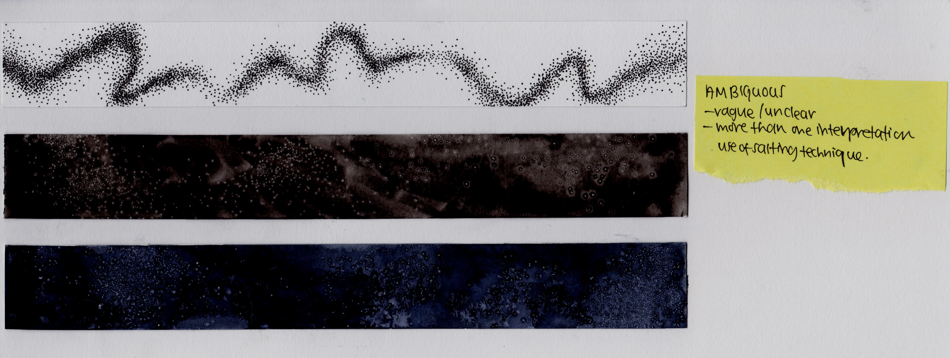
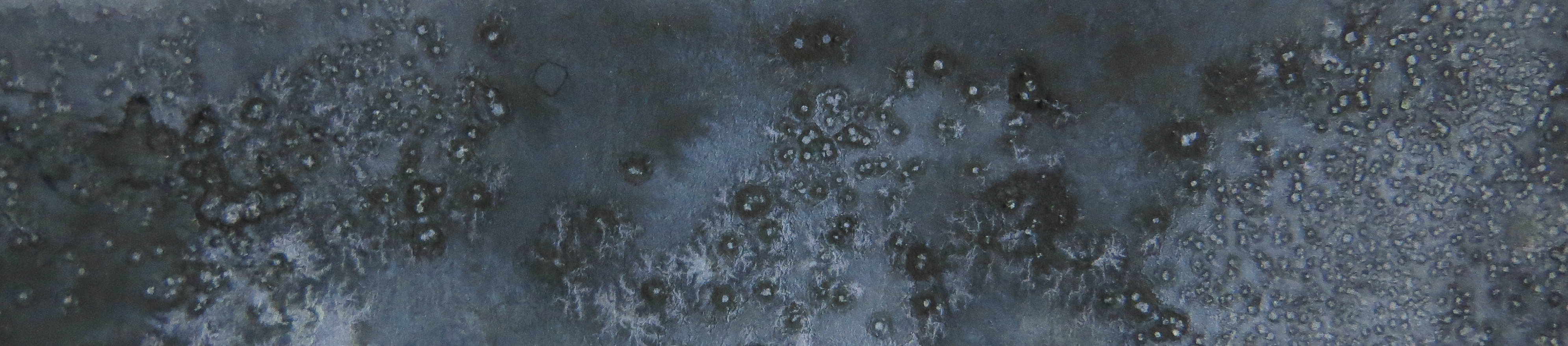
6 Ambiguous
The word ambiguous suggest a vague and unclear meaning. Something that is arguable and has more than one interpretation. For this strip, i used the salting technique. Salt is sprinkled onto the layer of watercolour while it is still wet. After the paint dried, simply sweep off the salt. Whats left is the textures shown below. The unclear and unpredictable movement of the water caused by the salt created a coral like textures with dots, a very cloudy and sparse effect.

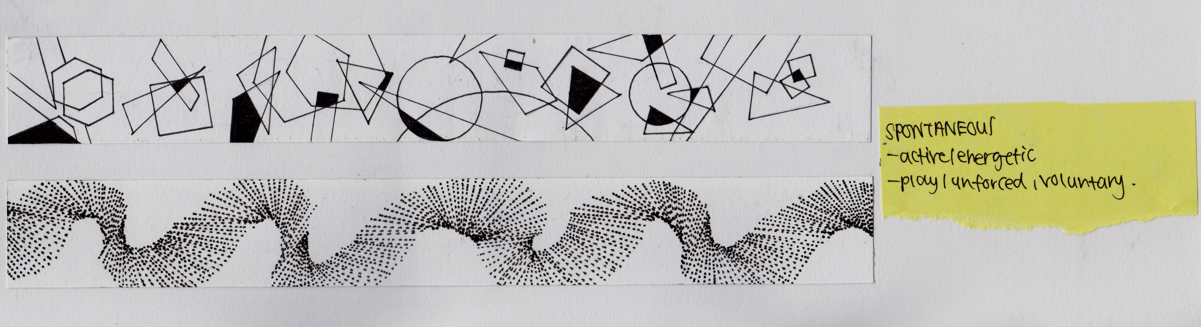
7 Spontaneous
‘Spontaneous’ suggest energetic, active and play. Hence, i used lines and shapes to depict a sense of movement. For the first strip, i used a variety of shapes in different scales and directions to suggest spontaneity. For the second one, i used straight lines to create a sense of movement in space.
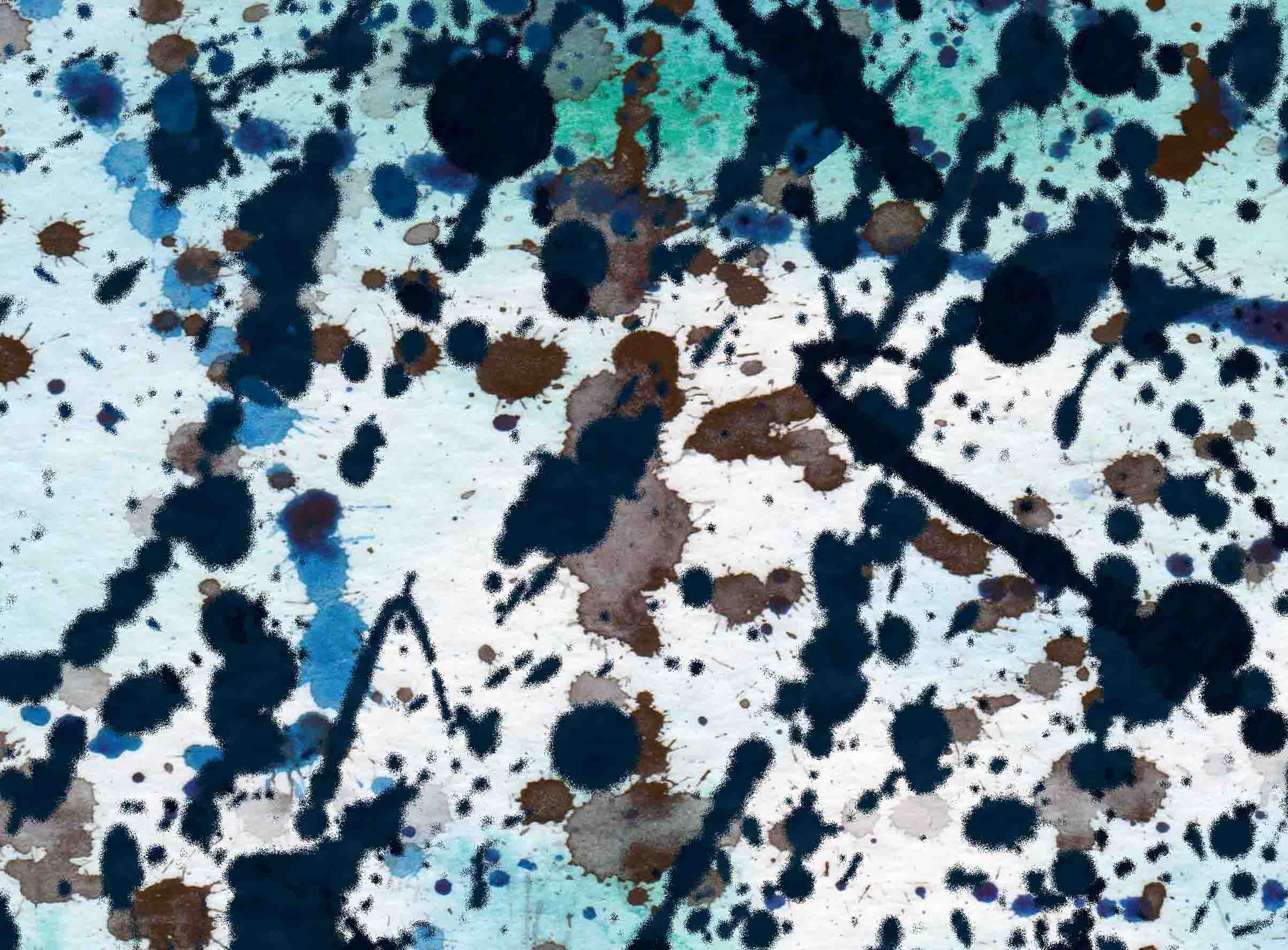
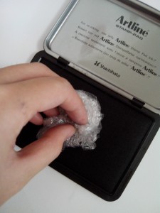
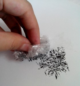
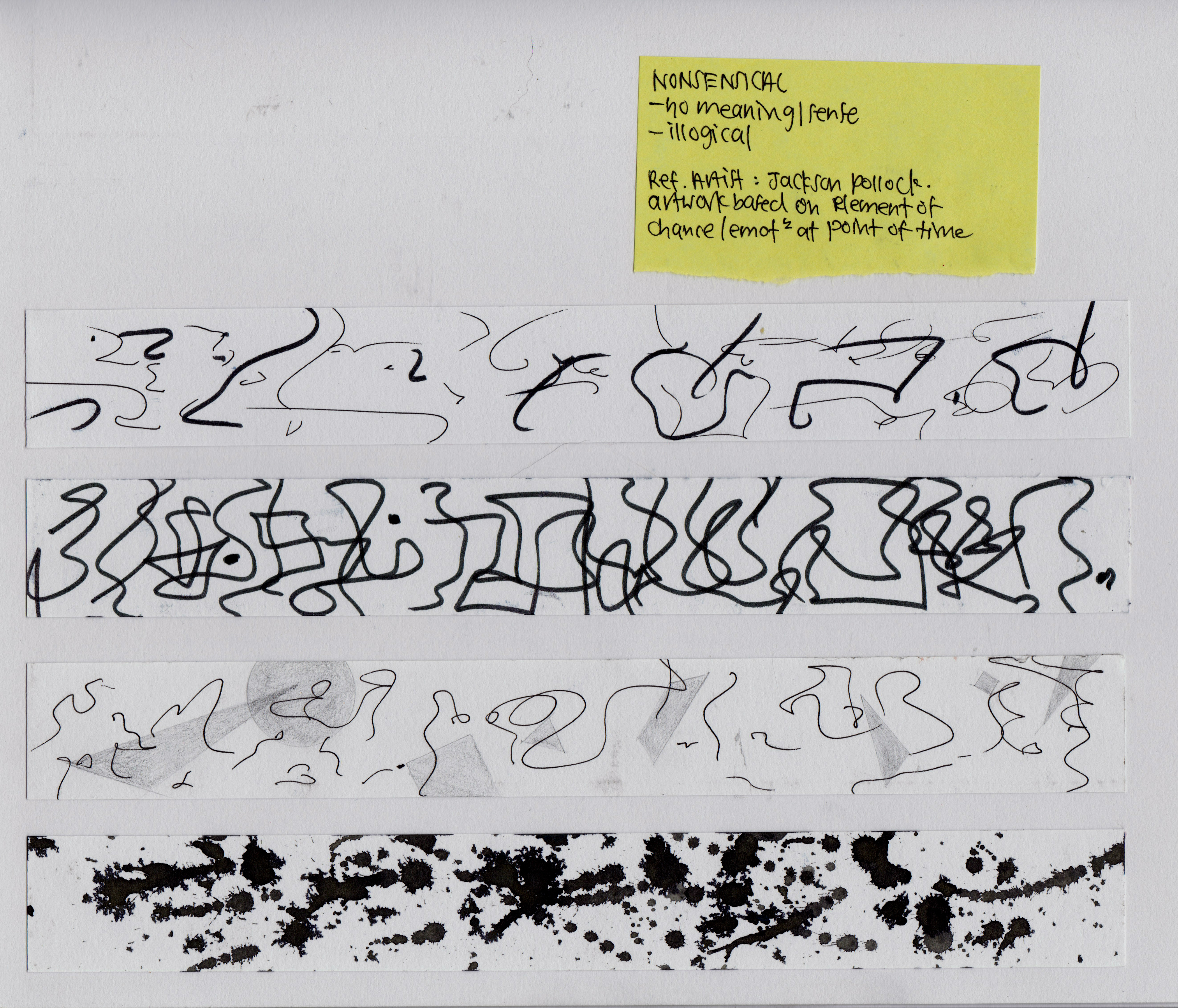
8 Nonsensical
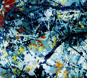
This just means no meaning or sense, something that is illogical. I used the concept of automatism to create random scribbles. Also, i tried the drip and splash paint effect which was inspired by Jackson Pollack, whose artwork was based on element of chance and emotion at the point of work.
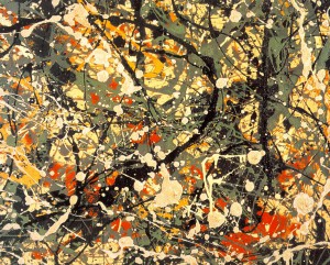
Jackson Pollock ‘Number 8’
9 Embarrassed
When i am ‘Embarrassed’ , i would naturally want to hide and leave as little trace as possible. Thus, for the first strip, i created little quotations, to show the little traces. Also, i drew springy lines that curl in, to suggest the mentality to hide.

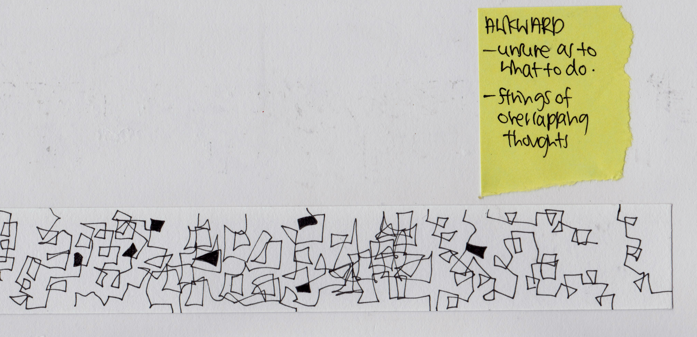
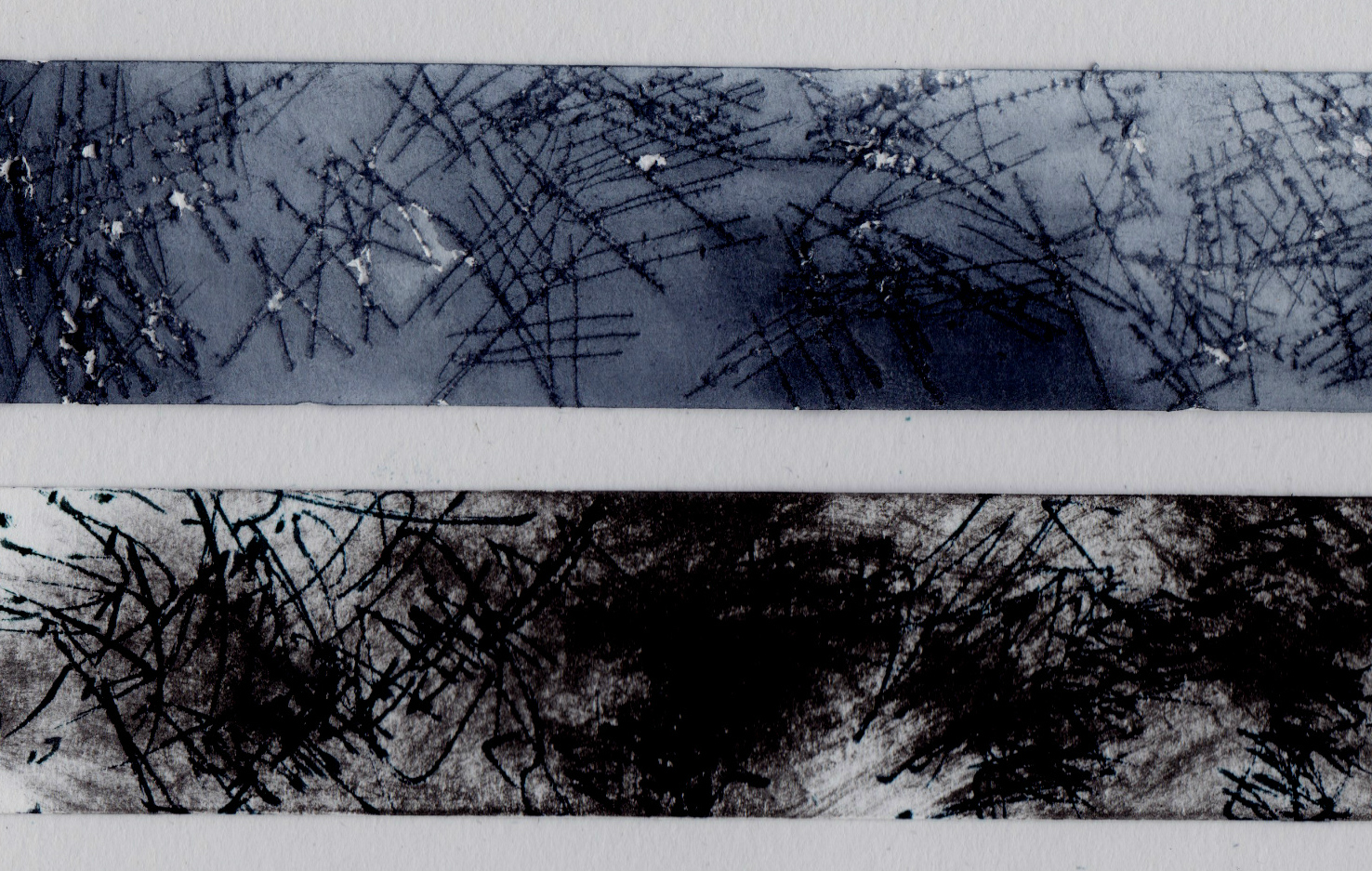
10 Awkward
When one feels awkward, they are unsure what to do and have strings of overlapping thoughts. Thus, i i created strings of intersecting lines with shades in the shapes enclosed, to show the uncertainty as to what to do.
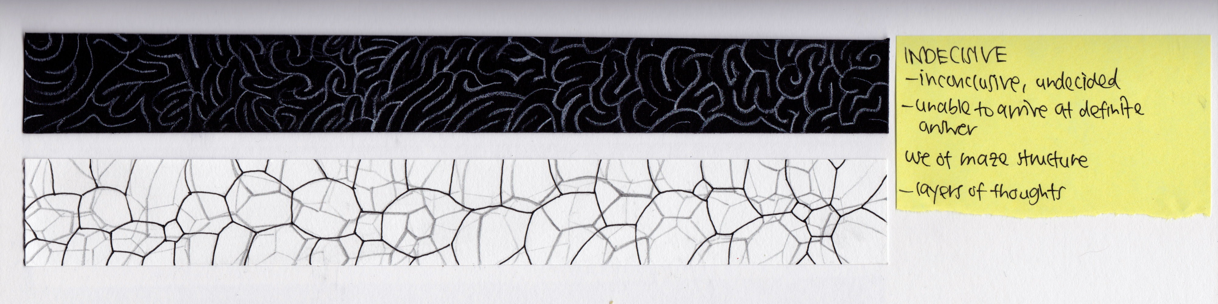
11 Indecisive
The word ‘indecisive’ suggest something that is inconclusive and undecided, being unable to arrive at a definite answer. Thus, i have used lines to create a maze-like structure to show the inner thought process of finding an answer. The second one depicts the layers of thoughts that one has when unable to arrive at a decision.
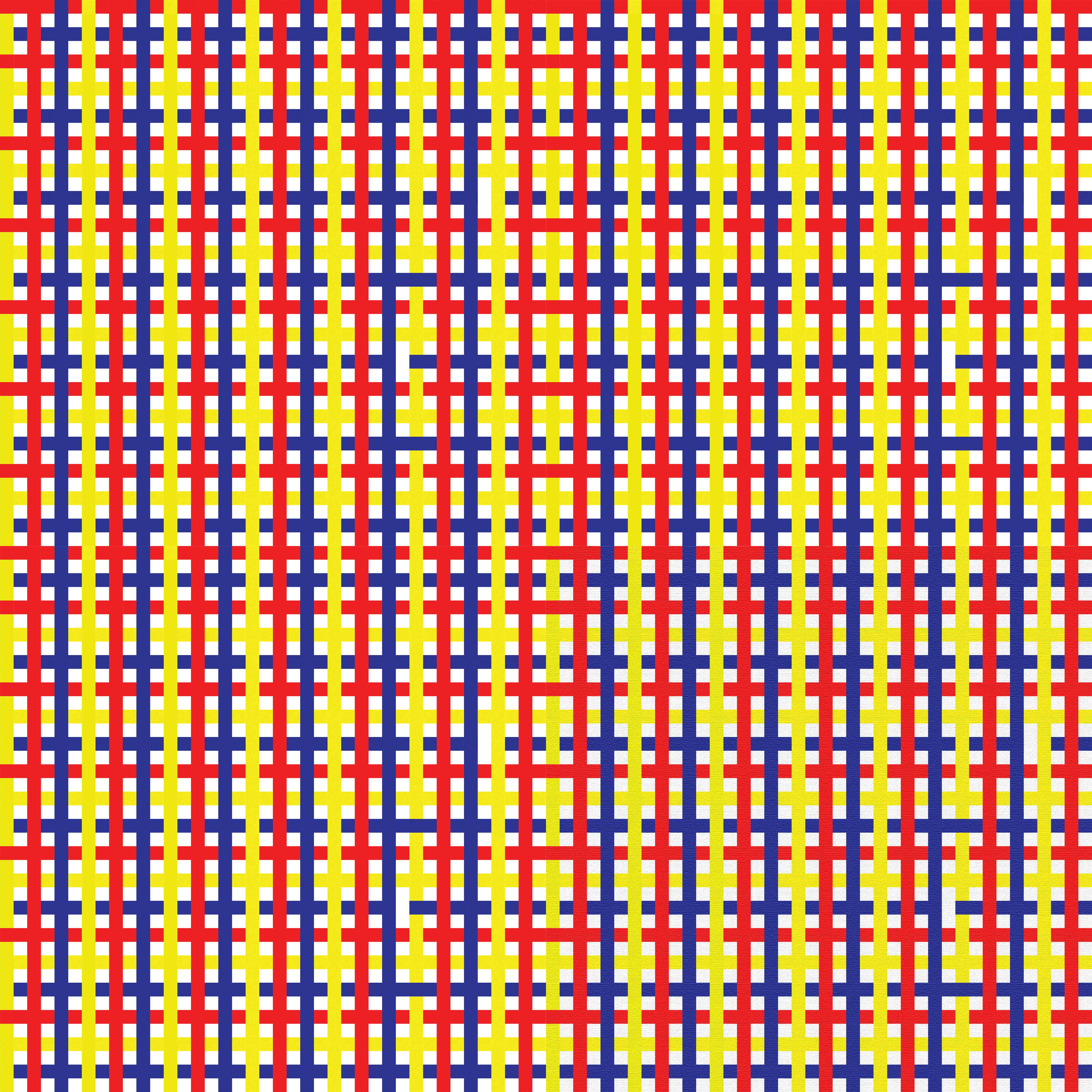
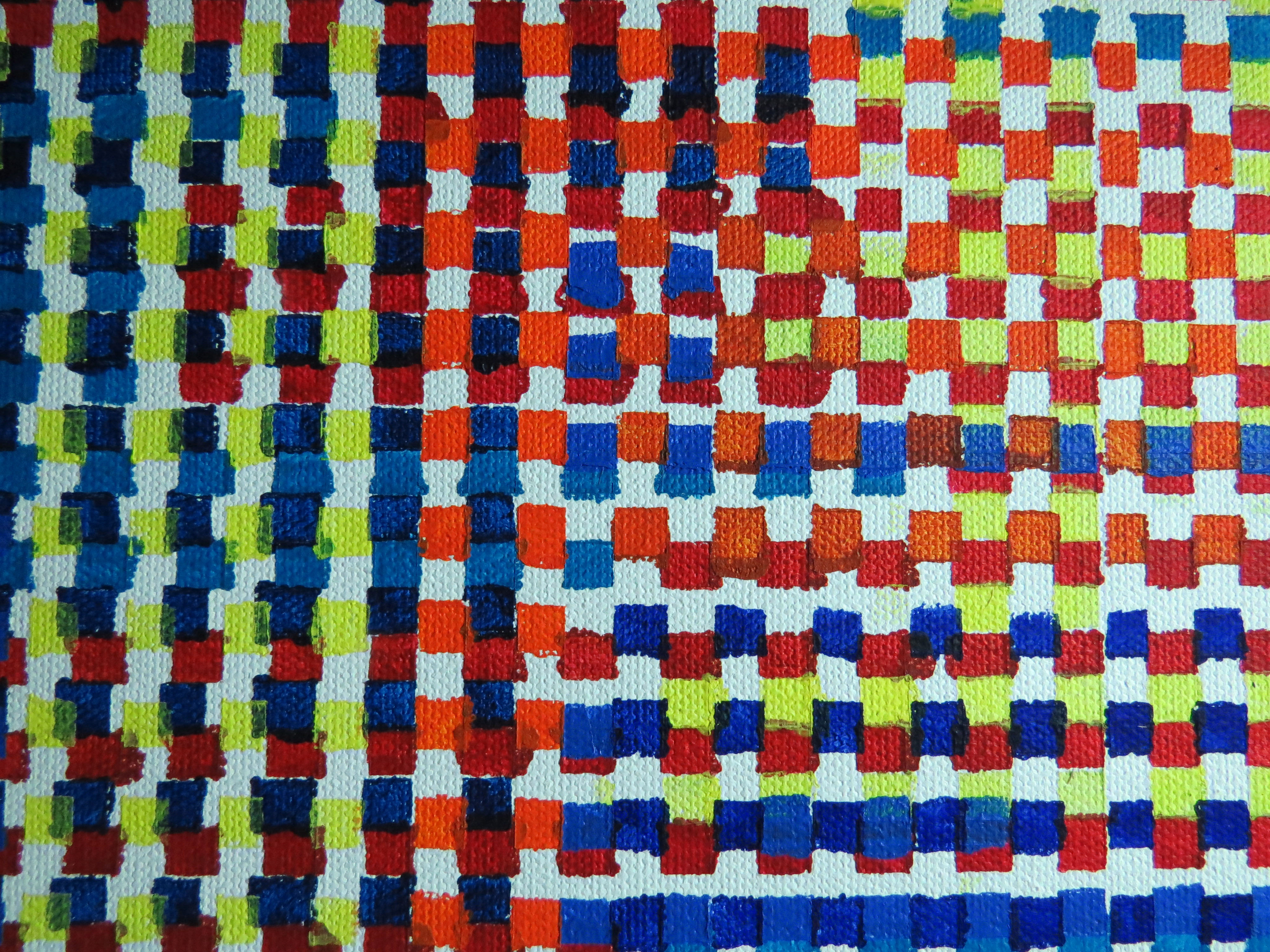
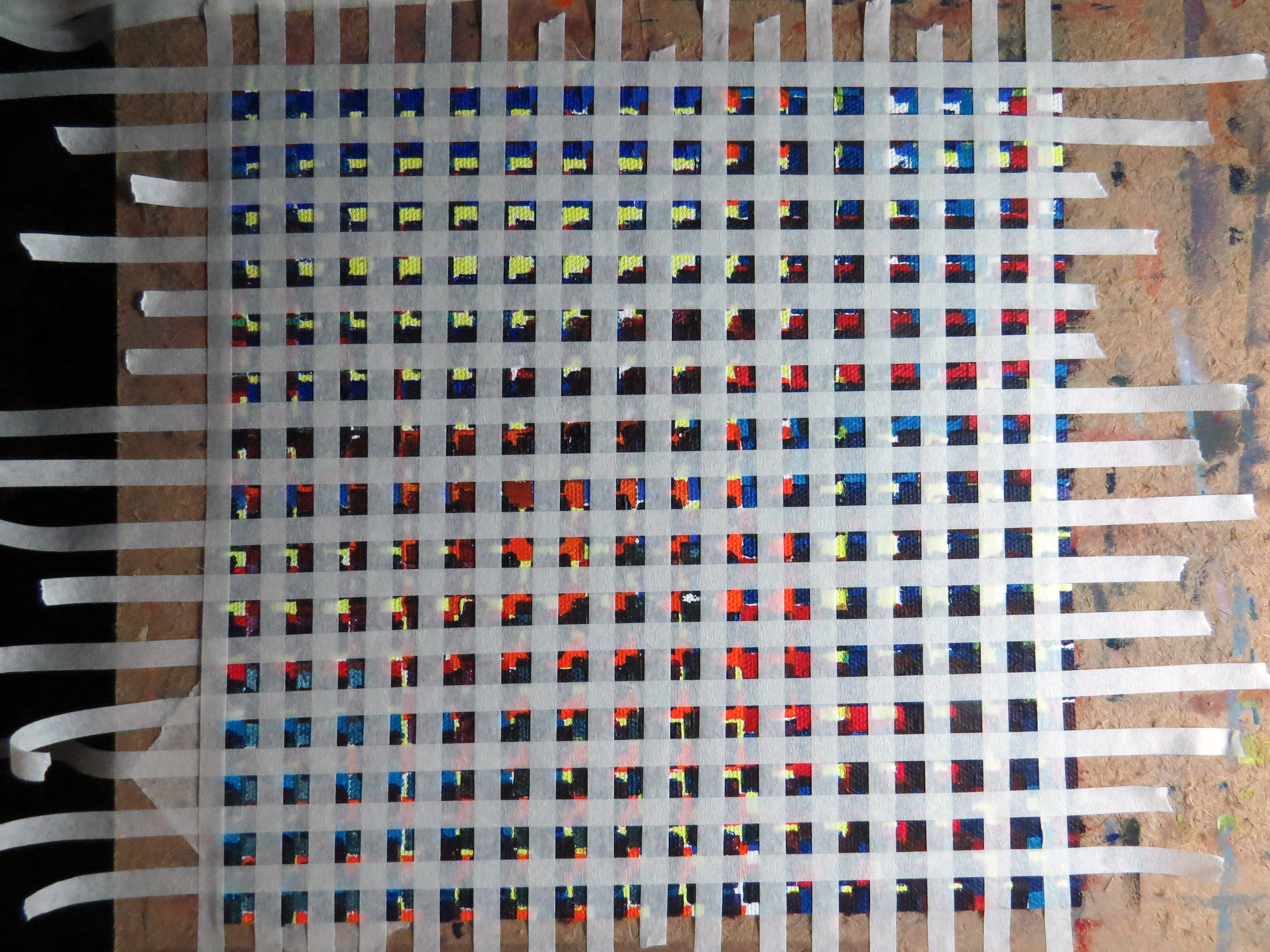
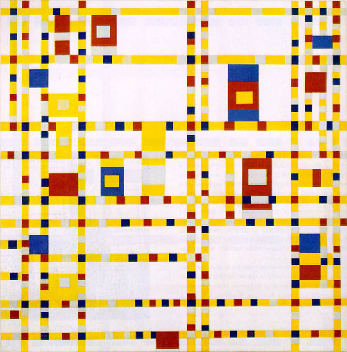
12 Systematic
‘Systematic’ means methodical and organised. To express this emotion, i referenced grids,maps and graphs. Also, i took inspiration from the artist Piet Mondrian, who strongly emphasize on geometry and orderly, clean design.

Piet Mondrian ‘Broadway Boogie Woogie’

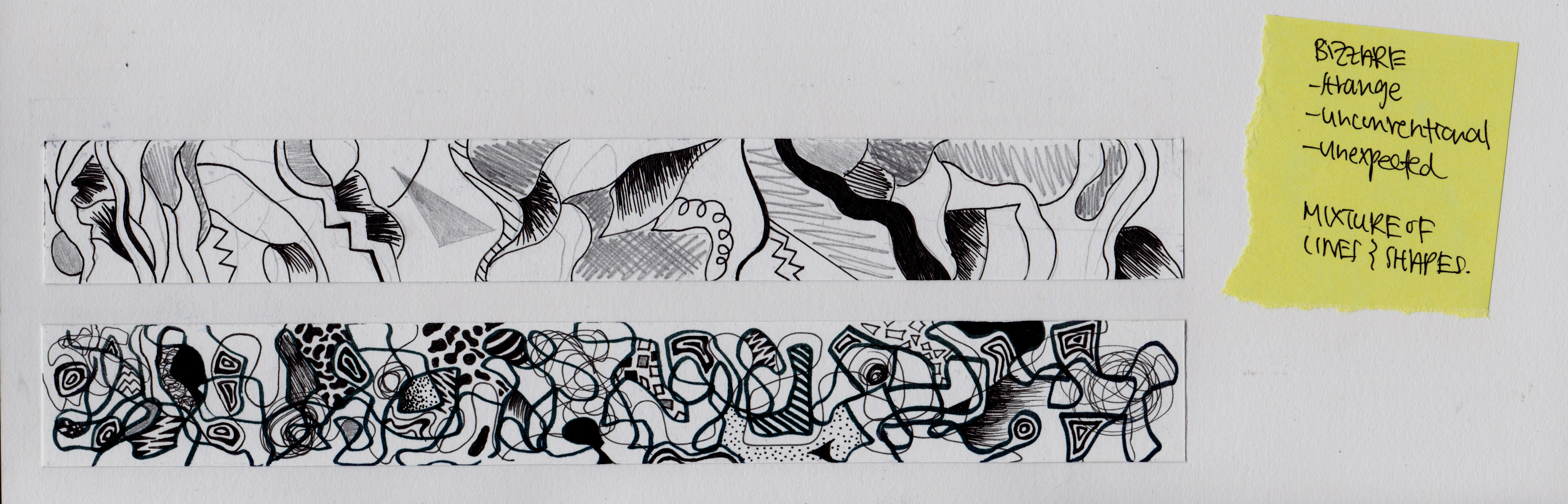
13 Bizarre
‘Bizarre’ suggest something unconventional and strange. The first strip, i have created an impression of the internal organs, something really unexpected and disgusting. For the second one, i used a mixture of random curve, straight lines and variety of shapes to give a bizarre feel.
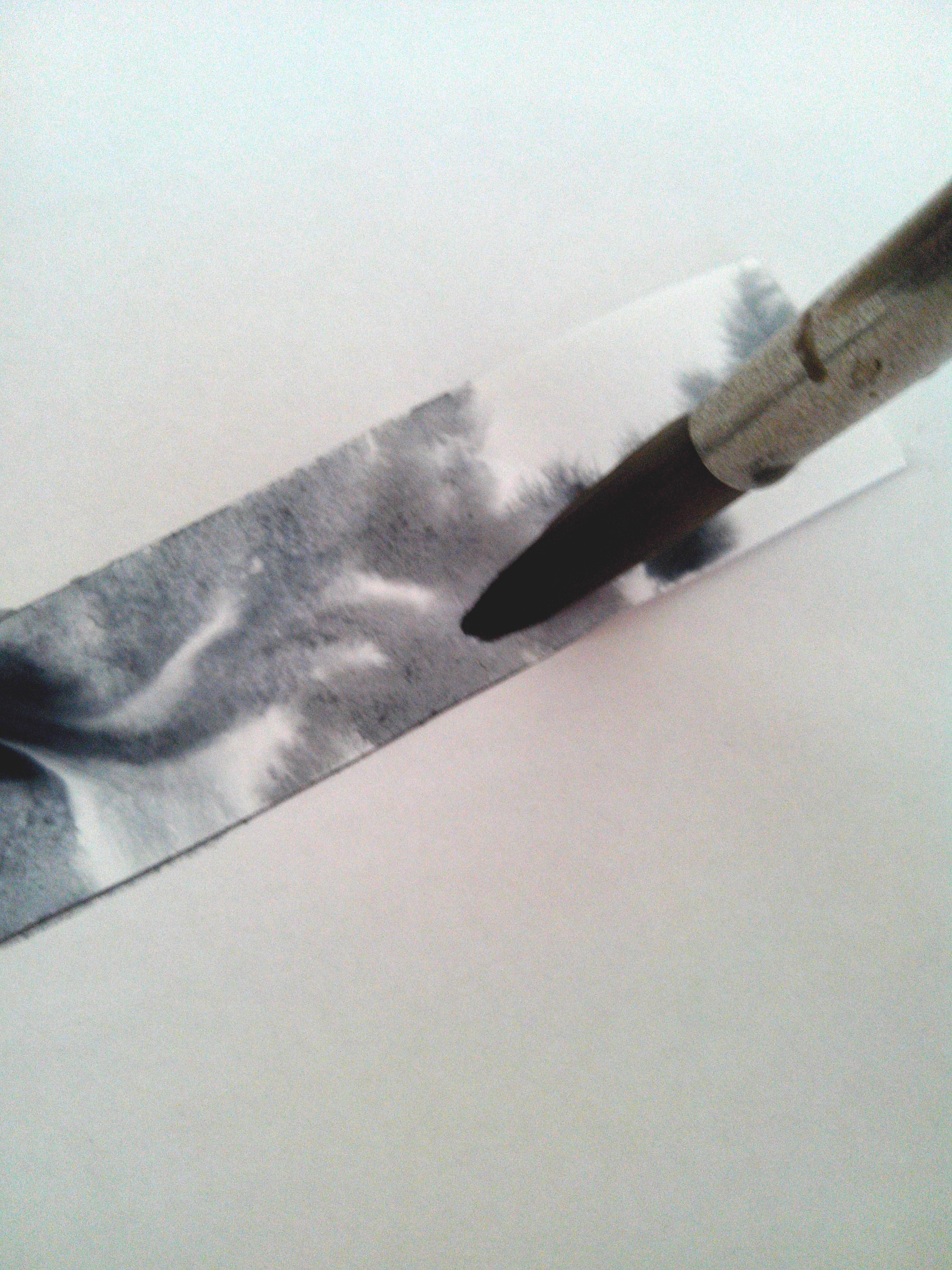
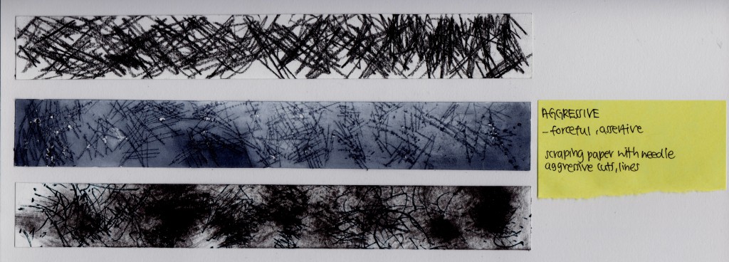
14 Aggressive
The word ‘Aggressive’ means forceful and assertive. Actions like cutting, stabbing, burning and bombing are aggressive actions. The first strip is created by aggressively drawing straight lines using charcoal.
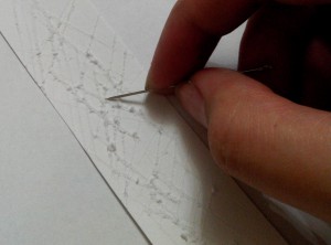
The second one, i scraped out the paper first, then apply a layer of watercolours over.
The final one is created by rubbing ink onto paper with tissues then throwing lines of markers onto it.
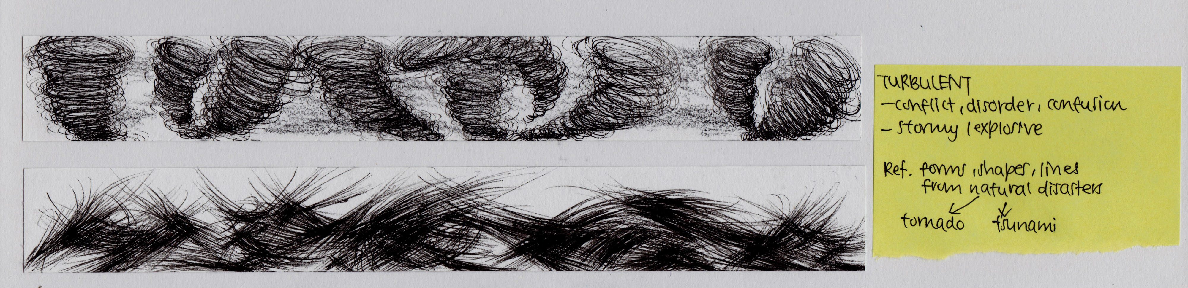
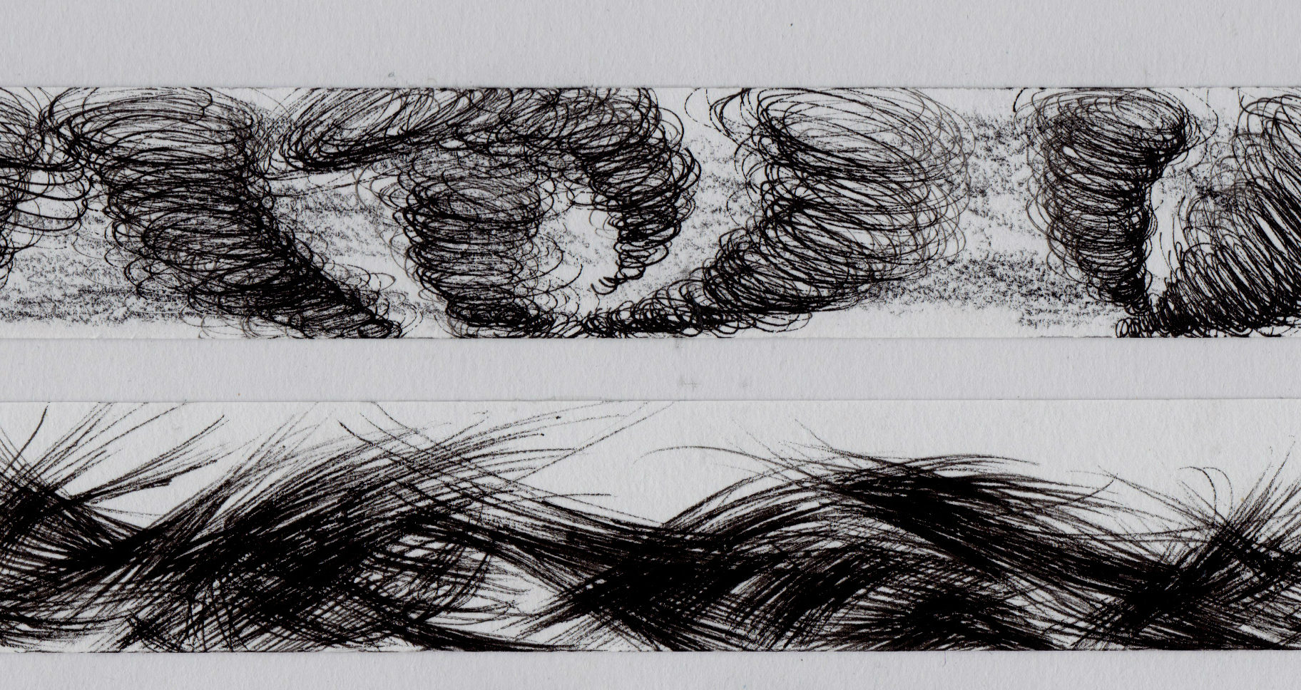
15 Turbulent
‘Turbulent’ depicts conflict, disorder and confusion. Examples are tornado and tsunami. The first strip gives an impression of a tornado with the expanding and spiraling curves from a point as well as the dirtied background using charcoal. The second one shows a more abstract version of the violent movement during conflicts with the overlapping s and c curves.
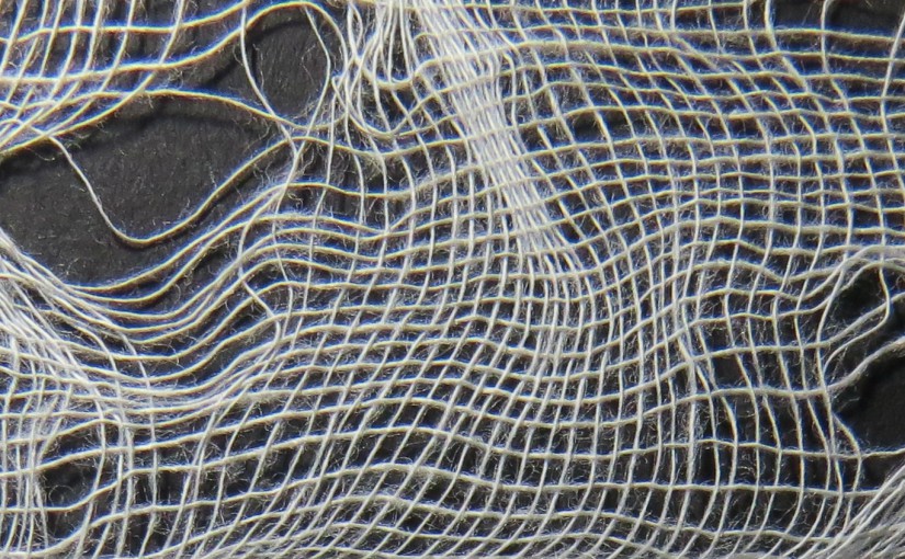
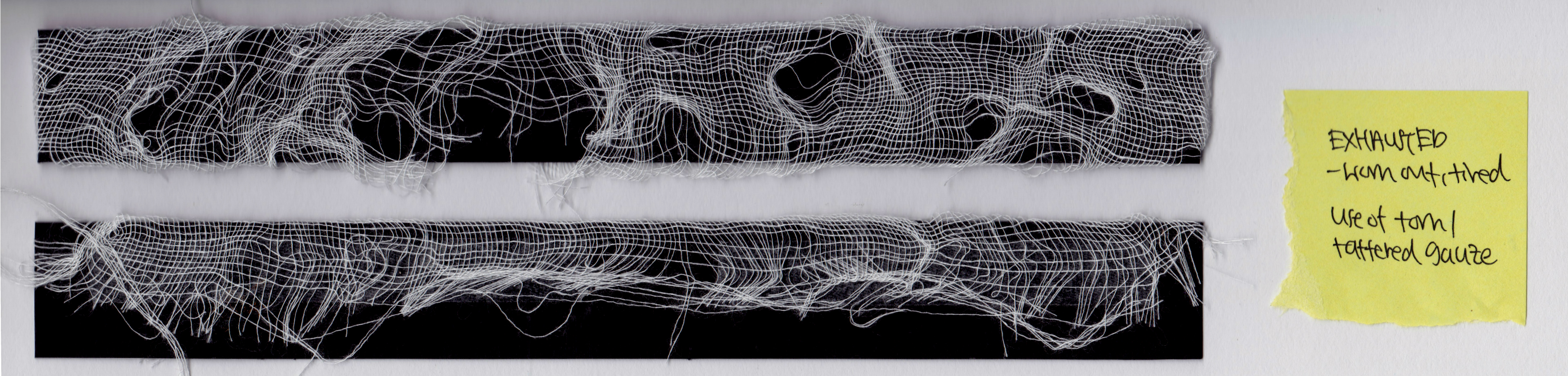
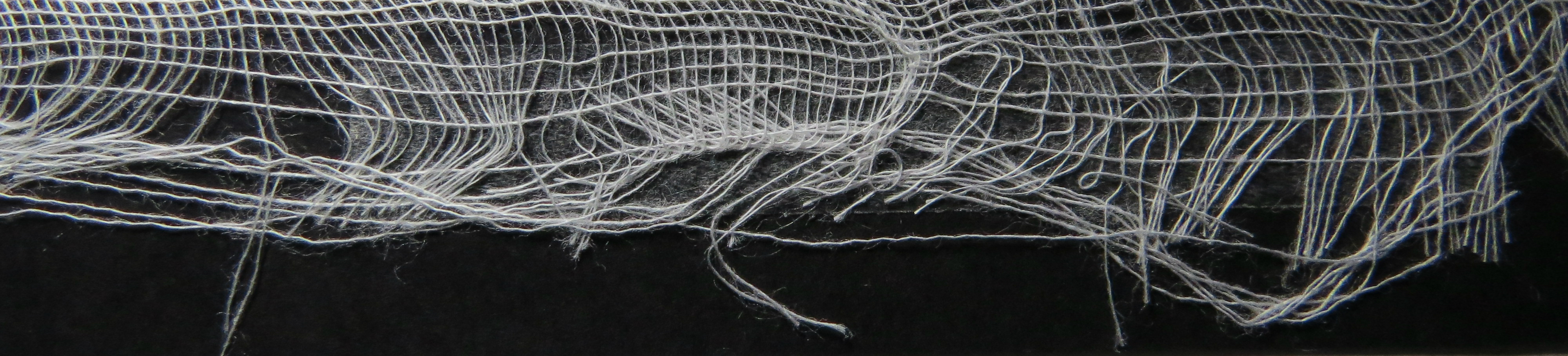
16 Exhausted
The emotion ‘Exhausted’ means something that is used and worn out. Something that is spend or depleted. To present that meaning, the gauze is stretched, expanded and pulled into threads. The first sample was one with only holes on the gauze. The second with threads pulled out. To avoid a consistent and methodical pattern, the final strip has uneven holes on the left and slowly towards the right the pulled out threads appear.

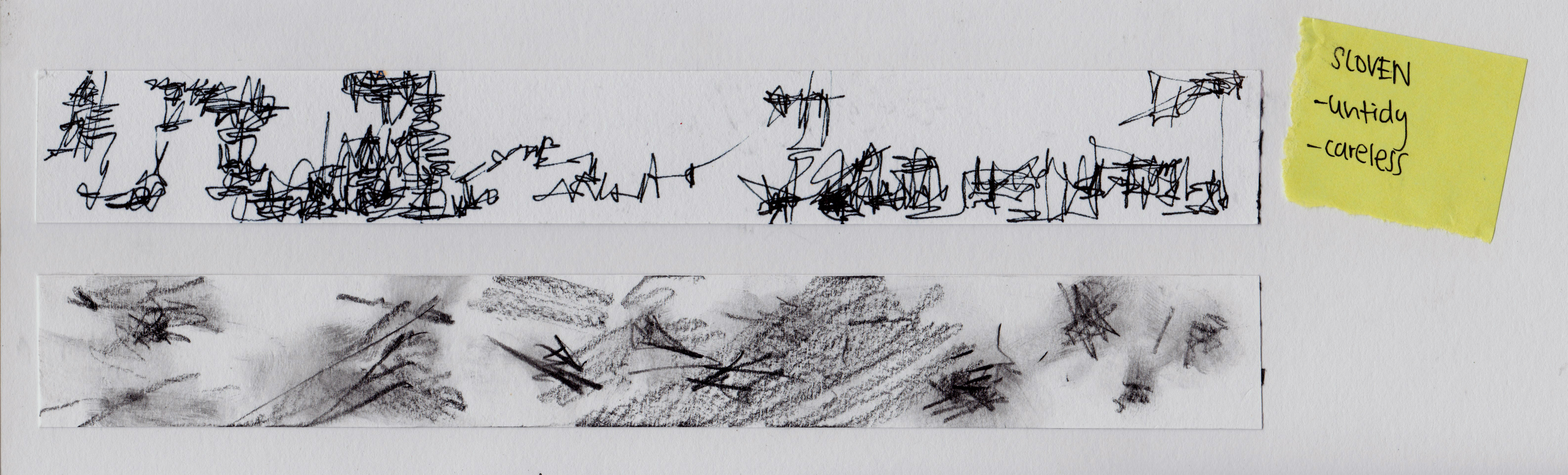
17 Sloven
‘Sloven’ means untidy and careless. The first strip gives the impression of untidiness with random scribbles, The second one is created by smudging and rubbing the charcoal with hands.
18 Distracted
One is off focused when distracted. For this emotion i used a line or dot to represent the focus. The first one show dots slowly being disperse to suggest the wondering of thoughts. The second one depicts line off the dot, to show the sudden deviation from focus. The third one has a line of focus and waves of jagged and curves to suggest the surrounding distractions.


![hello [template]ToPrint](https://oss.adm.ntu.edu.sg/lewm0002/wp-content/uploads/sites/184/2016/01/Hello-Typography.jpg)
![hello [template]ToPrint](https://oss.adm.ntu.edu.sg/lewm0002/wp-content/uploads/sites/184/2016/01/Hello-Abstract.jpg)
![hello [template]ToPrint](https://oss.adm.ntu.edu.sg/lewm0002/wp-content/uploads/sites/184/2016/01/Hello-Conceptual.jpg)