Part 2: Start to work on final project proposals – prepare three ideas for a screen-based experience that you’d like to create (it can be speculative). Prepare a slide show to illustrate your ideas. The ideas can be based on any of the field trips done so far or can be something completely new.
If you click on the following link, you will find a slide presentation of three ideas I came up with for a screen-based experience.
Part 1: Write a response to the exhibition “Future World”. Keep in mind the following questions – What is experience design and what are the possibilities of responsive environments? How might this change the way we think about the world around us and the ways that we communicate with each other?
Response regarding the exhibition “Future World” I visited on Thursday, September 22nd.
The slogan for the exhibition Future World is “Where Art meets Science”. It is indeed what I witnessed during my visit. As soon as I walked in the exhibition, I was instantly immersed into darkness. A darkness in which music met visual effects to create a perfect blend. In other words, I had set foot in a totally immersive experience.
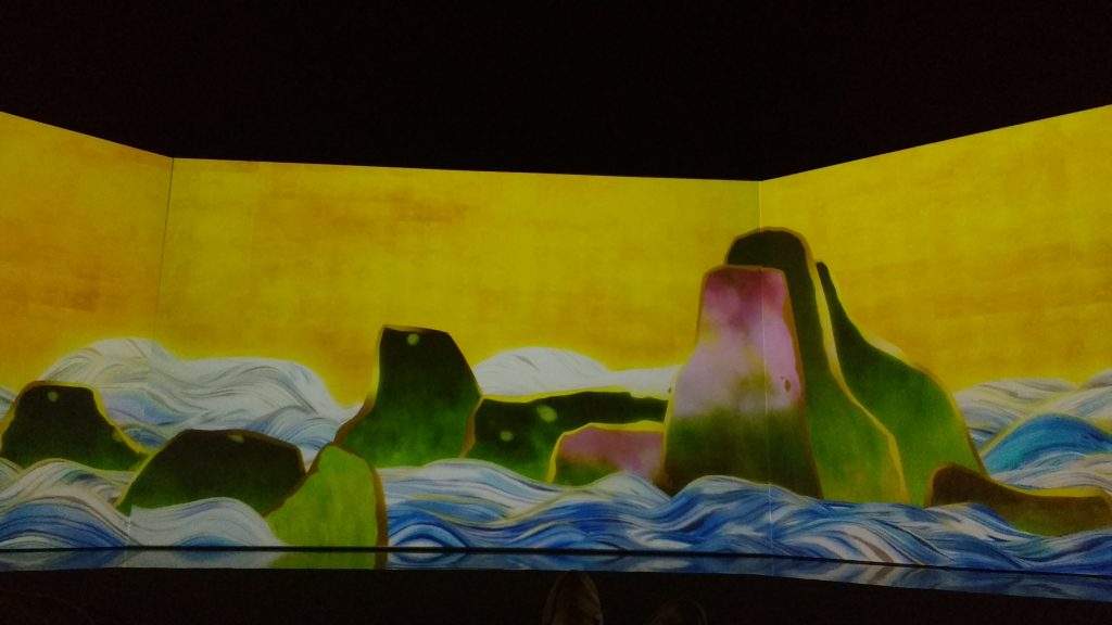
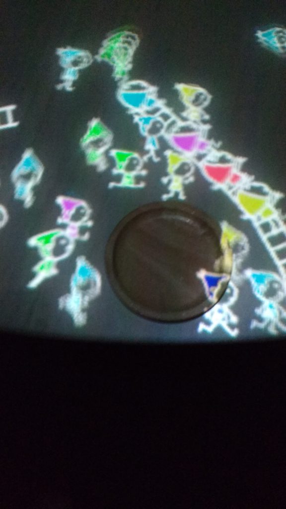
The first room was one of the displays of the exhibition which impressed me the most. At first I was wondering why people were laying down and just staring at an animation which seemed to be going on forever. But then I tried it, I sat down and finally decided to lay down on the floor. It took some time but the atmosphere succeeded in carrying me away. The music, the visuals, the colors, the way the screen were displayed (forming a quarter of an octogon), everything that was there, felt right.
First room of the exhibition
This is what the whole exhibition is about, immersing yourself in a world, an environment, and most importantly being able to interact with it.
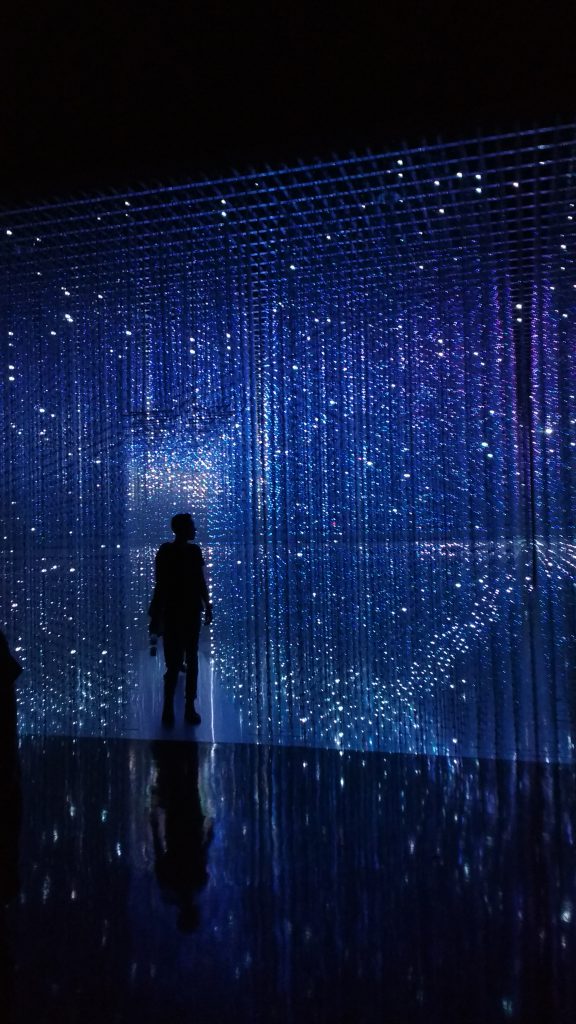
It was also the case with the last display of the exhibition, the crystal universe. I entered a room not knowing what to expect and suddenly I found myself surrounded by lighting effects, as if I was being transported to another dimension. And the experience got even more interesting when I realize that I, the person walking inside of it, could control this universe I set myself in. This was possible by selecting the desired universe on the iPad at the back at the room and swiping it towards the crystal hallway. A few seconds later, I had succeded in changeing the (shared) universe.
Crystal universe
To be able to interact with your surrounding but also in this last particular case to be able to control it, feels very empowering. I also felt to some extent that it gave me responsability, in that I was responsible for what the people standing inside the hallway were going to see next.
I also enjoyed the display in which you could make interact physical objects with digital objects (see picture below). First of all the technical aspect of it impressed me, since the physical object was just a simple disk of wood, but also I couldn’t help but imagine other kind of games/animations you could create with this concept.
Physical-digital object interaction
This exhibition made me realize that, when designing an interface, it is vital to take into account all the senses (all the relevant ones at least). For example if there hadn’t been any music the first room, the experience would have been totally different and most likely a lot less immersive.
If you take almost every display in the display, taking away one element, would completely change the user/visitor experience. The fact that we can immerse ourselves in it, and interact with the environment is key here.
Take for example the drawing workshop. If it wasn’t for the interaction part (scanning your drawing and seeing it appear in the environment on the screen), it would just have been a basic drawing workshop where we would have taken our drawing home, without necessarily showing it to others. Probably just because we were not really proud with it (or simply didn’t want to share it). But the fact that we could interact with the environment made us want to share our work to the world.
The sketch aquarium (Image courtesy of teamLab website)
In a way this is how experience design and immersive design could be helpful to people. It could help suppress people’s fear of being judged for their work, since everyone interacts with it the same way, everyone is seen as equal. And in a way even to have the courage to share and interact is sufficient.
It could be a new way of communication, instead of describing our product with words, we could just show it by modifying our environment. This brings me to mind the example of the hologram. We can display what we wish by making it appear as a physical object in our environment.
Part 3: Find 3 examples of a product/project that you think are good examples of thoughtfully designed user experience. Be prepared to support your choices.
Here below are 3 examples I chose, which constitute for me good examples of thoughtfully designed user experience.
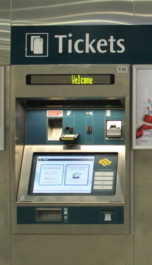
MRT Ticketing station.
The first product I chose to talk about in this assignement is the MRT Ticketing Station.
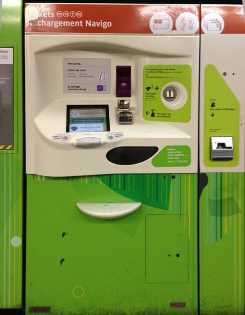
To illustrate my point, I will compare this machine with the existing ones in the parisian metro (see second picture)
You can see on the left picture below the Singaporean MRT Ticketing Station and on the right picture an example of the Parisian Metro ticketing station.
A ticketing machine in the MRTA ticketing machine in the parisian metro
The global impression that I have of this MRT machine is that it is very intuitive. In fact, I have never encountered any difficulty when using it. The instructions are clear and the user experience is all in all pleasant.
The large tactile screen is very appealing to the eye and the font size is big enough that you can read it from standing 1m away. The use of contrasting colors for the buttons to push on the screen makes it really easy to understand where to push.
Furthermore, the screen interface is very simple and clear, you have very few options (buy ticket vs. top-up / mode of payment etc..)
The ez link card physical emplacement is very easy to identify because it is situed just under eye level and it is protruding from the machine, you cannot miss it.
Plus, there are no physical buttons at all on this machine, on the contrary to the ticketing machines of the parisian metro which combines touch screen interface with physical buttons, which I find quite disorienting.
All these characteristics of the MRT ticketing machines contribute to make the top-up experience pleasant and very quick (less than 30 seconds in average).
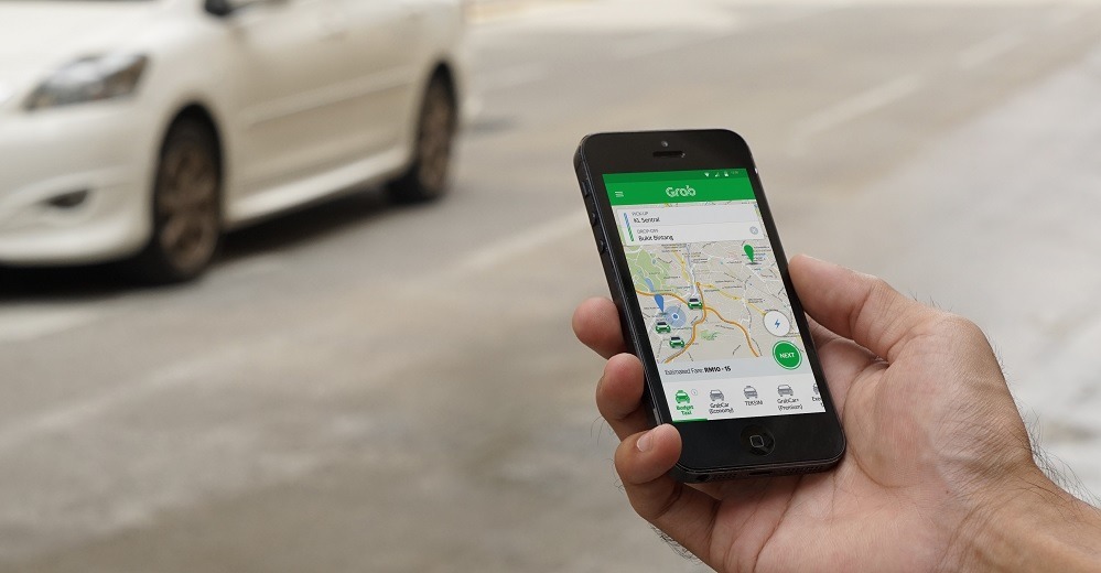
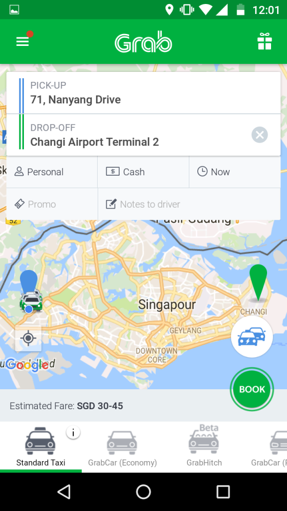
2. Grab Smartphone application
The second product I will talk about in this assignement is the Grab application.
Grab application for smartphone
In my opinion it is very well designed because every information that the user needs is very visible,as you can see on the screenshot I took of the application.
On the homepage, you find every piece of information you need : adress of pick-up and drop-off, type of payment you wish to use, how much it will cost you, when it will arrive and also the kind of taxi/car you wish to order.
All in all, it takes you less than 30seconds to order the car you wish.
Home page of the Grab application
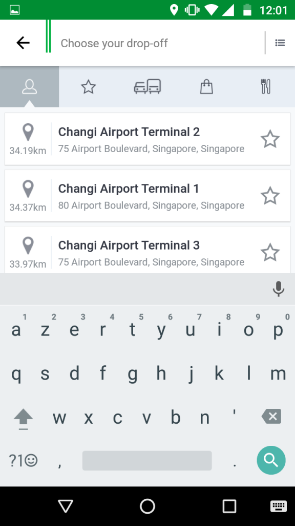
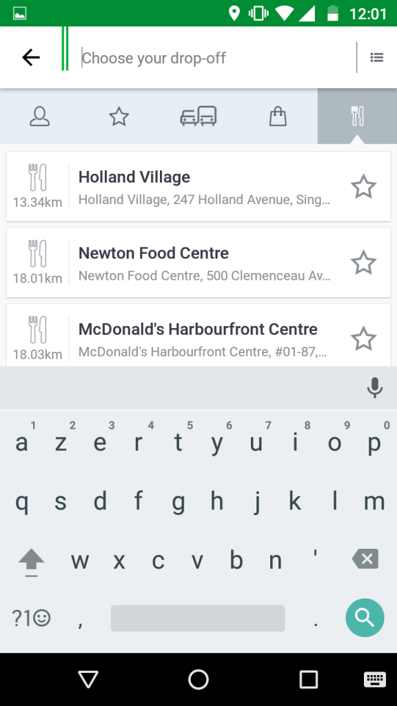
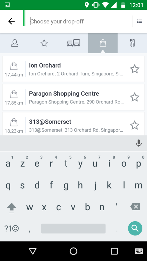
Furthermore, the system of suggestions when you type in the search box is very efficient as you can see in the screenshots below. In fact, the app shows you which drop-off location most people who took a taxi from your location chose. (in this case the airport)
Most common destinationHere restaurants for exampleYou can filter the result for drop-off place
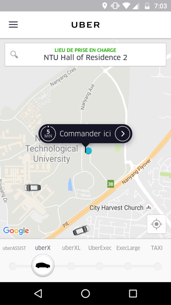
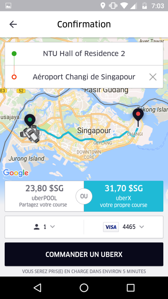
In my opinion it is better designed than other similar applications (such as Uber for example), in that it is more straightforward, you do not have go to 3 different app pages to get the information you desire. Here just one page (the homepage) is sufficient.
Uber homepage3rd page you get on uber, after inputting the drop-off adress
3. McDonald’s ordering machine
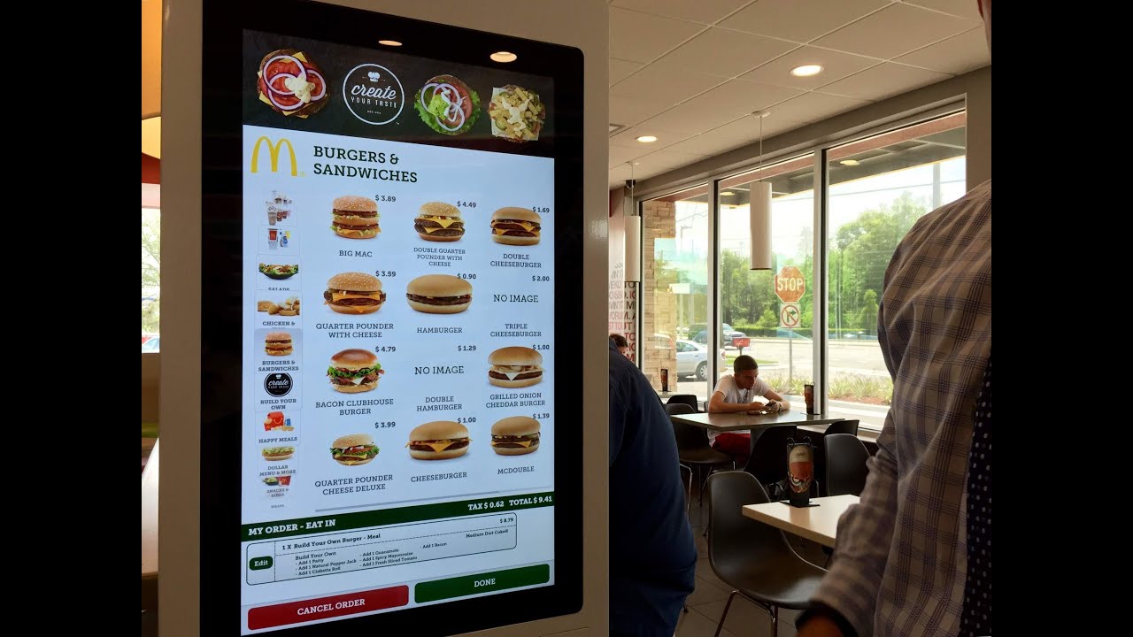
The last product I am going to mention in this assignement is the McDonald’s ordering machine.
The McDonald’s ordering machine
Although I am not a huge fan of McDonald’s, I am forced to admit that their order machine is quite effective and well designed.
The screen size is sufficient, because as you can see in the picture below, you can fit all the burgers in one, and have at the same time access to the other menus and to your current order at the bottom. Furthermore, the tactile screen is very responsive (a light touch is sufficient).
The Burger Menu on the ordering machine
The visual aspect of the interface is quite pleasing to the eye, especially for people that like to have images of what they eat before choosing. As the pictures are generally quite small on the overhead display, I find that it is more helpful to choose directly at the order machine. You can simply “browse” between the different menus to have access to all the burgers, rather than standing in front of the display and trying to figure out what to take.
The colors for the font, as well as the font size are spot on. You can read from a distance and the font chosen is pleasant to read.
Furthermore, I find that ordering at the Ordering Machine gives the user a quite reassuring feeling as you can control from A to Z everything you wish to order and what you will pay in the end. Thereby you avoid having a bad surprise and end up paying more than you thought.
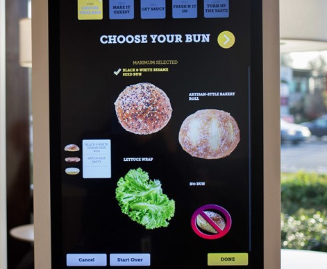
In the end the experience of ordering at a McDonald’s ordering machine feels a lot like an interactive game, which I feel like is the experience that McDonald’s was going for. It gets you feel more involved in the preparation of your meal, especially if you use the feature for creating your own burger (see picture below).
The “Make your own Burger” feature on the ordering machine
DAY 1 – create a diary of when, why and what you use your mobile device for. Observe how others are using their mobile devices. What are the most common uses and where do you see these behaviors?
My use of mobile devices
I use two mobile devices on a daily basis: my smartphone and my laptop
Thursday, September 8th.
First of all, I used my smartphone in the morning to wake up, then I checked my mails/ whatsapp messages. Since they didn’t need to be answered immediately, I didn’t respond to them.
Next time I used my phone was in public transport to listen to music. It lasted about 15minutes.
I continued using consistently my phone throughout the day for messaging.
While I was in class I kept my mobile phone within arms reach and I read the message I received but responded to them only if I had to.
I also used my smartphone for reminders and alarms during the day. This way I didn’t have to carry a physical planner and always had the information at hand.
I used my phone again for listening to music when I was walking back to my hall.
At night I went out for drinks, therefore I used my phone for calling a taxi using Grab, which is an app only available on mobile devices. I used it for gaining time (and money) because without a mobile phone I would have had to wait until a taxi came by and hail it.
I also used my phone for calling a friend back home late in the evening (via whatsapp).
As for my laptop, the use was not as consistant as for my phone. The reasing being that I use it mostly for the software which is on it (most of the software I use is not available on the library’s computers – infographic software for example). Therefore that day I brought my laptop, so that I could work during my free hours in the library. During that day I used it from 2pm until 6pm.
Furthermore I didn’t use my laptop during class, because the class required me to take manuel notes (calculations), therefore I used a notepad.
Common uses and behaviors
Concerning others, I noticed that behaviors varied with the location. For example in the library people seemed to put their smartphones aside while working, probably wishing not to be disturbed. In this case, it seemed like the only use of the smartphone was for music and so it was rarely picked up from the table.
In the public transports on the other hand, people seemed like they were trying to kill time so they spent a lot of time on their phone, mostly sending messages, playing on their phones and/or listening to music.
I encountered a very large number of people with the Pokemon Go app open on their phone (regardless of the location, I even saw so in the library).
Lastly and this surprised to some extent, I saw quite a few people taking selfies in the library (and not in a very discreet fashion ), which is in my opinion quite an odd thing to do, since it’s a place to study and not really a place of entertainment.
From what I observed, regardless of the location, the most common uses for a smartphone seemed to be messaging (mostly whatsapp in Singapore), checking Facebook and listening to music.
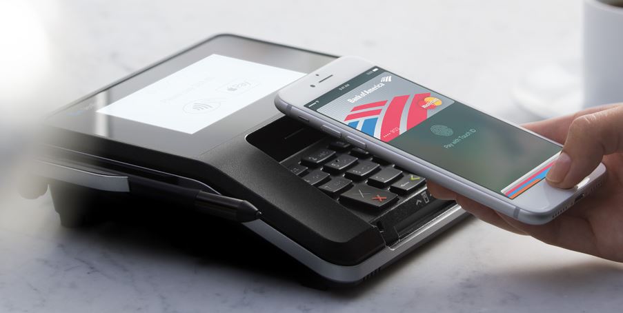
For now these are the most common uses for smartphones but in the future, smartphone may even have more diversified uses such as paying, as we have seen with the development of Apple Pay and Android Pay
Apple pay, another future use for smartphones
DAY 2 – Do not use your phone, computer or electronic device for 24 hours. Create a diary documenting and describing the difference in your behavior patterns. How did you do the things you would normally do with your phone? What other alternative behaviors did you develop? What else did you notice about the difference in behavior?
Friday, September 9th
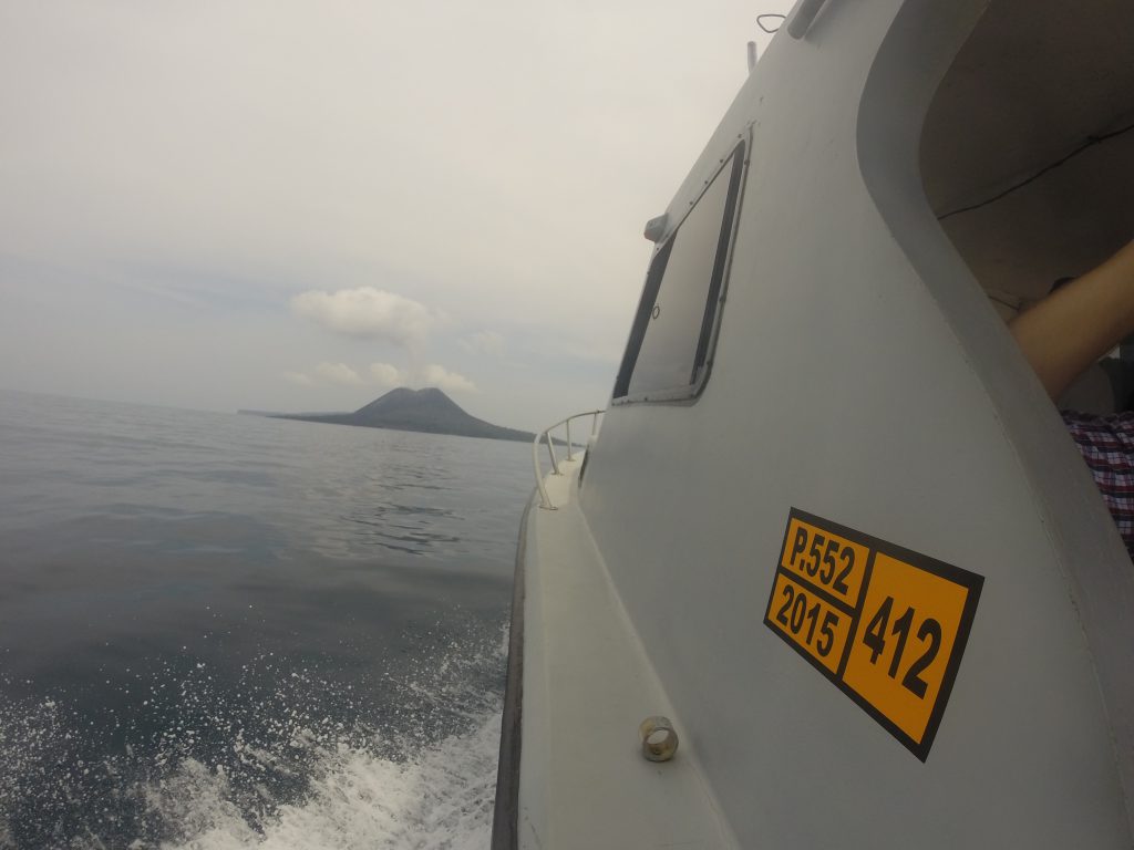
On this day I didn’t use any of the mobile devices I mentioned earlier (mobile phone and laptop). However, it was only partly a choice. In fact, I was on a trip abroad (on the west coast of Java, in Indonesia), therefore I didn’t have my laptop on me and I also didn’t have any cell phone service.
The only electronic device I used during that day was a GoPro (a pocket action camera, which doesn’t have any screen interface). However as it is not a device I use everyday and as I wanted to capture some of what I visited, I considered that using this camera wouldn’t be in issue for this assignement.
During that day I carried a notepad to write things down whenever I thought of something noteworthy.
The first difficulty I had was for waking up. Fortunately I shared a hostel room with a friend so I relied on him to wake me up (at a very early hour – 4am). If I had been alone it would have been much more complicated and the only solution would have been to ask the desk to wake me up at 4am by calling my room.
Then for the rest of the trip I set my phone aside in a friends bag so I didn’t have any access to it.
For taking pictures (which normally I would have done with my phone, I used my GoPro. But since a standard GoPro doesn’t have a screen, I didn’t know if the pictures I was taking were any good or not. This caused me to take much more pictures than needed. In my mind I was thinking “well I took so many, at least one is going to be good”. However this led to reduce the battery life and took a lot of space on my memory card.
The volcano of Krakatau I visited during that day
Impressions
All in all, one of the most difficult thing (and quite annoying at first) was not knowing what time it was. In fact it made realize that in a regular day I unconsciously look at my phone very often just to know what time it is. And as I don’t wear a watch, I had no other option that either ask someone for the time, or not care at all about it.
During that day, I really liked not having to worry about things such as where to find a power outlet to charge my phone or checking my mails/messages. I think it helped me enjoy my trip even more.
I noted that I found myself quite a number of times tapping my shorts’ pockets to see if I had my phone and then remembering that I had left in my friend’s purse. This gave me mixed feelings, on the one hand I felt very liberated and free but on the other hand I also felt quite vulnerable.
Part 2) Based on the lecture on Place, Location and Ubiquitous technology, post an example of a product, service or design concept and post it on OSS.
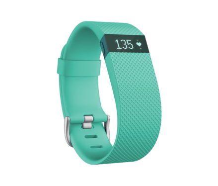
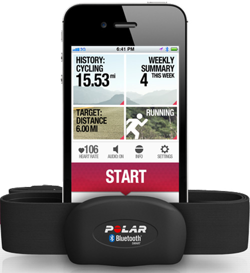
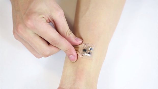
I think an area in which there is still a lot to do concerning Ubiquitous Technology and Wearable Technology is the health sector. Smartwearables which enable you to monitor you health aren’t really widespread as of now.
Of course you find wearables such as FitBit, and Nike plus, but these are made to monitor your efforts and your basic physiological factors (Cardiac activity) but it doesn’t take care of more in depth problems. Furthermore, most of the time this type of wearables are only met for personal use (or shared with friends, but that’s it).
Fitbit watch, monitors your heart ratePolar heart rate monitor
Some wearables exist for people over 60 years old, or any person with history of cardiac problems in the family. It consists of a cardiac monitor connected to the patient’s phone. In case of an unusual heart rate, the nearest hospital and the family would be alerted. This would be a stress relief for the family and could be especially useful for the elderly who live alone.
This system exists on the markets but is only available in the US and is pricey.
Heart rate monitoring system
But then again, why stop just at cardiac monitoring. You could imagine a dozen micro-wearables, all connected to the phone of the patient, which would all monitor a different aspect of the patient’s physiology.
Micro-wearable located on the patient’s body, connected to a smartphone application
The application on the patient’s smartphone would collect all the data and send an alarm/notification if there is anything unusual. Therefore, the app would have to be calibrated beforehand with the different specialist who cover the patient’s health (cardiologist, GP, etc..)
New system of biosensors that can keep track of people’s health by analyzing the chemical composition of their sweat (University Of California-Berkeley / Stanford University – School of Medecine)
Basically what this product does is analyze your sweat. In fact the metabolites and electrolytes found in sweat carry a lot of important information on the patient’s health (diseases, drug use, athletic performance). And the major advantage is that it is non-invasive, no needle is needed.
The fourth chapter of Jan Chipchase’s book Hidden in Plain Sight deals with how we interact with what we carry. The notion of range of distribution is quite interesting in particular here in Singapore because it is very different from what I’m used to in France. For example leaving your belongings on a table, while you get your food is something that is very common here, whereas you would never do it in France (even on a campus food court). But then I guess it goes as a whole with the general feeling of security or insecurity of the country you find yourself in. Although risk of theft in France is not as high as in other countries, it can still occur, which is why people tend to hold on to their belongings wherever they find themselves.
The author mentions predictive shipping in this chapter, giving the example of Amazon which could send you products based on your previous purchases or search inquiries. I don’t necessarily think that it is a bad idea, because we know that big companies already do monitor everything that we do, so we (as consumers) might as well gain something from it as. And since we could have the possibility not to accept it, the risk for us consumers is very low. It is the company who would be the most at risk and would have to create very robust algorithms to know for sure the product they are sending us is something we would most likely to keep and therefore buy. This would however redefine completely marketing and advertisement strategies.
Another example of predictive shipping could be for medicine, say you look online at the symptoms for a cold or a flu on a dedicated website, a medicine manufacturer detects it thanks to an algorithm and sends you, with the approval of a doctor, the appropriate medicine.
Predictive shipping of medicine
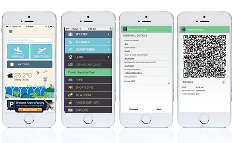
Lastly, in regard with what the author says about modern technologies, in particular smartphones and cloud based services, I feel like our mind is more at ease when we go somewhere. When travelling for example, before you had to go through the trouble of printing your embarkation card and carrying throughout your journey, which can be stressful when you have many flights in a short period of time. Now everything is on your phone, you just need to have enough battery at the time of your flight, but that’s another issue.
Most companies now accept digital embarkation cards
Q1) In the chapter, the author mentions location based mobile data, and how they can allow us to “venture out in the world with a near-total lack of awareness”, but he only seems to view it as an advantage whereas this in my opinion can be a problem. This process inhibits our ability to make decisions on our own, we rely on information posted by someone else and therefore we miss out on what could be a great experience (wondering in a restaurant and being amazed by their food).
Q2) The triumvirate Money-Keys-Phone concerns today’s society, but I would like to know how it would have been 40 or 50 years ago for example, when there weren’t any mobile phones. For example did people carry around a textbook with the phone numbers of everyone they knew, or did they just not communicate as much as we do now ?
Part 1: In your group, organize your documentation and notes from the observation and analysis of the MRT and create a slide-show presentation that you’ll share in class. Observe, take field notes, identify where things go wrong and what idiosyncrasies you notice through your observations. What are some unusual things that you notice? Make sketches, notes and document with photos to carefully analyze the user experience during this field trip. Make observations on how other people move through public space.
What solution would you propose to the “things that go wrong”? Remember, to think about scale in that your proposal might be simple or more complex. Consider what the challenges might be to implement your proposal.
-> You can access the presentation i did on this subject, by clicking on the following link.


 ), which is in my opinion quite an odd thing to do, since it’s a place to study and not really a place of entertainment.