Assignement Week 3 – Part 1

  • Think of a way in which you could develop an experimental map using images, sounds and stories. Some ideas… What else would we use if we didn’t use maps to find our sense of place? How would you map the sounds you hear every day? How would you map emotions? How would you map the overlooked peoples or places of Singapore?

I think virtual reality could be used in a very useful way in maps. For example when clicking on a point of interest, you could be immersed in that spot (thanks to virtual reality). Being immersed in the world could enable you to listen to testimonies of people who have been there.

We rely on maps because we deem that most of the time, street directions are insufficient. Therefore maybe we could work more on digital layering. A solution would be adaptable street signage. Every person would then see the signage they require (the street signage is linked to your personal account and has the information of where you wish to go for example and by wearing smart glasses, the signs displays the appropriate information for each individual). This way everyone has access to the exact directions they need.

Not having maps would also make us ask for directions and therefore have more human interactions with the locals, this would surely demand more time but sometimes provide us with useful information that cannot be found on maps or guides (hidden/secret places, local restaurants etc..)

Our ears are very sensitive to direction, maybe we could take advantage of the stereo sound systems in our cars and tell directions this way, if we need to turn right maybe have only the right side speakers say “ in 100m turn right” for example.

A good feature to add on a map would be to take into account flows of population. For example in touristic places such as Angkor Vat, it would be interesting to display on a map which route most people take and at what time, because a lot of people take the same route indicated by tour operators (first this temple, then this one etc.) . Having that knowledge could help you plan accordingly and take another route to avoid being in the crowd.  This would also show us overlooked places in touristic cities.

Emotions are quite difficult to lay out on a map. Generally we tend to separate them into two categories: positive and negative emotions. In France and in most of the northern hemisphere countries, due to the geographical disposition of the territory, we associate the south with the sun, the beach and therefore happiness, pleasure etc. (i.e. positive emotions). On the contrary, the north is the coldest and rainiest part; therefore we associate it with bad mood, stress, disappointment etc. (i.e. negative emotions).

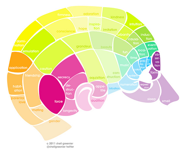
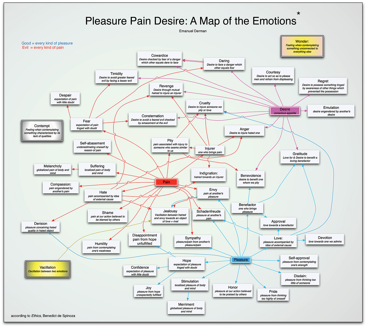
The most famous map of the emotions separates them into 3 categories: pleasure, desire and pain. In my opinion it is a quite accurate description of our emotions because as you can see on it, all of the emotions are somehow linked to these 3 categories.

Map of the emotions, as separated in 3 categories : pain, pleasure and desire

It could be also interesting to map emotions geographically, according to the parts of the brain they emerge from, this way we would what parts of the brain are stimulated for each emotion.

maps brain
Geographical map of the emotions

Assignement Week 2 – Part 2

  • Response to the 5th chapter of Jan Chipchase’s Hidden in Plain Sight

Jan Chipchase’s main idea in this chapter is cultural calibration when designing a product. Each region of the world has its singularities (behaviours, do’s and don’ts etc.). Therefore, it is vital to take them into account when designing a product, , if you want your product to reach its target audience. The best way to do so, according to him, is to immerge yourself in the culture, whether it is a just for a few hours or for a couple of weeks.

I agree with him in this point, it is impossible to really grasp a culture until you find yourself in the midst of the local’s everyday life.

I can speak about France for example because I can relate to it. If you have the “chance” to experience once in your lifetime a commute to Paris when you live in the suburbs, you can start to understand why Parisians always seem to be stressed and on a hurry. Regional trains and suburbian trains in the Greater Paris Area are a catastrophy: delays, works on the line, temporary shutdowns of the line for various reasons. All of which make the everyday commute to work a living nightmare.

Experiencing this can help you understand the needs of the users. For example, the success of mobile phones games and apps in France (Candy Crush and so on…) has a lot to do with this. It is a way to get your mind off the stressful commutes. And it is true now when you take the metro in Paris, you come across a lot of people playing games on their phone.

Question 1) The author talks about cultural calibration and I agree with him, but in my opinion it implies having a lot of resources and time to spare, however sometimes you need to be the first to get your product out on the market. Therefore spending money and time on this kind of research would mean that your competitor may release his product before you. And even if it isn’t as perfectly designed as yours, he will still have the advantage in the eyes of the public because he was the first to put it out there.

So the question that comes to my min is : is it acceptable not to be the first one to release the product on the market, even if it is better designed than the competitors’ product ?

Question 2) The author talks about breaching behaviors in this chapter and how for example it used to be seen as rude to block out noise of the city by putting on headphones. What causes a breaching behavior to evolve into becoming a normal behavior, can a technological advance be solely responsible for it or is it paired with a social evolution (more individualistic society)? And in this particular example, is it still seen as a breaching behavior in more collective societies, even though the technology exists?

Assignement Week 1 – Part 4

  • Response to the 1st chapter of Donald Norman’s The Design of Everyday things

As well as D. Normal, I feel like feedback is an essential component of our experience as users and should really be taken into account by the designers. In my experience, I have found that sound feedback is one of the most important component of user experience. For example I’m used to filming my skiing adventures with my GoPro camera. This forces me to turn on and off the camera at any time (whether I am in the middle of a slope or not). Therefore the sound feedback emitted by the device when I turn it on is essential for me because it allows me to continue skiing without having to stop to check if the camera is on.

This is an example among many others in which the absence of the feedback would be disastrous for the user experience.

I also enjoyed the author’s insight on the cycles in product design and how with time designers and manifucturers tend to over-complexify their products. . However I feel like it is a point a view which only takes into account technological advance but doesn’t take into account trends. If you think about it, 10 years ago, digital (and complex) watches were a hit (Casio’s G-Shock for example), but now trends like minimalism have had a real influence on how we see watches. We have now mostly become attracted to more minimalistic watches, which only have one function (see Ice Watch 2015 or Daniel Wellington watches for example).

Daniel Wellington Watch
Ice watches 2015
Ice watches 2015

Of course there are still complex watches but their target audience is a niche market (runners …).

Question 1) The author talks about the over-complexity of some products but sometimes it is a trademark of the brand and it is how it can differentiate itself from its competitors, only real “users” will be able to use it. For example if you take swiss knives (Wenger brand) with a lot of functions. Does it make it a poorly-designed product?

Question 2) The question of affordance of a product is very important but it differs from countries and areas in the world, is it better to adapt our design to each part of the world we are aiming or should we actually be able to design a product which will appeal to the entire world ? This question concerns especially high-tech products

Assignement Week 1 – Part 3

  • First object – Computer Mouse

The first object I chose is the computer mouse I use every day.

Basic computer mouse

IMG_20160824_163641863


It is a basic wireless Logitech mouse with one On/Off switch under it and the standard mouse buttons (Left Click – Right Click – Scroll). In my opinion it is very intuitive. If the device is off you notice it because the pointer on the screen doesn’t move, so the first reaction is to look for an On/Off switch and therefore picking it up and looking under it. There is a light on top the mouse to give the feedback that it has been turned on (Light turns green). There is one button to open the trap for the battery, which is labelled with a battery icon.

If I had to describe it to someone who had never seen one before I would say that it is a device which allows you to navigate on the screen of your computer. You use it by moving you hand holding the device in all directions, the immediate consequence is that you make the pointer move on the screen. You have however to maintain a contact between the desk/table and the device, otherwise the computer doesn’t detect the movement.

Here are some ideas of redesigns of this mouse

  1. This is a simple redesign which deletes a movement (picking up the mouse and looking under it) because the On/Off is now located on the side of the mouse, where the thumb rests. 

    re-design-n1
    Re-design n°1
  2. In this re-design, I changed the position of the left click so that the thumb now activates it. And thereby the scroll is moved in the left click’s original position so that the index now activates it. This way each finger is responsible for a specific function and it is even more intuitive.
Re-design N°2
Re-design N°2
  1. Same as the last one, it is a simple redesign which makes the changing of the battery even more intuitive since there is no more need to pick it up and looking under it. Just sliding the trap does the trick. Adding a battery icon and an arrow to symbolize the movement on the trap makes it even more intuitive.
Re-design n°3
Re-design n°3
  • Second object – Shower Gel Bottle Tahiti

This is another object I use every day, it’s a shower gel sold in France. The particularity of this product is its packaging, in particular the retractable beak which gives the product a very cubic and compact aspect.

IMG_20160824_175318813
The retractable beak is in its open position
Shower Gel Packaging

The product is very intuitive, the slot on the front suggest only one type of action possible by the user (pulling on the beak to get it out and pushing on it to put it back to its original position)

If I had to describe it to someone who had never seen it before I would say that it is a Shower Gel container which has a 90° retractable beak. This beak, when put back in its storing position (horizontally) avoids leakage or introduction of water in the container.

If I had to redesign it, I would add a transparent part opening on the  side of the bottle. This would allow the user to see how much product is left. It is in fact a feature that in my opinion lacks in this product and makes the user experience a bit frustrating because you have to guess how much product is left, by the weight of the bottle.

Re-design of the shower gel packaging


Assignement Week 1 – Part 2

  • Badly-designed map

In my opinion the NTU Campus Online Map has some critical design flaws, especially when using the search function.

The reason why I chose this map as an example is because I got lost on the first day when following this map. As you can see on the screenshot, I was looking for the Lecture Theatre number 13 with the “Search” tool. As a result a pin appears on the map revealing the supposed location of LT13 (A). On the map it seems to be on the same floor as all the other labelled Lecture Theatres (LT1, LT19A etc.…). However LT13 is located on the 4th floor, alongside LT14 and other lecture theatres. There is no indication on the map that tells us that it is in fact on the 4th floor and not on the 2nd floor like LT1.

To get this information, you have to look at the bottom left corner of the page (see part circled).

Online map of the NTU Campus

As I was unfamiliar with the campus and in a hurry, I had no way of knowing this and finally had to go find a physical map of all levels of the building in order to find my Lecture Theatre.

In my opinion, the map should be redesigned as to show the real level of the classroom/lecture theatre and not only one floor (the 2nd).

  • Well designed map

An example of a well-designed map in my opinion (although it is not a map of a building) is the map of the sports facilities at NTU.

In fact, it contains all the essential pieces of information one might be looking for. The location of the facilities is very clear and each facility is labelled. There are drawings to symbolize which sport is practiced on it, when there could ambiguity (Rugby / Football on the multi-purpose field).

Furthermore the color-code is efficient because it attracts the eye and the association of colors are somewhat natural (swimming pool in blue, fields in green and multi-purpose courts in a more neutral color).

The Sports Facilities Map

In my opinion, this map is much more efficient than a non-schematic one.

Assignement Week 1 – Part 1

The ADM building, because of its characteristic shape and architecture, provides the user with a very different experience from what he is used to. As most of the teaching buildings at NTU resemble each other (if you exclude the hive). This experience presents some very positive aspects but in my opinion there are also some aspects on which the user experience could be improved.

The presence of graphic elements, which contrast with the raw aspect of the building (concrete floors and walls, grass on the roof etc.), remind us that we find ourselves in an art and design building.

Graphic Element in the ADM Building

They attract the eye of the visitor. Furthermore signage is very discreet and quite tastefully chosen. For example the minimalistic metal plaques which fade in with the global design of the building.

Metal Plaque at the entrance of the ADM Building

The outside furniture and the lounge areas suggest a peaceful place to rest between courses and contrast with the purpose of our stay in the building (following a tutorial/ a lecture).

Outside of the ADM Building

The entrances and more importantly the exit signs are visible from a distance. Finding your way out and your way in the building is never an issue.

The fact that you can enter the building from almost every side suggests a very open and collaborative space.

However in my opinion some aspects of the building could be improved. For example what disturbed me the most is the complete absence, at least from what I saw, of signage to indicate the location of the toilets, as you can see on the picture. When you are not familiar with the building, it is quite disorienting. You find yourself walking across the entire building just to find some toilets because you failed to see the ones closest to you.

In my opinion there are not enough maps of the building and they are not visible enough, on the contrary to North Spine where large and visible maps are displayed. And the places where you would expect a map are sometimes overloaded with posters/flyers.

Overloaded wall at the entrance of the ADM Building
One of the few maps I came across

Furthermore since there are so large corridors, I find that the labels of the classrooms are too small, you need to get really close to know which classroom it is.

One last problem which I noted concerns the outside doors. It is exactly like the example given in the reading for week 1, you have no clue as whether to pull or push the doors.

The doors outside the ADM Building