CONCEPT // FINAL PORTFOLIO // PATTERNS (+process)
process for final outcome
It was really interesting because everyone who talked to me about my banner was curious about how I did it! Most thought it was through Illustrator, and I don’t think anyone expected that it was a photograph.
And thinking about it, it’s pretty cool that there’s a sense of mystery about my banner! Especially since I’m basing it on String Theory, this mysterious scientific prediction.
Method: Macro Photography of Oil on Water
(click on images to view them in full size)
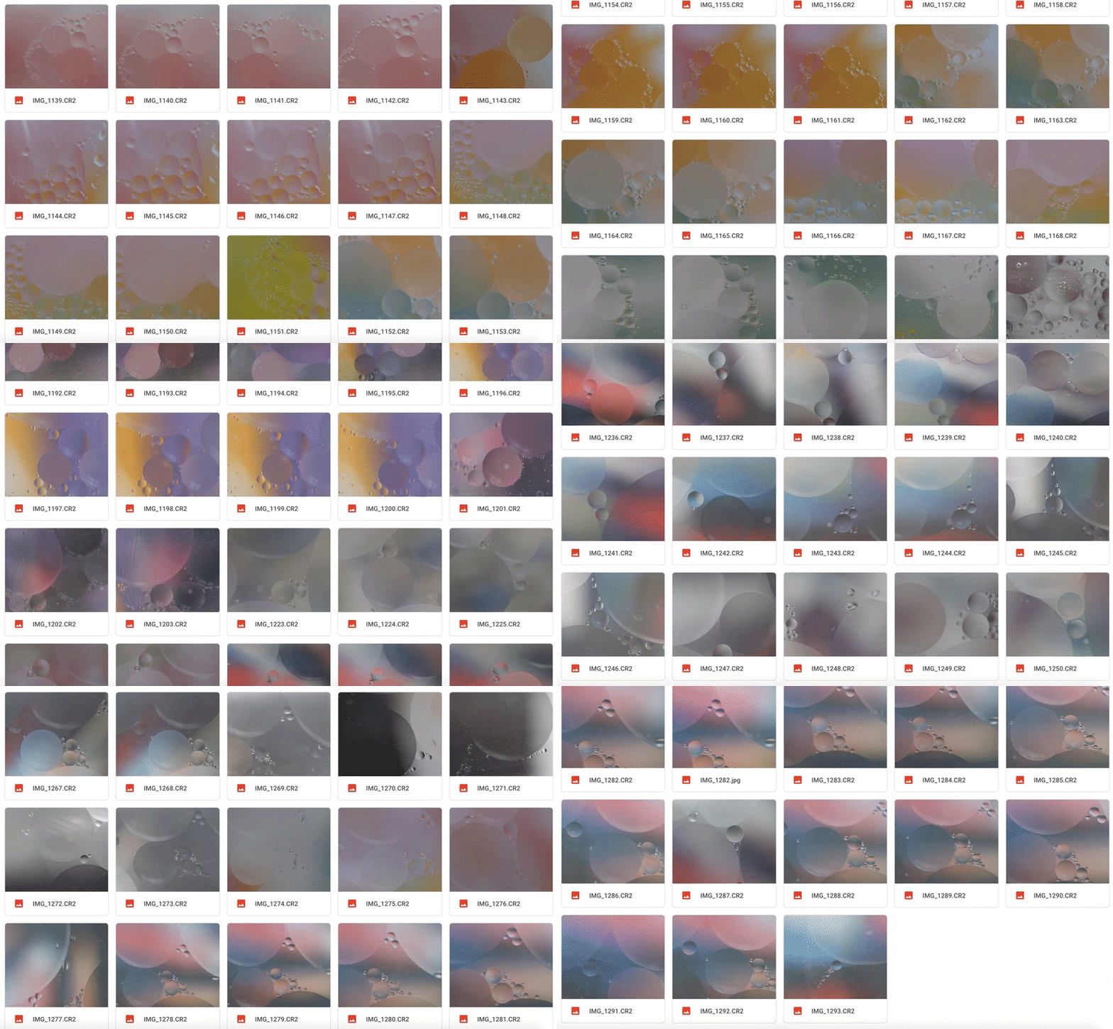
By changing backgrounds, I could get various colours and effects. Here are all the images that I took.

Keywords:
- Elegant
- Mysterious
- Ethereal
- Universe-esque (circle shapes resemble planets)
- Calm at times, messy at others
^ because of the very clear circular shapes and the blurriness of the background, as well as the added grainy effect.
I really like the graininess because it gives a 90s scifi look to the images.

(images sourced from Pinterest)
The oil bubbles formed very sharp and clear circular shapes that stood out against the colourful background. Was able to change the background by placing various coloured papers/ cloths behind it.
Overall through this method, I managed to achieve a visual abstraction of String Theory. It turned out to be as classy and mysterious as I how I envisioned it!
Final outcome
INITIAL EXPERIMENTATIONS
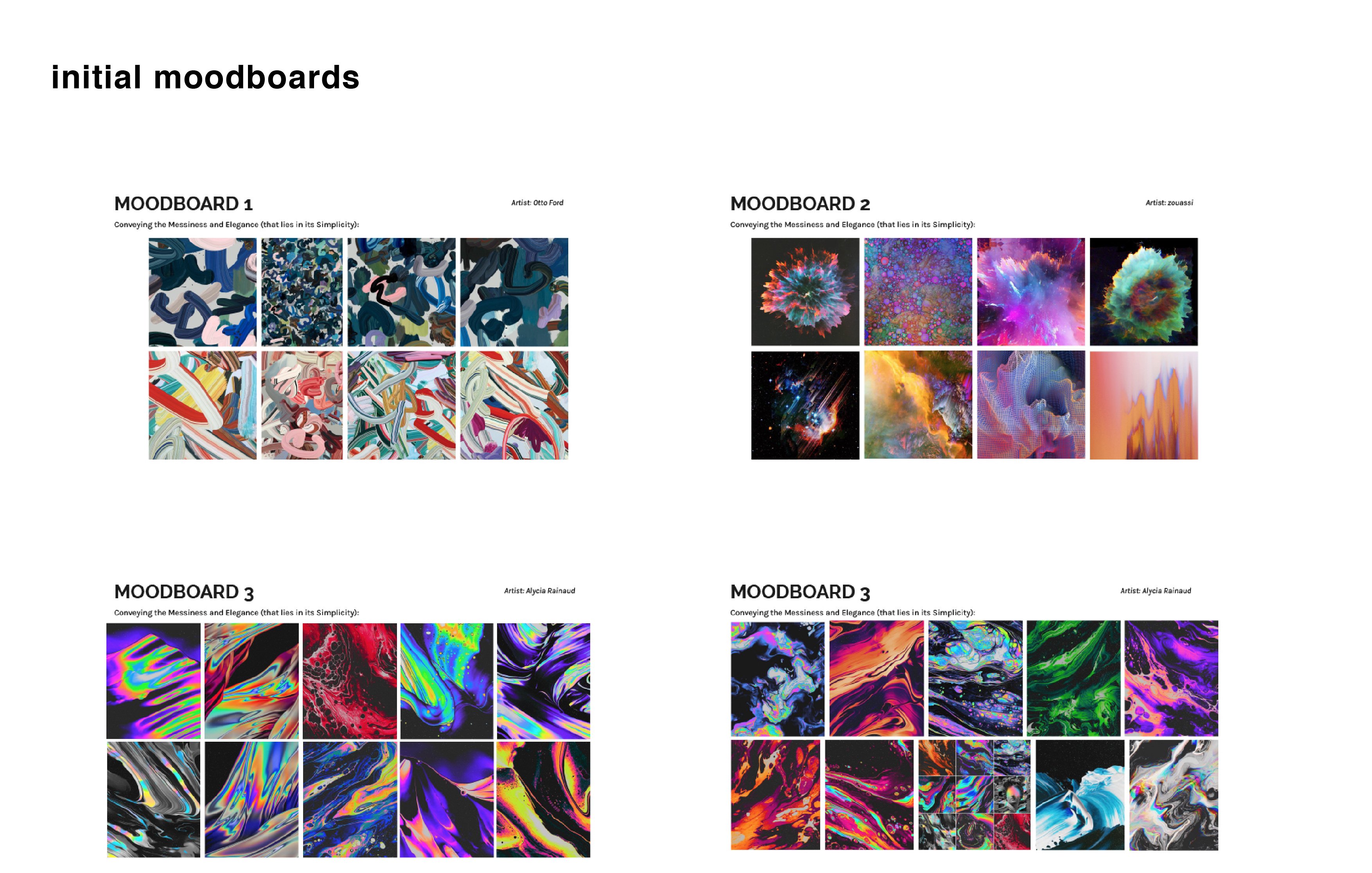
Tried following my moodboards but did not like the outcomes at all.
While I did not end up using my moodboards, they helped me to initially conceptualise by showing me what I did not want, and narrow down to what I did want.
For instance, I did not like how Moodboards 1-3 portrayed Messiness yet missed out the most important aspect of Elegance.
In Moodboard 4, I was intrigued by the artists’ use of macro lens, and macro photography in general. This led me to researching a whole new process which I ultimately used for my final outcome.
EXPERIMENT 1
Method: Milk with Food Colouring

Keywords:
- Bright
- Fun
- Loud
- Noisy
- Distracting
^ because of the swirls and neon colour scheme.
Food colouring made the colours appear very saturated, but at the same time it was very difficult to control the swirls. I inverted the colours as I wanted to try to make it look like my mood board but did not like the overall result at all.
Overall it was not classy or mysterious as I how I envisioned String Theory to be, rather it looked crude and unrefined.
EXPERIMENT 2
Method: Milk, Oil and Acrylic Paint

Keywords:
- Cute
- Fun
- Quirky
- Childish
^ because of the distinct bubble shapes and vibrant colours.
The bubbles and vibrant pastel-like colours made this cute and fun! Reminds me of my childhood for some reason. The acrylic and milk gave off a pastel colour, while the oil helped in forming the cute bubble shapes. While I admit that these are not the best pictures, it is because I was just experimenting. I was not overly concerned with the precision of the bubbles and only wanted to look at the overall aesthetics.
Overall it was not classy or mysterious as I how I envisioned String Theory to be, rather looked childish and playful.


