

Here’s the final outcome of my work!

The theme for my project 1 is Harry Potter! (mentioned why in process) And I decided to do them up like job posters on a bulletin board!
Let’s go straight into the designs first!
Initially, my work was very messy and didn’t have something that tied it all together. So I thought again, and decided to answer the question of “what do I like about this job?” for each of the jobs! I also had to think of how to subtly introduce the jobs/ include context for those who do not watch Harry Potter! (more can also be found in process)
What do I like about being an Auror? I love the exclusivity and prestige.
What do I like about being a Quidditch Player? I love the fame.
What do I like about being a Potioneer? I love that I get to create.
What do I like about being a Dragonologist? I love the risk.
AUROR – EXCLUSIVITY AND PRESTIGE

An Auror is a member of an elite unit of highly-trained, specialist officers. They are trained to investigate crimes related to the Dark Arts, and apprehend or detain dark wizards and witches. This makes them, essentially, the wizarding world equivalent of police officers and military (as they serve in both roles for muggles).
http://harrypotter.wikia.com/wiki/Auror
I set my auror design visually apart from the other 3 designs. For the auror design, it’s significantly darker than the rest (also because it’s related to the Dark Arts). And I printed it on matte white cardstock unlike the rest! For the rest, I had printed them on newsprint coloured cardstock as Joy suggested! So visually, there is a distinct difference between this and the others.
Also, I included a tagline for this which others do not have, it is “the few, the vigilant. auror”.”The few, the vigilant” kinda already gives an idea that it’s gonna be difficult to get this job since only few managed to get it, thus showing exclusivity and prestige! It’s also exclusive since it’s the only poster cool enough to be given a tagline.
In addition, because these are job posters, at the top/bottom of the other three posters, I have included ways in which interested applicants can apply. But for auror, there’s none! Instead, there’s a lil code 62442 in which interested (and vigilant) applicants have to find out how/where to use it, and to use it to apply for an interview. Fun fact, if you key in 62442 on the telephone, it says “magic”! So that’s a hint for them that the interview place has to be accessed by a telephone booth.

To give context to non Harry Potter fans, I placed my initials (N.G) in handcuffs and added it on! It shows that aurors are just like our policemen, just wizardy and mysteriously cool. I only put a hint of it by colour dodging it because I didn’t want it to be an “in your face” thing, I wanted it to be subtle and suiting the whole mystery mood!
My name and initials are included in this poster as the spell coming out from the wand!
QUIDDITCH PLAYER – FAME

Quidditch is a sport enjoyed by the people of the wizarding world! It’s played on a broomstick and basically a goal is scored (worth 10 points) when the ball (quaffle) passes through one of three hoops which is guarded by a keeper. It’s kinda like the wizard equivalent of soccer but cooler! Also, there’s a seeker. The seeker’s job is to find the golden snitch (a lil ball that has wings) and catch it. Catching the snitch ends the game and also usually decides who wins as catching it is worth 150 points.
Everything in this composition leads to the snitch! From the background lines converging, to the hands pointing to the snitch.
The snitch is in the form of a trophy as, in the eyes of the seeker, catching the snitch would guarantee the team a win! And as everyone’s attention is on the snitch (shown by hands pointing), the seeker wants to grab the snitch and with it, grab everyone’s attention.
My name is subtly weaved into the 3 hoops that are used for scoring in Quidditch! (well… I’m a keeper ;)) And the hoops spell out “NAS”!
POTIONEER – get to create
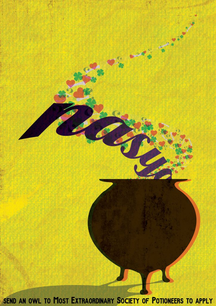
A potioneer, or a potion-brewer/potion-maker, as the name suggests, is someone who makes potions for a living!
To show the aspect of creating, I decided to use a dull colour for the ingredients going in, and to use many colours for the smoke coming out that symbolises the end product! This is to show that while the ingredients going in are dull and boring, I still get to create exciting and new stuff!
The smoke coming out of the cauldron is comprised of hearts, four leaf clovers, question marks and bones. These represent potions like Amortentia (a love potion), Felix Felicis (liquid luck), Confusing Concoction (causes drinker to become confused) and Skele-Gro (a potion to regrow bones) that can be made!
My name is incorporated into the design as the ingredients going in!
dragonologist – LOVE THE RISK

A dragonologist is a magizoologist who specialises in the study of dragons.
To show the aspect of risk, Joy suggested I play with scale to show just how big the dragon is! So I added in mountains and also made my human tiny to emphasise the size of the dragon!
And to show that I love risk, my lil human is running toward the fire and embracing it!
My name is weaved into this design as part of the flames!
After deciding on the vintage look and feel and choosing the colour schemes, paper was definitely a very important aspect! Joy suggested i print on newsprint coloured cardstock so after sourcing, I was superrrr happy when I managed to find it!!!!! The colours definitely came out so much better. There was even an added grainy texture to it! Definitely using newsprint coloured cardstock made my posters look more legit!

(with newsprint coloured paper)

(with normal white paper)
Here’re my final artworks when printed!


#thosegrains #thatcolourtho <333

Last but not least!!!! I sought to add some dark humour in my whole artwork through these: newspaper clippings. These newspaper clippings basically showed how someone from the job had died and that’s why there’s a job opening now! hhahahha


I printed the newspapers on a “transparency”, “baking sheet” kind of paper and really loved how it came out!!

COMMENTS:
Joy commented that for the Potioneer and Dragonologist, the name isn’t as subtly integrated as for Auror and Quidditch Player! And that for Potioneer, the colour of the ingredients is too dark and takes away the attention from the colourful smoke at the back. Also, for Dragonologist, the name could have been included into the flames itself! Like at the tail ends of the flames where it’s almost touching the lil human! But she also mentioned that the colour choice, visual analysis on the artist and presentation style was gr8 🙂
Also, my really encouraging and sweet classmates left comments on my work!
Thank you Joy and everyone for the comments! Really appreciate them :’)))


(I love post it comments :”))))
Here’s my final artwork in greater details!


Hi Naysa, thanks for the timely update! Please kindly remove the post from “Presentation” category as that is the category for group presentations. You may refer to https://oss.adm.ntu.edu.sg/2017-dn1006-g6/oss-categories/ for more info.
Thanks!
J
Apologies for the autocorrect in your name, Nasya! 🙂
OOPS so sorry!! guess I was too excited.. Have made the necessary changes and thanks for informing Joy! 🙂