Actualising a Self-Portrait
Welcome to Part 1 of the Project, where I will write about the inspiration behind the very project I have here with me: Stylised Self Portrait. Once I got home, I started drawing a basic mind map about myself – which includes my hobbies & (food) interests. Personally, I would very much describe myself as a HUUUuuuUuUGe FooOoooooooOdie – Cause food is life, right? Who can resist a bowl of piping hot noodles? Or a cone of beautiful, milky soft-serve plonked atop a crispy waffle cone. NOT ME!! I’d choose food over anything, anytime. Thank you, next.
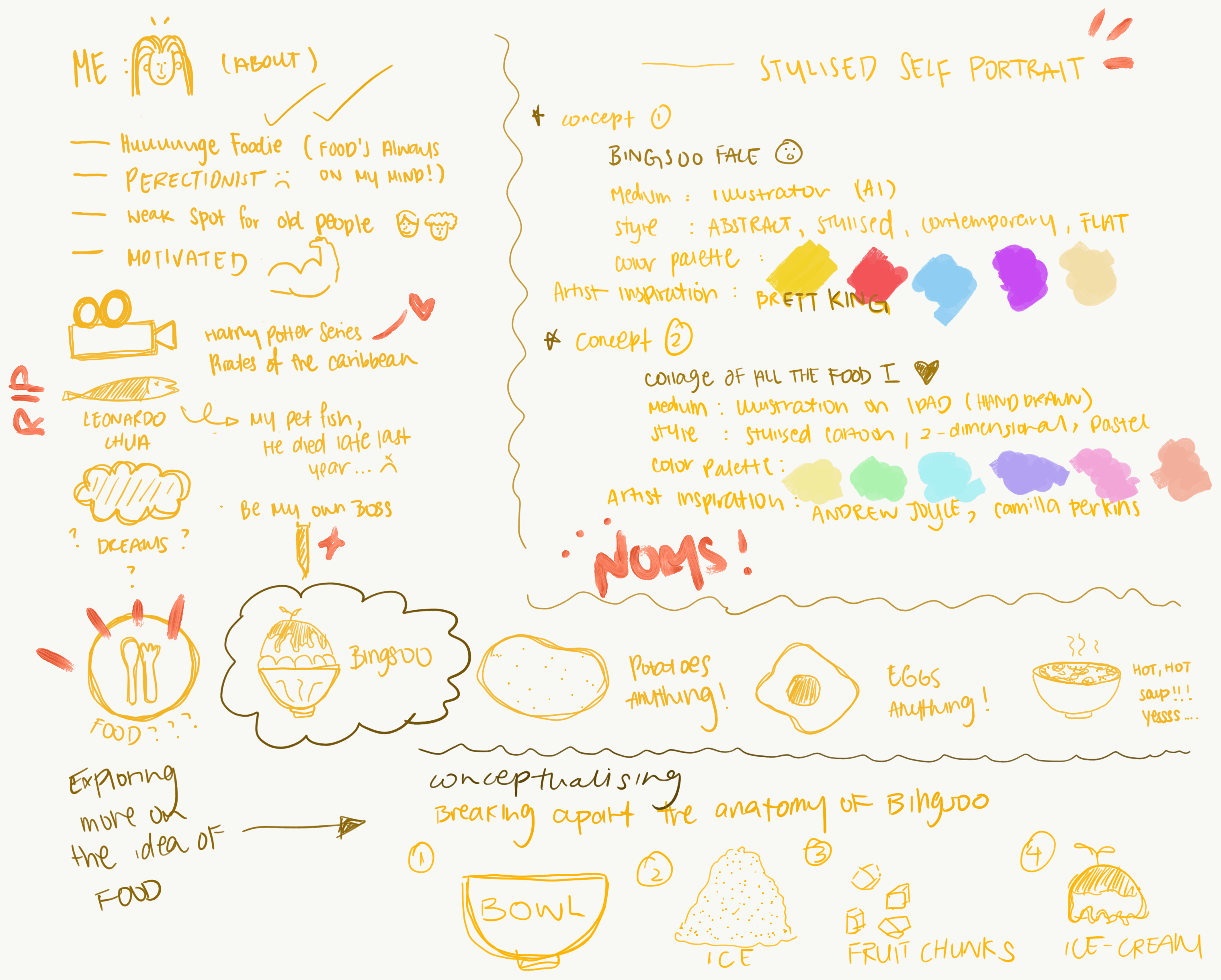
Here’s an overview of my thought process recorded in the form of a mind map: In essence, the image below speaks about the 2 concepts I have in mind and wish to execute. It includes the type of colour scheme I want to implement and as well as the medium & style for the portrait illustration.
Conceptualising the first idea: “Bingsoo Face”
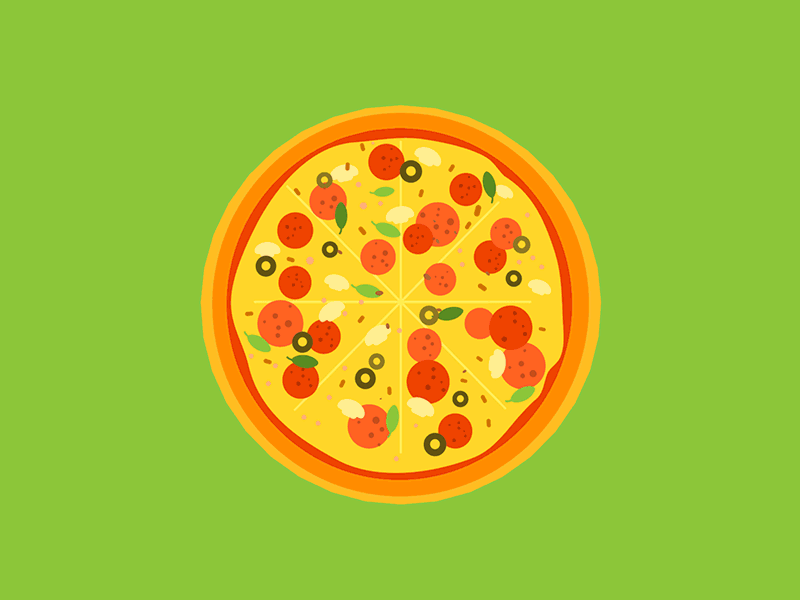
Bing soo is a type of Korean dessert, typically made from shaven ice + a myriad of saucy toppings and a bunch of freshly cut fruits. This is one of my favourite desserts and I ever dreamt of reincarnating to this perfect bowl of icy goodness. Below is an image of how it looks like! 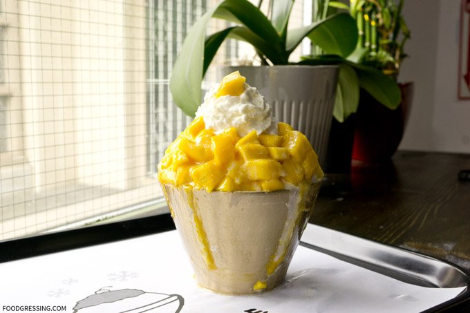
I thought it would be interesting if I were to break up my facial features and build the anatomy of the Bingsoo structure. Below is a rough sketch of how I imagined the split section to look like:
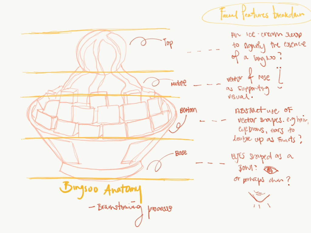
By splitting up my facial features (e.g. eyes, nose, lips, ears) and simplifying them into basic shapes like oval and circle, to build the structure of this yummy tower. I thought I would go full on abstract with this one to avoid being overly literal and representational of an actual face but at the same time describes my favourite food.
Artist References:
Jack Smith has a few ranges of works which I adore, in terms of his interpretations to abstraction really fascinates me. His works are often greatly influenced by the Bauhaus movement, and one of his remarkable creation of David Bowie’s Portrait resonated with me.
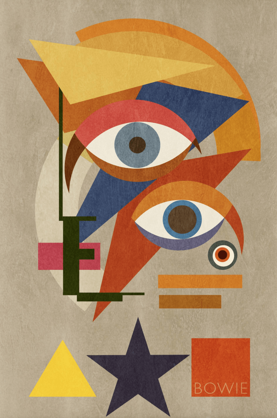
cr: https://www.saatchiart.com/art/Collage-Bowie-Bauhaus-THREE-David-Bowie-Portrait-2016-XLarge-Unique-Monoprint-1-1/672079/2851449/view?utm_source=collectors_non_purchasers&utm_medium=email&utm_campaign=2006&c_aid=non_purchasers&c_crid=presents2&c_xid=090116&utm_content=090116_non_purchasers
The choice of colours used was fantastic and well-coordinated throughout. I especially like the contrast between the primary colours, which is what made this piece stood out. The mix of geometric shapes kind of hint at the influence of Futurism and Bauhaus combine. The almost “random” placement of his deconstructed face gives it more depth which is able to peak interests amongst people. The smack centre composition and the tiny white space around the border frame up the structure of this albeit simple looking but well thought through piece. With all the playful “thoughtless” placement of objects, the art piece made David Bowie seems like a free-spirited person. I am mainly inspired by the thought that was placed behind the creation of this portrait, a rather anarchic approach to making art that perhaps not many can agree on.
Besides Jack Smith, there is also another artist/designer whom I adore. She goes by the name of “Alarah” on social media. Her style is super minimalist, usually accompanied by a few strokes of lines to illustrate dynamism and shapes. Her is her Instagram account which documents some of her works.
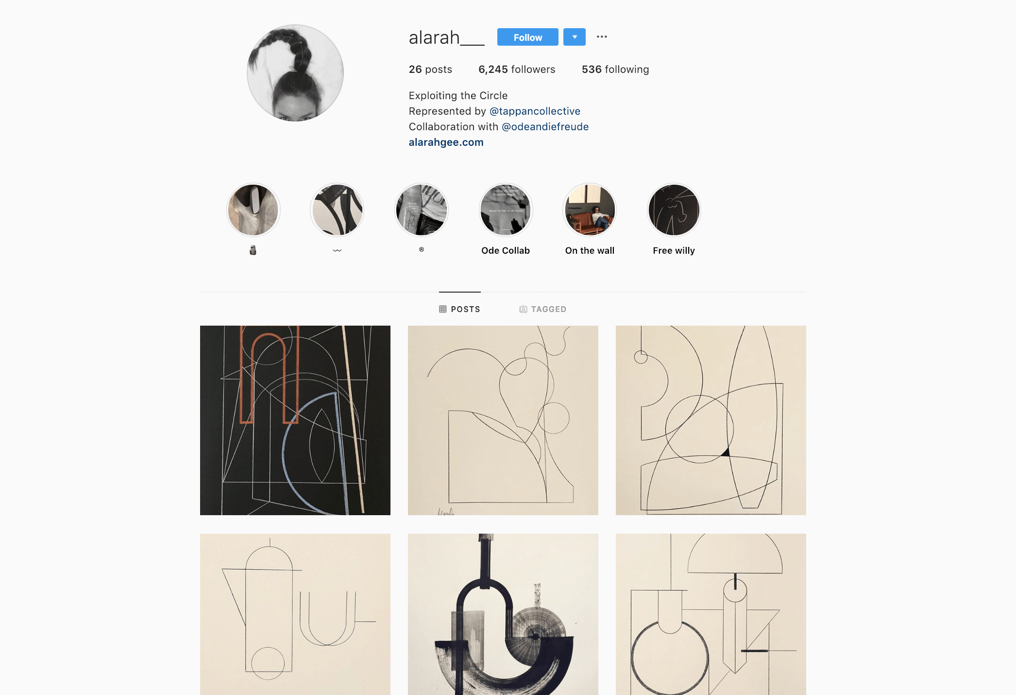
cr: https://www.instagram.com/alarah___/
I am not usually attracted to minimalism but her clean style caught my eyes. It’s funny how a few simple strokes can portray so much meaning, just as much as a maximalist work. Sometimes, less really is more. Lines are so powerful they have the ability to provoke thoughts.
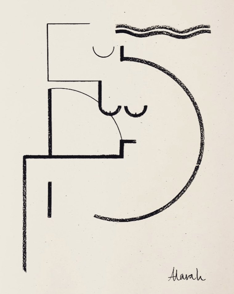
‘REFLECTIONS’ 2017 (Coal on A2 Eco paper)
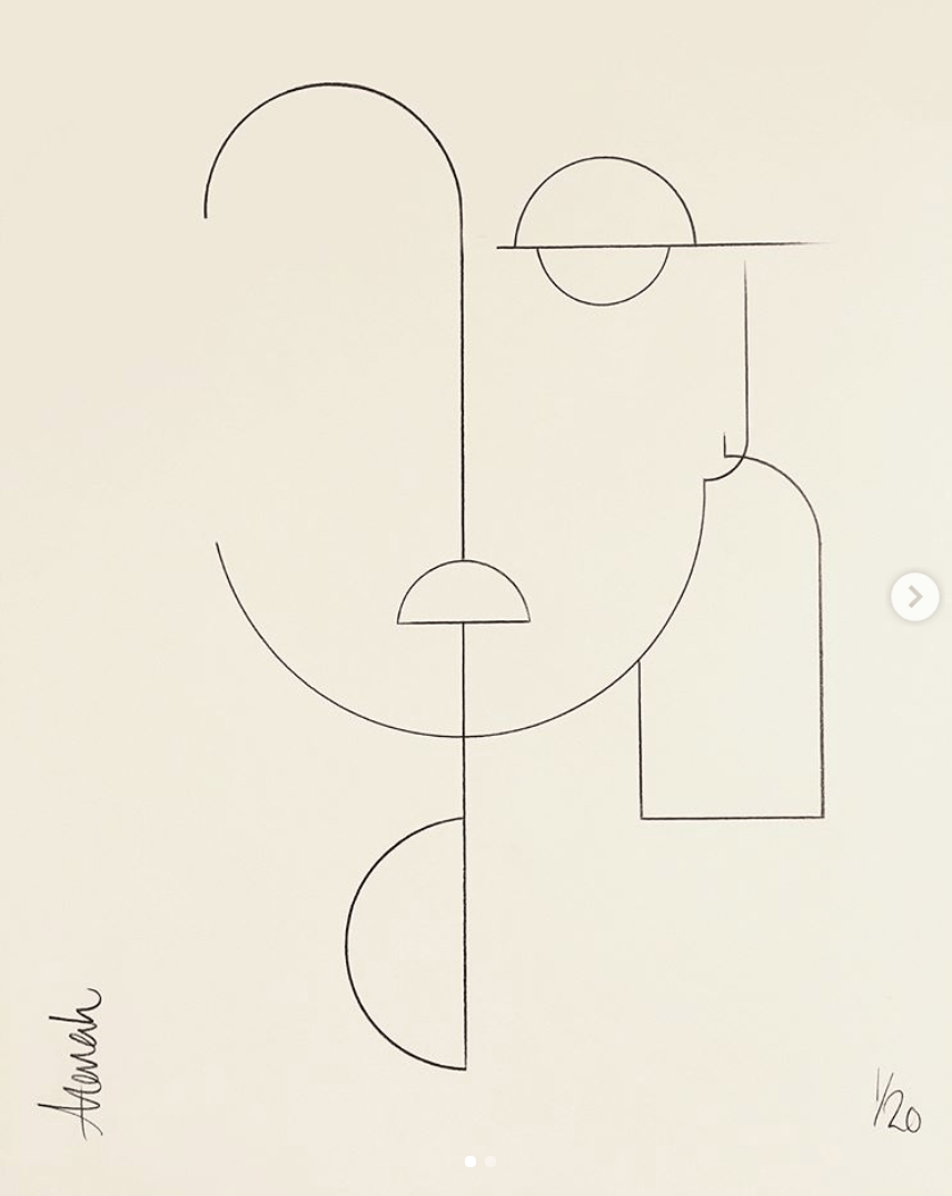
‘ALUA’
With all these artist references, I came up with my first draft for Concept #1 – The Bingsoo Face.

I employed a set of deeply contrasted bunch of colours to reflect the creaminess of an Iced Bingsoo dessert, and more so, the multi-sensory dimension that it has! You may have also noticed that each individual piece of shape has an accompanying texture which hints at the feature it was based on. For example, the light blue piece with zigzag lines reflects the flow of my hair. I wanted this layout to appear haphazard and anarchic, a way to reflect my free-spirited nature as I prefer to discover things along the way than to stick to a well thought through path. All these bits and pieces of vector shapes formed the anatomy of my favourite dessert! I thought it would be a straight-forward and interesting way to represent myself. The need to uncover each and every feature kind of provide an extra bit of fun for people to unravel/decode the meaning behind this piece. After sitting through the first consultation with Lisa, I realise that perhaps this is a little way too abstract! So I proceeded to hon on my (hopefully better) second concept.
Okay, let’s move on to concept 2!
Circle Food by Chris David
YES, MORE ON FOOD! The title of this work will be THE advent calendar (HAHA how uncreative). Essentially, it will be a collage of all the food I love, but at the same time, these food items form a silhouette of myself.
Artist Inspirations
Unlike the previous concept, I plan on illustrating this on the Ipad, perhaps with a mix of media! Here are a few of my all-time favourite concept works:
Works of: We are out of office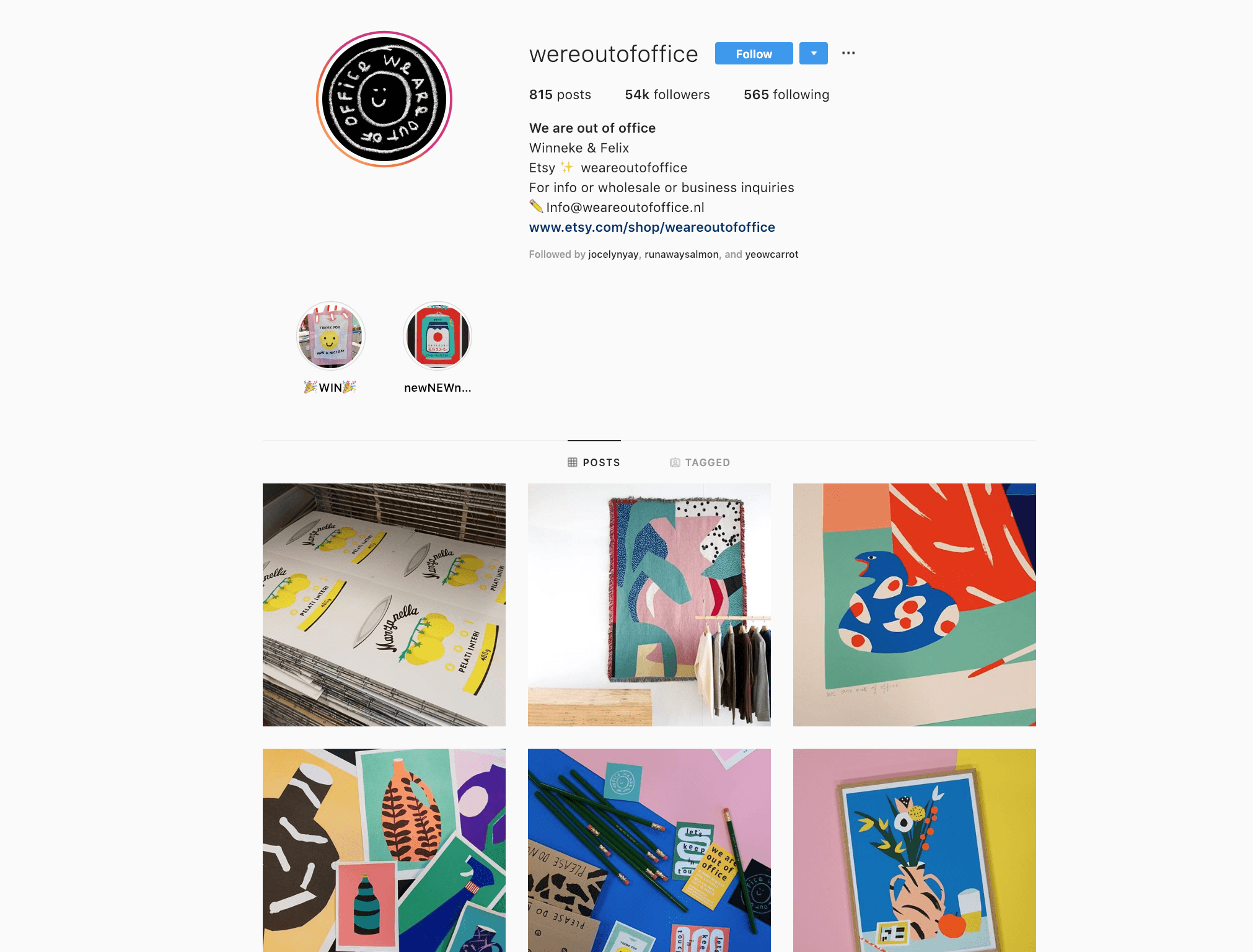
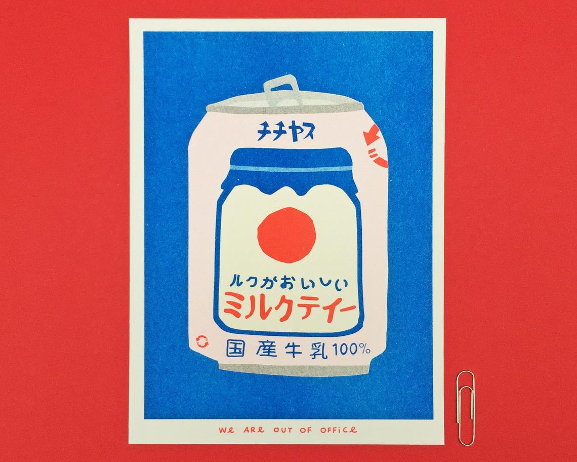
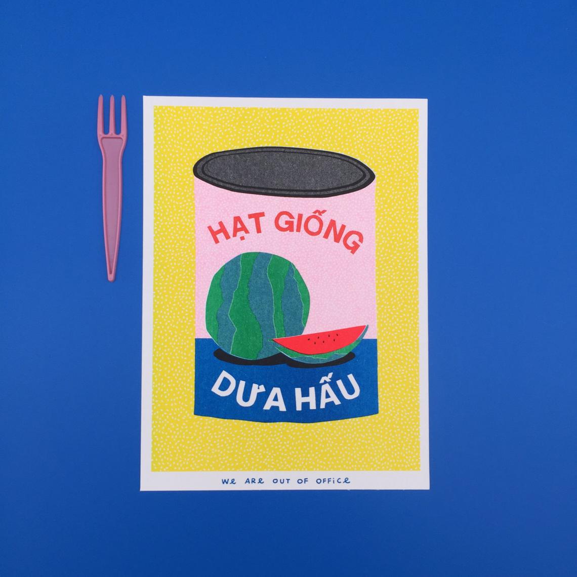
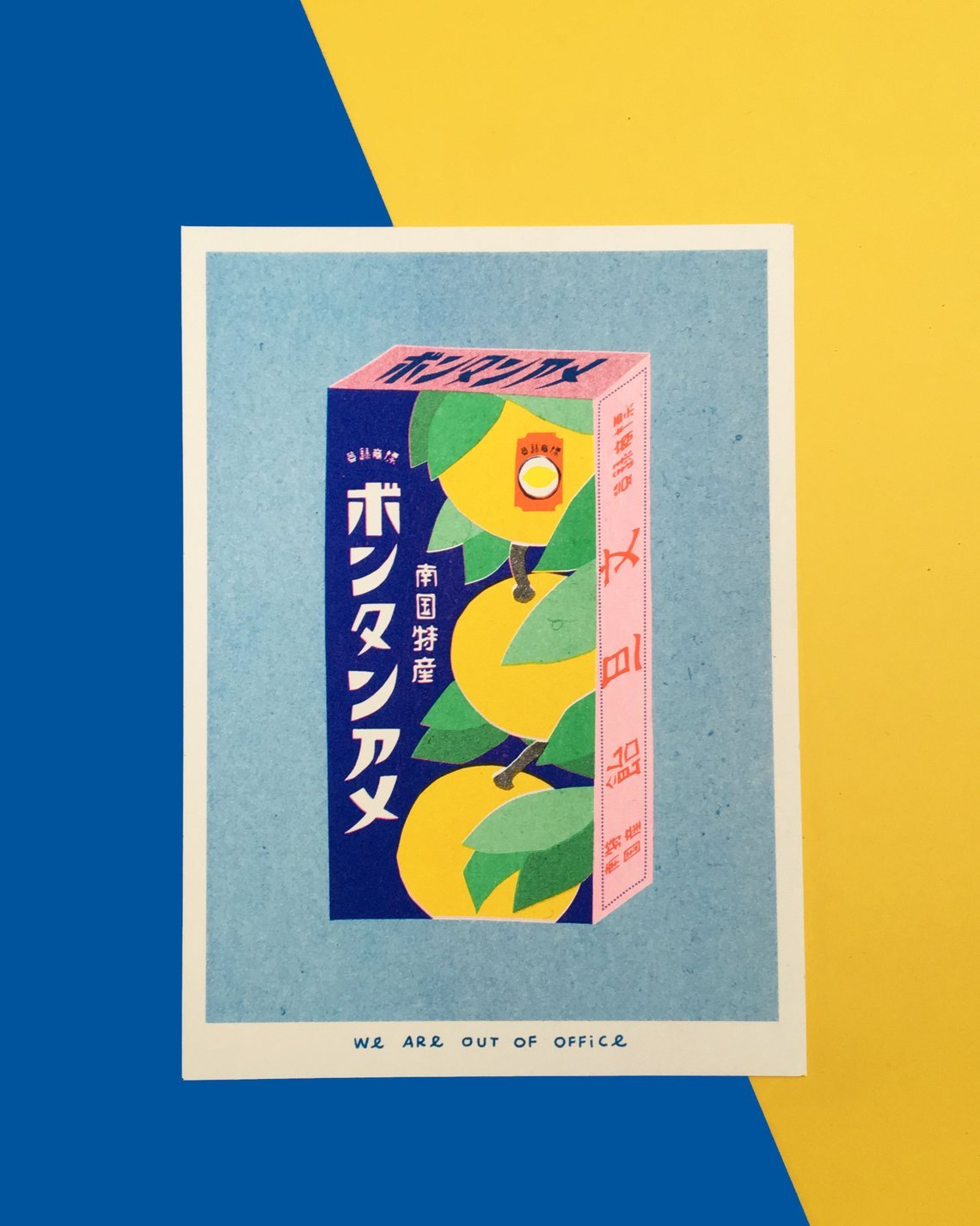
Can I just say I much I love their choice of colours?! These cards are actually risograph prints, that explains why the colours are so vibrant and poppish. The style of illustration is one big factor as to what makes their works stand out from the ordinary. It kind of reminds me of the ever iconic Andy Warhol’s works.
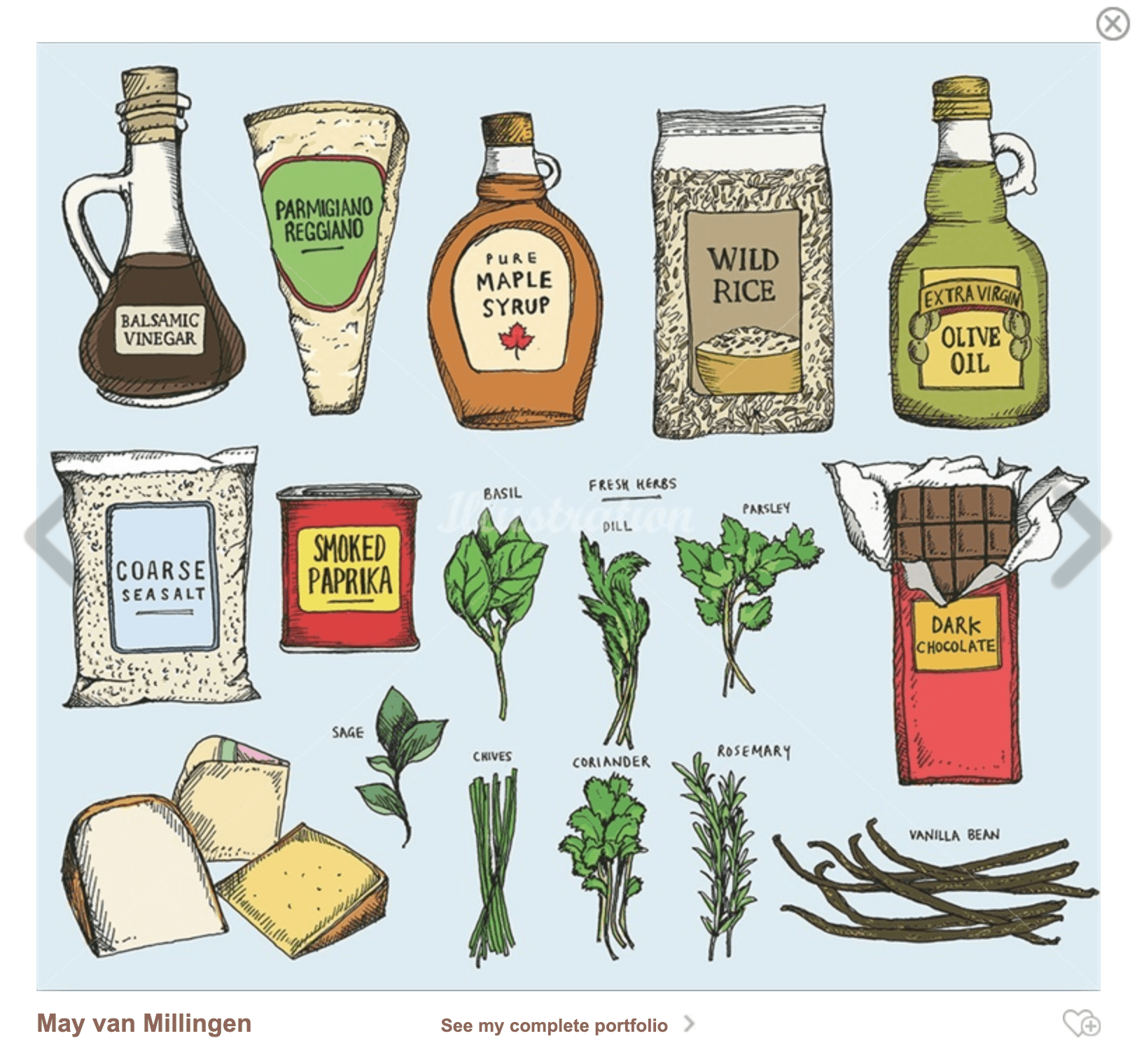
Works of May Van Millingen
May’s work often contains numerous drawings that come together to form a series. Her style has been influenced by old botanical and scientific drawings, which she often studies. She also combines hand drawing with digital processes and uses ink, pencil and watercolours to create her work. Her process usually combines mark-making, strong graphic lines, cross-hatched shading and bold use of colour which is what makes her work remarkably unique.

cr: https://www.illustrationweb.com/sg/styles/food-and-drink

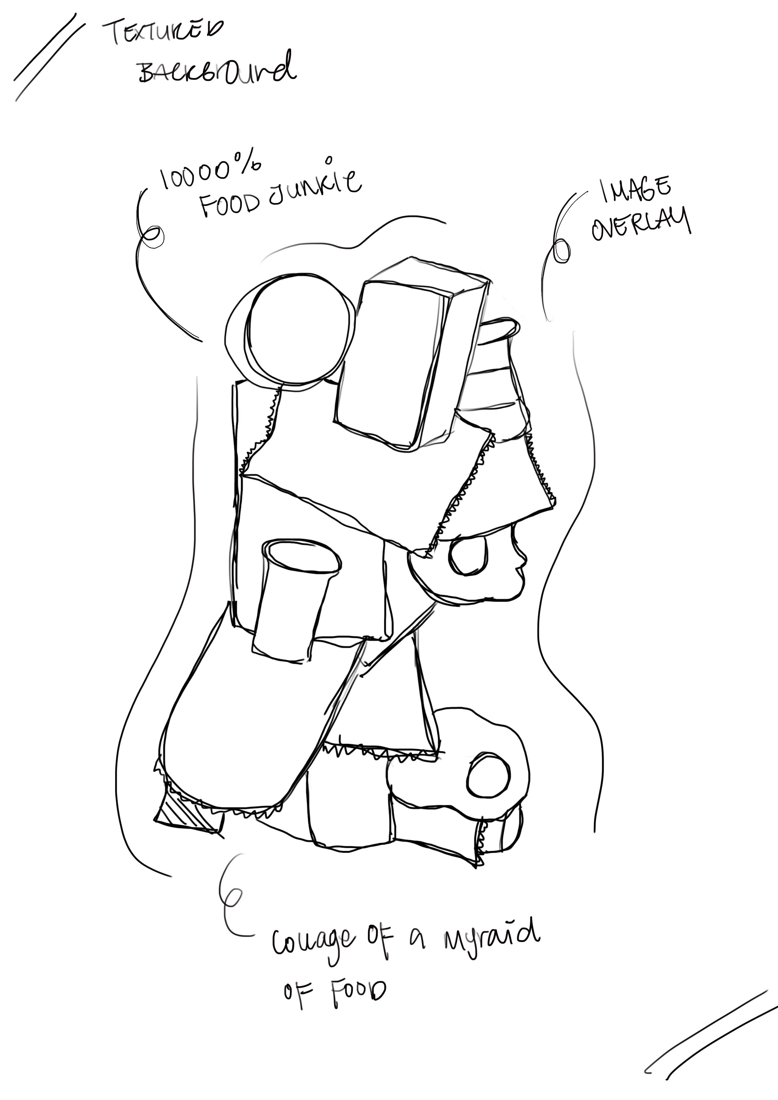
Here is my initial composition of how I visualise my artwork to be:
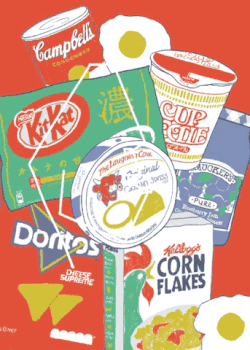
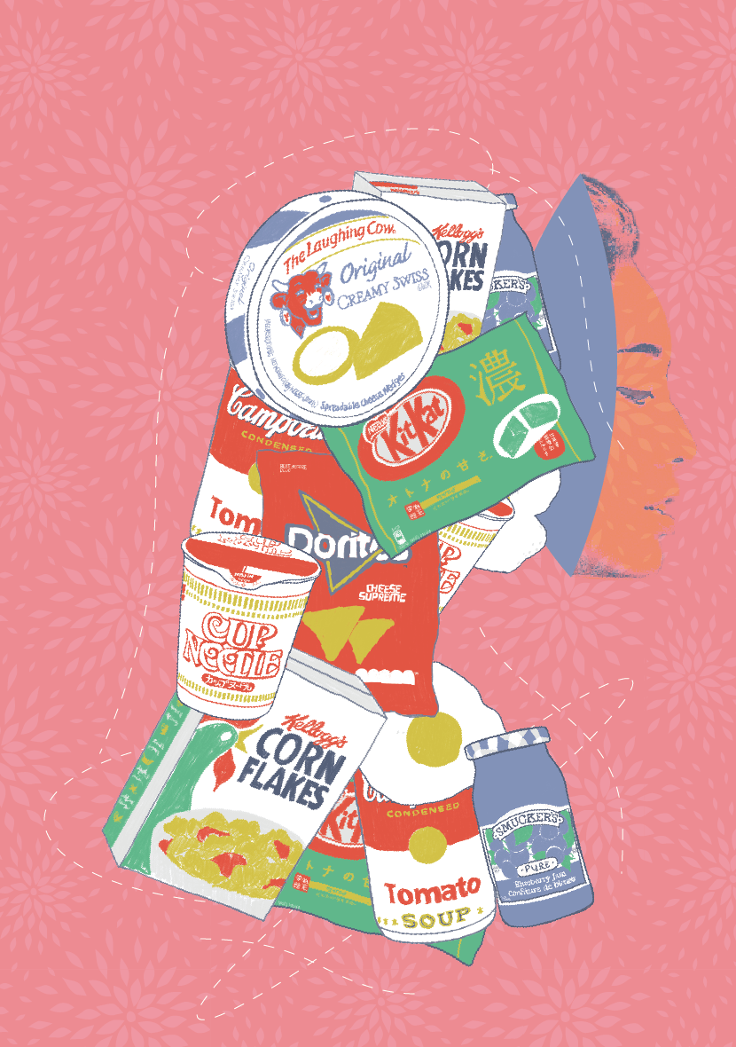
Listed below are some of my most most most bought snack/junk food that I absolutely cannot live without. Like chocolates, instant noodles, chips and cheese, tangy tomato soup, and fruit jams!! LOVE THEM TO BITS. Following through, I went on to create some illustrations based on the inspiration above. I want it to be stylised in a manner it doesn’t reflect too much realism, so it has a customise So here they are:

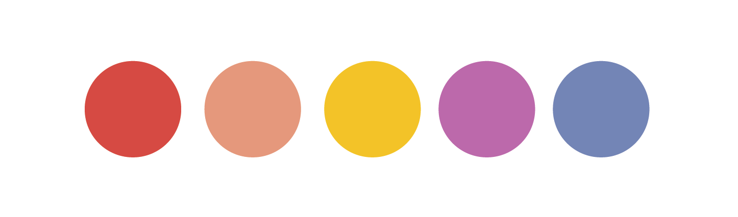
Colours are one of the most important aspects of design – The make or break perhaps. So when it comes to colour picking, The colours used were primary and secondary colours as I personally feel that selecting the right colour scheme can create the suitable kind of ambience and set the mood right. I gave the illustration a fine, blue outline and a similar set of colour treatment so all of them look consistent and overall the sketchy effect gives it a very personal touch. Here’s some of the behind the scene compilation of how I work with my layers:
I wanted the portrait to be of central focus, therefore, the placement of the portrait. The background colour (a strong contrast of red) that goes in harmony with the selected colour scheme compliments the vibe that I am aiming for, which also, resonates my cultural background – one that comes from a Chinese family amongst the Multiculturalism of Singapore. This gives my layout a stronger sense of rationality apart from my love for food. I also have repeated prints that resemble the traditional textile patterns that is almost representative of the culture – one that many can relate to automatically. When consulting Lisa, she noticed that perhaps the overall visual interest can be further peaked with the image of myself superimposed against the food collage. I tried it out and indeed, it looks brilliant!
This is one of the many attempts on creating a better visual interest instead of using the entire image as an overlay. The whole idea behind the concept of this is to illustrate the facade I put on, when deep inside, I am actually just a food junkie. The masquerade concept didn’t really work out the way I imagined so I decided to drop that and continue fostering on the current idea I have.

This is the pre-final layout that I (almost) settled for, but still, I find that there are still ways that I can improve the layout further. I guess it would require a few more layers so that it helps to tell a more compelling story visually. Read the next post to check out the final changes I made to the self-portrait.
Click here for the final reflection. I’ll see you there.
Thanks for reading! Ciaos.