Art Critique 3

img_4629

First Feeling:

I feel vital when I first see this artwork, the color of the tree and the sky makes me feel that everything is prospering.

Analysis:

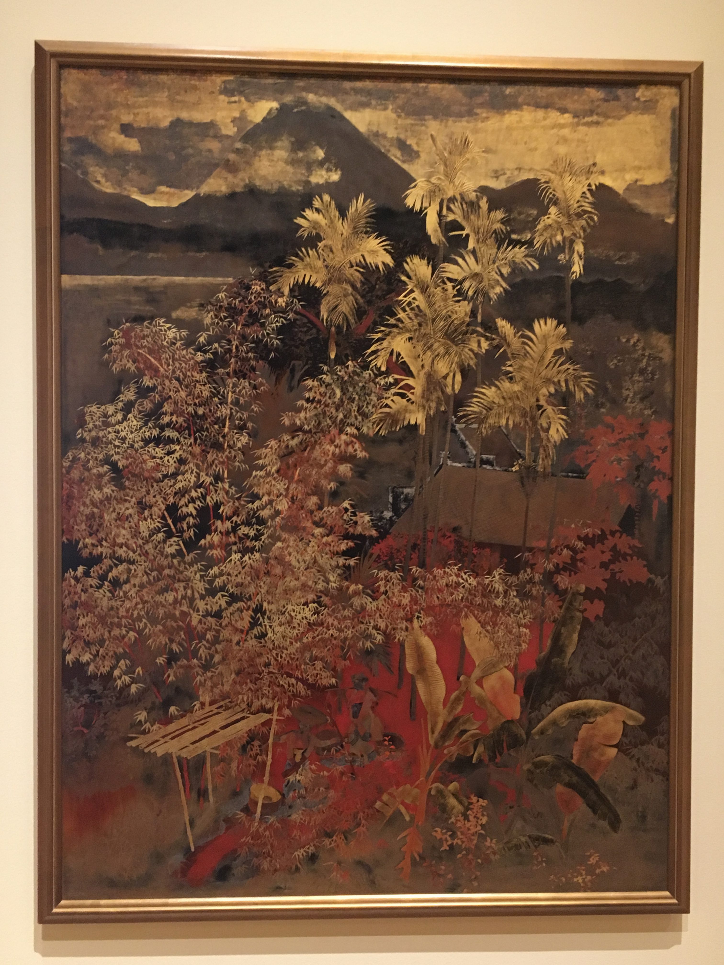
Lines are used to outline the shape of the objects (tree, mountain, buildings and clouds). This painting has a rough texture and its scale is realistic. Complex shape are used to represent the tree, the clouds and the building. This artwork has a deep space and the light source comes from the front of the picture since the light reflection is found on the top tree’s leaves, depth is used to show the vast of the scenery.

Analogous colors (red, orange and yellow) are applied to this artwork. Majority of the colors are red and orange which allows it to show the prosperity of lives, besides the red color at the lower part stands out and become the center of attention. Monochromatic colors are also applied in the artwork to show the shadows and reflection.

The lacquer artwork Landscape of Vietnam belongs to impressionist since the artist was trying to capture the best fabulous moment of the scenery in Vietnam. The arrangement of the objects is asymmetrical but the artist used the depth of the space to balance the asymmetry perfectly.

Nguyen Gia Tri was a famous Vietnamese painter for his mastery of lacquer painting. He did the lacquer artwork Landscape of Vietnam in 1940 when he was taken by the French government to a remote area. The landscape in this painting portrays the scenery where he used to stay. Furthermore I think Nguyen Gia Tri was also trying to express his love to his homeland by making this artwork. Landscape of Vietnam shows his excellent and unique skill in lacquer and with this technique, Gia’s lacquer work is certainly Vietnamese landscape and culture at its best.

Art Critique 2

img_4608

First Feeling:

This is an artwork about few people walking or fishing along the shore. I have a feeling of peace and lonely when I first see this artwork. The edgeless ocean and sky make me feel that I am too small to this world.

Analysis:

Lines are used to represent different texture such like sky, ocean and shore’s grass. Simple shapes and true scale are applied to this artwork to make it realistic. The light source comes from the back of the picture which makes the people on the shore cannot be seen clearly. The direction of the light source can also easily deducted from the shadow of the people. This picture has a rough texture in order to represent the sky, ocean and grass. Moreover, deep space is applied in this artwork to show the vast sea and sky.

This is a linocut artwork. The texture in this picture that linocut made creates a different feeling for me, making me feel this is a social realism artwork. Meanwhile, rule of thirds is applied to this artwork that 1/3 beneath the picture are main objects such like people and the rest 2/3 are the sky and the ocean. This artwork portrays a very ordinary scene about people walking and fishing along the shore, but the position of the shadow, the scale and the composition together creates a feeling of smallness and loneliness.

Lim Yew Kuan is a well-known second-generation Nanyang Style artist for his excellent painting, printmaking and sculpting skill. He was born in Xiamen, China and his late father was also well-known Singapore pioneer artist called Lim Hak Tai.

Seaside portrays a scene of people walking and fishing along the seaside. During the years from 1964 to 1979, Lim was serving as the second principle of the Nanyang Academy and the artwork seaside was created at the second year of his job in Nanyang Academy which is 1966. To represent the serene beauty of the tropics, Lim created this realism artwork via linocut. Seaside is considered as artists’ deep understanding of the printmaking medium which uniquely grounded his solid foundation in the art field of realism.

Art Critique 1

img_4631

First Feeling:

When I first see this artwork, I have a feeling of harmony and happiness. I feel that those people in that art work are very happy with their life.

Analysis:

Lines are used in this picture to create many objects (tree, people and animal). The scaling of the people, animals and trees are kept realistic. This artwork contains foreground and background that makes its space quite deep in order to balance the perspective weight due to the asymmetry arrangement of the foreground. The light source in this artwork is not very strong but it seems to appear from the front because the reflection on the leaves can be found.

Furthermore, simple shapes are applied in this artwork and this artwork has smooth texture due to its simple shapes. The artists use analogous color (brown, yellow, green and blue) to create a feeling of harmony. Monochromatic colors are also applied in the artwork to show the shadows and reflection.

The oil painting artwork Mother Nature’s Bounty Harvest shows a scenery where people are being busy with harvesting. It is an abstractionism artwork that shows the artist’s love to the mother-nature. Besides, the artists organizes this artwork according to the rule of thirds that the folks take up about 1/3 space below while the god and the other views takes up about 2/3 spaces above. By using analogous color and simple shapes, this oil painting art work portrays a feeling of happiness and harmony.

The artists, Victorio, Galo and Carlos create this painting in 1935 commissioned for their patron’s residence. These three artists used to work on several occasion to produce public murals in rapidly modernizing Manila. Victorio is a Filipino painter who was the leader of the revolutionary Thirteen Moderns, Galo was the first Filipino artist to study heraldry and he was a member of the International Institute of Genealogy and Heraldry in Madrid and Carlos was popularly known as Botong and he was a muralist from Angono. I think these artists were trying to express their love to the land they are living and the nature so that they create this artwork.

Colour Still-life Cut-Out

img_4450

Idea:

The concept of triad harmony color (red, yellow and blue) is primarily applied in this composition. Furthermore the concepts of analogous color (purple and red) and monochromatic color (shades and reflection) are also applied in this composition.

Planning:

First thing first, I took a picture of my composition:
original

Then i did a quick color analysis of my composition and I decided to use triad harmony color of blue ,red and yellow as my main color,the other colors i picked are purple,brown and so on:
87797935928071525

Process:

To begin with, I cut out the objects in my composition:
While I was making the body of the water bottle, I decided to use the reflecting paper to make it looks more like plastic
one

Then I added sunlight and shadows to my picture:
Until then, the basic structure of my picture is formed
two

To make it prefect, I continue to add details such as the deeper shadows and the reflection on the bottle to my picture and so on
img_4425

At last, I did few revisions on my picture such as the texture of the frame’s background
img_4450

Finally, my picture vs my composition:
ua412ln5wi8v1mc1e8