Theme
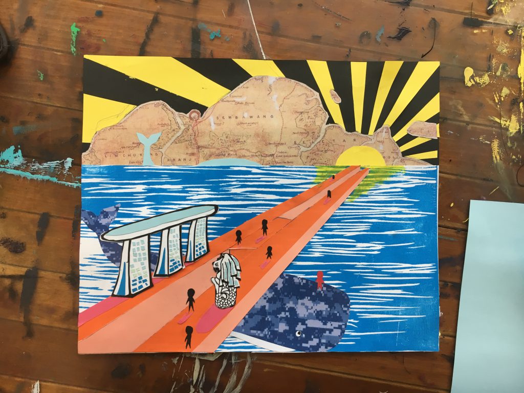
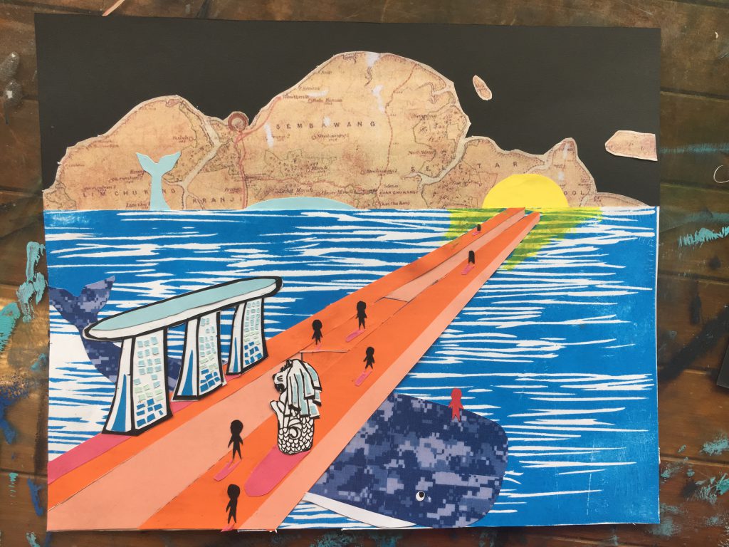
The theme of my piece is about the Singapore army, who are making their every effort to protect us from the outside danger day and night. It is their effort that leads Singapore and the people of Singapore walk towards prosperity.
Idea Formation
After deciding the theme, I started to think how to present my theme. I was inspired by the movie In the heart of the sea which is talking about a story of the guardian whale, then I suddenly came up with an idea: Why can’t I make the Singapore a whale ? The the rest ideas came up like a blast—— They are whales so it must relate to ocean and it would be a good idea that I let the people of Singapore walking on a bridge protecting by the whale, and this bridge can lead them towards the sun which indicates the prosperity
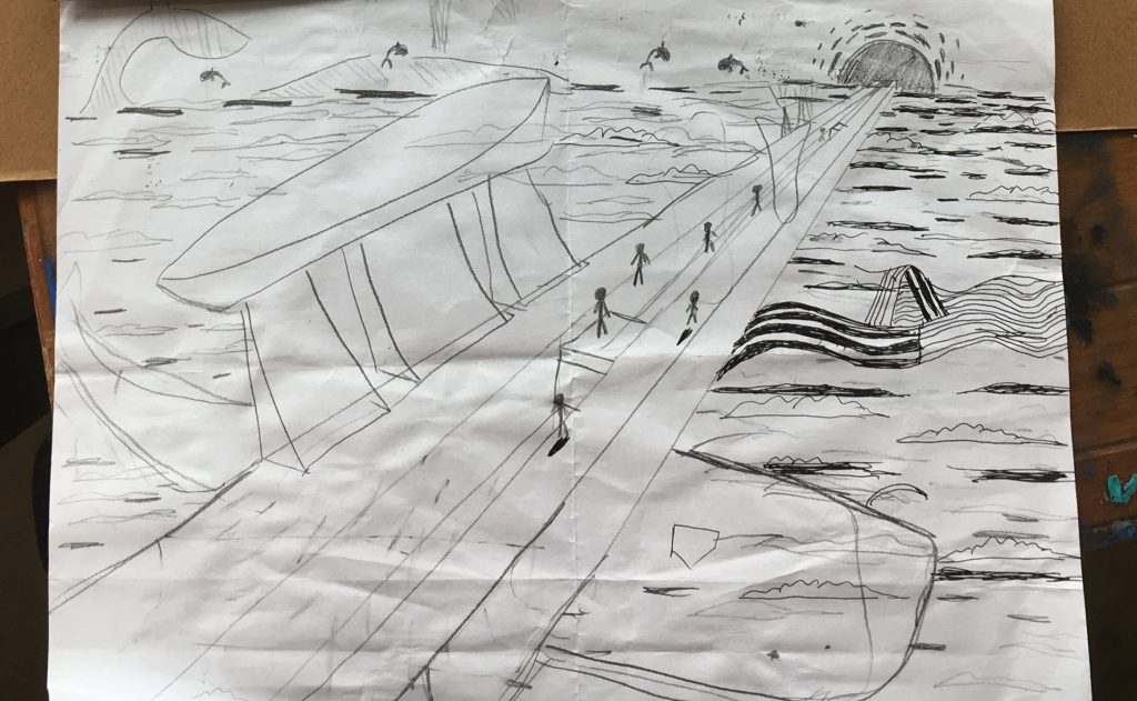
So I quickly draw out a sketch according to my idea:
Process
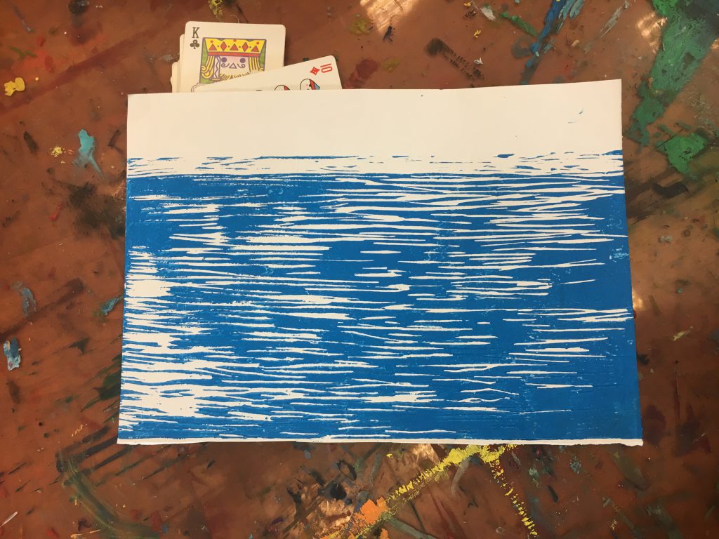
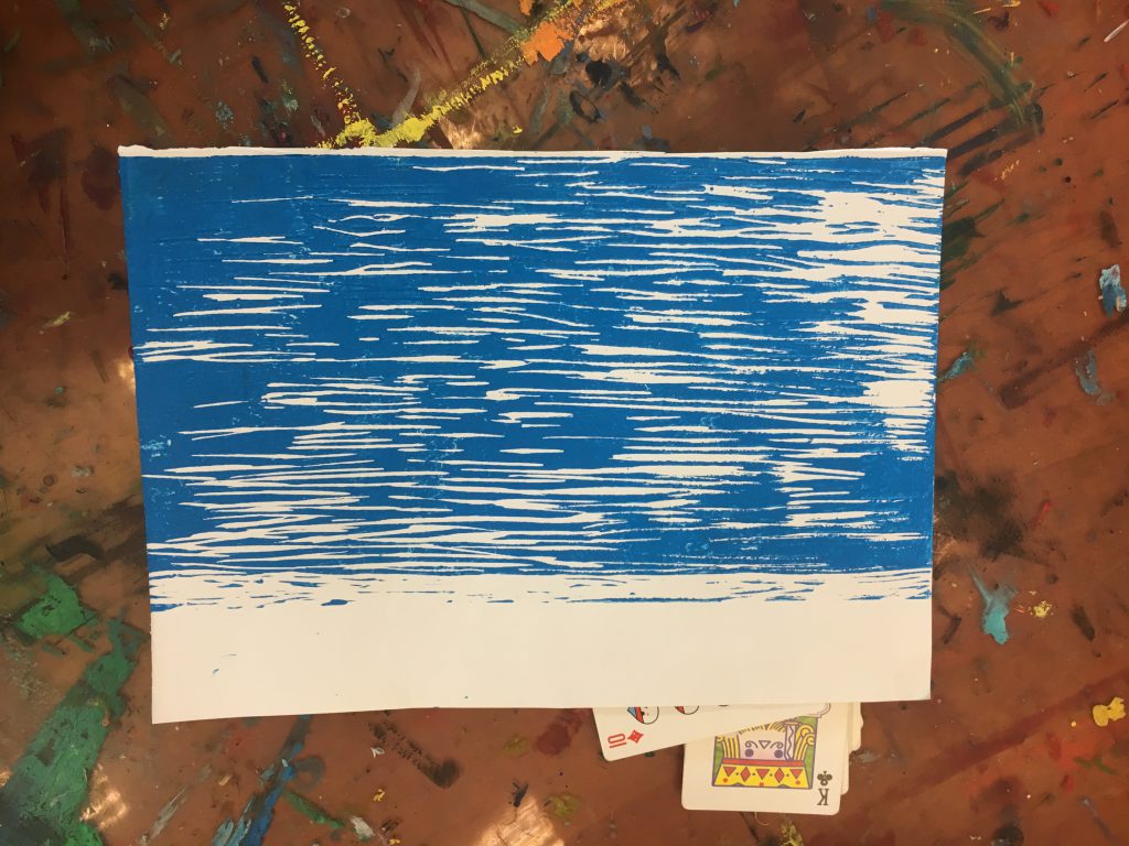
First thing first, the ocean:
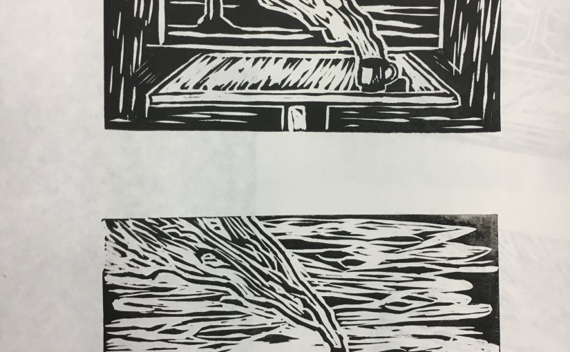
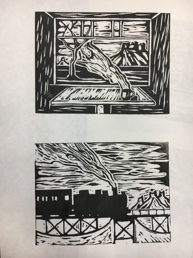
I did the ocean using lino-cut, one third rule is applied to the sea that I left around 1/3 space for the sky. After finishing cutting I found that if I turn the sea upside down it would look better.
Before:
After:
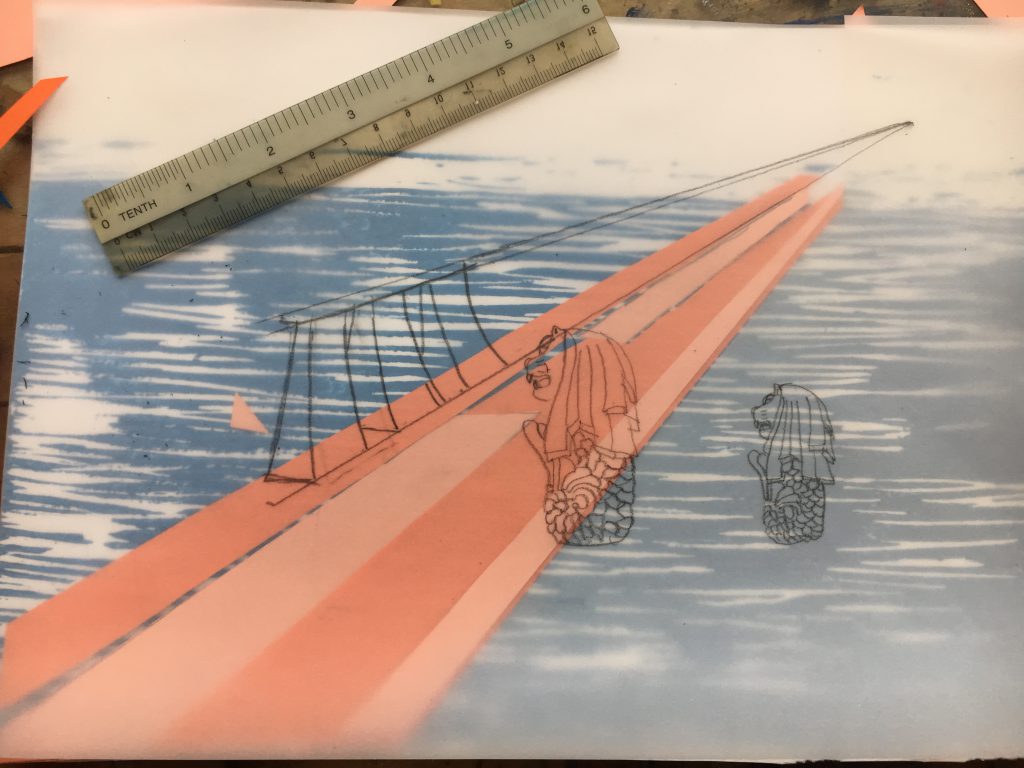
Still first thing first, the bridge:
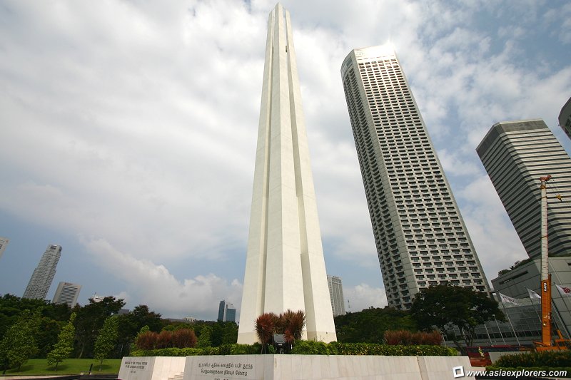
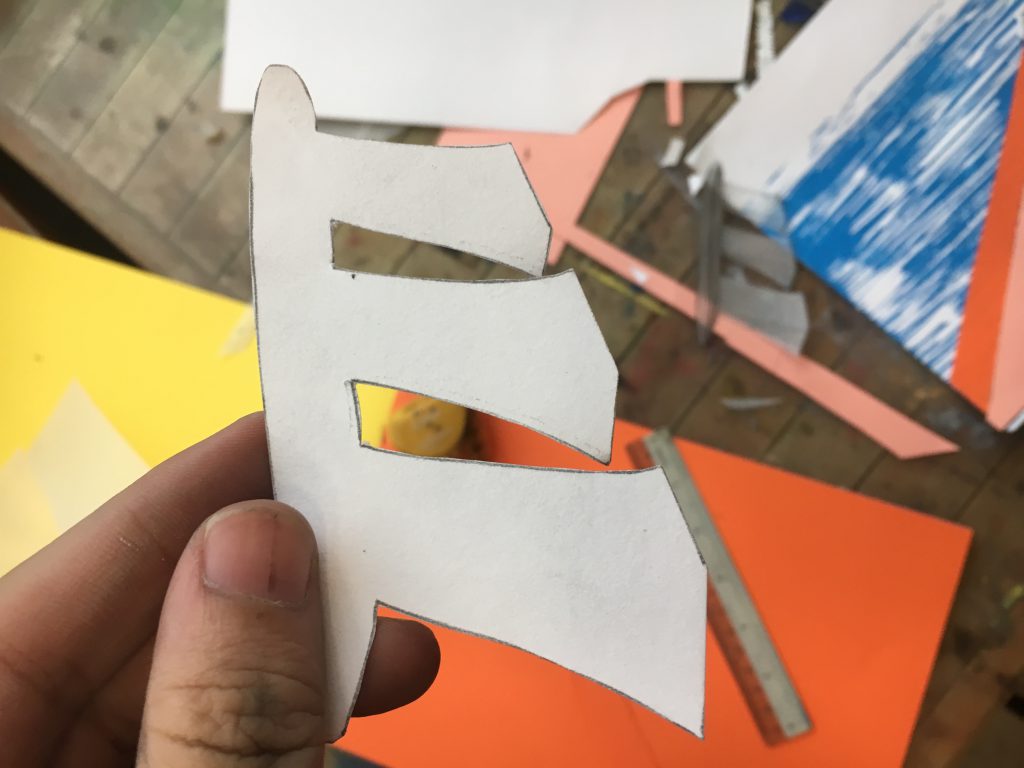
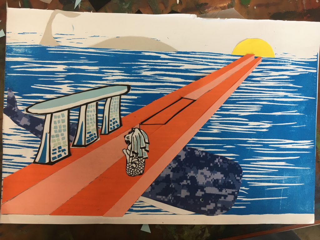
To form a colorful contrast, I used the complementary color of blue which is orange and I applied rule of thirds to the bridge to put it at the 1/3 side of the ocean. Besides to make the bridge means more than a bridge, I decided to copy the pattern of the Singapore monument:
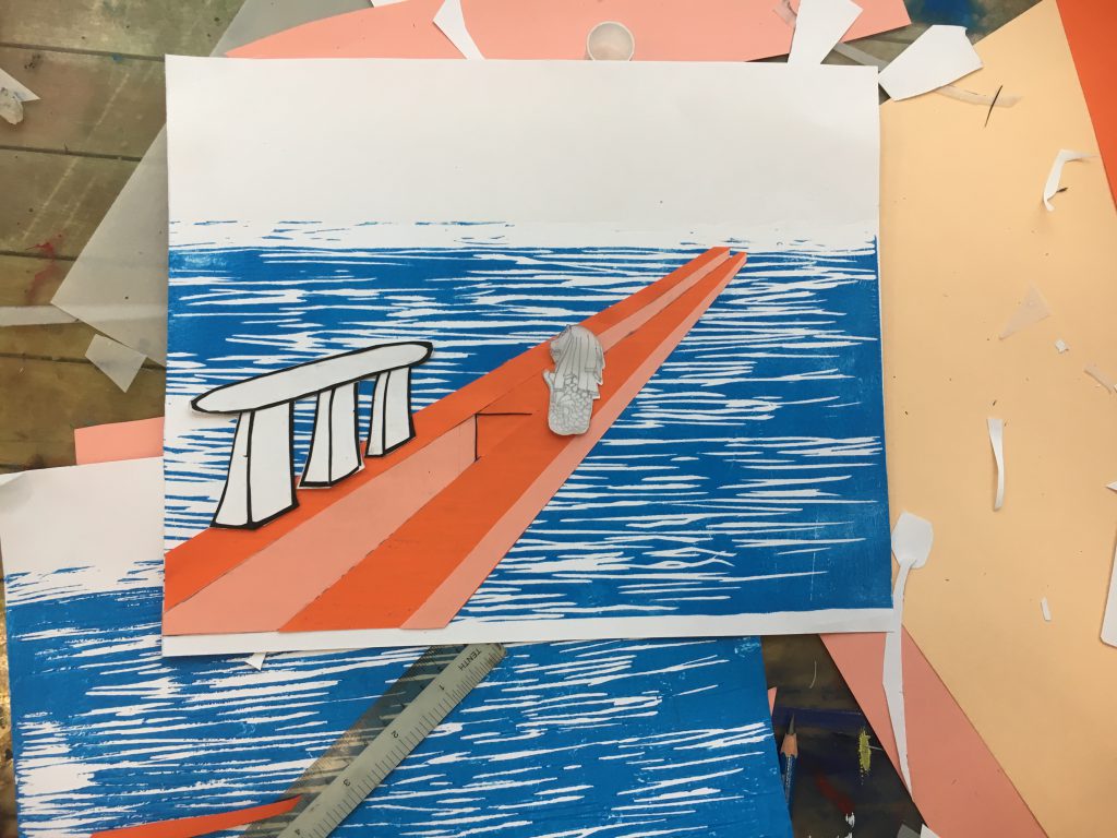
after I cut it out using orange paper, I placed it on the ocean just like a bridge, besides to make it more Singapore, I added some famous landmark on it:
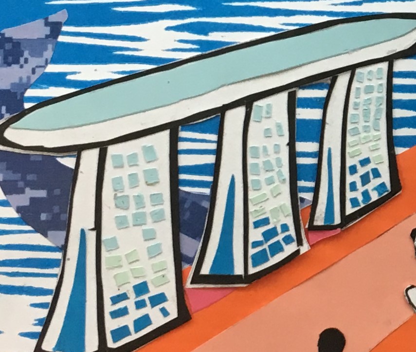
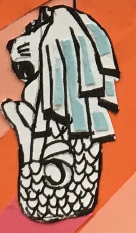
The landmark it very difficult to cut since i was using paper cut, I spent like 5 plus hours on it:
For the marina bay sand, the windows is the most difficult part since it is very small and there are a lot of them. Then i used analogous color on the windows to show the changing of the sunlight.
For the merlion, the scale of the statue is like ten times harder than MBS. Firstly I tried to use paper cut but i fail because of the scale, then I tried lino-cut and again I fail due to the scale, so for the third time I decided to draw it out and I made it. Besides I added some color on its head
After finishing the bridge, I started to do the whale and the sun:
For the color of the sun, I used split-complementary color of orange and blue which is yellow, so I cut it out from yellow paper and paste it. As for the big whale the reason I put it here opposite to the bridge’s direction is because I want to balance the asymmetry caused by the bridge.
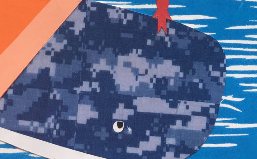
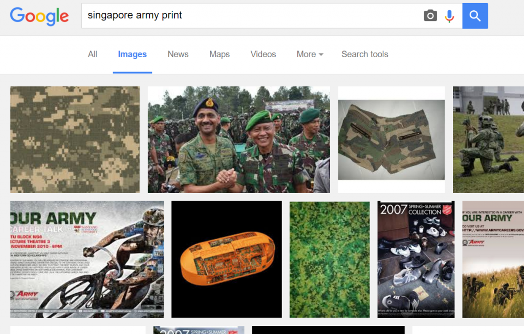
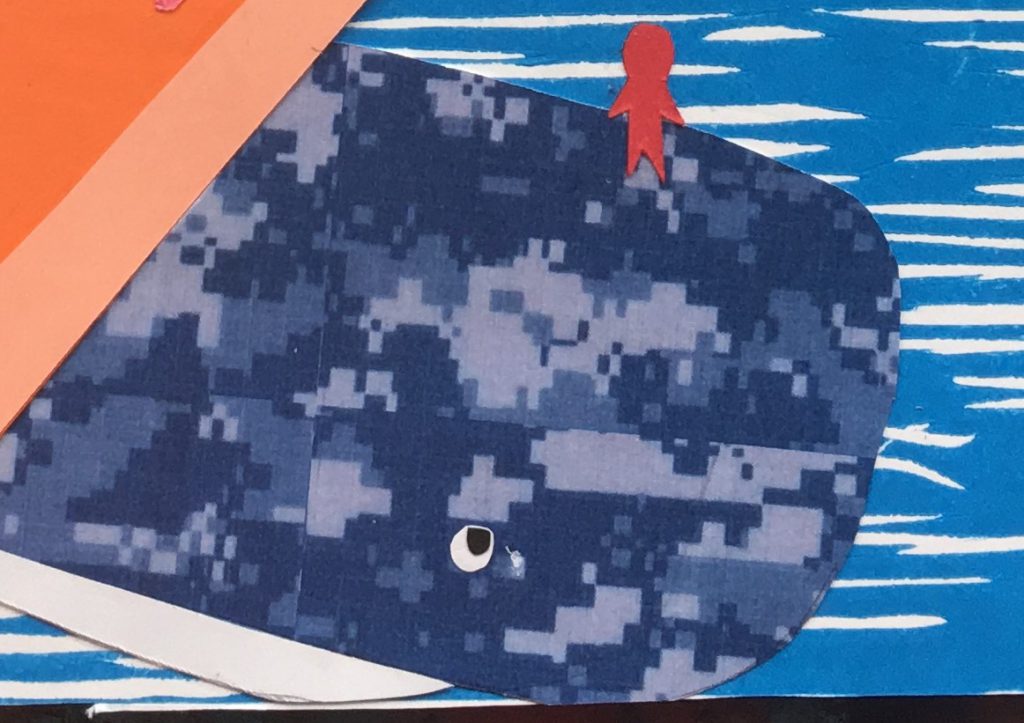
To do the whale, to make it the embodiment of the Singapore army, I downloaded the image of the army print and change the color from green to blue
Then I cut the whale out and for the whale at the faraway, I decided to use single color instead of army print since it’s at faraway.
So my first draft was done:
Don’t know how I felt that something was missing, then I suddenly realized that I missed the people and the background, for the back ground I decided to use the map of the singapore
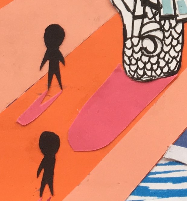
After which I also added shadow to the people:
So far the whole piece looks pretty good, then later I added the sunlight and did few adjustment to it.
For the background the reason I chose black is because I found that black is working very well with yellow since the composition of black and yellow looks very energetic.
Interesting Stuff
The disable:
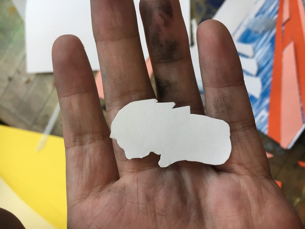
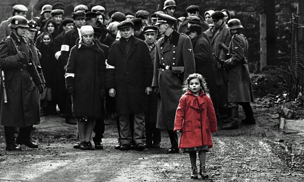
The little girl on the whale :
The little girl is a salutation to the movie Schindler’s list, which is one of my favorite movies.
Takeaway
Looking back to my whole process, I realized that I spent like 80% of my time on the detail of my piece but they are rarely or never noticed by thepeople (like the window and the shadow). But without these detail my paint would looks very bad. So I learnt that detail do matter no matter it will be noticed or not.
Final piece:
