Link to Research infographic here
To create a A5 size that consist of 8 pages bind together into a booklet zine, the theme being “Explore your own neighborhood”. It is going to be a trip down memory lane. weeeee
At the start, I felt super troubled about how I am going to portray the smell of the place. I started by researching how it smells like in a wet market, playground, food center.
To get a better understanding of how to work with a booklet, I start by planning the flow of my zine. A one day trip around the vicinity of Boon Lay Place Market Place.
I attempt to experience the place myself with a written list of what did I see and what smell do I identify closest to. For this project, I chose to use LINES as my main principle of element and to use colors and textures to express my ideas.
I decide to use a mixture of line illustrations and coupled with photographs collages as my medium. Either using colors to further push the impact of the smell as certain colors do trigger a sort of visual which ties in with the sense of smell.

I mainly get inspiration from pinterest and there is one artist that I really enjoy her art style and illustration and humor of her zine.

A collective of various distinguish smells – Fragrance, Floral, Roses, Fruity, Fresh, Lemon, Lime, Orange, Citrus, Wood, Minty, Chocolate, Bleach, Garlic, Durian, Toasted, Coffee, Bread, Pungent, Fishy, Smelly

Initially, I had the idea of using the display window of a shop with a bunch of different containers in various sizes and illustrate/collage all the smell that I am going to put in the next few spreads. Was planning to put some posters or “Enter” sign as well. I planned for the first and last page to be one continuous spread, so the back page will be the illustrate the back of the shop.

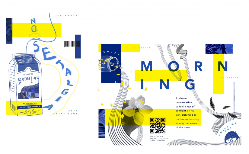
After sketching the layout, I felt that it was too cramped and there no not much of a hierarchy and no central focus. My second layout was inspired by a milk carton, I thought it would be a good focal element that I will be able to put more concise information on the sides.
At the start, it was only a wide range of blue monochromatic theme of different hue and saturation, but after exploring I realize I need another striking color to highlight the areas that I want the focus/attention to be directed to.
I wanted to use complementary colors of blue and orange, but I felt that it was a little too contrasting for my overall look of the zine. I wanted a more laid back feeling so even though the blue and orange combination helps to attract the audience attention but I felt that the pairing out yellow blue complements each other really well. Considering that this is not a one-page poster, but a multiple page booklet, it is more soothing, pleasing to the audience eyes.
Cold tone #25408f Blue and warm tone #fff200 yellow helps to bring contrasting visual on the spread.

Keywords: Refreshing, Sunshine rays, Calming, Relaxing, Morning Dew
I think to back think back and took an actual walk to feel the breeze of a Sunday morning. I took note of the objects that I see whilst walking on that path, afterward I try to convey the smells into curvy lines. Using an actual photograph of several different styles of flower collaging them together to further push the relaxing Sunday morning mood.
Learning from the previous assignment, I stayed far away from any symmetrical layout and use attempt to use the rule of the third to create an interesting composition. I decide to use the line to bring a sense of direction and movement throughout the spread. I leave a good amount of white space so I have space to insert my text.

Overall I decided to use serif fonts as it gives it a cleaner and clearer visuals which help as my illustrations and background have heavy visuals.
One main title per spread with a short paragraph of words. Lastly, I added an even small numbered text in the page that acts as a background aesthetic element which is the postal code of the boon lay place. With three text element, it would be ideal to show hierarchy.
I sprinkled off with something extra, I really enjoy morning strolls and it always gives off a spring chill happy feeling, so I added my favorite indie music link as a QR code, something interactive to further feel the smell of the morning breeze. Hoping that it will stimulate the sense of hearing too.

Keywords: Spicy Samba Chilli, Mouthwatering, Rice, Salty, Wanton Noodles,
Using photoshop, I masked the red, black, white chicken image on to the ceramic spoon, which is an element well recognize in Singapore. Semiotics! hehe
I selected the spoon to be the main element and chose to illustrate the lines of smell surrounding the spoon. I was thinking of bar chor me spicy, so I wanted to add small pieces of chill flowing through the illustrated lines. I continue to add onions, carrots, mushrooms but it became very populated with lots of visuals, so I removed them.

By intersecting the repeating lines that curved around the spoon, the proximity of each line takes and form a space in the spread. By using variations of thickness and color saturation, I was then able to create a different amount of space in between each element. The lines help to move to stimulate a sense of movement and direction


Keywords: Old Books, Rubber Slippers, Soft toys, Clothes, Watches, Ceramics
![]()
I started with this spread first and upon working on the mixed of line illustrations, coupled with photographs collages. I felt that the colored images are very distracting as they come in a wide range of their own color schemes. Thus I use added the filter of “Black and White” to all my photography elements and it instantly became more pleasing to the eye.

I received some feedback that there could be a further distinction between the subject of focus. The hierarchy here was not clear as both the lemon and the fish are grabbing attention. Upon adjustment, I decided to make the lemon smaller by enlarging the fish to be 0.5 times bigger, this will help to have a better flow of the eyes to move in a direction.

BACK PAGE

I decide to use a collage method to illustrate my map, instead of just line and icons, as I hope it would be able to refresh the reader’s memory of the smell by placing the most impactful image on the map itself. I experiment around with the size and proportion of the carton as I wanted to have a good size of the map but at the same time leave some white space to show that it is the same carton on the first page. By using the principle of design of closure and figure, I am glad it went well as it was not too complex and distracting. Lastly, I added a small detail of the “list of ingredient” and put a bunch of food smelling words and finished off with my contacts.

YASSSS, I had so much fun <3 working on this project among the rest of the stressful modules. It really inspired me to make more of my own zine to share with my friends and family. When i went to print my zine, there were students printing photo book and binding them together, hope I would be able to make one of my own soon!
The change from the usual one-page poster to designing for a booklet was hard as I have to be aware of the folding areas which will determine my spread layout.
I think this assignment really made me realize how important placement is in a zine/booklet. I initially made the mistake of focusing on the illustrate that I want to portray that I neglected the placing of each element and the fonts were crucial to this assignment. Once I placed in the text, a lot of my initial layout had to change so that it will flow well in terms of hierarchy and direction flow in general.
Lastly, I struggle so hard with InDesign as it was so foreign and it was tempting to go back to using photoshop but I strived to use it to the best of my abilities. I think it is a good additional software to know and in the future, it would definitely be super. I also had the problem with blurry images on my computer and I manage to solve it by updating the link of my files.
It was super interesting and fun to play with this assignment and the sense of satisfaction upon printing the zine was amazing.


Layout ideas: Landscape, turn it into an infographic.
IDEA 1: One day trip, Day to Night exploration of smell in Boon Lay. Decides to narrow down to the only boon lay market place area.
Front cover –
The second page – Explain the idea behind the smell and how it roughly works. Disclaimer this is based on my personal views.
how to represent time : Morning, afternoon / 9.00am 3.49pm. An analog clock includes in the design or using the analog clock as the page number.
Morning sunshine (A mood and smell to it) (calming)
Use a picture of a flower that blooms in the morning, then translate into curvy lines to convey the general refresh feel. a little bit more excited then calm. so the start can be refresh then slow down the curves and become calm. Use random elements to push the morning again.
Morning – Head to the wet market (accompany mom to buy some vegetables and meat. Heads to eat breakfast at the market. Visit the flea market at the nearby void deck.
The smell/excitement of the playground. Rubber, sweat smell, colorful, Ice cream/desserts.
Afternoon – Head to Jurong Point lunch. Eat some durian desserts.
Mama shop – buys a newspaper, inside have lots of sweets in boxes. The smell of new newspaper. The smell of smoke and cigarettes.
Night – Head to the night market at boon lay place, night breezes and lights/street lights. One long straight road with lights.


 Aquatic Analyst
Link to Final & Research Post (here)
The objective for this assignment: Using typography as an end in itself, minimizing supporting imagery. Develop ideas and conceptualize them into letterforms are combine with abstract images to express your job.
Upon reading the brief for 1st assignment, I begin to prepare my research on several art movements and artist that are involved in.
Polish Poster Artist – Henryk Tomaszewski
Overall his artwork generally have a distinct design style and approach. He works with by a combination of multiple symbols and signs. In his work, we are able to see how he executes his works using semiotics communicate this intended message. By reduces imagery & words into the simplest form, it multiplies the impact of the message delivered as it requires the audience to go through their thought process.
My takeaway from Henryk Tomaszewski NIE! (1953)
The simple shapes to illustrate a devastated city superimposed on a silhouette of a falling bomb. Clear and concise text and images distilling the content into the simplest form. The artist uses texture and shading to inject the element of destruction of the building. Instead of using the element of weapons he chooses to adopt the synecdoche (using the whole part to represent something). This inspired me to change my train of thoughts for the assignments. One approach could speak of the element itself, alternatively, I can use other forms of expression to hint on the elements.
I began by noting down all the version of my initials and nicknames.

(Whitney, Whit, WN, WNYS, YS,颖萱, 黄, Ying Suen)

Concept Ideation – I wanted to fuse two contrasting or contradicting elements to compose an interesting texture and contextual final image.
Cheese – Heavenly Aroma, Melts, Bright, Soft, full of flavor, Joy
Ninja – Well hidden, Merciless assassination, Dark
Motto: I pledge my life to protect any assassination of the legendary cheese recipet. Cheese is the love of my life. – Cheese Ninja

Moving on, to choose the type of font.
After experimenting with a few fonts, I continued to explore illustrator (3D Extrude & Bevel) giving the letters a depth and perspective
I chose this font “Sinhala MN” as ninja are associated with are sharp weapons, this font gives me a sharp pointy end in the middle of the “W” which helps to instill the sharpness. This rare font also has a flat bottom edge of the letter “W” is flat, which gives off a block cheese.
Initially, I incorporated the element of the ninja star by placing them on each individual words itself. I felt that overall it looks a little distracting even though the placement is cohesive.
I refreshed my memory on the Principals of Design – Movement. A knife slashing through the words can help to convey the ninja’s aspect. In order to further link back to ninja, I chose to use a well known in my current peers, a significant weapon – Shuriken (throwing stars). Attempts to use scissors and knife tool to separate the words. I went through some tutorial online and found one that really helps to create the slashing effect that I wanted. I further alternate some parts of the letters to create variety in the slashing effect. (Link if you are interested: (3D Isometric Text)


After trying out several compositions and colors schemes. I feel that my main letter should be in yellowish-orange as it creates the clearest message of the cheese. I further darken the shadows manually on the cheese’s texture to create more depth. This leaves me with having a dark colored background – Saturated purpled or dark blue create the night atmosphere when the ninja are mostly dispatched in the middle of the night.
I was struggling with having a secondary element for my background – I choose to use the moon as it has a simple circular shape in contrast to using the complex roof of the shrines. By using the Rule of Third, I placed my words slightly near to the top half of the frame. Using the gradient to blend the bright yellow with the blue sky. The moon is placed out of the frame to reduce the distraction, (Figure–ground). This helps to creates a negative breathing space.
Concept Ideation – I wanted to fuse two contrasting or contradicting elements to compose an interesting texture and contextual final image.
Cheese – Pure, Fluffy clouds, Soft, Crystallisation
Tailor – Well versed, Detailed Orientated, Bussiness, Professional.
The font that I chose was a Chinese simplified “Yuanti SC”. I slightly broaden the width of the characters. It has a very neat & smooth finish with curved ends making it look soft which was my intention as my job was about snow. I discovered a new tool called “Puppet Wrap & Perspective Wrap” with help to make the effect of the bending of the Chinese characters into the half.


At the start, I had the idea of using only a few elements of snow resting on top of my letter to represent the idea of snow. During the final consultation, the idea of the entire letter to be made out of the snow was raised.

Upon searching up the snow texture and attempting it, I find that it really helped to simplify the overall design look of the final piece. Instead of having small bits and pieces of the element, using the texture to clearly represent the snow element was a great input to my final piece.

In terms of composition, I tried to avoid using symmetrical layout and chose to push my initials to the right side leaving white negative space for my background. I tried to use a snowy background but it was a struggle as the main subject and background have the same hue, tone, and color. I thought using an element from the tailor instead, as there are more options to choose from.
I tried to experiment with complementary colors such as Blue #4520ff and Orangish-Yellow #ffa220, Red #ff4f1a and Light Blue #1afff7. In my first design layout, I applied split complementary color schemes that consist of highly saturated blue, yellow and orange. 

I decided to use a sweater like texture to represent the element of the tailor. I added in scissors that are cutting up the cloth. Since the initials are flushed to the right which leaves a negative white space, the scissors can be only shown partly through figure-ground & synecdoche, helps to push the hint of the tailor,
One comment was on the stitches that are not very visible at first glance, so working on that aspect I added shadows and use (Inner Emboss and Outer Emboss) in Photoshop effects to create the 3D illusion that helps to bring out the texture further. In addition, I use the same technique of shading to create the illusion of the folding marks of the cloth to make it look more realistic.
Concept Ideation – I wanted to fuse two contrasting or contradicting elements to compose an interesting texture and contextual final image.
DJ – Loud music, Parties, Flashing lights, Dance, Excited
Mathematician – Accurate, Smart, Problem Solving, Equations, More Equations

The final font that I chose was a serif font “Didot” with tails at the end of the letter. I choose this font over the San-serif font as I felt that it works well with the element of Mathematician. In contrast, the element of DJ is usually associate with parties, neon flashing lights, loud music, and flashy dancing. By using a rather more professional serif font, I think it contributes to making the image as a whole look more interesting. I made use of the perspective and distort function in Adobe Photoshop to angle it so that it will not have a symmetrical composition.

The design style of the fonts generally makes the lines on the right side thicker and the remaining strokes are considerably thinner, and I further develop this design font. I adjusted the perspective angle making the thicker stroke seems thicker, using the difference in size & scale. I rasterize the words and manually adjusted the width of the thicker strokes to put even more emphasis on them itself.
 I experiment with the analogous color scheme (#4d32ff, #b432ff, #32ccff)This gives off the feeling of the element of DJ. It is vibrant with a bright attracting colors.

Testing out various color schemes.


After confirming my rough idea, I started to add in the elements that represent either a DJ or a mathematician. I thought out using math formulas x = x(8y+ 3)º, but I felt that it could be further develop using metonyms a form of nonliteral communication. Instead of using another set of letters and numbers, which might take away attention from my main letters. I could use basic geometric angles where we calculate the degree of rotation of a shape. This allows me to utilize shape that is simplified.
I tested it out by adding some angles signs at the corners of the letter. and it fits well with the serif font. Moving on I applied a 3D shadow, inner and outer glow to the angles to make it seems like it is glowing. I got inspired by the flashing lights from the DJ.

The background is the situation where the letter is going to be presented. A good background that helps to push the context of the job even clear but not overtake the main subject itself. To counter this problem. I tried to apply a disc like the texture as seen on a DJ spinning disk. The disc usually consists only of a few colors which help it blend into the background. I use the design principle of synecdoche.
To further hint that it is the spinning disc I added the element of the DJ Needles used to spin the discs. I use a top-down point of view since my letters seem to recede into the background. By placing parts out of the frame the audience are still able to figure out the element by just looking at one part of the DJ needle using their imagination.
Concept Ideation – Experiment with the different texture that gathers more interest to the final image.
Aquatic – Free, Underwater, Ripples of waves, Bluish-Green, Cold, Relaxing
Analyst – Structural, Rules & Method. Accurate, Statistics.
Motto: There is a structual to everthing in life even the calm waterbodies. – Aquatic Analyst

After gathering the elements of my main job into a college, I begin to sketch out several ways I can approach this design. I was looking into plants underwater and thought I can incorporate plants into this design. Initially, I wanted to use my Chinese name so that there is more space for me to incorporate the elements of the plants in each letter. 

After the initial sketch of roughly how I am going to execute the final image, I did research on several photoshop and illustrator tutorial on how to achieve an underwater or paper texture effect that seems physically legitimate.

This was one of the first drafts of the initial “W”. I experimented with different plants to determine which plants fit the design approached.
Texture – I thought it would be interesting since paper in contact with underwater falls apart. By adapting the paper texture, I could add another level of unusual of the composition.

Color Scheme – I tried to experiment with the different hues and tone of the color scheme and came to settle with an analogous color scheme. The combination of the blue, purple and pink creates a harmonious, pleasing to the eye color scheme.
Color scheme used (EFA7CB ,740054, 5339D6 ,44388D, 20BEDF)

Initially, I had a symmetrical composition which causes the overall composition to be rather boring. I tried to use the smoke underwater color explosion background but it resulted in being a distraction from my main subject. I switch up the composition by tilting the words towards the right, making it a symmetrical composition.

I got really eager and interested when I got the brief at the start of this project. I think one of the hardest parts of the project is moving away from getting a good concept and idea so that I would be able to think of creative and funny ways for me to present my jobs.
One good aspect that I felt that I have improved from the previous semester was being able to finish my work in advanced (there was also a bonus of the deadline being pushed back one week) However, I still tried to management myself and discipline to finish on the original deadline. That gave me extra time to take a break from my work and after coming back to take a look once again. I was able to tell what needed slight amends to the colors or composition. I also enjoyed being able to add in the before some final pieces as the final touched up.
There are so many ways to illustrate, so I got to try out different art style. However, upon researching design by other b, it does really helps me to think out of the box. I also managed to explore many different tutorials on google and youtube which taught me a lot of hidden tools and style that Adobe Photoshop and Illustrator could do that I did not know still working on this project.
I look forward for the upcoming ZINE project WooHoo! 1 assignment down!