– NOSETALGIA –
SNIFF-SSUE 2019 EDITION
To create a A5 size that consist of 8 pages bind together into a booklet zine, the theme being “Explore your own neighborhood”. It is going to be a trip down memory lane. weeeee
At the start, I felt super troubled about how I am going to portray the smell of the place. I started by researching how it smells like in a wet market, playground, food center.
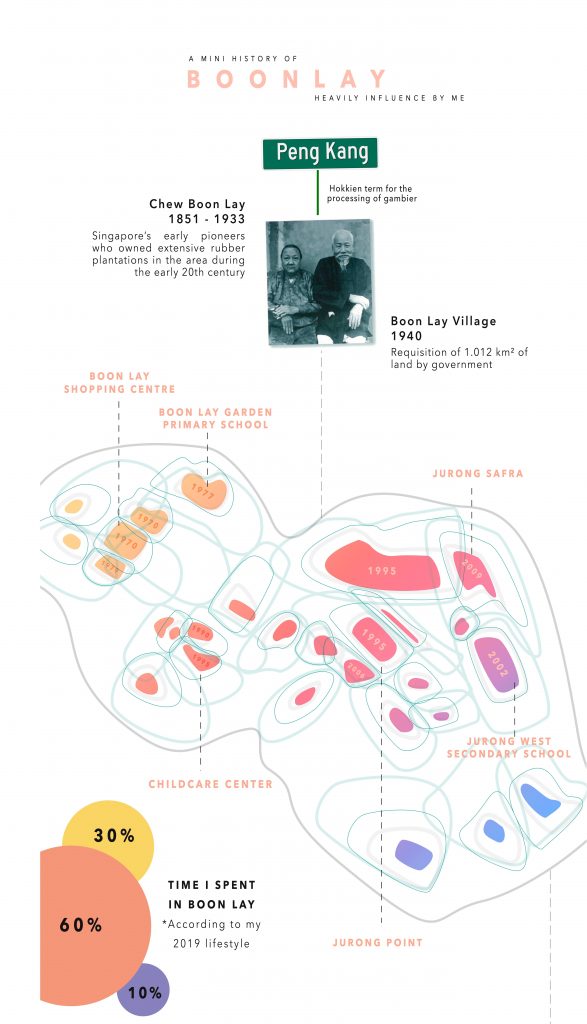
To get a better understanding of how to work with a booklet, I start by planning the flow of my zine. A one day trip around the vicinity of Boon Lay Place Market Place.
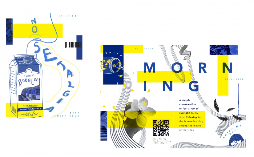
- Cover Page – Entering the shop of smells stored in jars.
- Morning stroll
- Food Paradise
- Weekly flea market under the HDBs
- Last Page – Leaving the shop of smells.
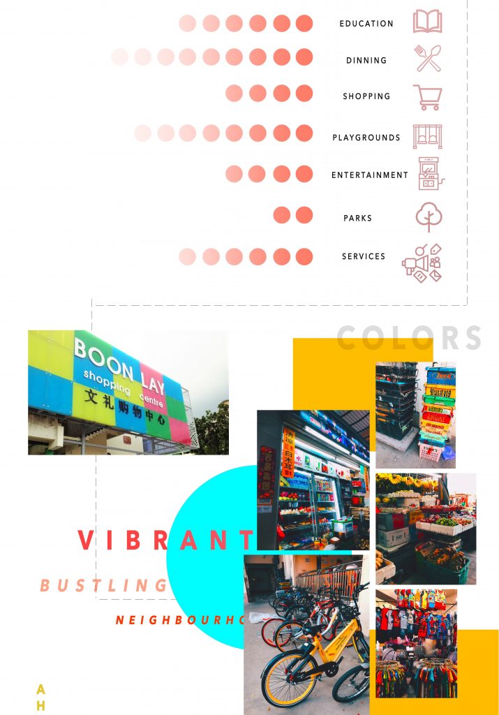
I attempt to experience the place myself with a written list of what did I see and what smell do I identify closest to. For this project, I chose to use LINES as my main principle of element and to use colors and textures to express my ideas.
I decide to use a mixture of line illustrations and coupled with photographs collages as my medium. Either using colors to further push the impact of the smell as certain colors do trigger a sort of visual which ties in with the sense of smell.

I mainly get inspiration from pinterest and there is one artist that I really enjoy her art style and illustration and humor of her zine.

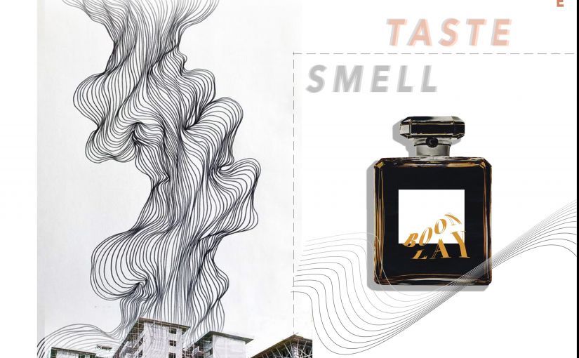
A collective of various distinguish smells – Fragrance, Floral, Roses, Fruity, Fresh, Lemon, Lime, Orange, Citrus, Wood, Minty, Chocolate, Bleach, Garlic, Durian, Toasted, Coffee, Bread, Pungent, Fishy, Smelly

COVER PAGE
Initially, I had the idea of using the display window of a shop with a bunch of different containers in various sizes and illustrate/collage all the smell that I am going to put in the next few spreads. Was planning to put some posters or “Enter” sign as well. I planned for the first and last page to be one continuous spread, so the back page will be the illustrate the back of the shop.

After sketching the layout, I felt that it was too cramped and there no not much of a hierarchy and no central focus. My second layout was inspired by a milk carton, I thought it would be a good focal element that I will be able to put more concise information on the sides.
At the start, it was only a wide range of blue monochromatic theme of different hue and saturation, but after exploring I realize I need another striking color to highlight the areas that I want the focus/attention to be directed to.
I wanted to use complementary colors of blue and orange, but I felt that it was a little too contrasting for my overall look of the zine. I wanted a more laid back feeling so even though the blue and orange combination helps to attract the audience attention but I felt that the pairing out yellow blue complements each other really well. Considering that this is not a one-page poster, but a multiple page booklet, it is more soothing, pleasing to the audience eyes.
Cold tone #25408f Blue and warm tone #fff200 yellow helps to bring contrasting visual on the spread.
FiNAL

MORNING STROLL
Keywords: Refreshing, Sunshine rays, Calming, Relaxing, Morning Dew
I think to back think back and took an actual walk to feel the breeze of a Sunday morning. I took note of the objects that I see whilst walking on that path, afterward I try to convey the smells into curvy lines. Using an actual photograph of several different styles of flower collaging them together to further push the relaxing Sunday morning mood.
Learning from the previous assignment, I stayed far away from any symmetrical layout and use attempt to use the rule of the third to create an interesting composition. I decide to use the line to bring a sense of direction and movement throughout the spread. I leave a good amount of white space so I have space to insert my text.

Overall I decided to use serif fonts as it gives it a cleaner and clearer visuals which help as my illustrations and background have heavy visuals.
One main title per spread with a short paragraph of words. Lastly, I added an even small numbered text in the page that acts as a background aesthetic element which is the postal code of the boon lay place. With three text element, it would be ideal to show hierarchy.
I sprinkled off with something extra, I really enjoy morning strolls and it always gives off a spring chill happy feeling, so I added my favorite indie music link as a QR code, something interactive to further feel the smell of the morning breeze. Hoping that it will stimulate the sense of hearing too.
FINAL

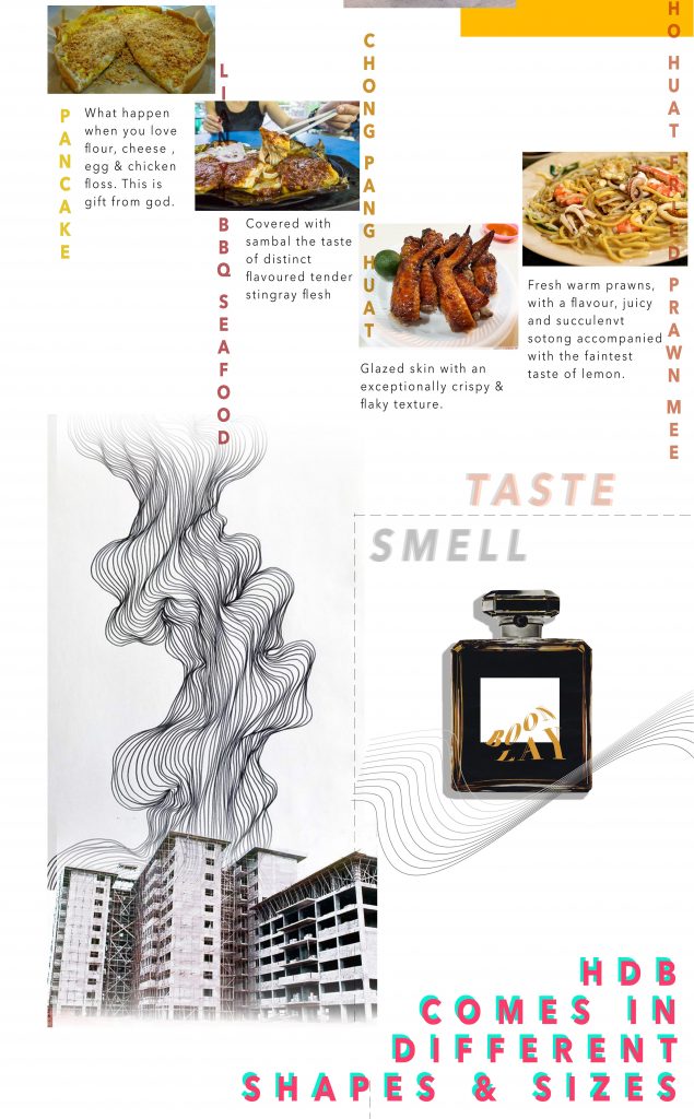
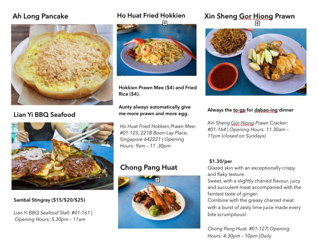
FOOD
Keywords: Spicy Samba Chilli, Mouthwatering, Rice, Salty, Wanton Noodles,
Using photoshop, I masked the red, black, white chicken image on to the ceramic spoon, which is an element well recognize in Singapore. Semiotics! hehe
I selected the spoon to be the main element and chose to illustrate the lines of smell surrounding the spoon. I was thinking of bar chor me spicy, so I wanted to add small pieces of chill flowing through the illustrated lines. I continue to add onions, carrots, mushrooms but it became very populated with lots of visuals, so I removed them.

By intersecting the repeating lines that curved around the spoon, the proximity of each line takes and form a space in the spread. By using variations of thickness and color saturation, I was then able to create a different amount of space in between each element. The lines help to move to stimulate a sense of movement and direction

FINAL

Flea market
Keywords: Old Books, Rubber Slippers, Soft toys, Clothes, Watches, Ceramics
![]()
I started with this spread first and upon working on the mixed of line illustrations, coupled with photographs collages. I felt that the colored images are very distracting as they come in a wide range of their own color schemes. Thus I use added the filter of “Black and White” to all my photography elements and it instantly became more pleasing to the eye.

I received some feedback that there could be a further distinction between the subject of focus. The hierarchy here was not clear as both the lemon and the fish are grabbing attention. Upon adjustment, I decided to make the lemon smaller by enlarging the fish to be 0.5 times bigger, this will help to have a better flow of the eyes to move in a direction.

BACK PAGE

I decide to use a collage method to illustrate my map, instead of just line and icons, as I hope it would be able to refresh the reader’s memory of the smell by placing the most impactful image on the map itself. I experiment around with the size and proportion of the carton as I wanted to have a good size of the map but at the same time leave some white space to show that it is the same carton on the first page. By using the principle of design of closure and figure, I am glad it went well as it was not too complex and distracting. Lastly, I added a small detail of the “list of ingredient” and put a bunch of food smelling words and finished off with my contacts.
FINAL

Reflection
YASSSS, I had so much fun <3 working on this project among the rest of the stressful modules. It really inspired me to make more of my own zine to share with my friends and family. When i went to print my zine, there were students printing photo book and binding them together, hope I would be able to make one of my own soon!
The change from the usual one-page poster to designing for a booklet was hard as I have to be aware of the folding areas which will determine my spread layout.
I think this assignment really made me realize how important placement is in a zine/booklet. I initially made the mistake of focusing on the illustrate that I want to portray that I neglected the placing of each element and the fonts were crucial to this assignment. Once I placed in the text, a lot of my initial layout had to change so that it will flow well in terms of hierarchy and direction flow in general.
Lastly, I struggle so hard with InDesign as it was so foreign and it was tempting to go back to using photoshop but I strived to use it to the best of my abilities. I think it is a good additional software to know and in the future, it would definitely be super. I also had the problem with blurry images on my computer and I manage to solve it by updating the link of my files.
It was super interesting and fun to play with this assignment and the sense of satisfaction upon printing the zine was amazing.
General feedback and areas of improvement
- The font size of the body size could be reduced significantly more
- The consistency of the line space throughout the whole zine