Recent Posts
Project 3: Research and Development

I started off the brochure project by researching on brochure design and applications of graphic elements.
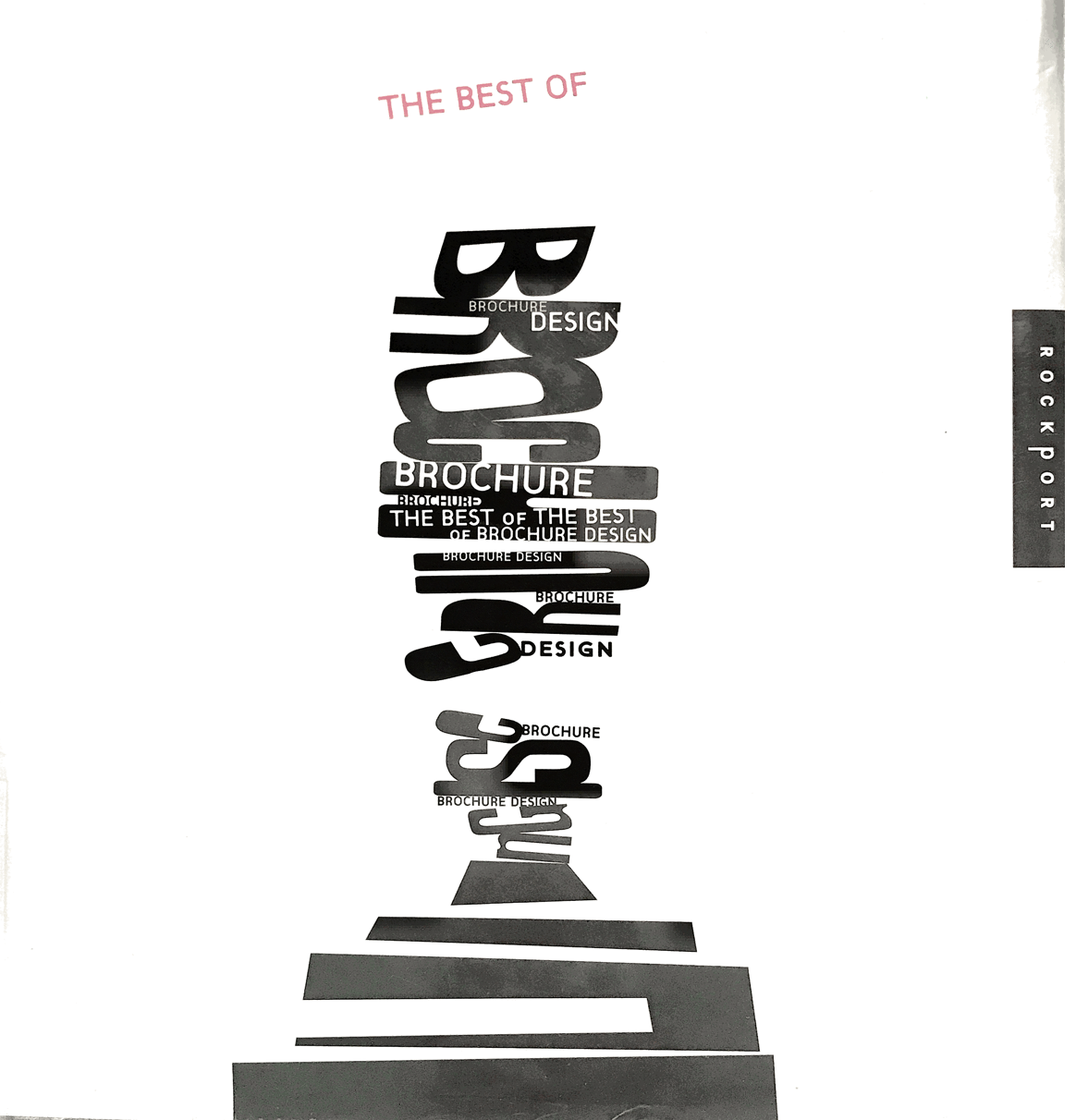
This book, titled The Best of Brochure Design, offered an insight into the process of making brochures.
I looked into handdrawn illustrations as a reference for its organic and friendly outlook.
I then looked into architectural brochures for their geometrical composition, clean simple lines Read more →
Work in Progress Check
Critic and feedback from one on one meeting:
currently the shapes compete over the body text – shrink down shapes integrate title to the bottom and integrate shapes into images remember margin crop image to tighten switch out the move with orange context need a sense of readiness the shape connection doesn’t need to be literal – broken lines title on the orange page or bold first line highlight art more keep Read more →Week 11: Work In Progress Check

Refinement Process With what I had last week, I proceeded on with the feedback given to me that I should include a captivating slogan (could be from the poster design) as it could better represent the overall theme rather than simply the generic lines of Arts & Health @NTF Hospital.
Also, the use of the pop up space at the back Read more →
Preliminary Design Review
Feedback and critic from peers and tutor:
colour as hierarchy – hot > cold, dark > bright – sequence orange first? mindful of the visual is the die cut for? – must have a purpose as it adds to the budget cost currently too bottom heavy cut out pictures to structure? has a sense of unity could move some shapes down be aware of contrast – visual vibrations – Read more →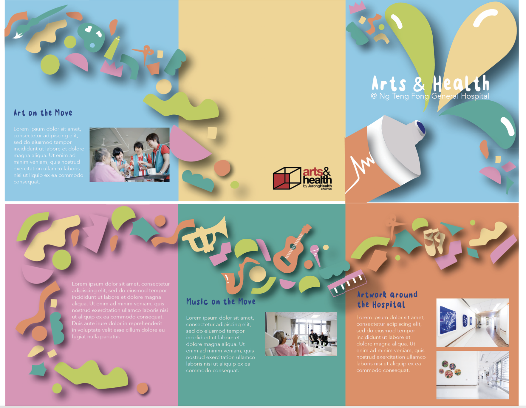
Week 10: Preliminary Design Review

Digital Translation With what I had last week, I proceeded on the feedback was given to me that I should include a captivating slogan (could be from the poster design) as it could better represent the overall theme rather than simply the generic lines of Arts & Health @NTF Hospital. I made use of the fold reference and redesigned a Read more →
Task 1: Designing Exploration
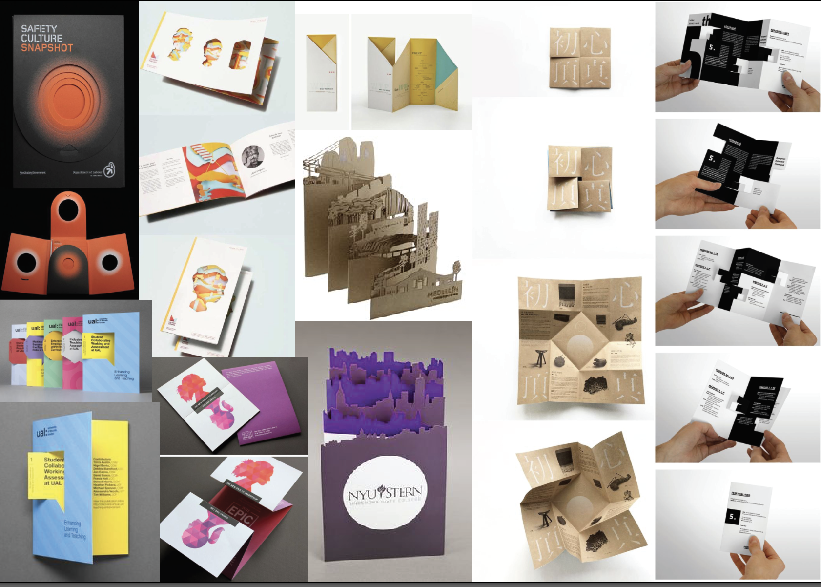
Existing brochure designs:
3 Favourites:
Using an accordion fold this brochure has been cut to create popups, surprising the reader when it is opened. This design is interesting and easily creates a rhythm with the eye.
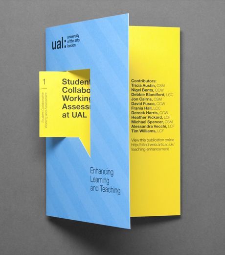
This brochure uses a die cut to highlight an element, the speech bubble.
This brochure is folded inwards using 4 panels. It is a fun way to Read more →
Week 9 : Design Exploration

Existing Brochure Design
I am always fascinated with origami folds. How it could unravel the message from within. I wish I could show more but here are three of my favourite designs.
# Numerical Order From Left to Right
Design Reference #01
Unravelling the fuller picture when unfolded. This technique of fold only require a slit in the middle while retaining the mystery of Read more →