Recent Posts
Assignment 2: Pencil Comps

I first did some brainstorming on an iso grid.
I looked at dimensions of the letters and decided that ~5×3 looked the best, which makes sense because 5×3 measurement is a widely agreed upon good design practice. This version does not have the dimensions included but they should be.
I traced the first comp to make a version with no iso grid. Read more →
Assignment 2: Thumbnail Sketches

The big decision that needed to be made in this stage was the phrase to be illustrated. I considered what a designer reading Varoom might be obsessed with. I made a word association chart as a class activity but ultimately my final idea came from elsewhere.
There is one thing all designers are simultaneously obsessed with and enraged by: Kerning. When Read more →
Assignment 2: Mood Board

My mood board includes several dimensioned technical drawings and exploded view drawings of letters because I would like to illustrate isometric typography for this assignment. I have included lettering from horror posters because I admire the energy and drama evoked by this type of typography and would like to attempt to emulate this emotion with my project. As for the Read more →
Assignment 2: Persona

For this assignment, we are required to create a persona. This person is a user of Varoom magazine, and our designs must appeal to them.
—— Research ——
I did a bit of research by looking at demographic statistics in the design industry and drew some conclusions as to what my user should resemble:
I decided that my user should be someone in Read more →
Assignment 2: Theme
For our second assignment, an editorial illustration for the cover of Varoom magazine, we were given the option of designing for the theme of “obsession”, “style”, or “empathy.”
I chose “obsession” because I want to experiment with engineering drawings and illustration, and I think this theme will lend itself well to that medium. I want my final piece to be an intricately, Read more →
Thumbnail sketches and development of concept
Theme & Concept : Obsession
Below are some thumbnail sketches of trying to portray the obsession for Christmas!
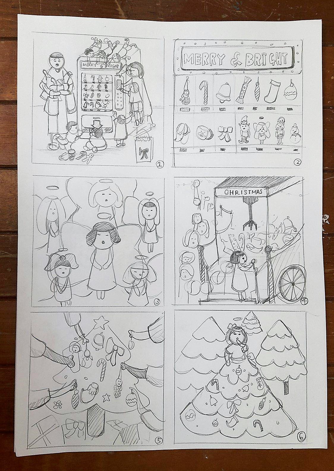
Idea 1: Family trying to get Christmas stuff from the vending machine / The father looking exhausted from carrying all the stuff his wife and children got
Idea 2: A close up of the vending machine and the things sold inside it
Idea 3: A Read more →
Inspirations & Ideation

PROJECT 2
Our second assignment is to create an illustration for editorial. “Varrom” will be the target magazine we will be working on. Looking at varroom, I could it’s magazine created for designers and those who are interested in illustrations and the Arts. There is a weird and dark twist in their topics, focusing on strange stories from people Read more →
editorial illustration #3: user persona & target demographic
Varoom magazine’s audience are:
Millennials & post millennials → 20’s & 30’s, possibly late teens? (17+) About to enter or already in the workforce → purchasing power Dedicated to their craft, or have a creative interestTheir goals/expectations from varoom are:
To discover new artists Keep up to date with latest visual trends Gather inspiration & references for personal work Expand personal library of Read more →Editorial Illustration #2: updates on concepts
Hello! It’s been quite a week. I left the previous class feeling more lost than ever but after some soul searching and more sleep (ok mostly sleep) I’m back with some ideas on how to tackle the deceptively simple but actually really complex theme of style:
style as zeitgeist
SO I chanced upon this article that defines style as a Read more →
Design for illustrators: Assignment 2 process
For our second project, we are commissioned to create an illustration for the front cover of bi-annual magazine, “Varoom”. We are able to pick from one of the three themes, style, empathy and obsession.
Choosing a theme:
Here are a few very rough mind maps I did to explore the three themes before narrowing on a final one.
I then decided that the Read more →