Category: Assignment 2 – Research & Process

The 3 Pencil Comps

Sketches 1 and 2 are linked to the vending machine concept as said in the previous post. Sketch 3 is a more detailed sketch of a little’s girl’s obsession over a gingerbread house . I am personally leaning towards sketches 1 and 3 but still can’t seem to make up my mind on which one I want to work with! What do y’all think? Any suggestions and feedback are welcomed!:)


Thumbnail sketches and development of concept

Theme & Concept  : Obsession 

Below are some thumbnail sketches of trying to portray the obsession for Christmas!

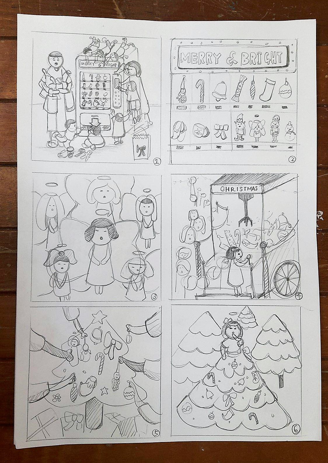
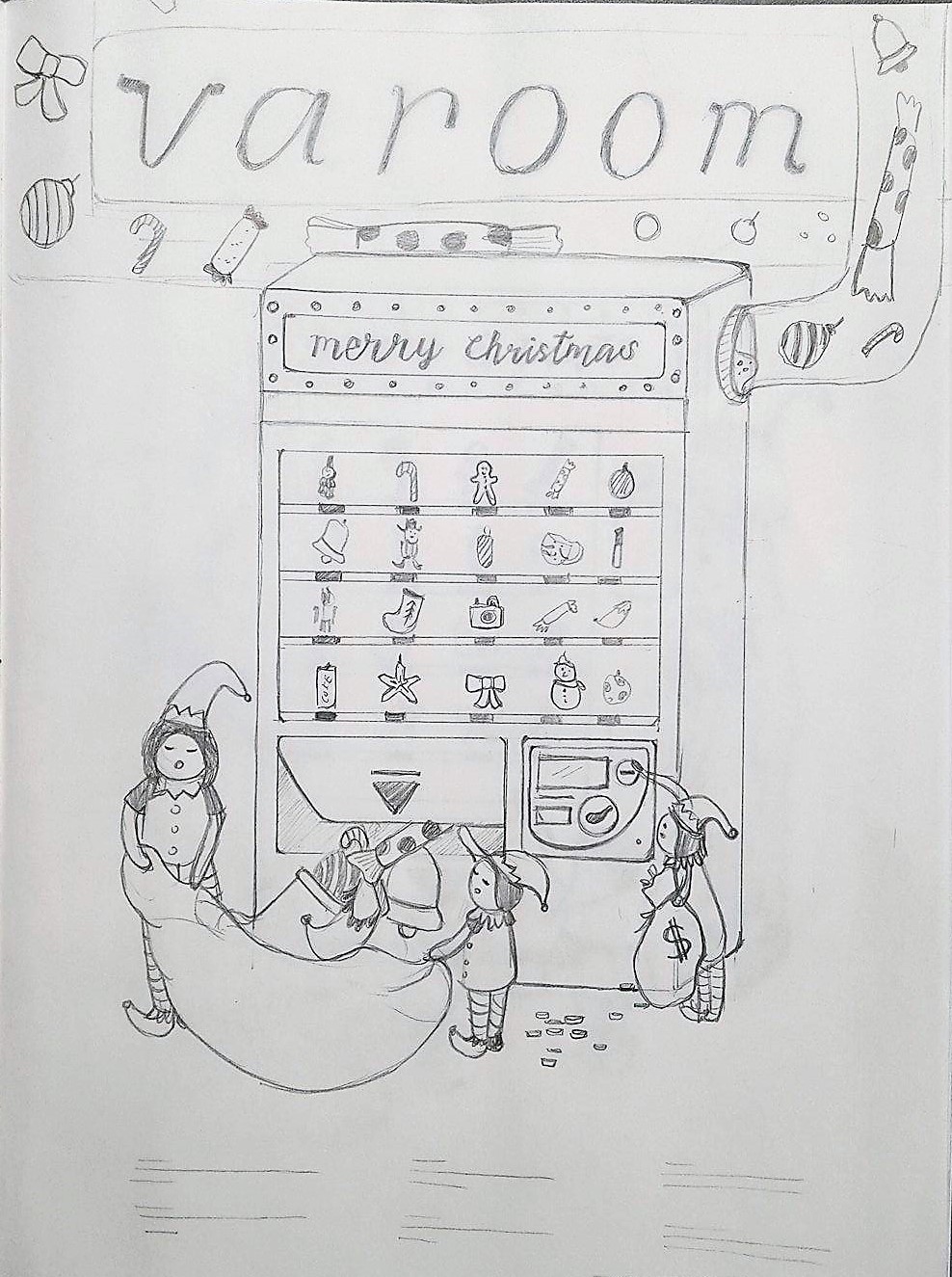
Idea 1: Family trying to get Christmas stuff from the vending machine / The father looking exhausted from carrying all the stuff his wife and children got

Idea 2: A close up of the vending machine and the things sold inside it

Idea 3: A composition of angels clouding the whole space

Idea 4: Young and old queuing up to give a shot at the huge claw machine filled with Christmas goodies!

Idea 5: Everyone helping to decorate the Christmas tree!

Idea 6: Girl wearing  a Christmas tree skirt

Idea 7: Family buying stuff for Christmas during sale

Idea 8: Girl eating off a gingerbreadhouse

Idea 9: Wreath filled with Christmas ornaments

Idea 10: Elves helping santa to move gifts around

Idea 11: BAKING COOKIES !!

Idea 12: Elves helping to decorate the Christmas trees


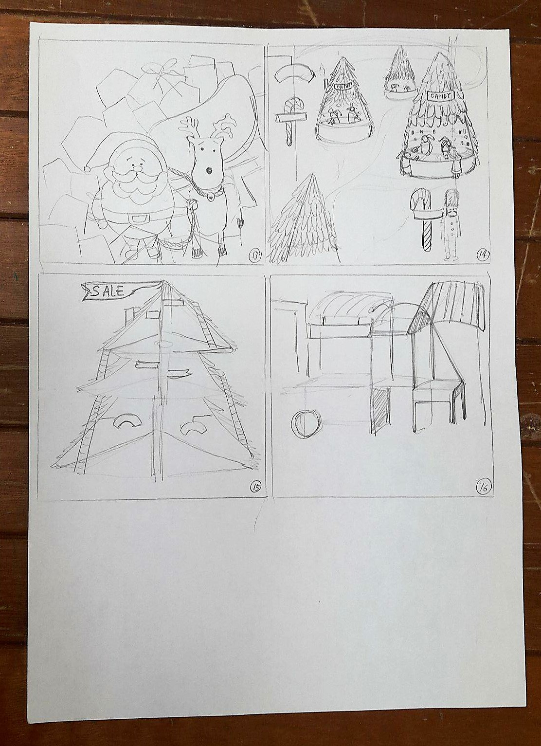
Idea 13: Santa feeling  stunned over the amount of gifts he has to send out

Idea 14: Christmas market

Idea 15: Different levels and section of the Christmas tree selling different items

Idea 16: Many rows of Christmas stalls

Choice of idea after feedback 

Idea 1, 4 and 8

  • Idea 8 shows the obsessiveness of Christmas by the way the child is aggressively chewing off her gingerbread house.
  • Idea 1 and 4 shows busyness and also fits the theme of Christmas.

Suggestions: Use Idea 8 as a main focus and combine the busyness of Idea 1 and 4 into it (eg: by adding snowflakes/ornaments/more crumbs/ mess on the floor to fill up the space)


Mood board, user persona and target market

MOOD BOARD 1

-classic
-sparkly/glittery
-bold red, green and gold 
-bright/glossy
-wonderland/fun


mood board 2

-vintage 
-faded/muted
-reminisce 
-collection
-newspaper/story/narrative

User persona and targeted market:
target market: female / anyone who loves Christmas!
age:18-30
occupation: working adults and students in the creative field / (anyone who loves creative graphics/appreciates/collects them!)

Editorial Illustration ( research and inspiration )

Research on Illustrators and editorial magazines.

  1. Joanne Poon

This was a poster designed by Joanne Poon for a circus event! I love how all the colors helped to make the event look inviting and fun! The poster along with the other information templates looked unified and belonging to each other too. I think that it is a very successful poster not only because it managed to grab the audiences’ attention but it  also managed to accommodate important information into the poster yet not making it look  overcrowded and messy!

2. Marta Leshak

Martha Leshak is a designer and illustrator that is passionate about children’s book and folk topics! These are some of the plots from a  series of paper cutting illustration she created to  reflect children’s representation of incomprehensible sayings and phraseologism. I love the color that she chose for her target audience that are very pastel and baby-like colors! She managed to create another world of its own in her illustrations and I find that it is a very important element to incorporate into the cover of a magazine design in order to captivate the eyes of the viewer!

3. Hee Eun Lee

POSTER2017 제 6회 대한민국 도시농업 박람회The 6th Korean urban agriculture Expo[농작물음악제 포스터_ 딸기 콘서트 / 감자 콘서트]  contact_hikikomolee@gmail.cominstagram.com/hikikomolee

농작물 음악제 포스터 - 브랜딩/편집 · 일러스트레이션 · 파인아트, 브랜딩/편집, 일러스트레이션, 파인아트, 그래픽 디자인, 일러스트레이션

POSTER2017 제 6회 대한민국 도시농업 박람회The 6th Korean urban agriculture Expo[농작물음악제 포스터_ 딸기 콘서트 / 감자 콘서트]  contact_hikikomolee@gmail.cominstagram.com/hikikomolee

The design of this illustrator is very pleasing to the eye as she uses muted colors and rounded edges to create her designs! The right way to welcome people to the concert! 🙂

4. The New Yorker Magazine

New Yorker August 2nd, 1958 by Arthur Getz

New Yorker August 2nd, 1958 by Arthur Getz

Ilonka Karasz : Cover art for The New Yorker 1710 - 23 November 1957

Ilonka Karasz : Cover art for The New Yorker 1710 – 23 November 1957

Constantin Alajalov Christmas Store New Yorker Cover (December1949) Back in the day, stores actually gave you boxes that were boxes and you didn't have to line up in some obscure corner of the store to get them either.

Constantin Alajalov Christmas Store New Yorker Cover December 1949

May 6, 1939 (Ilonka Karasz)

May 6, 1939 by Ilonka Karasz

The New Yorker - Saturday, May 30, 1931 - Issue # 328 - Vol. 7 - N° 15 - Cover by : Barney Tobey

May 30, 1931  Issue # 328 – Vol. 7 Cover by Barney Tobey
 After looking through quite a number of The New Yorker’s Magazine, ( especially the older issues, as seen above) I am in awe of how the artists managed to create  and compose complex pieces of cover magazines yet not overcrowding the whole page!