Illustration for Design: Assignment 2 process pt 2

After creating the basic shapes required for the final composition, I then looked into creating compositions for magazine cover, which was extremely tough for me in the beginning as I was lost, not knowing what outcome I wanted to have exactly in the final product.
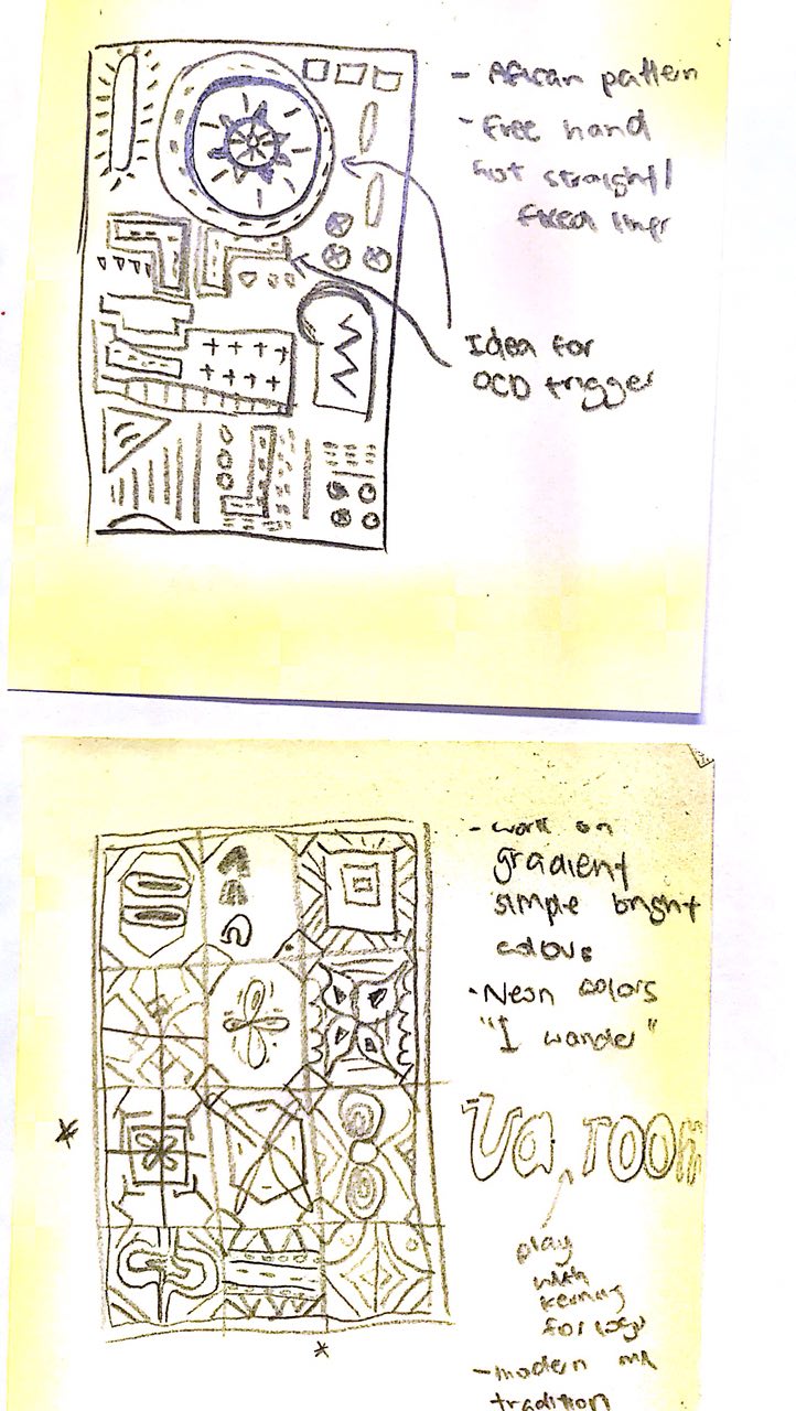
Version 1

Version 2


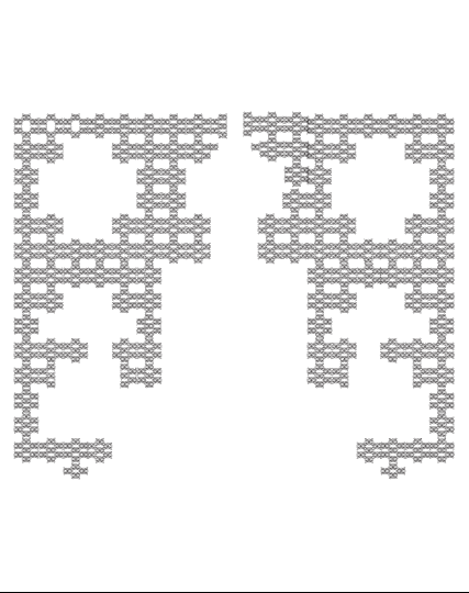
This was what I had in the beginning, playing with the layout of the different elements. As you can see on the diamond shaped elements on the right, it is was done by combining individual shapes together. However I was unsatisfied with the final product.

After showing it to the people around and asking for feedback (which is super greatly appreciated!), it showed me what was the issue of the work:

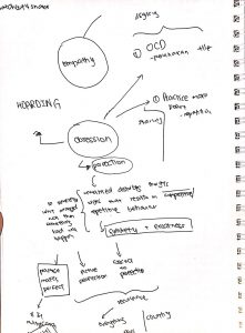
  • I wanted to touch on the theme of obsession, besides the trigger aspect of the whole work I also wanted to show obsession through the repetition and detail that is poured onto the work. However, it is not translated onto this
  • Everything is too consistent and symmetrical, the layout can be played around with so much more

I believe that it is because I did not have the final product in mind, keeping in mind of what I want the user to feel through the piece of work.

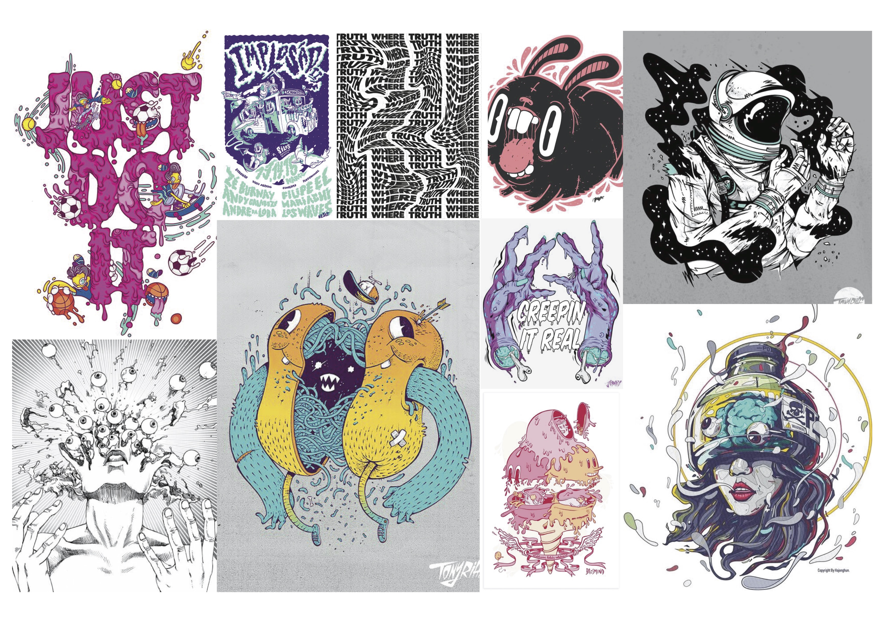
Hence everything was scrapped and started on a new piece of work, studying my inspirations; Marian Bantjes and Peranakan even more. I forced myself to think the same way of its created, the combination of different elements to form one huge one.

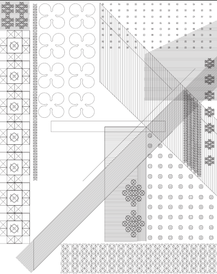
That was when I started playing around the one of the 9 elements that was created, and it can form this:

From here onwards, I started to create a base for the entire layout.

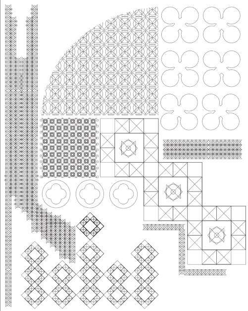
From here onwards, it was much simpler to create the details within the gaps. I also created a frame for the entire piece as I liked the way it looked. Here are a few of the shapes that was created closeup!

These were rough combinations I tested out before including it into the final work. Below is a rough sketch before finalising and adding in even more details into the work, guidelines also helped me to imagine the layouts that could be played around in this piece.

Rough sketch before adding in more details, noted the various guidelines which kept me in check throughout the process

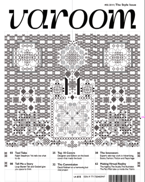
After adding in more details!! The final work before colouring

I then started to work on the colours and initially tried to use neon tones as said in the pervious tones, but because there was so much details in the piece the colours that was planned look too much. Looking back at Marian Batjes work, only simpler works uses more colours wheres detailed works like these were mostly plain (she uses black backdrop with gold strokes for the lines).

Hence various colours were tested out before finalising on the work:

I somewhat like the bottom right colour depite it not being neon, the grey against the black looks cool!

After settling on the final colour, the work is then moved around for the “trigger” aspect I was looking forward to in the beginning. But now, because of putting so much into the work it was saddening to destroy it haha. You can view the final post here, where the two diff versions are uploaded 🙂

Reflection:

It was a learning curve to reach the final product that I am extremely pleased with, of course with the help of many who gave the necessary feedback. Initially there was a lot of fear of choosing such style for the editorial, as it was completely different from what the rest was doing.

However with the encouragement of Lisa I decided to take the plunge and push myself onto unfamiliar grounds, which resulted in me finding joy in creating works of these kind which I would definitely try again in future!

I think that like what was suggested during class presentation, I do agree that there can be patterns around/above the Varoom logo, as after looking at it again the bottom seems heavy compared to the empty top. Though I did not submit that for the final grading I would edit it in what was suggested and place in my portfolio.


Illustration for Design: Assignment 2 process pt 1

In order to create patterns for the editorial design, I decided to go for the idea of creating patterns and alter it to “trigger” people due to design mistakes like misalignment, inconsistent colourings and the likes.

Lisa introduced me to a particular artist who creates beautiful patterns, Marian bantjes. Her book, “I wonder” is available in the ADM library. Here was a few of her works that inspired me to create my final product.

Then I looked into Peranakan, moroccan, and islamic tiles as I personally love its patterns. These were heavily referred to throughout the whole process of creating the final work, as this gave me an idea of how to create a pattern and inspired me to combine sets of element together to produce a product that looks cohesive as a whole.

I had the basic understanding such patterns and the works of Marian bantjes were created from repetition of basic shapes. So to kick of the entire project, I started creating basic shapes inspired from the works above. These 6 patterns and shapes was used in the final composition (besides the addition of other basic shapes like rectangles and circles), despite the complicated look it has, which people think was a combination of many different patterns.


I also initially looked at different coloured schemes that would appeal to my initial target audience. Initially my moodboard was blue and white, mainly inspired my chinaware ceramics. But of course such colours might be boring hence Lisa and I agreed that bright neon (inspired from one of Marian Bantjes works below) would be a great addition to complete the work. 

Therefore below is a few sets of colour schemes that I played around with before progressing onto the work.

However, at this point I was thinking that the colour might be too bright and too much for the patterns that would be created in the final composition. But I decided to just keep this concern in mind and progress with exploring different compositions first, which is expounded in the next post!

Design for illustrators: Assignment 2 process

For our second project, we are commissioned to create an illustration for the front cover of bi-annual magazine, “Varoom”. We are able to pick from one of the three themes, style, empathy and obsession.

Choosing a theme:

Here are a few very rough mind maps I did to explore the three themes before narrowing on a final one.

I then decided that the most promising topic that I could work on is obsession, which definition from dictionary.com stated that it is an idea or thought that continually preoccupies or intrudes on a person’s mind. Upon being introduced to some strategies for divergent thinking, which aids in developing ideas and creating conceptual links to the theme, I expanded my thoughts for the specific theme.

Thinking of the theme word obsession reminds me of a phrases/metaphors in the word association chart:

Concept 1: Practice makes perfect

Regular exercise of an activity or skill is the way to become proficient in it.

This remind me of how I learnt chinese spelling, multiplication, and numbers during my kindergarden years. Writing and rewriting the words till it is ingrained in my head. There was once in kindergarden I actually vomit during class as I had a headache and my teacher did not allow me to take a break. I guess that was when my hatred for numbers stem from haha.

Concept 2: An aspect of OCD, Obsessive Compulsive Disorder.

More specifically, the aspect where there is a need for the individual to have items ordered in a certain way (for example, according to color, size, or facing a certain direction). Children and teens with this type of obsession are either anxious because “it just doesn’t feel right” or because of a superstitious belief that something bad will happen (e.g., “if my shoes are not arranged properly, my mom will die!”). 

This is because of how people these days are so obsessed over the idea of perfection.

A lighter take on this topic reminds me of everyday things that just triggers people for the lack of completeness, below are some things that is an example of such:
 How does it feel for you to feel? Does it trigger you?


Target Audience

From these two concepts, I narrowed and picked a specific target audience. I believe a key aspect that the TA require is appreciating humour. Moodboard:

Concept 1: Practice makes perfect

Lisa suggest taking a literal approach to my real life experience, by illustrating vomit into the cover, and I think it is such a quirky approach!


Concept 2: “OCD”, obsession with perfection

For this, I thought of playing with tiles and illustrate it in such a way that triggers people. For example, not aligning a square with the rest of the tiles, which is quite fun and different!


That is all for now, excited for this project.