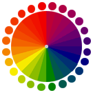
Colour – the visual perception of electromagnetic radiation by the eye that falls under the visible light spectrum; it is a continuous spectrum of colours varying from red (infrared) to violet (ultraviolet).
Between the colours red and violet in the visible spectrum of light, the continuous variation creates an infinite number of colours of varying shades, saturation and vibrancy. Hence, I will discuss a few basic colours and 2 basic colour systems right under the cut!
Warm and cool colours

Warm colours: Red – Yellow

Cool colours: Green – Blue – Violet
Colours can be broadly classified into 2 categories: warm and cool colours.
Warm colours mainly consist of the transitional spectrum between red to yellow. These colours are often perceived as warm, energetic, passionate and positive. They are also often associated with fire, heat, autumn, sunrises and sunsets.
On the other hand, cool colours mainly consist of the transitional spectrum from green to blue to violet. These colours are often perceived as cool, calm, collected, peaceful, passive and relaxing. They are also often associated with cold, water, nature, winter.
However, it should be noted that these categories are not hard and fast and can often be interchangeable e.g. a red with a blue tint can be said to be a cool red compared to an orangey coral, while a green tinted with yellow can be said to be a warmer green compared to a cool blue shade like turquoise.
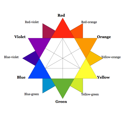
Primary colours

Red
Red is one out of the 3 primary colours, and can be said to be the most visually impactful one. It is often associated with passion, fire violence warfare and danger – its immediate visual recognisability (esp in its pure saturated form) has made it a very commonly used colour on danger signs. In nature, its vibrant nature has lent itself well to different organisms, either to attract (e.g. attracting bees to flowers) or to warn of danger (e.g. poison mushrooms). Due to its strong impact and vibrancy however, too much use can lead to a design being too “loud” and overwhelming.

Yellow
Yellow is the 2nd primary colour, and it can be said to be the brightest one. It is commonly associated with the sun, happiness, positivity. It is also commonly associated with danger, with its common application in caution signs, but to the extent of red. Out of all the primary colours, yellow appears to be brightest in that it presents the least contrast on a pale/white surface due to higher amount of light rays reflected off yellow; this means that too much yellow in a design on a pale background can make it too blinding and hard to decipher.

Blue
Blue is the last of the 3 primary colours, and it can be said to be the most passive, “dark” one. It is commonly associated with the night, the sky, water, sadness(melancholy) and calmness. Blue appears to be more subdued and receding compared to the other primary colours, hence it gives off an aura of calmness, stability and responsibility. However, too much blue in a design can feel too static and unmoving.
Neutral colours

Black

Wihte
Black and white and the two basic neutrals with the spectrum between them creating an infinite number of neutral shades (grays). They are complementary colours, with one “opposite” of the other – the stark contrast between them is highly readable and thus can be manipulated to create easily readable text and interesting design.
The two colour systems – Additive and Subtrative
The colour systems that an artist or designer uses is dependent on the medium one is using; and the 2 systems use different methods to achieve a particular colour/shade. The terms additive/subtractive refer to the manipulation of colours with respect to light to form the desired hue.
Subtractive System (CMYK)


When mixing paint either from the tube or while printing, the system used falls under the subtractive system. Subtraction color mixing means that one begins with white and ends with black; as one adds color/pigment, the result gets darker and tends to black. In terms of light, as one subtracts certain wavelengths of light from the visible spectrum, white light gets darker and darker and eventually transitions into black.
Additive System (RGB)


When viewing colours from a screen or a computer, the system used falls under the additive system. Additive color mixing begins with black and ends with white; as more color is added, the result is lighter and tends to white. In terms of light, different wavelengths of coloured light are converged onto a infinitesimally small point until it forms pure white light.
You must be logged in to post a comment.