Colour Harmony
In design and the visual arts, colour is an important element in bringing out the best parts of an image – if the image is visually uninteresting, the viewer is disengaged; if the image is visually too chaotic, the viewer gets confused at what to look at. Hence, the use of colour harmonies or colour schemes become significant in its use to create a proper hierarchy for an image for it to be visually balanced.
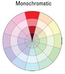
Monochromatic
Rather than an actual harmony, monochromatic harmony consists of a single hue and varying tints of that colour. This harmony is typically low in contrast and visually homogeneous but it is considered pleasing to the eye and easy to apply with good result.
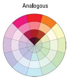
Analogous
Analogous harmonies consists of a few colours adjacent to each other on the colour wheel. Typically, one colour will dominate with the other 2 or 3 as accent colours. As they are next to each other on the colour wheel, this harmony typically produces little contrast and instead creates unity and consistency in the colours without being too monotonous.
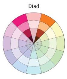
Diadic
The diadic colour scheme consists of 2 colours one space away from each other in the colour wheel. Although the diadic scheme is still pretty harmonious due to the similarity in hue, it is unlike the analogous colour scheme as the slight gap between the 2 colours produce a slight contrast between them.
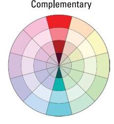
Complementary
The colours in a complementary colour scheme are typically 2 that are directly opposite each other in the colour wheel; this scheme is the easiest way to bring out the most contrast in an image and can be used to make an image more striking. However, due to the high contrast, excessive use of this colour scheme without proper balance can make an image look jarring and hard to read.
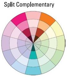
Split Complementary
The colours in a split complementary colour scheme are derived from the two colours adjacent to the original colour complement – this still creates a great amount of contrast between the 3 colours but not to the extent of the direct complementary colour scheme. Due to the high contrast between the colours, proper care must be taken when using the colours to create a visually coherent image.
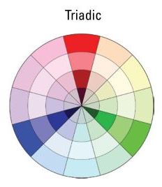
Triadic
A triadic colour scheme consists of 3 colours equally spaced from each other in the colour wheel -their equidistance from each other creates equal contrast between each other and thus creates a overall vibrant colour palette. They are considerably harder to recognise (as a colour scheme) and appear comfortable to the eye.
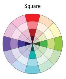
Square Tetrad
A square tetrad colour scheme consists of 2 primary colours and 2 secondary colours spaced equally between (and opposite each other in pairs) in the colour wheel. The positioning of the colours in the colour hue mean that the resulting colour scheme is extremely vibrant. The square colour scheme works best with all 4 colours used evenly in an image to balance out each other.
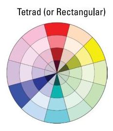
Rectagular Tetrad
In a tetrad colour scheme, one can have 2 primary colours with 2 secondary colours, or 4 tertiary colours – this gives a wide variety of colour combinations to choose from but also makes it harder to juggle to create a visually balanced image. The colours, if not handled properly, can also tend to appear muddy – hence fixing one as a dominant colour and the rest of the colours as accents is a good way to balance this colour palette. The variety of hues in this palette also makes this colour scheme hard to recognise.
You must be logged in to post a comment.