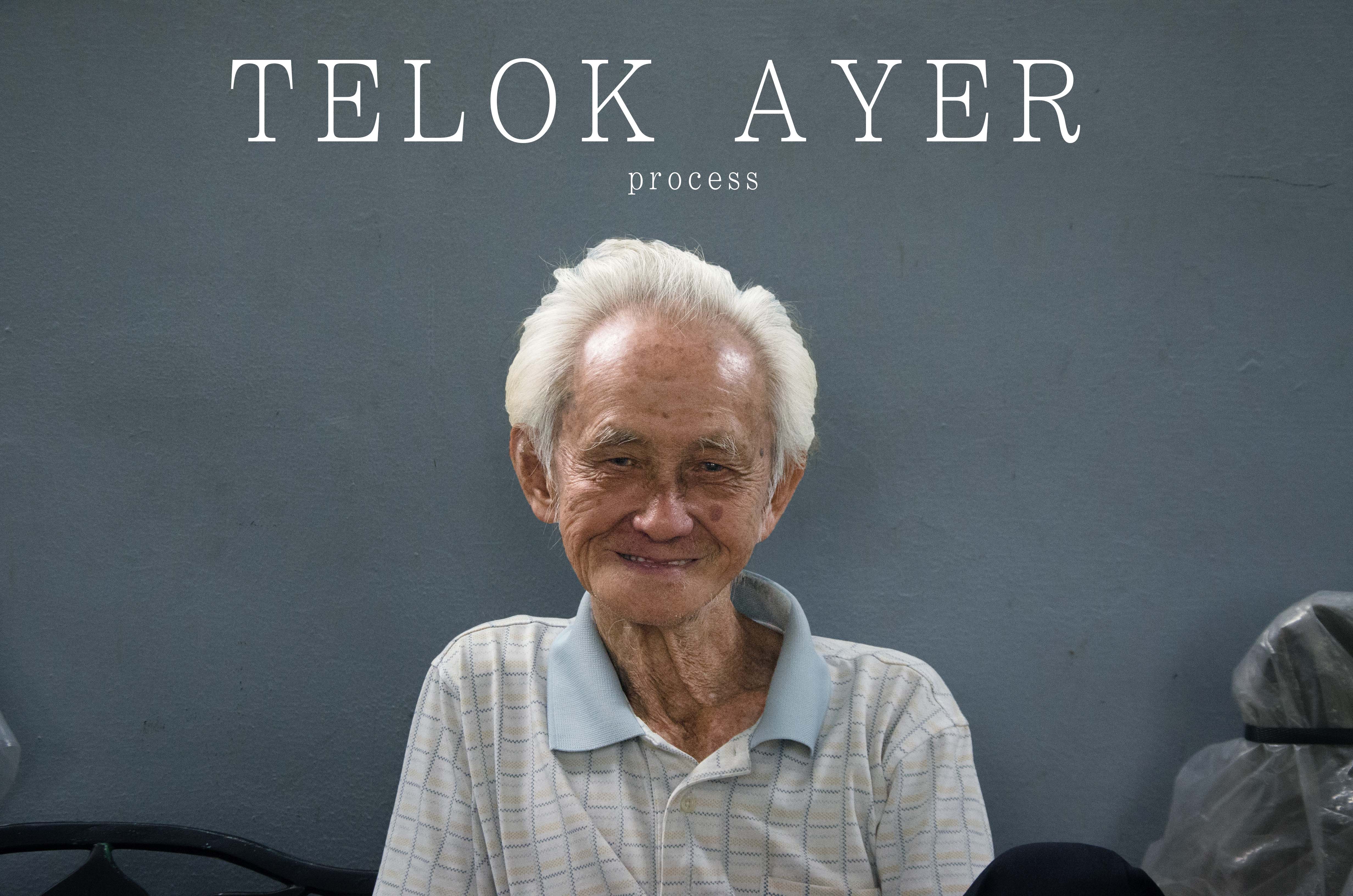
終 。 始 – Gallery
Leave a reply
This is my final design for my Zine.
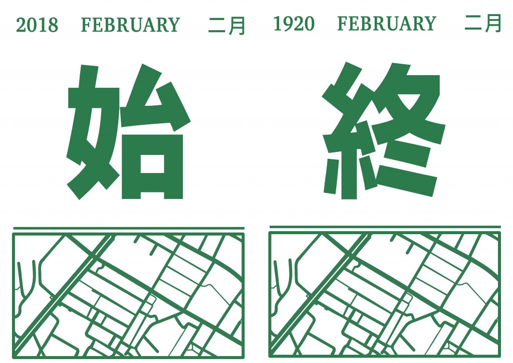
Page 1 & 8
I decided to design the cover page with reference to the traditional Chinese calendar, as it was a subtle message to indicate that it is related to the overarching theme of time. Since it was a 2 way zine, it does not matter which way the reader starts off from.
終, zhong – end
始, shi – start
The usage of using Chinese words is to represent the saying of the end is the start of something new. In the box, I drew out the map of Telok Ayer. I decided not to include the location in because it would be a little tacky, hence I included the map.
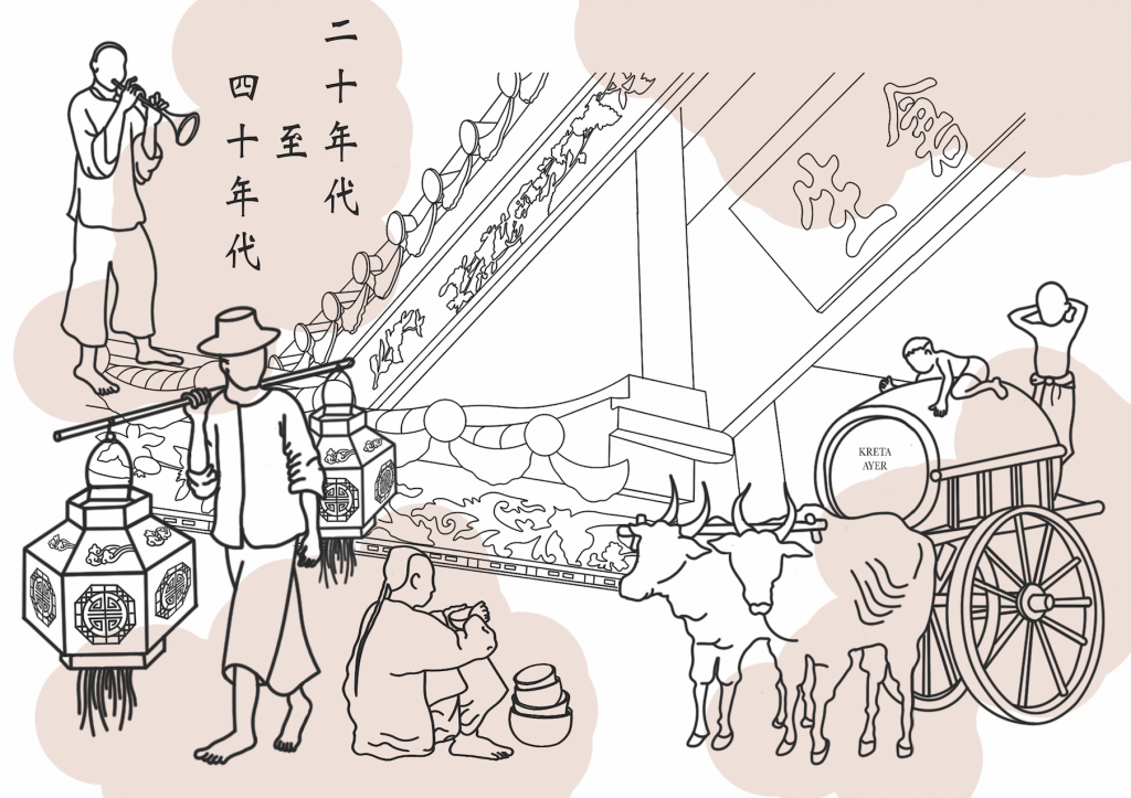
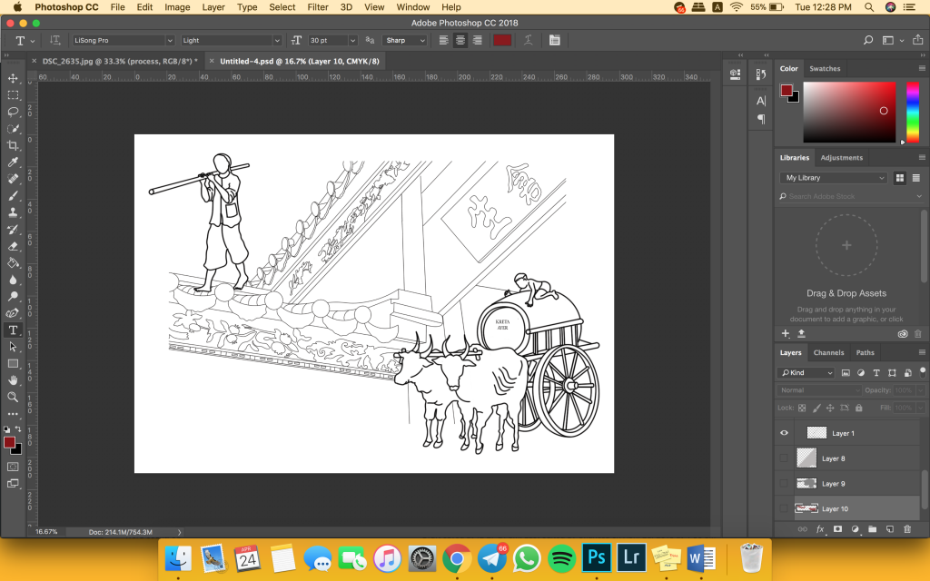
Page 2 & 3 (1920s – 1940s)
Thian Hock Keng Temple:
One of Singapore’s oldest temple. Though it was not built during the 1920s (but earlier), the idea of new immigrants coming in to Singapore, and using the temple as a place of worship, gave it life, creating its mark during the era.
Bull cart:
Chinatown is known as “gu chia zui“, in hokkien. “gu” – bull, “chia” – car/cart, “zui” – water. Hence, I felt that it was significant to draw the bull cart, to show how Chinatown got its name.
Immigrants:
I wanted to show the jobs that the immigrants were doing, hence the variation of jobs, from carrying the lantern, to selling food by the road side (man sitting down).
Red:
The usage of red connotes the meaning of blood, and blood represents life. Hence, the red patches represents the new life that settled in Singapore. In addition, I made it a point to highlight the time stamp in red, to represent how the time and era is significant.
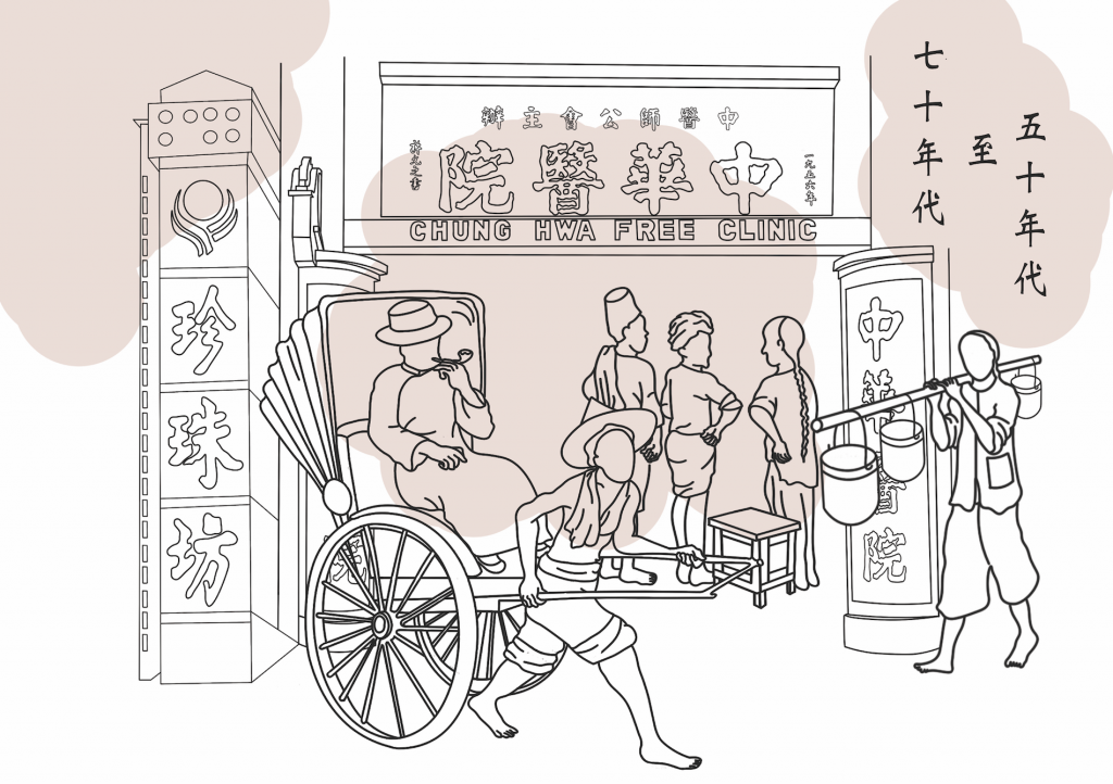
page 4 & 5 (1950s -1970s)
Chung Hwa Free Clinic:
It started in 1956, after WW2 ended. It was a significant building as it was the headquarters and main clinic of SCPA. The clinic provided TCM to the citizens, and helped the needy and poor, serving the community, making it a better place.
People’s Park Complex:
It was the first of such shopping complex in the whole of Southeast Asia during the 1970s, and hence making it significant in the history of Singapore. Furthermore, its iconic building and colour makes it difficult for people to forget.
People:
There are 3 distinct group of people in the drawing itself.
Man holding buckets(right): Indicates the mode of transport back then, and how it is common to be walking around barefooted.
A group of men talkings (centre): The idea of interracial forming, which makes up Singapore’s today multi-racial culture
Man on trishaw (left): This shows the evolution of transport, from foot to trishaw.
Red:
The red patches in this case represents the life loss during WW2, and the start of a new country where Japanese have withdrawn from Singapore. The placement of the red patch in the centre, mimics the Japanese flag, indicated the previous invasion by the Japanese.
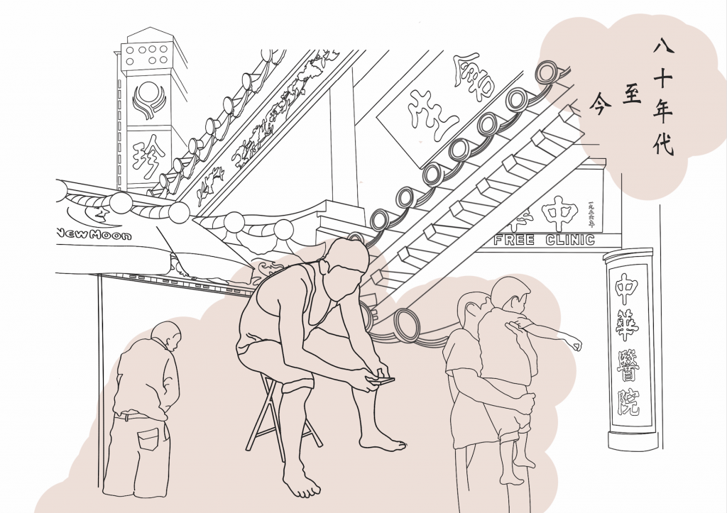
Page 6 & 7 (1980s – today)
Background:
I fused both old and new together, as Chinatown is a representation of co-existence of old and new. I combined the Thian Hock Keng Temple, with the new Buddha Tooth Relic Temple as one. In addition, I included Chung Hwa Free Clinic and People’s Park Complex, as they are still buildings that exist today. However, the usage of it did change. Chung Hwa Free Clinic is now a hipster cafe, whereas People’s Park Complex is a place that consist of many travel agency, with a cool carpark where youth goes to take pictures.
People:
It consist of 3 different generation, starting from the left.
Left: The New Moon Umbrella reminds me of the uncles that sit under it, hence it represents the oldest generation.
Centre: Middle age man that is glued to his device, showing the transition from nothing to electronic device.
Right: A father with a child. The idea of it is to show the passing of generation, and how people from our grandparents generation have since passed on Chinatown to us, for us to preserve it.
Red:
This time round, the red represents the new life, which is us, the new generation.
Reflection:
The process of developing this zine was not easy, and I encountered many problems along the way before churning out this final product. However, despite the errors along the way, it was a fun journey, and also an assignment that forces me to get out of my comfort zone. I explored into this whole new drawing style that I never thought would work out for me. The challenge of exploring a new place, to be away from where I was comfortable in was indeed tough but also a fruitful one.
Hence, this concludes my zine, and also my final submission for Year 1.
Signing out!
xx
Thanks Mimi for your guidance this whole academic year!
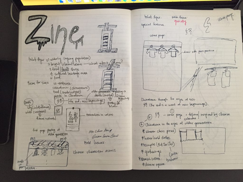
As mentioned in the previous post, I decided to change my idea once more, and settled for the overarching theme of Time – the end is always a start to new beginnings.
Before starting, I decided to plan my layout, to avoid making the same mistake as my previous idea, where I get stuck. I drew out the rough layout, to have my thoughts settled in place. 
While planning, I decided that it would be interesting to tell my story with a 2 way zine, where one get to read it both ways, since it is in a chronological order. Therefore, with this idea, I went for consultation with Mimi once more to get the green light. Below was the sketch showed to Mimi, during the consultation.
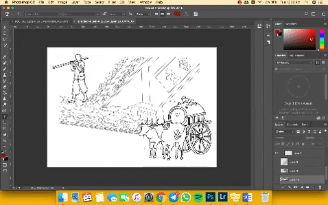
 This sketch was drawn with reference to the murals that I came across at Telok Ayer. Everything drawn were the items or places that existed during 1920s – 1940s. I wanted to expand this page (2 & 3) alone till 1970s, and have page 4 & 5 to be of a digital image to show the passing of the older generation.
 cr: https://www.pinterest.com/pin/417357090461581464/
I wanted page 5 & 6 to consist of traditional and modernity element, despite the usage of digital medium. I envision the image to be similar to the one above. However, after getting some feedbacks from my classmates and friends, they said that it did not translate the idea clearly. Mimi also said that it would be better if the zine was in a continuous chronological order, and not a sudden jump. Hence, I took the advice and decided to do it in a timeline order
Zine layout:
page 1 : cover
page 2 & 3: 1920s – 1940s
page 4 & 5: 1950s-1970s
page 6 & 7: 1980s – now
page 8: cover
I did some research on my zine layout and design too, and referenced mostly Chinese zines or product to learn how the idea of “chinese design” is being market, and used as packaging to identify itself.

cr: https://www.pinterest.com/pin/417357090461021829/
 cr: https://www.pinterest.com/pin/417357090461587571/

cr: https://www.pinterest.com/pin/417357090461610440/
I came to realized that Chinese fonts are bold, with very little cursive. Colours are either extremely bright and striking, if not extremely down to earth tones. It is distinctive, and not loud.
As I have decided on using line drawings, as it would be completely different from my usual style of illustration, I referred to a few line drawing artists. 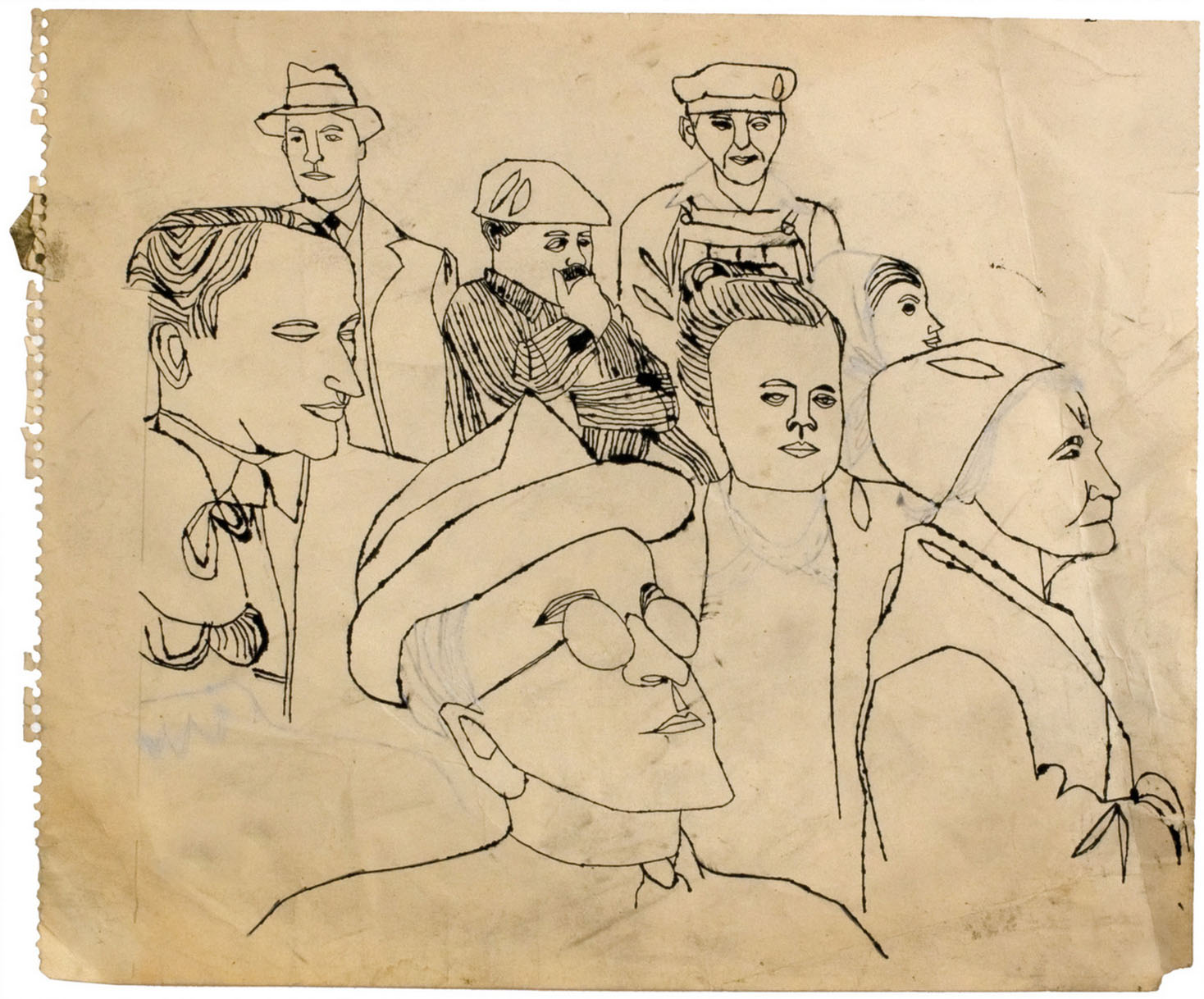 cr: https://www.huffingtonpost.com/2013/01/23/andy-warhol-early-drawings-louisiana-museum_n_2529261.html


 cr: http://www.tate.org.uk/art/artworks/warhol-boy-with-flowers-ar00271
 cr: https://www.pinterest.com/pin/551479916865796008/


 cr: https://www.pinterest.com/pin/3307399702752371/
I wanted to see how human figures were drawn, and I noticed it was the shape that gives definition to it, not so much on expression. Hence, I decided to leave out the facial expression of my human figures and focus more on the definition of body line.
This was after more details were added, and a re-arrangements were made, to create the zine page 2 & 3. 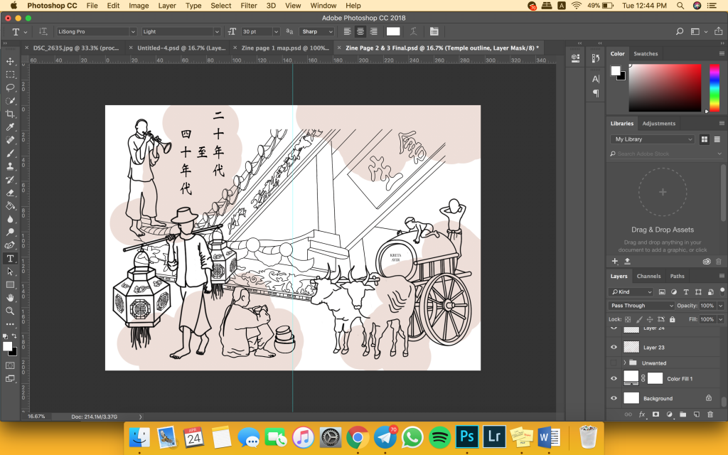 After settling on the design, I had to decide whether to add colours or not to the outline drawing. However, I felt that the lines itself created a background and foreground, and adding colours will be too much, but leaving it black and white will be too ugly. Hence, I added red patches to give it a little more life. This idea of using read its not only purposeful, but it helped to give some life and style to the zine.
The whole explanation of the final zine can be read in the next post, where I share more about my final piece.
With reference to my research, I decided to create a zine that revolves around the idea of bringing social awareness. Hence, I started looking into brochures, magazine, news letter, websites, and pamphlets of social organizations. 
 cr: https://www.touch.org.sg/get-involved/fundraising-campaigns/details/make-their-golden-years-better
cr: https://www.touch.org.sg/get-involved/fundraising-campaigns/details/make-their-golden-years-better
I noticed that the elderly shots are always in portrait form, or interacting with volunteers. Hence, for my zine, I decided to follow a newsletter layout to design my zine.
I started by choosing the image I want, and decided to go with this uncle I met. This was the first time I tried realism digital illustration, and it was tough. I had to do multiple layers of shading in order for it to look less cartoon-like.
I proceeded on to draw out buildings that stands out in Chinatown, however, I came to realized that it did not fit well with my design layout. 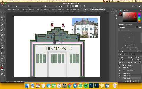
There were many empty spaces, and after showing Mimi during consultation, the place and idea was not well presented.
I struggled to come up with something abstract, and also found the difficulty in conveying a message through abstractness. Hence, I decided to change my topic once more, as I found myself being very restricted and bounded by this topic.
I decided to look for more information, and brainstormed for newer ideas. I came up with ideas that ties in with Chinatown, and think deeper than the mere superficial aspect of the place itself. 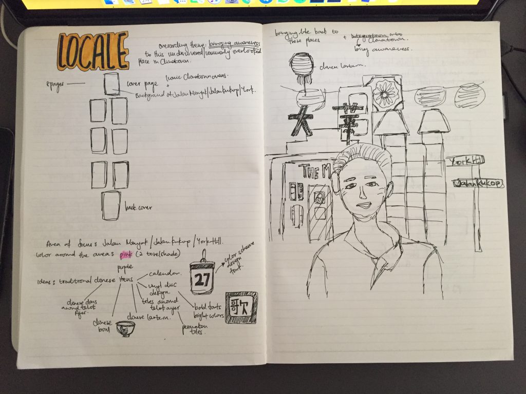
I wanted my zine to encompass more than just what the place have, but the story the place can tell. Hence, moving towards the direction, I decided on the overarching theme of Time, where the end to something is always a start to new beginnings.
The process of this new idea can be seen here.

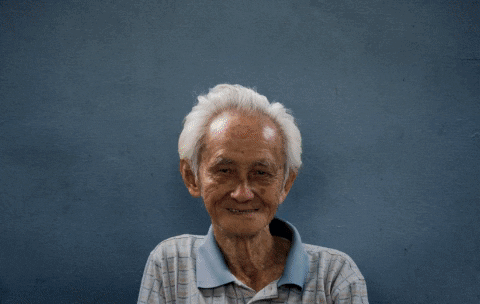
After my first research around Telok Ayer, I felt that I was still lacking information, hence I went back down a second time to get more pictures for my zine, and did more research on my own. I studied the map of Telok Ayer, and decided to expand my area to Chinatown, since Telok Ayer is a subset of it.

Hence, the second time I went, I decided to explore further up into the OG People’s park area, which I did not cover the other time. In addition, I went online to do a little more research and I found out about this 3 places in Chinatown – Jalan Kukoh, Jalan Minyak, and York Hill. These 3 places are nested in the same area, however, it is commonly overlooked due to its location. It is in between Chinatown and Outram, but no where near both. However, based on the map, these 3 places are counted as Chinatown. Hence, I decided to cover the area too.
 When I went there, I came to realized that the area was heavily populated with elderly and the flats are mostly rental flats, or one-room flats. The picture above was an elderly man that I met while I was there. He is deaf and mute, but he had this positive energy shining through him. He kept smiling, and even though we could not communicate verbally, we managed to do so through body language. Aside from this elderly uncle, I met his neighbours, which reminds me of the kampong spirit that I read very often from my textbook.

With the initial idea of using colours, I scrapped it off after a consultation session with Mimi, as she mentioned that it should be more personal rather than editorial. Hence, I decided to go with create social awareness as my overarching theme, since it is something that resonates well with me.
Initial research on colour:


Before editing all the pictures, and deciding on the layout, I started off by grouping them into the various colours that I see around Chinatown. As mentioned, it appeared too editorial, hence I decided scrap it off.
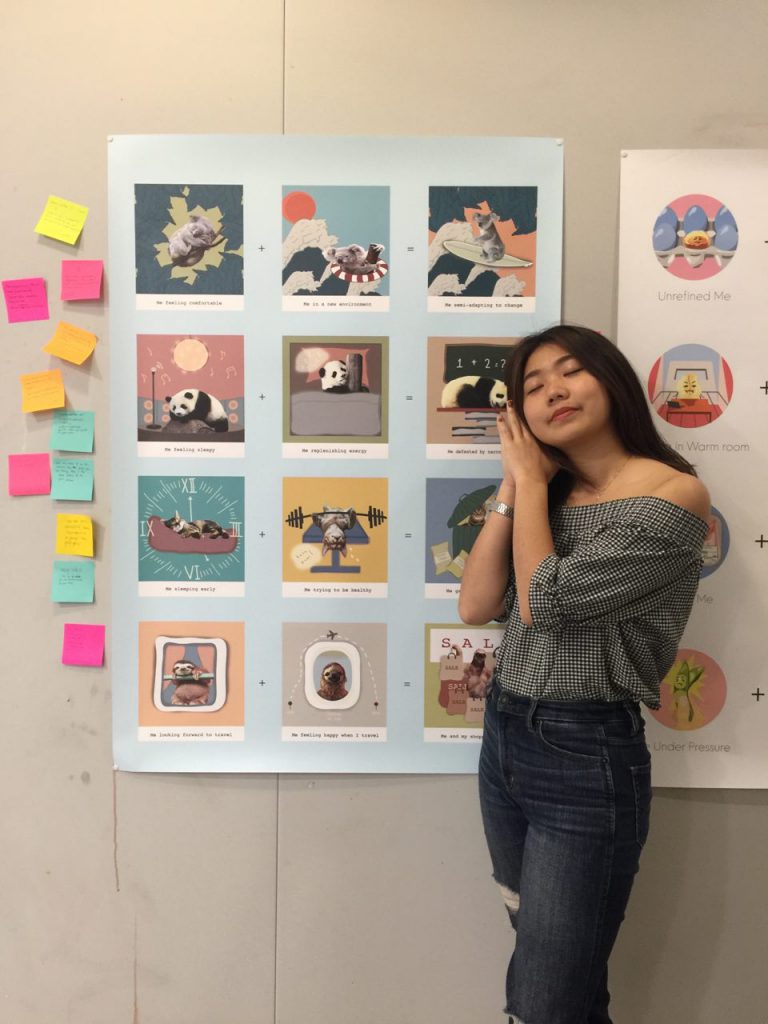
Reflection: I really enjoyed the last submission, and it was my first time attempting digital illustration!!!! I must say that it was really tough, but the end result was really a fulfilling experience!! I enjoyed playing with colours, and manipulating images. In addition, I have never done such a thorough studies of myself before, and it was interesting to see what my friend think of me!
Signing out from Sem 1!!!
After all my research, and deciding on the medium I wanted to use – Illustration (to be honest I was really keen in embroidery but it is too time consuming). I started asking my friends to describe me in 1 word. 

I started expanding my idea on what my friend describe me as and wrote it out on my sketchbook. I was quite keen on the idea as a uniqlo lover as described by one of my friend, since i own mostly uniqlo clothes.
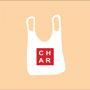
I started illustrating myself as a plastic bag, but I found it difficult to proceed on as there was not much linkage between me and a plastic bag, except for the fact that I LOVE uniqlo…
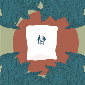
I went on to be a Chinese sky lantern in nature after much thoughts and planning.
Chinese Sky Lantern: Sky lantern are used by many countries in the Southeast Asia region, and they are commonly sent up in air after people have written their wishes on the exterior of it. Since I cal myself a dreamer, and one who always have many wishes, I felt that the lantern would best represent me, and since it is a Chinese lantern, it best explains my love for the Chinese culture.
静: “Jing” is the Chinese word I wrote on the exterior of the lantern. The word means silent/quiet in Chinese, which is not what many associate me with. However, internally, I see myself as quite an introvert, more than an extrovert. Hence I have the word plastered on the exterior of the lantern.
Nature: I love the nature, it is a place where I find my peace. I feel most comfortable being in nature! Which I felt that it would be best to use it to compare me being in a foreign environment.
I had all 3 panels of ideas drawn out in my sketchbook. However, I could not come up with a consistent theme for the remaining 3 equations which was what I planned to do. Hence, I scrapped off the idea and decided to explore even further.
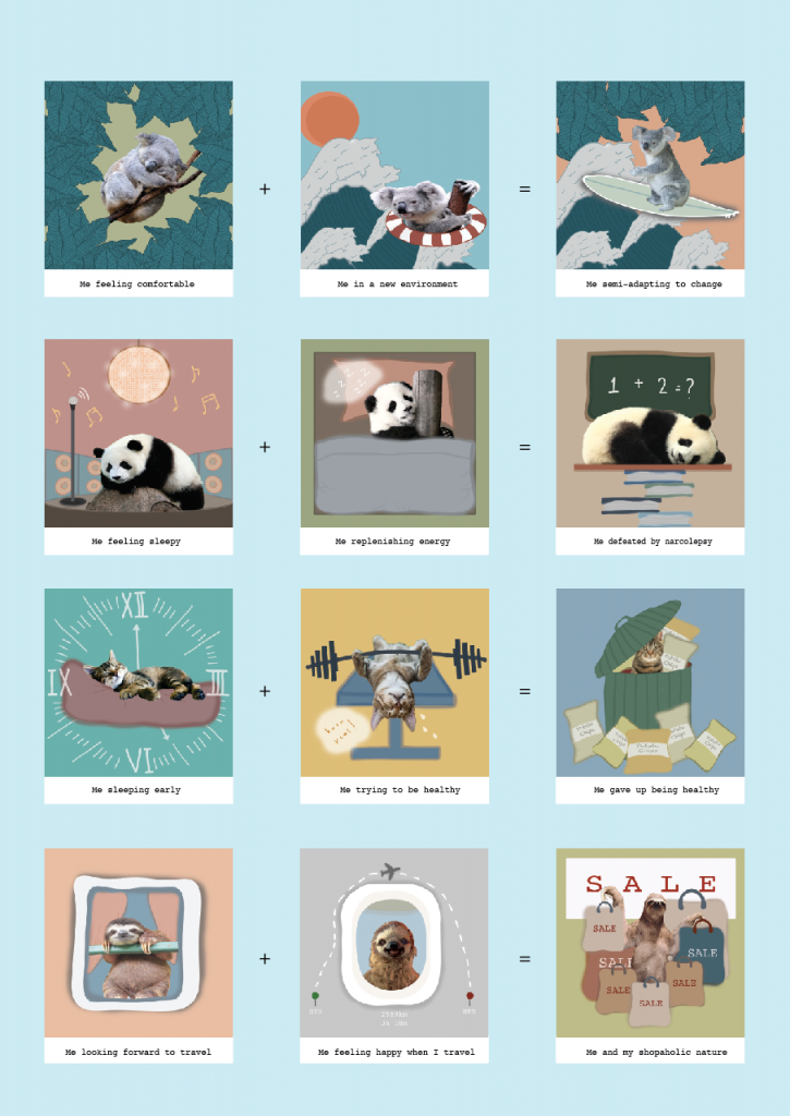
Eventually, I settled on the theme of animals, but not just any other animals but top 20 laziest animals who sleeps the most. 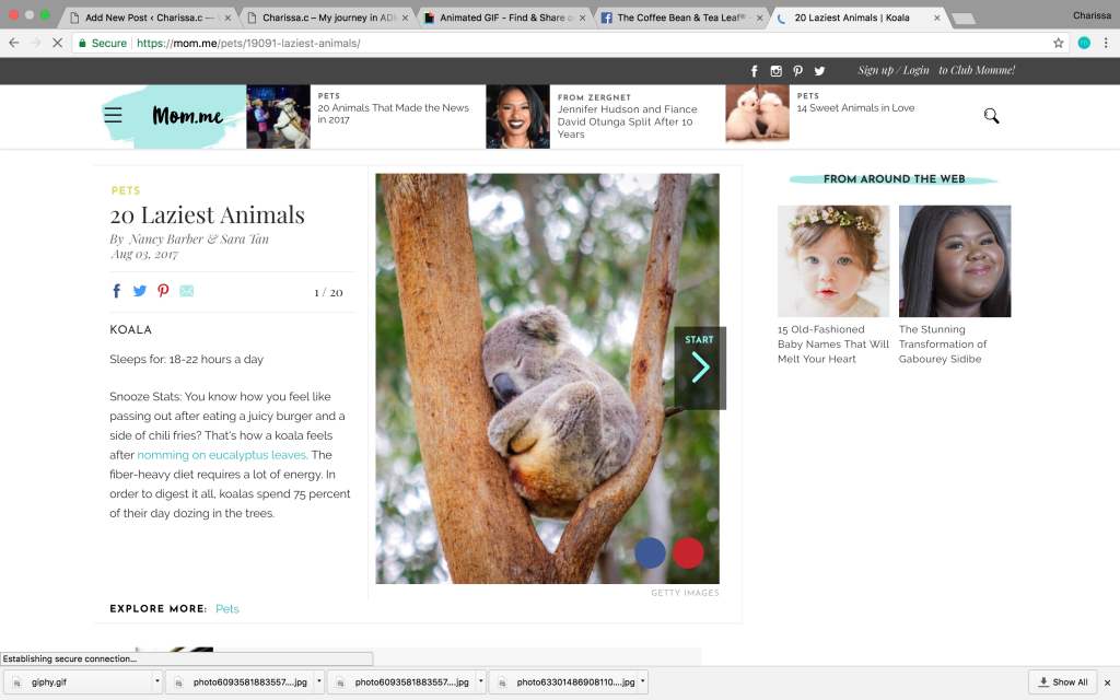
No, I am not implying that I am lazy!!! I just resonate with the fact that I sleep as much as them!!!! I always get caught sleeping/dozing off in class (something I am still trying to improve on!!)

I decided to use the top 5 animals who sleeps the most – Koala, Panda, Cat, Sloth!
I switched up my medium, and used mixed medium – photography + digital illustration.
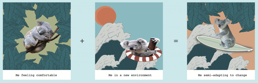

For the first panel of my equation, I decided to use a Koala as they sleep the most! I explored into colour and space, and tried using complimentary colours but it seems a little weird so I removed the orange/reddish circle at the back. I decided to stick to one colour, but played with the tone of it. Using dark green and light green as the key colour.
The difficulty I had was to decide the colour used, as I had to make sure that it suits the Koala, and also finding the correct image.
For my second panel, I drew my wave with reference to the famous Kanagawa wave by Hokusai. 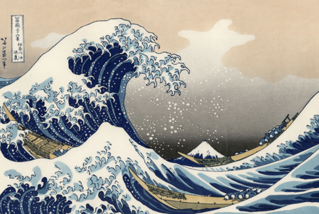 cr: http://mentalfloss.com/article/66591/15-things-you-might-not-know-about-great-wave-kanagawa
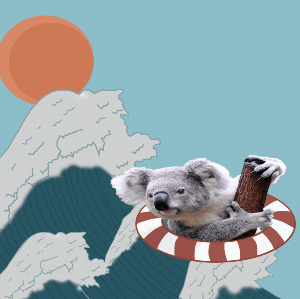
Wave: Although to many, the sea is where they find peace or calmness, I am actually terrified of going near it. I am afraid of the sea due to the fact of the unknown beneath my feet when I enter the water. Hence it also represents me being thrown into a foreign place, a new environment. I personally do not fancy a change in environment, as I am afraid of the unknown. Hence I drew myself on a lifebuoy, trying to survive this change.
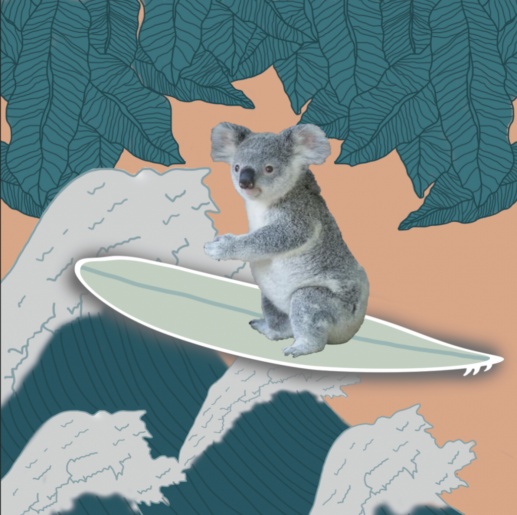
The last panel shows me trying to surf, as a symbol of me semi-adapting into the environment, while maintaining the comfort level I am feeling.
For my second equation, I chose the sleepy panda to represent me.
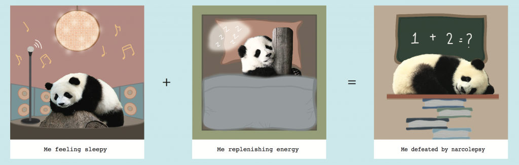
Initially I included a vinyl disc, and speaker to with a disco ball to represent a noisy place, and how I feel sleepy in the midst of such environment.
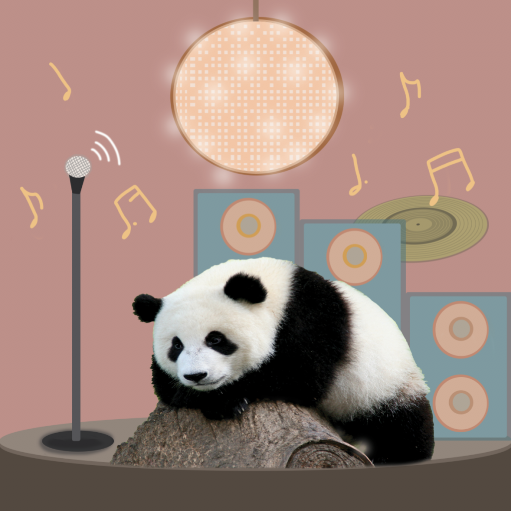
I attempted spilt complimentary colour scheme for this illustration, but the vinyl disc appears to be out of place as it is floating. Hence I removed it and settled on using speakers.
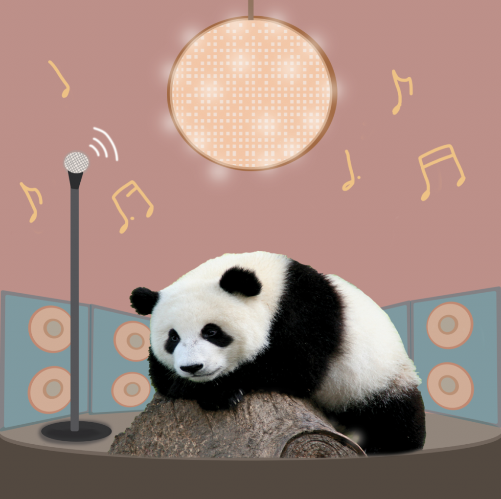
The hardest part of this illustration was to adjust the perspective of the speaker and also making the disco ball, look like a disco ball.
For the second and third panel, it shows how after I replenish my sleep I still fall asleep in class. This is because of a genetic sleeping disorder – narcolepsy, that I suffer from. I am unable to control when I fall asleep, especially during daytime.
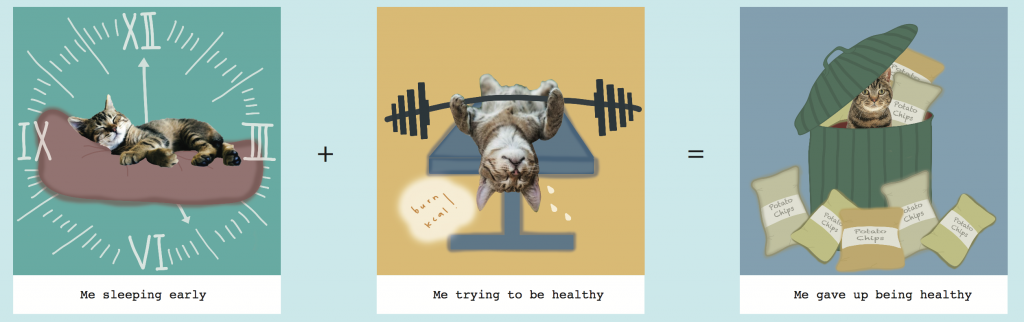
Third equation, I chose the cat!
![]()
For the first panel, I tried using the text font on photoshop to draw my clock, however, I felt that it was too non-illustrated. 
I wanted it to look more organic, hence I wrote in the numbers on my own. In addition, I did not want to clock to look too circular as I want the design to be consistent. Due to the fact that my illustration style is more curved and rounded, which does not make it look vectorised, I wanted that style to be consistent throughout.
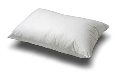
I referenced how a pillow looked like to draw the bed my cat is lying on. The lines on the bed where the cat lies on, provides more realism to it, making it seemed like there is pressure on the bed.
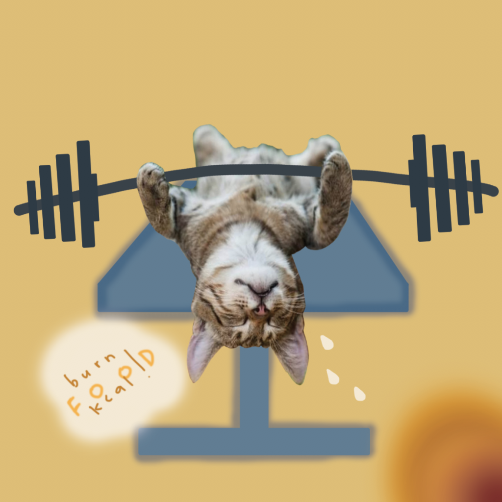 For my second panel, I tried drawing fire with a brush, but not only does it look weird, it did not really make sense. Hence I eliminated the idea, and kept it simple.
 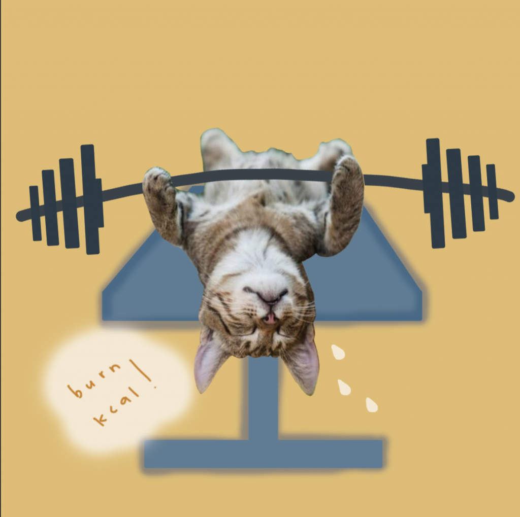 I did not know what the gym chair was called so my search history was like “gym chair”, “weights chair”, “gym chair lying down” AND I COULD NOT FIND THE CHAIR I WANTED……

I FINALLY FOUND THE IMAGE I WAS LOOKING FOR!!!
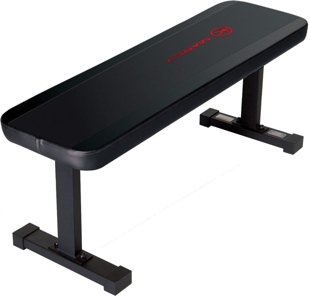 cr: https://www.dickssportinggoods.com/products/weight-benches.jsp
For the last panel, I got the idea from Oscar & Cookie Monster from Sesame Street!!
 cr: https://www.pinterest.co.uk/pin/223280094000952810/
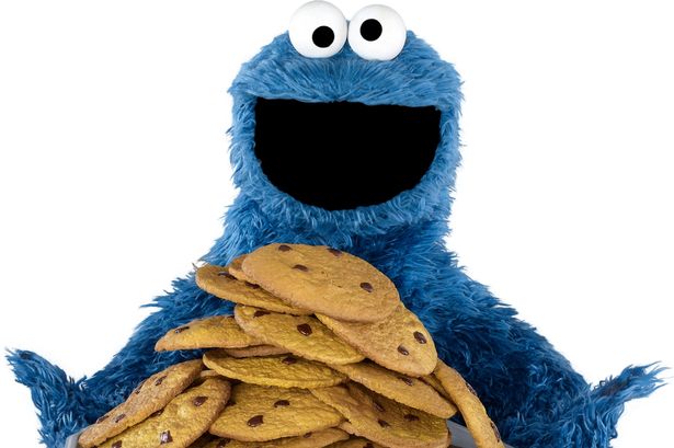 cr: https://jhwink.deviantart.com/art/Cookie-Monster-630269212
I felt that covering my cat with food and being in a bin will show the idea of greediness and how trashy junk food is! However, my trash bin is a watermelon, which juxtapose the idea of it being trashy. I wanted it to show how I try to be healthy, but consuming all the trash.
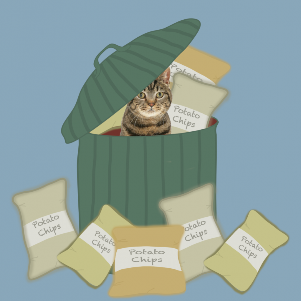
To draw the packet of chips, I went to search how the creases on a real packet look like, to give it some realism in the illustration.
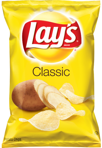 cr: https://www.fritolay.com/snacks/product-page/lays
Moving on to the last equation
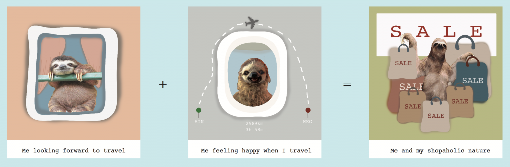
I chose a sloth!!! Sloth has so many emotions which makes them very adorable, but the downside is, it was very difficult to find images of sloth!!
Hence, for my last equation, I tried to manipulate my sloth to fit the equation.
The first panel I had to erase and crop out to make the pole look like a window grill.
The second panel, I referenced how an aeroplane window look like 
However, what i forgot was this is the inside of the aeroplane. Lucky Hannah pointed it out!!! So i changed it and swap it around. 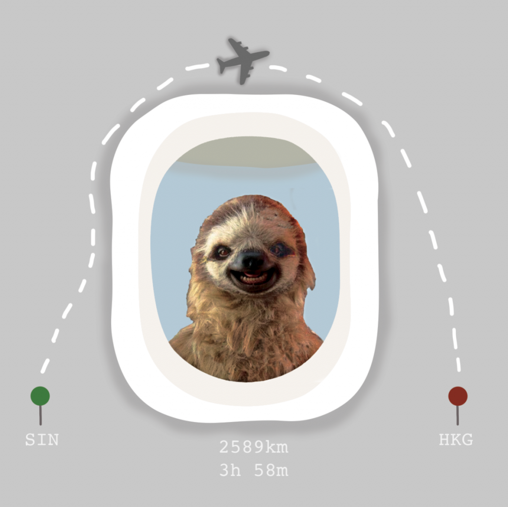
I added in a plane vector because I could not draw a plane, but I guess it fits in nicely!!!
The last panel was just me covered in shopping bag, and I got the idea from the movie “Confession of a Shopaholic”

cr: https://www.rogerebert.com/reviews/confessions-of-a-shopaholic-2009
The multiple plastic bags to signify excessive shopping!!
For all my panels, I got my inspiration from digital illustration & photograph manipulation that I came across on pinterest.
 cr: https://www.pinterest.com/pin/417357090459660936/
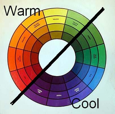
Colours is interesting and exciting and it is alive! We see it in our everyday life, and how it is applied in different aspects (e.g. make up, food, household items, furnitures etc). Colours are generally separated into two different tones – Warm & Cool.
It can be seen easily with the colour wheel. Warm tones colours are like red, orange, yellow etc. It makes you associate with warm things such as sunlight, which will evoke feeling of coziness. Cool tones are usually blue, purple, purple etc. Cool colours are associated with calming and soothing effect like the sea or water.
 cr: http://tabithadumas.com/look-good-in-any-color/
Some juxtapose examples of cool tones and warm tones:


The second image which has a warmer lighting (orange) evokes feeling of closeness and warmth more than the first image does with white bright lights and blue furnitures.
Cool and warm tones are also applied to make up applications, such as skin tone, hair colour, lipsticks etc.
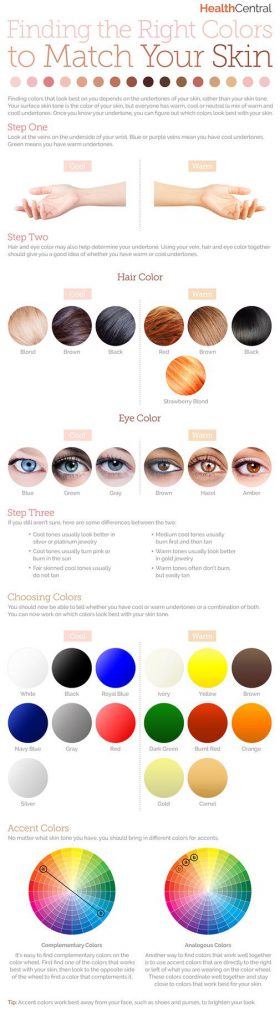
However, when it comes to make up, the make up product used depends on whether one has a cool tone or warm tone skin colour. Hence, bringing it back to how the colour wheel works, it shows how certain colours are better suited for each other. The mixing of colour will affect the final look of the product.
Moving on to the last assignment for 2D, we are exploring into the world of colour (FINALLY!!)
Colour is a theme that covers many various concepts, and in order to understand it, we will have to understand the basic – Colour Theory.
Colours are separated into Primary, Secondary, and Tertiary, which is easily understandable with the representation of a colour wheel. The wheel represents color in a circle. Closer to the middle of the circle, colors are less pure. At the outer edge of the circle, they are more pure and more saturated
 cr: https://blog.asmartbear.com/color-wheels.html
How do we interpret the colour wheel?
Primary colours = Pure colours (E.g Red, Blue, Green, Yellow)
Secondary colours = Primary colour + Primary colour (E.g Red + Blue = Purple)
Tertiary colours = Primary colour + Secondary colour (E.g. Blue + Purple = Blue Purple)
So why is it so important to understand the colour wheel?
The colour wheel helps us to match colours that creates a pleasing combination to our eyes, which is also known as Colour Harmony. The thing that is important to know in color harmony is that how dark or light or how saturated colors are does not affect their position on the wheel.
In order to determine which type of colour harmony to use, one will have to determine the key colour. The key color is the most important color of your design. It is the color you can’t change or the color of the element you want to draw attention to.
What are the different types of colour harmony?
Complementary

Complementary colour scheme refers to colours that are opposite each other. The high contrast of complementary colors creates a vibrant look especially when used at full saturation but can be jarring if not managed properly
E.g. Hulk

His purple pants is a representation of complementary colours, based on the colour wheel.
Split Complimentary

The split complementary takes the two colors directly on either side of the complementary color. This allows for a nicer range of colors while still not deviating from the basic harmony between the key color and the complementary color.
This color scheme has the same strong visual contrast as the complementary color scheme, but has less tension. The split complimentary color scheme is a safe choice for virtually any design as it is near impossible to mess up and always looks good.
Triadic

This refers to the color two spaces to either side of the key color’s complement. Essentially, with the triadic harmony, you are using three equally distanced colors on the color wheel. As such, you’re stretching the basic idea of color harmony and thus this harmony is best used with only touches of color.
Too much of each color and your design appears to have too many colors and can be too vibrant.
To use a triadic harmony successfully, the colors should be carefully balanced—let one color dominate and use the two others for accent. Or, desaturate all your colors and only use the triadic colors in small spots or touches.
Analogous

Also referred to as related colors, these are the colors directly on the left and right of your key color. They usually match up quite well and create a serene and comfortable design.
Tetradic

Similar to the Triadic, except that there are four points, all equally distanced on the color wheel. This harmony is good when you have numerous elements that all need to stand out on their own—such as a poster that features 4 or more characters. By using colors equally distant on the color wheel, each character gets equal attention.
Source: http://zevendesign.com/color-harmony-hulk-wears-purple-pants/
 cr:
cr:  cr:
cr: