Moving on to the last assignment for 2D, we are exploring into the world of colour (FINALLY!!)
Colour is a theme that covers many various concepts, and in order to understand it, we will have to understand the basic – Colour Theory.
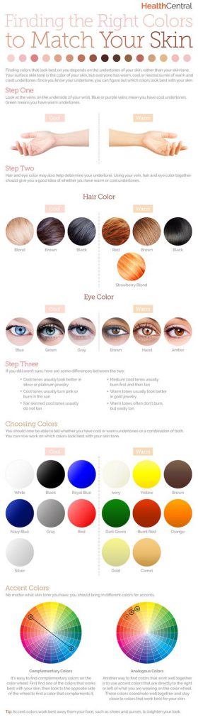
Colours are separated into Primary, Secondary, and Tertiary, which is easily understandable with the representation of a colour wheel. The wheel represents color in a circle. Closer to the middle of the circle, colors are less pure. At the outer edge of the circle, they are more pure and more saturated
 cr: https://blog.asmartbear.com/color-wheels.html
How do we interpret the colour wheel?
Primary colours = Pure colours (E.g Red, Blue, Green, Yellow)
Secondary colours = Primary colour + Primary colour (E.g Red + Blue = Purple)
Tertiary colours = Primary colour + Secondary colour (E.g. Blue + Purple = Blue Purple)
So why is it so important to understand the colour wheel?
The colour wheel helps us to match colours that creates a pleasing combination to our eyes, which is also known as Colour Harmony. The thing that is important to know in color harmony is that how dark or light or how saturated colors are does not affect their position on the wheel.
In order to determine which type of colour harmony to use, one will have to determine the key colour. The key color is the most important color of your design. It is the color you can’t change or the color of the element you want to draw attention to.
What are the different types of colour harmony?
Complementary

Complementary colour scheme refers to colours that are opposite each other. The high contrast of complementary colors creates a vibrant look especially when used at full saturation but can be jarring if not managed properly
E.g. Hulk

His purple pants is a representation of complementary colours, based on the colour wheel.
Split Complimentary

The split complementary takes the two colors directly on either side of the complementary color. This allows for a nicer range of colors while still not deviating from the basic harmony between the key color and the complementary color.
This color scheme has the same strong visual contrast as the complementary color scheme, but has less tension. The split complimentary color scheme is a safe choice for virtually any design as it is near impossible to mess up and always looks good.
Triadic

This refers to the color two spaces to either side of the key color’s complement. Essentially, with the triadic harmony, you are using three equally distanced colors on the color wheel. As such, you’re stretching the basic idea of color harmony and thus this harmony is best used with only touches of color.
Too much of each color and your design appears to have too many colors and can be too vibrant.
To use a triadic harmony successfully, the colors should be carefully balanced—let one color dominate and use the two others for accent. Or, desaturate all your colors and only use the triadic colors in small spots or touches.
Analogous

Also referred to as related colors, these are the colors directly on the left and right of your key color. They usually match up quite well and create a serene and comfortable design.
Tetradic

Similar to the Triadic, except that there are four points, all equally distanced on the color wheel. This harmony is good when you have numerous elements that all need to stand out on their own—such as a poster that features 4 or more characters. By using colors equally distant on the color wheel, each character gets equal attention.
Source: http://zevendesign.com/color-harmony-hulk-wears-purple-pants/
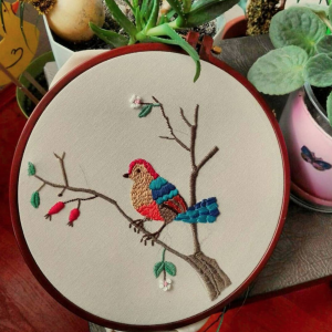
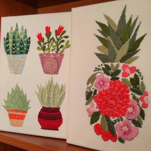 cr: https://www.instagram.com/esrakaplanembroidery/
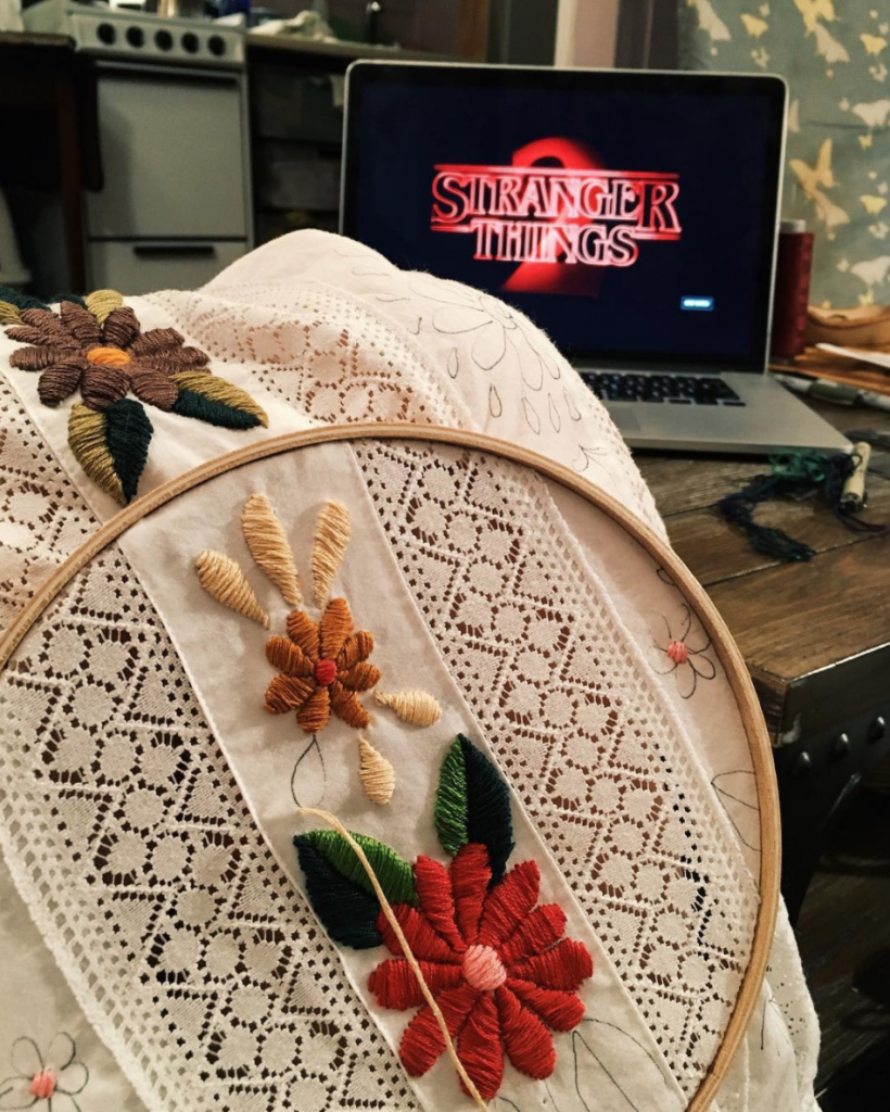
 cr: https://www.instagram.com/tessa_perlow/
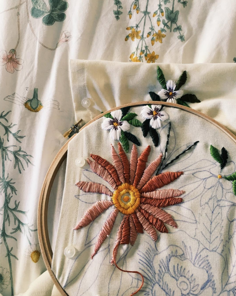
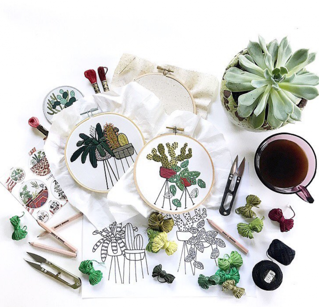 cr: https://www.instagram.com/sarahkbenning/
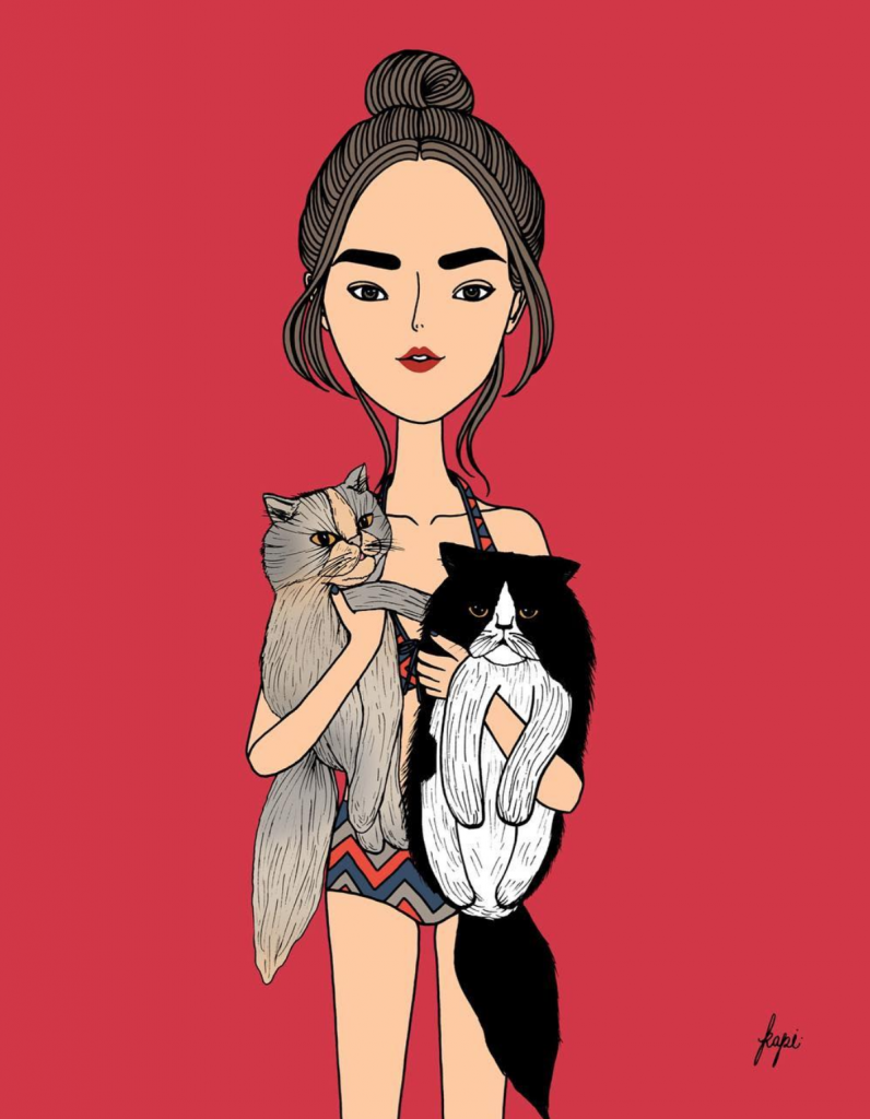
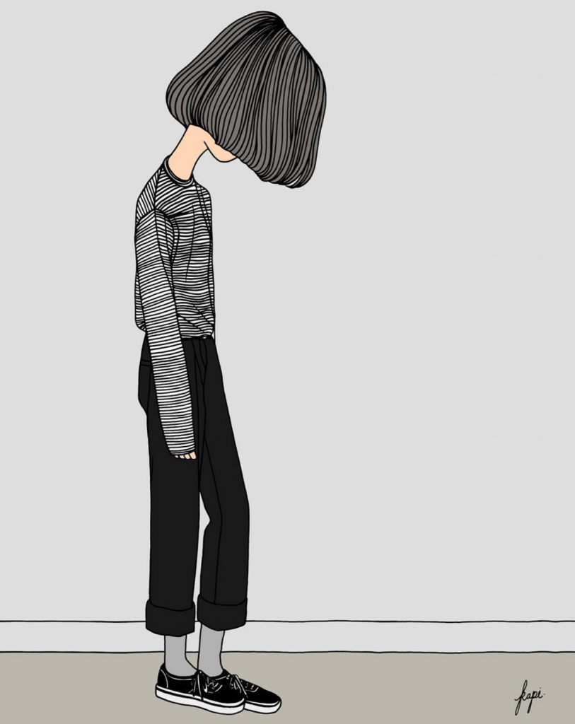 cr: https://www.instagram.com/kapiz/
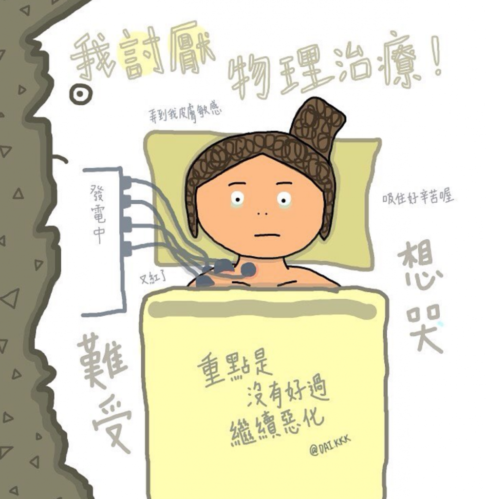 cr: https://www.instagram.com/dai.kkk/
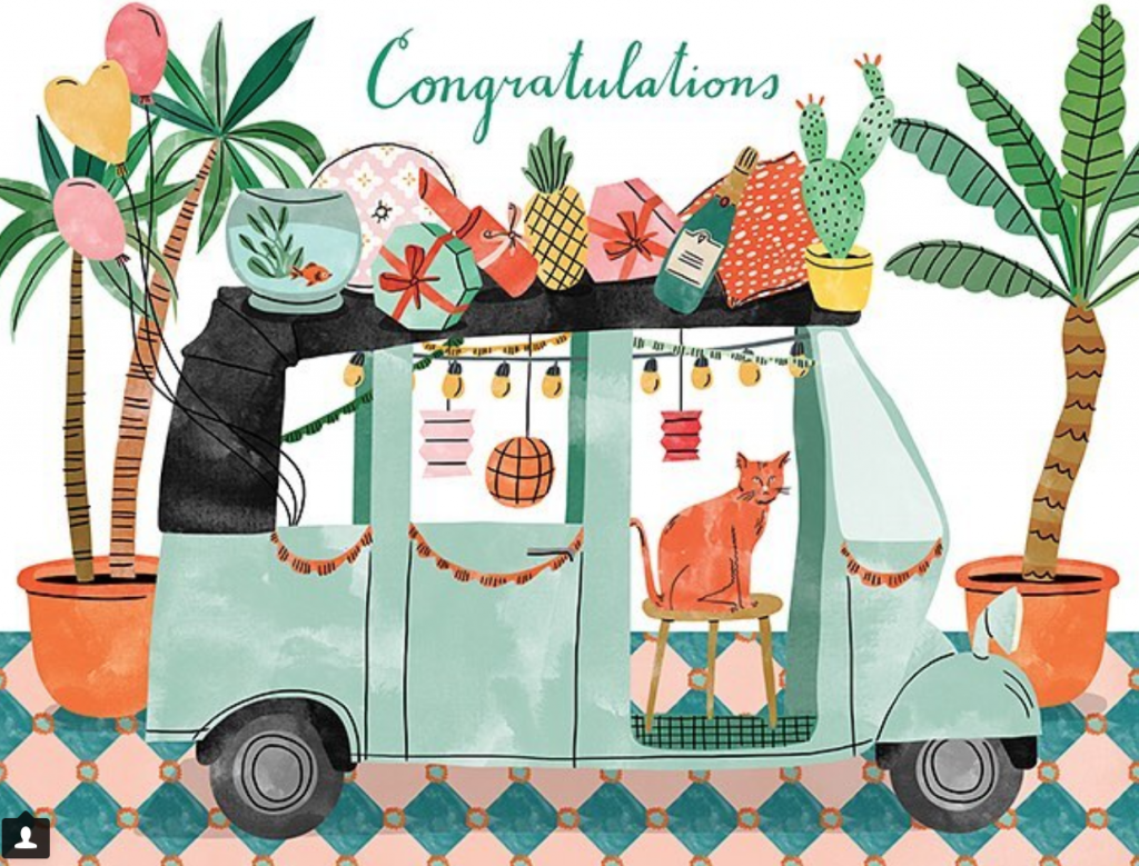
 cr: https://www.instagram.com/mr.paul_tw/
 cr: https://www.pinterest.com/pin/417357090459560433/
 cr: https://www.pinterest.com/pin/417357090459560430/
 cr: https://www.instagram.com/matejakovac/
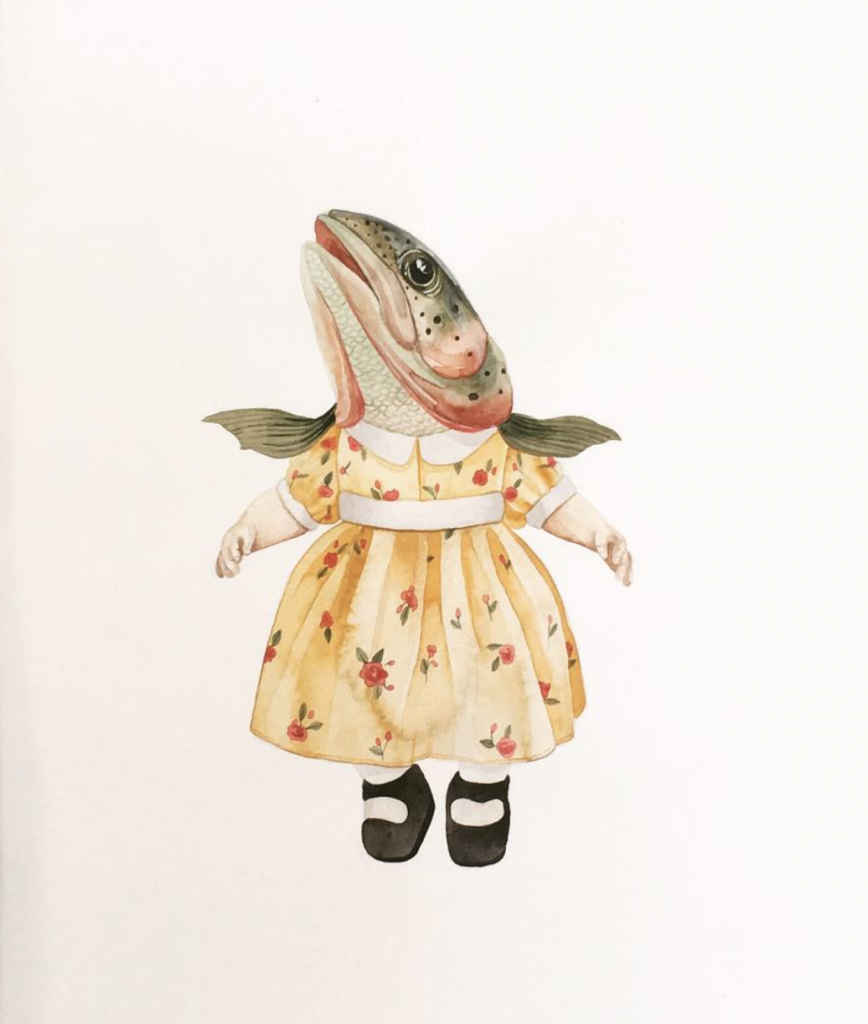
 cr: https://www.instagram.com/__jorj__/
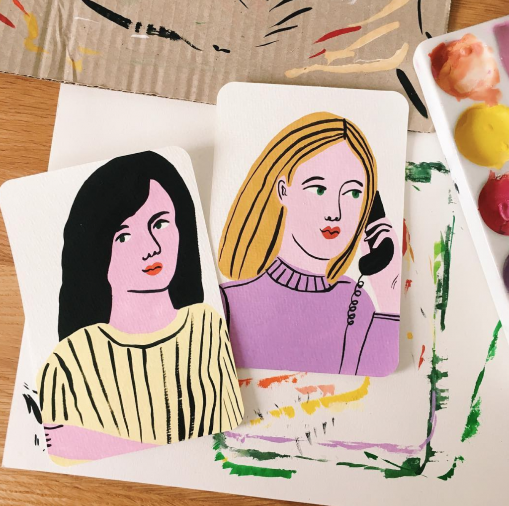
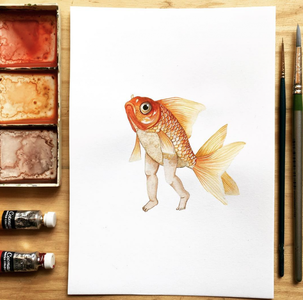
 cr: https://www.instagram.com/bodiljane/
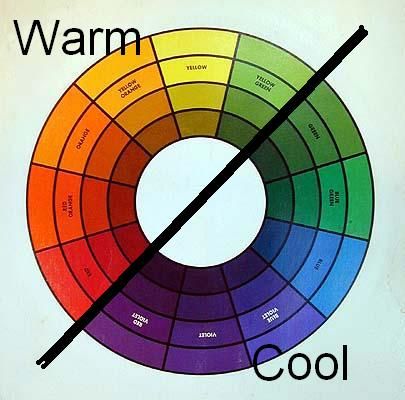 cr:
cr: