
Initially it started out with 6 ideas which we were supposed to present at the end. And these were the 6 ideas that I had initially before narrowing it down to 4 ideas, also with a few names/nicknames just right above it that I can use as the typography words.
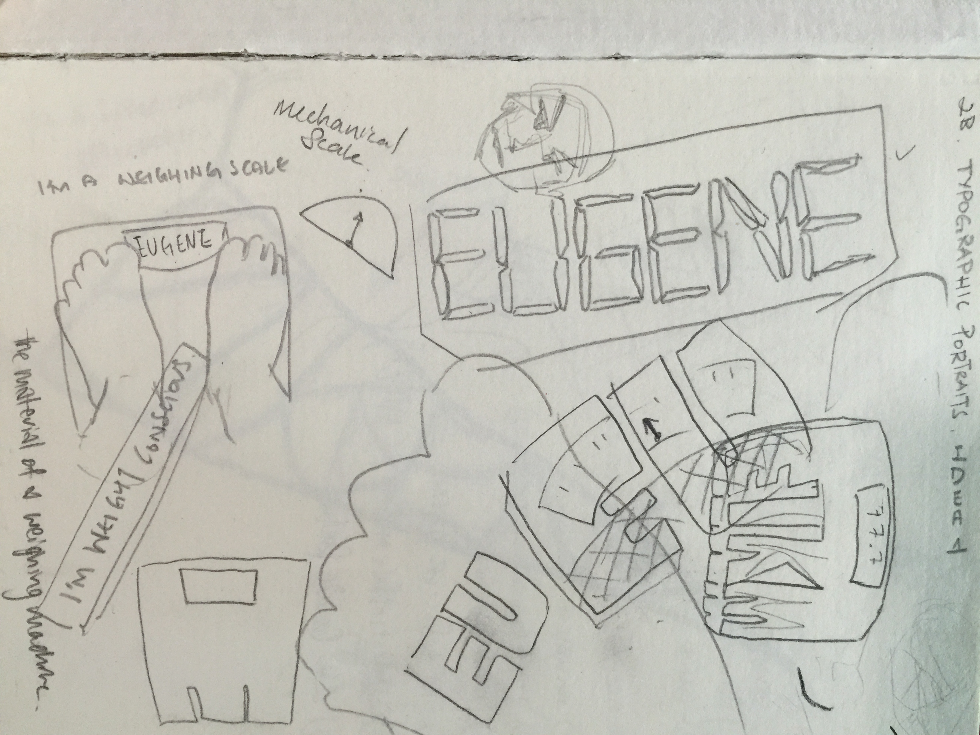
It starts with this, being Weight Conscious. My ideas were implementing the object of the weight scale and input the name into the part where it shows the weight of the subject. But prof. Shirley didn’t want there to be objects in the typography, rather having the texture or something that shows the object on the words itself. These are just a few sketches of how I wanted the idea to be like, but it wasn’t easy finding a good texture of a weighing scale.
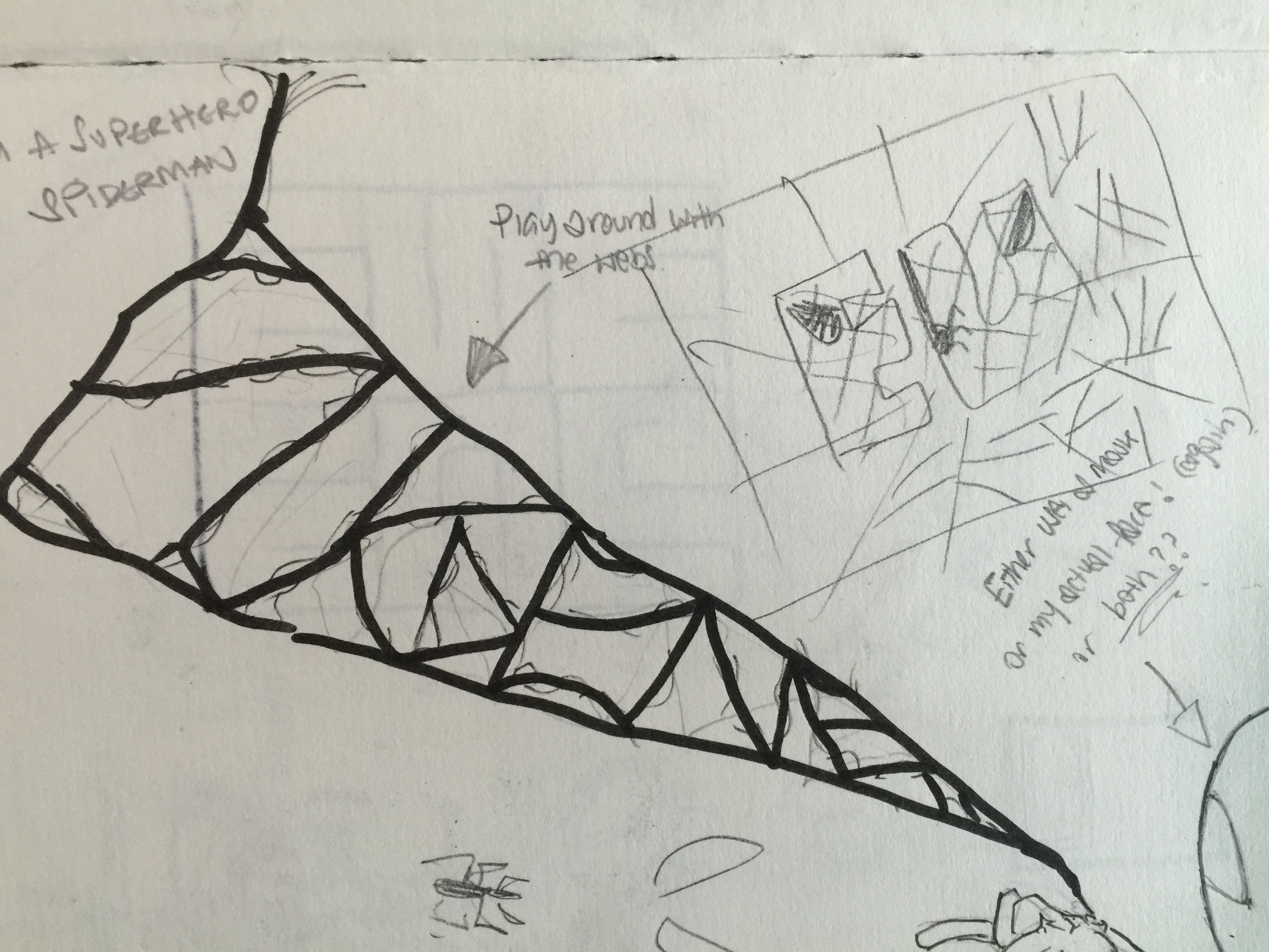
The next idea I had was being a Superhero. The first and only one I immediately thought of was being Spiderman. So with Spiderman, naturally I had thoughts of implementing webs that would form my name, and including a Spiderman figure at the corner to show that those are webs that are being shot out of Spiderman. But after consultation, prof. Shirley said she didn’t want to include and people or object into the typographic portrait, rather implementing the chosen object’s texture or material onto the words. So it went more towards finding the texture of the suit of Spiderman, or the features of Spiderman to put on the words itself. And also, to subtly include webs inside to add on to the features of Spiderman.
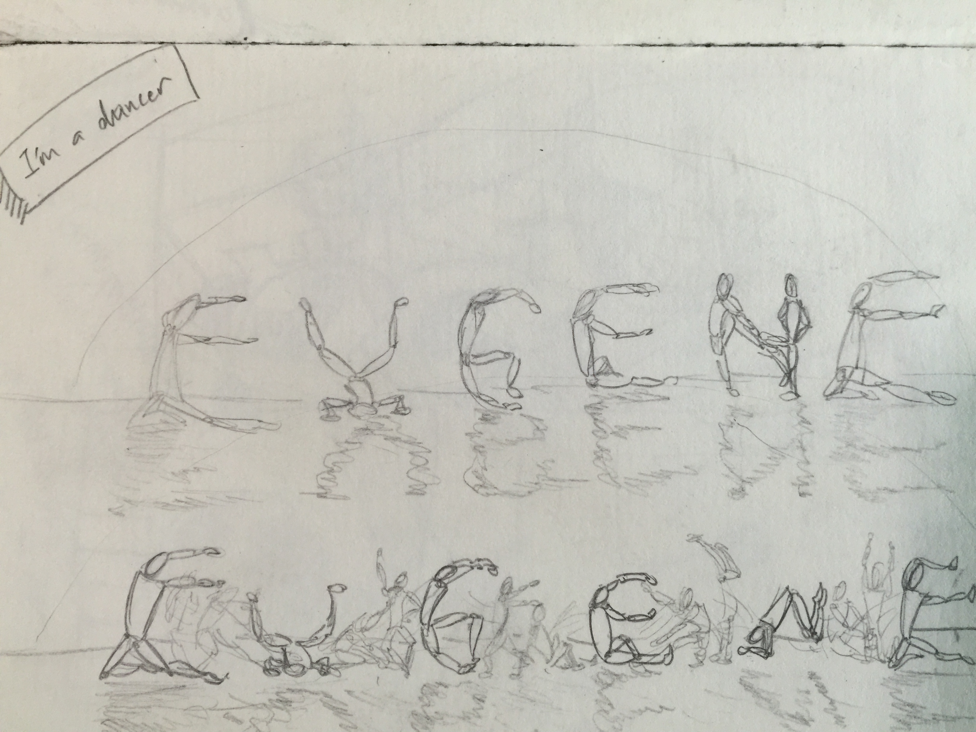
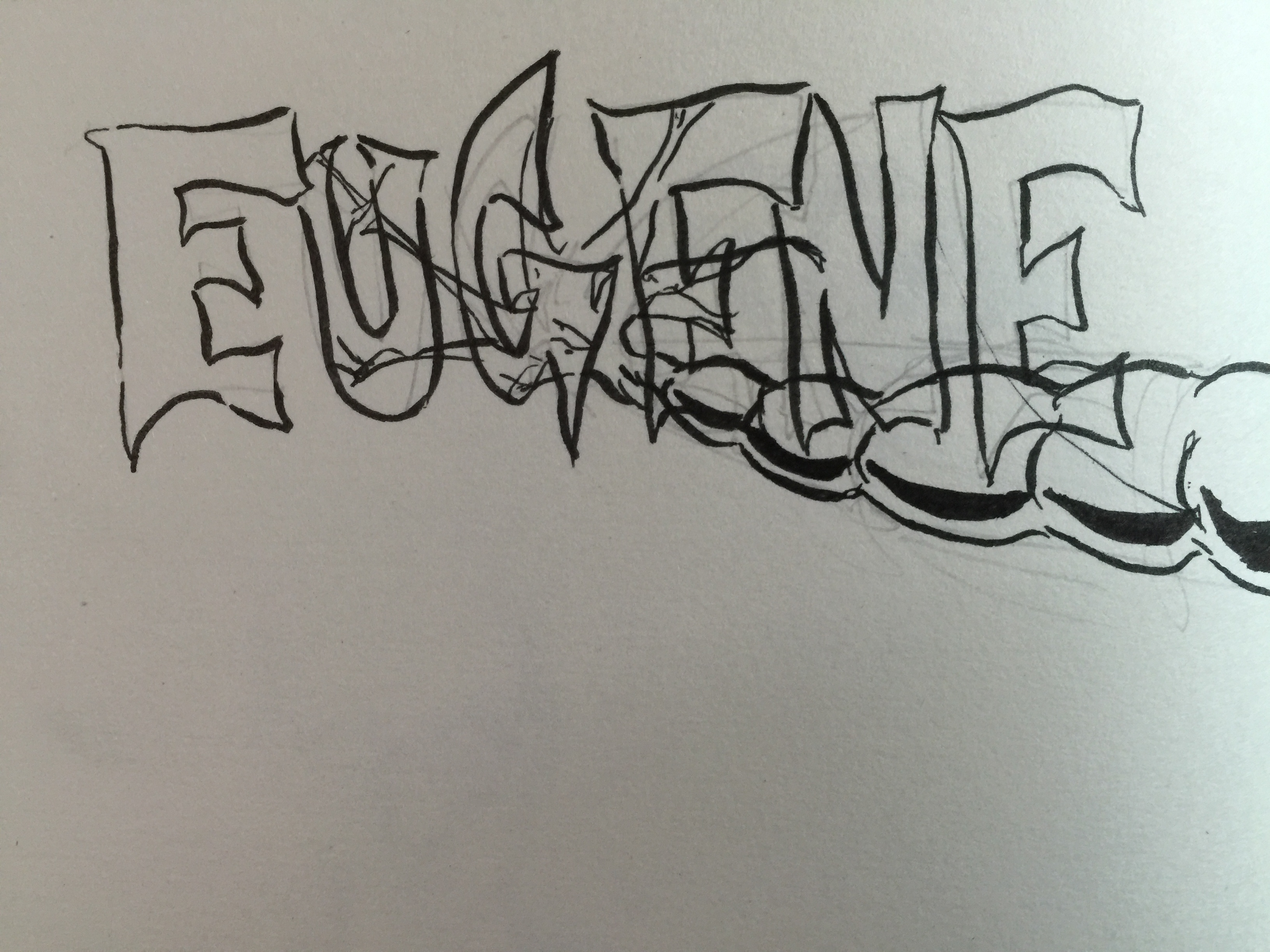
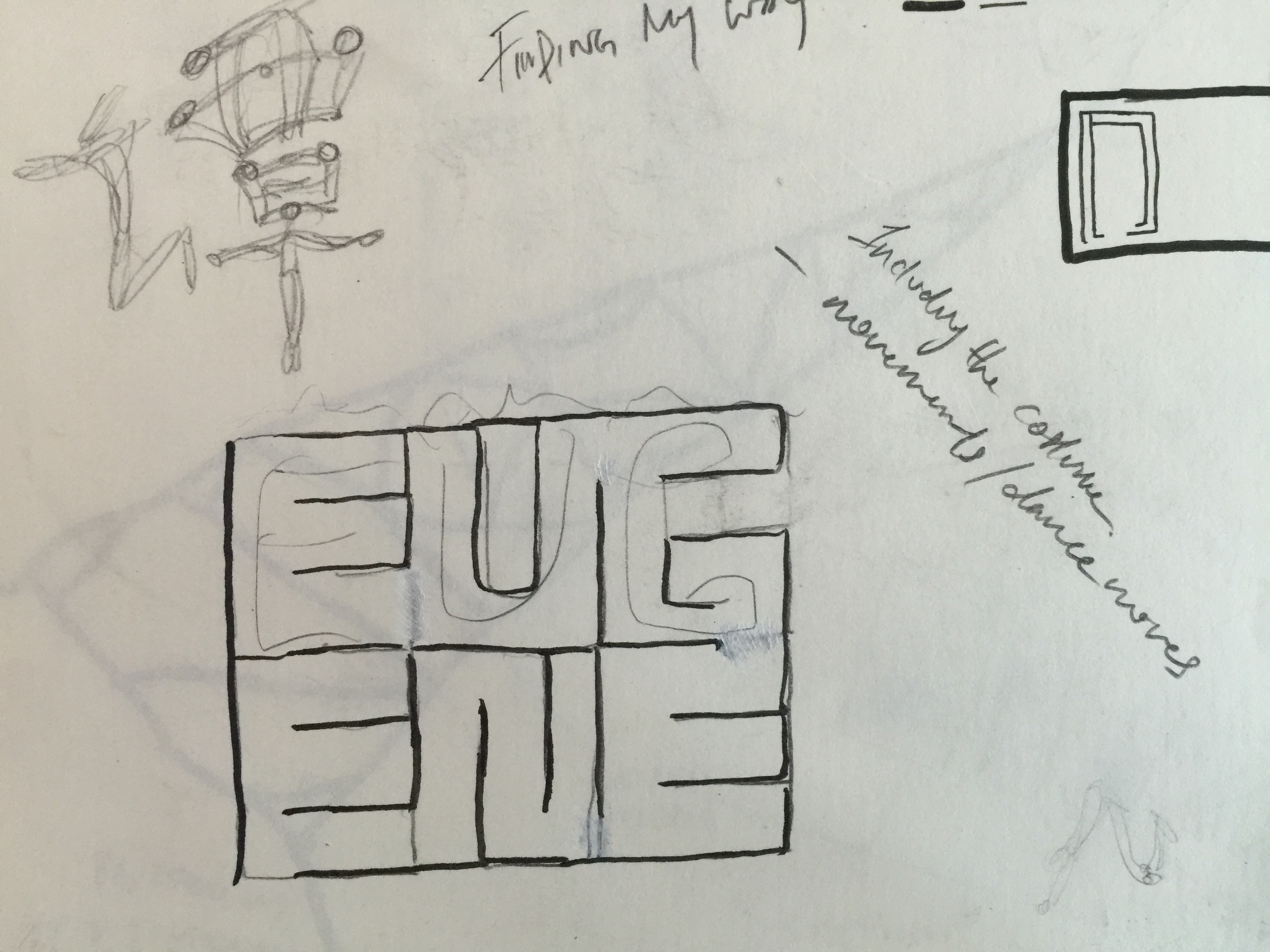
The next idea I had was being a Dancer. Initially I thought this idea would come out pretty nice, or at least easier to do. I tried implementing dance moves into each individual character of the words. But as I showed it to prof. Shirley, she said the words didn’t really show much movement, and it really is hard to capture the movement as the character kind of seems pretty static. As dance is really all about the movements and the flow of the moves as well. I tried including a stage as well, in the sketches, and a spotlight, to show like as it the characters are performing on a stage.
(Ignore the weighing scale sketch below the shoe, unrelated to soccer)
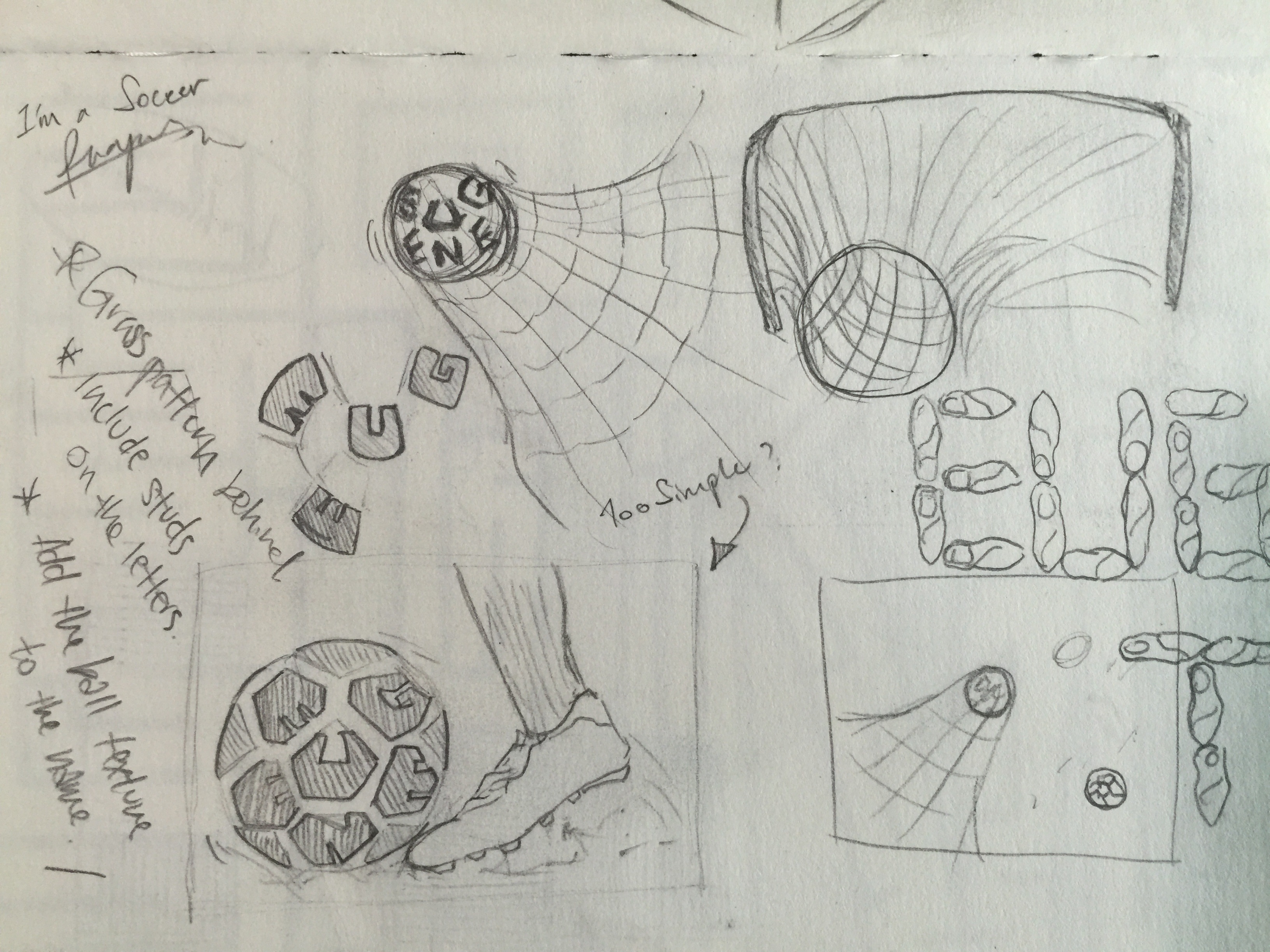
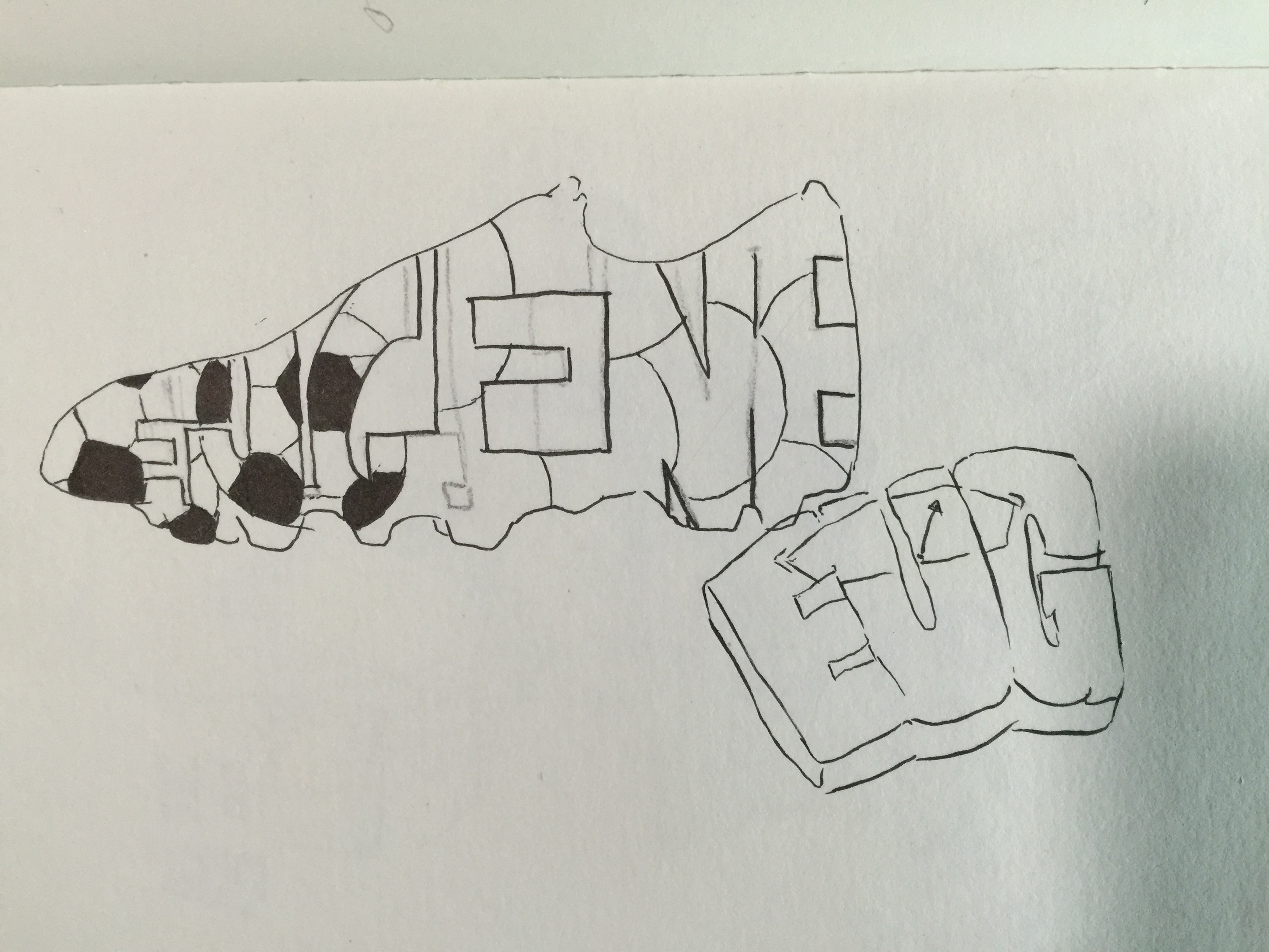
My fourth idea was being a Soccer Player. And as it was for the start of the previous ideas, I wanted to implement the object of either the soccer ball or the boots of the player into the typography. But as prof. Shirley did not want to include the objects itself into the typographic portrait, I had to include the objects or textures of it onto the words. And the one stand out thing of being a soccer player is probably having the soccer ball texture on the words itself. So I tried different ways of including the texture as shown in the sketches. With one of which I tried including the texture of the soccer ball, and fitting the typography into a shape of a soccer boot.
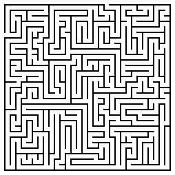
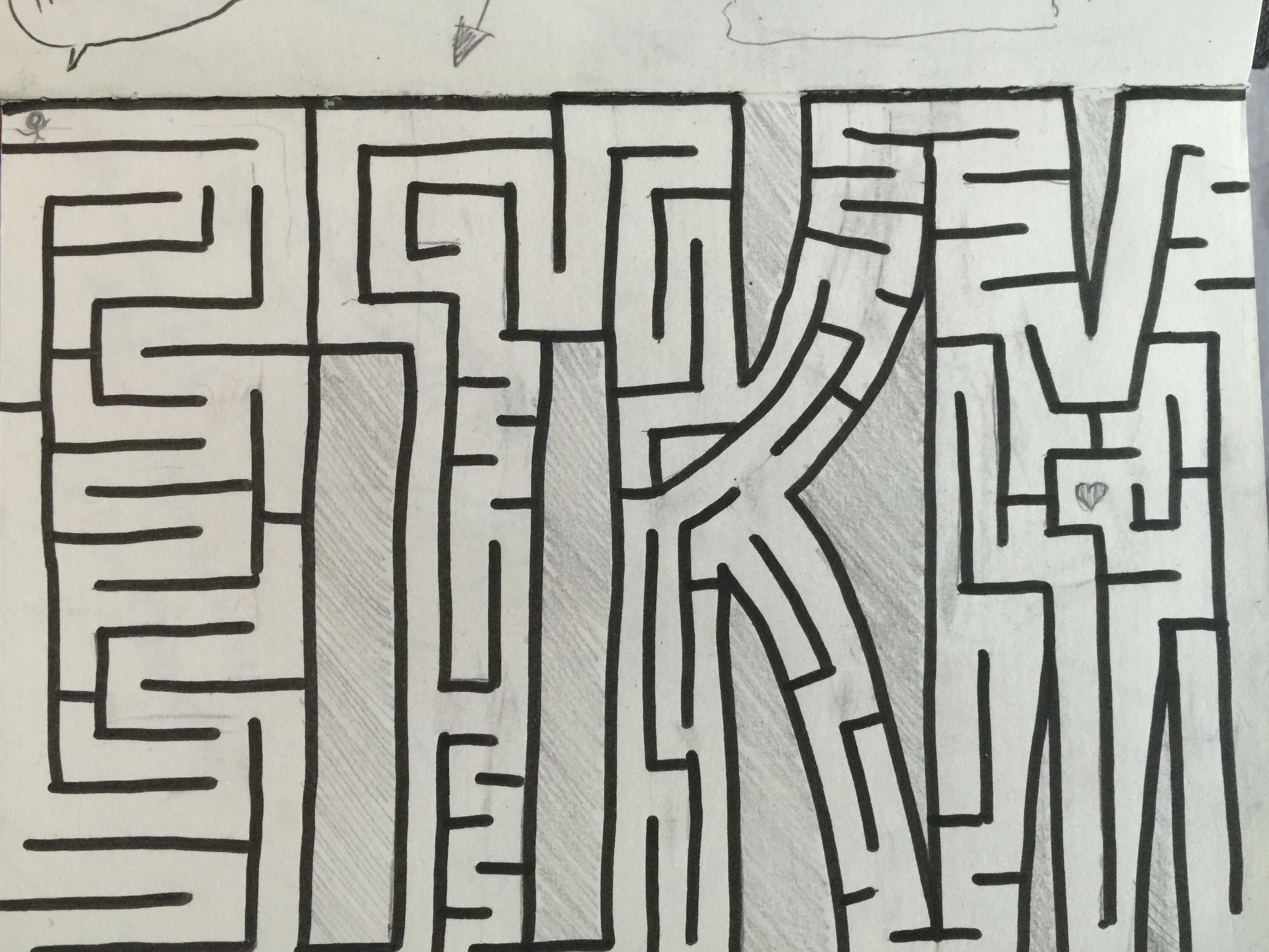
And as for the next idea, it was me Finding My Way. And what better way to find my way is to put myself in a maze. So immediately I thought of how I could implement a maze within my name. I went on to research a little on how mazes were made, and how the lines for the maze INSIDE of a huge square or rectangle. I found a simple maze as shown above in the images, and I got the idea of how I wanted to put my name as a maze that shows that i’m Finding My Way. So I hand draw everything onto my sketchbook to slowly try and piece everything together and form a real maze. P.S. the maze can really be played.
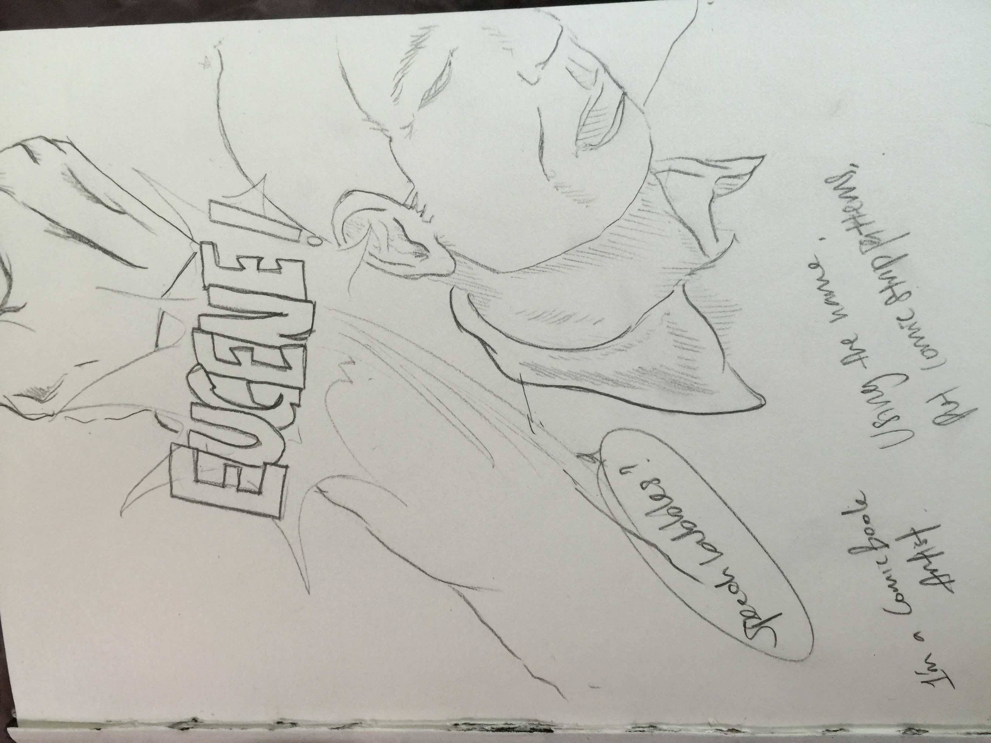
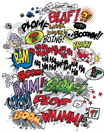

And for the my last idea, was me being a Comic Book Artist. So the first thing I thought of to really show a comic book style, is the old school way of how actions happen. Like when there’s an explosion, or someone gets punched as shown in the images above. Instead of the action word of getting punched, I would include my name in the action word, as shown in the image above. But prof. Shirley said that I did not have to go so much into details to show a comic book style by showing a whole panel of a comic. Rather why not just show the word itself of going BAM, BOOM or CRASH as shown in the second picture of above. And instead of those words, put my name into it. And also to modify the comic art style into a more old school pop art comic style.
These are all just my initial ideas, and definitely as one gets further into a project, the ideas gradually change and hopefully get better.