This project really brought about a new experience. As it was a first time for me to design and make a zine from scratch, and also dealing with InDesign, which I had never even accessed before. Another obstacle that I was facing was to what did I actually want to put into my Zine.

Shirley initially said to just make the Zine about all of my past work in 2D, and I guess it would’ve been a lot easier to just work with that as I wouldn’t have needed to create and illustrate anything else. I figured to put every single one of my projects into the Zine, so consulted Shirley about the layout of the project.

new doc 3_2

She provided this really good layout guide of what my Zine should look like.

I went on to see how I should frame each of my projects. I mostly just researched different Zine examples, and there were many examples in Pinterest.

BUT, I honestly felt that I could do a lot better than that, and that my Zine might not be very interesting if it’s just about my work from the previous 2D projects. Also, it was pretty hard to have a continuous narrative or idea throughout the Zine, as my previous works didn’t exactly have much link between them.

THUS, the idea of doing a Zine about Corgis came to mind! And instead of just putting pictures, I thought why not illustrate every corgi picture in the Zine.

A good practice indeed!

Then I went on searching for what exactly I should put into the Zine about Corgis, and I noticed people are always looking at how the Corgis are all so short and stubby, very much focused on its outlook. So what better way to appreciate the Corgi breed, than to make a Zine about the facts of Corgis! I went on to search more facts about corgis, and filter out the facts which I could illustrate better.


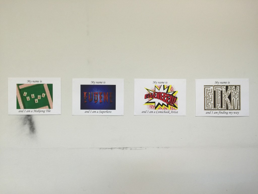
Now here I present to you, my final 4 composition of the Typography Portraits project! Plus some short description of the chosen 4.

IMG_5802

MahjongFINAL

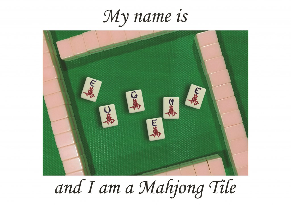
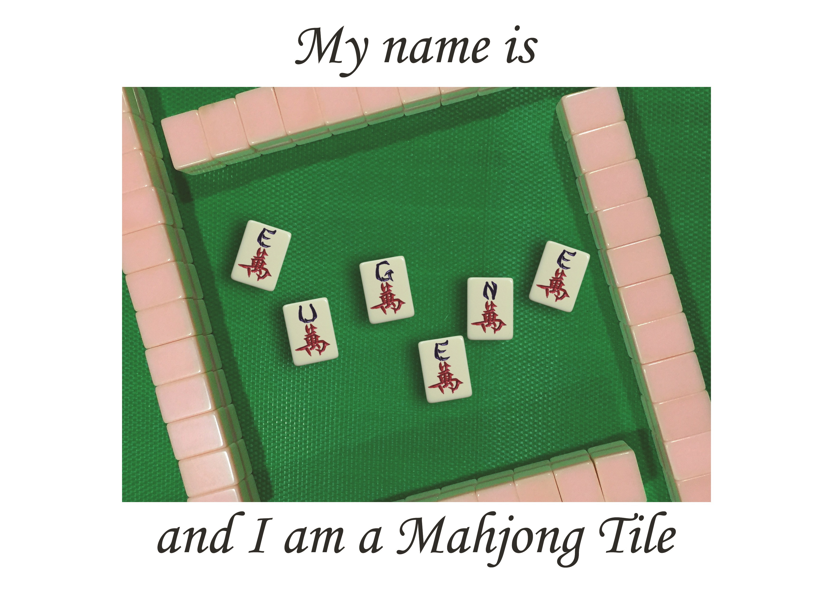
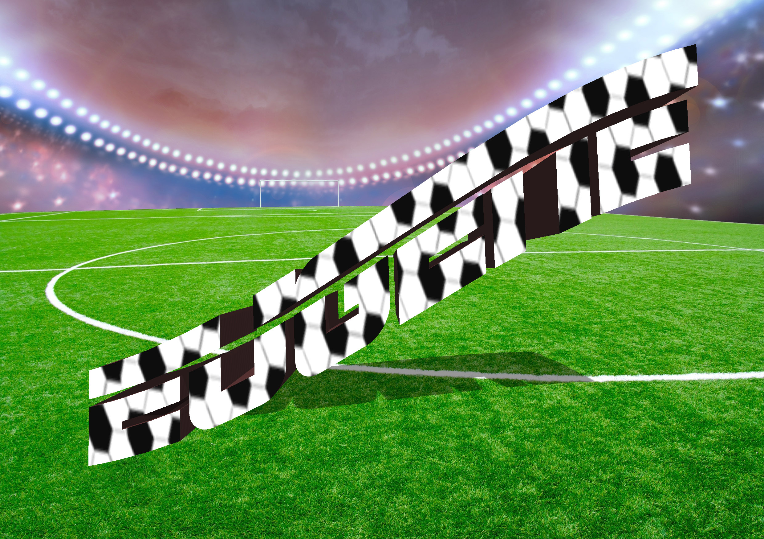
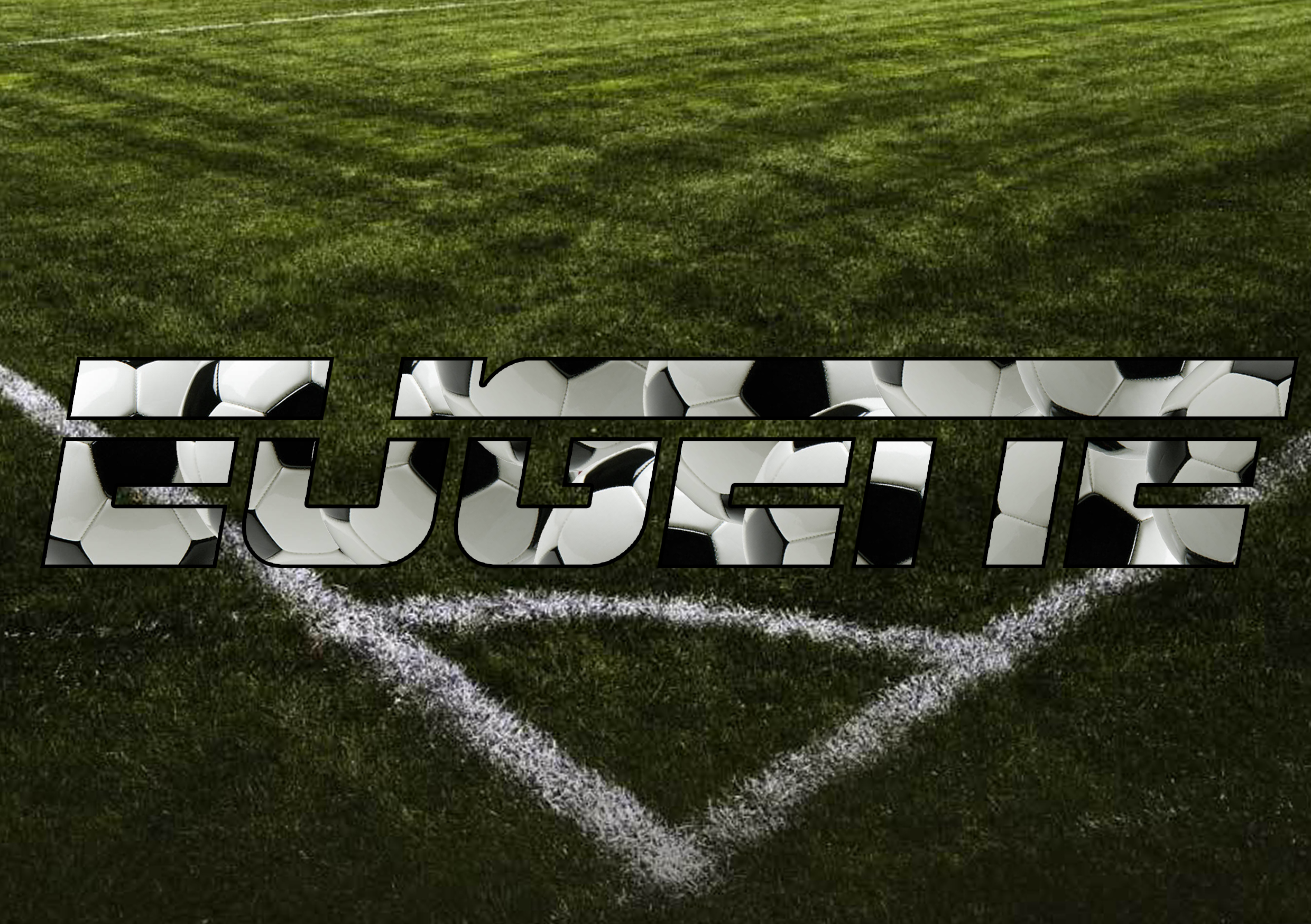
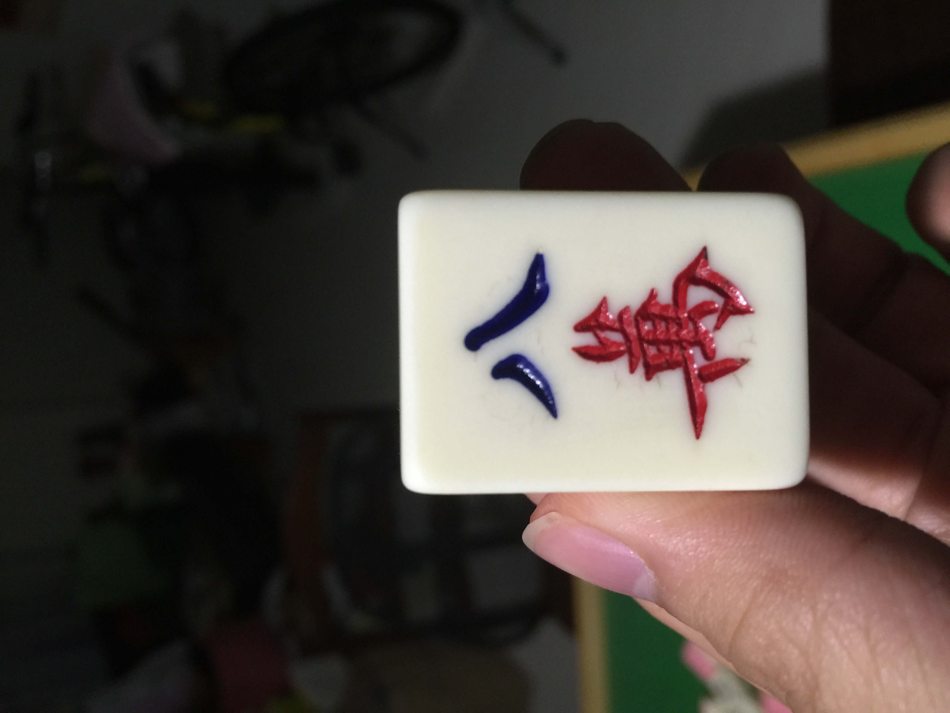
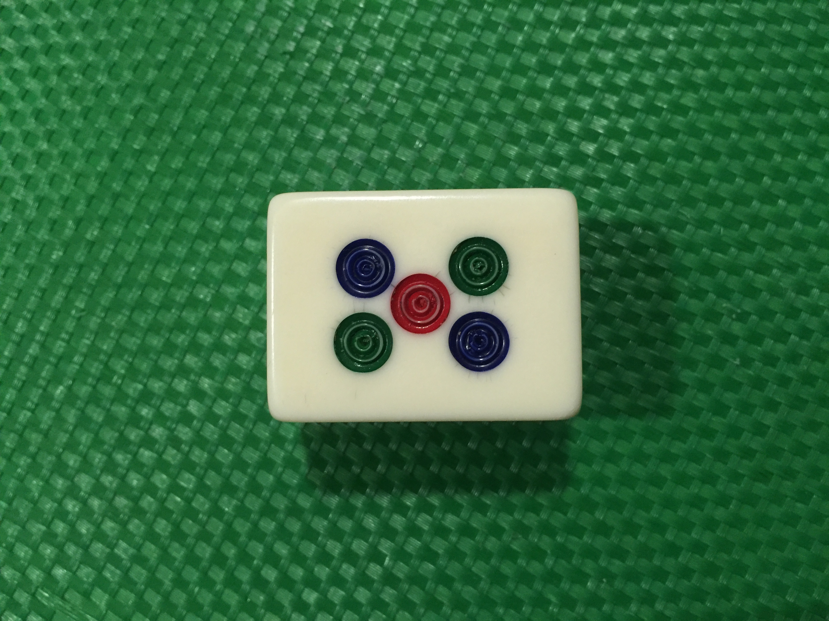
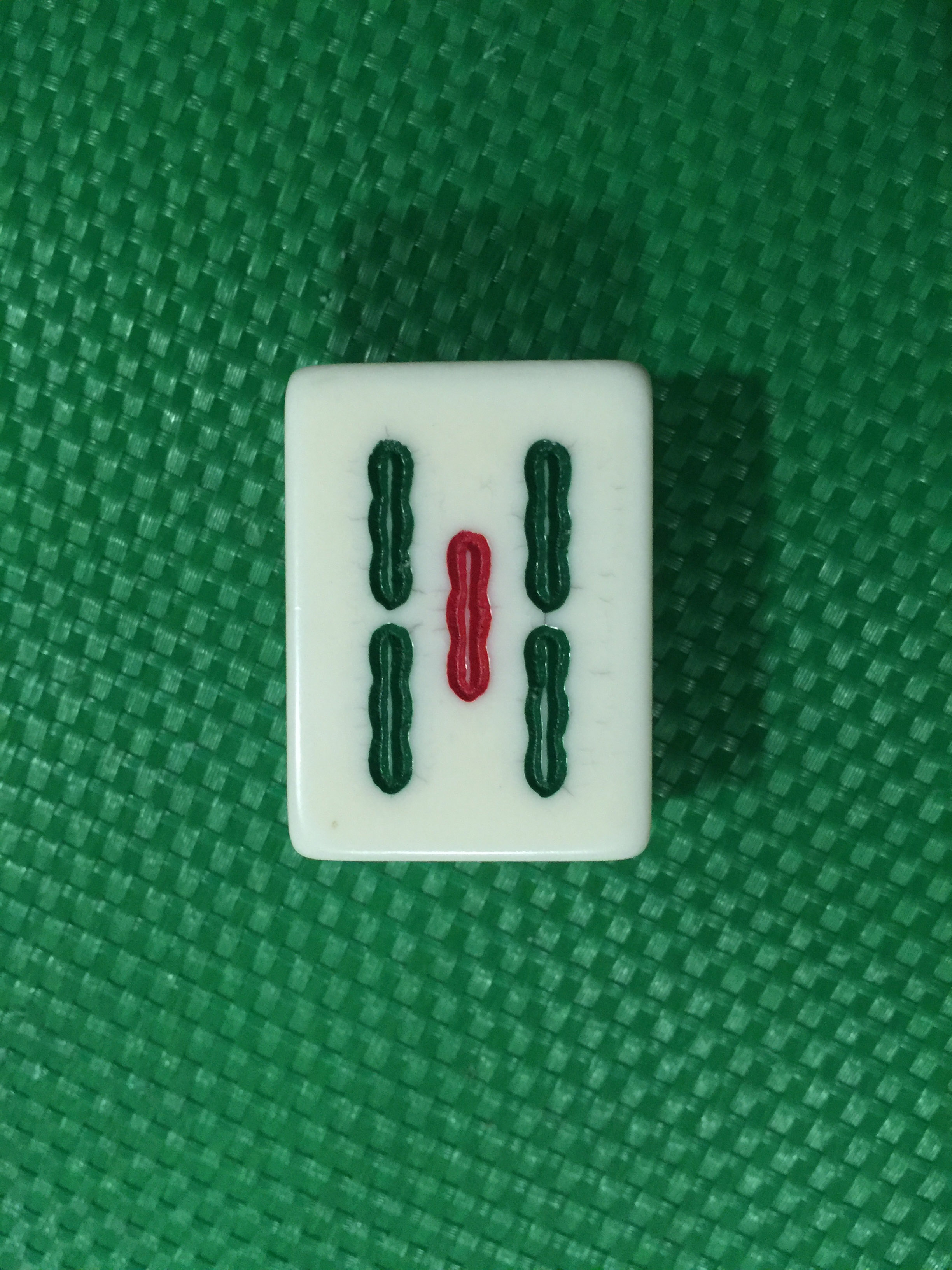
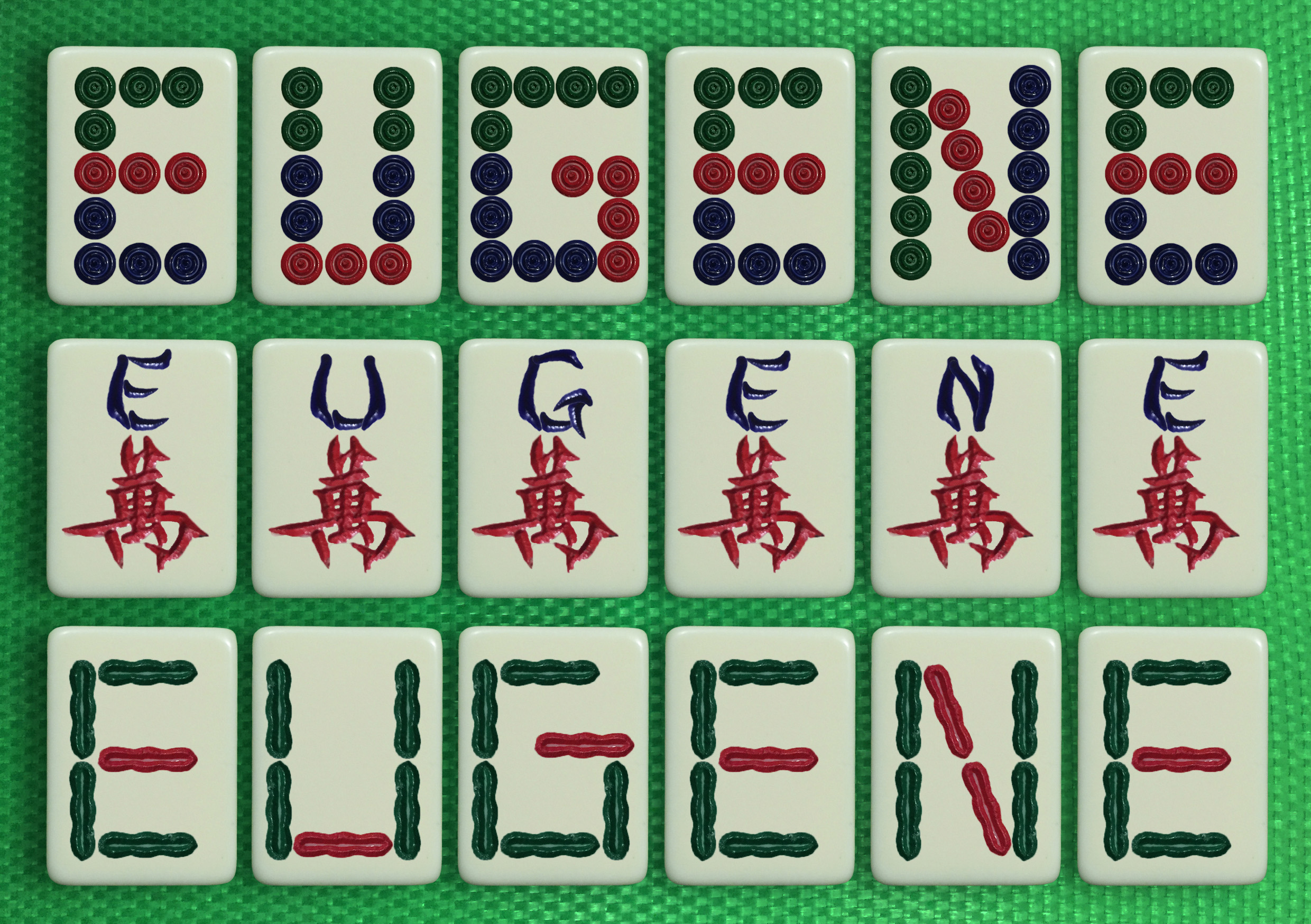
The first idea I chose was the I am a Mahjong Tile. It seemed like a really good time to be presenting one with mahjong, especially since it was still around the Chinese New Year period. But not only that, there’s also just a short description of meaning behind it.

Mahjong was actually a weekly thing that happened at home when I was younger. And as a young kid, one will always be curious as to what’s happening on and around. Being that curious young boy, I’ve always sat and watched how my family members played the game, and I picked up how to play along the way as well! And until now, even though I might not be that good at it, I still enjoy the occasional mahjong sessions. It brings a little reminiscence of the past and how i’ve always enjoyed playing mahjong.

SuperheroFINAL

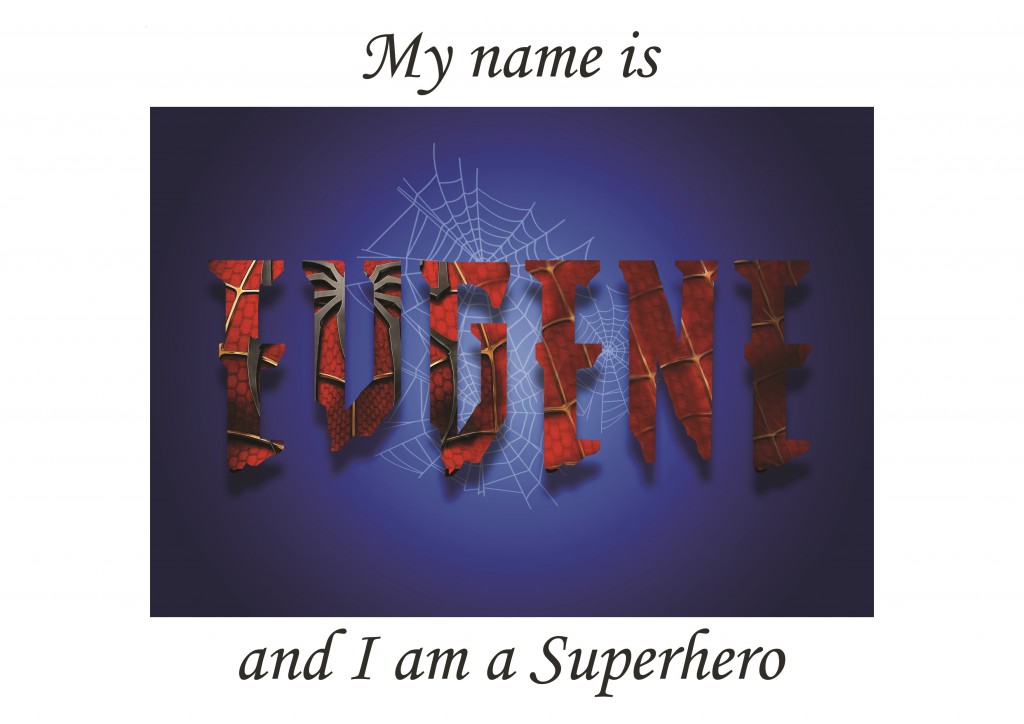
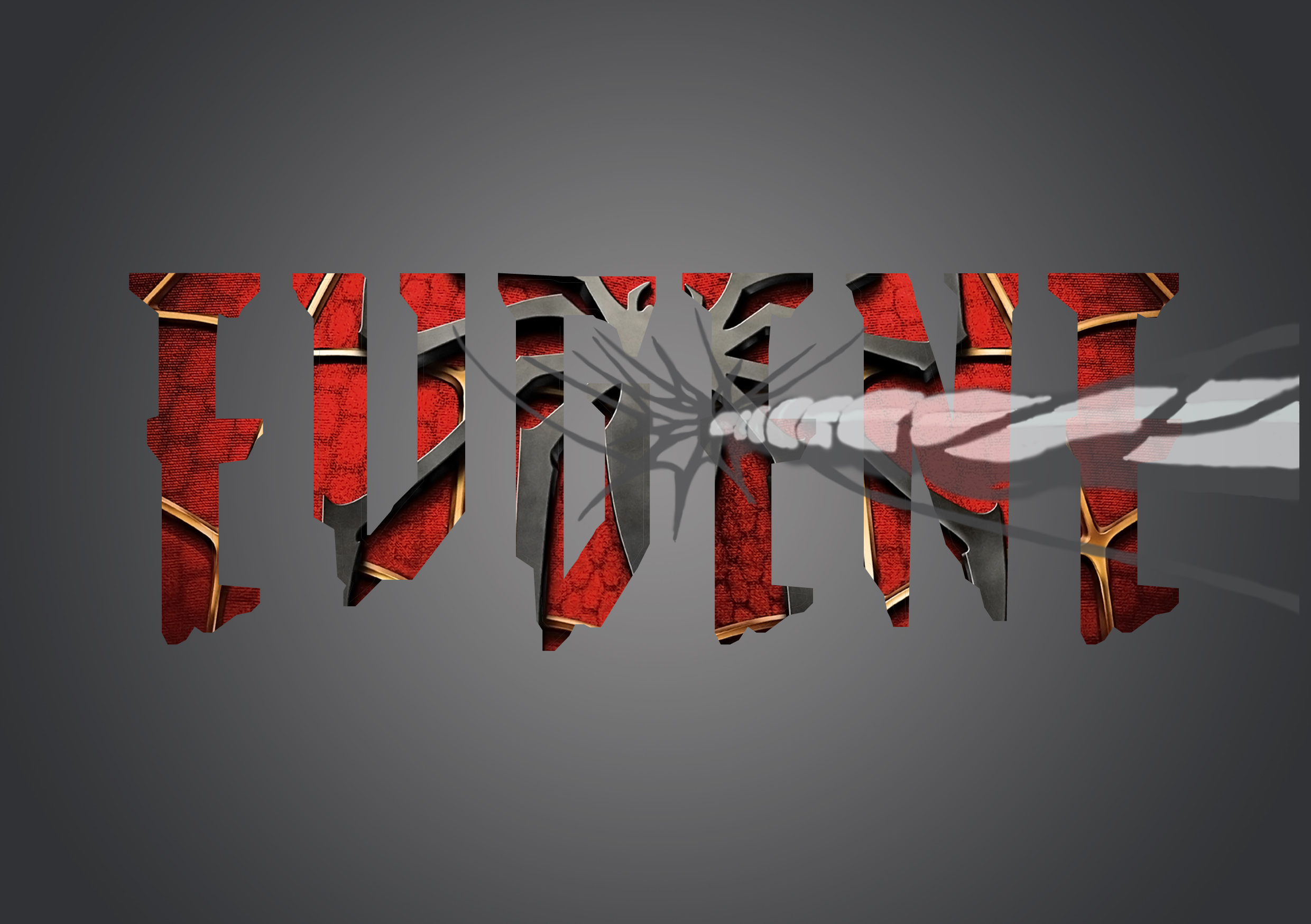
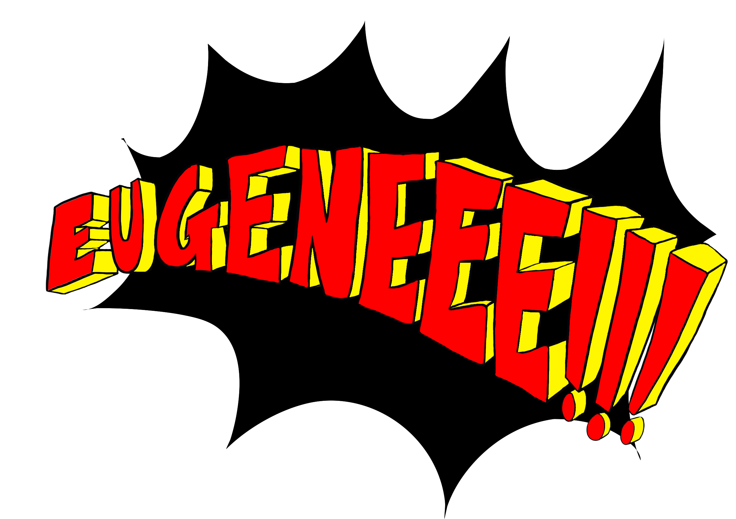
As for my second chosen idea, I chose I am a Superhero. Even until now, I still have the kid inside of me that is still in love with all the superhero stuff. And I really do adore Spiderman.

But other than that, the reason why I chose this idea was that everyone, or at least most people, when they were young, would fancy or look up to a certain superhero or heroine. It’s kind of our childhood, and then there’s a few that carries it on until adulthood. And that’s where I come in, telling the story of how i’ve come to love spiderman as a superhero.

ComicArtistFINAL

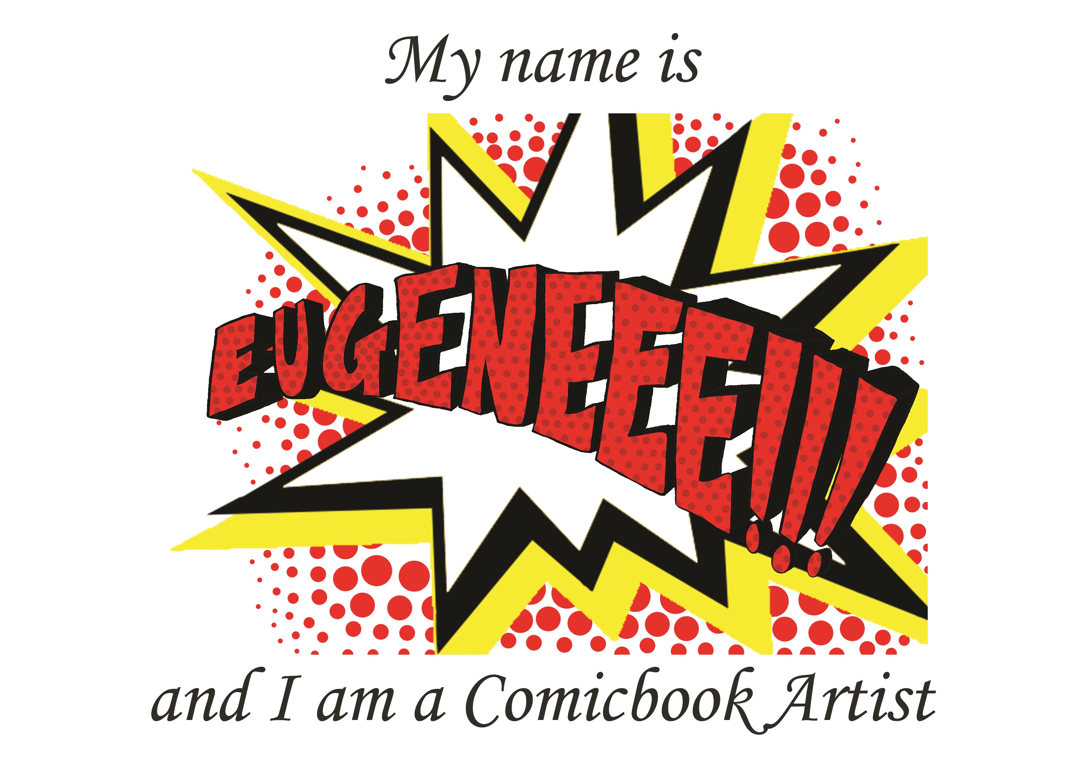
And as for my third idea, I chose I am a Comicbook Artist. In this case, it kind of links to the second idea a little more, other than stories of when I was younger. I’ve always liked drawing, ever since I was about 4 or 5 when my mum and my uncle showed me how awesome and truly amazing drawing is. From then on, i’ve always practiced, treating it a lot like a hobby, only realising after that it could be something of what I want to pursue as a career in the future.

From then, too, I started to like comics. The way they’re drawn, how the stories are told, each panel shows the different characters and stories. And each one always played so well in my head. And from there, it links to the amazing styles of drawing that is seen in the Spiderman comics. Hopefully one day, i’ll be an amazing comic artist enjoying the illustration of each panel!

MazeFINAL

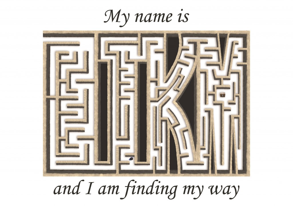
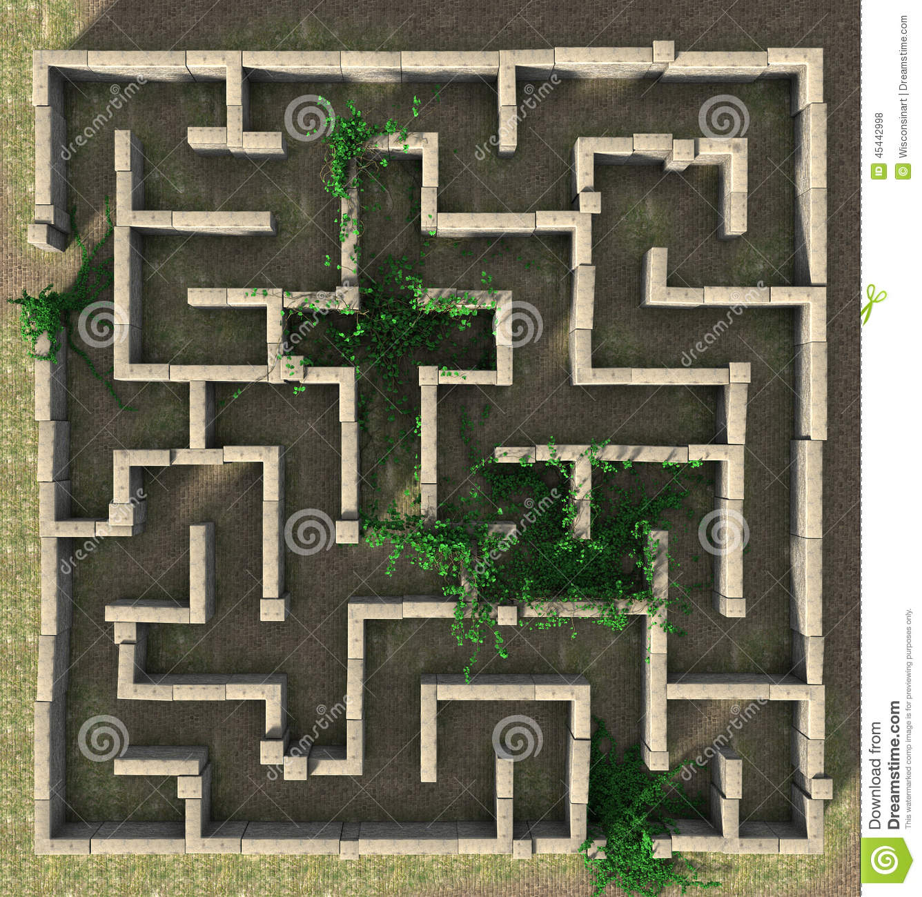
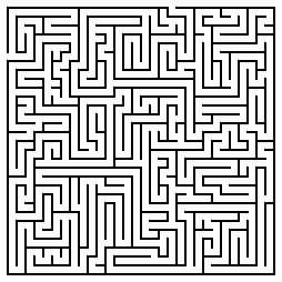
And last but not least, my last idea i’ve chosen is I am finding my way. I chose this idea also to show that, at a very young age, people start to discover what they love to do. From there, they choose whether or not to pursue what they love as career, or to choose the other option of getting a stable job and keeping the thing they love as a hobby.

Until now, i’ve always loved to draw, and it’s what I hope to be doing in the future as a career too. But just recently, I was in a dilemma of what I really wanted to major in. I wasn’t sure of what I wanted to do, and even with the benefit of both having drawing which is what i loved to do, I still wasn’t sure. Even though i’ve chosen animation in the end, but I still am not sure what the future holds for me. Which is why, in this idea of finding my way, I decided to show that there will be obstacles along the way, and paths that might lead me to a dead end. But by persevering and taking each task a step at a time, one day eventually, i’ll end up at where I wanna be, and to know what I wanna achieve. As no matter how many paths there are, there’ll always be that one path that will lead you straight to what you’re looking for, and you just have to persevere and not give up.


Thanks for taking some time off to read my not so short description! But I do hope you enjoyed it! Enjoy the rest of your awesome day!

The process of creating the different typographic portraits was definitely a tough one, as my idea slowly keeps changing while at the same time I kept thinking of better ideas that I could work on.

The first idea, Weight Consciousness.

scales

The idea for the weighing didn’t seem that it’d work that well. I tried clipping the image onto text in photoshop, but it looked really plain and did not really stand out that much.


The second idea, Superhero.

Spiderman screen04-web Spider-Man

The idea of implementing spiderman for my superhero was one that I wanted to stick with. I started with searching for a font that suit the spiderman theme. After which, I searched for a good quality suit texture of spiderman that I can use and put into the text that I use. And to also include a subtle addition of a spiderweb in the composition.

The first picture shows one of the ideas I tried, and thats the font that I’m probably going to work with. I consulted again with prof. Shirley and she gave the idea of making the spiderman logo less obvious, and to show more texture of the spiderman suit.


The next idea is Soccer Player. 

Test soccer_ball foolball IMG_5844ssp

Initially I thought this idea would work, but it turned out pretty hard to continue. I tried finding many different soccer balls, and its textures and patterns to put in the the text. The first picture was when I tried converting the text into 3D shapes while including the pattern of a soccer ball onto it. But it looked kind of weird and definitely too bright. The second one I tried was to make it more 2D, and I tried using the ESPN logo font as the font for my name as well. It still didn’t seem to work that well, and it felt like something was missing.


The next idea was Finding My Way.

d-illustration-stone-maze-puzzle-aerial-view-45442998 maze

For this idea, I had the whole idea for the maze already sketched out, as i’ve shown in my previous post. So all I had to do was to find a good pattern that I could work with and that would make the maze more believable and realistic. I choose the above texture of walls for my maze.


For my next idea, the Comic Book Artist.

Comicartist comic-pow-clip-art-8401671 2

comiccomic


The comic book artist idea, I went with only showing the speech bubble of the old school pop art style comics. Initially I tried finding fonts of comic books or pop art style fonts, but it felt very unnatural, not really much like a comic, as shown in the first image above. The next thing I thought of was to make the font from scratch and drawing it out instead. It came out a lot better than a font I found on the internet. After consulting with prof. Shirley, she also asked me to try and include the pop art style of having the dotted or half-toned effect on the words itself. To make it seem even more so like and old school pop art style comic.


Another idea I came up with was, I am a Mahjong Tile.

ok IMG_5735

IMG_5722 lol

This last idea came to me quite suddenly, and also while I was playing mahjong. There are characters in all the mahjong tiles itself too, so why not include characters or letters of my name into each individual tile! So I took a picture of the tiles, one that would be easier to edit and move the images. I got blank tile which I could easily add in the strokes and patterns of each tile.

lllllll

These are the 3 different tile patterns from the mahjong set that I came up with. All forming my name after I edited and changed the strokes for each individual tile.