The process of creating the different typographic portraits was definitely a tough one, as my idea slowly keeps changing while at the same time I kept thinking of better ideas that I could work on.
The first idea, Weight Consciousness.
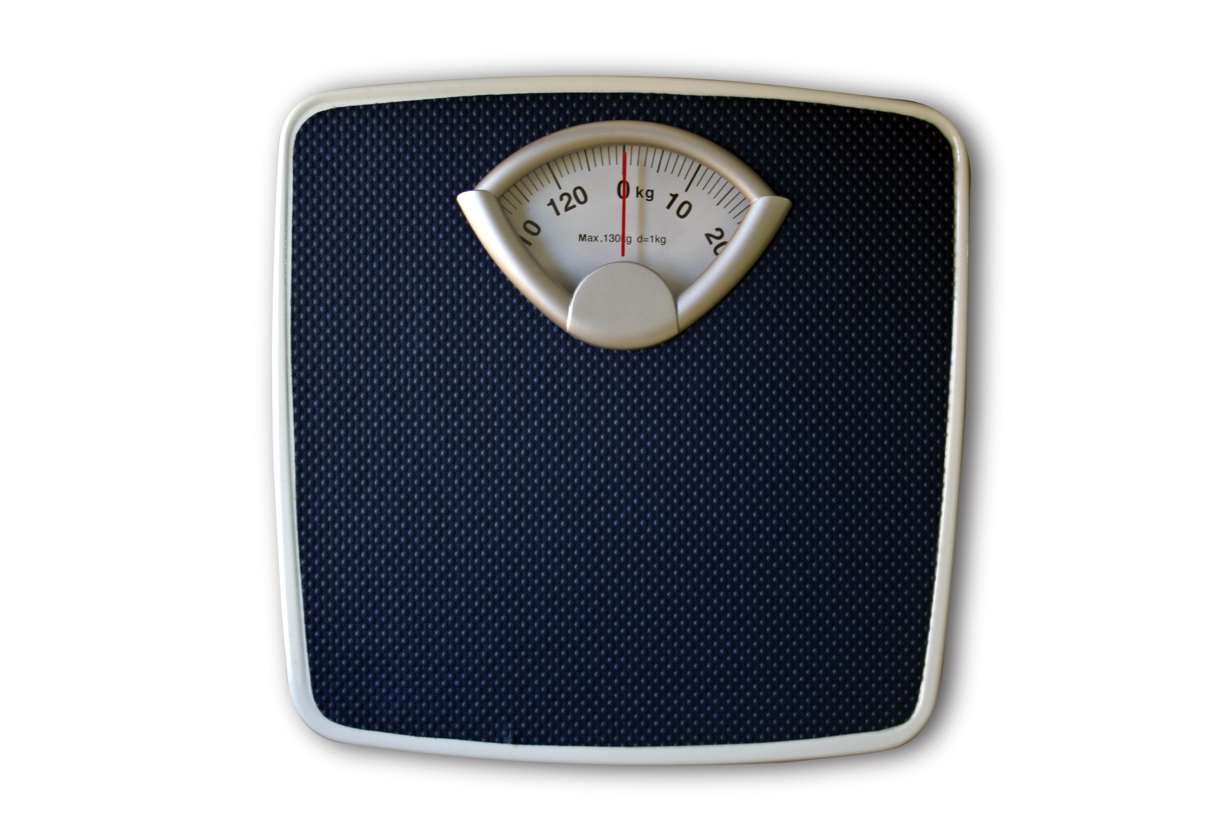
The idea for the weighing didn’t seem that it’d work that well. I tried clipping the image onto text in photoshop, but it looked really plain and did not really stand out that much.
The second idea, Superhero.
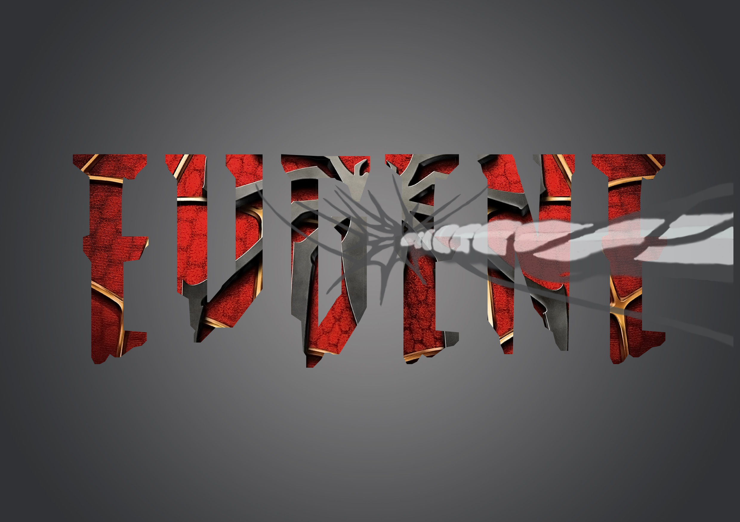
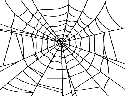
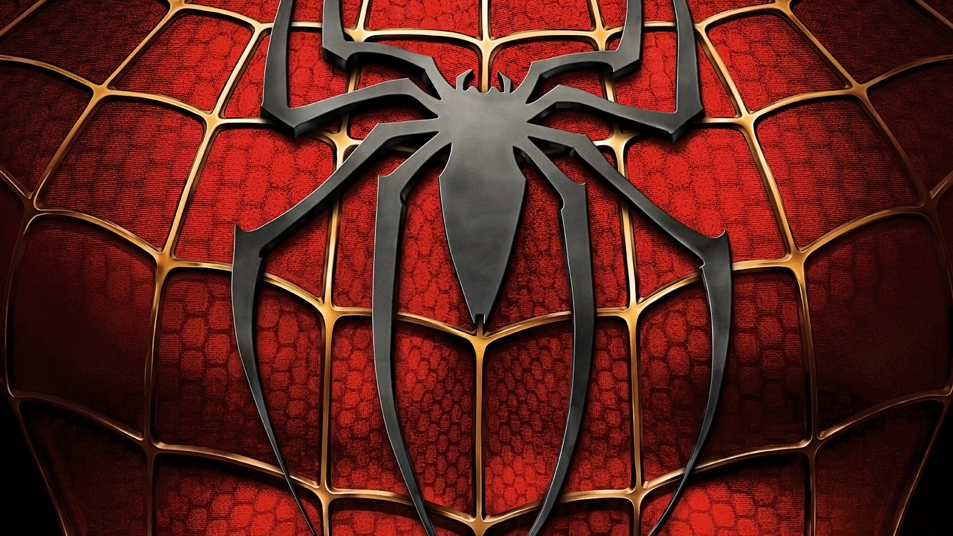
The idea of implementing spiderman for my superhero was one that I wanted to stick with. I started with searching for a font that suit the spiderman theme. After which, I searched for a good quality suit texture of spiderman that I can use and put into the text that I use. And to also include a subtle addition of a spiderweb in the composition.
The first picture shows one of the ideas I tried, and thats the font that I’m probably going to work with. I consulted again with prof. Shirley and she gave the idea of making the spiderman logo less obvious, and to show more texture of the spiderman suit.
The next idea is Soccer Player.
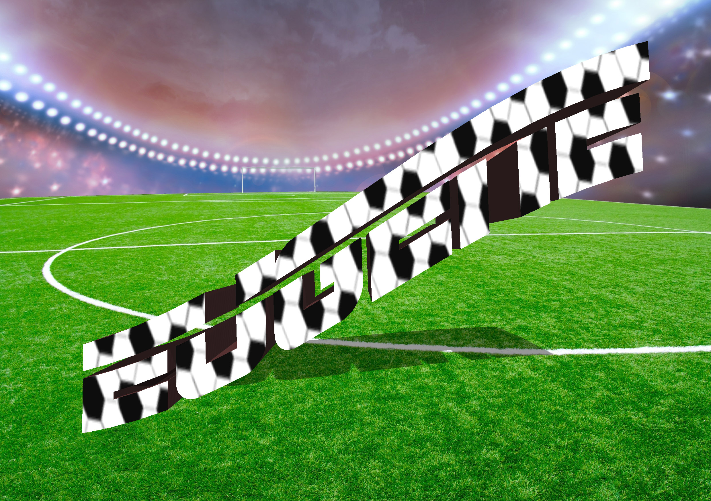

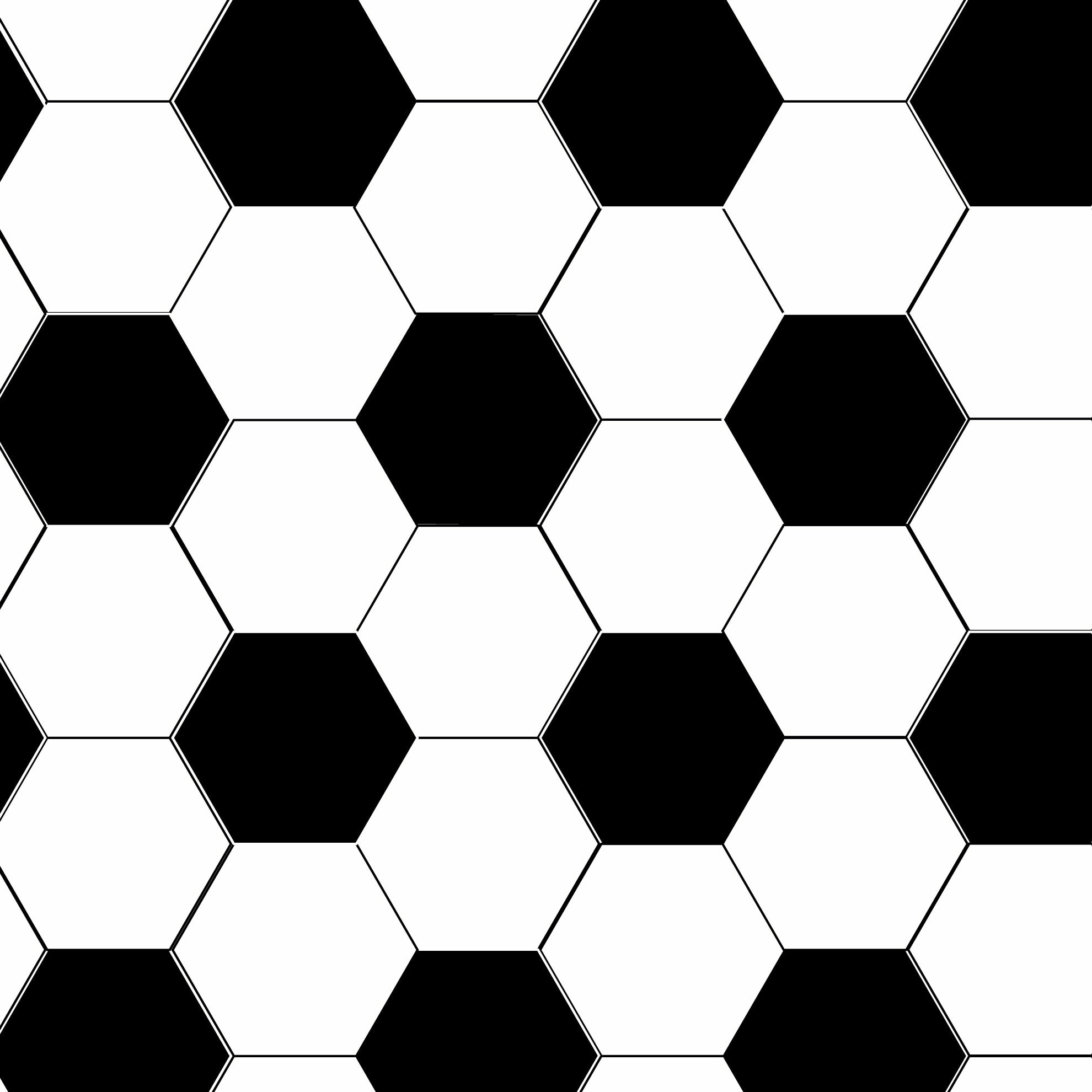
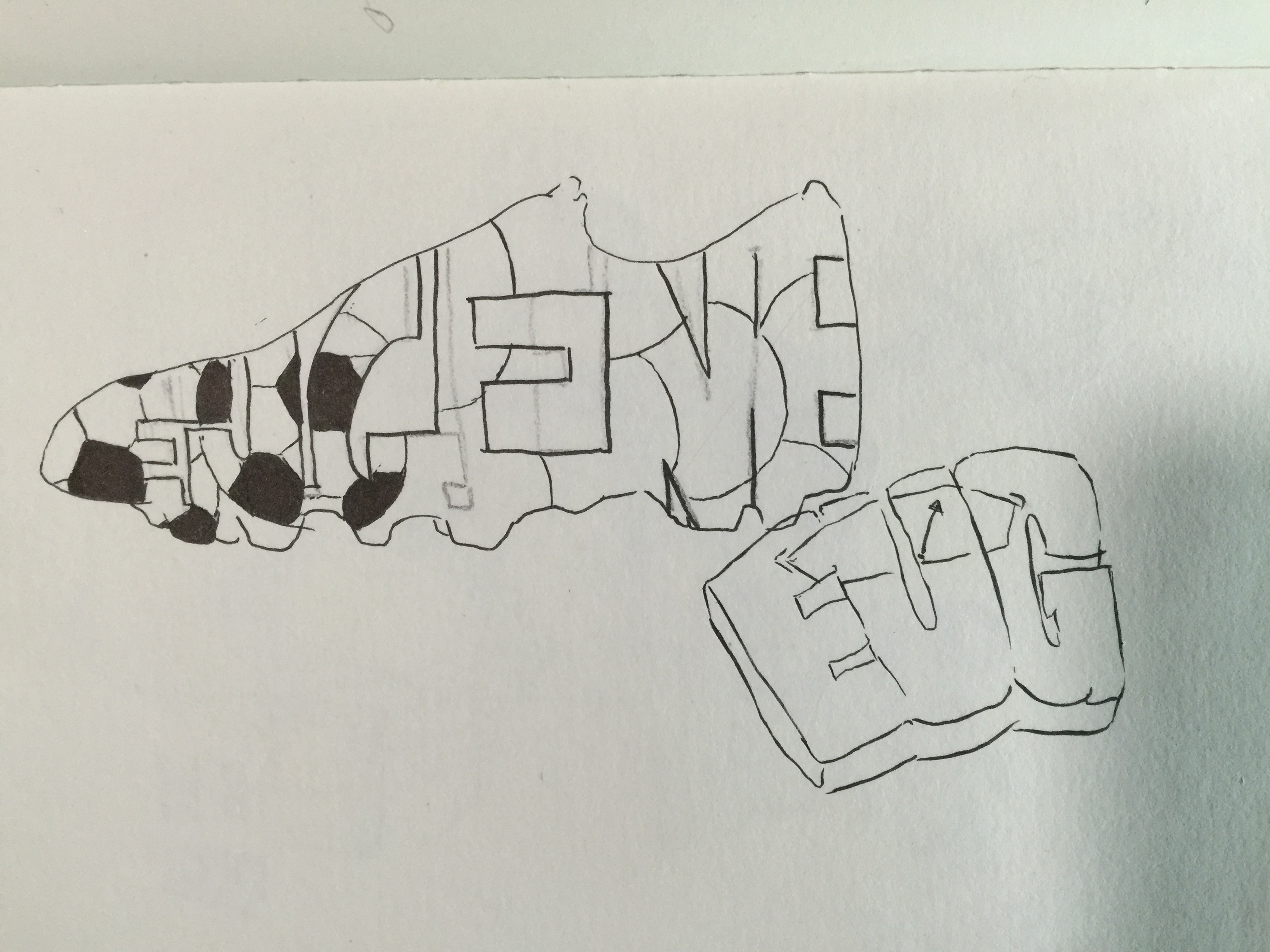
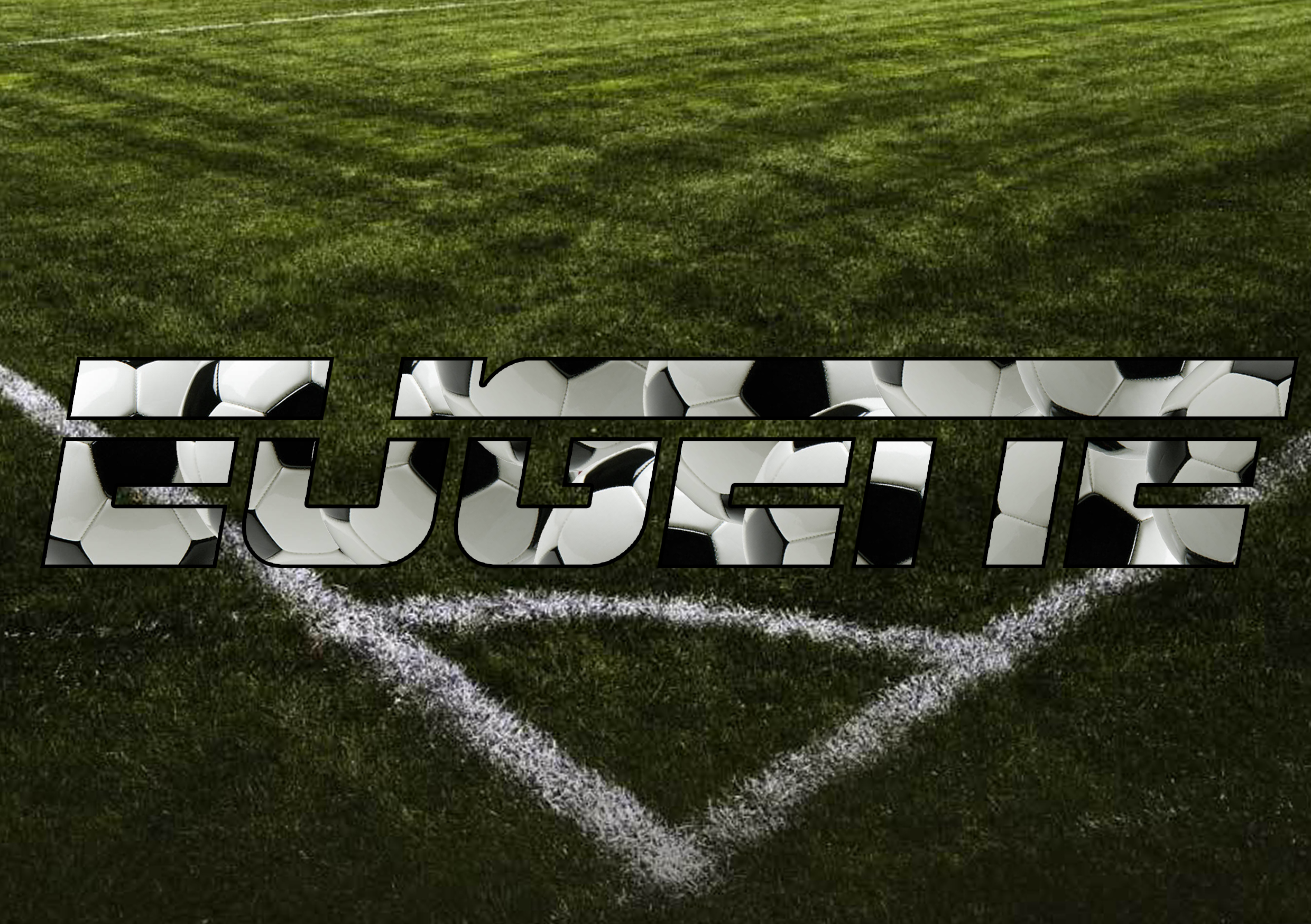
Initially I thought this idea would work, but it turned out pretty hard to continue. I tried finding many different soccer balls, and its textures and patterns to put in the the text. The first picture was when I tried converting the text into 3D shapes while including the pattern of a soccer ball onto it. But it looked kind of weird and definitely too bright. The second one I tried was to make it more 2D, and I tried using the ESPN logo font as the font for my name as well. It still didn’t seem to work that well, and it felt like something was missing.
The next idea was Finding My Way.
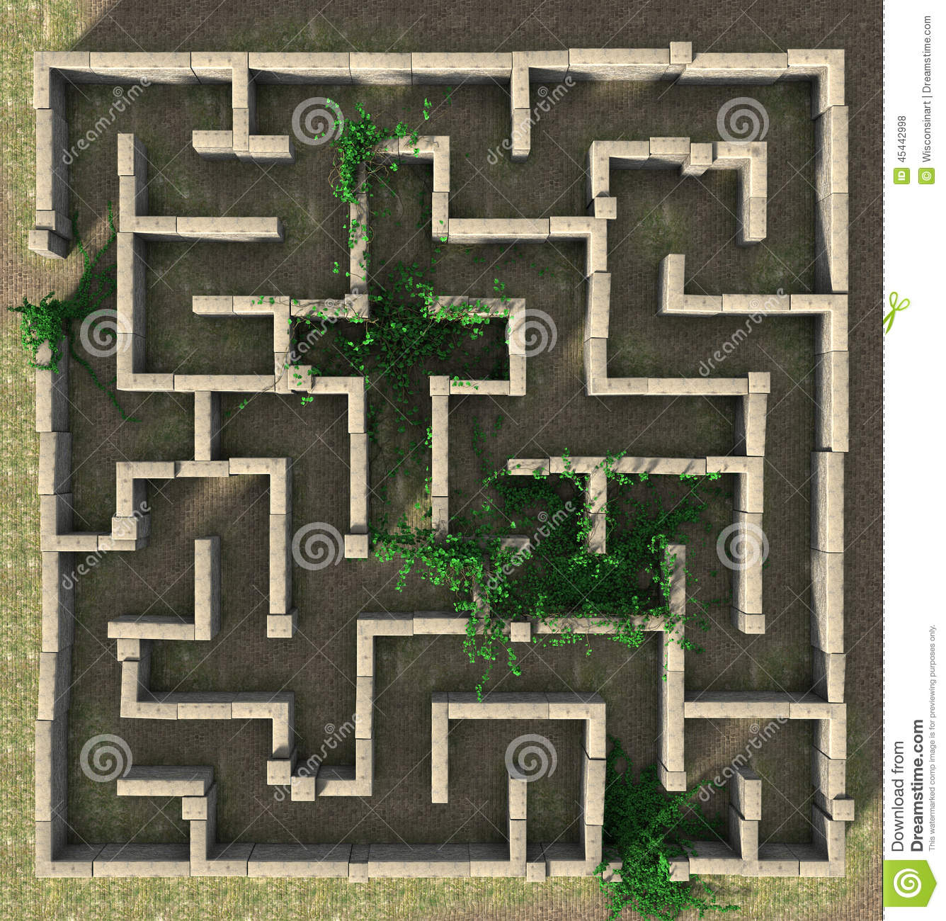
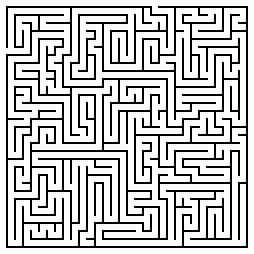
For this idea, I had the whole idea for the maze already sketched out, as i’ve shown in my previous post. So all I had to do was to find a good pattern that I could work with and that would make the maze more believable and realistic. I choose the above texture of walls for my maze.
For my next idea, the Comic Book Artist.
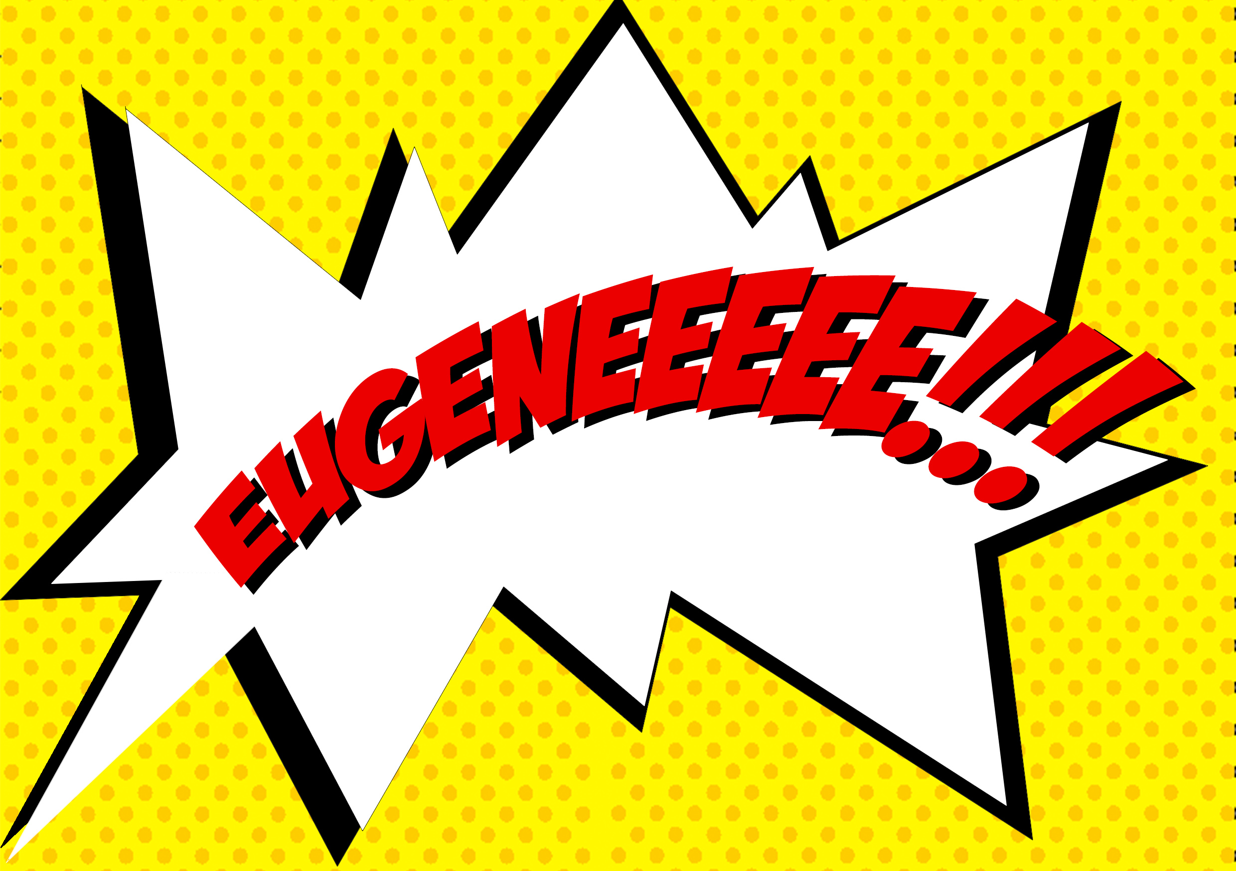
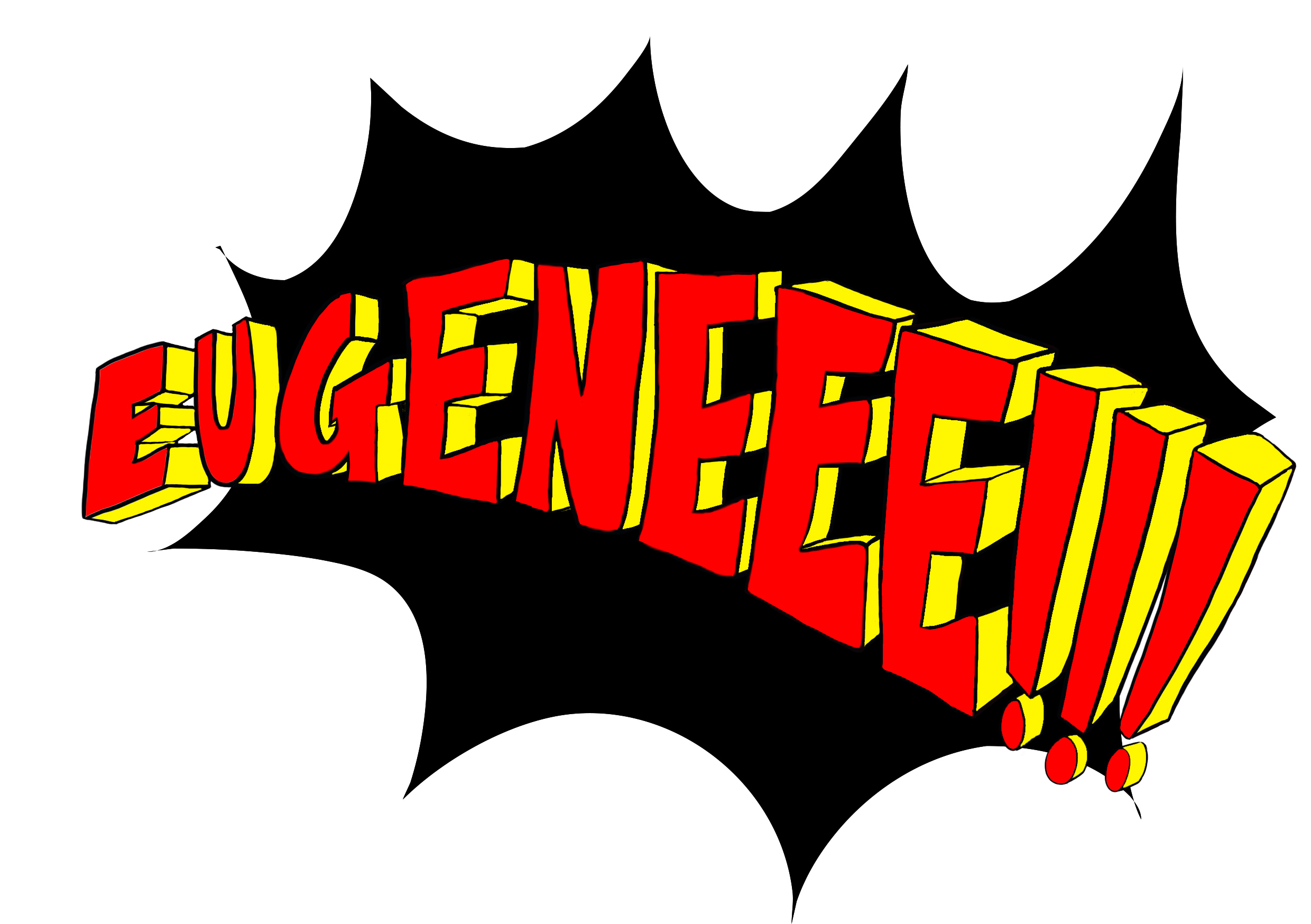
The comic book artist idea, I went with only showing the speech bubble of the old school pop art style comics. Initially I tried finding fonts of comic books or pop art style fonts, but it felt very unnatural, not really much like a comic, as shown in the first image above. The next thing I thought of was to make the font from scratch and drawing it out instead. It came out a lot better than a font I found on the internet. After consulting with prof. Shirley, she also asked me to try and include the pop art style of having the dotted or half-toned effect on the words itself. To make it seem even more so like and old school pop art style comic.
Another idea I came up with was, I am a Mahjong Tile.
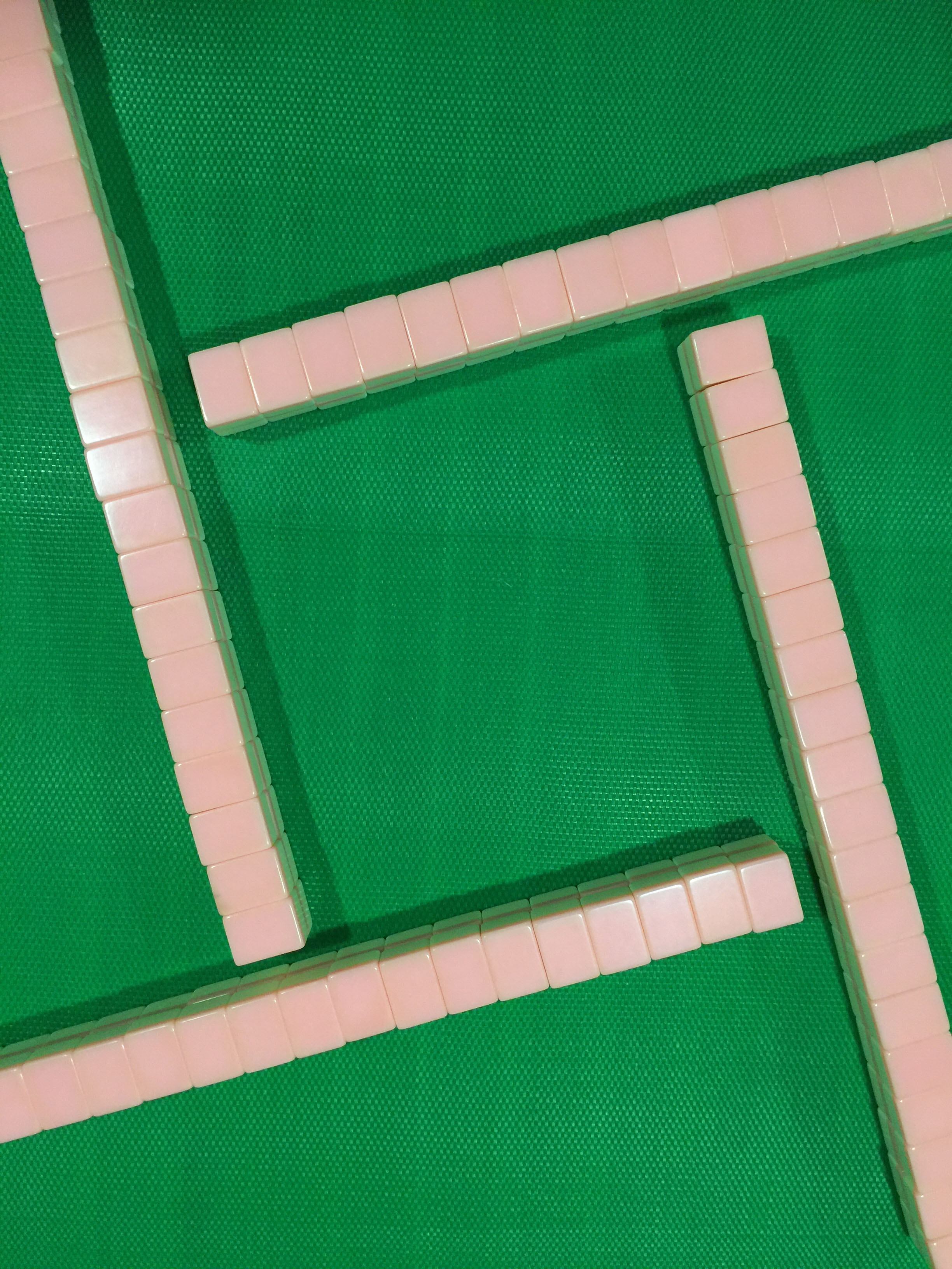
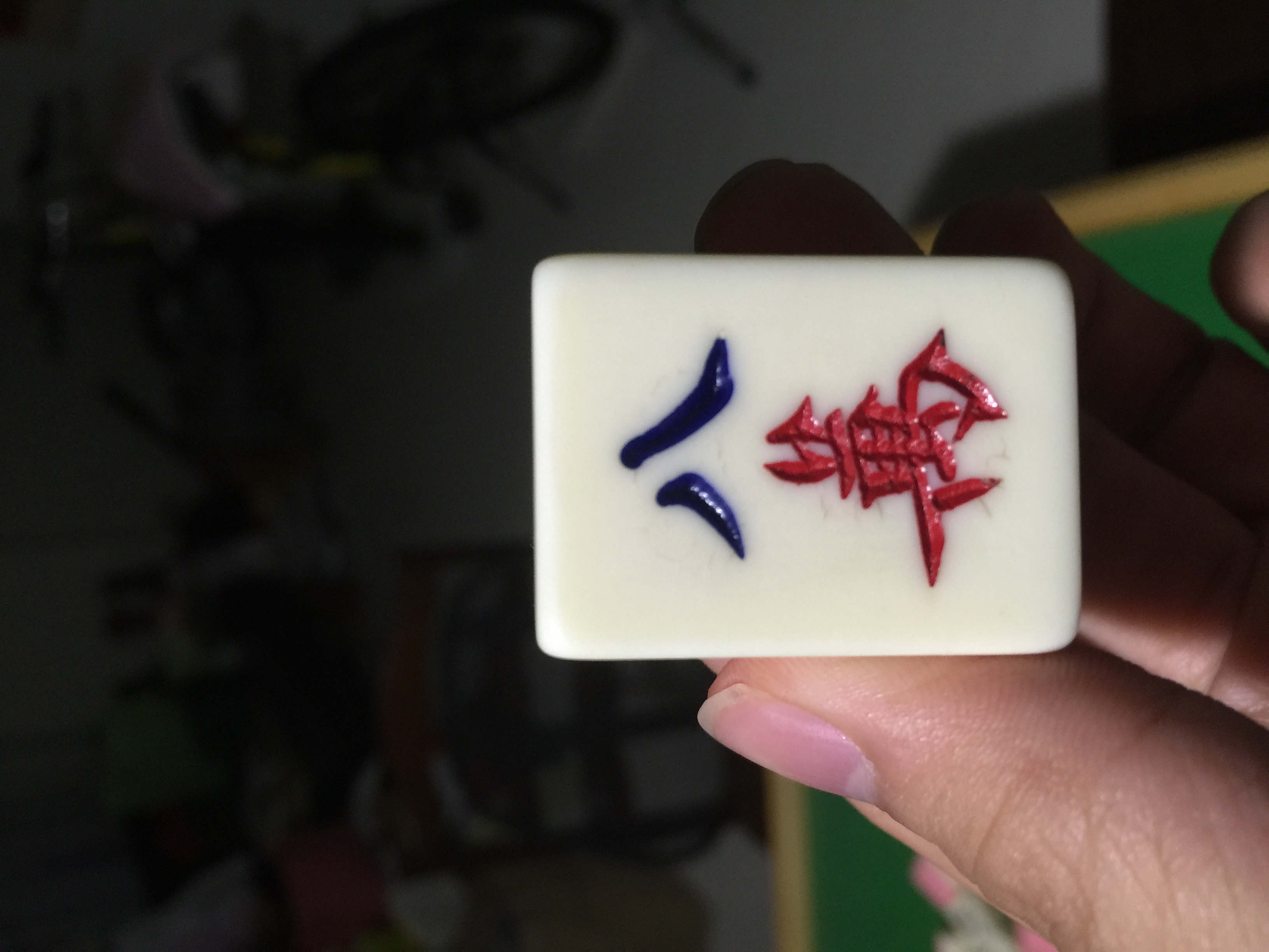
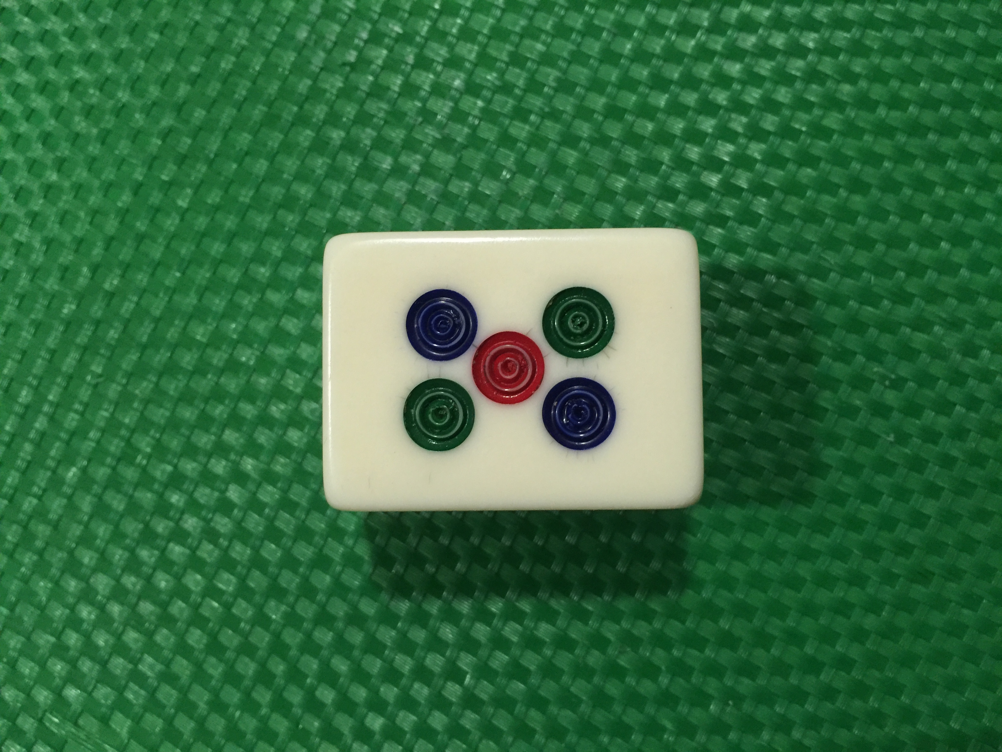
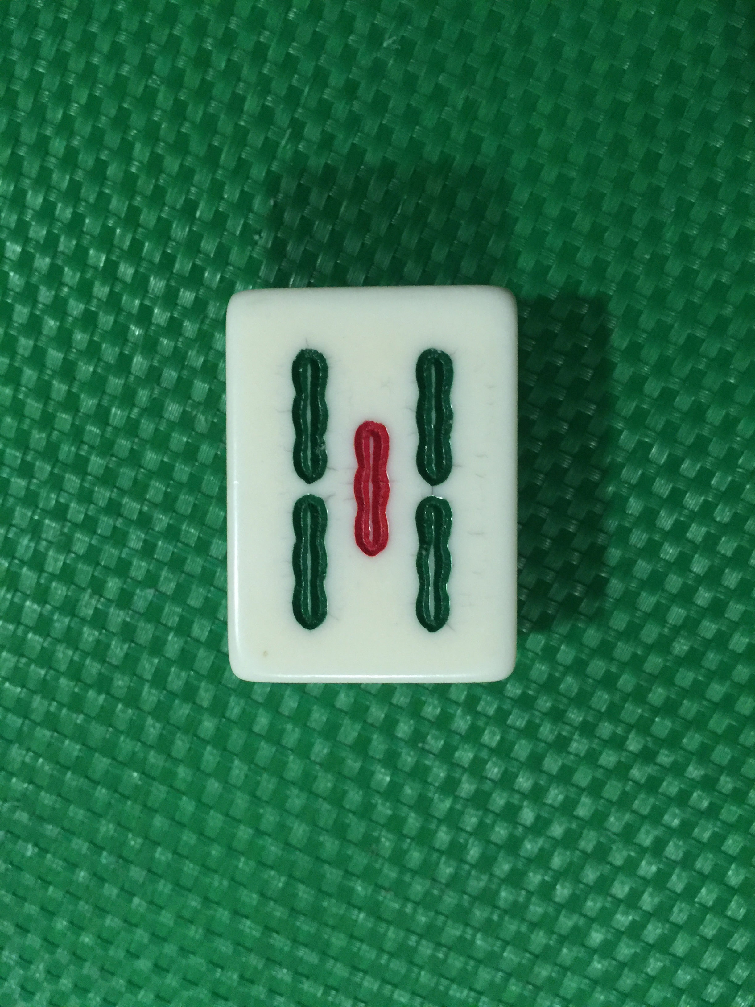
This last idea came to me quite suddenly, and also while I was playing mahjong. There are characters in all the mahjong tiles itself too, so why not include characters or letters of my name into each individual tile! So I took a picture of the tiles, one that would be easier to edit and move the images. I got blank tile which I could easily add in the strokes and patterns of each tile.
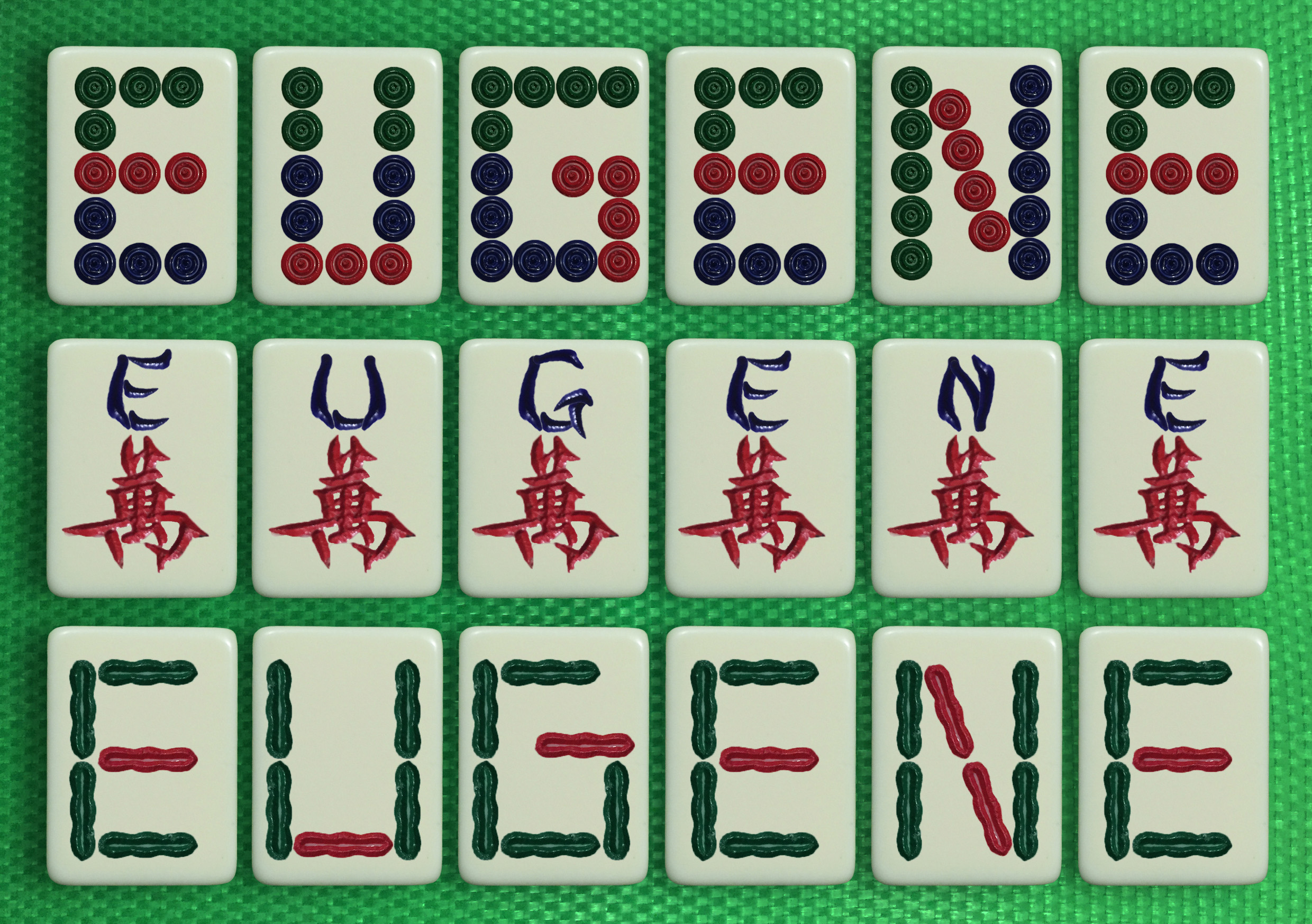
These are the 3 different tile patterns from the mahjong set that I came up with. All forming my name after I edited and changed the strokes for each individual tile.