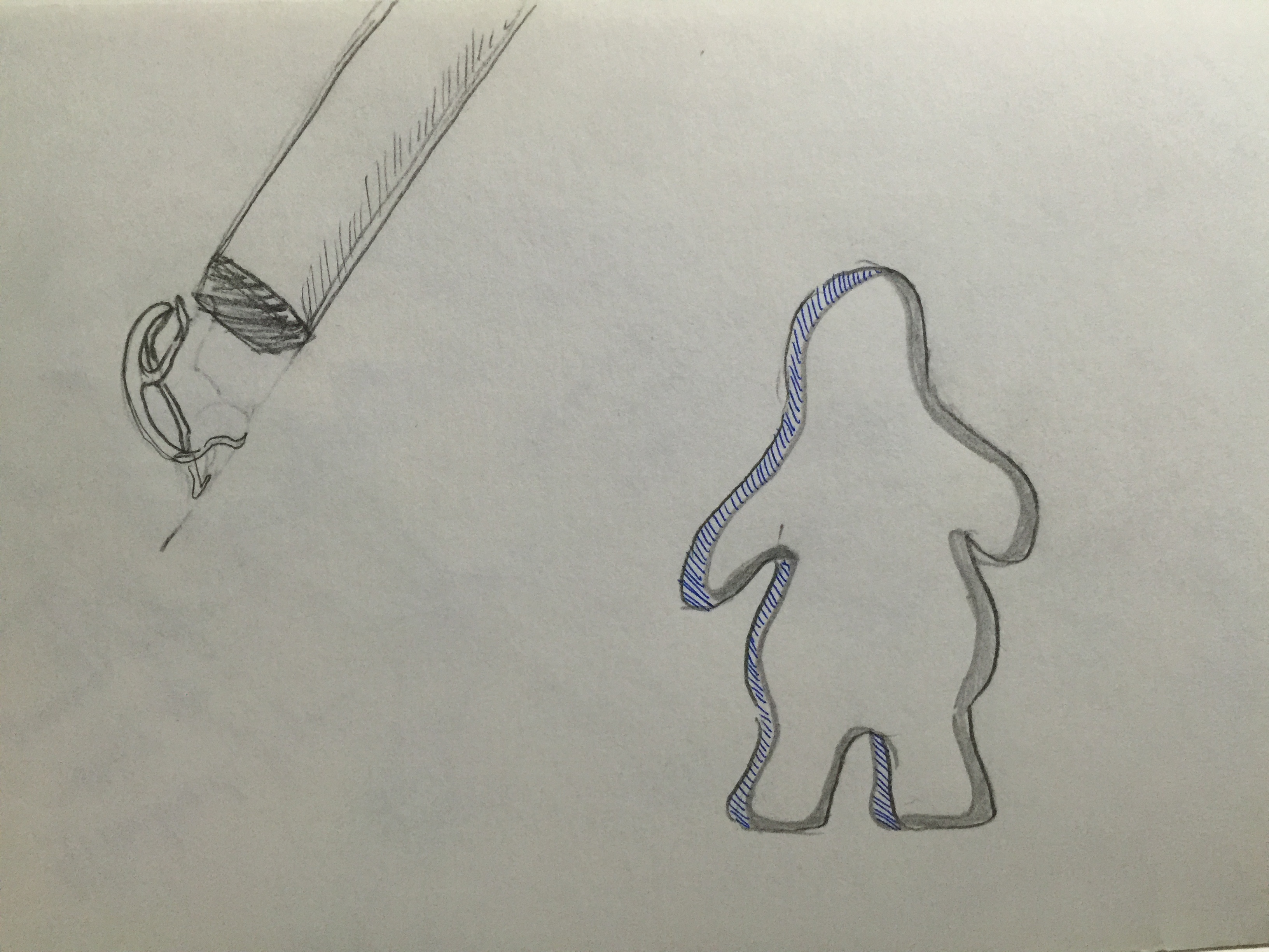
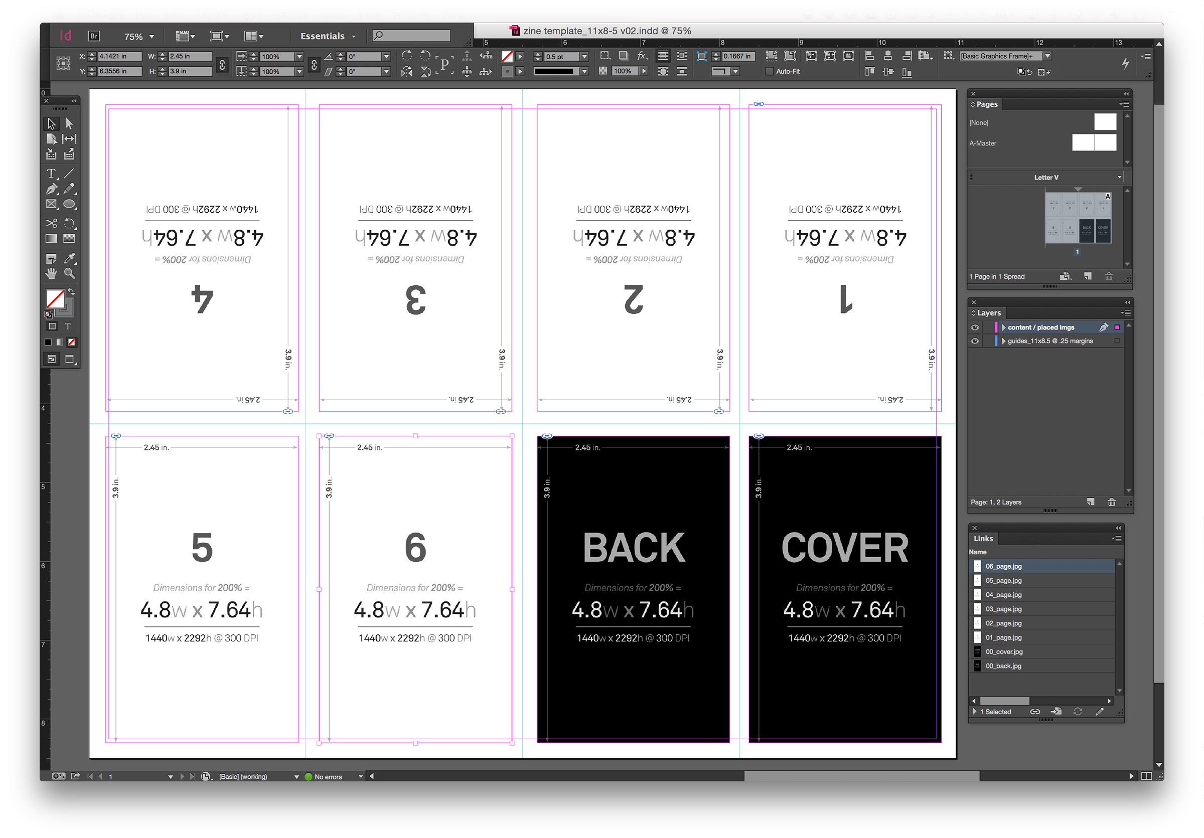
With the new Corgi idea, I went on to filter out at least 10 rules which I could use and ones that I thought I could illustrate. From there, I moved to trying to see how I could lay them out in the Zine itself. This proved to be quite a bit of problem, as I wasn’t too familiar with how to properly layout the Zine nicely.

I went on to see many examples of Zines online, to get some inspiration.

But in the end, I kind of stuck with something similar to what Prof. Shirley had recommended me to try with my previous idea, but with a little tweaks. From there I reduced the number of facts to 7, which helped in my layout also.

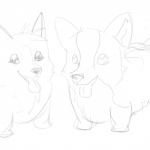
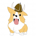
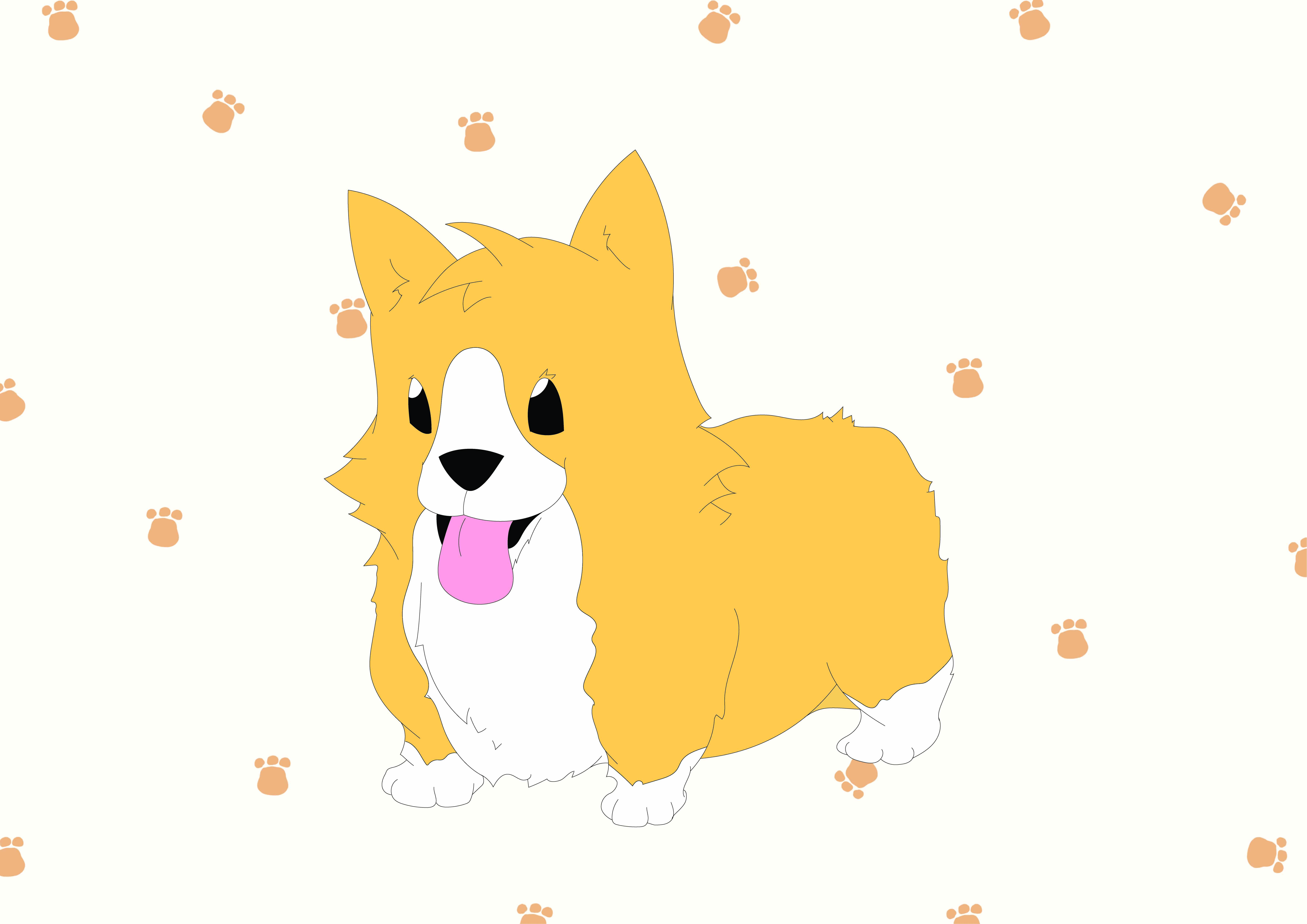
I started to illustrate the Corgis for all the different facts. I used MangaStudio to illustrate most of the illustration. It was actually a pretty fun and interesting process, as I somehow got very used to drawing with a tablet as well.

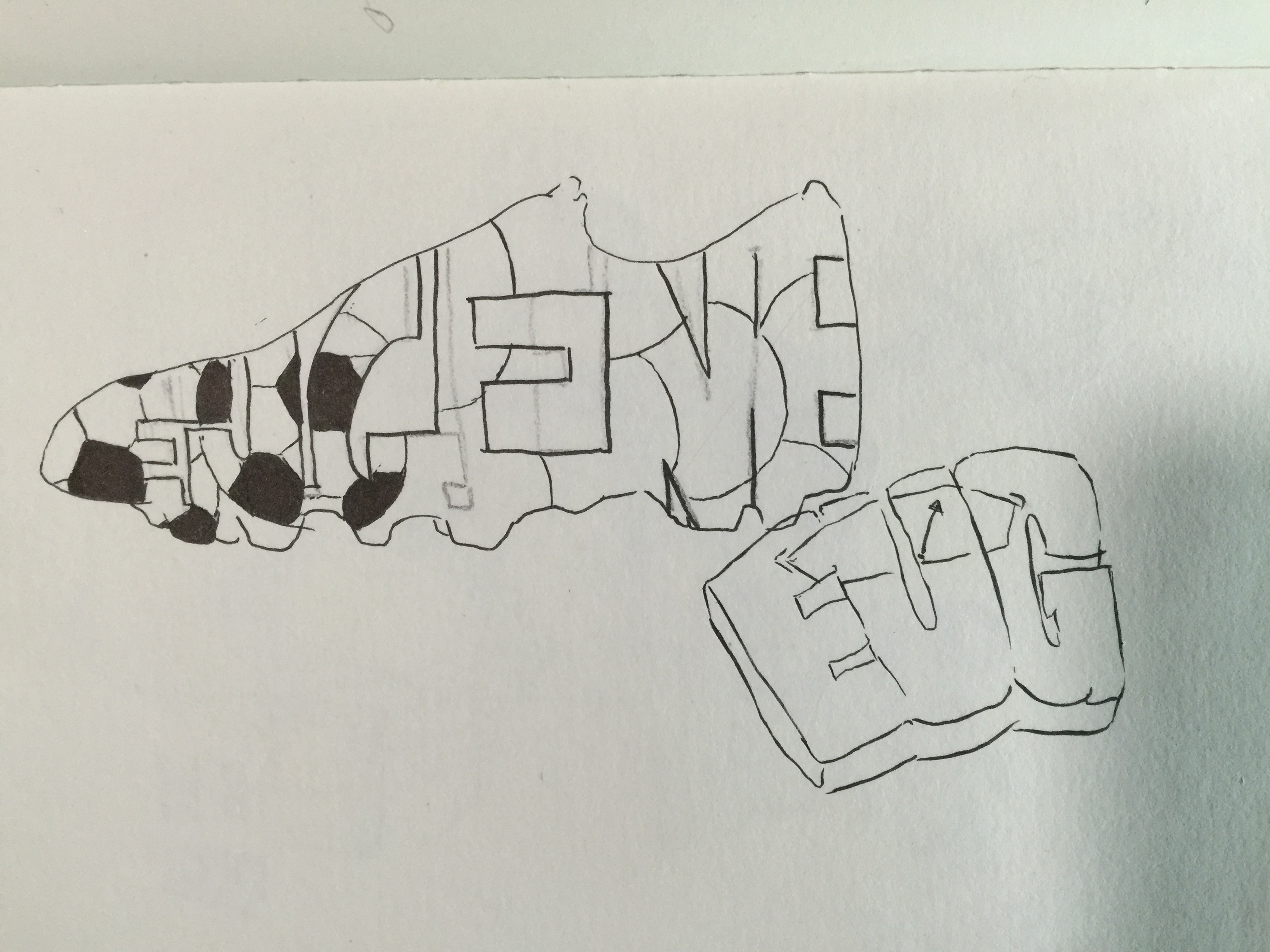
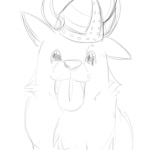
These below are a few of the starting sketches I did in the program.

From there I moved to colouring in those sketches.

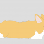
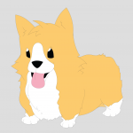
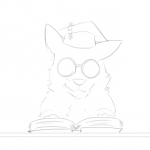
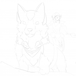
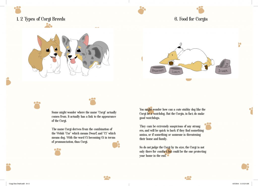
This were the Corgi models that I was going for. I didn’t really have much references for this, mostly because I always liked drawing corgis! The initial idea was to include a background for all the Corgis, but i thought to try and add them into the Zine first to see how i could properly lay them out.

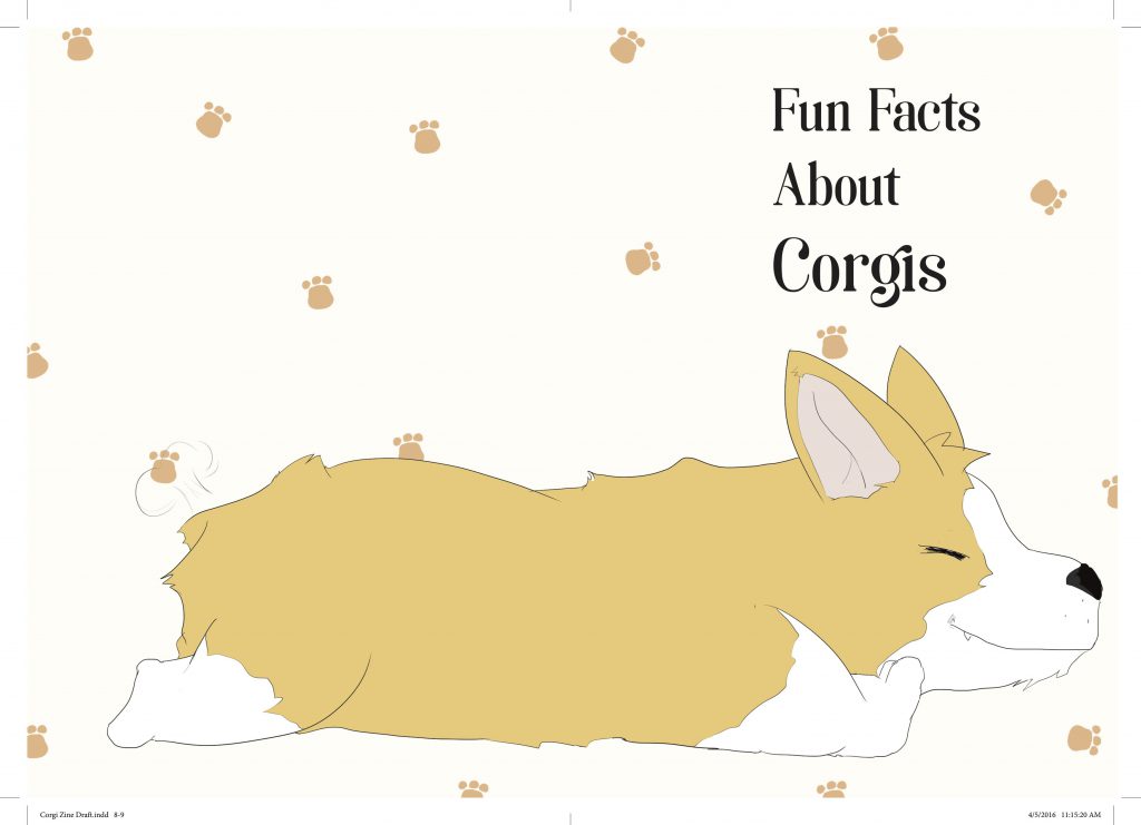
And this came to be the initial layout for my Zine, and as you can see, it’s really bad and it looked extremely plain. I then consulted Prof. Shirley with this, and she guided me with how i could properly lay them out. She gave me the idea of how to properly place every subject in the Zine, and how putting one as a main subject can help capture the audience attention even more.

I went on to try and improve the layout of my Zine with the advice I got from Prof. Shirley. Other than that, I tried including a background for most of them, but it seemed like if I did that, every subject would be fighting for attention.

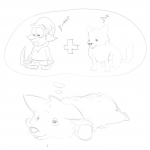
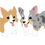
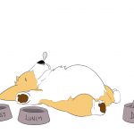
I tried putting a background for two of the corgi facts.

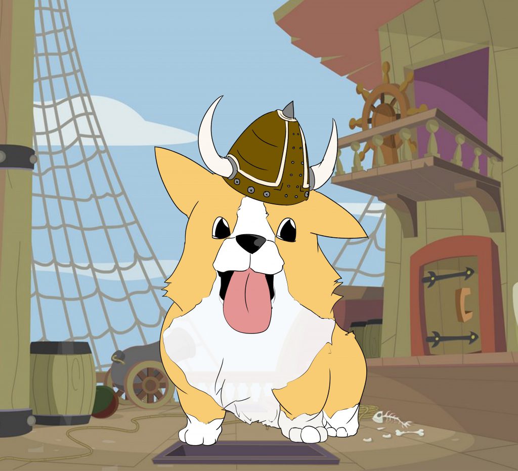
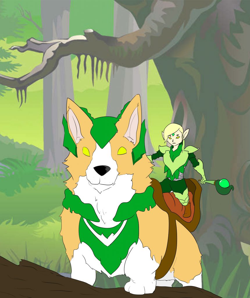
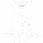
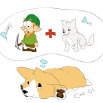
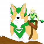
I tried fitting a background for each of them into the Zine, but they definitely did not stand out much when I did that. So i stuck with giving only the main one, which is the Corgi folklore, whereby the mythical Corgi resides in the woods with the fairies!

This certainly gave each spread one fact that would stand out more, and not make it a competition between each illustration.

150622_zine-indesign2

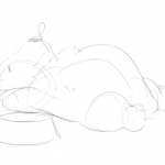
Also, I followed the above layout for my Zine. Because of this, there would be a large poster illustration behind, and I thought of making a Corgi Anatomy Poster for the back.

Print

This was the initial illustration for the background poster, without the labels of each part. But it didn’t really seem to stand out much. So I got an idea from Toby, and he told me why not make a blueprint instead since a blueprint itself would have labels of each part as well. So with some inspiration of ideas for the blueprint online, I put together and illustrated and edited a blueprint of a corgi! I’ll show it in the next post!


The moment I heard what this project was about, I immediately wanted to go straight into doing hand drawn illustrations for this project! The first project was all about going digital, so I thought it’ll be good to show something new, yet comfortable for me, for the 2nd project. It was probably a first for me doing hand drawn illustration for 2D, definitely a fun experience.


From there I went about brainstorming for ideas, of what object to use for the Point of View. Below are a few ideas I tried to come up with:

IMG_6092

In the end, I kind of stuck with Rubberband. Probably because its more or less an object that many people use everyday, but honestly i’d think some people don’t really know how much use of a rubberband is.

Following with a few ideas of what point of views I wanted in terms of a Rubberband. Definitely wasn’t easy thinking up ideas.

IMG_6093

From the list, I consulted Shirley, and she advised me to try out a selected few. (The ones with the orange ticks were the selected few). So I came up with a few sketches of what I thought I’d show the Point of View as.

IMG_6095

For starters, this initial sketch was supposed to be Rubberband in the point of view of a girl, is a Fashion statement.

I wanted to put a little more character into the illustrations. Which is why I added a little cartoon-ish features like the eyes and hands, to portray the Rubberband to be more life-like.

IMG_6096

The main sentence for this picture was, Rubberband in the point of view of a kid is toy gun/pain. This one came off a little harder than I thought. I initially wanted to pose it off as a kid aiming the rubber band with a gun like pose using his hands. But I thought it’d be more realistic with kids always typically taking the pose as i’ve drawn above. As you can see, I added a little bit of character into the Rubberband, providing emotions of how the rubberband would seem based on human reactions.

IMG_6097

Here are a few more sketched out ideas! The one on the left being, Rubberband in the point of view of money is Protection. And on the right, it didn’t really work out that well, but, its Rubberband in the point of view of an Artist is an Artwork.

IMG_6098

For this sketch, the one on the left is Rubberband in the point of view of a remote control is Friction. Its a pretty neat trick of tying rubberband at the front and back of the remote to keep it from falling off the sofa!

And as for the one on the right, it was Rubberband in the point of view of a plastic bag is a Chokehold. I had to test out a few drawing of a plastic bag, it was pretty hard to get the proper texture!


So after consulting Shirley, she told me, “Why not make the rubberband itself into a character? Not just the face, but a whole character!”. And I thought that was really interesting! and something really fun that I could work with. So, I just came up with a simple sketch of how I’d think it’d look like.

IMG_6099 IMG_6100

More or less the Rubberband character was going to look something like that! I gave it a round blobby look, and a hollow middle, just like a normal rubberband.

With the new rubberband character, I went on further to properly sketch out the sentence I had picked.

So this were the new sketches I came up with! I really liked how I could use a rubberband character to interact with the other object in the composition.

Then I went on to consult Shirley for my new sketches, and she approved everything! She told me to try and stick to one type of composition. One being like the Rubberband in the point of view of a paper, whereby its really just the two objects being in focus, without any background. Or to put it like the Rubberband in the point of view of a remote control, whereby there’s a background like the sofa.

From there I decided to choose one without background, to bring more focus towards the two objects! And I went on to work on my final few pieces!

The process of creating the different typographic portraits was definitely a tough one, as my idea slowly keeps changing while at the same time I kept thinking of better ideas that I could work on.

The first idea, Weight Consciousness.

scales

The idea for the weighing didn’t seem that it’d work that well. I tried clipping the image onto text in photoshop, but it looked really plain and did not really stand out that much.


The second idea, Superhero.

Spiderman screen04-web Spider-Man

The idea of implementing spiderman for my superhero was one that I wanted to stick with. I started with searching for a font that suit the spiderman theme. After which, I searched for a good quality suit texture of spiderman that I can use and put into the text that I use. And to also include a subtle addition of a spiderweb in the composition.

The first picture shows one of the ideas I tried, and thats the font that I’m probably going to work with. I consulted again with prof. Shirley and she gave the idea of making the spiderman logo less obvious, and to show more texture of the spiderman suit.


The next idea is Soccer Player. 

Test soccer_ball foolball IMG_5844ssp

Initially I thought this idea would work, but it turned out pretty hard to continue. I tried finding many different soccer balls, and its textures and patterns to put in the the text. The first picture was when I tried converting the text into 3D shapes while including the pattern of a soccer ball onto it. But it looked kind of weird and definitely too bright. The second one I tried was to make it more 2D, and I tried using the ESPN logo font as the font for my name as well. It still didn’t seem to work that well, and it felt like something was missing.


The next idea was Finding My Way.

d-illustration-stone-maze-puzzle-aerial-view-45442998 maze

For this idea, I had the whole idea for the maze already sketched out, as i’ve shown in my previous post. So all I had to do was to find a good pattern that I could work with and that would make the maze more believable and realistic. I choose the above texture of walls for my maze.


For my next idea, the Comic Book Artist.

Comicartist comic-pow-clip-art-8401671 2

comiccomic


The comic book artist idea, I went with only showing the speech bubble of the old school pop art style comics. Initially I tried finding fonts of comic books or pop art style fonts, but it felt very unnatural, not really much like a comic, as shown in the first image above. The next thing I thought of was to make the font from scratch and drawing it out instead. It came out a lot better than a font I found on the internet. After consulting with prof. Shirley, she also asked me to try and include the pop art style of having the dotted or half-toned effect on the words itself. To make it seem even more so like and old school pop art style comic.


Another idea I came up with was, I am a Mahjong Tile.

ok IMG_5735

IMG_5722 lol

This last idea came to me quite suddenly, and also while I was playing mahjong. There are characters in all the mahjong tiles itself too, so why not include characters or letters of my name into each individual tile! So I took a picture of the tiles, one that would be easier to edit and move the images. I got blank tile which I could easily add in the strokes and patterns of each tile.

lllllll

These are the 3 different tile patterns from the mahjong set that I came up with. All forming my name after I edited and changed the strokes for each individual tile.

IMG_5834

Initially it started out with 6 ideas which we were supposed to present at the end. And these were the 6 ideas that I had initially before narrowing it down to 4 ideas, also with a few names/nicknames just right above it that I can use as the typography words.

IMG_5833

It starts with this, being Weight Conscious. My ideas were implementing the object of the weight scale and input the name into the part where it shows the weight of the subject. But prof. Shirley didn’t want there to be objects in the typography, rather having the texture or something that shows the object on the words itself. These are just a few sketches of how I wanted the idea to be like, but it wasn’t easy finding a good texture of a weighing scale.


IMG_5835 IMG_5845

The next idea I had was being a Superhero. The first and only one I immediately thought of was being Spiderman. So with Spiderman, naturally I had thoughts of implementing webs that would form my name, and including a Spiderman figure at the corner to show that those are webs that are being shot out of Spiderman. But after consultation, prof. Shirley said she didn’t want to include and people or object into the typographic portrait, rather implementing the chosen object’s texture or material onto the words. So it went more towards finding the texture of the suit of Spiderman, or the features of Spiderman to put on the words itself. And also, to subtly include webs inside to add on to the features of Spiderman.


IMG_5838

The next idea I had was being a Dancer. Initially I thought this idea would come out pretty nice, or at least easier to do. I tried implementing dance moves into each individual character of the words. But as I showed it to prof. Shirley, she said the words didn’t really show much movement, and it really is hard to capture the movement as the character kind of seems pretty static. As dance is really all about the movements and the flow of the moves as well. I tried including a stage as well, in the sketches, and a spotlight, to show like as it the characters are performing on a stage.


IMG_5840 IMG_5844

(Ignore the weighing scale sketch below the shoe, unrelated to soccer)

My fourth idea was being a Soccer Player. And as it was for the start of the previous ideas, I wanted to implement the object of either the soccer ball or the boots of the player into the typography. But as prof. Shirley did not want to include the objects itself into the typographic portrait, I had to include the objects or textures of it onto the words. And the one stand out thing of being a soccer player is probably having the soccer ball texture on the words itself. So I tried different ways of including the texture as shown in the sketches. With one of which I tried including the texture of the soccer ball, and fitting the typography into a shape of a soccer boot.


IMG_5837

maze

IMG_5841

And as for the next idea, it was me Finding My Way. And what better way to find my way is to put myself in a maze. So immediately I thought of how I could implement a maze within my name. I went on to research a little on how mazes were made, and how the lines for the maze INSIDE of a huge square or rectangle. I found a simple maze as shown above in the images, and I got the idea of how I wanted to put my name as a maze that shows that i’m Finding My Way. So I hand draw everything onto my sketchbook to slowly try and piece everything together and form a real maze. P.S. the maze can really be played.


IMG_5843

comics_word_vector_2_157054mill5

And for the my last idea, was me being a Comic Book Artist. So the first thing I thought of to really show a comic book style, is the old school way of how actions happen. Like when there’s an explosion, or someone gets punched as shown in the images above. Instead of the action word of getting punched, I would include my name in the action word, as shown in the image above. But prof. Shirley said that I did not have to go so much into details to show a comic book style by showing a whole panel of a comic. Rather why not just show the word itself of going BAM, BOOM or CRASH as shown in the second picture of above. And instead of those words, put my name into it. And also to modify the comic art style into a more old school pop art comic style.


These are all just my initial ideas, and definitely as one gets further into a project, the ideas gradually change and hopefully get better.

FINALLY.

After many hours of playing around with lines and finding all kinds of emotions, probably losing quite a few along the way, it is finally done! It was most definitely a long process in getting all 18 emotions with the lines I had, but I’m glad everything worked out fine.

Below are some process work of me trying to find all 18 emotions! Followed by my final piece!

IMG_3532 Trying to collage different lines which somehow looked similar too, to find a new composition.

IMG_3539 Testing out and trying to feel some emotions.IMG_3541 Combining different pieces to form a whole new piece!IMG_3542 Inspired by Jackson Pollock! Splattering ink with a paintbrush.IMG_3548 IMG_3549 IMG_3551 Preparing the frames for my final composition!IMG_3553Testing more collages! IMG_3557


and for the finale,


My final piece!

FINALE

Below are the individually labelled emotions for each line:

final1

  1. Indecisive
  2. Spontaneous
  3. Embarrassed
  4. Exhausted

final2

  1. Systematic
  2. Anxious
  3. Sensual
  4. Turbulent
  5. Lyrical

final3

  1. Sloven
  2. Bizarre
  3. Psychotic
  4. Awkward
  5. Ambiguous

final4

  1. Nonsensical
  2. Fragile
  3. Aggressive
  4. Distracted

It was a fun, yet a little tiring experience! But certainly, with all my friends around, it makes every single work I did more worthwhile!