Personally, I find the second project to be more of a challenge. Although I have experience in photoshop, I do not usually use it for design. Furthermore, as I am from a strong Chinese background, rhymes were literally non-existent in my life until Primary 2 or 3, where my English teacher would request us to do some readings.
I prefer my designs to be direct, straight to the point, and not overly abstract. This is important as rhymes were used to convey information, and it is primarily targeted at younger children. Thus, I can not diverge too far from the original idea and produce something that looks like Dali and Picasso’s secret love child.
I have also felt that being given rhyme 03 was both a godsend and a curse, as this rhyme is simple, and direct, but however, it lacks creative space unlike the other two rhymes.
Final images and research
Image 01: There was an old woman who lived in a shoe.
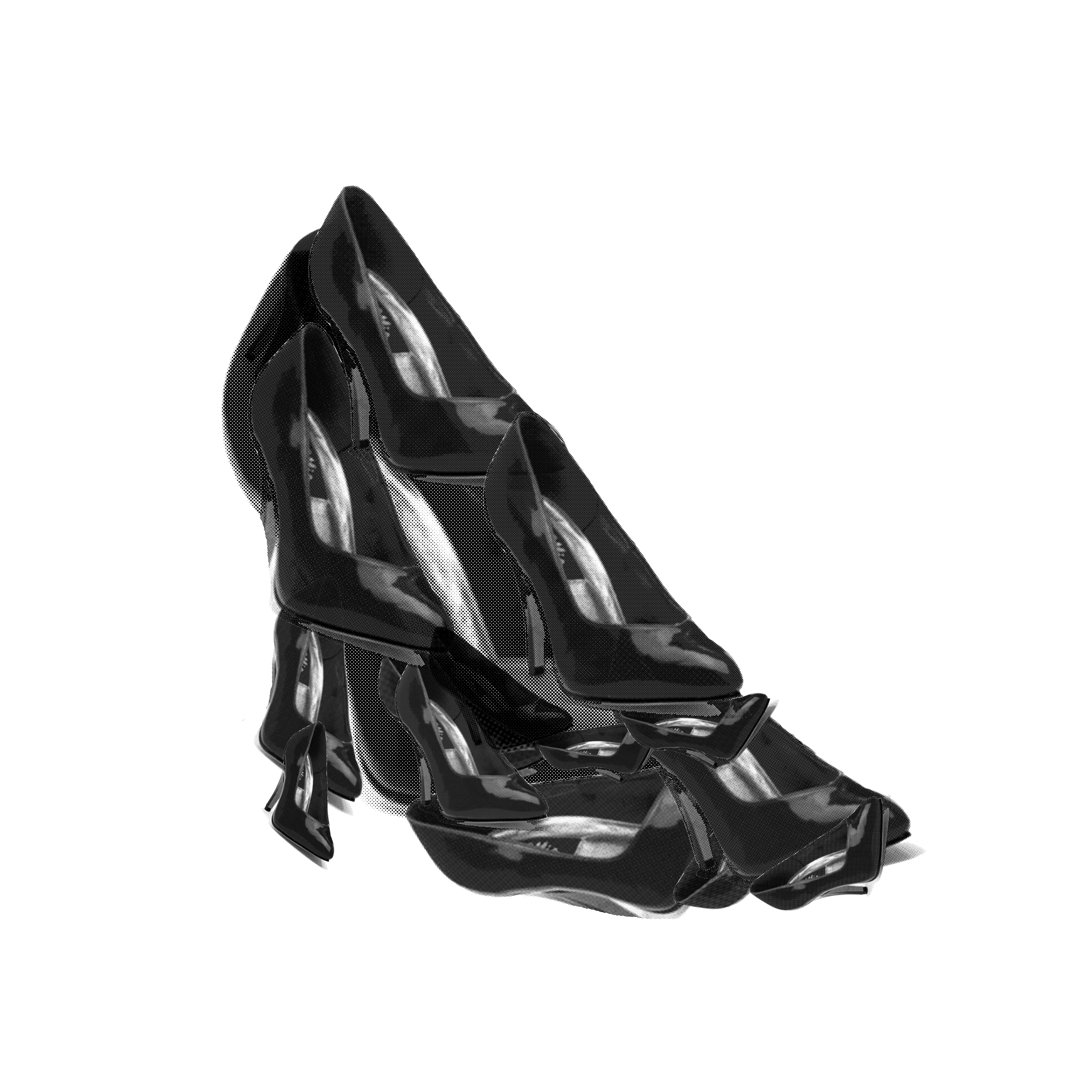
This image consists of heels, just in case it is not obvious enough. The primary inspiration came from a slightly startling observation. The layer of heels upon another heel was a result of days of observing a wolf spider with its egg sac, and subsequent release of its offspring.
In the case of this rhyme, ‘There was an old woman who lived in a shoe’, it could be considered that there were multiple smaller shoes living in another larger shoe (the shoe home), as I preferred not to directly associate the old woman in the first verse of the rhyme.
The original heel was converted to black and white using Illustrator’s pen tool, which I found ridiculously troublesome and I eventually changed to another method, which will be explained in the following rhyme image. The colour curves were edited to result in more minimal midtones, and more blacks and whites. However, some midtone was retained so the heels actually looked like what they should be. Colour halftone was kept small (4 pixels) so that the heels did not look odd.
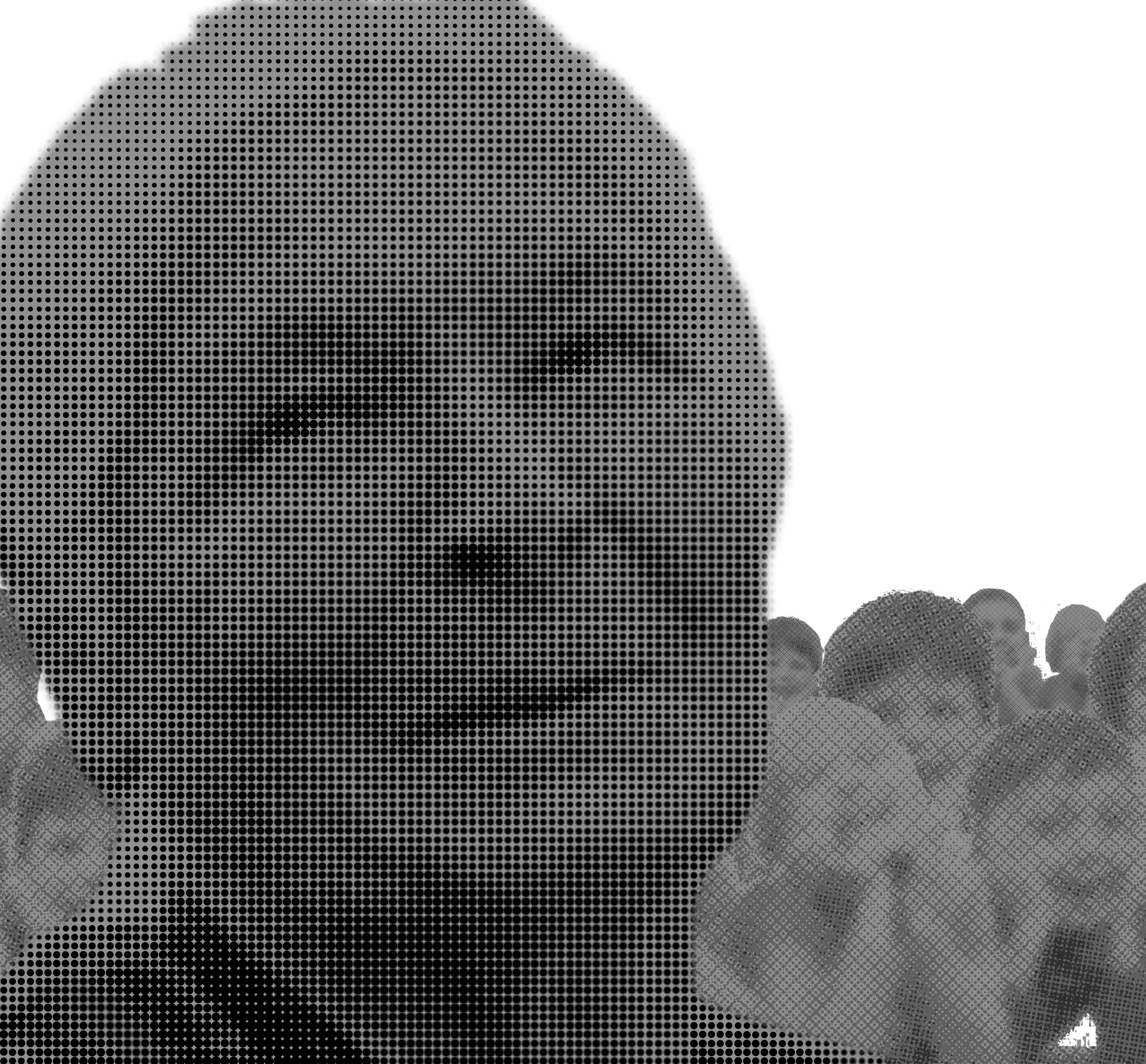
Image 02: She had so many children, she didn’t know what to do
The image consists of a line art of an old lady, with line art of both male and female teenagers arranged in circular fashion, with three different scales. The teenagers were positioned at a 45 degree difference, while the scale changes in a multiplier of 4 from the inner circle towards the outer circle.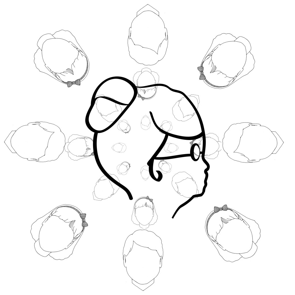
The inspiration for the old lady’s line art comes from Emma Webster, or the Granny from the Looney Tunes series.
The number of characters (8) in a circle consists of largely religious overtones.
In Buddhism, the Dharmachakra has 8 spokes. Buddha’s Four Noble Truths resulted in the Noble Eightfold Path.
In Christianity, there were 8 people on Noah’s Ark. The Antichrist was also the 8th king in the Book of Revelation.
In Chinese culture, the Eight Immortals were 8 demigods (duh). In Taoism, there are 8 trigrams of Ba Gua.
In Hinduism, Lakshmi has 8 forms.
In Islam, the throne of Allah is carried by 8 angels.
In Judaism, Hanukkah is a 8-day holiday that begins on the 25th day of the Kislev. Circumcision is also conducted on the 8th day of a baby boy’s life.
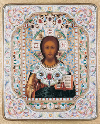
The arrangement of the design was similar to the halo of Russian orthodox icons of Christ. The other influence was from the opening sequence in the anime series Himouto! Umaru-chan, though the number of characters was reduced to create a strong sense of symmetry.

The image was imported in PNG format (and thus transparent), reducing the need to edit the background. Layers were added on and shifted around.
Image 03: She had so many children, she didn’t know what to do
Image 3 is a totally different image compared to image 2, as I included mainly photographic techniques, and contrast. The old lady’s face is positioned roughly similar to the curavture of a nautilus shell (golden ratio). The center of focus of the children’s faces are 1/3 from the edge of the image. The images of the children were then laid over one another, with a few adjustments such as horizontal flipping and change of scale to provide a sense of depth.
There is not much inspiration to this photo, as I wanted to produce an image that shows the kindly aspect of the old lady with the energetic and bubbly liveliness of the children.
Gaussian blur was introduced to reduce the impact of the slightly sharp edges as a result of cutting out the image from the background. The halftone size (8 pixels) was relatively large, this brought out the old lady’s features in comparison to those of the children behind. The image of the children behind was edited, with contrast reduced. The entire image was then converted into greyscale by desaturation.
Image 04: She gave them some broth without any bread
The image is that of a prominent set of hands holding an oversized bowl of soup/broth, and a series of smaller hands waiting to receive it.
The outstretched hands, a sign of receiving, is also a sign of the children being hungry and waiting for the last meal of the day. The larger set of hands defines that the giver is the authority, and also has a more literal meaning; a mature lady will definitely have a larger set of hands than young children.
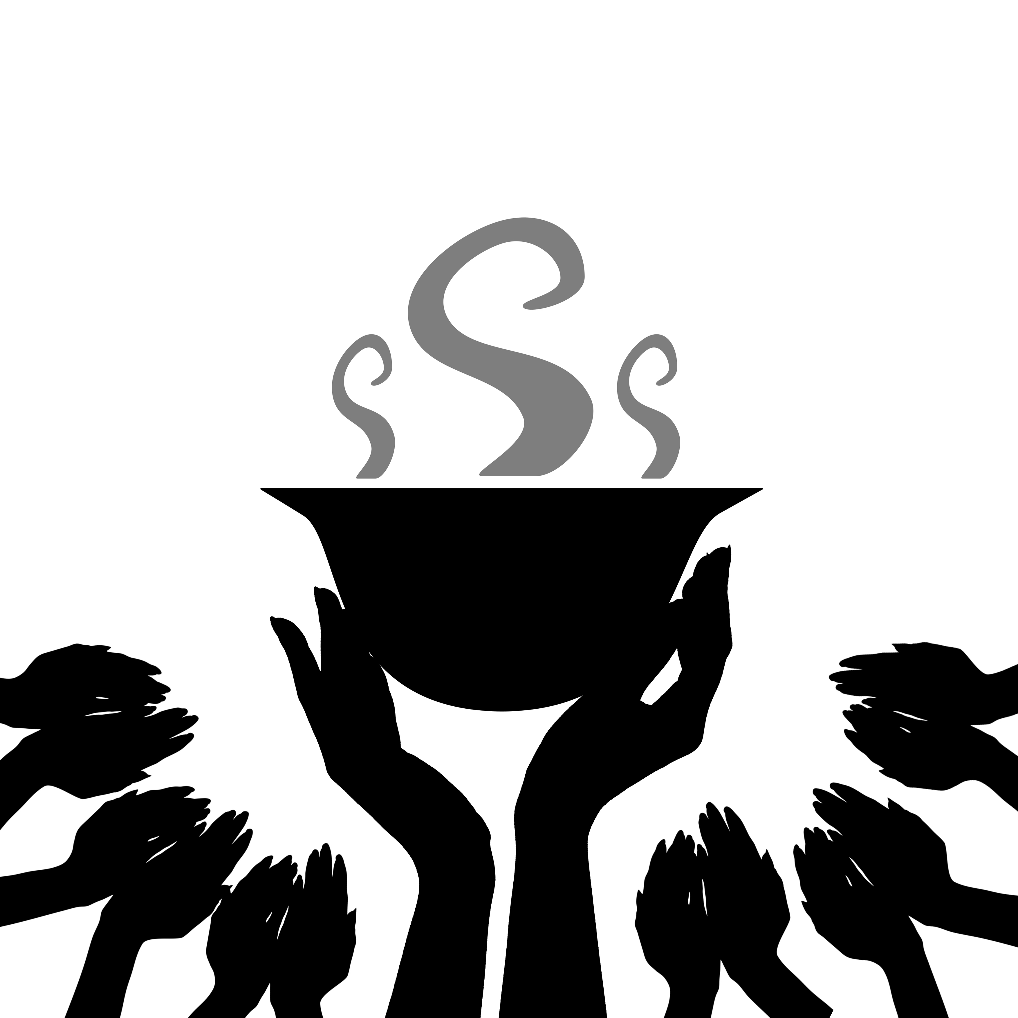
The image is edited by digitally removing the background and smoothening edges. Contrast was set to minimal and the sliders on curves were pushed all the way down, creating an opaque black image from a colour image. The sets of hands were copied and pasted, with a rotation of 35 +/- 4.8 degrees, randomly accounted for by the computer. This is to create a sense of individuality for the different children, in direct contrast to image 02.