In this post, research on mark making and my process of making marks are documented. Let us start off with some visual research on three mark making artists.
Cy Twombly
Article || Article
Twombly was an artist that went about mark making in a more abstract manner and his work piqued my interest. In Panorama, there are scattered thatches of chalk lines. They seemed to show his nervous system. While in Untitled (Say Goodbye, Catullus, to the Shores of Asia Minor), the piece showed a progression of life from vibrant energetic youth towards duller blankness.
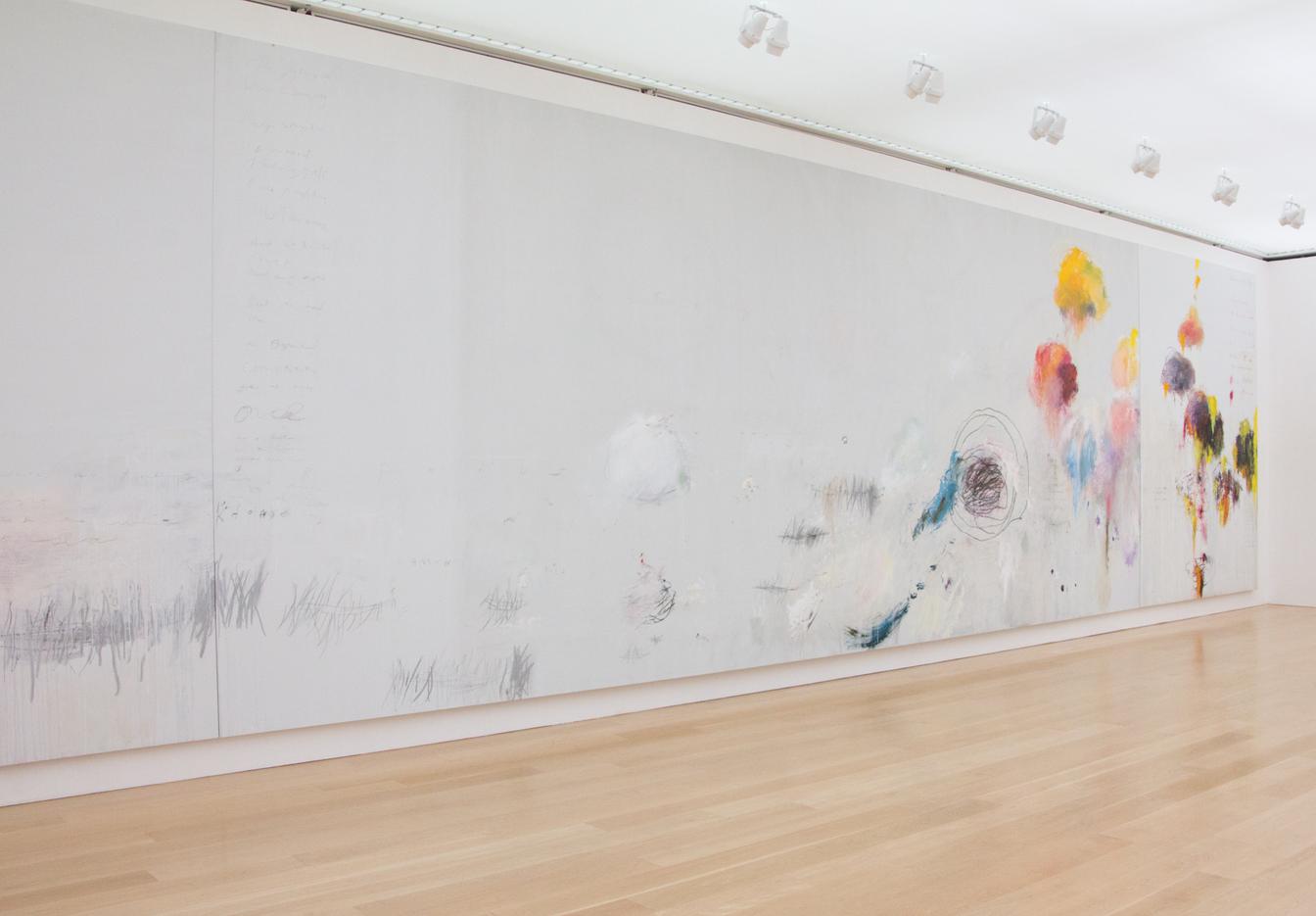 Cy Twombly, Untitled (Say Goodbye, Catullus, to the Shores of Asia Minor), 1994 |
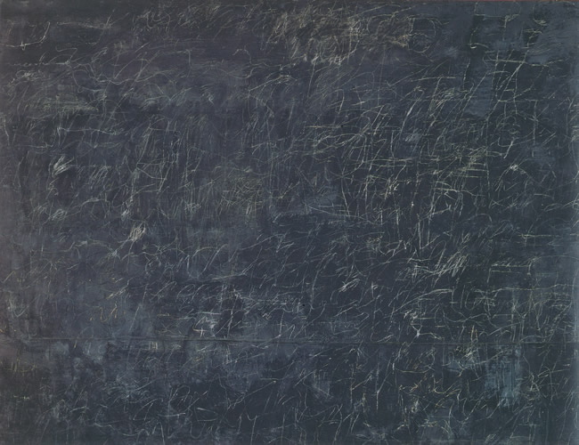 Cy Twombly, Panorama |
Roanna Wells
Site || Instagram
On a more contemporary and modern front, I discovered a current artist Wells and her use of mark making in her works. In Tracing Process, I liked how she used brush marks and allowed others to join in to create marks. This created a visually captivating art as there is a contrast between the orderly, straight marks by Wells and the seemingly more “random” marks by the public. To me, the piece felt like and represented a society that is not perfect but can come together to build something.
 Tracing Process |
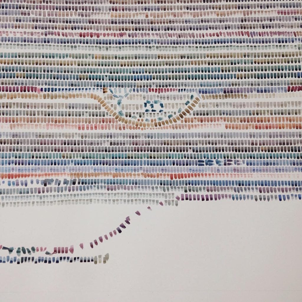
Yeo Shih Yun
Brochure || one of her exhibitions
I found a Singaporean artist that uses mark making tools like robots and tree branches in her art pieces. In Choreographed Collisions, Yeo used action painting techniques for more impulsive marks while making intentional silkscreen marks to create contrast in her works. While in Trees, Yeo “attached Chinese brushes dipped in Chinese ink to the tips of branches of trees in various settings across Singapore and allows the movement of the wind to create the marks.” The end results have aspects of randomness and aim to celebrate nature, the medium, and playfulness.
 Conversations with Trees #19 , 70 x 50 cm, silkscreen and ink on Fabriano paper, 2011 |
 Choreographed Collisions |
Next, let us look at some elements of design.
Elements of Design [meaning/emotion of different type of dots, line, shapes, texture]
Dots are more about the position while lines explore direction and movement. The eye moves along the line and is directed towards a certain point in space. Lines can also be used to create depth and perspectives. [link]
During my research, I also discovered Mood lines. 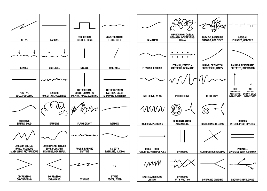
Mood lines demonstrated and broke down that the lines/shapes were able to portray different meanings and scenarios. They showed how impactful visual designs are and can be used effectively to convey a message to the audience. Some of the examples of mood lines usage certainly helped in enhancing my understanding of lines and shapes to represent certain emotions. They include how a circular object showed a focal point while a line/curve represented movements. Also, a rising line brought about positive vibes while a falling line showed pessimism.
Other shapes [link | link] also bring about different emotions like how rectangles lead to a sense of stability and we tend to trust them as they feel dependable. Triangles show a sense of superiority as they visually show the “pinnacle of success”. However, when inverted, triangles could show a sense of instability and danger as well. Curves are very free-flowing, and they show movement, pleasure and generosity.
Last, textures also play a role in setting a mood and invoking emotions. Using natural textures often brought warmth and beauty. Other uses of textures involve how Artist Vincent Van Gogh created flowing textures that bring energy and a sense of movement to his paintings.
Moving on to the second part of this post on my personal mark-making tools process and reflection:
Note: The marks below will be made from either acrylic paint or Chinese calligraphy ink, but unless specified will usually be from acrylic paint.
During the first class, I experimented with a few items and made prints with them. Here are some of the prints:


I will look further at some of the more interesting prints and tools (which will cover some made from the first class and more!).
- Bottle cover

At first, I stamped the bottle cover overlapping one another and thought they looked like barbed wires and invoked a sense of feeling trapped. However, after a consultation, I learnt that it did not make for an interesting mark as contrast was missing to bring focus to a particular point. Furthermore, a more abstract print will be more engaging for the viewer to study, bring meaning to and in return be more memorable. I agreed that the results would be more impactful if I can link the prints to how I think of a specific emotion rather than what physical objects that I associated with the emotion, and hence kept that in mind for future exploration and prints. - Raffia string/rope


During the first class, I was introduced to a method of placing a string between two surfaces of paper and then pulling the string out. As it unravels, the ink drags along the surface and creates a rather unique and interesting print. However, while some prints turned out rather “pretty”, it was a technique that required a certain amount of skill and luck to get a desirable print and hence was rather hesitant to use them as a submitted piece. - “Reprint”


Along the same thought process of folding paper or placing two surfaces together, I tried placing a piece of paper on top of another mark to transfer just some paint over. The result was really “pretty” too at times but is not as easily executed as well. - Palette knife – tried applying grattage technique which is the scratching of painted surface with pointed tools

I tried scraping but the way I did so was resulting in less prominent marks. Hence, I decided to switch it up by using the palette knife to spread paint instead of scrape like below. - Spray bottle and palette knife


At first, I tried spraying and making more watery marks as follows and then tried to scratch and spread outwards with the palette knife. It does look quite interesting as they contrasted, one created a calming and light watercolour effect while the other was able to create sharp lines and darker tones, showing a slight sense of unease. - Comb


Along the same lines of scrapping and moving ink along, I tried using a comb. The marks seemed and felt calming and hypnotising, possibly due to the resemblance to ripple effects.
- Plastic bag


It created a more sparse and random mark, giving rise to a disorderly feeling. - Styrofoam


Printing with styrofoam gave an organic shape, which in a way to me reflected life and also how as the ink lessened, the prints seemed to be washed out and “drained”. - Cardboard tray bottom

When I first saw the mark the bottom made, I was drawn into it. Certainly, it was interesting with parts of sparseness within the mark and reminded me of something diseased. Hence, I decided that this was worthy of a negative/fearful piece that I will further explore. - Fruit foam mesh wrap


With wrap I experimented with printing through the holes, stamping with the wrap, and also with acrylic vs caligraphy ink. They created slightly varied results in which I liked the stamping with the wrap most as the shaped involved lines that created a sense of movement. - Paintbrush bristles


While painting through the holes of the fruit mesh wrap, I noticed the brush bristles came slightly spread out (*apologies for causing stress to the brush… it did return to its proper form afterwards) and took the opportunity to quickly drag them across the paper for marks that looked rather distressed. - Toothbrush

The toothbrush that was taller at its sides made marks as shown above which I thought showed a high sense of small movement or uncertainty due to the unclean lines made from the thin and not compact bristles. - Other miscellaneous marks – clothes peg, failed 3D printed parts


While the clothes peg did not catch as much ink as I hoped to make an interesting mark, the 3D printed part was rather unique. For the most part, the mark was sparse but had a certain shape to it which I thought might be appropriate in a future piece.


And, with that, click here to read my next post on my final pieces for Project 1.