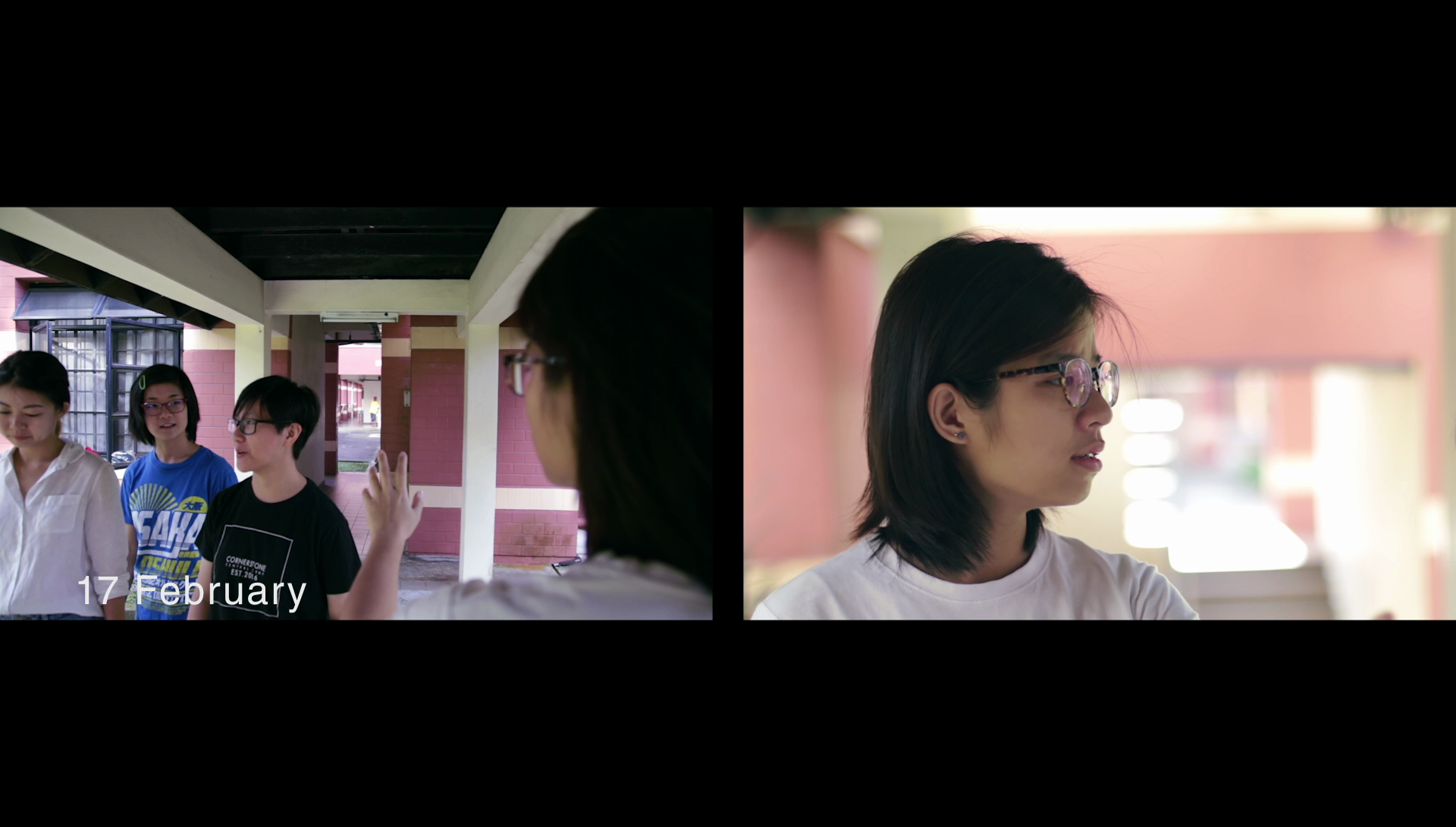
4D II Assignment 2: Image Sequencing

14 March 2017

For this assignment, a lot of planning, thinking, scheduling and piecing are involved. As the main videographer for this assignment, I had to plan my vision beforehand, as a lot of shots were involved. It helped to save time and ensure nothing was missed out. This is the process of my Assignment 2…


By: Gabrielle, Natalie, Yulin and Jia Qi

The story is about a girl named Emily Tan Hui Hui, facing cyber-bullying and isolation from her friends. As the bullying intensifies, she finds it hard to live and decided to commit suicide. Before her suicide, Emily faces an internal conflict on the reasons of living. 


Brainstorming

At the start, my group reference on the above video, and we liked the concept of the multiple personalities. Then we decided on the idea of having 2 internal characters, a Harm and a Heal character, to show internal conflict. Follow-up, we decided to do on a main subject: Cyber-bullying, to give the conflict a purpose. The parallel storytelling will be shown through the display of current struggle of Emily, and the flashback of Emily’s memories. The use of chronological storytelling shows the current state of mind of Emily, and reverse chronological shows that Emily is slowly losing herself psychologically. 

Production

During the shoot, we mainly faced difficulties with noisy background and for me, syncing the shots for dialogue, as I wasn’t working with a tripod. On set, we just grabbed a chair and few boxes to make a temporary tripod.

For the fake blood, I actually referenced from this video.

Editing

In my video, I added a comment speech bubble animation, to introduce to the audience that, the story is about cyber-bullying. 

I added the day of happening, in reverse chronological order, to show subtle hints of the flashback dating earlier and earlier. Then eventually leading to her childhood times. I added a keyboard typing sound when the day is revealed, to blend with the entire theme of cyber-bullying.

For my edit, I used split screen effect to show the internal conflict more directly. I wanted my video to be depressing yet still hopeful. Therefore, I added a flashback dialogue of Emily’s parents, to give the ending a nostalgic feel, and also a reason for Emily to live on. I did not add any visuals to it, as I wanted it to be a reminiscence of Emily’s childhood when she’s dying.

I faced difficulty with the white noise of my dialogue audio. I tried my best to silence it, but it’s still too distracting. In the end, I asked my main actress for a favor, to re-record her dialogue.

For my dialogue, I added single-band compressor, vocal enhancer and denoiser, to reduce the noise and create a richer sound. By setting single-band compressor to voice over, my dialogue sounds closer, as though the vocal was drawn nearer. I added dynamics to one of my sound track, to limit the peaking of the audio.  I also used Echo effect (reference video 01:11) as a bridge to the next video. 

Overall, I learnt a few tactics on sound through the journey of editing, and also from my fellow classmates. The possibilities of sound creation through various elements, really broaden my perspective on sound. 

Till next post! Ciao!


Project 2: Part I (Final)

9 March 2017

Riding on from my previous research, I emailed the respective organizations to get more information on Animal Shelters. However, I did not receive a reply from them. Therefore, I’ve chose to do a map on Pasir Ris Farmway with the various well-known shops. As Pasir Ris Farmway will be returned to the SLA (Singapore Land Authority) by end of Dec 2017 for other developments. Hence, I’ve decided to do a map to remember the current Pasir Ris Farmway.


For Part 1, we had to produce an Infographical work of our place of research. Infographics are graphic visual representations of information, data or knowledge intended to present information quickly and clearly. Infographics can be used for Map, History timeline, Recipe or Education purpose.

At first, I went online to search various artists’ infographics work. I adapted an overall look of a plain background with main visuals in the centre. As I felt that complexity if not handled well, will only cause the entire infographic to look too cluttered and not visually pleasing. 

As I am coming up with the design of the map, I still felt the need to address on not abandoning of animals in my Infographic. Eventually, I did both and combined them together.
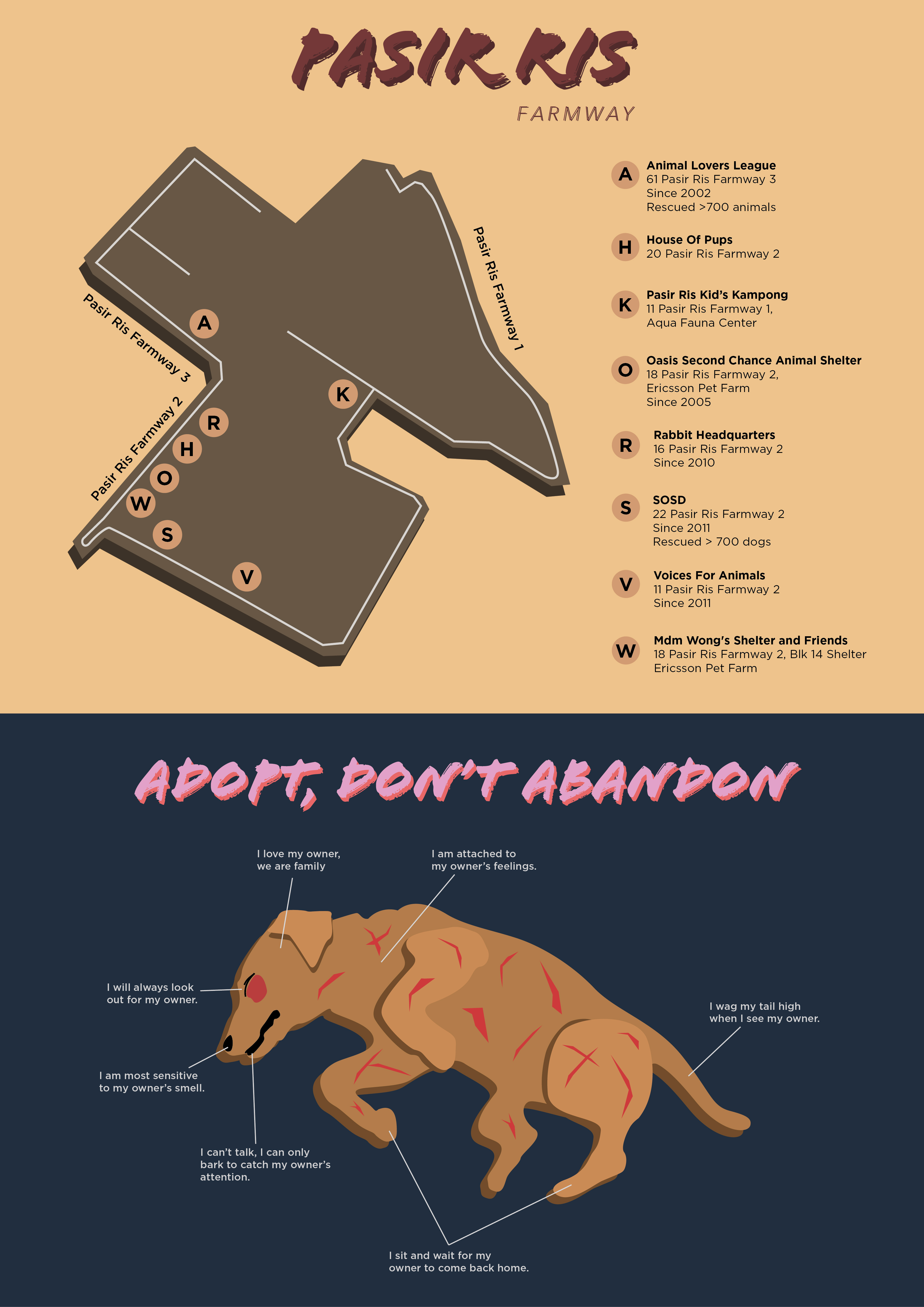

Ver. 1

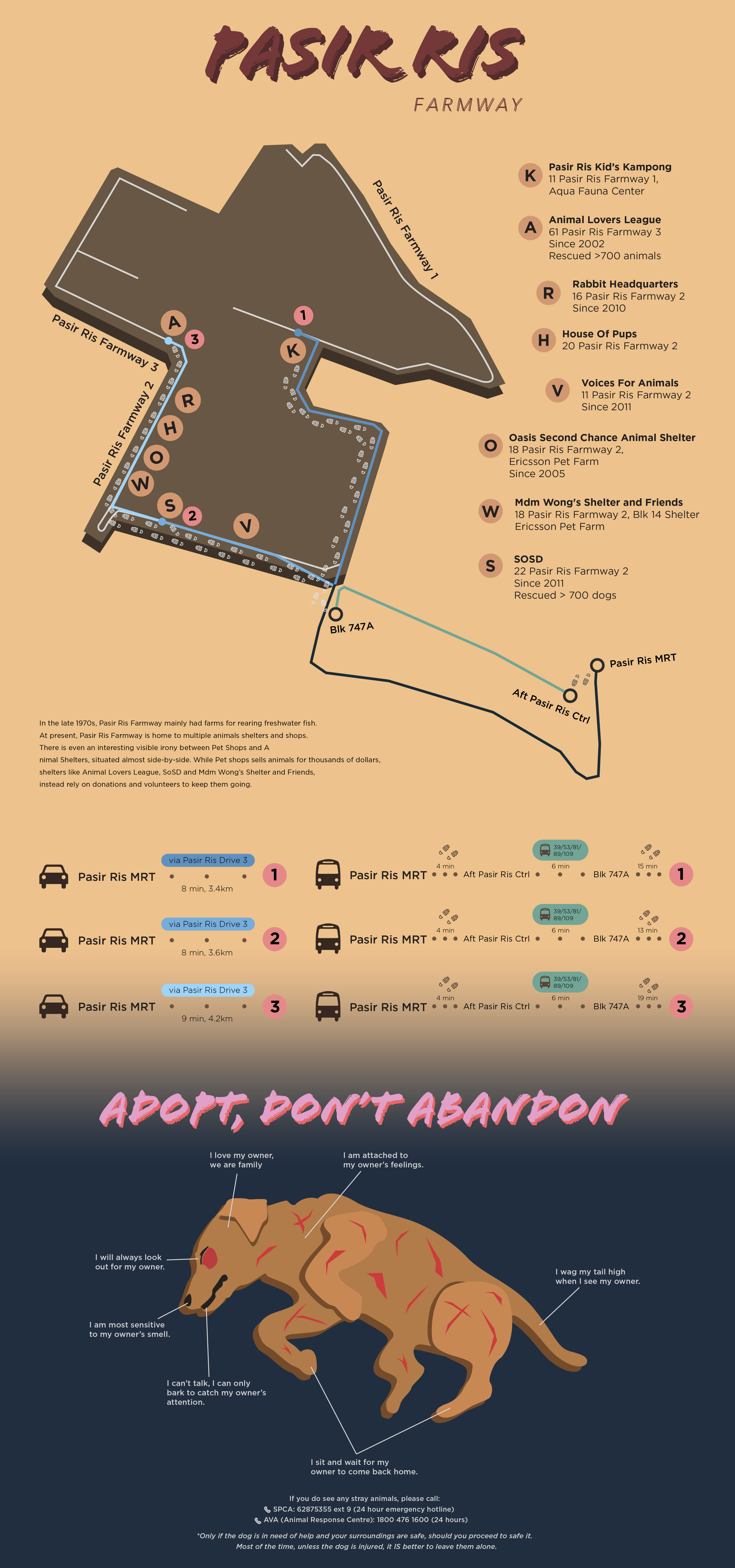
On the day of presentation, I showed the above Infographics. I received feedback like the information was not enough, I should add in the transport route, etc. Gathering the feedback, I decided to do a second version.
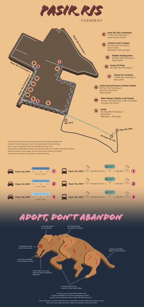
Ver. 2

For the map, I added the transport route (for both bus and car), and differentiated them through green and blue respectively. I used these 2 colors as they are not too glaring but still can be seen, and it compliments well with the muddy background. I created 3 shades of blue driving route, to show that they lead to different paths. I indicated 1, 2 & 3 in the map to show the destination point. Hence, it’s easier for audience to see where the transport route ends at. I also added footprints to show the walking route. I shifted the legend to side of the map for easier reference.

At bottom left hand side of the map, I also added a short brief of Pasir Ris Farmway, to tell the growth of the place.

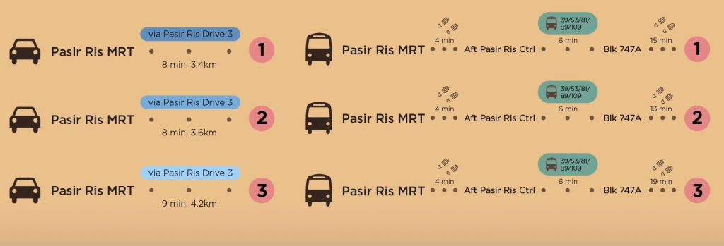
For the driving routes, I used the respective route color to let audience know which route I’m referring to. I also added which route to take and amount of time, allowing the audience to know how long it will take, and adding it to their preparation time.

For the bus routes, I found a common bus stop, but different walking path after that, which will lead the audience to each farmway. However I did not combine them into one, as I’m afraid it will confuse the audience. 

For the destination point, I only selected 3 common points, as each destination point can lead them to other shops. Therefore, I chose a shop from Pasir Ris Farmway 1-3, to represent each farmway. Having a common destination point, minimizes the route indications, making it less cluttered. It also reduces the confusion of the audience.

I chose a yellowish brown color for Pasir Ris Farmway, as it’s like a rural place, not having any urban features in it, very raw and untreated.


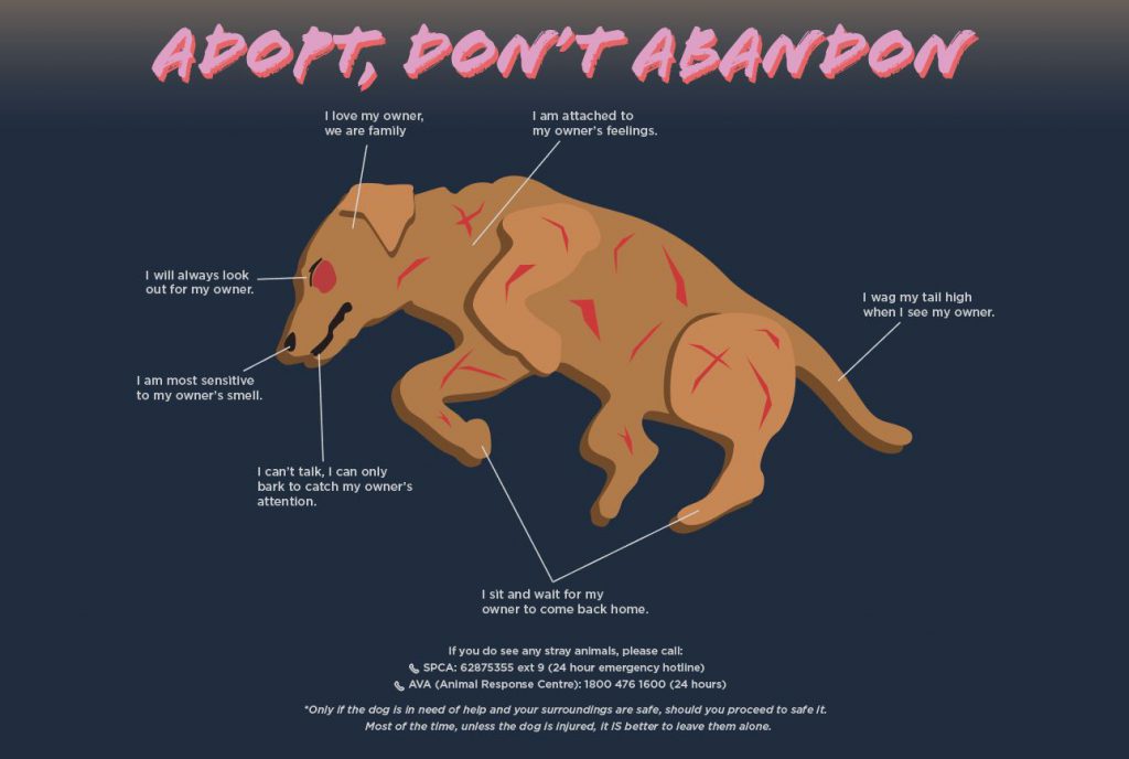
This was an additional section of the infographic. I wanted to bring across the message of choose adoption and don’t abandon animals/dogs. As Pasir Ris Farmway had lots of animal shops, therefore, I find that it’s a relevant topic to bring across.

I illustrated a harmed dog to show that if you abandon your dog, their feelings will be harmed too. Additionally, their dog when abandoned, may also face ruthless action by the public, and tortured. I made the dog look pitiful/bloody, to let viewers be more cautious of it. The dog’s feelings were also added to different parts of the dog’s body, to show a dog’s devotion. 

For the color of the dog, I used a common stray dog in Singapore, which is the yellow dog (黄狗), as reference. For the header, I used pink and red (shadow), to represent love and compassion. For the background, I chose blue, which represents loyalty. I desaturated it slightly, to show the depression of the dog, despite it being loyal their owner.

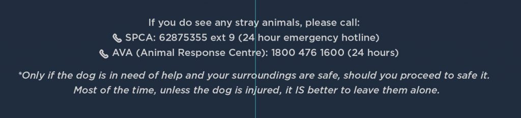
At the bottom, I also added a hotline information for viewers to know who to call when they see a stray dog. I also added a side note to warn people not to approach stray dogs if they are unhurt. It’s for your own safety as well.


Overall, it was a good experience learning and trying out infographics. I had a tough time gathering information, knowing what to put as priority, arranging in a visually pleasing manner and not making the entire composition look too plain. Nonetheless, I’ve managed to pull through and will be focusing more on Part II. 

Till next post! Ciao!

NASA + Future World

3 March 2017

On 28 Feb, Ruyi brought us to the Art Science Museum for a field trip. The trip was quite an interesting one, as I had different experience and it broaden my views on various possibilities that we can create.


NASA – A HUMAN ADVENTURE

At the start, we visited the NASA exhibition. The first gallery I encountered had portraits of famous historical figures, eg. Leonardo Da Vinci. The gallery is in a circular form, therefore you can walk around and see each individual artists’ portraits hang on the wall. The interior design is very steampunk-ish, giving the gallery a vintage feel. After reading up online, then I knew that the selected portraits are early dreamers who ignited a passion for travel to the stars.

Moving on, it’s the history of NASA. It showed the process of how they made it to outer space, also the evolution of the inventions, technology and space suit. I also had a look at the type of food that astronauts ate.

In the exhibition, they had a G-Force simulator. It’s a ride that simulates the experience of an astronaut embarking on their journey out of the Earth’s atmosphere. It was really a fun experience, but just a bit too short. Just a heads-up, you may get slight lightheadedness or nauseous after the ride. 


INTO THE WILD

Next, I experienced going “Into the Wild”. We were given a smartphone device with handle bars to it, as we embarked on the journey through the phone app. We had to walk around the Art Science Museum, to discover the different animals around the compound. Through the phone, I found deer, tiger, anteater, etc. Towards the end, we had to plant a seed at the 4th Level of Art Science Museum. For every virtual tree planted, and accompanied with a pledge to WWF, a real tree will be planted in a rain forest in Indonesia. That marks the end of our virtual adventure. It was a refreshing experience for me, as it’s my first time going through it (other than Pokemon GO). 


FUTURE WORLD: WHERE ART MEETS SCIENCE

That day, I didn’t manage to see the crystal universe, as it’s under maintenance. However, I still manage to see the other exhibitions. In the exhibitions, there are neon color lighted balls, that change it’s color once touched. There is also an installation of a fictitious town. We just had to color on the given paper ( with diagram shapes on it) and scanned it in the digital scanner, and our buildings/cars/plane will reflect on the projection wall, becoming 3D animated objects. 


Overall, this outing showed me the impossible became possible. In the past, no one would have thought that man can travel to outer space, no one would have thought that virtual can be combined with reality, creating a new experience. With the improvement of technology, possibilities are countless. I can’t wait to see what lies ahead in the future world.

Till next post! Ciao!