Project 2: Part II (Final)

18 April 2017

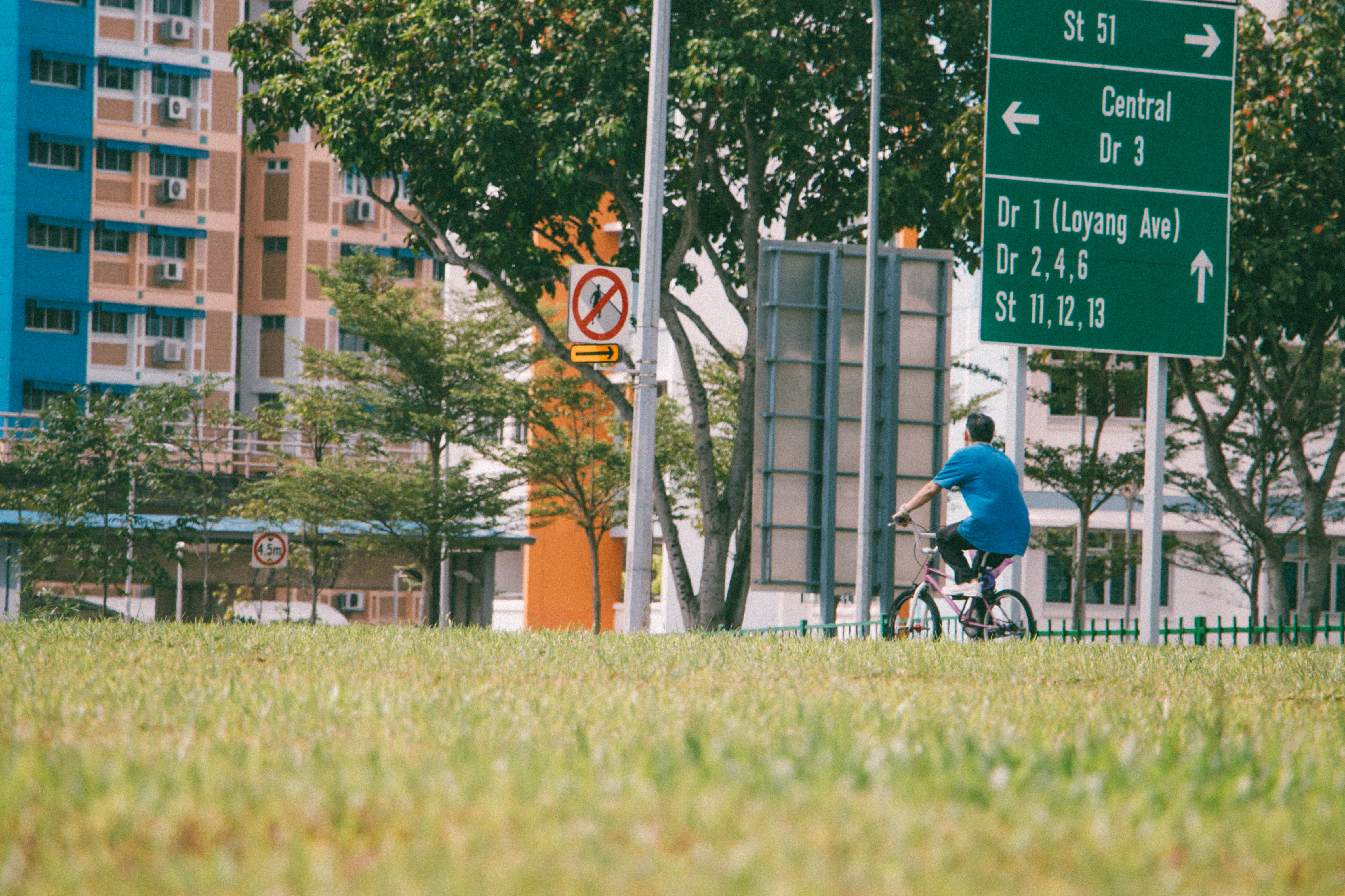
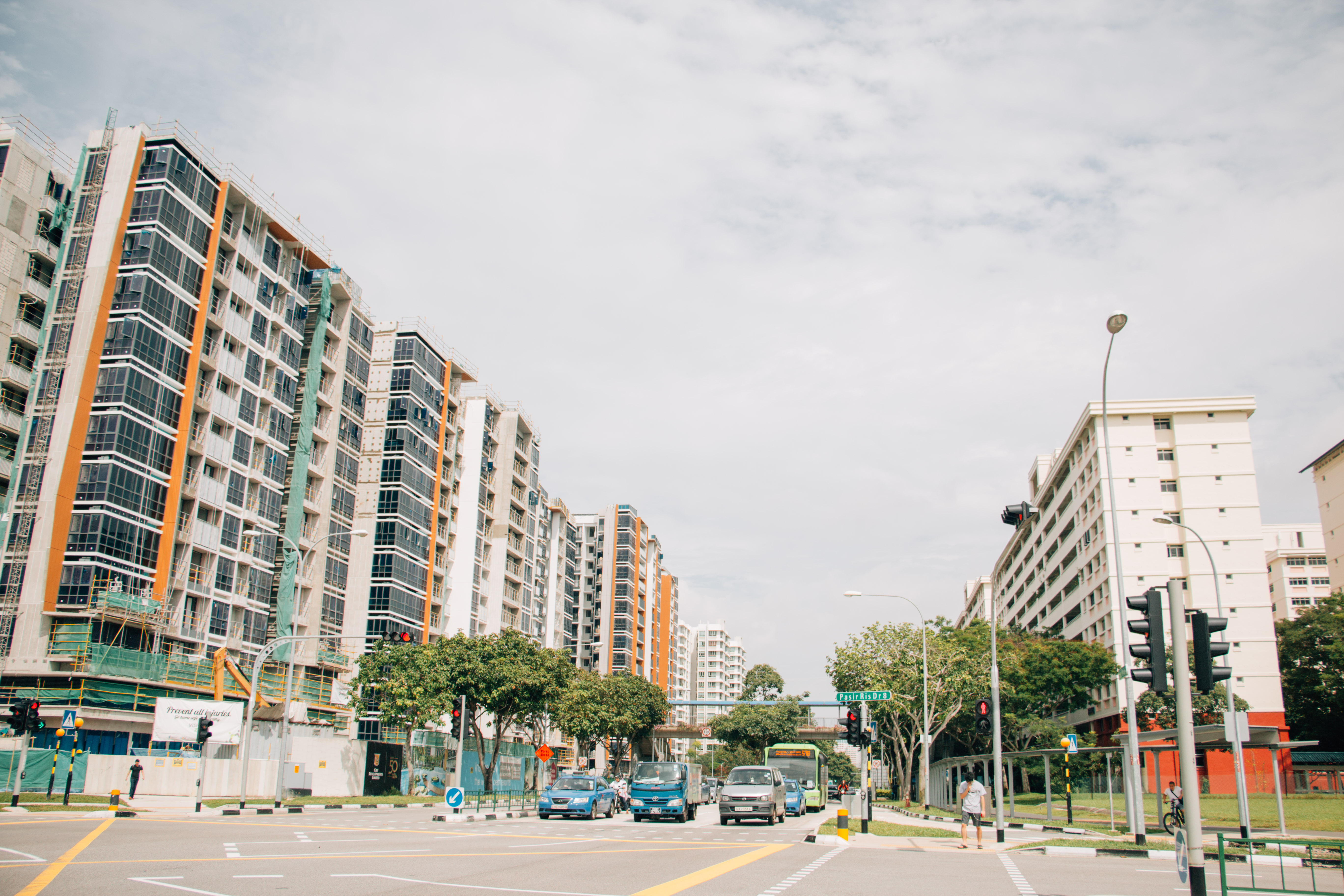
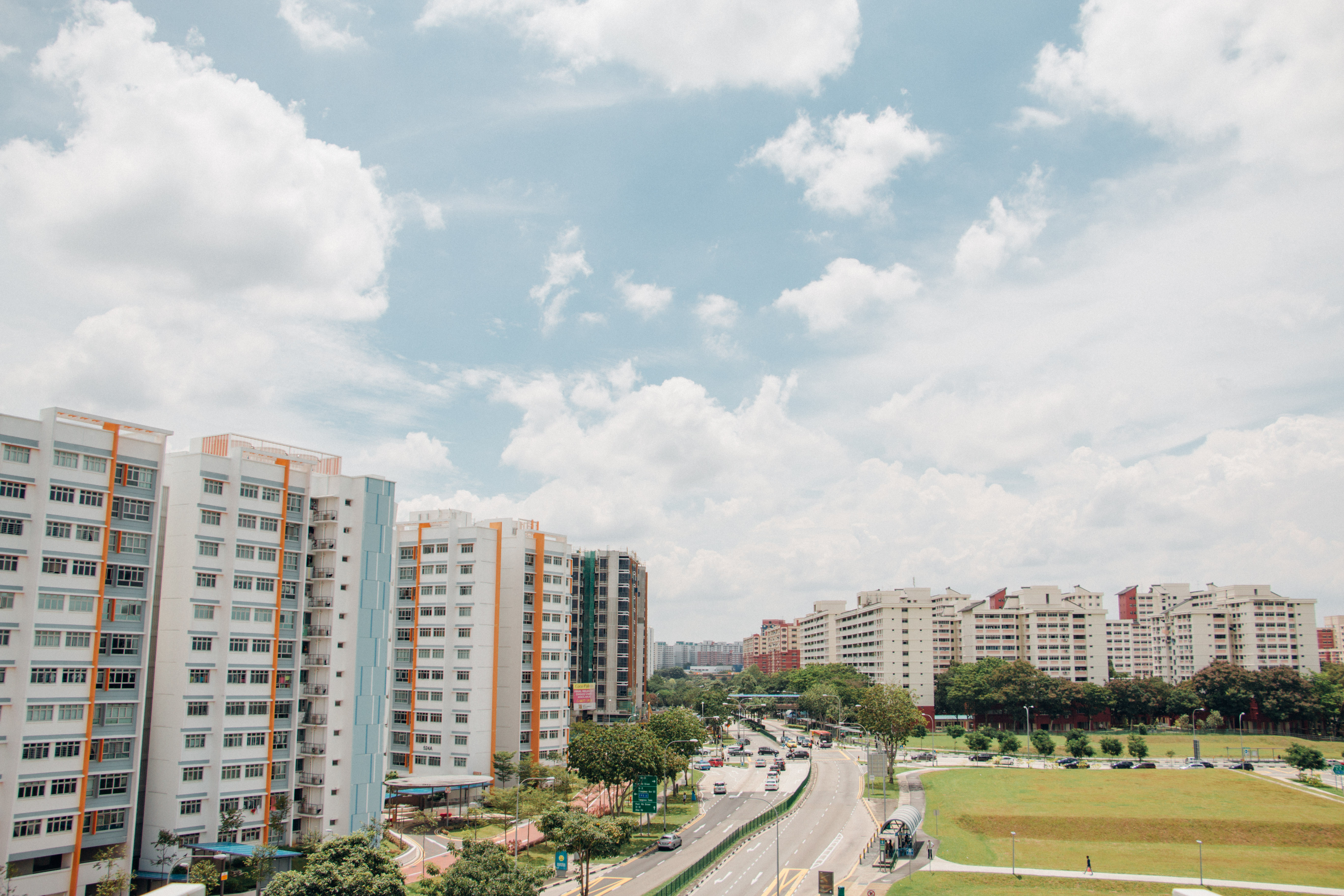
Previously, I had difficulty showing the element of Pasir Ris in my Zine, and I was not done with my double exposure pictures. 


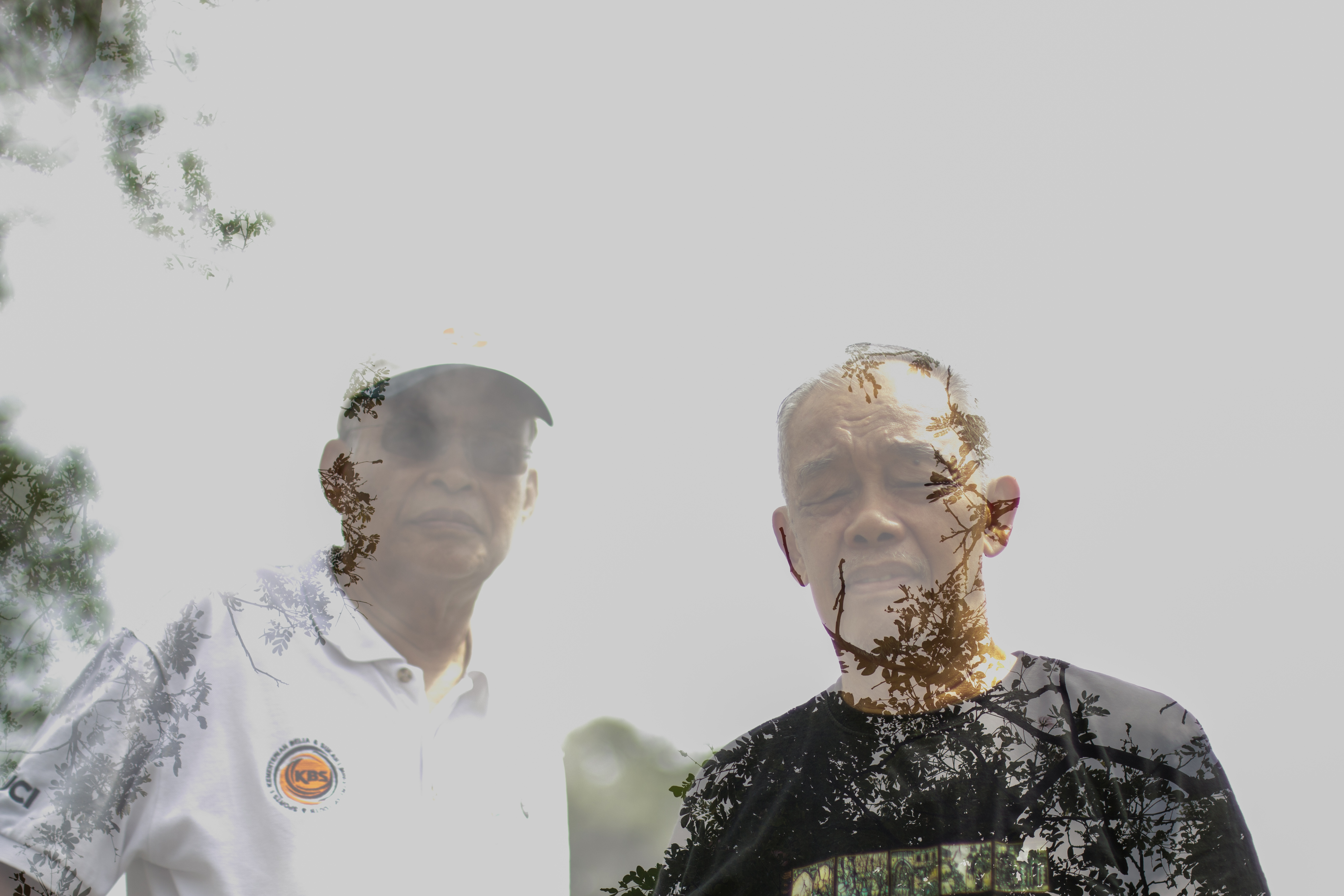
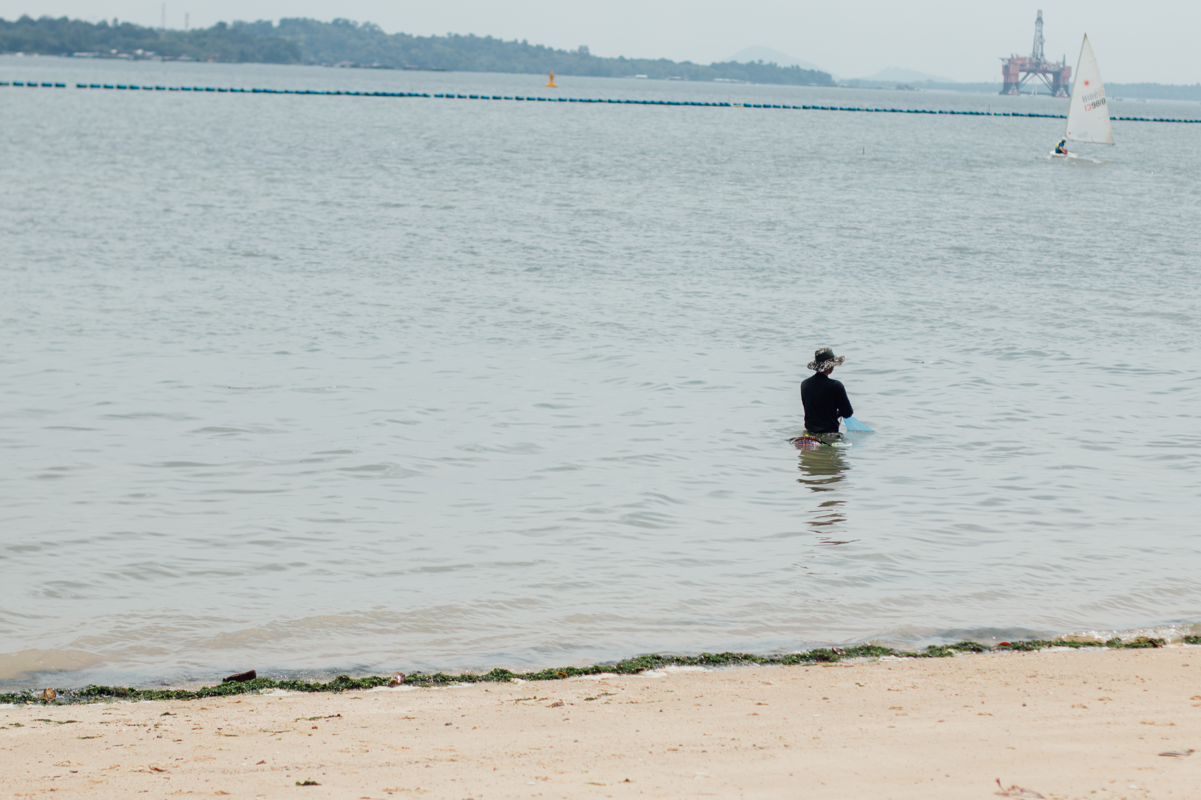
Photograph concept: Lonely

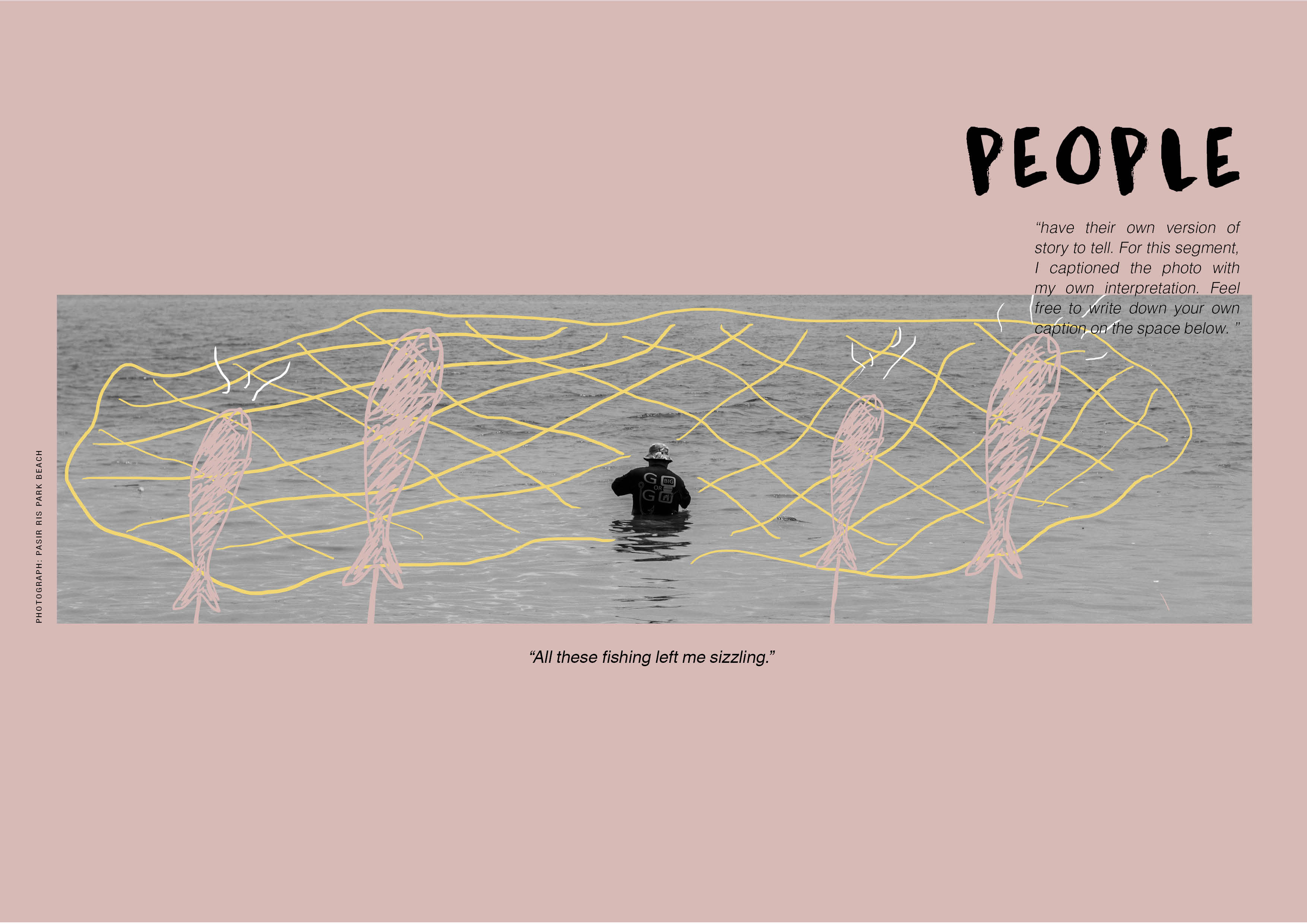
When I placed my double exposed visuals inside the Zine, I felt that it does not blend well as a whole. Therefore, I decided to doodle on one of my image and add a caption below. 

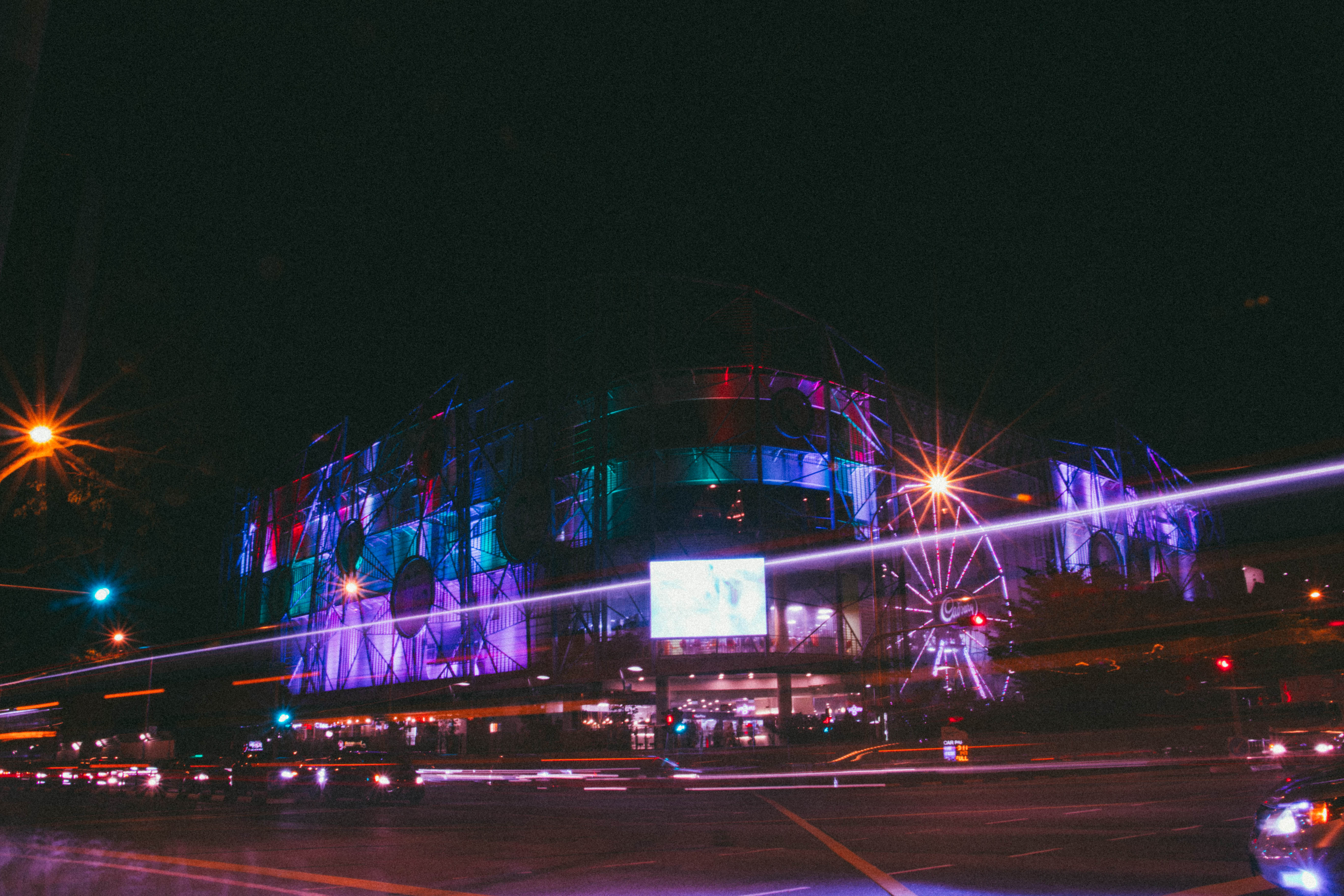
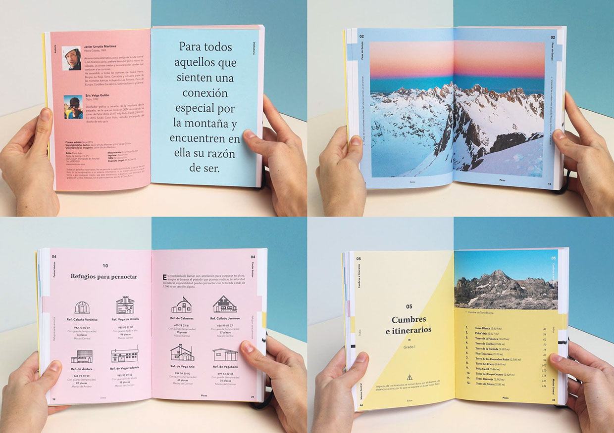
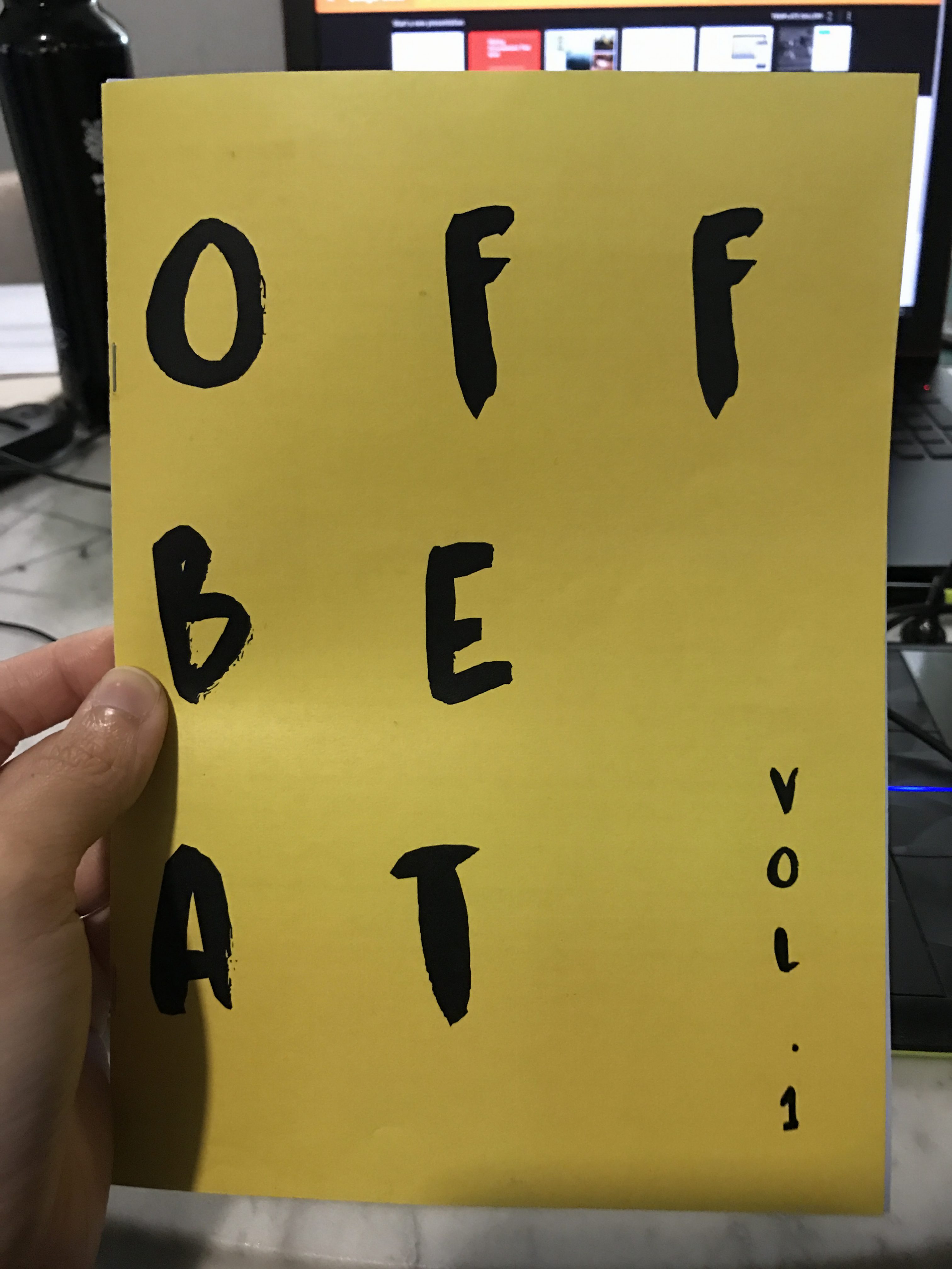
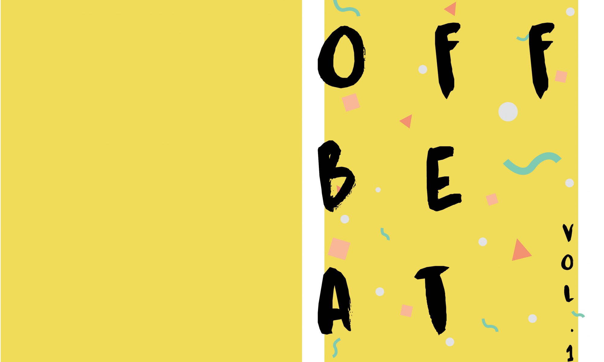
Here’s my final Zine design.


Final

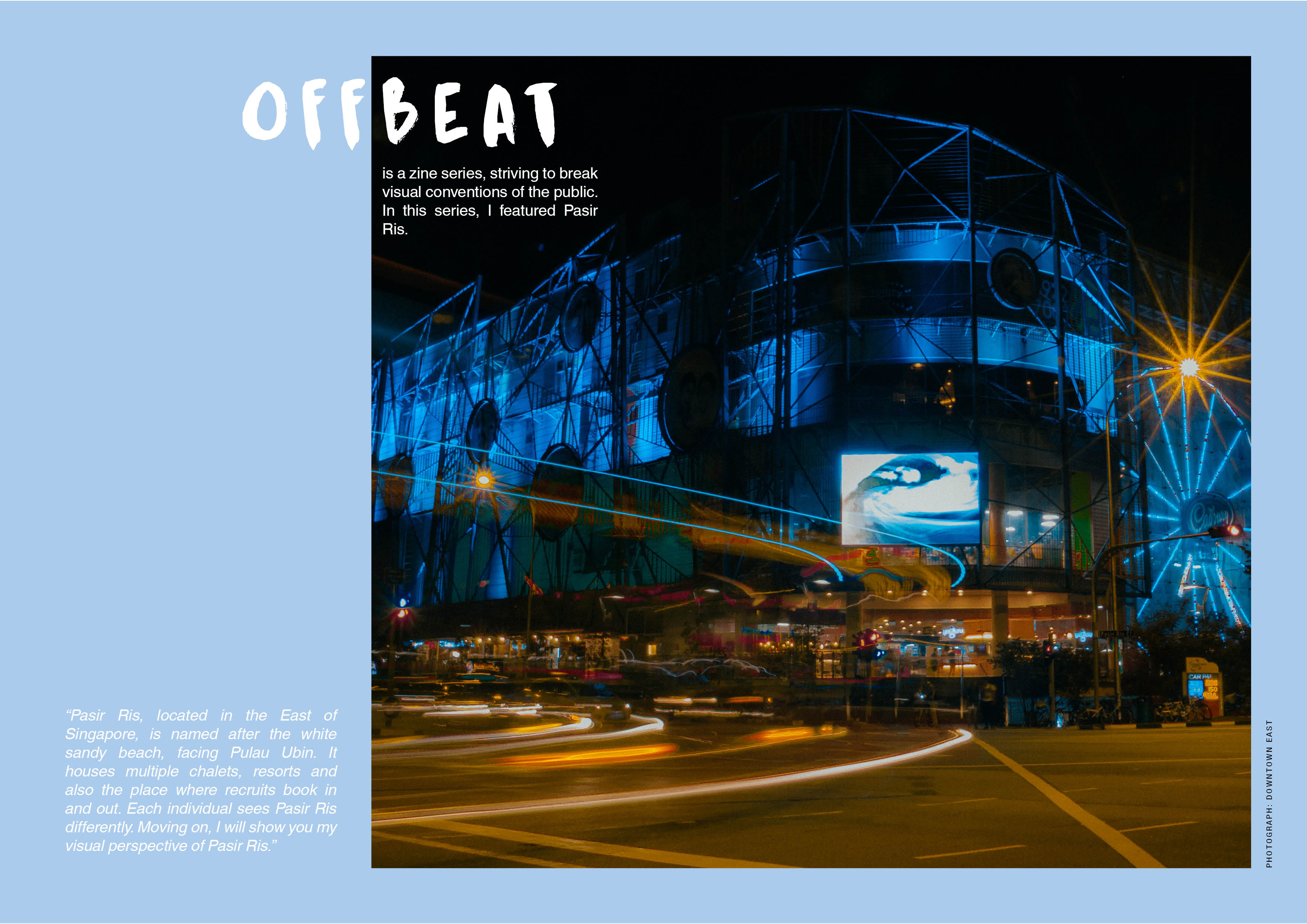
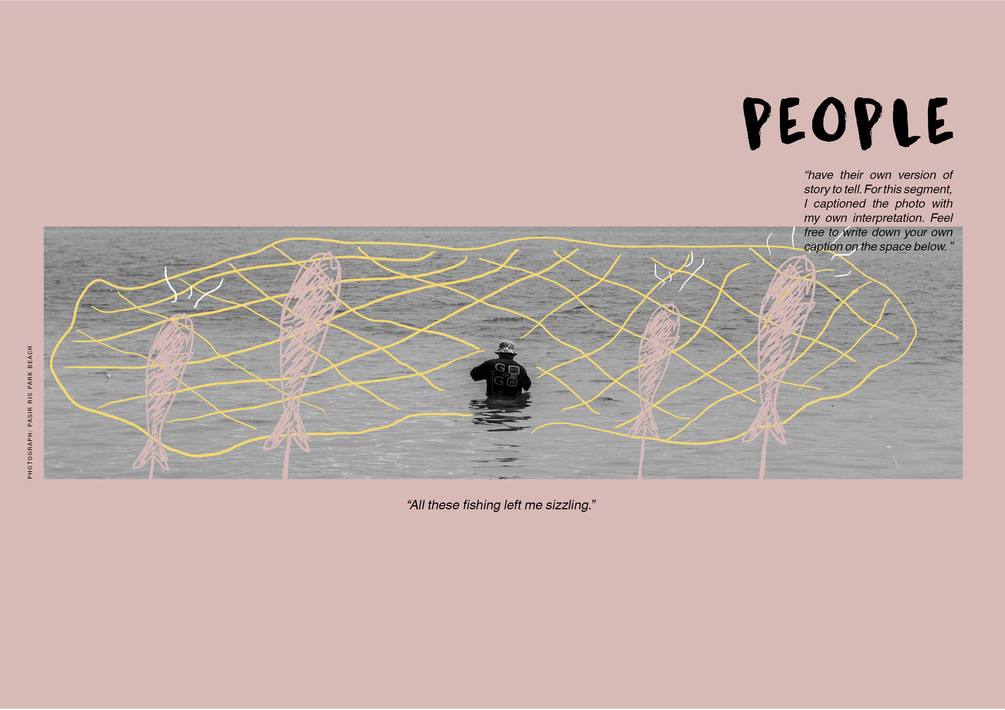
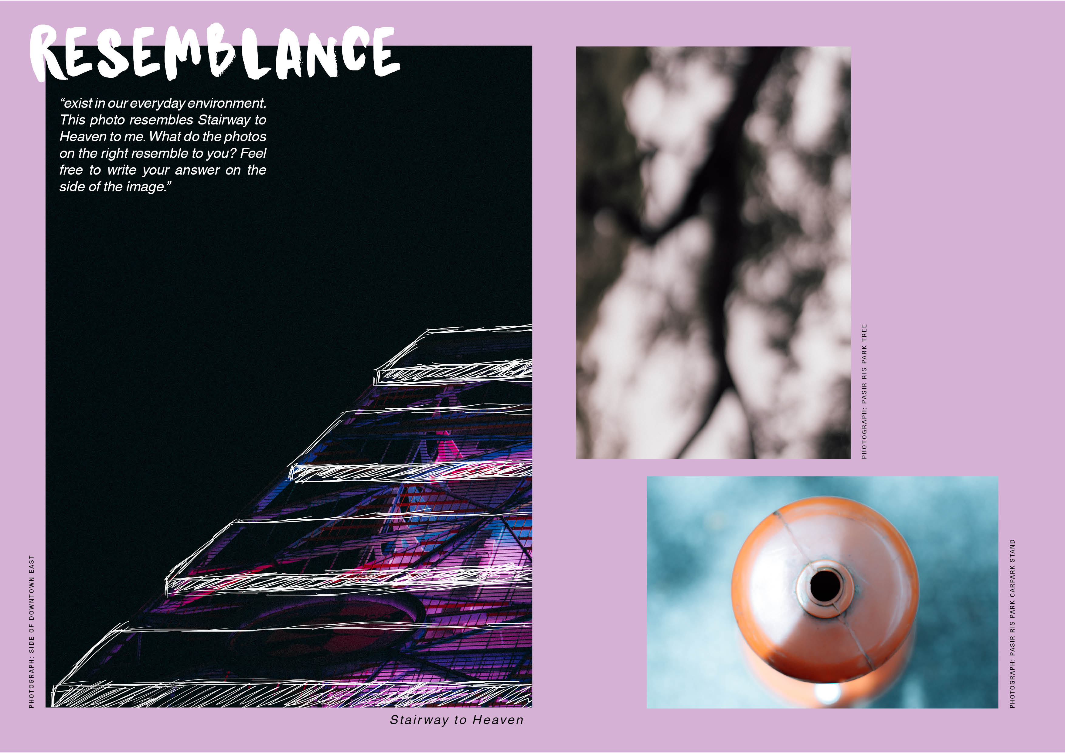
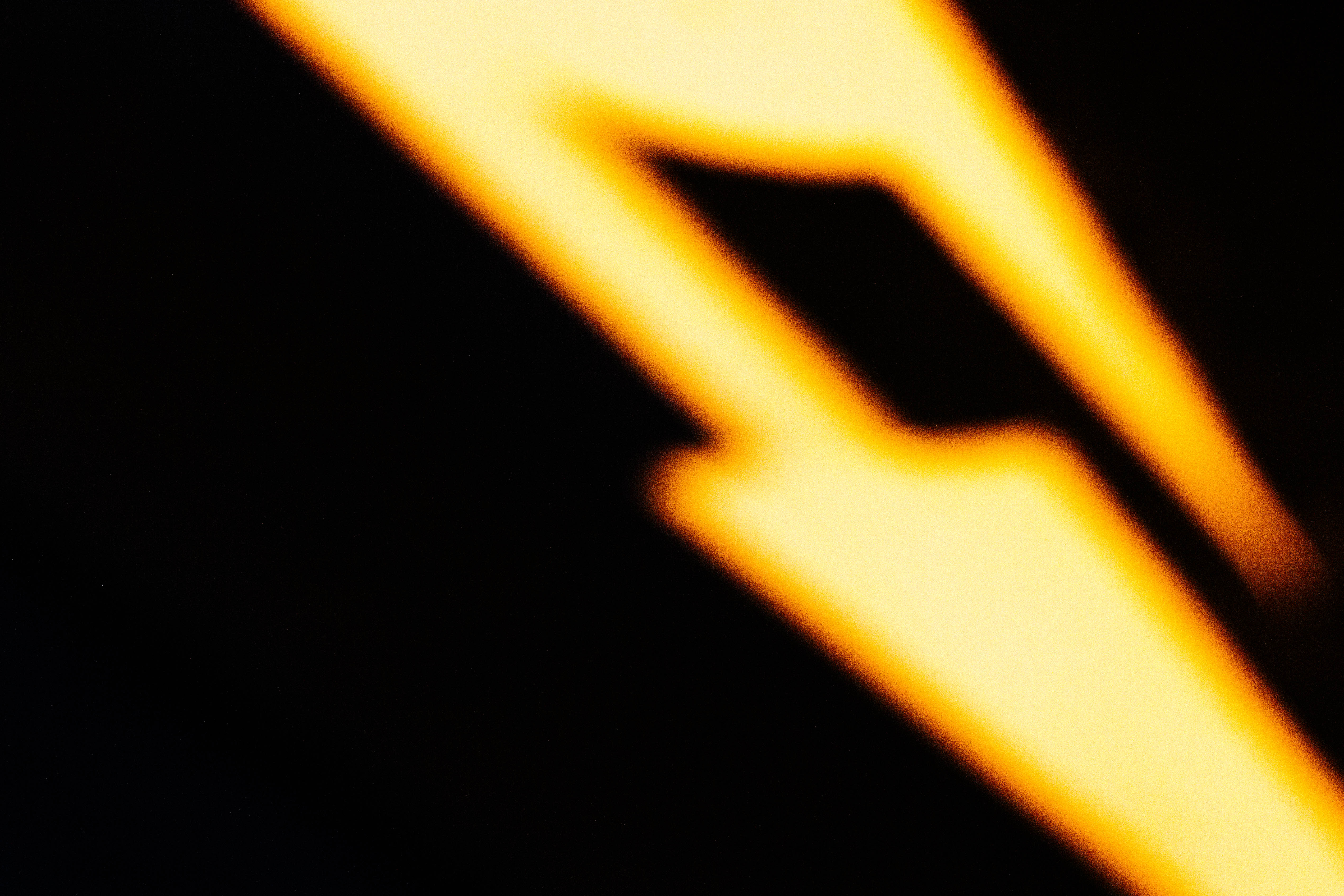
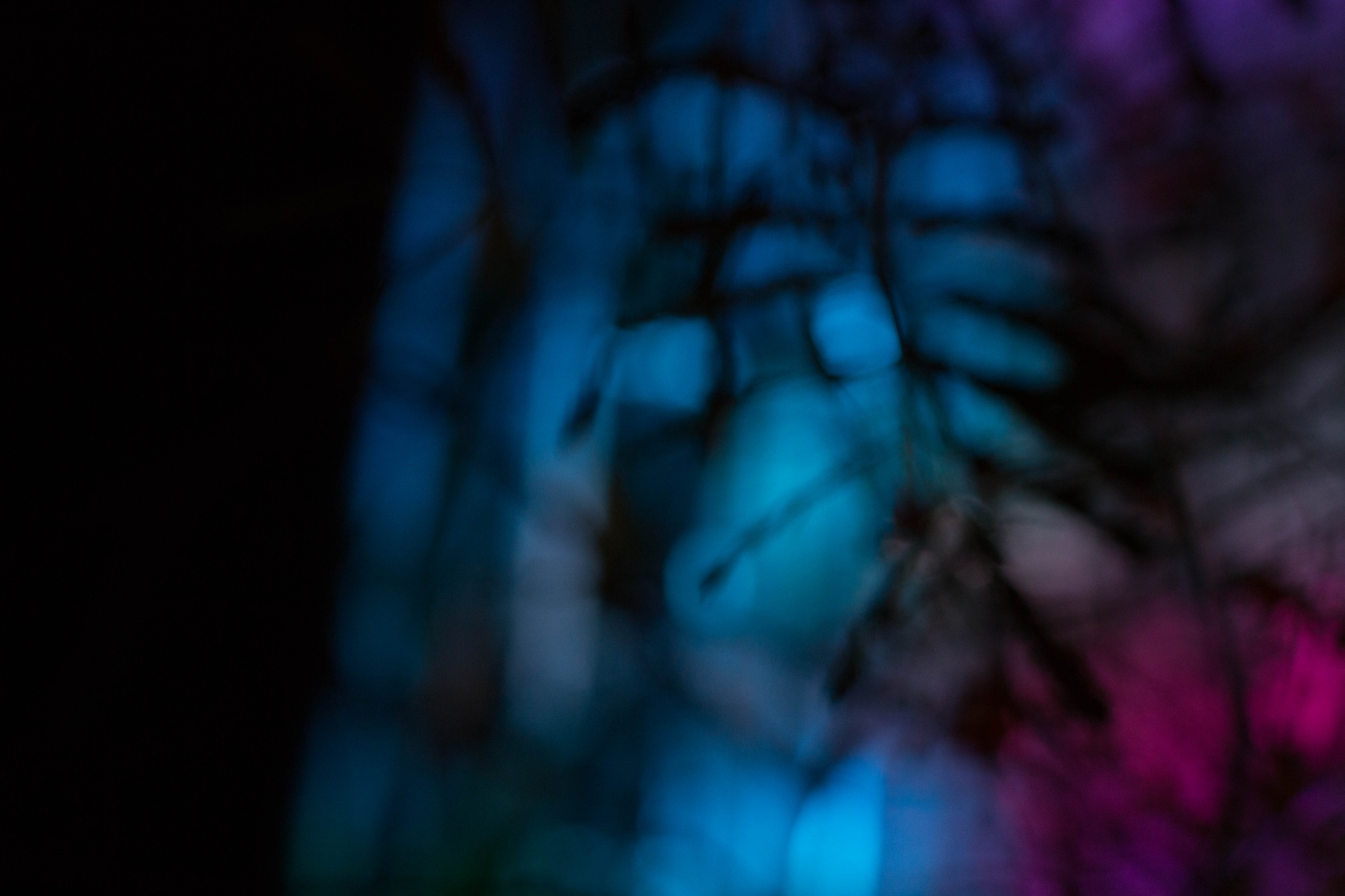
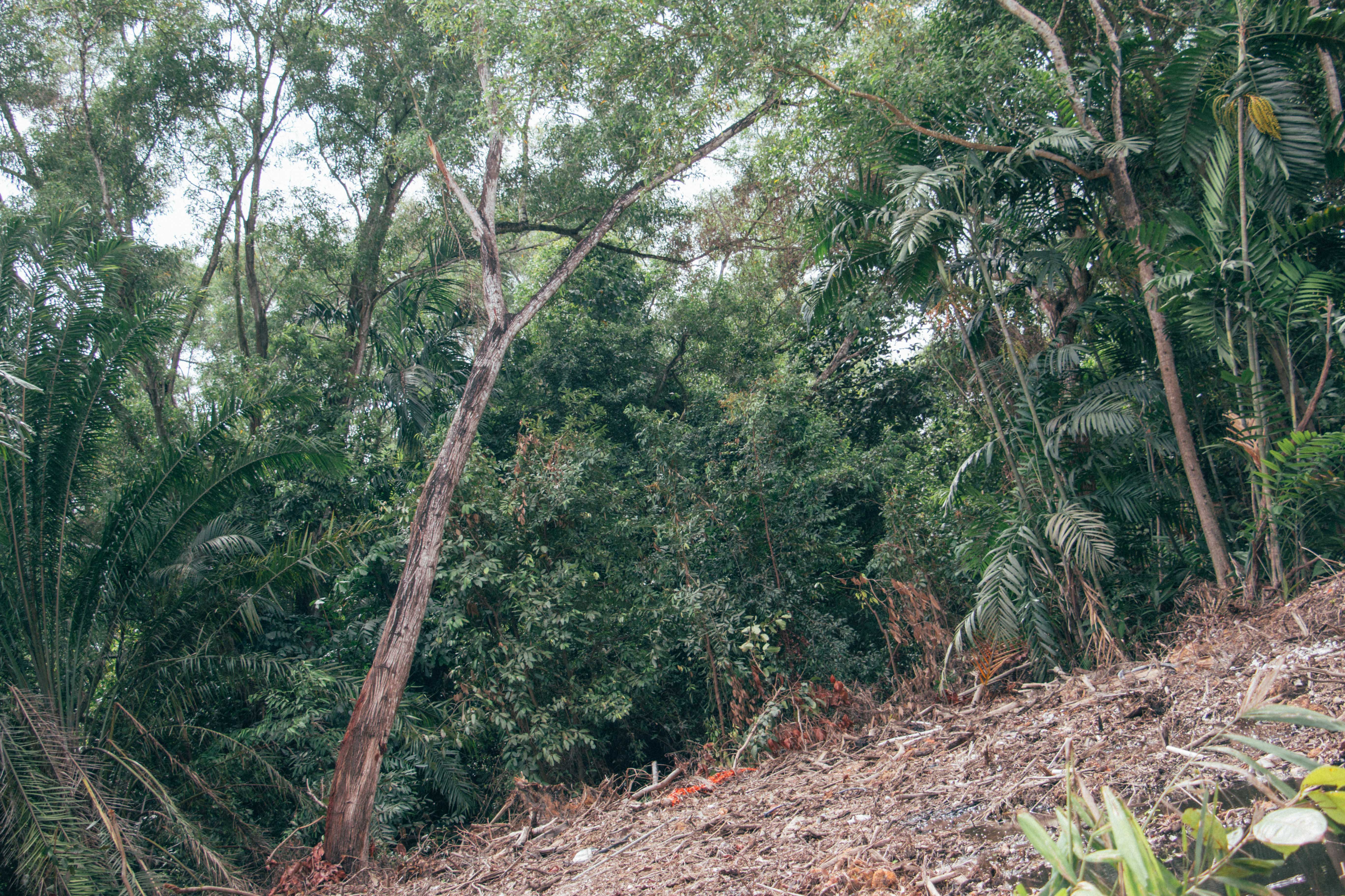
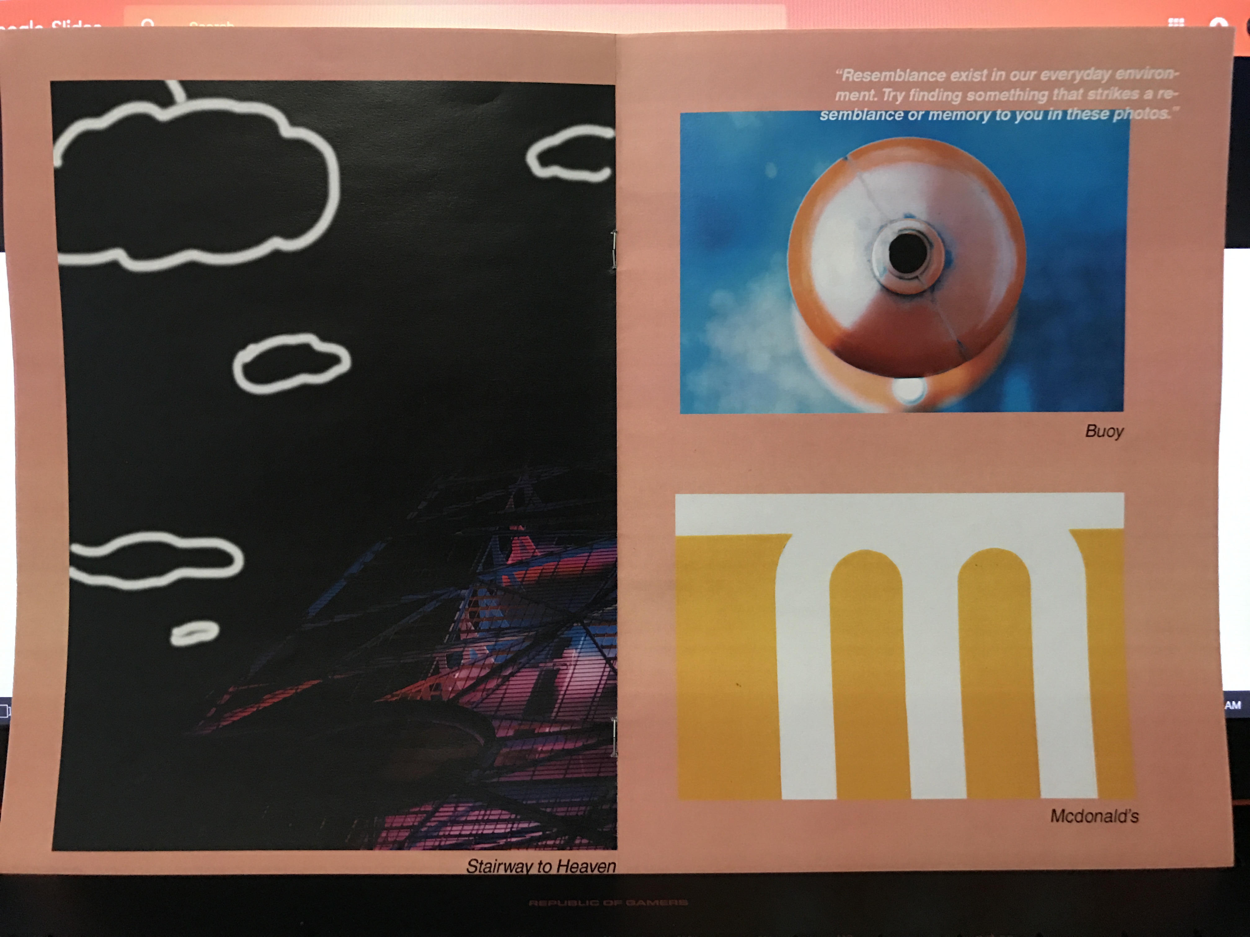
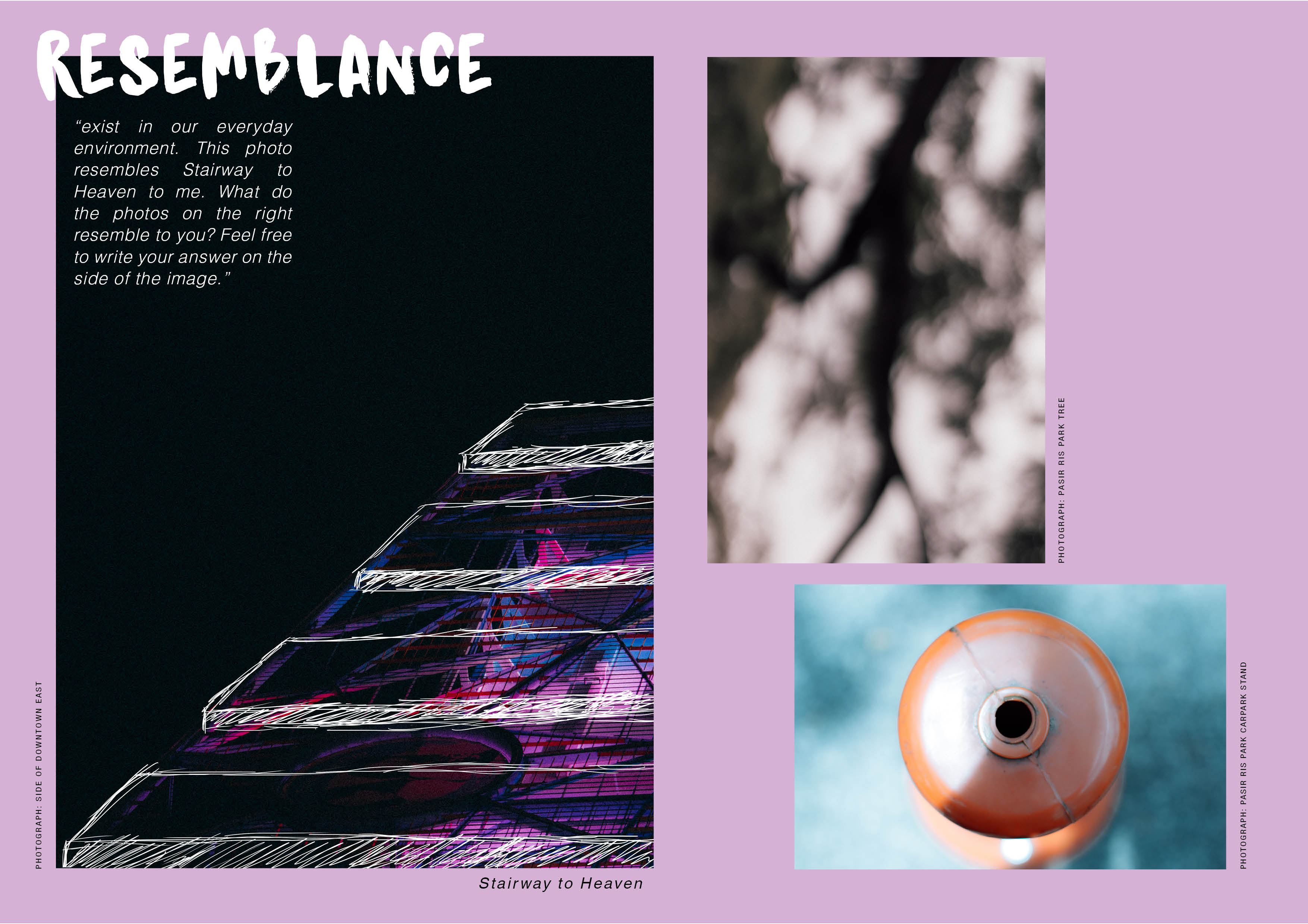
During the presentation day, I had feedbacks like some read my cover page as: OFF-BE-AT, which is supposed to be read as OFF-BEAT. Some also commented that my words were camouflaged by the background colors. Some do not understand the OFF button placed at the back cover. Some felt that the doodle could be spread out to all images. However, I wanted my second page to be an introduction, and what people viewed Pasir Ris as, without any doodling. Therefore I did not add any illustrations to it. For the last page, the right 2 images are for viewers to put in their own answers of what the images look like to them. The left image, “Stairway to Heaven”, was my own interpretation when I saw the image below.
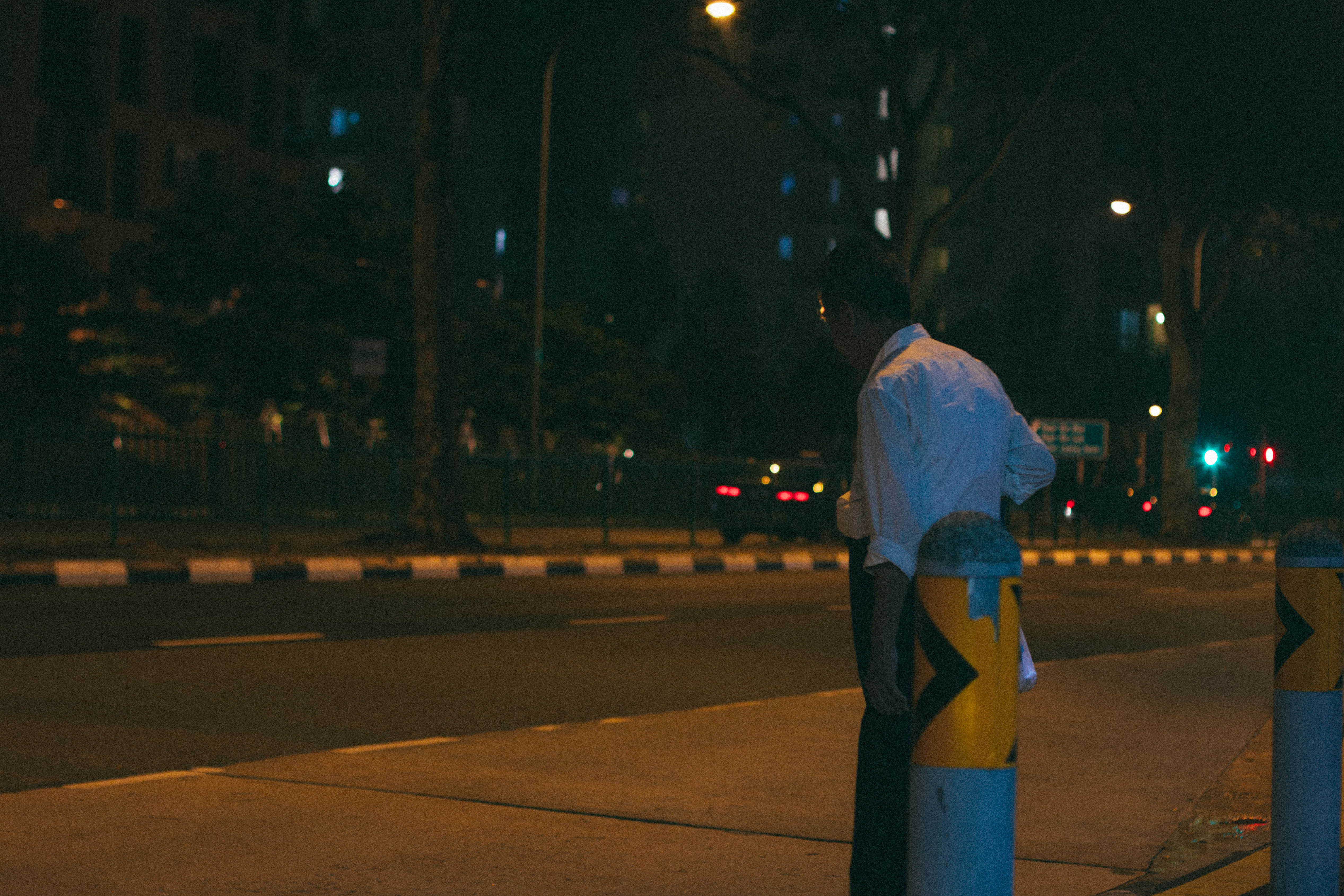
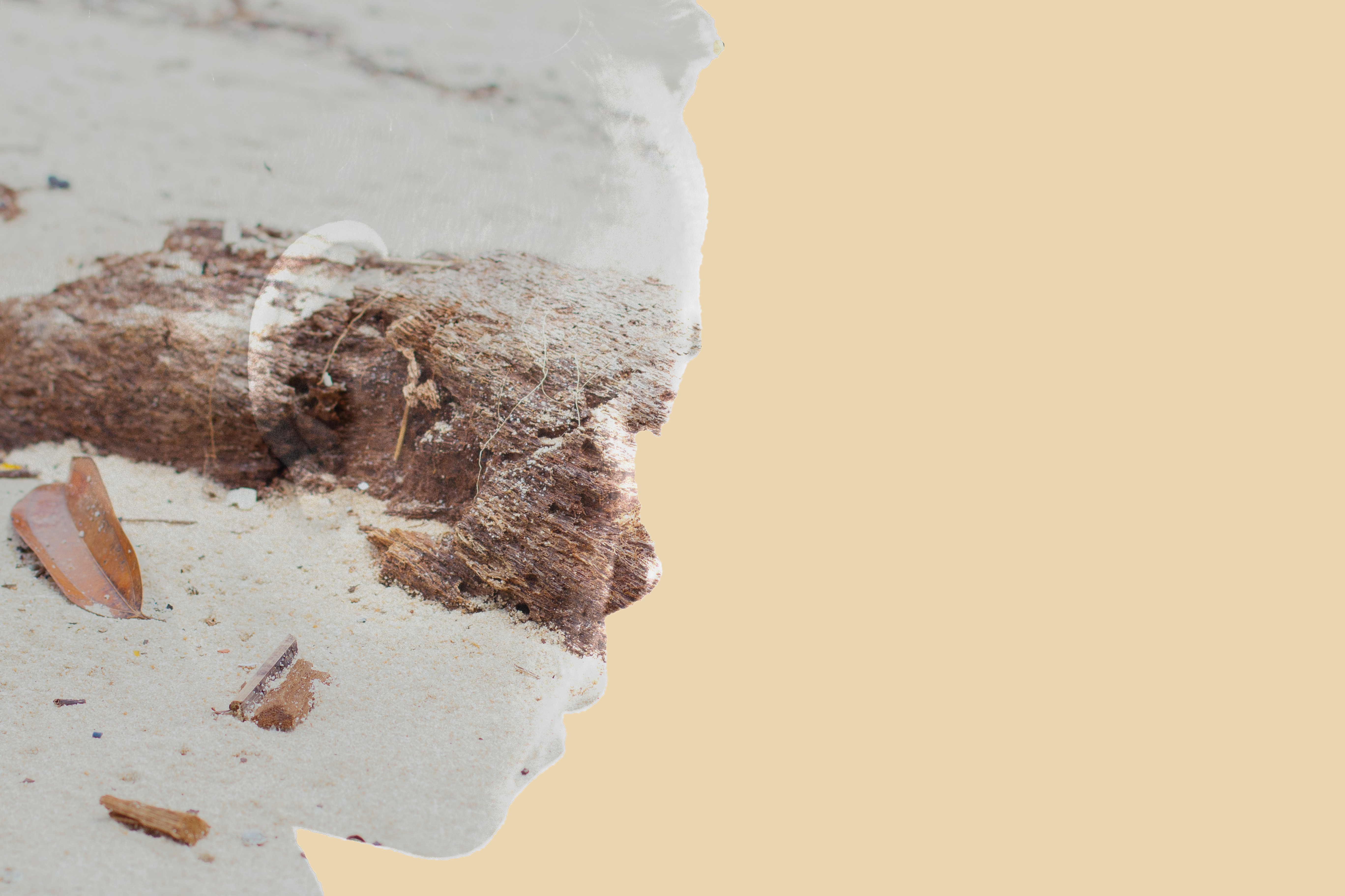
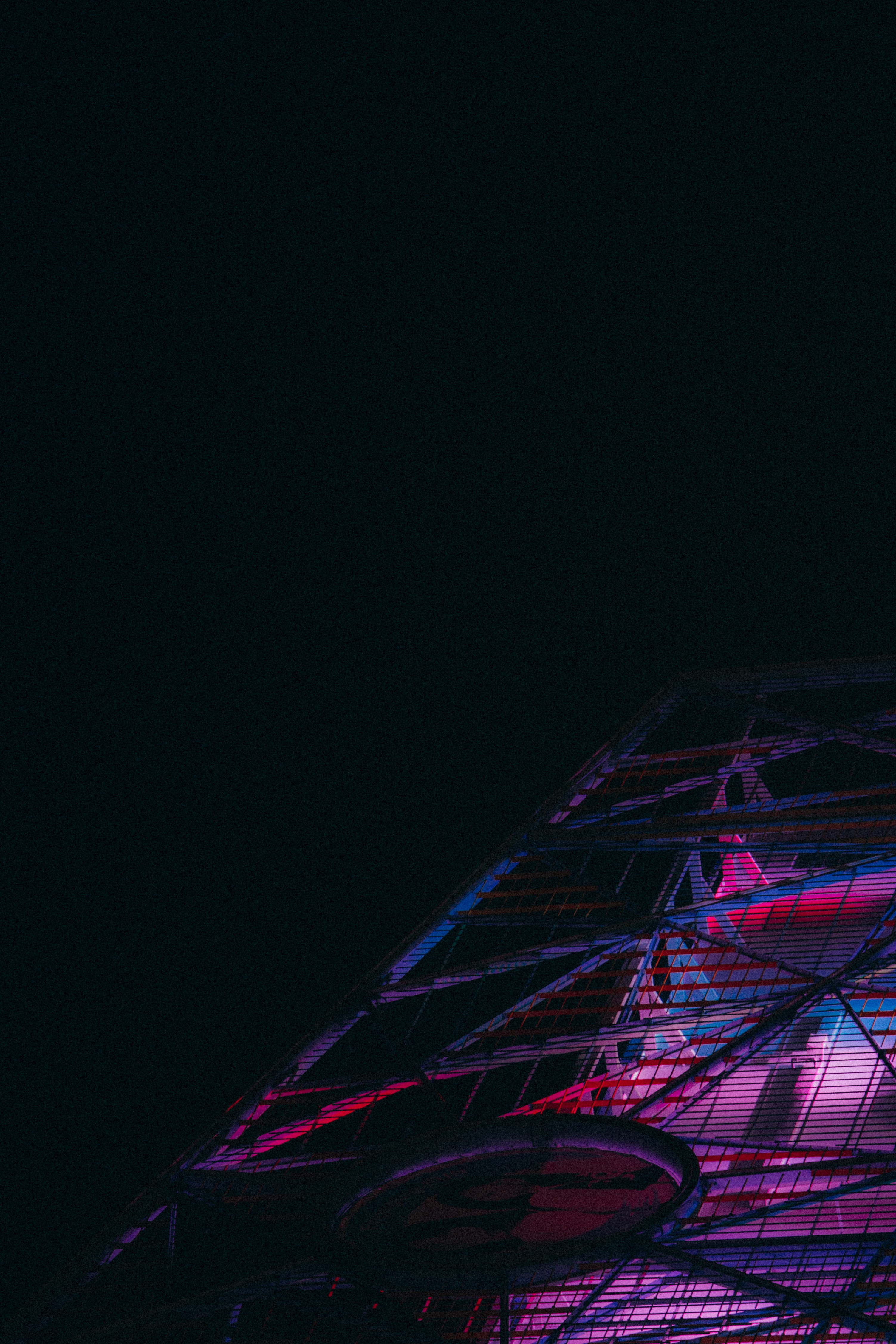
Before

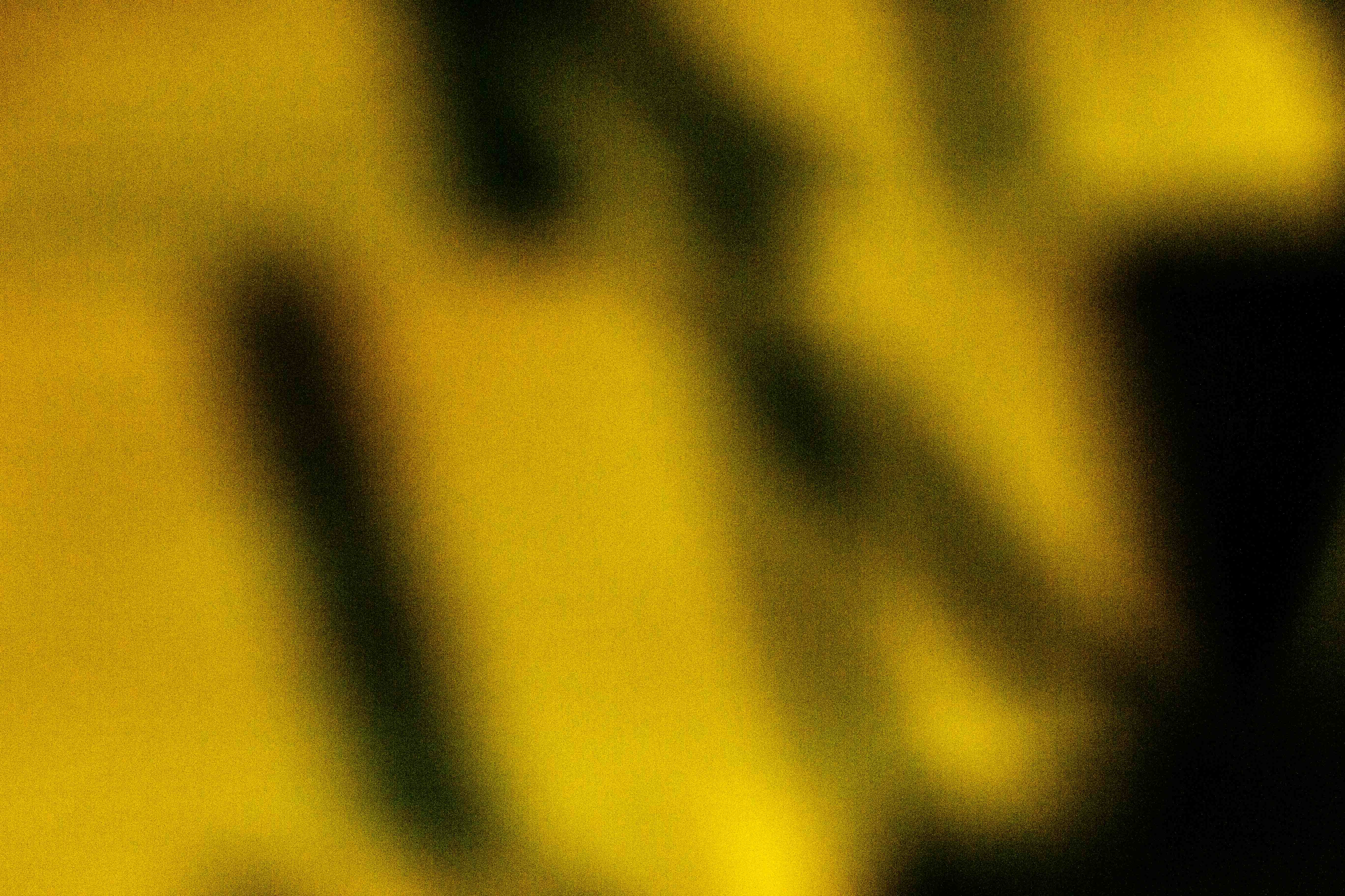
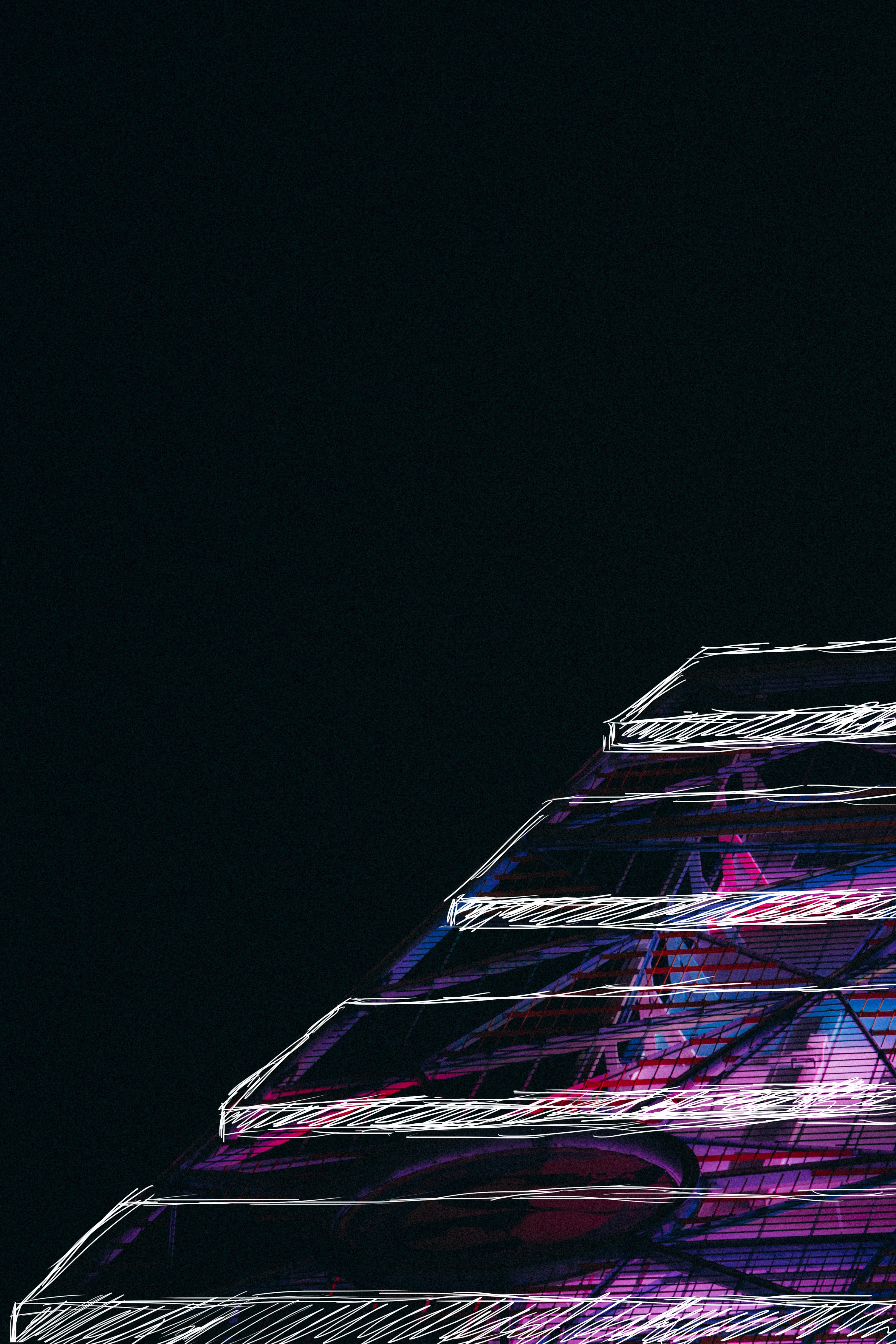
 After(my own interpretation)

This image was actually an example for the images on the right, to let viewers have a better understanding of what I want to convey.


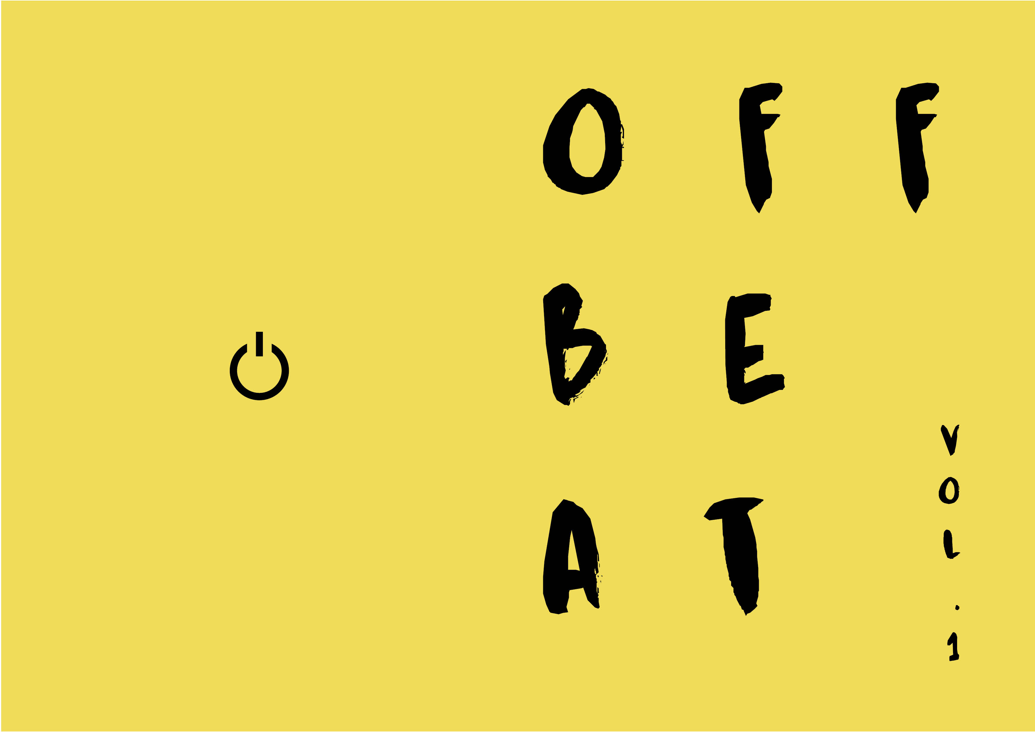
After hearing the feedbacks during the presentation day, I edited a bit of my Zine, to try incorporating their views.

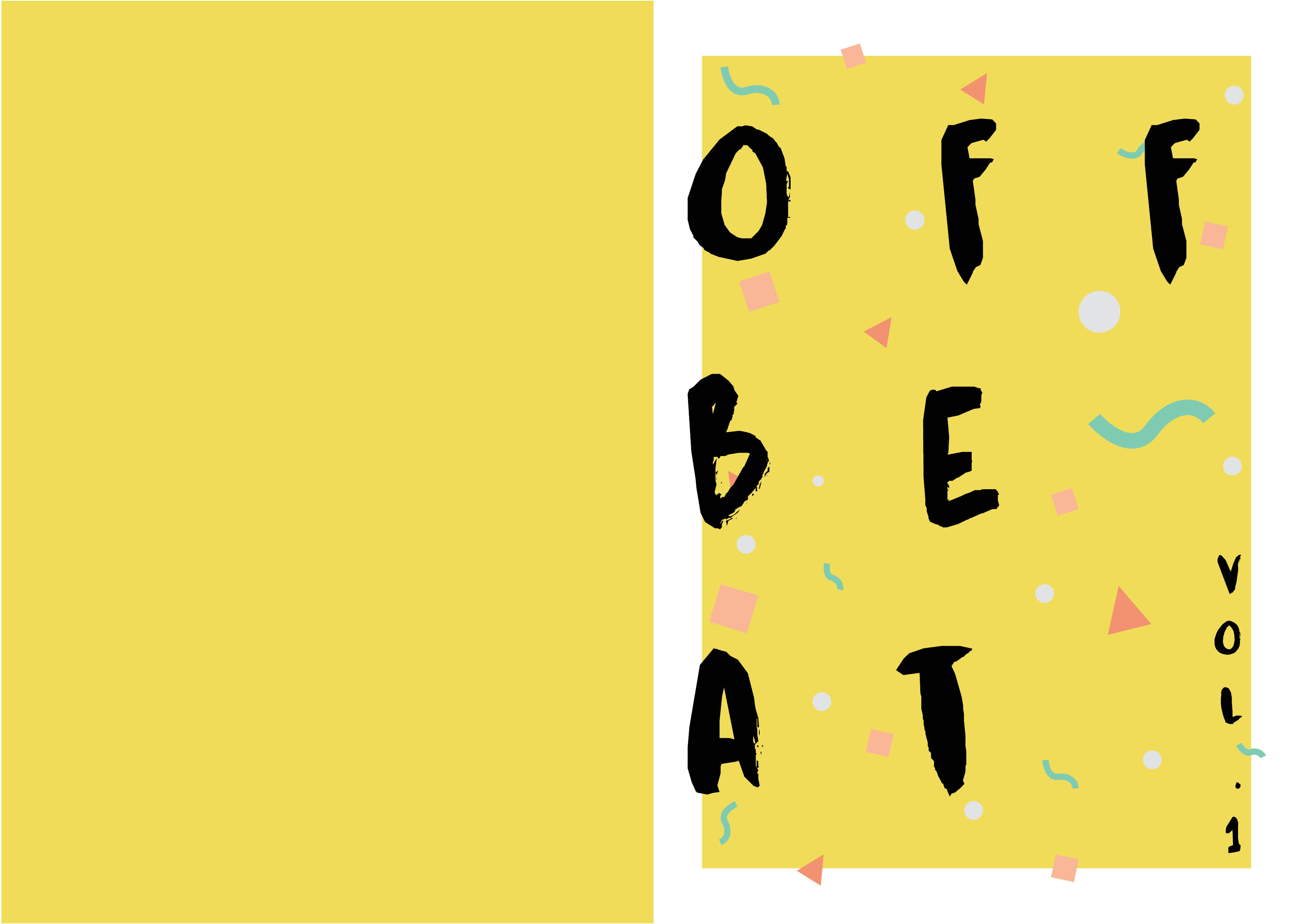
I tried making the text thinner, darkening the second spread (but not losing the pastel look) and making the cover look more fun and playful. 

Overall, I learnt a few stuff in the process, like how to use Indesign, how to prepare my zine for print and to view my work in other people’s point of view. It was a fun project overall, which killed dozens of my brain cells. Thank you Joy for your patience and feedbacks during consultation, guiding me through my entire first year for 2D. I’m really grateful that you supported my ideas and not discriminating them, answering email enquiries promptly during crunch times, and the comfort food given after the last submission of each sem. Thank you Joy, and see you around in the future! 

Till next post! Ciao!


click on the link below to view Project 2 part I:

Project 2: Part I (Research)

Project 2: Part I (Final)


4D II Assignment 3: Auntie One Pack Kueh Tutu Please!! (Final)

18 April 2017

After going through multiple ebbs and flows, we had finally finished our last assignment for 4D!!! Before saying goodbye to 4D, I will document the final process of my group’s 4D exhibition. 


Just a recap, my group’s exhibition is about prolonging the legacy of Kueh Tutu by creating the awareness of it to Singaporeans.  In this exhibition, we engage our audiences five senses, to allow them to fully appreciate the art of Kueh Tutu.

Presentation Day

Station 1: Touch

This station shows the process of how Kueh Tutu flour is made. This video is projected on the wall, with a table in front, filled with the materials used to make the flour. This station’s objective is to engage the audience with the flour, to allow them to touch it or taste it, and experience the end product of what’s shown on screen. 

Station 2: Smell

This station shows the process of how Kueh Tutu filling is made. This video is projected on the wall, and a table is placed in front of the projection. On the table, we have 3 jars. Each jar contains coconut filling, peanut filling and pandan leaves respectively. The objective is to allow the audience to appreciate the smell of each element.

Station 3: Sound

http://loopvideos.com/v_oMvpp-Z7Y

(Tutu Steaming Sound)

http://loopvideos.com/G9jqili3CFE

(Auntie serving the Kueh Tutu into the steamer sound)

This station engages the audience’s ears, to listen to the sound made when the Kueh Tutu is steamed. In the past, “Tutu” sound was made by the charcoal-heated steamers, that were used to cook the Kueh Tutu, which speaks for it’s name – Kueh Tutu. However, due to technology advancement, tenants no longer use the charcoal-heated steamers. Clara tried to remake the Tutu sound, as this sound could no longer be found. I think she really did a great job remaking the sound. 

Station 4: Sight

This station concludes the different types of Kueh Tutu made by different races, to embrace each cultures’ confectionery. Najiha stitched different videos found online, putting Ruyi’s teaching to good use. It contains different races’ interpretation of Kueh Tutu/Putu Piring, allowing each race to indulge in the confectionery.  I felt that it showed the Singapore spirit, where each race have their own unique taste for confectionery.

Station 5: Taste

The last station we brought the Kueh Tutus and Putu Pirings to life, allowing our classmates to savor it.

Documentation


Overall, I’ve learnt from my fellow group mates on treasuring the essence of Singapore in our project. I’m also thankful to them, as they were there when help is needed, especially Clara for all her enthusiasm for this exhibition. It is also through this exhibition that I’ve learnt the hard work behind making a small Kueh Tutu. It is only through passing down this knowledge, that we can prolong the legacy of Kueh Tutu.

I’m really grateful to Ruyi for teaching me throughout my first year of 4D.  She really broaden my sight and thinking through her various break down of the movies and also looking in dept into various artists’ works. This concludes my first year of 4D.

Till next post! Ciao!

Project 2: Part II (Research)

17 April 2017

After the first part of Infographic representation of the neighborhood, the last part was to produce a Zine of that neighborhood. For the Zine, I wanted to try something different, something more abstract.


At first, I had to 2 concepts.

1.  Imagery of Pasir Ris landscape that have resemblance of familiar objects. (Offbeat concept)

– Finding resemblance of alphabets in Pasir Ris landscape. Images are blurred to see the alphabet clearer. Alphabets can also piece up to form P-A-S-I-R R-I-S

– Shapes in the blurred image that have resemblance of childhood objects

2. Imagery of People in Pasir Ris + Landscape of Pasir Ris (Double exposure concept)

For the first concept, I wanted to incorporate unconventional visuals in my Zine. I had an idea of using images to allow people to view their mundane scenery differently, and having interactive element in my Zine.  I drew this inspiration from my childhood practices. When I was young, clouds were amusing to me.  The irregular forms made by the clouds, sometimes could piece out a dog, koala, etc. Therefore, I wanted my image to draw a sense of resemblance  to each individual. The images could be in blurred form, to see the main subject better.

For my second concept, I wanted to use double exposure to create a state of mind of the people in Pasir Ris, through overlaying people and elements in Pasir Ris. However, I liked both of my concepts, and I’m unsure which was better or more appropriate for the Zine.

During my first consult, Joy suggested that I combine both of the concept in my Zine, which I thought “Right! Why not?”

That Saturday night, I went down to Pasir Ris to capture a few photos and test out my idea.

Photograph: Road direction( this looks like an Axe to me)

Photograph: Shadow cast beside a flight of stairs (this looks like a hanger to me)

 Photograph: Downtown East

 Photograph: Trees beside Downtown East (this feels like Christmas to me)

When I tried taking photos for my resemblance concept, I found it hard to find familiar objects among the landscapes. I kept squinting my eyes to look at the negative space among the landscape. However as it was night time, most of the areas were dark and filled with road lights or vehicle lights, I mostly found familiar shapes from the shadows ( as seen from first 2 of the pictures above). I decided to come down another day for a re-shoot, and also for my double exposure pictures.

The following week Sunday morning, I went back to Pasir Ris in search for more inspiration. 

During this second trip, it was quite pleasant and smooth. Some of the people in Pasir Ris gladly allowed me to take photographs of them. I felt that during the day, it was easier to look for shapes that have resemblance, as the landscape was not covered by darkness.


I referenced some Zine designs from Pinterest, to get some inspiration and look at how other people design their Zine.

 I liked this Zine’s color template, maybe I could incorporate it into my Zine. During the second consultation, Joy did suggest that I could overlay my header on the images, as my Zine aims to be interactive, fun and unconventional. 


For the group consultation, below was the Zine that I test printed. My final page was not done yet at this stage, as my double exposure photos were still in the process.

During the consultation, I had feedbacks like:

  • the doodle is too thick, the brush stroke could be thinner
  • naming of the pictures do not engage the viewers to think what the elements in the image resemble to them
  • the placement of the quotes have to take note
  • the images do not portray it’s resemblance of Pasir Ris

After all the feedbacks given, I faced some hardships of how to amend my Zine to convey my idea and churning out my last spread image. 

Till next post! Ciao


click on the link below to view Project 2 part I:

Project 2: Part I (Research)

Project 2: Part I (Final)