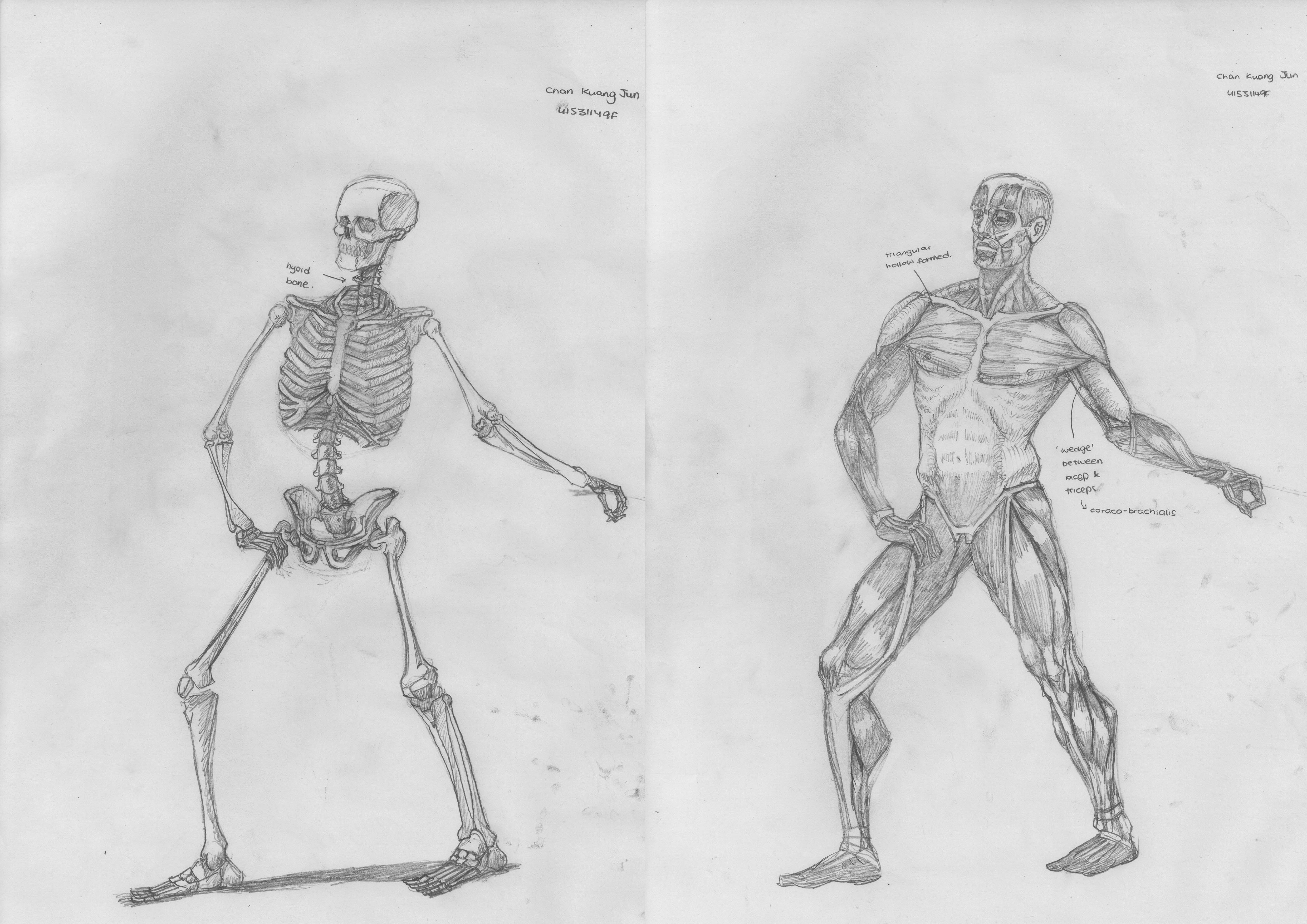
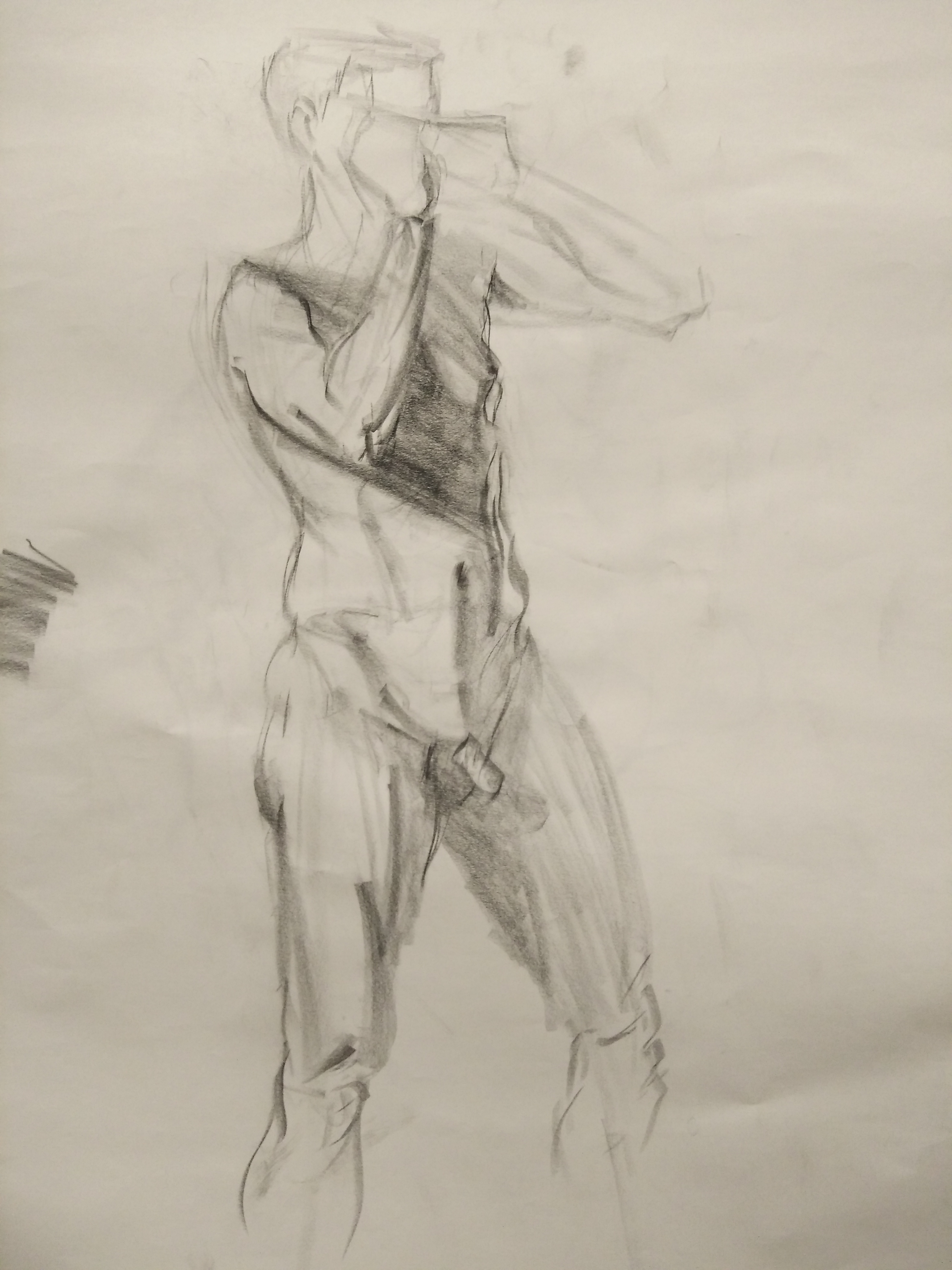
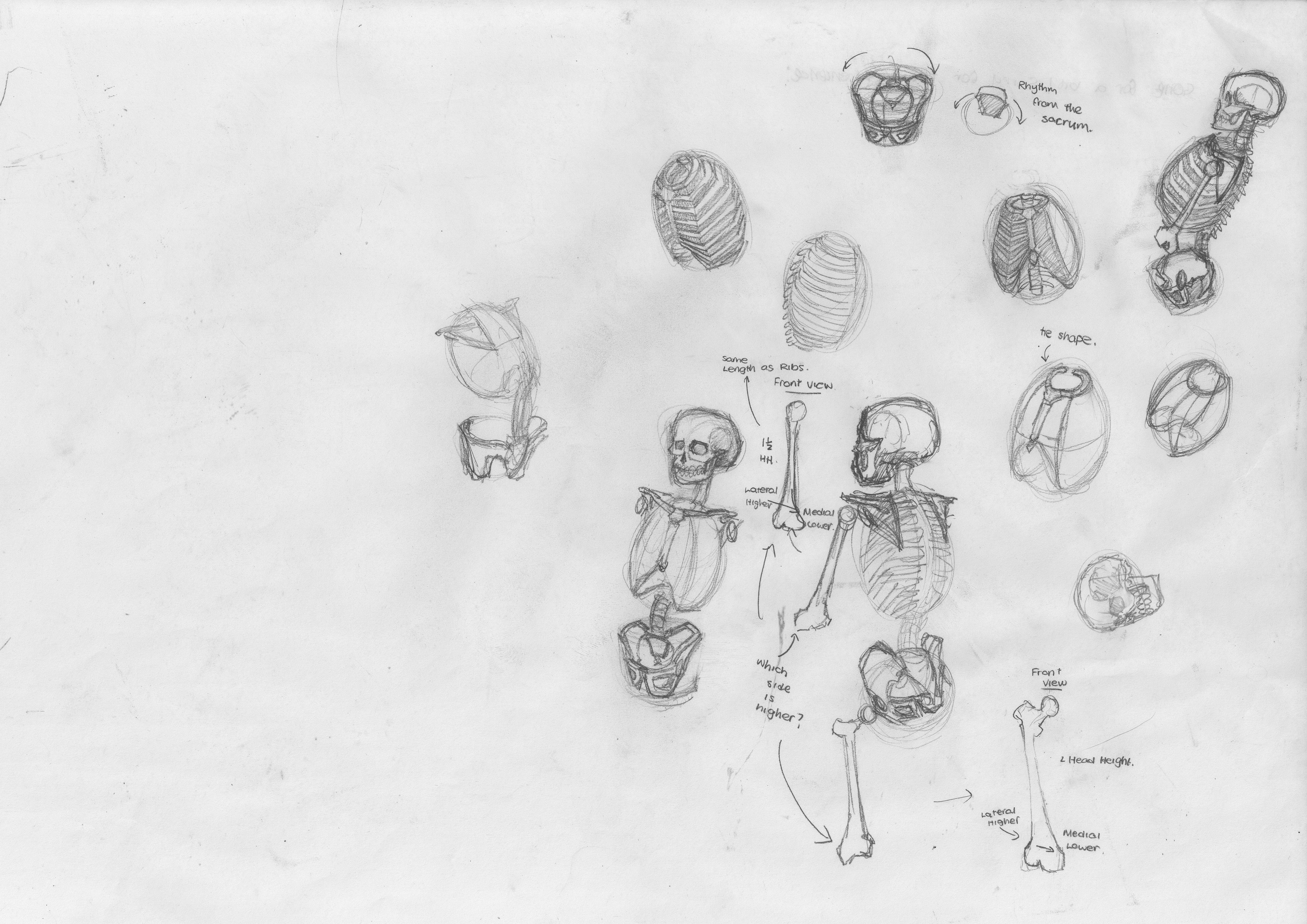
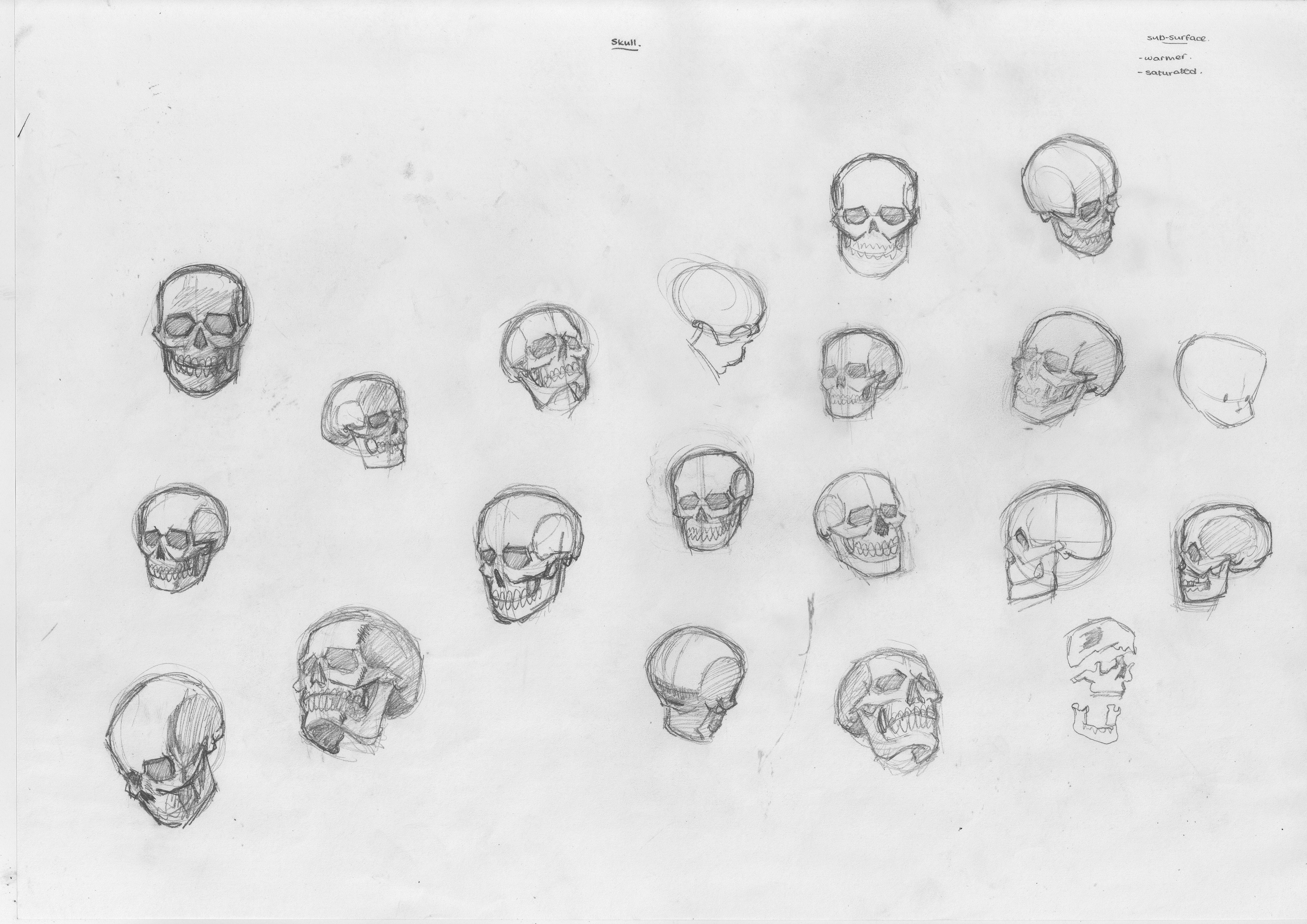
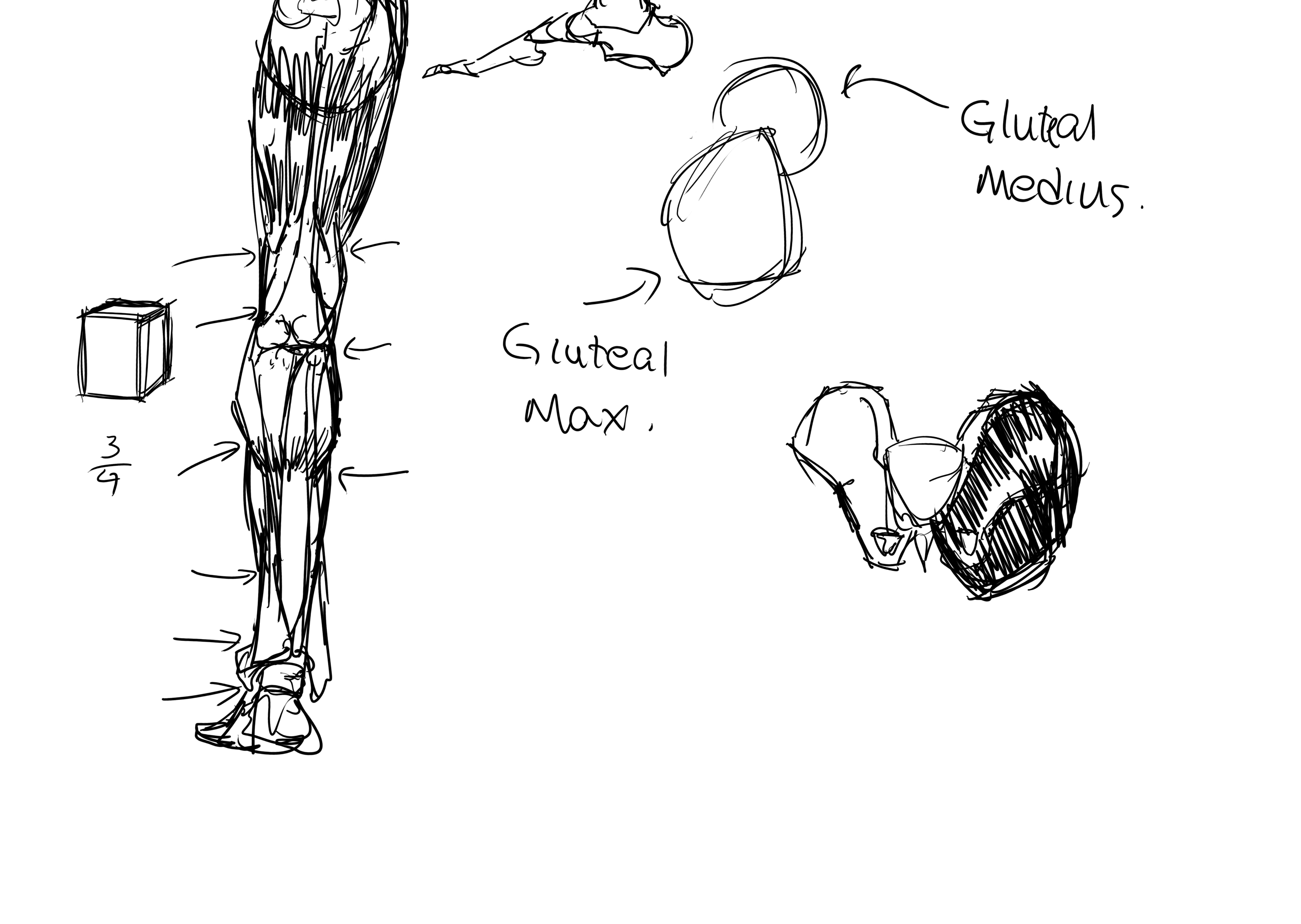
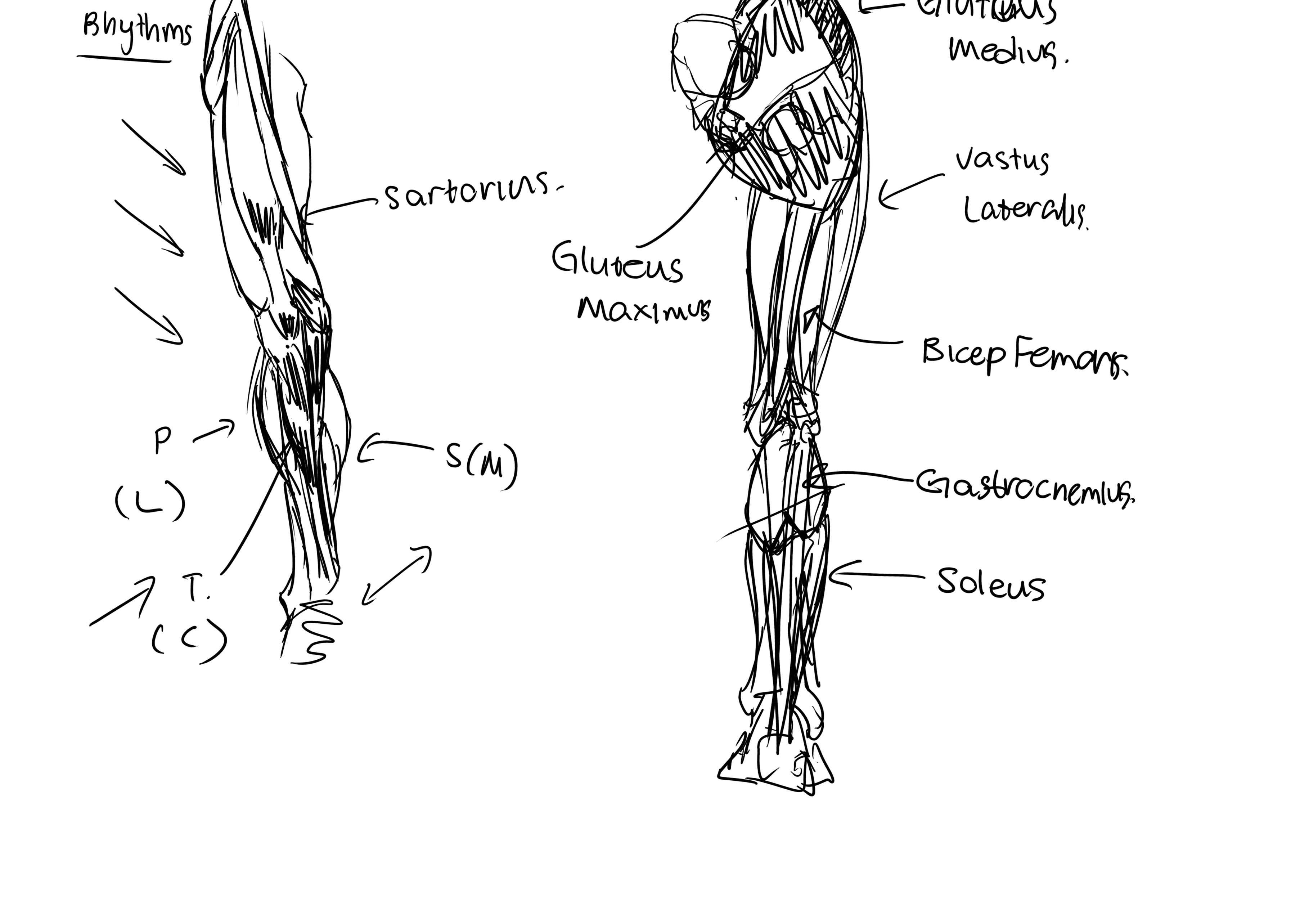
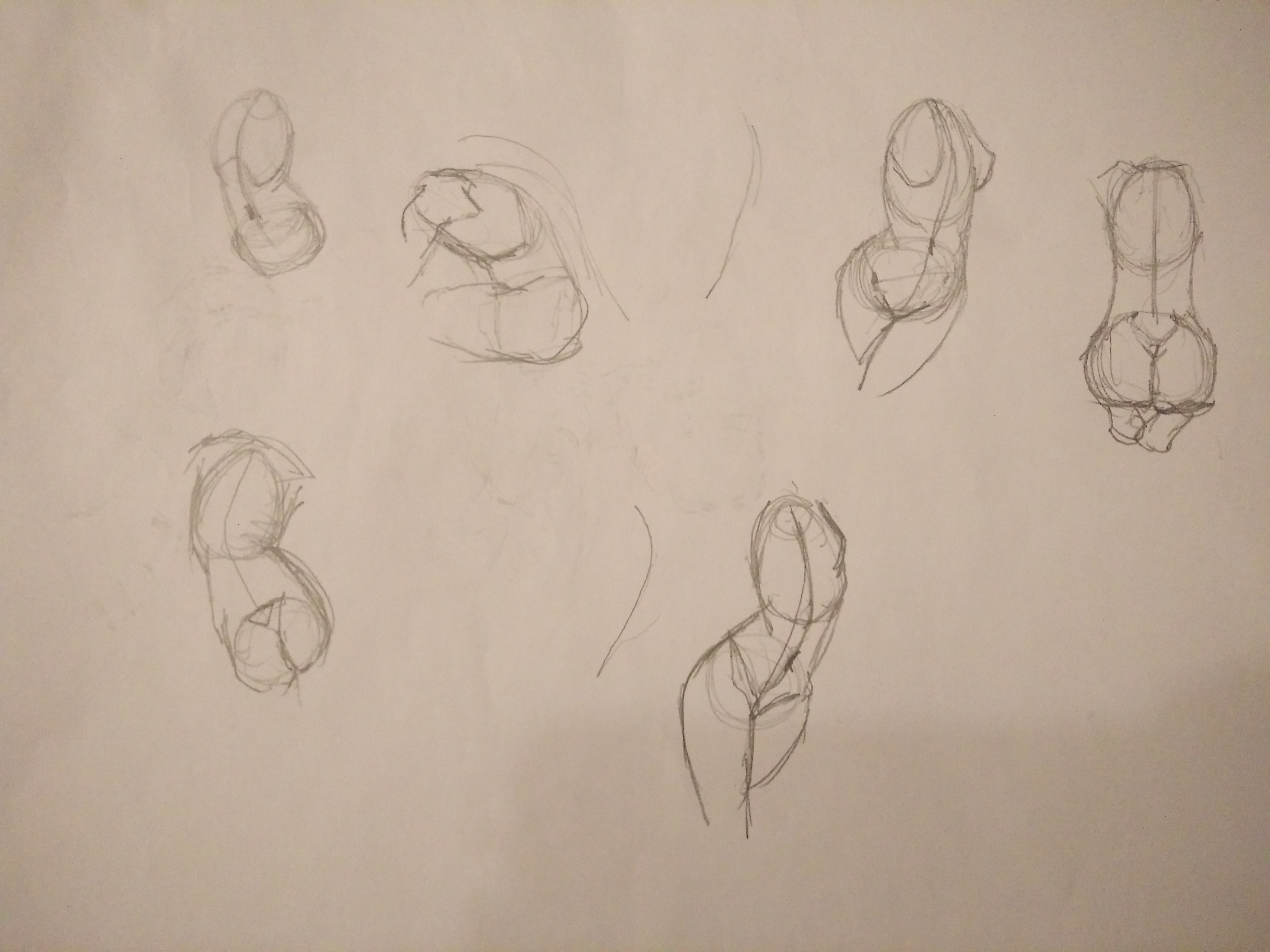
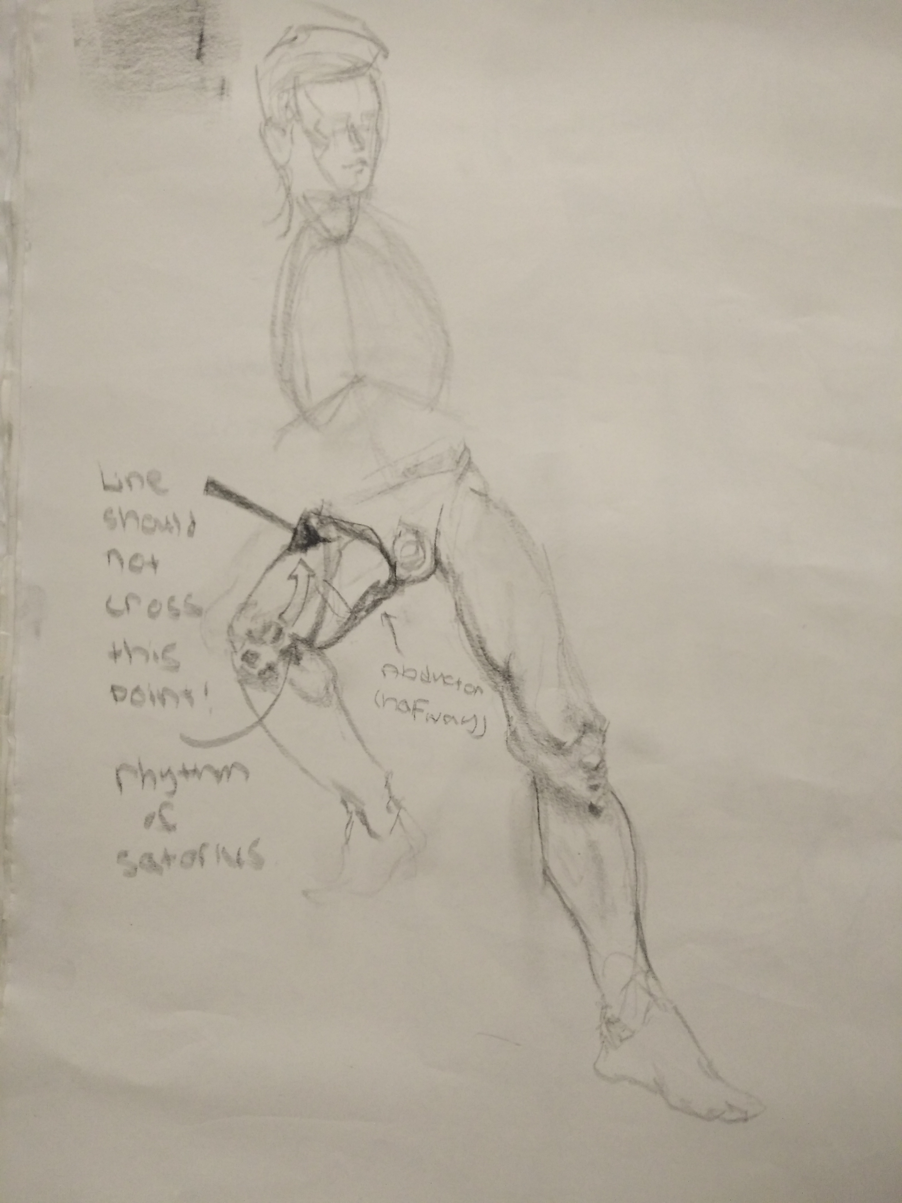
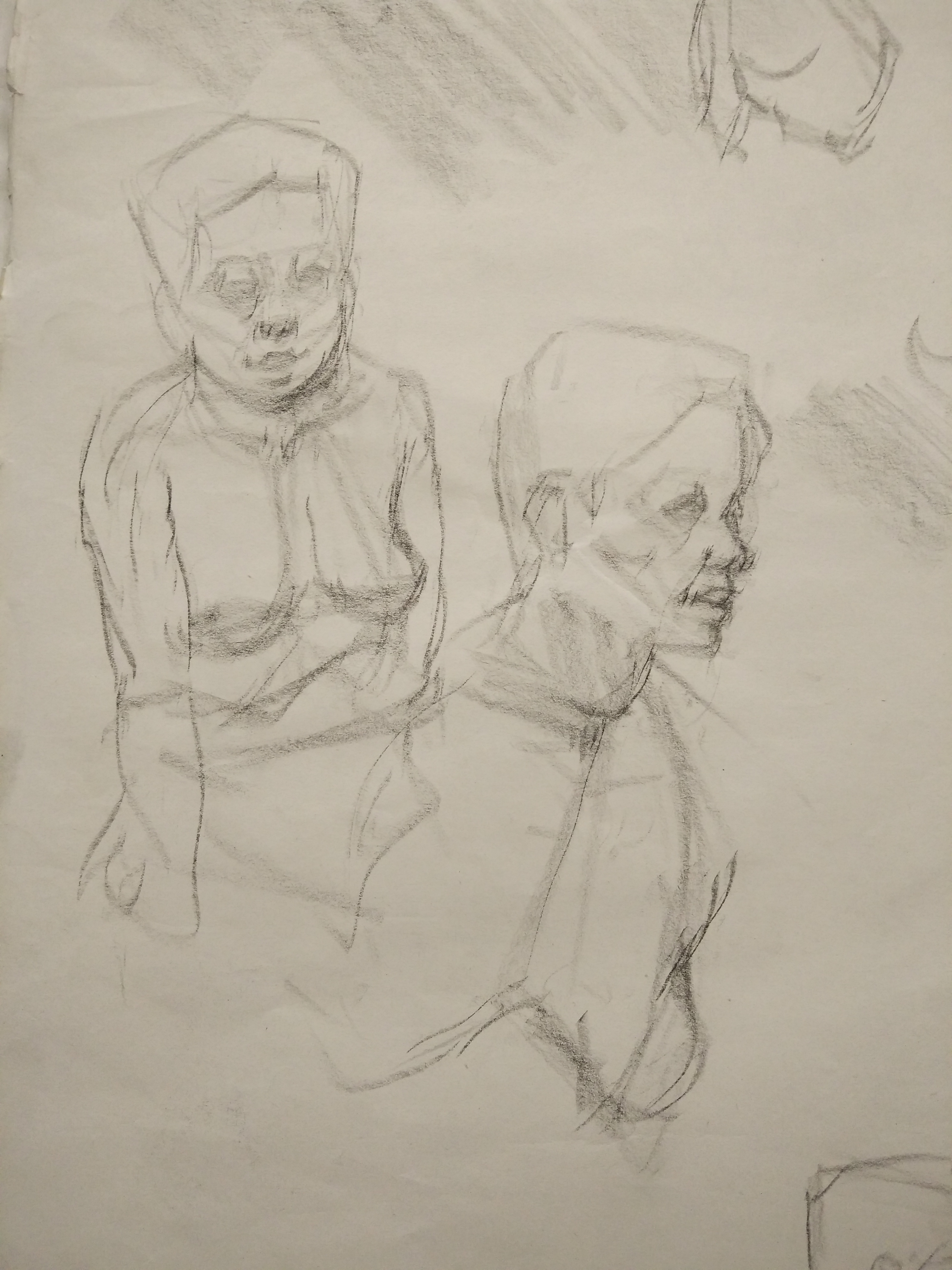
Below are rough gestural sketches. Decided to put this in because of its importance in helping me understand the proportions and gesture of the human anatomy. One of my most important lessons.
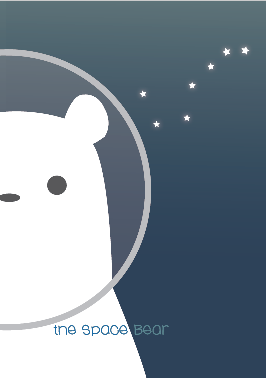
This is SPACE BEAR. The main character of the story. Had this little guy appear in my ego project. Decided to explore more of this character’s story since we were told to describe our ‘Journey’ through this 2D course. Placed him as the largest object in the cover page to place emphasis on this character. Had a silly way of placing the title to make the Zine evoke a more playful feeling.
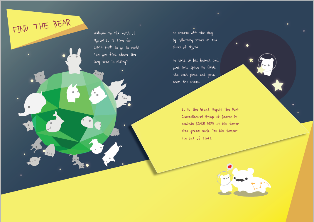
Spread 1:
SPACE BEAR lives in the world of Nyota, where little cosmic animals live. In their country they harvest stars from the skies to ensure that the constellations shines brightly. That day was SPACE BEAR’s turn. He wears his space helmet and goes on to space, placing the stars carefully. His first constellation is his favourite! Can you guess what constellation it is?
It is the great dipper! The bear constellation! It reminds SPACE BEAR of his great uncle.
In order for the story to flow in this spread, i utilized type hierarchy to allow the reader to follow the activities. The funny yellow boxes indicate the different task and the largest font will be the first activity.
Also, for aesthetics, I used a diagonal dividing line to give a sense of energy and playfulness to the overall composition. The contrast of warm and cold colours makes the composition interesting to look at.
Spread 2:
There are times when SPACE BEAR makes mistakes. Then the poor thing has to redo everything all over again. Can you spot the differences?
Finally, after a long day of work, SPACE BEAR likes to climb to the moon to view his work:
Used the same style of text boxes to emphasize the activity moments.
As mentioned during the presentation, I used an ‘object’ to play spot the difference so that the design still looks appealing despite the repetition. Placing it in a vertical position with the central text box also breaks up any sense of repetition, thus keeping the design appealing.
Used the interactive element to bring the attention of the reader to the top right hand corner of the spread, which consists of the moon and an aurora connecting the colour of this spread and the next. This is to ensure a sense of flow towards the final spread.
Spread 3:
And there we have it. A job well done.
Wanted a spread with a composition consisting of a ‘wide shot’. Had ambitious ideas but decided to put horoscope constellations at the end. Named them so that the readers will be able to learn about their names and how they look like. With the bear as the brightest and centralised object in the composition, we naturally bring our eyes to our character. That was where I ended my final line, aligned with the eye level of the eye so that the reader will be able to get to the words comfortably. For the constellations, had them in varying sizes and opacity to give a sense of depth. I also adjusted the font sizes to place further emphasis on the relative sizes of the constellations.
Really liked the peaceful feeling given off by this final spread.
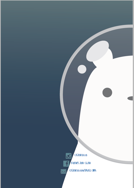
Final Page:
… and we close off to our last page.
The back page has the same treatment as the front page to achieve a spread when the entire book is opened. It also serves to remind us of the character within the book. Treated my social contacts in the same way as the title on the cover page.
And that is it. My final 2D project.
Now for some overall sentimental reflections:
Looking back on my previous projects, have come a long way from barely struggling with my designing tools to be able to producing something more properly rendered.
In fact, the story of the bear was actually supposed to describe my creative process:
Spread one: Collecting the stars is the same as gathering ideas, and placing the ideas down and joining them together is the way I go about doing my work.
I always have the tendency to place emphasis on the ideation before I start my executions, placing all of them together and piecing them towards my desired piece.
I remember the first quote of the course: ‘ a line is a dot that went for a walk’. From there was probably how my inspiration for constellations come about.
Spread two: Like the silly bear, I make many mistakes too. However, the mistakes are the most valuable lessons I can ever have. By working on them and rectifying my mistakes, I eventually get the desired work I want.
Then, at the end of the day, I like to look back at my work, to have a simple reflection on the things I’ve learnt during this process.
Spread three: Whether the work turns out good or bad, I always know I’ve poured my heart into it, thus I am always have an emotional connection with my works. All of them tell a story of my growth as an artist so far.
So grateful for patient mentors and professors that are willing to guide me through an entire design process. Like placing the constellations in the night sky, I hope my art will be able to be seen by a lot of other people. And my art is a testimony of the mentor-ship that I have received.
So many things I’ve learnt, so many more I have to learn. I guess I have to do it one star at a time.
So in my book there are interactive elements to make it more appealing to kids.
I remember when I was young i always loved interactive elements in story books. I liked the surprise element when you open a window to learn something within the pages and also the usual giggles as you make something move. Interactive elements were always fun and magical.
I decided to add it to the zine.
In order to do so, have to do additional prints for the zine on top of the actual layout:
Front
Back
Moving Element:
This is probably the most fun to make and its quite simple.
Just need 3 pieces to create:
A pulling strip
A base for the image
A image
To make the pulling element:
Step 1: Attach the base to the pulling strip
Step 2: Slot the base through the slit created on the actual page
Step 3: Paste the Image. Done!
A rough video of my experiment:
For my actual, i created the strip with the ‘Pull Here’ sign to provide instructions to the reader on how to interact with the piece.
Flip Window:
Created a flip window as shown above, printing along both sides to get my desired effect. Had to ensure that the words were inverted so that the flip panel will be upright once it is opened.
After 7 tries of changing the layouts and consulting every friend available,
Managed to come up with a decent layout for the entire Zine.
Below is the layout:
Changed the font of the words. Much clearer now. Probably will still experiment on a few more. If time permits.
Had a huge conflict over the page being separated into 2. Changed the ‘mini page’ into a geometric shape. By changing the ‘page’ and placing it in the one-third division of the spread, the panel becomes more distinct and coherent with the entire composition. The diagonal division also makes more sense as it separates the last panel from the rest of the composition.
Some existing problems:
-weight of the two circles might be the same, thus might cause some visual tension, will adjust accordingly to see whether it flows better.
-the BG colour of the bottom panel might be too dark for any mark making. Have to adjust the colours accordingly to something lighter.
-the stars for the activity ‘join the stars’ might be too small for the reader to take notice. Might have to adjust the size of both the stars and the bear.
Finally figured out how to display the ‘spot the difference’ with something that is easy to look at. Was worried that repetition of the ‘spot the difference’ elements will spoil the entire design of the zine. However, the vertical repetition of small objects made the entire composition still easy to look at.
Some problems:
-Colour in the rectangular panel might be a little off as compared to the rest of the spread. Have to experiment on the different colours.
-Constant feedback on the empty space in the middle of the spread. Have to find out ways to fill in that gap.
Still working on this. Generally have to aim for a ‘nice finish’. Which is something i’m not able to come up with at the moment.
Added my own social contacts. There is definitely a better way to represent this. But this will do for now.
Still have quite a bit to resolve. But glad that the general idea of this zine is there. Just have to focus a lot on the aesthetics of the work.
Wanted so much more time to figure out this assignment. But oh well, will try my best to work around it as much as possible.
Realized stars and galaxy were always my favourite subjects in my projects.
That’s why I wanted to do something about them this time.
Another thing that is really consistent is the fact that I always have story elements in my projects.
Can’t find a way to put all my old works together.
Decided to work with a ‘illustration book’ as my idea for zine.
Still at the initial phases so below is what I have so far:
wanted a more quiet and minimalistic feeling to the work. ended up with this
the second page will contain constellations. still have not figured out how to make it more magazine like.
thought of having a splash page to break the quiet rhythm to the start. this is just another rough sketch of the look I intend to achieve. (This is mostly inspired by my EGO project of Monk Prince and I. Used another celestial being since we’ve gone through all the Asian art and stuff)
still confused with this panel. but that’s the general story that I want to tell.
As usual, a simple ending.
Some obstacles that I am facing now:
I have NO IDEA how to digital paint a starry sky properly. I kinda used a different technique for the previous project which I want to avoid for this. For my EGO project I also did a night sky but I thought I should push myself to achieve better this time around.
Compositions. Still struggling with compositions until now… guess it takes time to get used to these stuff.
Diversity in colour schemes. Really liked the blue and purple in the double page. Just wonder if there are any other colour combinations that will describe a night sky nicely.
Still have a LONG WAY to go. Kind of started work a little later because it took a while for the ideation. Need advice on the way I can work on this idea. Even if the idea is bad I thought it’ll be really beneficial to be able to digitally paint a night sky. For my future use when I go for my major in animation.
Anyways just wanted to have a more consistent uploading of my progress this time around. Hopefully can gain more inspirations tomorrow during the consultation.
What is a cube? A cube is usually a building block. With its even and flat sides, we can stack them on top of one another to create massive works of varying shapes and sizes.
Cubes are typically found in games. In fact, while growing up, cubes have always played a crucial role in things that I perceive as ‘fun’ and ‘playful’.
Nowadays, there is even a game where everything is made up of cubes. Its called ‘Minecraft’ and its the game which is popular among children nowadays.
A cube, in the eyes of minecraft, is therefore the world.
In fact, when I was a small boy, I used to have games which have lots of cubes too. One of the classics is the Super Mario Brothers video game. In the game, Mario breaks up cubes in order to get power ups and items.
A cube, in the eyes of Mario, is therefore a Surprise.
Growing up, we begin to expose ourselves to more high resolution video games. Not only do the graphics advance, but narratives and plots thickens too. In the game Portal and Portal 2, your character (Chell) experiences a simple friendship with a sentient cube. Eventually, *spoiler alert* you have to let go of this friend in order to advance. Heavier themes such as friendships starts appearing in games as we get older. Bringing an additional emotional dimension to the work.
Thus, a cube in the eyes of Chell (Portal), is a close friend.
Of course, games can come with risks too. In fact, some are bad and are discouraged. One main example is gambling. It can be quite thrilling to play a game of chance and we love the occasional adrenaline rush, however it is important that we only do it when we have more than enough, but not as a way to ‘earn money’. That’s why the choice of a refined and well to do gentleman. Gamble at leisure, not at the expense of your wealth and relationships.
A cube, in the eyes of a Gambler, is a Chance.
Even at the intellectual and scientific realm, cubes play a part in bringing the fun too. Rubric’s cubes and tetris are formal examples of games that are mostly intellectually stimulating. Every hardworking scientist or mathematician will definitely need their well deserved break every now and then.
A cube, in the eyes of a Scientist, is therefore a Challenge.
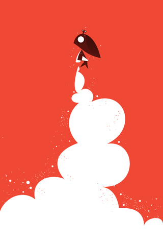
So, despite being in this world for 23 years, I still find a inclination towards fun and games. Games are part of what helped to shape my character. And cubes are what helped to shape the games. So, to the little child within all of us, a cube is a little rocket that helps us travel from one video game world to another. A never ending exploration.
Therefore, a cube, in the eyes of a gamer, is an universe.
Yeap. Thanks for your patience. And have lots of fun.
Final presentation for the project:
That’s it. For more stuff on design and references refer to the previous process posts. Thank you. 🙂