Untitled ③

☑  ¯\_(ツ)_/¯

Project Brief

Document time in any form of your choice and showcase a manipulation of time.


My Theme
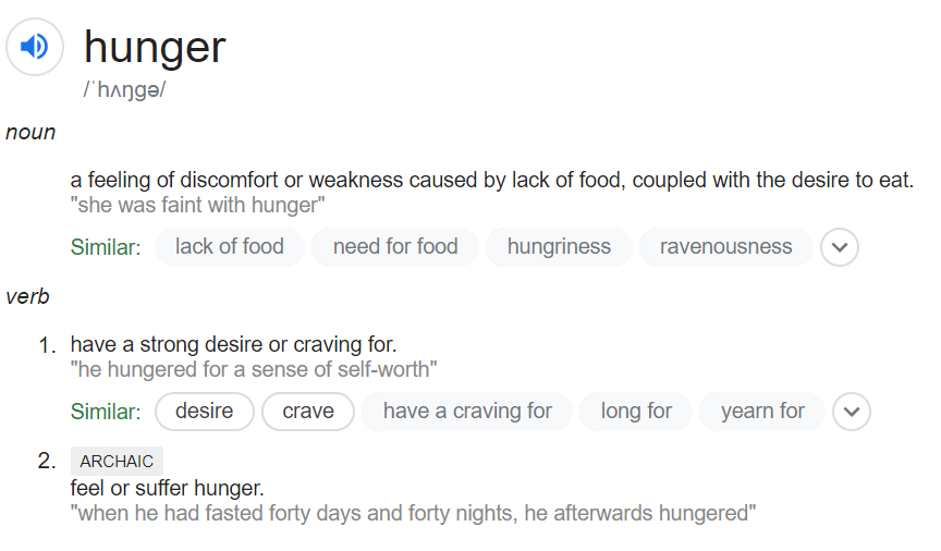
image.png


IDEATION

My thinking process


I decided to make a video collage with cooking and eating scenes as it has a chronological order.


The word “hunger” reminds me of a Korean movie, Burning (2018), which brings the concept of  “little hunger” and “great hunger”:

Little Hunger is when someone is physically hungry. And Great Hunger is when a person yearns for the bigger answers, like the meaning of life.

From <https://morganawyong.com/2018/06/29/burning-movie-review/>

And I wanted to incorporate this idea into the video as well, so that it will not only be cooking and eating food but also something else.

It can be anything, as long as it suits someone’s desire and makes one “hungry” for it.

With that, I decided to use some clips which have similar motion as the normal cooking process and combine them together.

—————————————-☑—————————————–

PROCESS

Methods to manipulate time

Image result for doctor strange gif

As I am new to Premiere, I would like to try out all the methods and learn it along the way.


Possible resources


As I can imagine that I will need A LOT of different resources, I had list down some of the different choices which I can get the clips and sounds I want, and try to have a variety of clips and sounds(and hope I can sleep early).

—————————————-☑—————————————–

SEMIOTICS

Preparing food: working hard for the outcome.

Eating food: Hungry, urgent to get something

As I used many clips in this video, and from each, meanings can be derived. For example, sharpening pencil & flipping book symbolised willing towards learning and writing, ballet dancer symbolised the desire to dance and performing etc. Hence, I decided not to display a fixed meaning of each clip but instead leave it for the viewers.

—————————————-☑—————————————–

Reflection

I felt I’ve spend tooooo much time on this project, especially when I was searching for a suitable clip among all the resources.

 But I would say that it’s worthy as I enjoy the process of editing clips and sound, and learning how to make transitions (although I didn’t get to use most of them)!! 

And I learnt that sometimes when I have too many ideas I need to make a choice to sacrifice some (although there are many elements still).


It feels good to create something which I like to watch and I wish you do too. > <


Video and audio used (including but not limited to):

A Bite of China/ Spirited Away/ Ratatouille/ Tom and Jerry/ Your Name/ Howl’s Moving Castle/ Fantastic Mr Fox/ Adventures in Fiesta TV Advert etc.

ENCORE – Zagor


Untitled ②

【Project brief】

To design a 30 seconds cacophony of sounds/soundscape against a single image or text or even both of your choice.


“With the advancement of online shopping, people’s lives are becoming much easier as they are able to get whatever they want from various choices online. This had definitely increased the level of convenience to a large extent. However, this also reduced the chances for them to contact with the real world. Especially when they can fulfill all of their requirements through online shopping.”

——Intro of one of my secondary school essay

【Bgd story….】

For the past few years when I opened my own online bank account, I started shopping online for everything, as long as I can wait for it to come. Furthermore, nowadays we can even receive it on the same day of purchasing if the seller is in the same city, which we can select before buying. The more time I spent on it, the more I felt addicted to it. 

The idea for this project came about when I received my air express package from Taobao. When I collected them back to my hall and placed them in front of me, I suddenly realized that I’ve bought too much, in fact, I’ve always been buying too much. 


【Process】

【Choice of IMAGE】

So I decided to take a photo of the recent packages I received (there are more on the way). And add some drawing of hands to emphasize the idea of something is hiding there. Something, what thing? Well, it can be the uncontrolled desire to buy more and more online, or those who want to escape from reality to the virtual world, or the attraction for people to be addicted, or just something unknown. And I use hands to symbolize that as we do most of our actions using hands.

The hands are coming out from all the gaps and corners between the package, stretching and fondling, which shows that they are attached with the packages. Most of them are only showing their fingers as they are still hiding, from which I believed is the reality, where is full of communication and trouble. Also, I purposely drew them with thick outlines to further emphasize that although they are a feature of human beings, they are still not real.

[colour]

The colour of the photo is majority black and grey, with some reddish tone inside. Which is just the original colour of the packages, I decided to keep them but darken the tone as I think that red can show the feeling of enthusiasm towards online shopping, as well as warn that it may be dangerous.

Moreover, I made the background entirely black to show the cycle of buying and unpacking is endless.

[oritation]

The packages are placed orderly to form the shape of a wall, which allows things to hide inside and defends the outside world.


【Choice of SOUNDS】

So what can hands do with the packages, open them right?

I recorded the sounds of me opening the packages, which includes cutting tapes, paper boxes, and popping bubble wraps. Also, add in the sound of typing keyboard based on Bryan’s suggestion

❶ The sounds started from pushing out a penknife followed by cutting the paper box slowly, which shows that the unpacking is going to start, the speed of it is being slowed down to create a sense of threatening.

❷ Afterwards, there was a mix of cutting and popping and typing at the same time, it also gets more intense over time to show the excitement of opening the package.

❸ There was the sound of typing on the keyboard, which continues almost throughout the entire 30s, which is to show that all these started from online surfing using computer. Towards the end, there was silence for about two seconds, and followed by the sounds of typing again to show that the cycle is continuing.

❹ Among all the sounds, the sound of cutting paper box was the loudest and, kind of repeating, which I want to show the feeling of mechanical, and how our lives are driven by technology. Also, I added a little bit of echo effect into it to show that when addicting with online shopping, our lives are becoming empty.

there is also the sound of popping bubble wraps, which is relatively soft compared to the others. This is to create a sense of touching and fondling on the plastics to show the reliance and indulgent towards online shopping.


【Conclusion】

At first, I wanted to create something that is creepy, but while I was doing I decided to make it threatening as something is hiding there and watching you, and it can be yourself. People will keep finding easier ways to solve their problems and the threat will always be there…

And it’s time for me to buy something more to reward myself for finishing this interesting project…✧⁺⸜(●˙▾˙●)⸝⁺✧

Untitled ①

Click here for the full image

When I first get this topic of using an inanimate object to show “life”, I immediately thought about the pen I use daily as my subject. And I wanted it to show symbolize myself, as a student especially an arts stream student who always write A LOT. When chosen this object, the feeling I wanted to emphasis also came to my mind, which is stress and lost which I went through last year when preparing for A Levels.

With the object and concept chose, I started to think about how to make it more interesting and attractive. As the pen contains both the cover and the refill, why don’t I separate them in order to form a new shape, for example…a cross?

This was the photo which I decided to work on initially, maybe just ways to strengthen the feeling involved. With this in mind, I went for a consultation as well as conducted some researches.


HOWEVER, the more I researched, the more I felt..unhappy(?) with the image. It may because that I still do not have a suitable method to express the current feeling (stress and lost), I believe that a good still image is able to make the viewer feel related with it as well as the feelings it contained. Yet, I couldn’t even persuade myself at this stage.

It was hard to change the idea so last minute, and it was definitely a struggle. Although I couldn’t really express stress and lost in my current image, I feel very stressful and lost now.

—————————·-·—————————

So I started to think from the object, the pen, and I realized that actually it is not the stationary that I used the most. Especially after the exam period. Instead, I would rather use a pencil to write down notes and practice sketching.

Holding the pencil, I suddenly think about the times when I was drawing without a fixed topic and I just let my mind flow and set my mind free, and some inspirations and ideas will just come to me…

OK I think I get my new topic.

Sometimes it is hard for me to get inspiration, but when it comes, ideas will not stop flowing so easily.

—————————·v·—————————

I was thinking about making a combination of real-world and imagination things, so I decided to make a combination of photo and digital painting.

Semiotics 

At first, I was holding my pencil vertically so that making it perpendicular with the sketchbook, but I felt it doesn’t look natural enough, so I held it with an angle to make it looks like in the process of writing/drawing.

[holding pencil in two diff. ways]

Afterwards, I started to draw short curved lines using different colours to represent inspirations and ideas. I drew it in to make it like water waves as I wanted to represent that ideation just flowing like a tsunami.

[shape of the curves]

The colourful curves are mainly going upwards to represent the flowing viable ideation. Furthermore, the coloured parts are smudged to signify the ideas can keep changing or merged to form a new one.

[details of the smudged curves]


While the pencil remained its original black and white colour, I enhanced the grey tone of it to further contrast with the surrounding lighter tone.

[zoom in to show the grey tone pencil]


There is a little bit of grey colour on the top of the ‘inspirations’, showing that it is not that easy at the beginning of the design process. Afterwards, it started to have more colours showing that some inspirations were caught.                                                             [grey colour on top]


The most interesting part of this image is its irregular border, which I purposely create a feeling of flowing ideation which cannot be restricted or limited.

[irregular shapes at the bottom]


Hence, this image intended to emphasise the difficulty of starting the design process as well as the fluency of a wide range of ideation while having the inspiration. Also, I wanted to express that I wish I could have such a plentiful of ideation.

Thanks for reading!