Topics Selected
Out of the 4 topics, I’ve chosen to work on Interior Space and Weather Condition.
If time permits, I definitely want to try out the other topics too! (Or at least study them)
As of now, I only have in mind what I might want to do for Interior Space.
Process: Research, Studies and Drafting
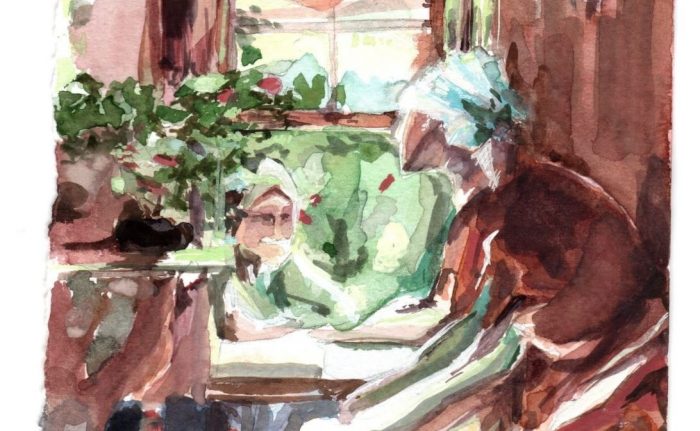
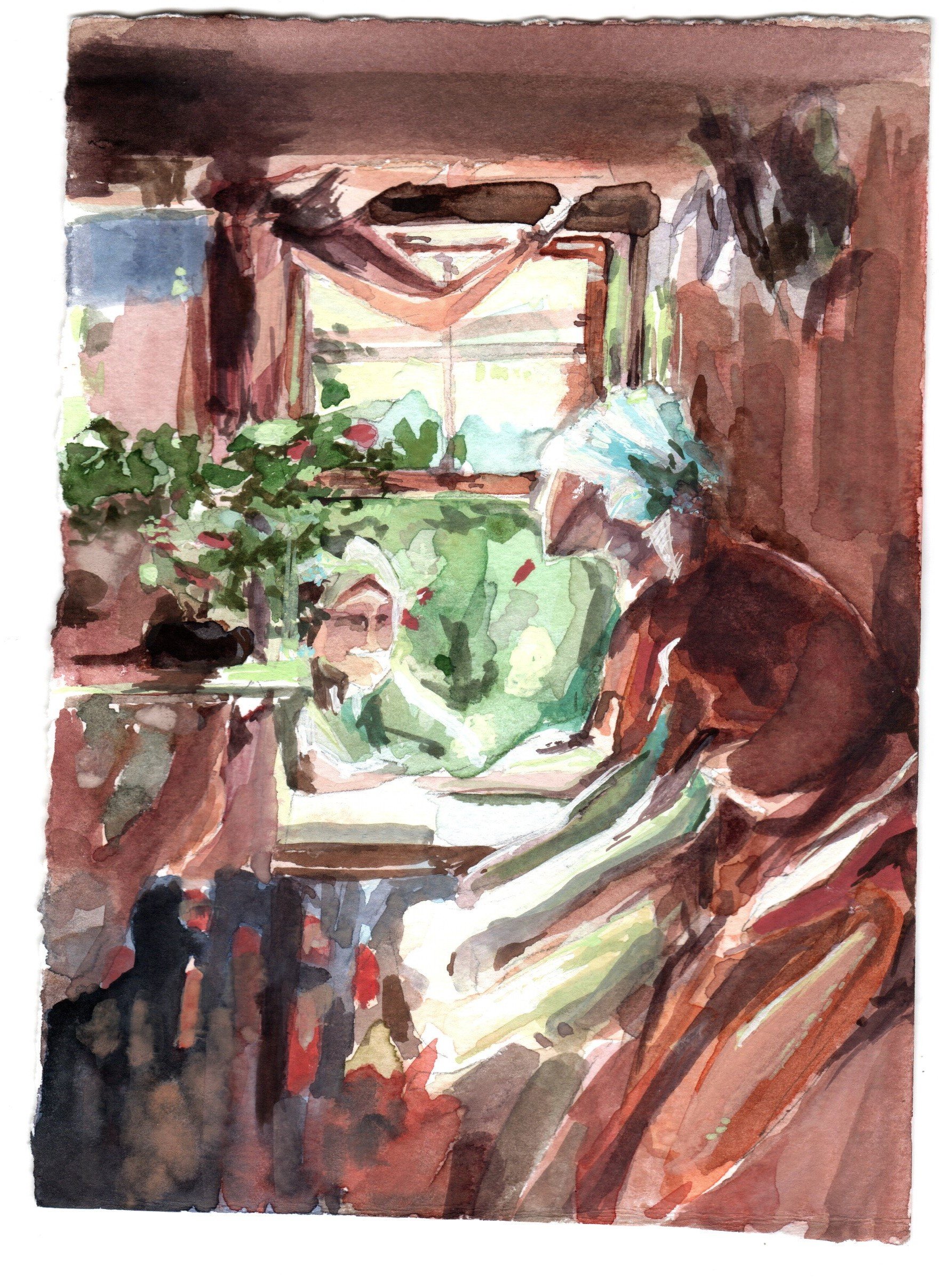
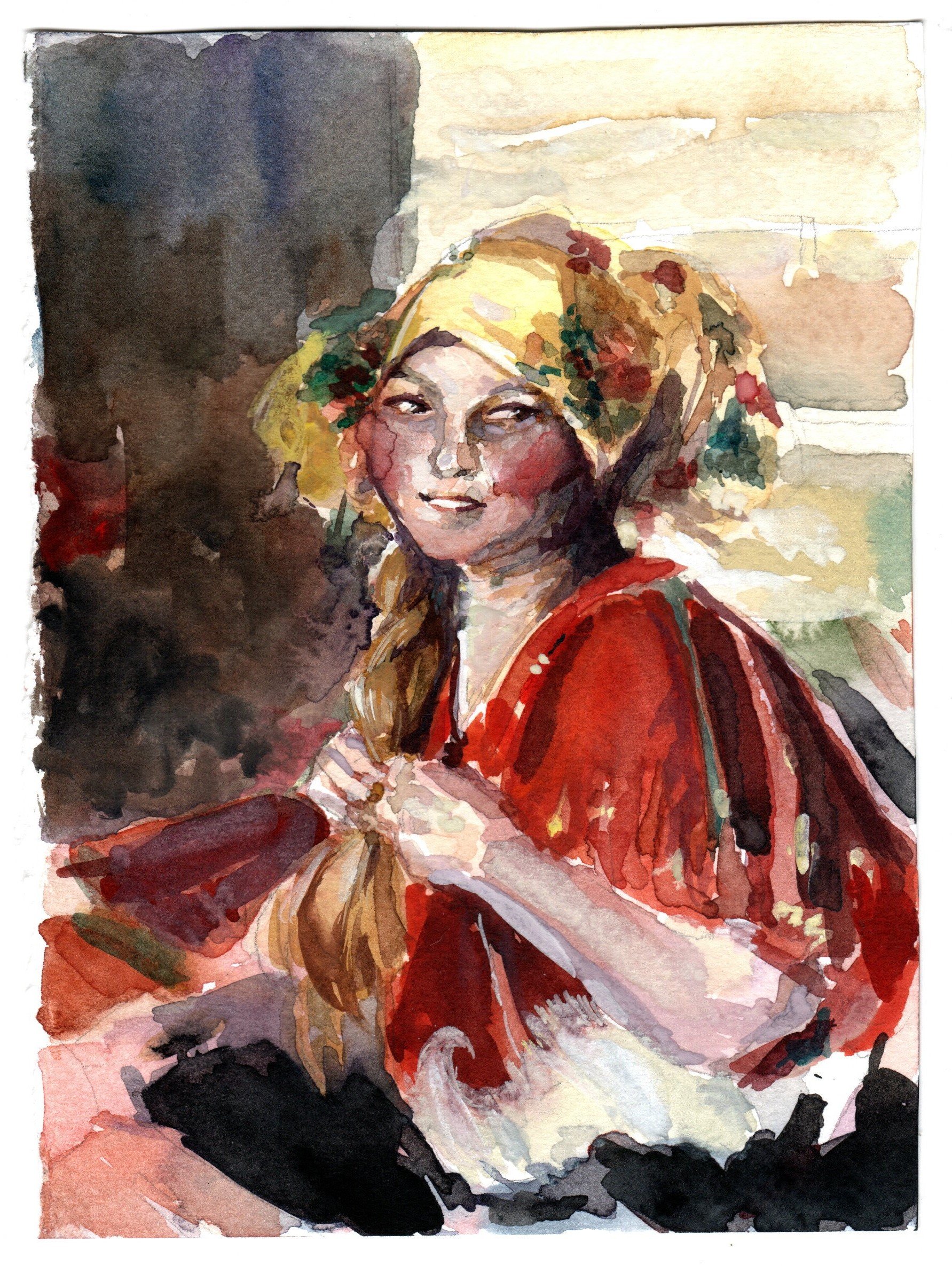
On week 10, prof. Woon Lam mentioned a Russian painter called Abram Arkhipov and I went to check him out. I love the color control in some of his works – the recurring use of reds in his works and how the colors transit from red to greens/blues.
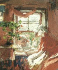
Abram Arkhipov Excerpt
My Abram Arkhipov Study #1
My Abram Arkhipov Study #2
I want to try studying and implementing his color schemes on an interior! Maybe find a way to play with it too. 🙂
Thumbnails
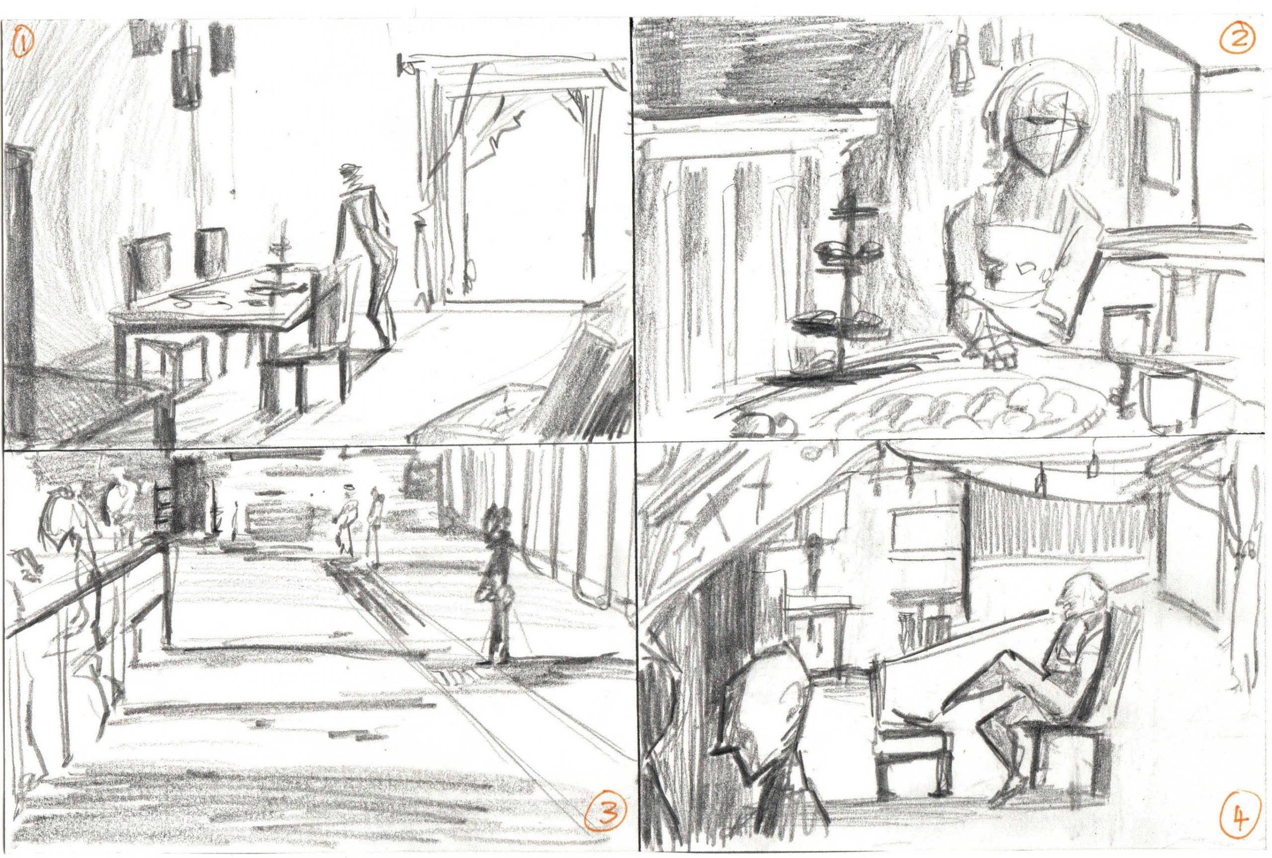
I did 4 quick thumbnails so far that are a combination of photos/live doodles.
No. 1 is a living room space with a glass door/window shining in.
No. 2 is a dining moment with lots of food on the table.
No. 3 is a quick thumbnail based on Jurong East bus station waiting lines.
No. 4 is a combination of windows, chairs and people to make a party-like interior situation. Abit messy here.
Looking to do more thumbnails and try the cutout filter method too. So far I’m more keen on No. 3 because I want to look into painting shadows, or No. 4 because I want to paint more food.
Links to previous work
Week 2 to 10 works (In-class practices and self-studies): https://oss.adm.ntu.edu.sg/laum0005/watermedia-landscape-painting-week-2-10-exercises/
Week 5 tonal practice: https://oss.adm.ntu.edu.sg/laum0005/watermedia-landscape-painting-week-5-tonal-exercises/
Look at Arkhipov’s use of different edges. You can use some gouache white to work a bit like oil painting to get all kinds of edges. I just did a watercolor demo on Youtube. You can see how I use different drybrush and semi-opaque glazing to get different edges. https://youtu.be/j1h7gJurEYc
To keep the freshness of highly chromatic colors (here, the cadmium red color in Arkhipov’s painting — the lady in red), paint it and don’t touch it. If you want the transitional edges, mix some intermediate colors and work around the edges. Once a different pigment goes to the chromatic color, the chroma will be reduced — Science of light scattering with different particle size.
When you layout your subject matters, also think about the shape change. Don’t get locked by the complete forms that describe the objects.
Good effort! Thanks for sharing!