


There are 4 posts filed in Final Project (this is page 1 of 1).

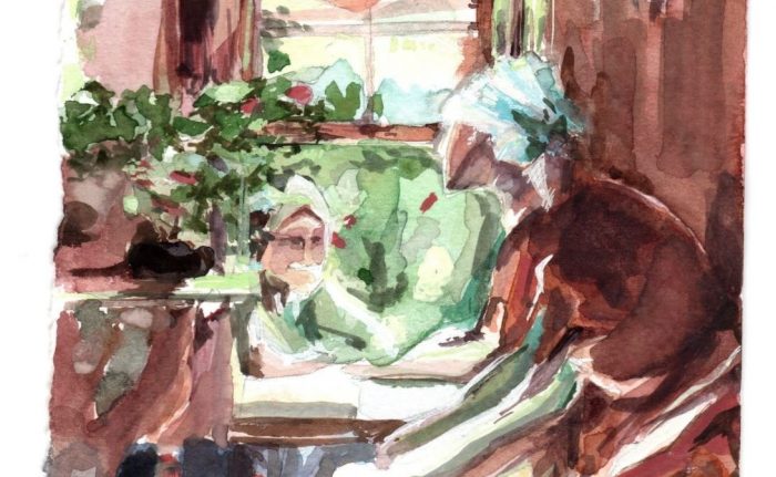
Week 13 update! Painted the topic interior.

Final artwork #2 – embroidery
20cm x 28.2cm
Looked mostly into a combination of Arkhipov and Inness for this topic.

Color test (with a different composition)
(got too excited to try out the colors with the final after doing this color test and the Inness study so I headed right for final after this piece…)


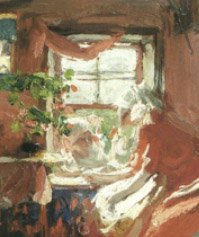
Inness Study
(studying how the transitions are handled on the trunk and retaining chroma but woops with the many green HAHAHA)

Random balance practice (looking into transitional colors – purple/brown)
Reviewed the video on transitional colors and did a super quick practice on my own based on class time’s abstraction practice and view from window

Thumbnails for final / color tests
For the layout of the piece, I liked Arkhipov’s subjects (embroidery/women) and wanted to do something a little similar, so I combined some Arkhipov/embroidery/yangqin poses and embroidery to try to catch the same intimacy in the image.

Images: Arkhipov, Inness, Yangqin player, Chinese clothes, Cheesecake Factory photo from a trip to US, Embroidy close-up

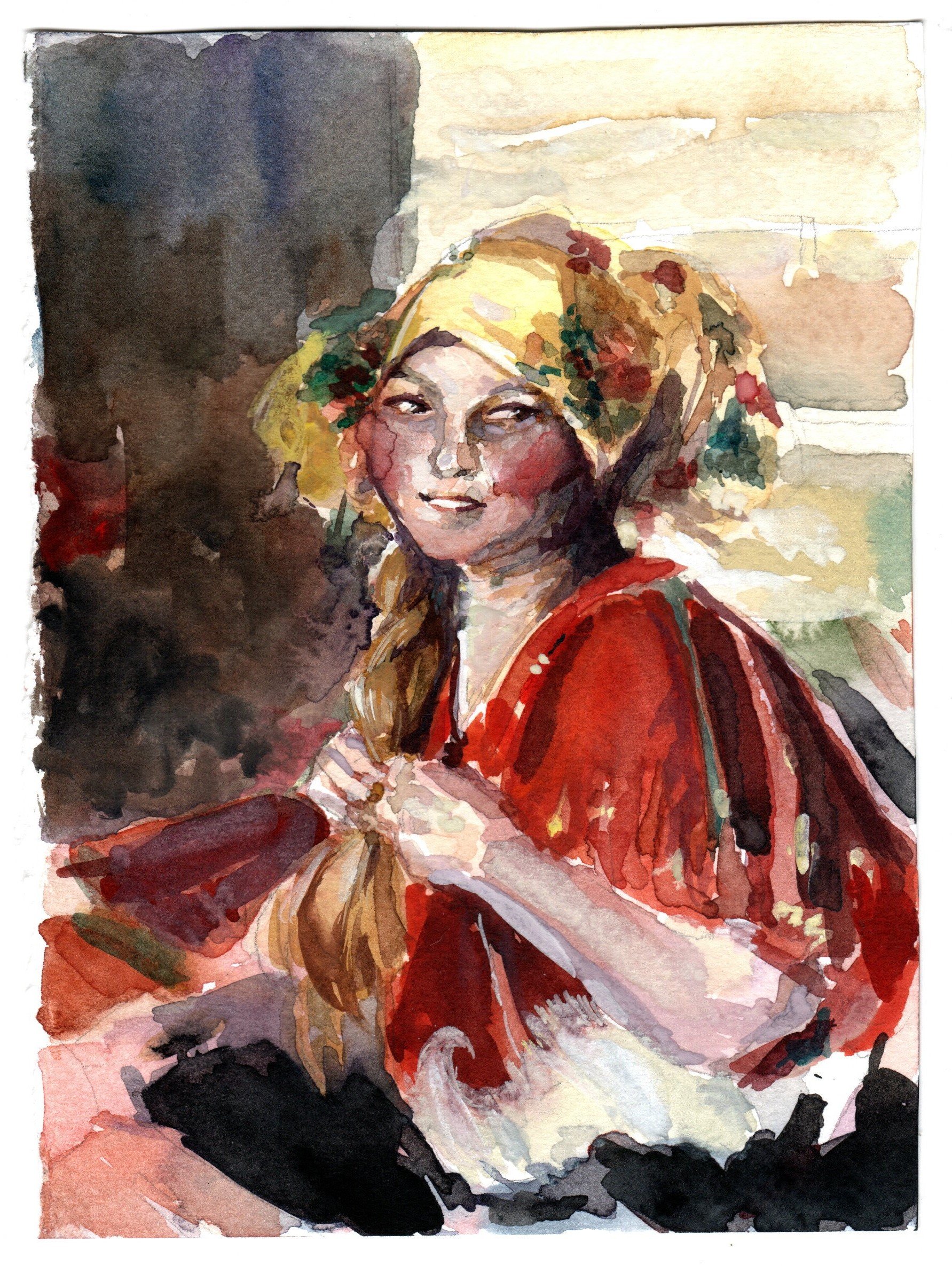
Archipov Study #1

Arkhipov Study #2
Not very happy with how little chroma is retained in the final and also I think I still isolated subjects again… I know some of the persisting problems I have and still accidentally committed them during painting RIP. :’) Need to turn on my brain more during practice and less rushing. I’m so glad I borrowed Inness’ book to study from the school library before circuit breaker.
If time permits, I’ll try to get another piece done for the final (Weather Condition/Tinted) or revisit Landscape/Interior.
(If not, I’ll practice on my own anyway HAHAHA)

A week 12 update!
Between last week and this week, I suddenly decided to attempt another topic (Landscape) instead because I suddenly got intimidated at the thought of needing to paint a final image. This hopefully helped me to chill abit and warm up for more paintings while painting barns and a field. 🙂

Final artwork #1 – barn by the mountains
28.5cm x 19.5cm

Color tests
I think the thumbnail in my opinion seemed to work a little better than the final due to the smaller range from more tinting and less shaded colors? I lost the field a little between the thumbnail and final for this landscape piece.


Photos of the paintings
I looked into Shishkin and Inness’s fields for reference on colors and foreground and Inness and Monet to paint the field (painting distance as a relative whole; changing colors), but in hindsight should have also looked into being better at managing the mountains and skies – I tried using more purples as a transition and tinting more to hold the image together but the mountains and skies still look abit odd. I got abit too greedy but it was fun… Perhaps I should have done more color tests (and also time to look into more sky and mountain practice)… :O
Also, here are the initial thumbnail sketches for landscapes


Pencil thumbnails for landscape painting
Will probably try another topic first before considering making more attempts. 🙂

Images: Barn photos, Inness, Monet, Shishkin
Out of the 4 topics, I’ve chosen to work on Interior Space and Weather Condition.
If time permits, I definitely want to try out the other topics too! (Or at least study them)
As of now, I only have in mind what I might want to do for Interior Space.
On week 10, prof. Woon Lam mentioned a Russian painter called Abram Arkhipov and I went to check him out. I love the color control in some of his works – the recurring use of reds in his works and how the colors transit from red to greens/blues.
Abram Arkhipov Excerpt
My Abram Arkhipov Study #1
My Abram Arkhipov Study #2
I want to try studying and implementing his color schemes on an interior! Maybe find a way to play with it too. 🙂
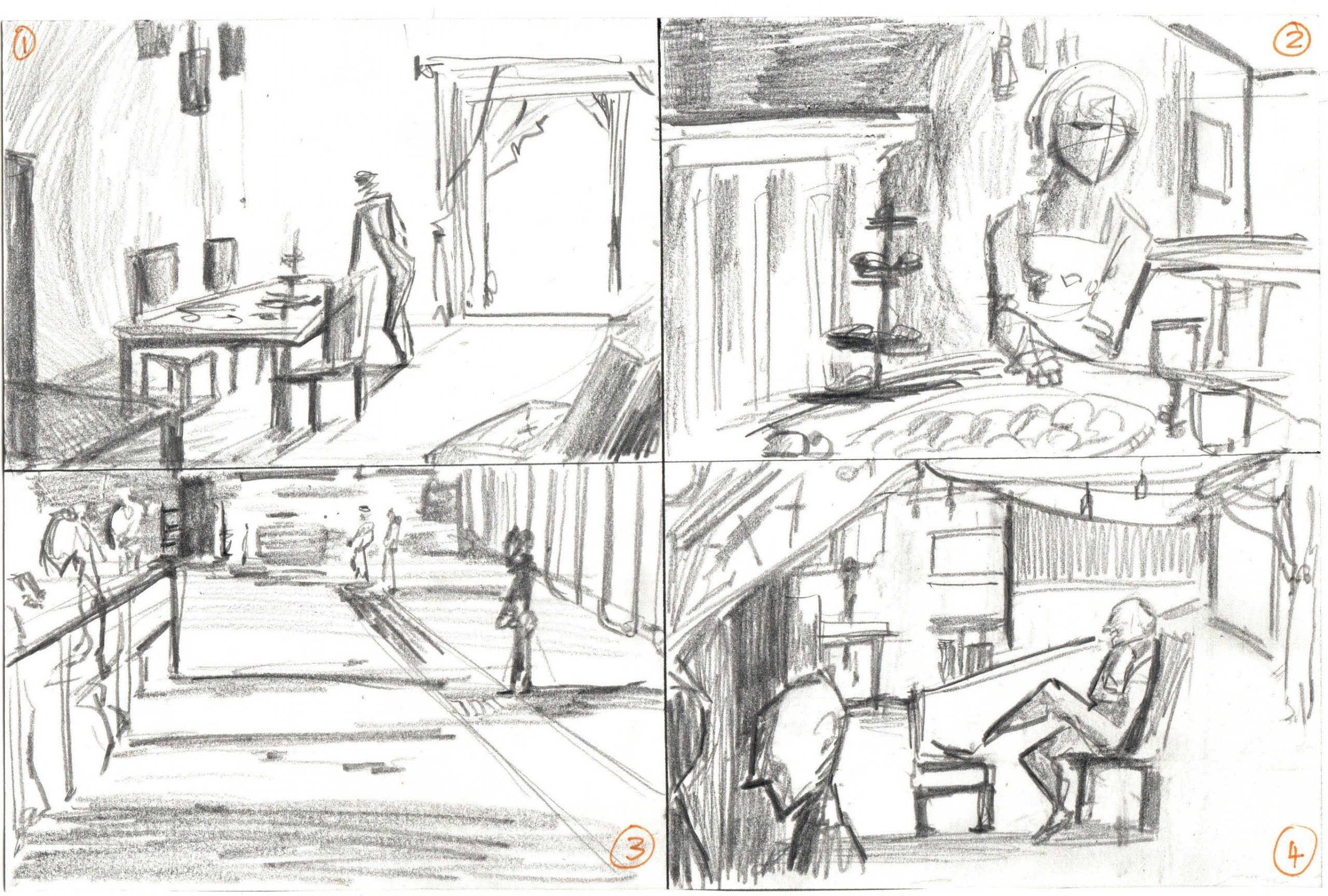
I did 4 quick thumbnails so far that are a combination of photos/live doodles.
No. 1 is a living room space with a glass door/window shining in.
No. 2 is a dining moment with lots of food on the table.
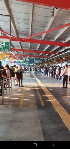
No. 3 is a quick thumbnail based on Jurong East bus station waiting lines.
No. 4 is a combination of windows, chairs and people to make a party-like interior situation. Abit messy here.
Looking to do more thumbnails and try the cutout filter method too. So far I’m more keen on No. 3 because I want to look into painting shadows, or No. 4 because I want to paint more food.
Week 2 to 10 works (In-class practices and self-studies): https://oss.adm.ntu.edu.sg/laum0005/watermedia-landscape-painting-week-2-10-exercises/
Week 5 tonal practice: https://oss.adm.ntu.edu.sg/laum0005/watermedia-landscape-painting-week-5-tonal-exercises/