— FINAL —
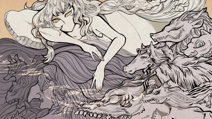
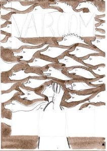
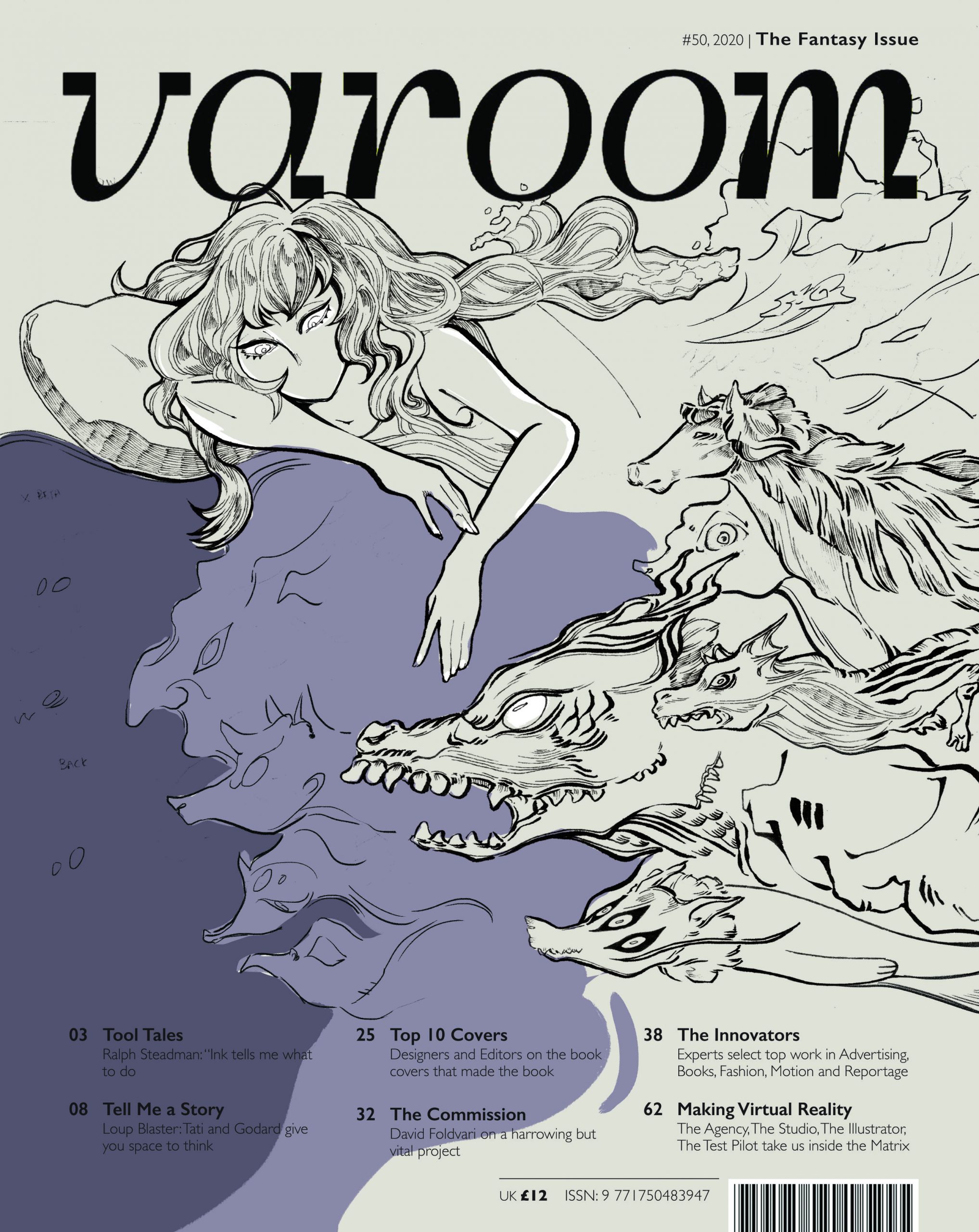
(1) ILLUSTRATION ON VAROOM COVER
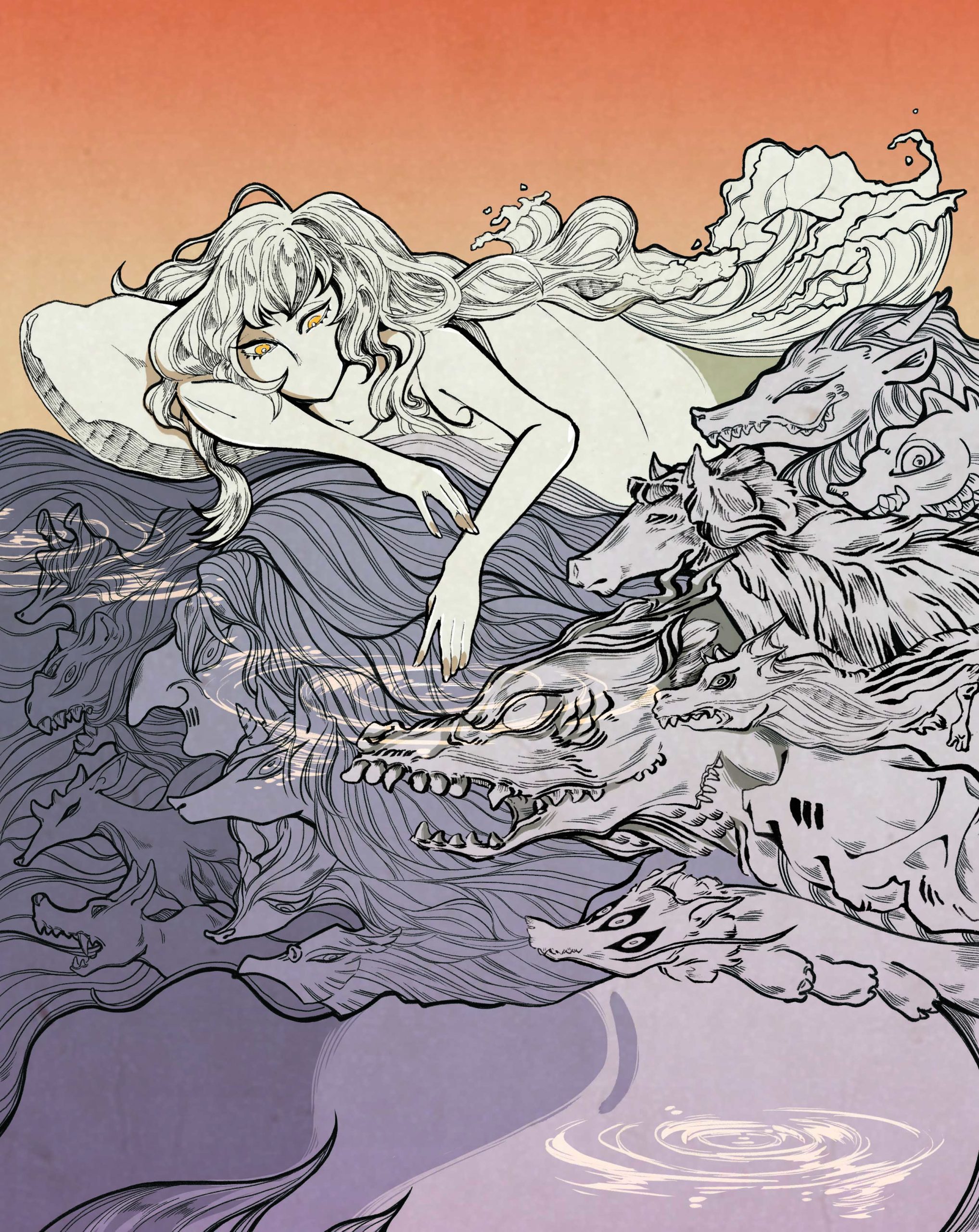
(2) ILLUSTRATION ONLY
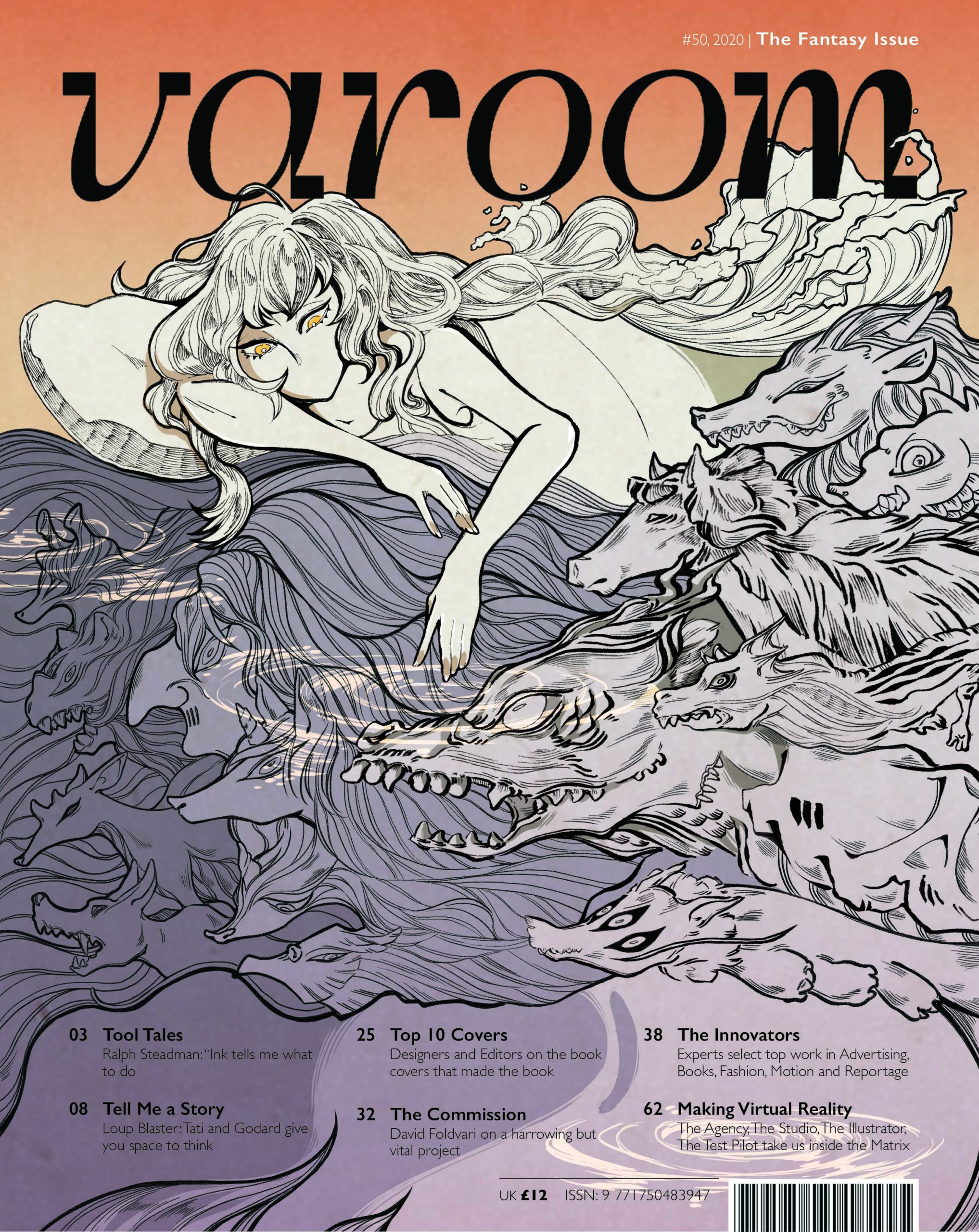
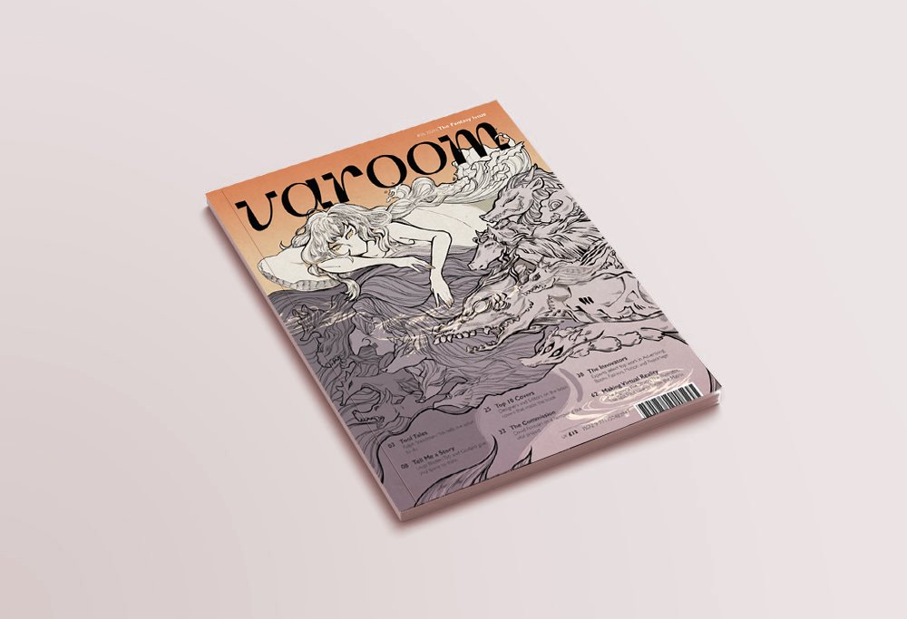
(3) MAGAZINE MOCK-UP
(4) CONCEPT: POLARITY
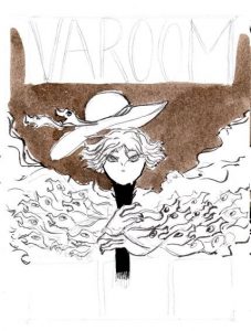
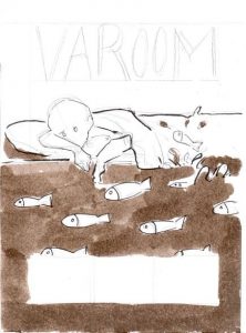
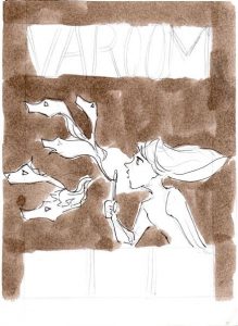
I chose to expand on the thumbnail that featured a composition of a girl in a bed, with monsters swimming under her bed. The composition was first inspired by the state of dreaming and the idea of having ‘monsters under your bed’.
I chose to integrate water as an essential element as to me, water is a symbol of great change and polarity (life and death, benevolence and ferocity). This reflects my take on fantasy where alot of elements and ideas are taken to the extreme (good and evil, poor and rich, colorful and colorless).
Towards the end of the illustration, I also decided to leave out the mouth of the girl to convey restraint when staying on the side of reality – since the image is split into dual halves: orange half symbolizing reality and purple half symbolizing fantasy.
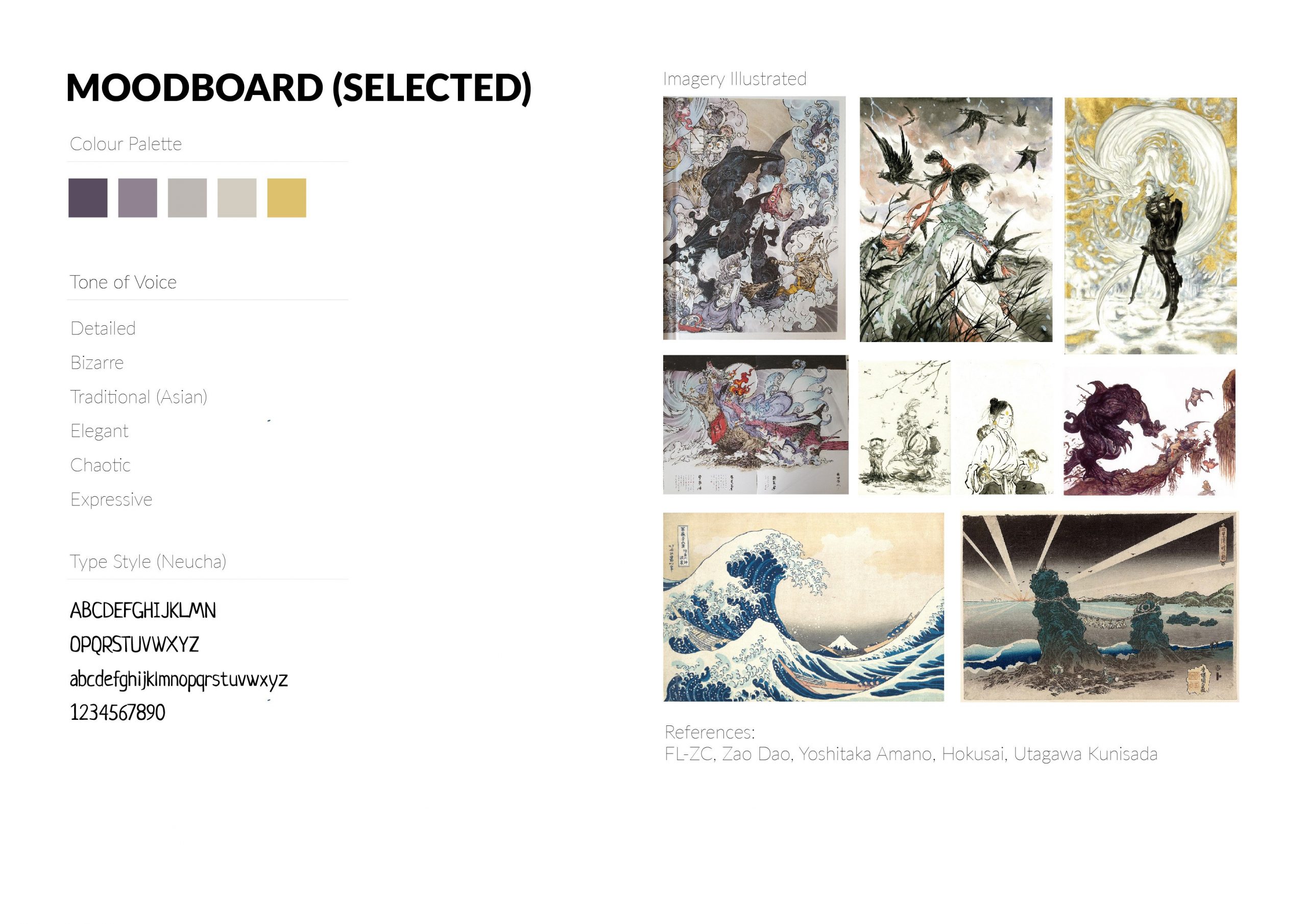
For references, I looked into Hokusai, Zaodao and a few other Asian artists because they were great influences in my artistic journey.
I took this chance to review some of the text in their art books to check out their working processes. An interesting tidbit I found:
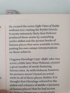
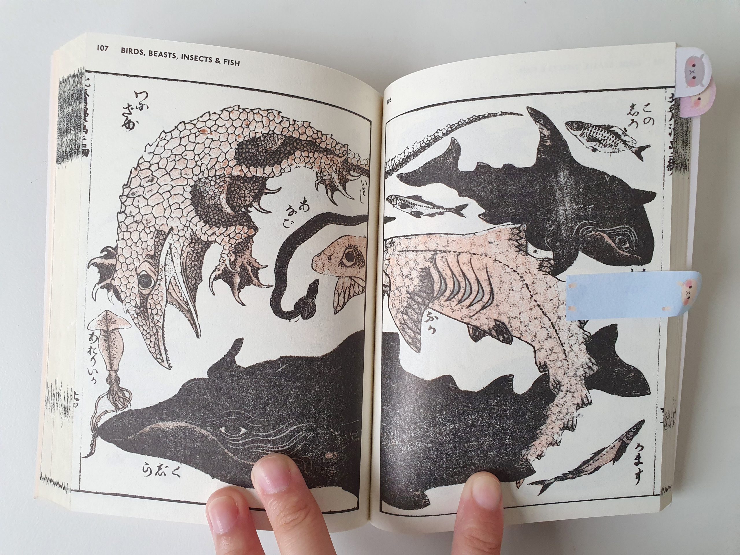
An excerpt from Hokusai’s sketchbooks: The Wonders of Nature
I found out that Hokusai wasn’t a very well-traveled man. His lack of travel and getting information from sources around him (picture books, etc), however, contributed to the bizarre nature of his creatures and fantasies.
Other than artist research, I also drew inspiration for the creatures from the animals at my house right now like:
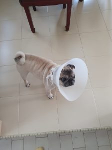
My sister’s pug, Pepper
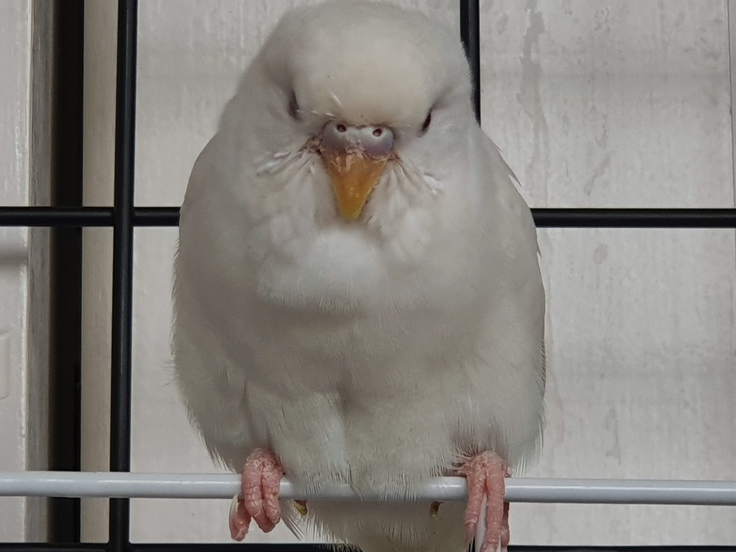
My budgie friend, Ginko
Pepper had alot of folds and wrinkles in her face and was the major source of inspiration for the brush pen in my drawing to achieve texture and volume in the creatures! Ginko (and Hokusai) was good reference for the fierce look and textures of the creatures.
(5) MEDIUM
The tools I used were: Micron pens (0.03mm – 0.1mm), Brush pens, Adobe Photoshop (with natural brush textures) and Adobe In-Design (compilation)
— WORKING PROCESS —
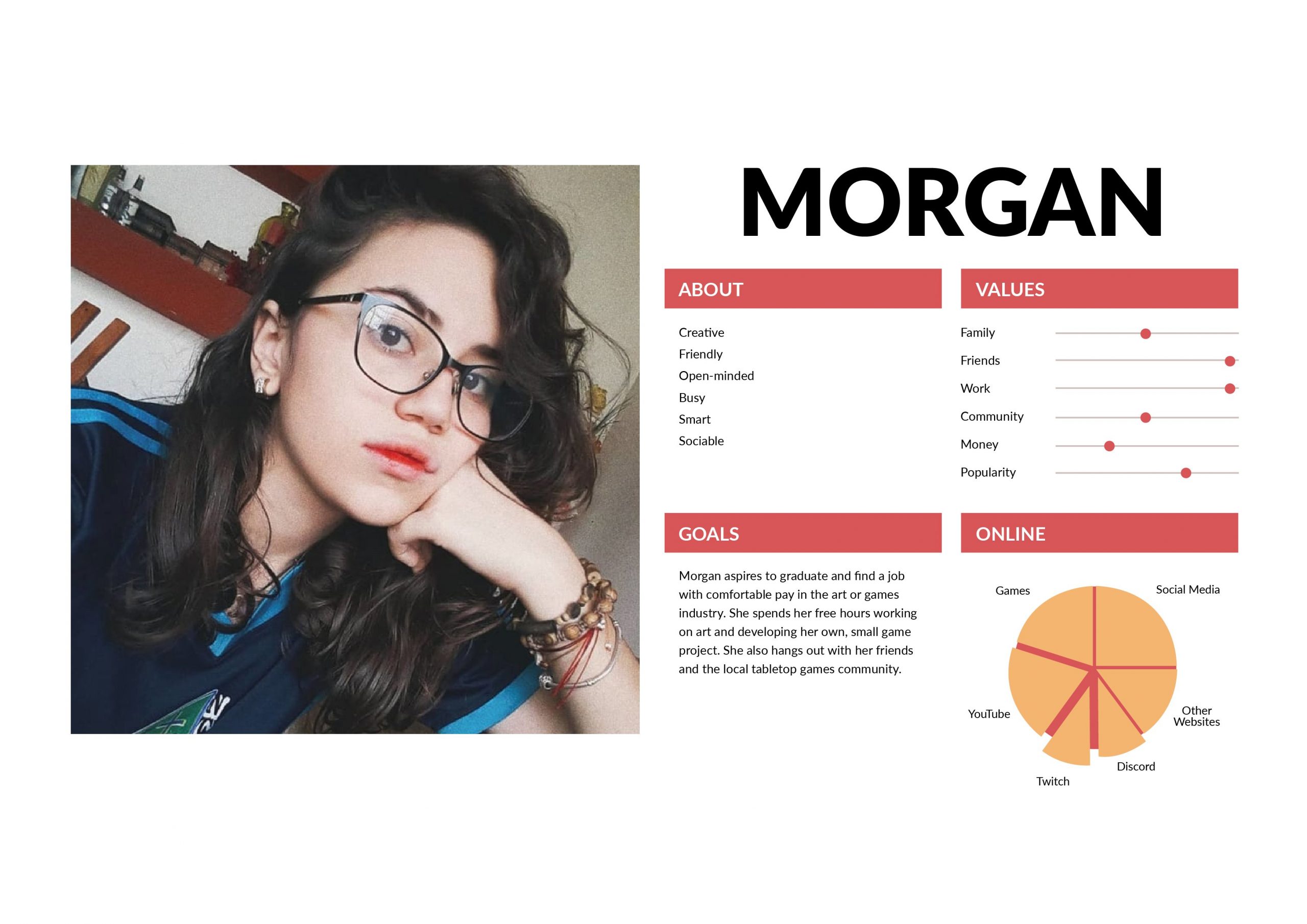
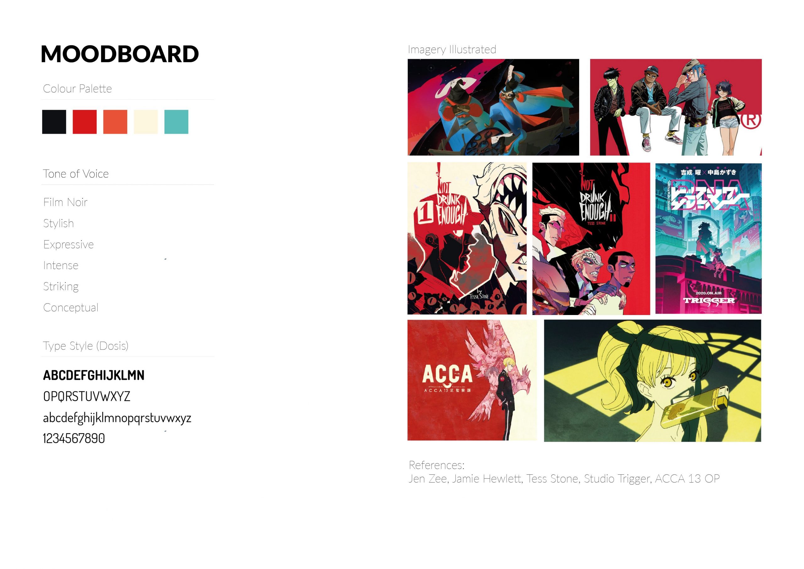
(1) USER PERSONA & MOOD BOARDS
(2) THUMBNAILS
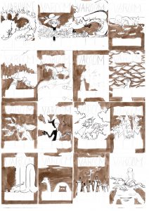
My 16 Thumbnails
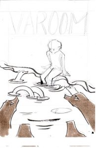
Thumbnail #1: Hero and dragons
Thumbnail #2:Wearing fantasy
Thumbnail #3: Traveler and a twisting dragon
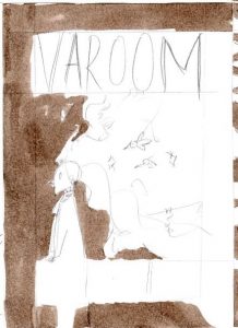
Thumbnail #4: Sleep
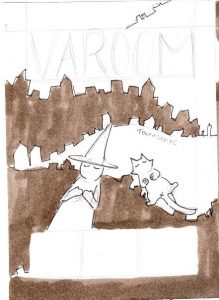
Thumbnail #5: Witch, her Cat and the City
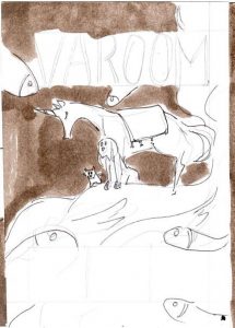
Thumbnail #6: Traveler and her sea
Thumbnail #7: Thinking
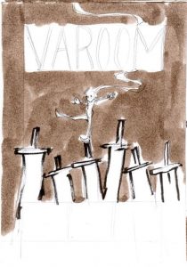
Thumbnail #8: Spirit Parade
Thumbnail #9: Bubbles
Thumbnail #10: Day and Night
Thumbnail #11: Dreaming with friends
Thumbnail #12: Things around You

Thumbnail #13: Cat and Twisting Dragon
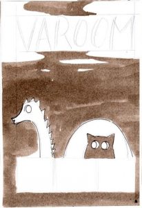
Thumbnail #14: Loch Ness and Cat
Thumbnail #15: Swords
Thumbnail #16: Sea of Monsters
Concept behind the thumbnails:
My thumbnails were generally based off on my experience with the fantasy genre (in games and novels). During the thumbnailing process, I focused alot more on creating visually interesting compositions and not so much about the individual concepts. When I think of fantasy, I think of fantastical creatures in my childhood. I loved monster-taming games like Pokemon, Rhapsody: A Musical Adventure and Azure Dream.
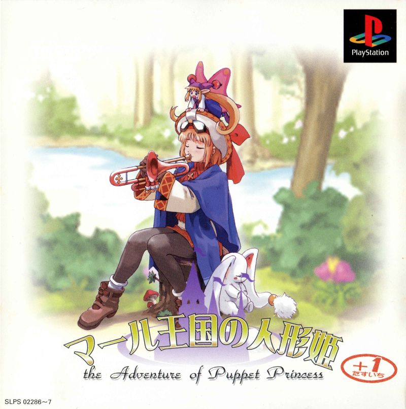
Rhapsody: A Musical Adventure
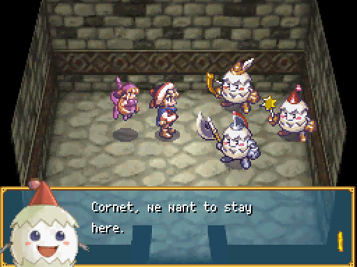
Rhapsody: A Musical Adventure (Gameplay Screenshot)
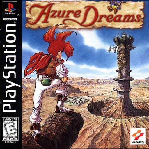
Azure Dreams
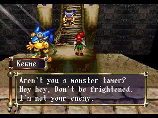
Azure Dreams (Gameplay Screenshot)
My thumbnails generally revolve around animals as friends and companions, or creatures as an anthropomorphized aspect of myself or a journey to overcome. As a kid and teen who never traveled much last time, these creatures were simultaneously my best friends and worst fears at the same time because I could relate to them in stories but they also confronted things and concepts I didn’t have much exposure or access to – such as responsibility, power, loss, and more.
This was also why I related to the passage in Hokusai’s sketchbook since he lived in a time where the world was not so accessible yet and had to rely on his imagination to fill in the rest – which made things alot more polar and led to the creation of extremes, absurd creatures and concepts.
(3) PENCIL COMPS
The three chosen pencil comps after the thumbnail feedback session are as follows:
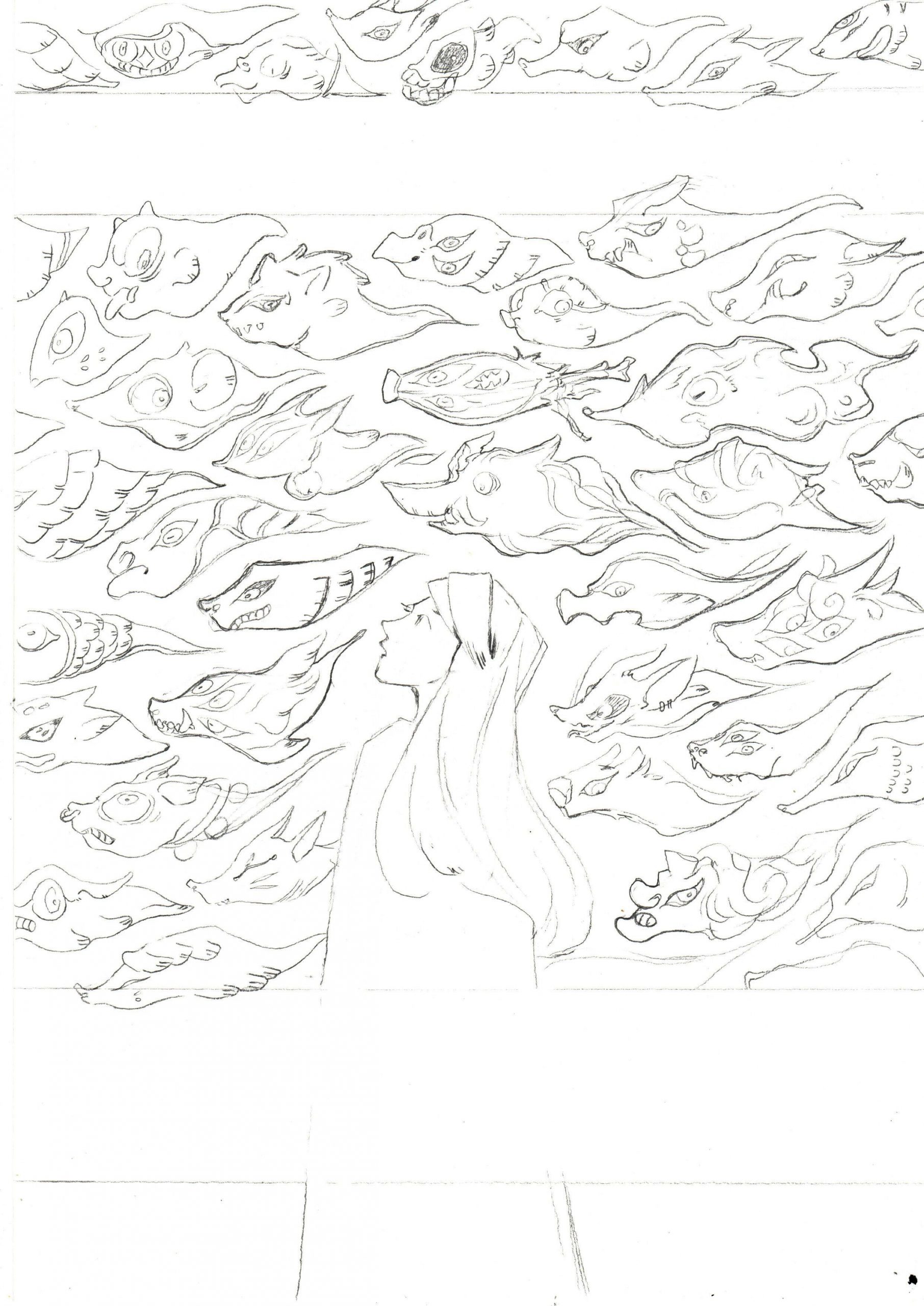
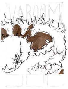
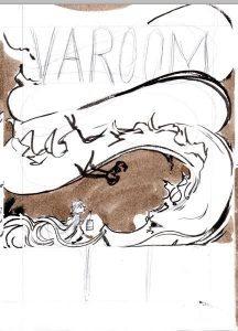
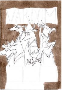
Pencil Comp #1: Spirit Parade
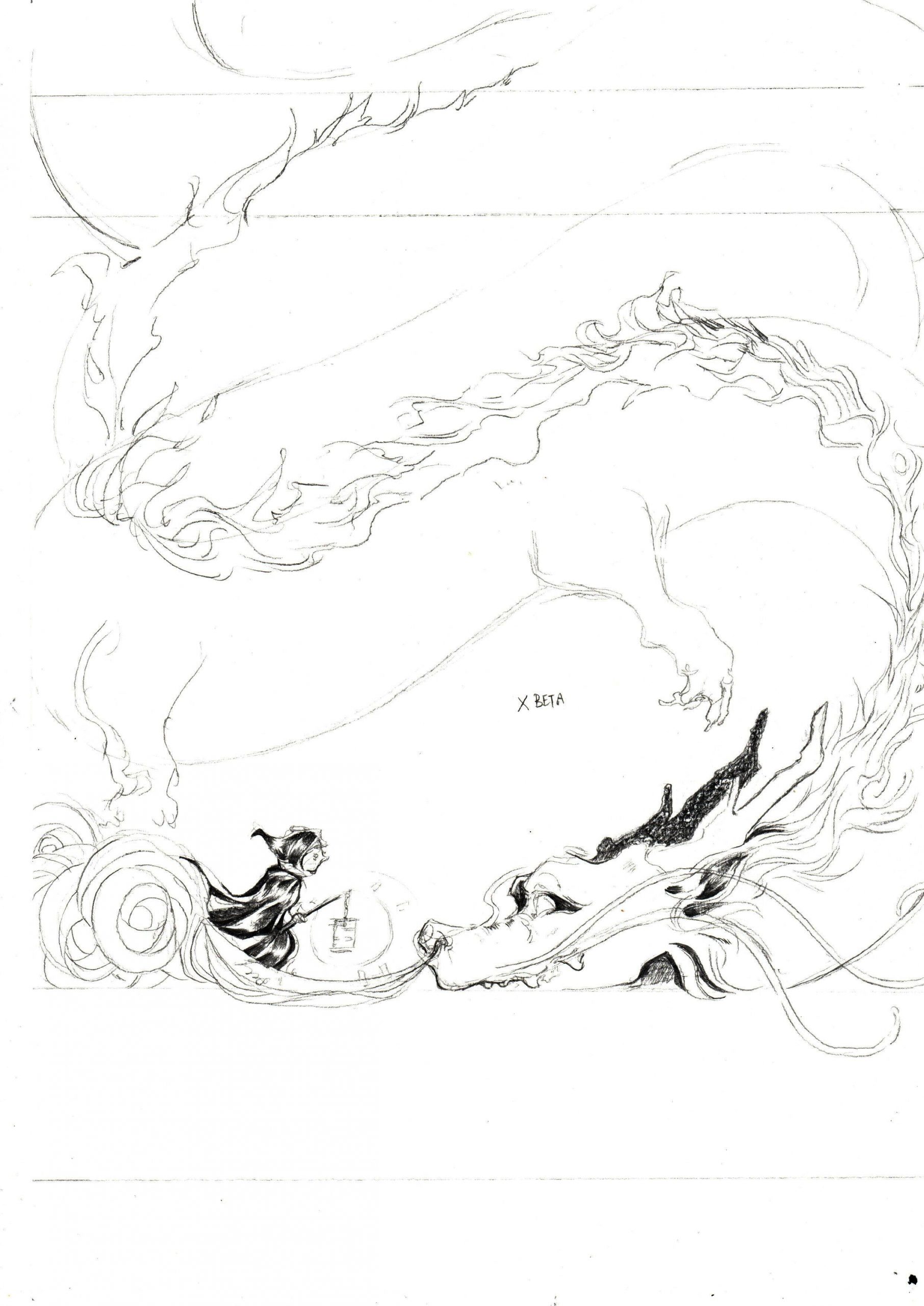
Pencil Comp #2: Traveler and a twisting dragon
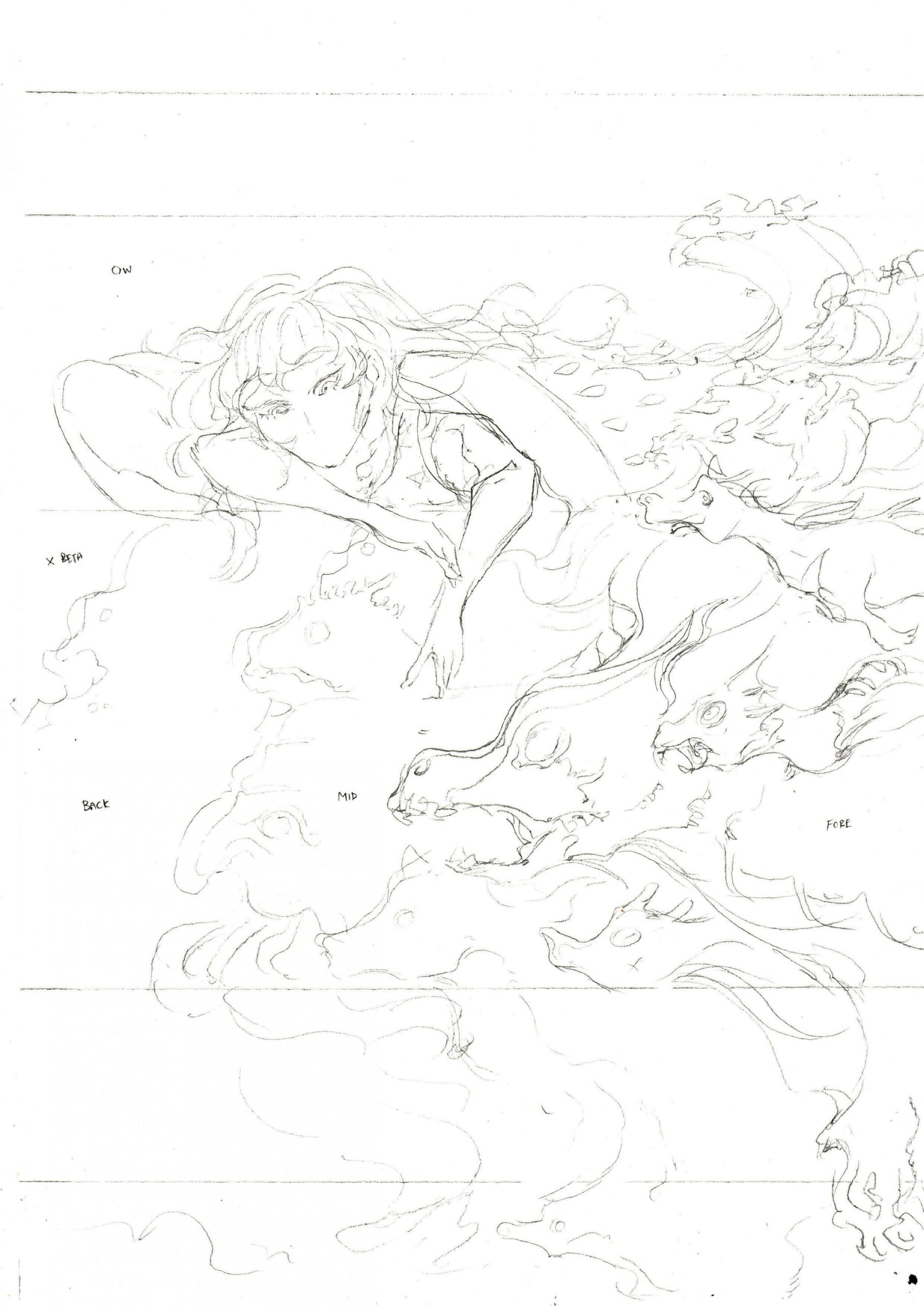
Pencil Comp #3: Sleep
(4) WORK-IN-PROGRESS
My materials
I worked directly on the pencil comp with black brushes and microns, before scanning in the drawing, increasing the contrast to extract the black lines.
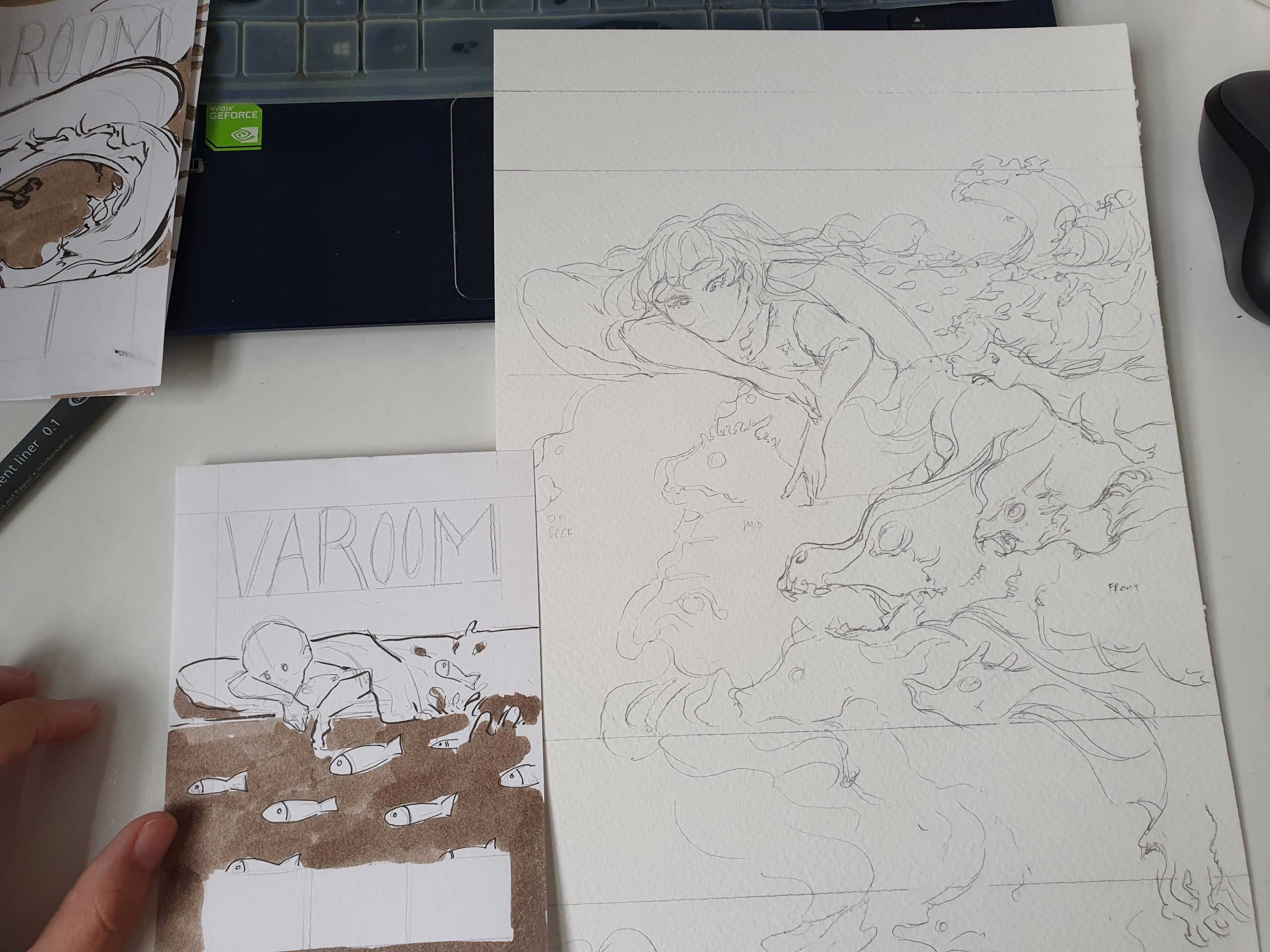
From thumbnail to pencil comp
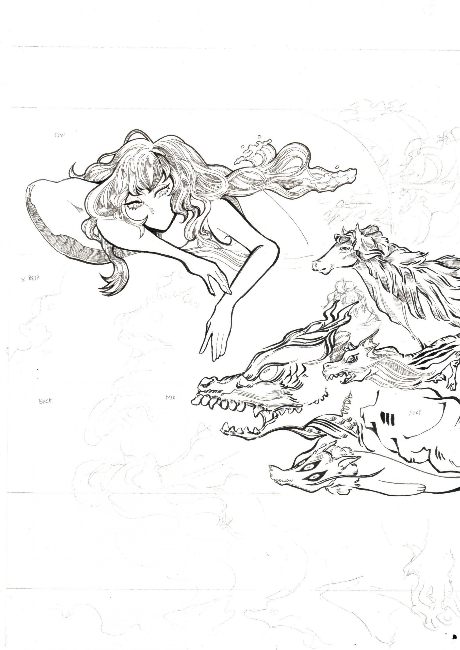
The pencil and ink scan
Initial draft for Week 9 review
I filled in the rest of the rest of the image digitally on Adobe Photoshop and also filled in the purples and orange/yellows to work out the composition!
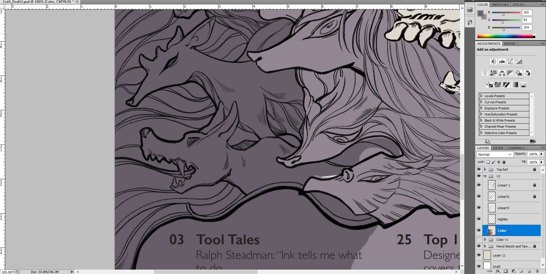
Adobe Photoshop: continued work-in-progress
Final – overlay with paper texture
Link to Varoom Research: https://oss.adm.ntu.edu.sg/laum0005/illustration-for-designers-varoom-artist-research-week-5/


