It’s been a really long few weeks but we’ve finally arrived at the last part of Project 1!

 A shot of the final 18 pieces!
This post will talk about what went on behind each emotion too! (‘u’) But first – I want to thank this project for the wonderful experience! I feel like doing the 18 emotions have exposed me to alot of mediums and possibilities through personal research and talking with friends about their take on the emotions.
It was an extremely educational and enjoyable project, and while there were some hiccups and difficulties, I feel like I’ve gotten over them and came out stronger and with better clarity after this!
Some of the difficulties I faced and my takeaways:
Material Harmony: Pairing the wrong medium with the wrong canvas, for the wrong emotion: I tried gouache painting on thin balsa wood for Passion, but it didn’t spread well at all, and couldn’t recreate the original piece!
Material Choice: While working with ink, I found out that some of inks I own were not pure black at all. When they were mixed with white or diluted, they became purple or blues instead. I had to rework them or repaint when they became too much purple or blue. Lesson learnt – play and understand your materials more before directly applying them!
Selecting too many similar emotions: I realised halfway through, after the consultation, that I may have done in myself when I picked 9 emotions from Joy and 6 from Love – when I was supposed to pick 3 from 6 different categories. I quickly rectified that by reshuffling the emotions and finding emotions more suitable for the ones that were ill-fit, and it turned out for the better!
Variation: There was a limit on the school resources as well as the newsprint and A3 papers ran out. I had to eventually tap into my own materials and also buy some.
However, I’m still able to attain a reasonable level of variation in marks I made and maybe even more so since the school materials running out has pushed me to think more about using what is around me – such as reusing transparency films and gauze that I already had at home.
I felt like I’ve learnt to be more creative, and I’ll definitely explore more in my own time! I’ve learnt alot about materials during this project I never thought I’ll abuse (like gouache paints and transparency films), and to be more flexible with my emotions.
I didn’t want to work on many negative emotions when I first started as I felt like I wouldn’t relate to them as much as I would to the positive ones, and felt that I had restricted my play ground by alot just by thinking that.
As I worked and reworked more on the emotions, I started to feel that sometimes working on a variety of positive and negative emotions would turn out better – as the general look of all the 18 emotions together would have the positive emotions working together with the negative emotions to complement each other!
And not all emotions are completely negative – some are temporary, and some exists in duality to positive ones. I’ve learnt alot from my research and to keep my mind open as well!
And now I’ll elaborate more on the individual emotions and the thought that went behind them.
Passion

Definition: a strong feeling of enthusiasm or excitement for something or about doing something
Method/Medium: Black and white gouache, painted with wool on newsprint, then edited on Adobe Photoshop
Behind the piece: Doesn’t it look like people dancing in pairs from the top, captured in motion? I used black and white gouache for this, painted on with wool in a fanning motion! I have attempted to recreate this on wood as well, but it didn’t turn out so well as the gouache was not able to spread smoothly on wood, hence I’ve decided to take my line to Photoshop instead.
Tenderness

Definition: very loving and gentle; showing affection and love for someone or something
Method/Medium: Copic multiliner on 250GSM white paper
Behind the piece: I wanted to convey how tenderness would cradle something gently, and hence the fluid lines! I believe that tenderness is a healing and positive emotion, hence the white strips against the crosshatched background that could stand for wounds or scars!
Adoration

Definition: strong feelings of love or admiration
Method/Medium: Payne’s Gray watercolor paint on 300GSM watercolor paper, with white gouache (flecks)
Behind the piece: I feel that adoration is a huge, sweet emotion contained in a tiny, simple and pure form, and wanted to convey that through the use of painting a texture that resembles the sky or galaxy contained in bubbles!
Zest

Definition: great enthusiasm and energy
Method/Medium: Black marker, copic multiliners and diluted black gouache on 250GSM paper
Behind the piece: I feel that zest is a very firey and a very lively emotion (and after my research, it started feeling a little fruity as well). I wanted to convey that through imitating the tendrils of a fire and plants, but emphasizing on the life and bounce of the emotion as well!
Zeal

Definition: a strong feeling of interest and enthusiasm that makes someone very eager or determined to do something
Method/Medium: Pink watercolor concentrate, chinese ink and white gouache on newsprint, then edited on photoshop
Behind the piece: Almost similar to zest, zeal is a firey emotion to me as well. But instead of feeling like tendrils, I feel that zeal is passionate and there is an urge to leap forward – hence I selected the part of the mark where the Chinese ink is being thrown forwards and looks like it’s leaping forward to burn at something!
Optimism

Definition: a feeling or belief that good things will happen in the future; a feeling or belief that what you hope for will happen
Method/Medium: Payne’s Gray watercolor paint on 300GSM watercolor paper, with white gouache
Behind the piece: I feel that optimism shines best when there is contrast, thus I placed white gouache bubbles that stood out from the background dyed grey and black. I didn’t dye the background completely black as I believed that optimism was something you only realize during grey and difficult times, and it doesn’t have to be absolute depression or despair!
Delight

Definition: a strong feeling of happiness : great pleasure or satisfaction
Method/Medium: Payne’s Gray watercolor paint on 300GSM watercolor paper, with white gouache (flecks)
Behind the piece: I feel that delight are like fireworks! It’s a slow emotion that blooms happily and comes up to your cheeks and throat when you see something that you really like – and it’s child-like! This piece was done with stroking watercolor horizontally upwards – to represent the direction of the emotion, as well as to give an earthly, festive feel. After the verticle strokes, I decided to use black and white gouache to create ‘fireworks’ that looks like flowers as well. I took some inspiration from the Japanese word “花火” (Hanabi), which also means fire flowers!
Elation

Definition: great happiness and exhilaration
Method/Medium: Payne’s Gray watercolor paint on 300GSM watercolor paper, with white gouache
Behind the piece: I wanted to convey elation as an emotion that almost completely overshadows the negative and dark emotions – hence the struggle of the blacks and greys, against the percentage of white in the background and within the space of the bubbles.
Surprise

Definition: to strike or occur to with a sudden feeling of wonder or astonishment, as through unexpectedness
Method/Medium: Black and white gouache mixed with some glow-in-the-dark powder, painted and dabbed on 250GSM white paper
Behind the piece: I feel that surprise is a sudden interruption to the norm, but a pleasant one; like a warm and light bursting in your chest when you feel it!
This piece was based off on my previous draft of ‘Hope’ – where I realised halfway through while reworking on this, that it seemed more like a little spark, rather than light at the end of a tunnel. I also didn’t feel that Surprise had the aggressive properties of a spark, so I made the center powdery by dabbing white gouache instead, and mixing out some greys as well to try to convey a warm, blooming sensation!
Loathing

Definition: a feeling of intense dislike or disgust; hatred
Method/Medium: Black and white gouache and watercolor paints, pressed between transparency film
Behind the piece: I pressed gouache paint between two pieces of transparency for this one, and was surprised by how it turned out! Loathing to me is a swirling emotion that is unconscious in nature and yet could co-exist and achieve duality with something positive, sometimes maybe even melting into it – it’s when you feel an extreme hate for someone, but sometimes even believing that you are right – hence the progression of light thoughts into dark thoughts, but with a few bright emotions swirling in the darkness.
Hostility

Definition: deep-seated usually mutual ill will
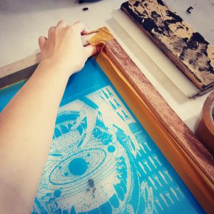
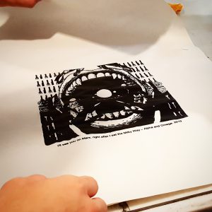
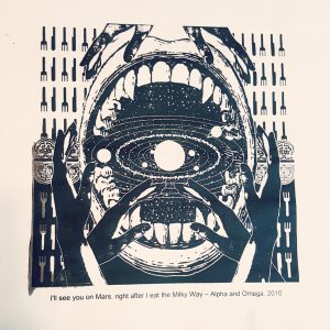
Method/Medium: Black printing ink spread on a linoleum sheet with yarn patterns and tissue flecks, then pressed onto A3 white paper
Behind the piece: Hostility resembles the jaws of a predator, or the fierce nature, so I melded both into one image! Do you spot the owl? (‘u’)
Resentment

Definition: a feeling of anger or displeasure about someone or something unfair
Method/Medium: Black printing ink; remnants when an A3 white paper stuck onto ‘Hostility”s piece was torn from it and repurposed digitally.
Behind the piece: This piece was born when I tore a piece of white A3 paper that was stuck to Hostility. There were root-like patterns and I immediately thought of Resentment. I feel that Resentment is an unconscious emotion that creeps up to you and exists together with a light mind. It’s an unconscious dislike for something or someone, and it’s almost stifling, suffocating and gives you the goosebumps!
Heartache

Definition: emotional anguish or grief, typically caused by the loss or absence of someone loved
Method/Medium: White gouache and medical gauze on black texture paper
Behind the piece: I feel that Heartache is an extremely depressing emotion that is desperately looking to heal itself and restore itself to its original form, chasing after the shadow of what it was!
Abandonment

Definition: a feeling of utter loneliness and neglect
Method/Medium: Black and white gouache pressed between transparency film, with wool glued to the top
Behind the piece: Abandonment is the feeling of loneliness and stagnation, rendering one blind to all the other things happening out there, thus I used wool to hide, putting a barrier between the honest emotions and the viewer.
Gloom

Definition: a state of depression or despondency
Method/Medium: Chinese ink on newsprint, digitalized
Behind the piece: Gloom is drippy; the feeling when you just want to do nothing else but sink into the floor. I don’t feel that it’s quite like sadness, but like a feeling of unhappiness and unsatisfaction instead.
Trapped

Definition: unable to move or escape as a result of obstruction
Method/Medium: Copic multiliner on 250GSM paper
Behind the piece: I wanted to portray the feeling of being caged and trapped in the unknown, and to create a sense of confusion, nonsense and unrest.
Fright

Definition: a sudden intense feeling of fear
Method/Medium: Chinese ink on newsprint, digitalized
Behind the piece: I feel like fright is an extremely sudden emotion – going away almost as soon as it is experienced, but even when it goes away, it leaves a deep impression and traces of what just transpired
Perturbation

Definition: mental uneasiness
Method/Medium: Sea salt on Payne’s Gray watercolor paint and grey string on 300GSM watercolor paper, with white gouache
Behind the piece: I feel that Perturbation is the feeling of uneasiness, unrest and the feeling of being disturbed, and almost like sickness. I used sea salt to spread the paint – to try and make it look like a sickly emotion within the middle of each body, despite the outwardly alright disposition of the emotion.


