Typography I: MASTERLIST

TYPOGRAPHY I MASTERLIST

Below is a masterlist of OSS posts done for Typography I during the semester!

ASSIGNMENTS

Assignment 1: Comic Sans Presentation (with Claire, Joel, Melo and Louisa)

Assignment 2 The Walls Have Ears! Part 1/3: https://oss.adm.ntu.edu.sg/laum0005/typography-i-assignment-2-the-walls-have-ears-part-1-3/

Assignment 2 The Walls Have Ears! Part 2/3: https://oss.adm.ntu.edu.sg/laum0005/typography-i-assignment-2-the-walls-have-ears-part-2-3/

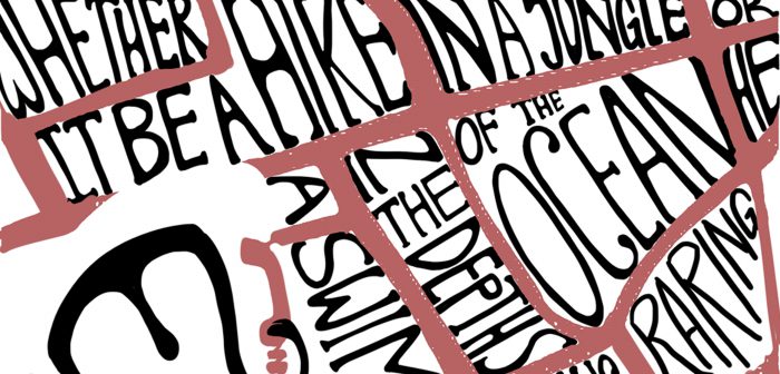
Assignment 2 The Walls Have Ears! Part 3/3 (Outcome): https://oss.adm.ntu.edu.sg/laum0005/typography-i-assignment-2-the-walls-have-ears-part-3-3/

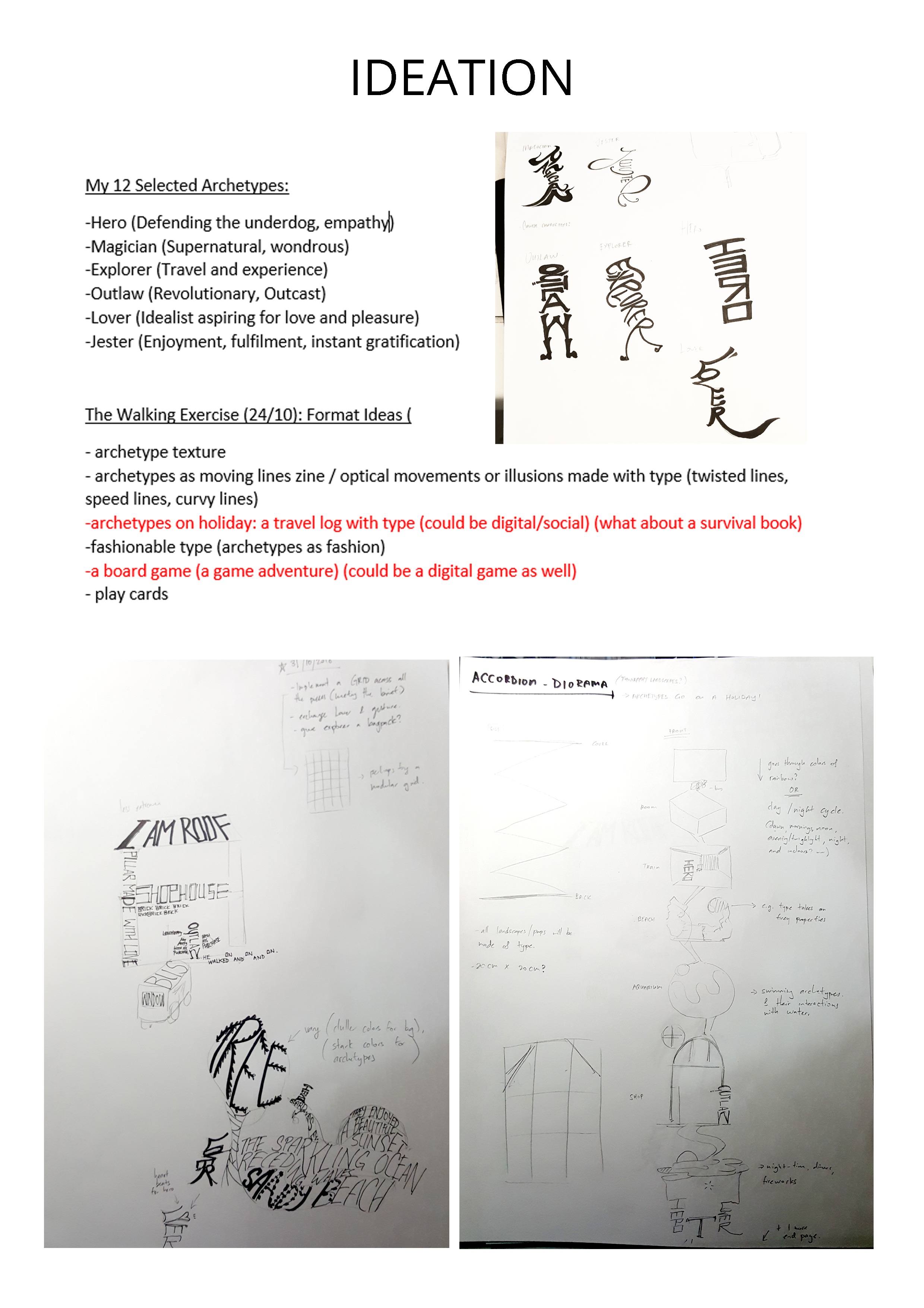
Assignment 3 Archetypes and Typography Part 1/2 (Process): https://oss.adm.ntu.edu.sg/laum0005/typography-i-assignment-3-archetypes-and-typography-part-1-2/

Assignment 3 Archetypes and Typography Part 2/2 (Outcome): https://oss.adm.ntu.edu.sg/laum0005/typography-i-assignment-3-archetypes-and-typography-part-2-2/

TYPOGRAPHER OF THE WEEK

Jan Tschichold: https://oss.adm.ntu.edu.sg/laum0005/typography-i-typographer-of-the-week-jan-tschichold/

Massimo Vignelli: https://oss.adm.ntu.edu.sg/laum0005/typography-i-typographer-of-week-3-massimo-vignelli/

Neville Brody: https://oss.adm.ntu.edu.sg/laum0005/typography-i-typographer-of-week-4-neville-brody/

Paula Scher: https://oss.adm.ntu.edu.sg/laum0005/typography-i-typographer-of-week-5-paula-scher/

Jonathan Barnbrook: https://oss.adm.ntu.edu.sg/laum0005/typography-i-typographer-of-week-6-jonathan-barnbrook/

Erik Spiekermann: https://oss.adm.ntu.edu.sg/laum0005/typography-i-typographer-of-week-7-erik-spiekermann/

Herb Lubalin: https://oss.adm.ntu.edu.sg/laum0005/typography-i-typographer-of-week-8-herb-lubalin/

Tobias Frere-Jones: https://oss.adm.ntu.edu.sg/laum0005/typography-i-typographer-of-week-9-tobias-frere-jones/

READINGS AND REVIEWS

Type Speaks: https://oss.adm.ntu.edu.sg/laum0005/typography-i-type-speaks-1948/

Thinking with Type (Letter): https://oss.adm.ntu.edu.sg/laum0005/typography-i-thinking-with-type-letter/

The Crystal Goblet by Beatrice Warde: https://oss.adm.ntu.edu.sg/laum0005/typography-i-the-crystal-goblet-by-beatrice-warde/

On The Elements of Typographic Style: https://oss.adm.ntu.edu.sg/laum0005/typography-i-on-the-elements-of-typographic-style/

“Wake up and smell the fonts” by Sarah Hyndman: https://oss.adm.ntu.edu.sg/laum0005/typography-i-wake-up-and-smell-the-fonts-by-sarah-hyndman/

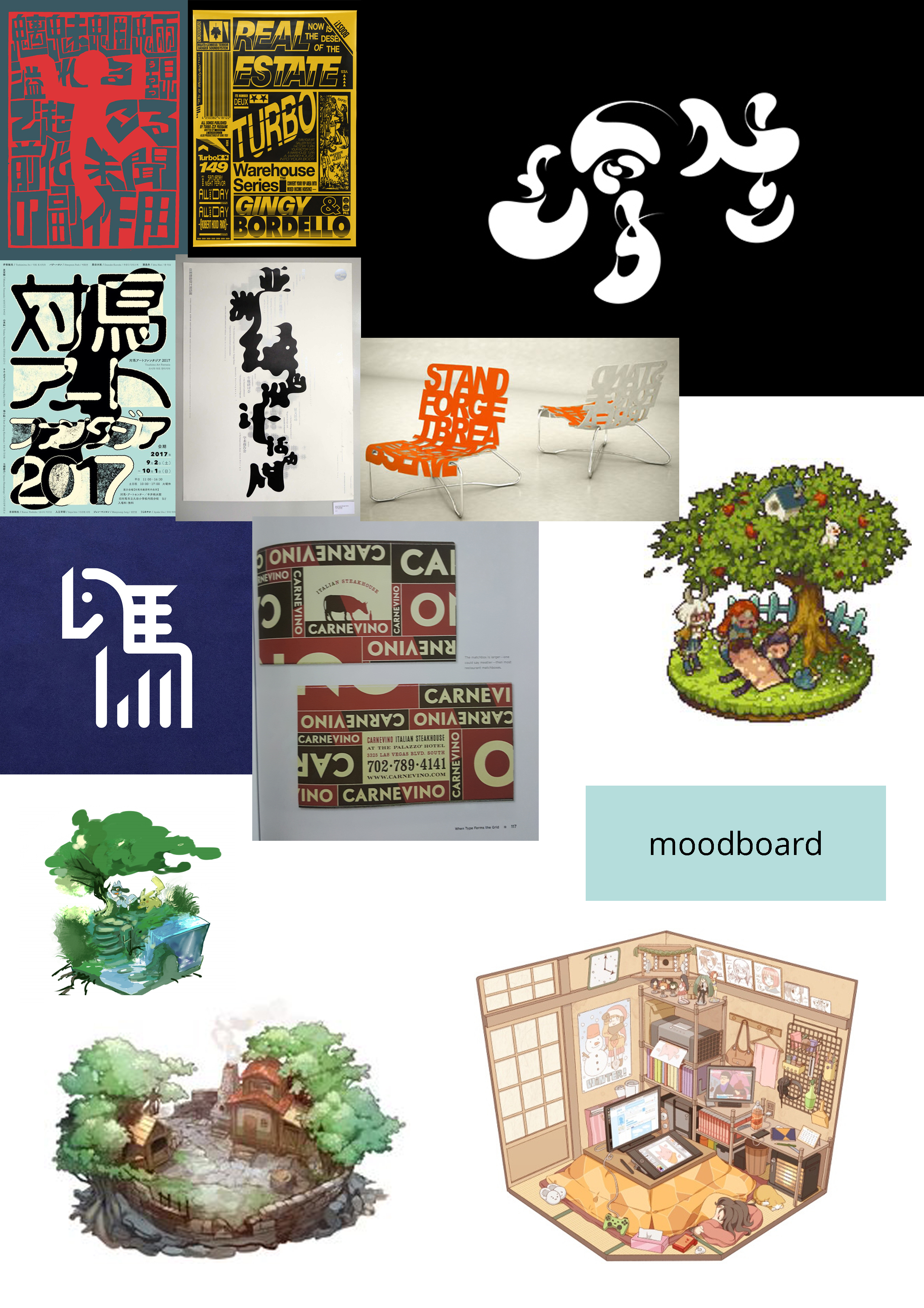
Archetypes and Typography: https://oss.adm.ntu.edu.sg/laum0005/typography-i-archetypes-and-typography/

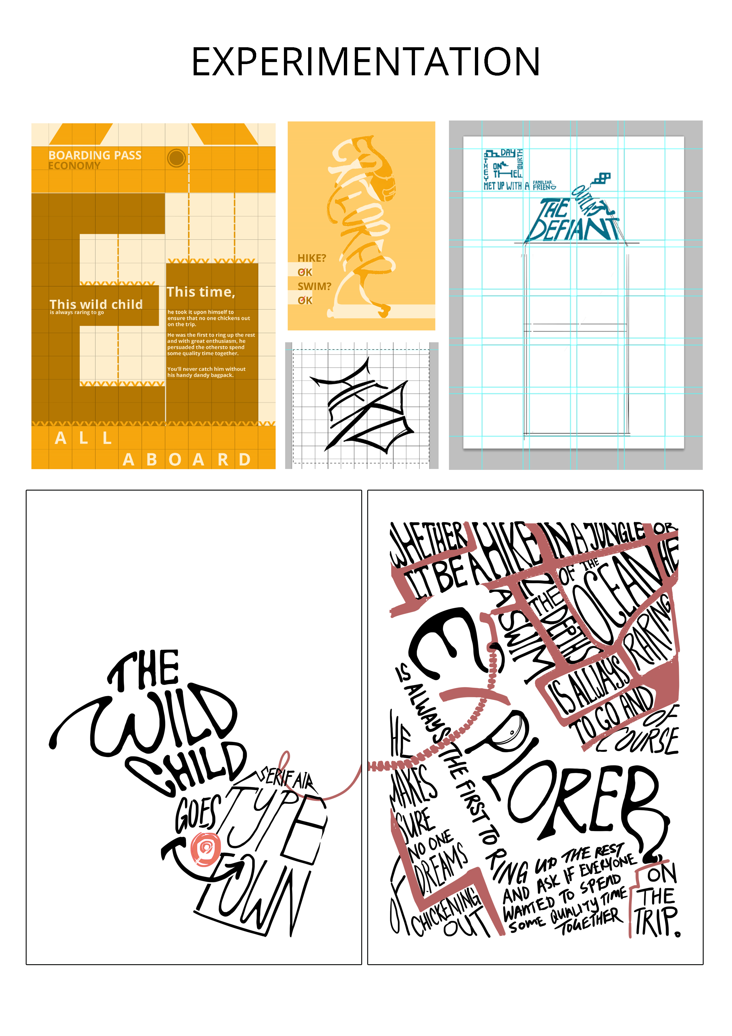
Readings on Grids + Walk to enhance creative thinking: https://oss.adm.ntu.edu.sg/laum0005/typography-i-readings-on-grids-and-the-walk-to-improve-creative-thinking-week-10/

IN-CLASS ACTIVITIES AND HOMEWORK

Type in the Wild: https://oss.adm.ntu.edu.sg/laum0005/typography-i-type-in-the-wild/

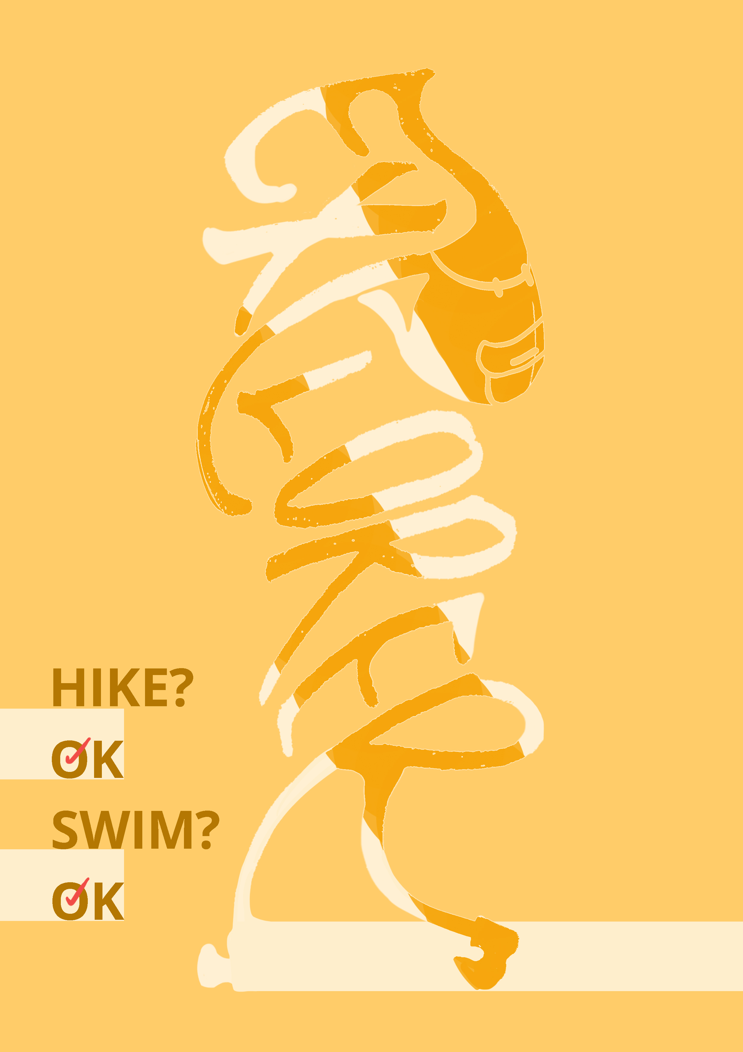
Expressive words, Opposing Pairs: https://oss.adm.ntu.edu.sg/laum0005/typography-i-in-class-activity-4-expressive-words-opposing-pairs/

Haiku (Hamster): https://oss.adm.ntu.edu.sg/laum0005/typography-i-in-class-activity-5-haiku/

Play Nice: https://oss.adm.ntu.edu.sg/laum0005/typography-i-in-class-activity-6-play-nice/

Automatic Drawing: https://oss.adm.ntu.edu.sg/laum0005/typography-i-automatic-drawing/

A Lesson in Pattern (Illustrator): https://oss.adm.ntu.edu.sg/laum0005/typography-i-in-class-activity-7-a-lesson-in-pattern-illustrator/

Custom Drop Cap: https://oss.adm.ntu.edu.sg/laum0005/typography-i-drop-cap-class-activity/

Word Association (Lover): https://oss.adm.ntu.edu.sg/laum0005/typography-i-in-class-activity-word-association-lover/

Menu (In-Design Exercise): https://oss.adm.ntu.edu.sg/laum0005/typography-i-in-class-activity-menu-making-in-indesign/

OTHERS

First Impressions & Group Allocation: https://oss.adm.ntu.edu.sg/laum0005/typography-i-first-impressions-of-the-course-and-group-allocations/

Typography I: Assignment 3 – Archetypes and Typography (Part 1/2)

CONTENTS

  • Chosen Archetypes
  • Ideation
  • Write-ups
  • Experimentation and Process
  • Decisions
  • Link to Part 2 (Final Outcome)
CHOSEN ARCHETYPES

Assignment 3’s mission is to disseminate information on 6 (out of 12) archetypes used for brands!

On 24/10 (Week 10), I’ve chosen the following archetypes for my project:

  • Hero [Defending the underdog]
  • Magician [Supernatural and wondrous]
  • Explorer [Travel and experience]
  • Outlaw [Revolutionary]
  • Lover [Idealist aspiring for love and pleasure]
  • Jester [Enjoyment, fulfillment and instant gratification]
IDEATION

During my walking exercise in class, I’ve managed to come up with a couple of ideas for the format of the project:

  • Archetype texture book
  • Archetypes as moving lines zine / optical movements or illusions made with type (twisted lines, speed lines, curvy lines)
  • Archetypes on holiday: a travel log with type (could be digital/social)
    (what about a survival book)
  • Fashionable type (archetypes in a fashion magazine)
  • A board game on archetypes (a game adventure) (could be a digital game as well)
  • Archetype diorama (made with typography; archetypes in their enviro)
  • Archetype tarot/lenormand cards
  • Play cards

The bolded ones were the ones I thought about and expanded on after the first consultation! In the end, I decided to go with the concept “Archetypes on a Holiday” and use the diorama/landscape idea to approach the concept.


Some sketches!

WRITE-UPS

Since we learn about the gist of the archetypes through the lessons and our personal research, I kind of wanted to have a situation where they could interact with each other – a little bit like the ABO blood-type comics where they’re all doing their own unique and cute thing.

ABO comics!

My concept developed in the slice-of-life direction:

  • What would be the role of each archetype when they traveled together?
  • What would they do together?
  • What would be their individual agendas?
  • What would they want to eat?
  • Would they get along?

Thus for each of them, I gave them a situation and did a short write-up of their reaction!

Explorer: The wild child can’t sit still. This time, he took it upon himself to ensure that no one chickens out on the trip. He was the first to ring up the rest. With great enthusiasm, he persuaded the others to spend some quality time together. He brought his handy dandy bagpack along for the trip and can’t wait for the journey to start!

Hero: The brave friend who scored a free meal. Right before departure, Hero noticed a highly suspicious type at the terminal dressed in black and tailed the fellow. He later assisted the staff in effectively disarming and arresting the suspicious type, before regrouping with everyone before the flight to enjoy a good burger on the house.

Outlaw: The defiant rogue. Nauseated by how hopelessly clingly the rest of them are, he immediately left the group after the flight to enjoy some time on his own. He wandered around and found a quaint little shophouse full of little trinkets and took a nap there with the resident cat, Mr. Pica.

Jester: The free spirit brought nothing with him. He never properly prepares for any trip and this time he forgot to bring a change of clothes. Thankfully, everyone decided to pool some money for him to buy some essentials. He is very appreciative but ended up squandering everything on an armful of trinkets.

Magician: The old soul spaced out and got lost. Penniless, he started performing and attracted a lively crowd in the streets. He was almost arrested for illegally performing on a streets but pulled a vanishing act at the very last second and snuck away. Eventually, he found his way back to the group but had to be persuaded to let the seven rabbits under his coat go.

Lover: The charmer struck lucky on this trip. Lover received a proposal at the airport, right before they went back home. The proposal caused a huge commotion. Due to the commotion, the flight was delayed and everyone decided to take an extended vacation.

EXPERIMENTATION AND PROCESS

I collected some images for a moodboard

While I wanted to do a diorama initially, the experimentation stage didn’t work out too well for me. I was reminded countless times about my poster grid as well. The poster grid is definitely the biggest struggle I had during this project. 🙁

I purchased a book on grids because I was stumped and it definitely saved me (kind of). Both the consultations and the book gave me a little bit of foothold and pulled me back from doing the wrong kinds of crazy.

I promise to study grids 🙁

Different drafts that I experimented with

I definitely started out with alot more illustrative elements, before deciding to go with a more structural layout and do my best to play with existing fonts instead of wanting to illustrate everything. I also picked to use a modular grid.

The set at the bottom was initially intended for me to make an accordion book – I wanted to connect it in a “ARCHETYPE -> LOCATION -> ARCHETYPE -> LOCATION -> …” sort of manner, but it didn’t work out too well because I needed to find a way to make it more structured and more poster grid-ded. I scrapped it, but kept the same concept and elements, instead of depict moments instead of actual location.

DECISIONS

Around 15/16th Nov (Thurs/Fri), I arrived at these drafts:

I can’t say I’m completely satisfied with the outcome, but it’s a start!

More images of experimentation with fonts and layouts for the rest of the archetypes:

LINKS

Final Outcome (Part 2/2): https://oss.adm.ntu.edu.sg/laum0005/typography-i-assignment-3-archetypes-and-typography-part-2-2/


Typography I: Assignment 3 – Archetypes and Typography (Part 2/2)

CONTENTS

  • Final Outcome
  • About the Individual Archetypes
  • Link to Part 1 (Process)
FINAL OUTCOME

A5 Booklet (artcard, staplebound)

About: A booklet about the different archetypes going on a trip together. Left page is a hand-drawn silhouette of the archetype, while the left depicts a moment/scene that is more constructed (structural.). The individual archetypes are also represented in varying shades of different colors.

ABOUT THE INDIVIDUAL ARCHETYPES

Grid used: Modular Grid

► Explorer

Spread

Left Side (With Grid)

Right Side (With Grid)


Font Choice: Mount, Rockwild, Open Sans

Color Choice: Yellow/Orange. To me, these shades of yellow/orange represents grit and earth.

Concept (Left Side, Hand lettered): I gave Explorer little boots and a backpack! To me, the Explorer represents adaptability and practicality. I decided to go with mostly distinct and easy-to-follow lettering.

Concept (Right Side, Structural): As I’m basing my right page after a moment/scene in their trip, I decided to use a boarding pass to represent the flight. I used Open Sans for the structured look of an airport, and Mount and Rockwild contained to represent the Explorer. The dashed lines are also meant to show the perforation of the ticket but at the same time represent movement (elevators and travellators in an airport!).

► Hero


Spread

Left Side (With Grid)

Right Side (With Grid)

Font Choice: Mandrake, Rowdy Light, Open Sans

Color Choice: Blue. Blue and red are both common colors chosen for a hero. I decided to go with blue as I wanted to portray a more police-like hero, a do-gooder.

Concept (Left Side, Hand lettered): To me, Hero is bold and strong. I was very influenced by the many chinese novels I’ve been reading lately and decided to go for a more proper, square approach for Hero. The Hero is law-abiding, loud and big.  I incorporated a little bit of a slant for the lettering to depict some arrogance and pridefulness as well to contribute to the quality of loudness. I also used the ‘G’ from Mandrake to give the Hero a pair of flexing arms and convey that everything is okay!

Concept (Right Side, Structural): The right side depicts a scene from the text – of the burger that Hero gets to enjoy! The burger and layout is constructed out of mostly Rowdy Light, with select areas such as the ‘ceiling’ using Open Sans as Rowdy Light and Mandrake weren’t stiff and structured enough to portray the airport interior.

► Outlaw

Spread


Left Side (With Grid)

Right Side (With Grid)

Font Choice: Toxia, Rakesly

Color Choice: Red. Red to me is the sign of danger, individualism and law-breaking. It’s a very loud color that stands out from the others. I also chose to use almost-black red and off-white for the background to break away from the rest of the pages in terms of contrast.

Concept (Left Side, Hand lettered): Outlaw’s left page is the only one that breaks away from the rest subtle-ly. My impression of the Outlaw is someone who doesn’t care for the law, but doesn’t go out of his way to break it, only when it’s convenient for him – a lazy scoundrel. In accordance with this, he stands within the frame, but the tip of his cigarette peeks right out of the space that the individual archetypes are supposed to stand in (in white).

Concept (Right Side, Structural): The scene is set up to look like a lonely car driving on a vast sandy road with ‘no doing stuff’ signage. The text conveying the tale of the Outlaw has little cat ears and an S for a tail to represent the cat!

► Jester

Spread

Left Side (With Grid)

Right Side (With Grid)

Font Choice: Da Bomb, Nova Classic

Color Choice: Green. While I could have reversed Explorer and Jester’s colors easily, I felt that green is a more unorthodox choice for Jester. It throws off people abit and despite how it’s usually used for nature, it takes on a more unique and strange meaning when used to represent other things. Popular and more bizarre examples I can think of are DC’s Joker, The Mask or Teenage Mutant Ninja Turtles. I also decided to use green as it also represents a sense of freedom and doesn’t have the sense of ‘groundedness’ as the earthy brown/orange.

Concept (Left Side, Hand lettered): The lettered Jester is inspired by the pumpkin-like pants that a Jester wears as well as the curled tips of the Jester’s shoes, hence the exaggerated curves within the word. I wanted to portray a light form that’s almost dancing with the curves as well.

Concept (Right Side, Structural): For the structural side, I wanted to convey a simple and empty scene of a flower being held and blown away – that the Jester has nothing except the clothes on his back. Compared to the other structured pages, the Jester’s right page to me is also a reflection of his simple mind, using much less tones and easy to look at. I used a contrasted curly whimsical font to a classical one intending to show a juxtaposition and how this archetype is whimsical and tends to flip-flop in extremes.

► Magician

Spread

Left Side (With Grid)

Right Side (With Grid)

Font Choice: Dukeplus, Timeless

Color Choice: Purple. Purple is mysterious, elegant and regal. I feel that this color was most suitable for the Magician because of the sense of depth it conveys!

Concept (Left Side, Hand lettered): I modeled the handlettered text after the silhouette of a literal magician (with dress shoes and a bowtie!). To me, the Magician is authoritative and smooth, so I decided to represent that with something thick and bold, but fluid. The ends of the drawn letter trails off to something that is wispy and flame-like.

Concept (Right Side, Structural): On the right side, the scene depicts a structure akin to a medieval castle/building with the dash lines leading up to fireworks (fire flowers). I wanted to depict something that’s more grand and older compared to the rest, to show the old, and still burning bright, mind of the Magician.

► Lover

Spread

Left Side (With Grid)

Right Side (With Grid)

Font Choice: Youthful Touch, Josefin Slab

Color Choice: Pink. I considered red and other colors but still came full circle back to pink since it was a little difficult to escape the feminine impression this color gives (especially since I wanted to go for a more muted version of all the above colors).

Concept (Left Side, Hand lettered): I lettered Lover with delicate, flowers and bugs in mind. The first words I thought of when the word ‘Lover’ comes up were ‘infatuation’ and ‘sweet nothings’. It gives me the impression of a small delicate flower and honey. Hence, I lettered Lover with a much thinner body – like a light, youthful and refreshing touch.

Concept (Right Side, Structural): The scene is constructed to look like a pair of rings (represented by Os in the font Youthful Touch) and a torch-like airport control tower at the back. I decided to go with a larger percentage of white for this particular right page so as to convey the nature of the text (a wedding proposal – popularly represented in white).


LINKS

Process (Part 1/2): https://oss.adm.ntu.edu.sg/laum0005/typography-i-assignment-3-archetypes-and-typography-part-1-2/


Typography I: Readings on Grids… and the walk to improve creative thinking (Week 10)

Readings on Grids

From Grids are Good: “Constraints are the mother of design invention.”

I kinda like this quote from the PDF since it reminds me of a similar art/drawing quote which was: “Limitations breed creativity.”

After going through the reading, I felt that I got the gist of how the grids worked but I felt like I couldn’t absorb more of the content specifics. The numbers were killing me midway through the reading. Eventually, the text does, however, provide specific examples on how to create a grid and introducing specific terms (margin, padding, etc). It also gives useful insight on good and bad designs for the web – and how to reorder crowded information.

Later, it even goes into a step-by-step of rebuilding a website to a grid.

It also cuts to the chase and is very direct in explaining the effect and consequence of certain design choices such as:

I was a little baffled at first by the numbers but it eventually looked really useful as it’s a really good guide on how to make use of the modules within the grid!

From How you make a grid:  “Design Grids are Not Mathematical Grids”

PHEW!

I was a little worried since I’ve been looking into several poster grid books recently. I’ve been feeling that using poster grids became something that was increasingly stifling. I started unconsciously looking at it like an iron rule, and not a helping guide.

I really did wish I read this particular text earlier for Assignments 2 and 3.

This reading was also really helpful in providing the basic dos for picking out fonts and deciding text sizes, and eventually fitting them within the poster grids, before providing some really nice examples!

Benefits of going for a walk to enhance creative thinking

This week we started class off with a walk to enhance creative thinking! Yingying, Sam and I walked in (mostly) silence to canteen 2 to grab some food as well.

During my walking exercise in class, I’ve managed to come up with a couple of ideas for the format of project 3:

  • Archetype texture book
  • Archetypes as moving lines zine / optical movements or illusions made with type (twisted lines, speed lines, curvy lines)
  • Archetypes on holiday: a travel log with type (could be digital/social)
    (what about a survival book)
  • Fashionable type (archetypes in a fashion magazine)
  • A board game on archetypes (a game adventure) (could be a digital game as well)
  • Archetype diorama (made with typography; archetypes in their enviro)
  • Archetype tarot/lenormand cards
  • Play cards

Personally, I felt that it’s definitely effective for me as I was still at the starting point of the project and the walk gave me some quiet time to organize my thoughts.

More on Project 3 (Process): https://oss.adm.ntu.edu.sg/laum0005/typography-i-assignment-3-archetypes-and-typography-part-1-2/

Typography I: Typographer of Week 9 – Tobias Frere-Jones

TYPOGRAPHER: TOBIAS FRERE-JONES

Frere-Jones is an American type designer who had designed over 500 type faces – crazy! From the readings on him, it seems like he really picked type and stuck by it.

Some of the typefaces he designed includes Gotham and Interstate.

 Gotham was popularized throughout New York City in signages, Barack Obama’s 2008 presidential campaign and other campaigns. Interstate was designed as homage to Highway Gothic, the official typeface of the American Federal Highway Administration.

Typefaces are Solutions

Frere-Jones talks in specific about typefaces for the different mediums and display (for print and for web) in this particular video. The video really highlights the problems that surfaces when a typeface is directly plucked from print and placed for web-reading, down to pixels!

The most interesting thing about this video for me is that the video provides the different methods to solve and clarify the typefaces for web, and the specific problems in specific letters down to pixels. It’s a really in-depth review of his experiences, experimentation and solutions for type problems.

I think this is really importance as a designer today where the computer screen is (almost) king.