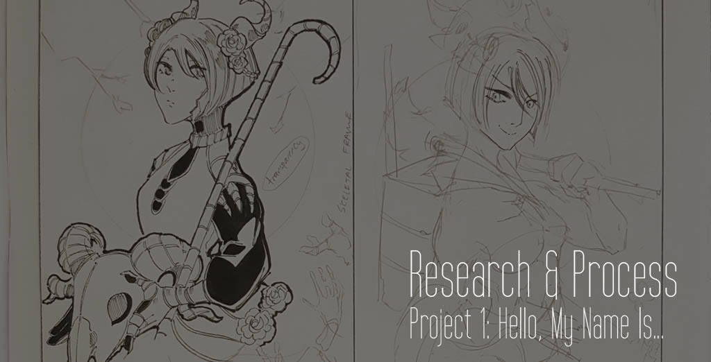
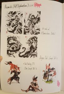
This was a personal project and I naturally swung towards Japanese comics and game art upon starting on the research for this project! Japanese RPGs are my life and I really want to let my love for games decide where to swing for this project!
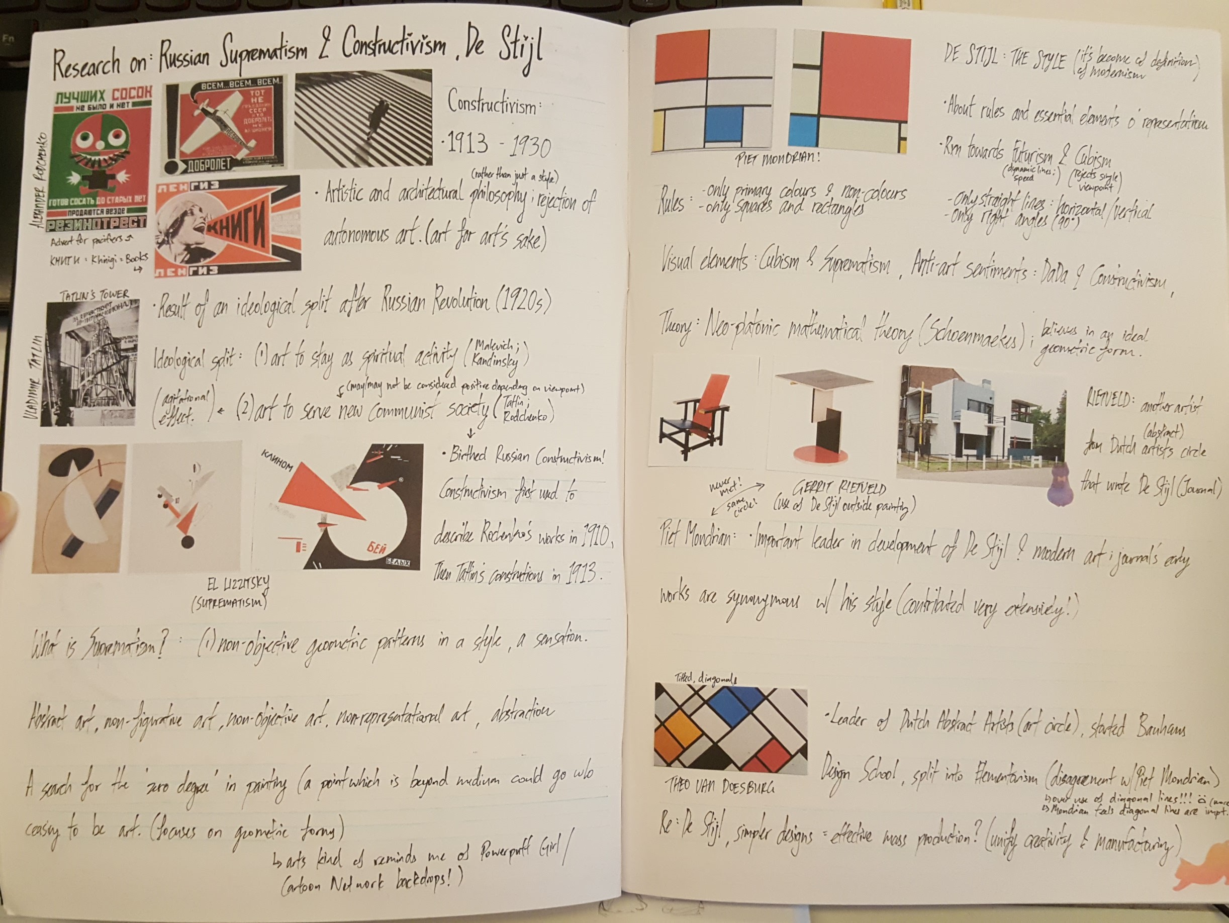
Seeing as I was assigned to the first week for the weekly presentations as well, I decided to incorporate extensive research of Russian Constructivism, Suprematism and De Stijl into my works as well.
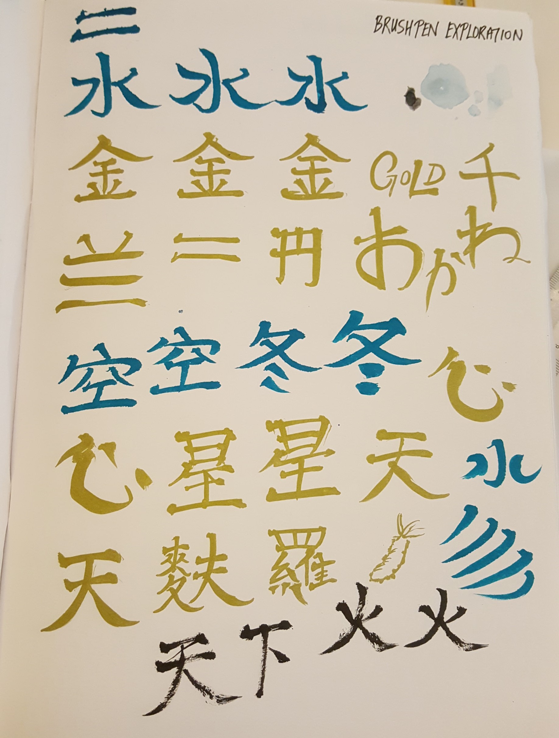
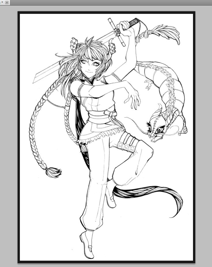
I did some research on brushwork and practiced some calligraphy too to practice discerning line work and improving my line expression for this project.
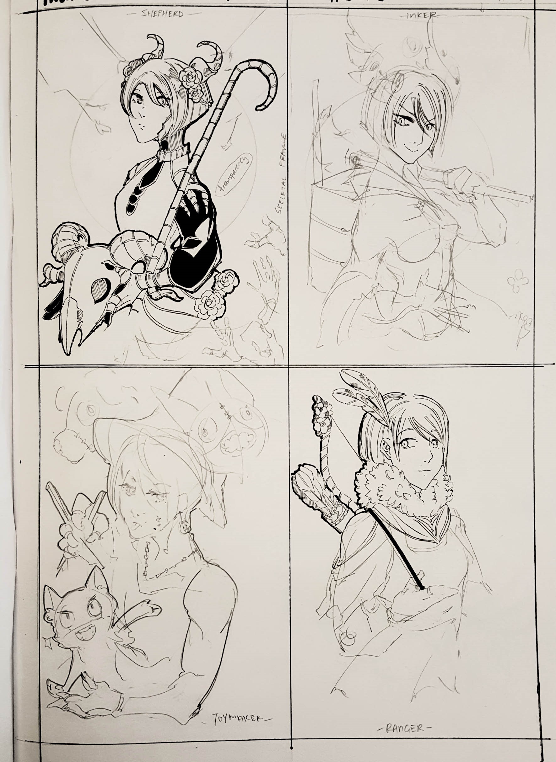
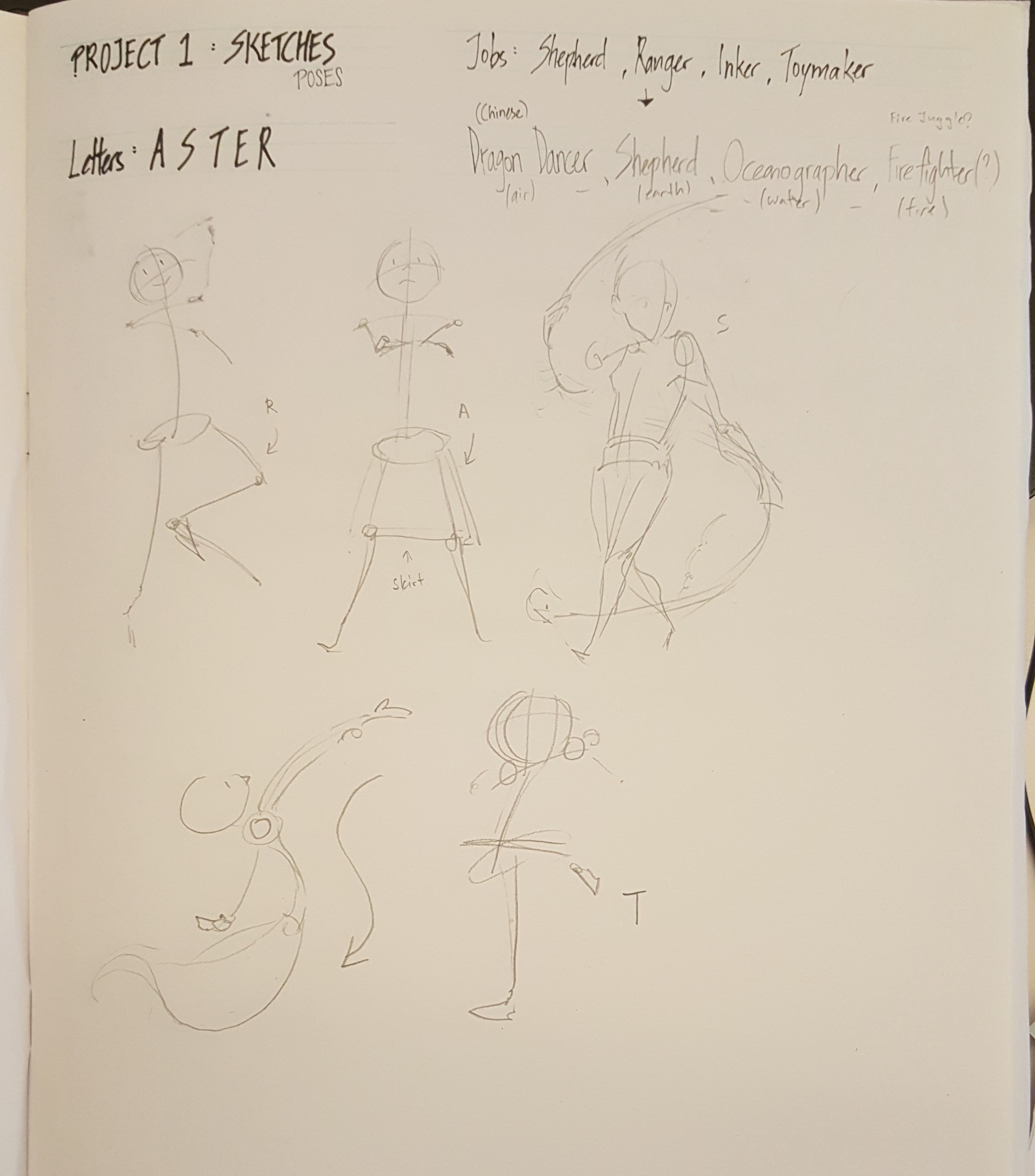
I decided to base my Project 1 on interpreting real life jobs as a utopian fantasy much like fantasy jobs such as Mages, Swordsmen, Bards, and more!
PROCESS
Sketches:
Deciding the occupations was definitely the toughest part of this project – but I didn’t expect sketching and composition to take so much time! It took me the entire Chinese New Year break (at the rate of approximately 1 drawing a day, at least) to complete the pencil work and line art.
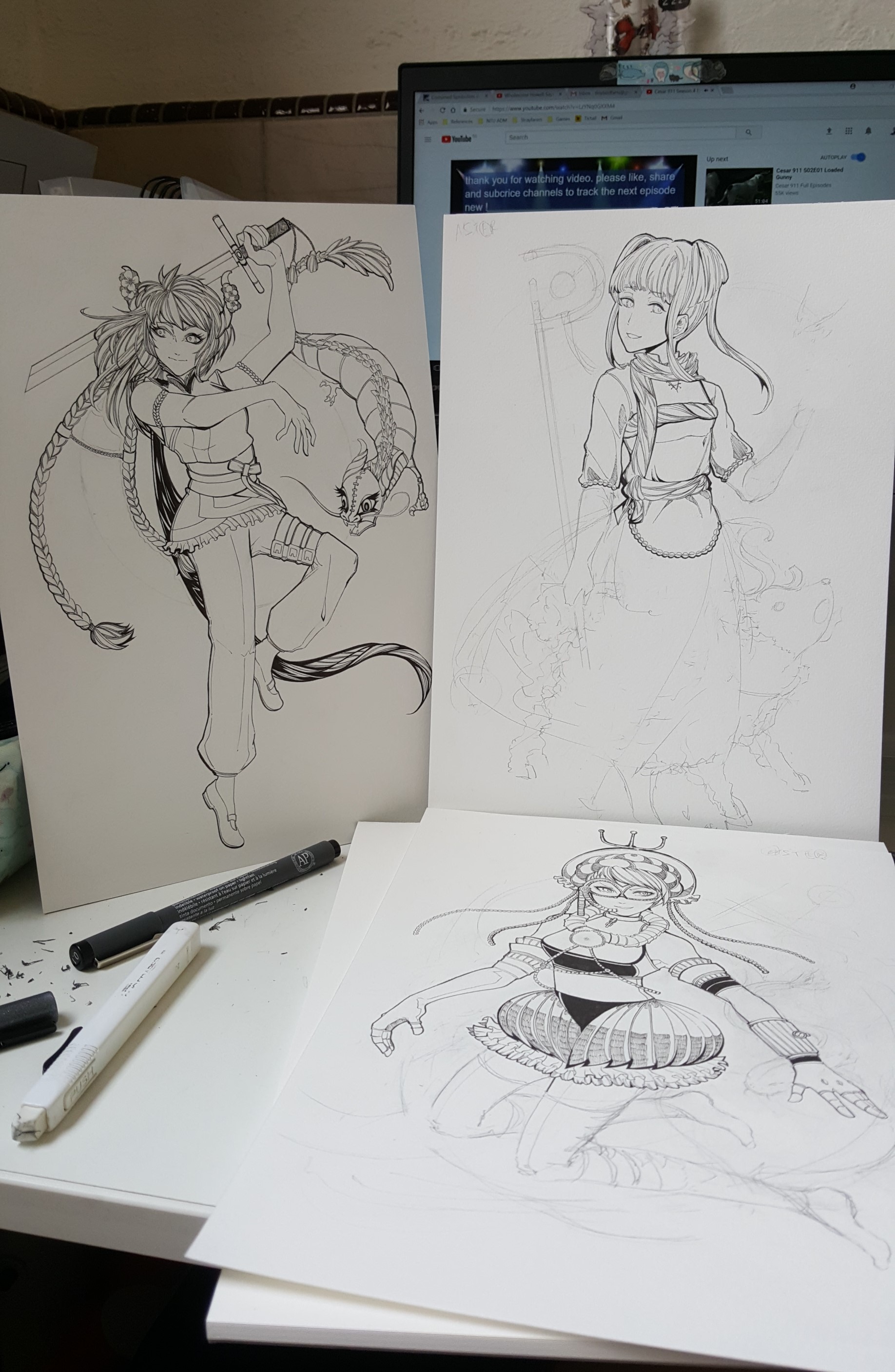
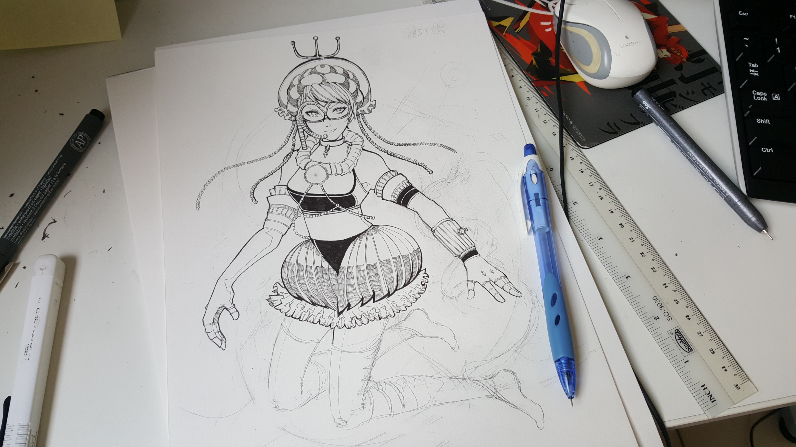
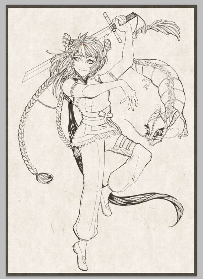
I proceeded to scan in the drawings and repurpose them into digital portraits for printing through Photoshop.
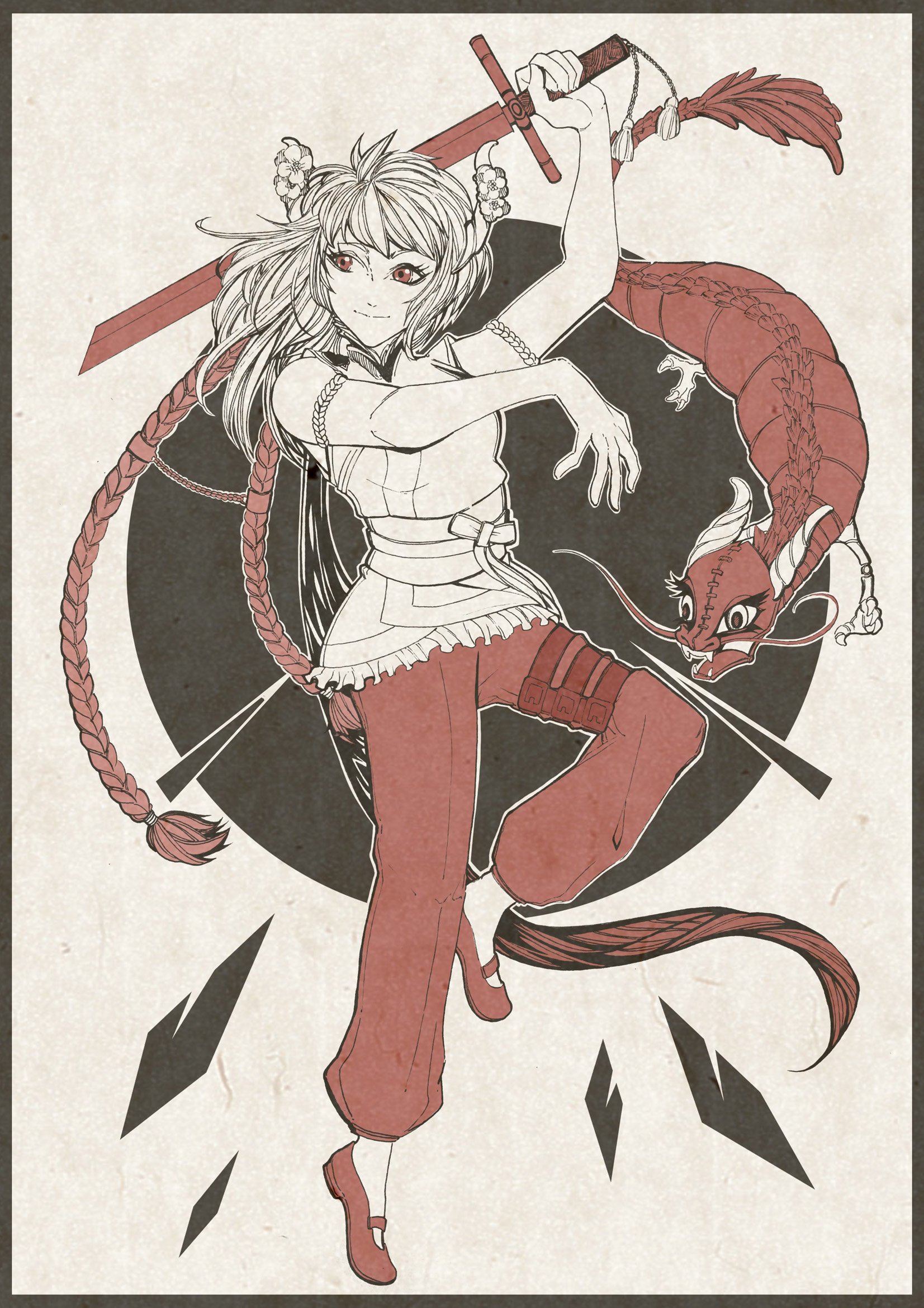
I initially planned for it to be monochromatic, but it didn’t turn out so well. After consultation, I decided to have larger percentages of color and…
It worked out decently – I think! 🙂
… now just need to repeat consistently for 3 more.
After finishing up the four portraits, I went down with Nic to Sunshine Plaza for printing!
My general concept for this project was to emulate a comic and game style for my images to link it to my narratives – which were alot about my daily life.
I wanted to go with an expression in comic art style – like how different artists for different comics could change the genre of the comic.
Some of the panels have an interactive element to it. (‘u’)✿
(The video is actually 20 seconds but YouTube is mean (;u;) There’s nothing but black for the rest of the last 3 minutes. )
(On a side note, it would be super cool to make GIFs for a school project next time ♡)
Here are my four sets of panels:
“Me, An Atheist” + “Cult of Corgi Butts” = “Suddenly Religious”
(Interactive Element: The white ring with planets extends outwards, to show that I’m free to think, and science is all around me.)
Materials Used “Me, An Atheist” : Sakura micron pens, watercolor on watercolor paper, wire + acrylic, gold foil, nail polish
“Cult of Corgi Butts” : Digital
“Suddenly Religious” : Sakura micron pens, watercolor, gold foil
Behind the Image I’d decided to use corgi butts as a topic. I’m a super huge fan of corgi butts, and converted because I like their short legs and fluffy butts!
I wanted to show my deep adoration for corgi butts like a religion – I fervently worship the fluffy butts, so I decided to convey these set of panels through inked pieces mounted onto a paper. I tried to convey a sense of 3D to make the portrayals of myself pop out – since I wanted to make it seem like a religion and about personal beliefs, which is very close to heart. The eyes are also cut out – transparent to reflect and mirror my heart and thoughts.
In the first panel and last panel, I specially wanted to show the noise of the world, and the contrast as it quietens down into singular devotion – hence the line of flowers.
For “Atheist Me”, I pierced a wire to imitate the rings of a solar system diagram, and cut small circular pieces. I then painted glittery nail polish on them so that they’ll be silvery and look like little moons and space-like.
Color Palette Selection and how it enhances message
I used analogous harmony for all three images- where the colors are right next to each other on the color wheel, and of the same-ish family (warm colors).
In ‘Me’, I portrayed myself in the colors of space (blues and blacks), as when I think of science, I think of space!
In ‘Setting’, I chose to portray The Cult of Corgi Butts in the color of a Pembroke Welsh Corgi (light brown). Also, I used light rays to show the ‘holiness’ of the cult, as well as enlightenment.
I used cool and warm colors to show opposing beliefs, and a change of cool to warm to show my change in belief and religion.
“Acrophobic Me” + “Room of Roaches” = “Up, Up and Away!”
(Interactive Element: Includes the door – Surprise! Roaches!)
(Interactive Element: The bird extends outwards, and flutters about when there’s wind or force. Inspired by stratosphere pictures.)
Materials Used “Acrophobic Me” : Sakura micron pens, watercolor on watercolor paper
“Room of Roaches” : Digital
“Up, Up and Away!” : Wool felt, watercolor, black Sharpie, wire
Behind the Image I’m scared of heights, but I’m more disgusted by roaches than I am scared of heights. (‘m’)
I’ve decided in “Acrophobic Me”, to portray myself as a chick who can’t fly even though I have nowhere else to go – and everyone around me is encouraging me to overcome my fear of heights. I used blue watercolor as clouds and mist, to convey morning and a sense of coldness – like getting cold feet.
I pierced the wire through the middle, much like the “Me, An Atheist” panel, and put masking tape on the bottom.
In “Room of Roaches”, I’ve decided to go digital and put a bunch of roaches on a floorplan of a house, to show infestation.
Finally in “Up, Up and Away!”, I felt that just a simple chick in space would not be enough to convey my urgency and fear. I decided to have a chick flying high above the clouds and beyond, with speedlines to show me zwooping out of Earth – unwilling to stay a moment longer.
I drew a chick and attached it on wire – it hovers/flutters when you move or blow at it (‘v’)
Color Palette Selection and how it enhances message
I used a triadic color harmony for the first frame, and monochrome canvas so that the colorful subjects would pop.
In ‘Setting’, I used monochromatic harmony for roaches – to show distance and alienation.
In ‘Result’, I combined the coldest color with black speedlines – to show the result of the roaches on my psyche – me leaving Earth for a better place.
Materials Used “Fearless Me” : Digital
“KFC – A Horror Movie” : Digital
“Cowardly Me” : Sakura micron pens, watercolor, watercolor
Behind the Image I usually just go for horror movies even though I’m scared of gore/blood. I wanted to go for the look of me a brave challenger (“Fearless Me”), and challenging a horror movie (“KFC – A Horror Movie”), transforming me into “Cowardly Me”, timidly peeking out from a low corner of the canvas and not wanting to be at the center of attention any longer.
Color Palette Selection and how it enhances message
For this set, I used monochrome scheme, with an accent (red or yellow (warmth)).
For the second image, “KFC – A Horror Movie”, I used blacks and reds to imitate the look and feel of a horror movie poster, such as movies like “The Amityville Horror”. Supernatural/horror associated with monochromatic scale (blacks – whites), and red with blood.
I wanted to do a contrast between “Fearless Me” and “Cowardly Me”, so I tried to contrast as much as I could. “Fearless Me” is done digitally, in mostly blacks and reds, and “Cowardly Me” is done traditionally on watercolor paper, to convey a softer and fragile side, almost as if to show that I turned “pale as a sheet”.
“Me, Out of Shape” + “Bus Leaving from the Stop” = “Suddenly Ripped”
(Interactive Element: You can rip the bus away – as if it’s moving away!)
Materials Used “Me, Out of Shape” : Sakura micron pens, copics, watercolor on watercolor paper
“Bus Leaving from the Stop” : Sakura micron pens, copics, watercolor on watercolor paper
“Suddenly Ripped” : Sakura micron pens, copics, watercolor on watercolor paper
Behind the Image I didn’t want to just talk about my personality and likes, and I felt like I wanted to convey something physical that I did on a daily basis as well – since that might be more fun.
I decided to choose me running for my bus as a setting – I have an affinity for arriving at a bus stop just as my bus is about to leave, and I end up having to run for my buses all the time.
I chose to change my art style to something more malleable, natural and expressive in this set of panels and looked through LINE’s stickers to get some inspiration – to show that my pudge is stretchy and I’m “Out of Shape” since all I do is just sitting around and drawing.
When I run for my bus, I get an adrenaline rush and it makes me feel super ripped and macho, so I decided to draw that literally in the third panel “Suddenly Ripped”. The adrenaline gives me a fake sense of accomplishment even though all I’ve done was just to run for a minute or so.
Color Palette Selection and how it enhances message
In this series, I decided to only color myself (the chicken) in the panels where the chicken appears in “Me, Out of Shape” and “Suddenly Ripped”, so that it would be all about my emotions, feelings and ego of being the only one that mattered.
I chose a monochromatic scheme, with the reds and yellows as accents to define myself. In “Bus Leaving from the Stop”, I used green to
Difficulties and Takeaways (Learning Points)
In this project, I experimented with exploring mediums and colors as a form of expression rather than consistency (mix of digital and traditional art). Hence, I decided I wanted to dabble in mixed media for Project Ego!
I tried doing the images individually and break out of the “same style” mindset in which I would only use either digital or traditional medium. I decided to jumble them up and do them randomly just according to the text I wrote, so that I’ll be impartial to the medium I used for each image as I wanted to fit my traditional works together with digital and see if they worked well together.
However, this experimentation didn’t turn out so well as the digital images looked like they fitted with other digital pieces, but not so much with the traditional pieces. They still kind of fitted, but just not as well as it would have if I had decided to render them all traditionally. It was a great learning point and I’ll be super to keep that in mind next time. (‘u’)
I felt that it was also a great lesson that gelled the technique of conveying a feeling (Project Emo) and a narrative/message (Project Forrest Gump). It was difficult weighing which was more important in Project Ego. At times, I felt that aesthetics should take precedence because I saw a section in the brief that talked about explaining colors. However, I finally decided that I would prioritize the narrative as my colors should revolve around my message. Using the first set as an example (Atheist Me -> Cult of Corgi -> Suddenly Religious), I had decided to match my colors to my state of mind and my subject, and it came quite naturally – probably more so than if I had planned the color scheme for the entire project.
While I felt like I could have done much better and I am a little regretful that I was not able to proceed with my initial plan of inking everything (like I did for “Atheist Me”), I do feel like having a deadline forced me to explore different art and coloring styles and forced me to explore alternatives, rather than just the normal monochromatic inking style that I was used to. I got to use some digital panels and explored colors mostly as accents and symbolic representatives of myself as a character as well.
Also, traditional art is extremely time-consuming – it’ll do me more good to plan more time for them and work on the sketches more consistently too! Cutting and trimming took more time than I anticipated since I cut all of them myself.
(My dad took a photo of me cutting my stuff at home!)
I’m insanely grateful for the fun consultation sessions and the wonderful 2D projects. I really hope to explore more in upcoming 2D lessons in the next semester! It was a wonderful experience!
I’ve made the final changes to the concepts behind the four designs! They’re now:
1. Me, An Atheist -> Cult of Corgi Butts -> Suddenly Religious
2. Acrophobic Me -> Room of Roaches -> Up, Up and Away!
3. Fearless Me -> KFC – A Horror Movie -> Cowardly Me
4. Me, Out of Shape -> Bus Leaving from the Stop -> Suddenly Ripped
Work-In-Progress
Other than the final concept changes, I’ve also worked on quite a few of the frames today. (‘u’)
My progress over the weekends went somewhat like this in the middle:
I know I photoshopped Colonel Sanders to look creepy but I couldn’t stand to look at his face at night so I had to cover up his face with some leftover pieces of gold foil because black, red with “October Crow” font is too much for me. (;u;) I can’t see KFC the same way again.
(This is terrifying to look at; I get a scare every time I step out for water and come back to see this on the floor)
But aside from that, I started work on the traditional pieces at my own pace after finishing up the digital pieces and printing them at Jurong Point.
Corgi butt is love, corgi butt is life (‘u’)
I also took a break (procrastination ;u;) and found out that pushing the color filter for my traditional mediums make them look so much better – especially analogous colors – for some odd reason. I was also wondering if the 3D element looked cheap, and I tried to filter and testing with Instagram’s filters.
The colors turned out super crisp and I liked the feel of it. It was really difficult when I was deciding if to scan, push colors and print it or to go with the original piece though. I decided to go with the original piece in the end for the presentation, since the organic feel of the drawing grew on me. I like original copies!
Also, here are some of the other panels!
I was inspired by some stratosphere pics! I really wanted to recreate the clouds so I decided to make this into a 3D panel, and make the clouds out of wool!
Drawing macho chicken
Generally for this project, there was more doing, rather than design changes, since doing my panels traditionally meant that my sketches had to count. I had alot of fun. I hope things turn out well! (‘v’)
Color Research
Last month when I worked on Project 2, it was Inktober.
This month, while we’re working on colors, it’s Huevember!
Rather than looking up old masters or famous designs, I’ve been wading through a bunch of amazing Huevember art and they’re absolutely gorgeous.
There are traditional and digital artists participating in Huevember, and alot of them apply color theories in very interesting manners, or select specific colors to focus on.
Huevember Challenge by Cylindric
There are those who use colors as a connecting factor in narrative (e.g. colored objects) and also those who use colors as an emotion (e.g. red as anger, blue as sadness, etc). I really enjoyed looking at some of these art, especially ones that look like tarot cards or card game art – because they look extremely well thought-out. They seem to carry an entire message or narrative within one image – I probably want to go for that style for some of my images too!
Other than Huevember, I did some research on Shepard Fairey too. He’s a contemporary street artist and graphic designer, and the founder of OBEY clothing. He works alot with black, white and reds, and dabbles alot in art regarding politics. I found this super cool since informative or propaganda always focuses alot on narratives! It was fun going onto TeeFury for ideas too. (‘u’)
Conceptualization
I previously got 3 out of 4 of the concepts approved, but I still wasn’t quite happy with them so I revamped them and came up with a different set – but I decided to keep the corgi one!
I’m still not quite sure if the new concepts will be solid at the moment, but here’s the list:
1) Atheist -> Cult of Corgi Butts -> Suddenly Religious
2) Big chicken goes “cluck cluck cluck” -> KFC Horrors -> A tiny chick goes “pi pi pi”
3) Fear of heights -> Room of roaches -> Outer Space
4) Happy birdy -> Zombie Apocalypse -> Happy Meal
I might still tweak some stuff, but there’s that for now! And also the paired sketches:
Layout Drafting and Sketches
“Atheist” panel;
I chose to depict myself as a chicken after gathering some feedback from friends – it’s probably my hair and how I whisper chicken into my friends’ ears all the time. (;u;)
But anyway – I chose to pair myself as a chicken zoomorph with the concept of the planets and galaxy around me. I’m hoping that it will show my appreciation of the beauty of, and the belief in, science and nature.
I’m planning to most likely ink this image after correction.
I quickly composed a digital draft as well for “Cult of Corgi Butts” as well. I’d most likely be drawing and inking this traditionally but I had a boat load of fun doing this panel – I LOVE CORGI BUTTS SO MUCH.
But anyway, I’ll be trying to work on more drafts over the next week or so. I’m really looking forward to working on them!
Conceptualization Booked a consultation with Shirley at 10AM – 10.30AM today; I managed to clear some stuff up and got some feedback for my sketches for my new Ego project!
My sketches were a mess (;u;)
Drafts that were okay-ed: 1) Godzilla Bird -> Gathering of Common Interest (Gathering of Small Birbs) -> Tiny Bird
2) Atheist -> Cult of Corgi Butts -> Suddenly Religious
3) I love inking! -> Social Media -> Tiny Bird F-Arts
Representations
I decided to represent myself as a bird, but not limit myself to any particular species. Birds are very special to me – they were the first animals I had a keen interest in, and at one point of childhood I kept some as pets. Even now, there’s a little bit of bird in my social media handle as well. (‘u’)
Style As for style, I feel like going with a mix of traditional and digital. I intend to ink traditionally, digitally enhance, print out and paint over.
Some of my inking art! 🙂
I plan to mix inking with watercolor, and may draw some hatching ideas from these to make my Ego frames!