Illustration for Designers: Assignment 3 (Process, Final Illustrations and Mock-ups)

My Event: A Prom for Supernatural Creatures

— The 4 Illustrated Items —

I think I went a little crazy working on this assignment.

Illustrated Item #1: Gif E-Invite (for humans), Physical Invitation Card (for supernaturals)

“Come to prom. Please.” – Spelltown Student Council

*Note: Stay for around 10-20 seconds on this image! 🙂

In an ideal situation in a supernatural junior college, they would probably receive an physical piece of paper with moving images like the newspapers/howler in the Harry Potter books. The next best thing to replicate that effect is probably a gif…


Illustrated Item #2: Prom King Poster

Illustrated Item #3: Prom Queen Poster

Illustrated Item #4: Sticker Set (Prom Favour)

“We’ve got all sorts of clubs – there’s something for everyone!”


— Mock-Ups —

Item #1: E-Invite (for humans) / Moving Physical Invite (for supernaturals)

(I imposed it to do a mock-up for how a student might receive the invite!) 

Item #2: Prom King Poster

Item #3: Prom Queen Poster

Item #4: Stickers (Prom Favour)

— Process —

I wanted to go with a very colorful/striking palette for this project!

In the previous post, I started with the stickers first to determine a narrative and look and feel for the rest of the assets (invites + 2 posters). Decided on a more comic book style and I was quite determined to illustrate as much as I can over the different assets so that they would all provide a different narrative over the different medias to tell more about the event!

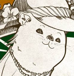
I started the Ken poster with Ken as a soft, fluffy boy (but gave him some fierce after Lisa said he wasn’t intimidating enough woops). I struggled with his ferocity quite abit…


Then there’s Circe the witch!


Ken and Circe have come very far indeed…

Original Thumbnails

I did the e-invite last even though it was the first thing I planned for in the series of assets. The e-invite was really fun! But also a pain because there were so many issues!

Edited comp from thumbnail (to fit square)

Invert checks

Still image

At this point, I already finished the poster and stickers so I already had a look I wanted to work off on, but I quickly realised that I’ll have to pay the price in linework if I wanted to add more animated elements. 🙁

I reduced the lines and number of tones to put the characters more in place with the background characters of both posters, but hopefully still in line with the look of the other assets.

COMEEEEE TO PROMMMMMMM… COMEEEEEEEEEEE

I initially wanted to use Live2D and break down the characters by body parts but Live2D crashed my PC multiple times… so I guess I’ll have to settle for Adobe’s animation timeline. This gif is 100+++ of layers and I had a major brainfart at some parts when I couldn’t find the layers.

I did a little ref to the standard animation for seaweed cycle for his wriggly tail hehe.

The pink demon’s skin didn’t export well – noooo!!! D:

There was also another issue with export because there were so many colors. So the colors exported all over the place and I had to try a few different settings. Thankfully I had some foresight to do the invite on a much smaller file (1000 x 1000 px) so that I could keep it a pretty small file and not have to deal with sizing issues – but still have decent quality to the illustrations eep. BUT ANYWAY, IT WAS FUN WORKING ON MOVING THINGS.

I did wish I have more time to bomb on paying more attention to color and linework and making them more consistent – but overall I was super happy working on this project since it was so fun!

— Links —

Assignment 3: Part 1 (Week 11-12 Progress): https://oss.adm.ntu.edu.sg/laum0005/illustration-for-designers-assignment-3-week-11-12-progress/

Gallery of research and past works: https://oss.adm.ntu.edu.sg/laum0005/illustration-for-designers-gallery-academic-blog/

Illustration for Designers: Assignment 3 (Week 11-12 Progress)

Assignment 3: Week 11 – 12

I was a little stuck between a tea party for witches or a prom for supernatural creatures ( or even a zombie body parts auction my brain is poot). I went with the prom in the end!

Selected Event

Prom for Supernatural Creatures

Target Audience User Persona

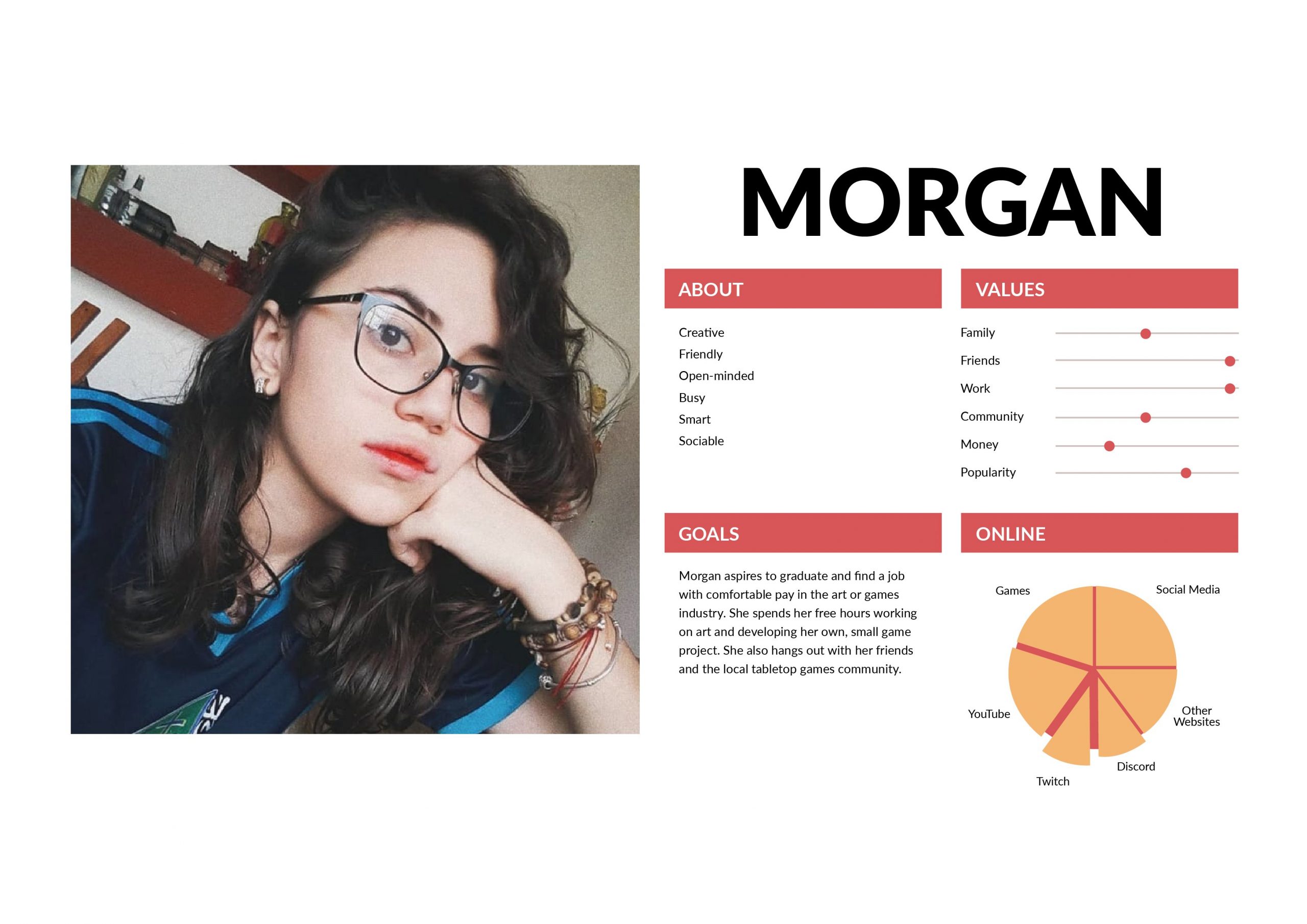
I created two user personas – one specific to the event and the other is a real life user persona.

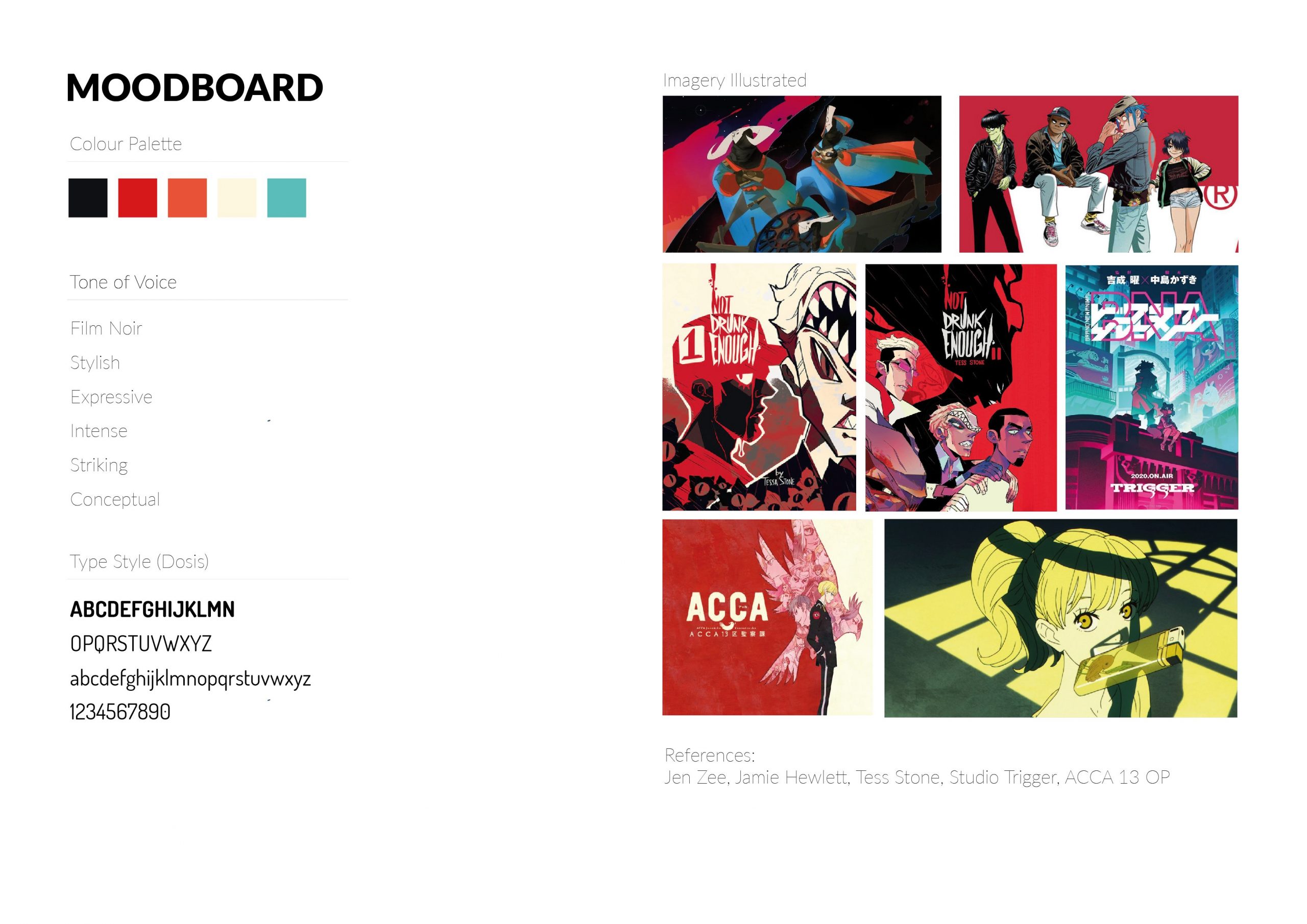
Moodboard

Since I went with the prom idea, I looked back to my unused moodboard from Assignment 2 that I really liked and found would fit the event really well. I wanted the prom to be dark, but still ultimately fun, teen and wholesome!


Research & Mind-Map

I dumped a bunch of things onto the mind-map and tried to see what I could use – since the creatures and their representations would set the tone of the party and items.

I imagined myself in the shoes of the student council/staff in order to try to figure out what assets would be needed for a prom… and did lots of research since I went to poly and not JC, so I’ve never really gone to a prom myself. (I will live vicariously through this project I guess)

16 Thumbnail Sketches

Stickers Thumbnails:

E-Invite Thumbnails:

Prom King/Queen Poster Thumbnails:

Warning Poster Thumbnails:


Conceptual Visuals (Pencil Comps)

I decided to stick with these 4 items for the finals:

  1. Sticker Pack (Prom Favour)
  2. E-Invite (Gif, because moving items look magical!!!)
  3. Prom King Voting Poster
  4. Prom Queen Voting Poster

Honestly I’d make all the assets move and breathe if I could but I’ll do the e-invite first… and see how about the rest. :’)

I started working on the stickers first since it would be the easier asset to use to visualize what a school of supernatural creatures would be like – their clubs, facilities and space!

Here are some work-in-progress items:

Got some feedback from Lisa that it might be better to simplify since the details may be lost at a smaller sizing (smoke strips/claw), so I removed them and strove to do the other stickers in a similar vein.

Final Compositions (Asset #1: Sticker Pack of 5)

Sticker #1: Bone Hockey Student Club

Joining costs an arm and a leg

Sticker #2: Poisons & Venoms Student Club

Tasters get extra CCA points

Sticker #3: Spelltown Junior College Student Council

Working day and night to enhance your student life

Sticker #4: Student Welfare Committee

For the bleeding hearts


Sticker #5: Theatre Student Club

Cultural diversity!

I want to join the wing brigade. :’)

Illustration for Designers: Assignment 2 Final + Process (Varoom)

— FINAL —

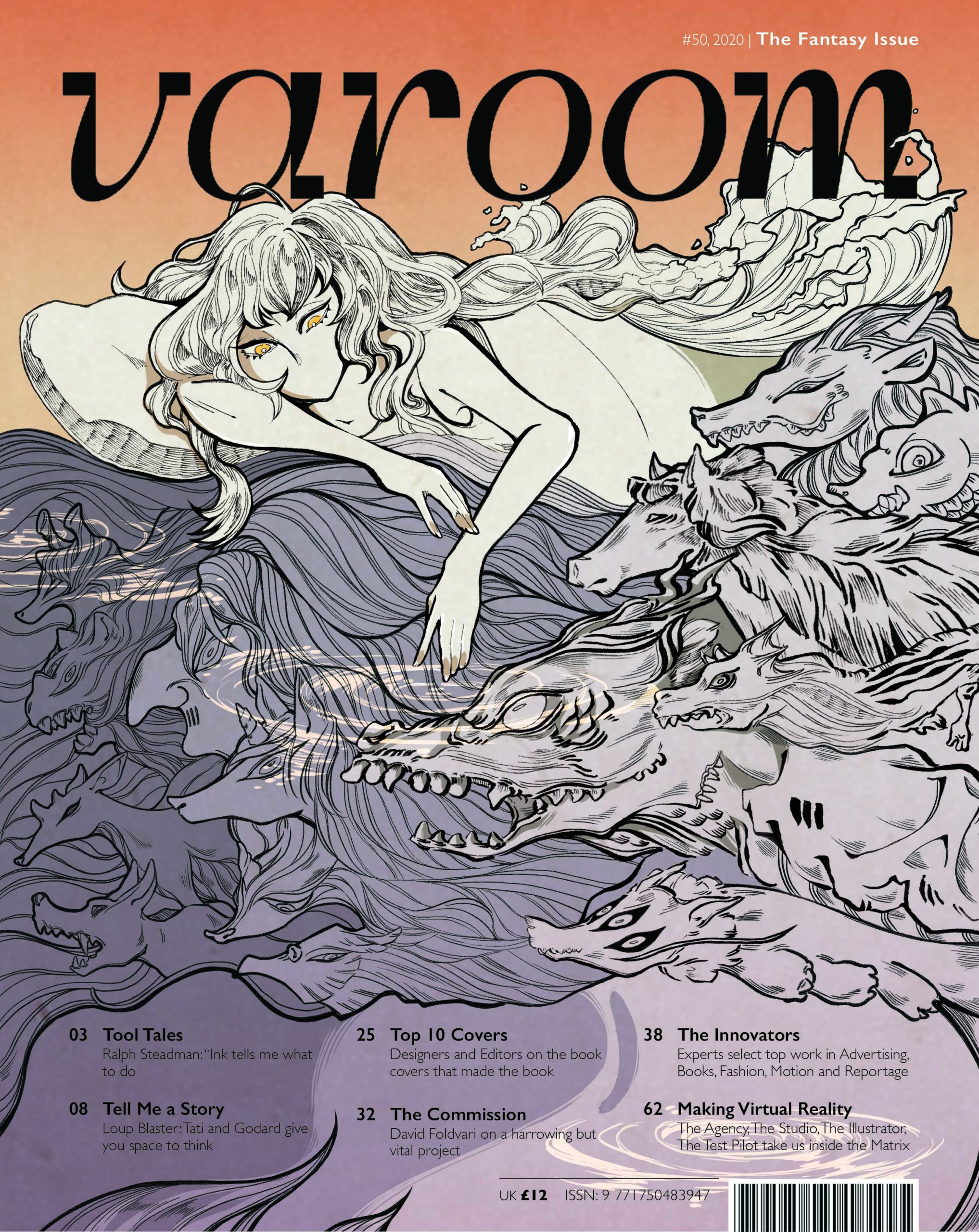
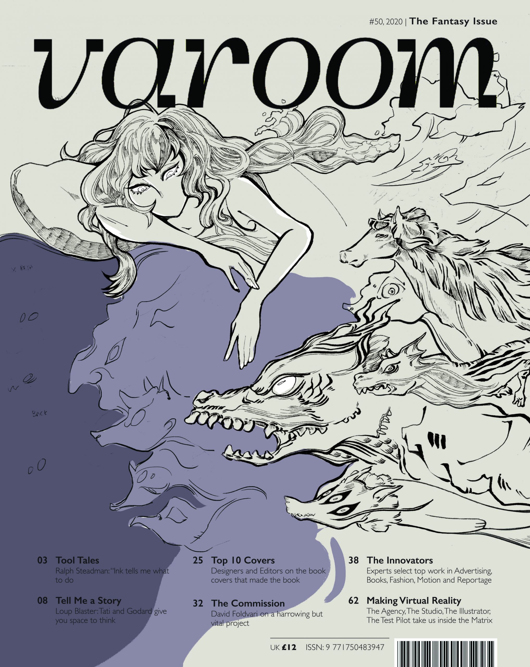
(1) ILLUSTRATION ON VAROOM COVER

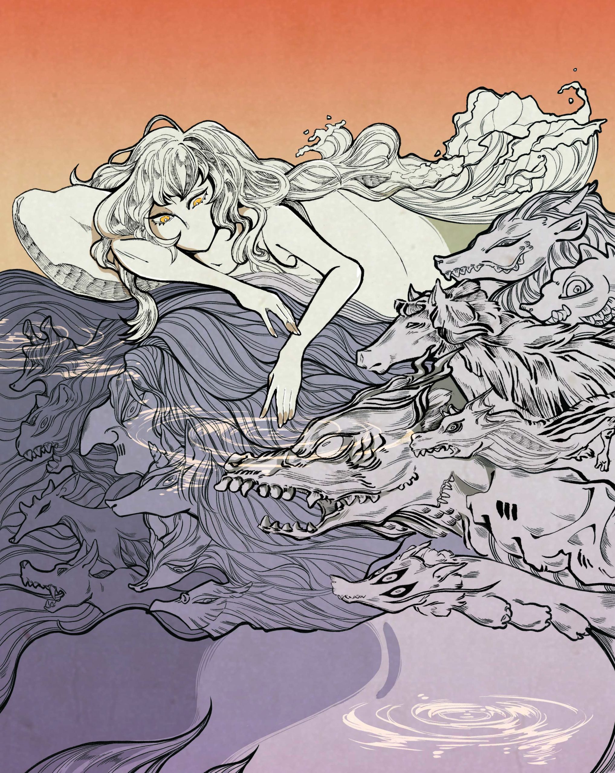
(2) ILLUSTRATION ONLY

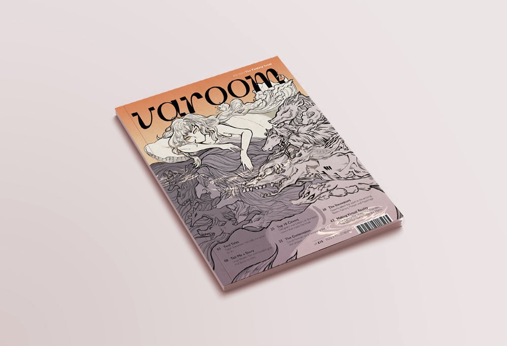
(3) MAGAZINE MOCK-UP


(4) CONCEPT: POLARITY

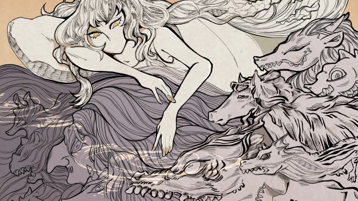
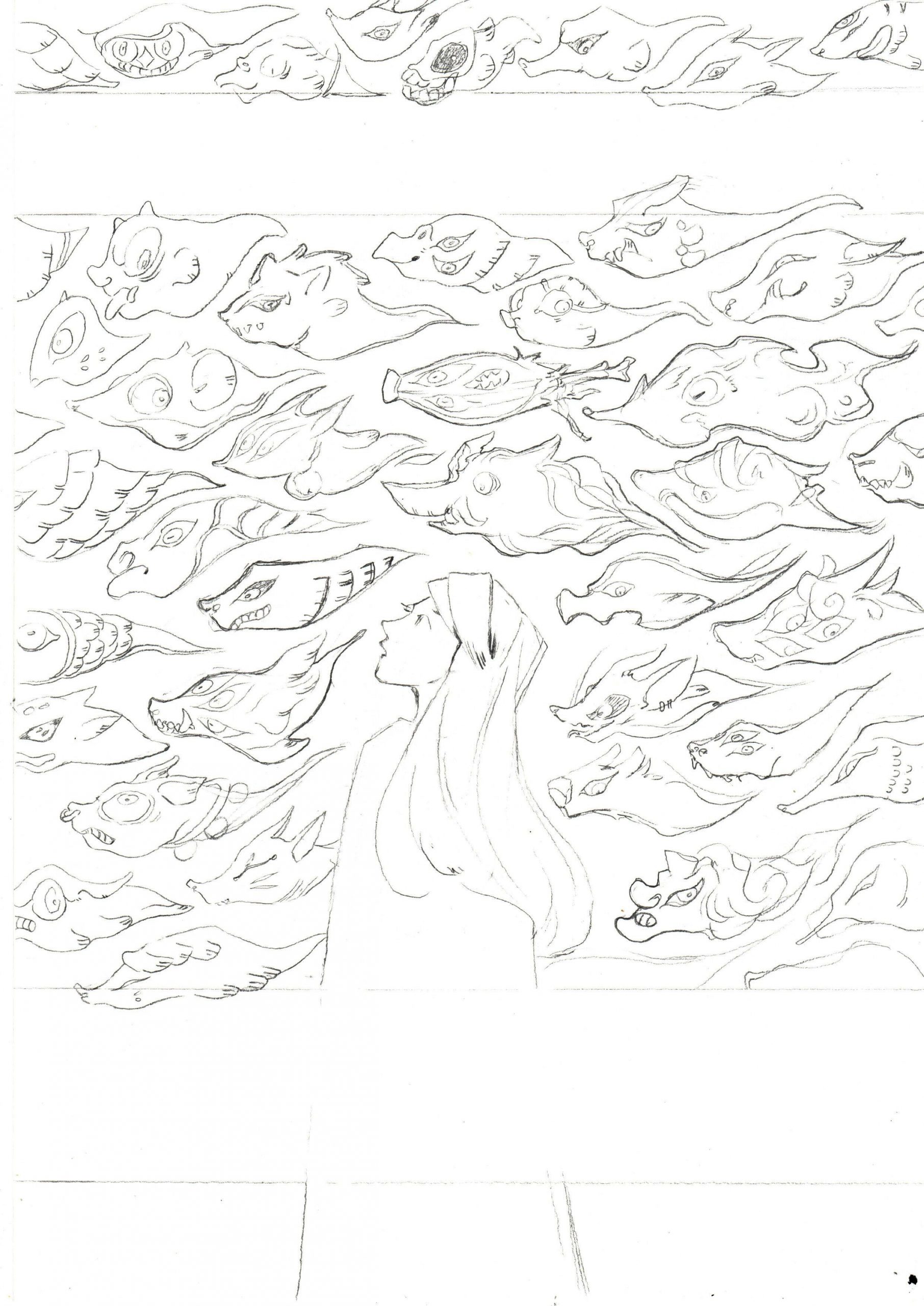
I chose to expand on the thumbnail that featured a composition of a girl in a bed, with monsters swimming under her bed. The composition was first inspired by the state of dreaming and the idea of having ‘monsters under your bed’.

I chose to integrate water as an essential element as to me, water is a symbol of great change and polarity (life and death, benevolence and ferocity). This reflects my take on fantasy where alot of elements and ideas are taken to the extreme (good and evil, poor and rich, colorful and colorless).

Towards the end of the illustration, I also decided to leave out the mouth of the girl to convey restraint when staying on the side of reality – since the image is split into dual halves: orange half symbolizing reality and purple half symbolizing fantasy.

For references, I looked into Hokusai, Zaodao and a few other Asian artists because they were great influences in my artistic journey.

I took this chance to review some of the text in their art books to check out their working processes. An interesting tidbit I found:

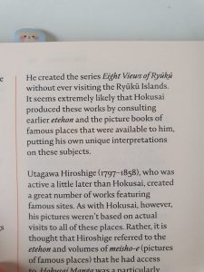
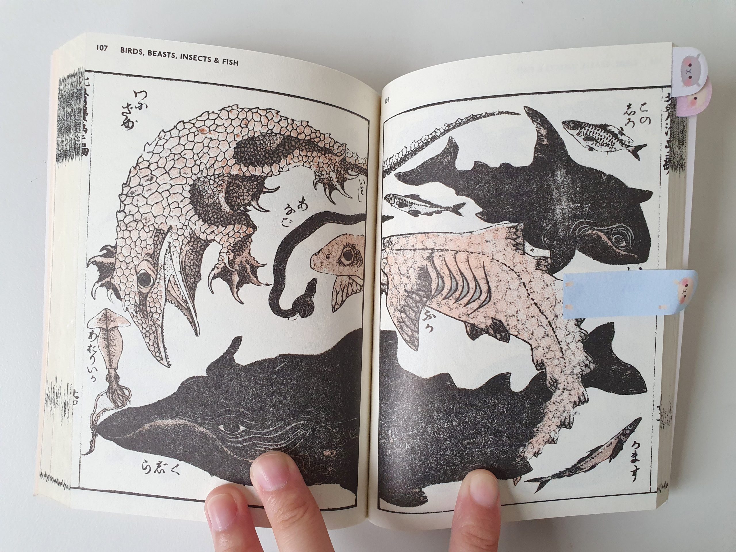
An excerpt from Hokusai’s sketchbooks: The Wonders of Nature

I found out that Hokusai wasn’t a very well-traveled man. His lack of travel and getting information from sources around him (picture books, etc), however, contributed to the bizarre nature of his creatures and fantasies.

Other than artist research, I also drew inspiration for the creatures from the animals at my house right now like:

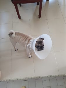
My sister’s pug, Pepper

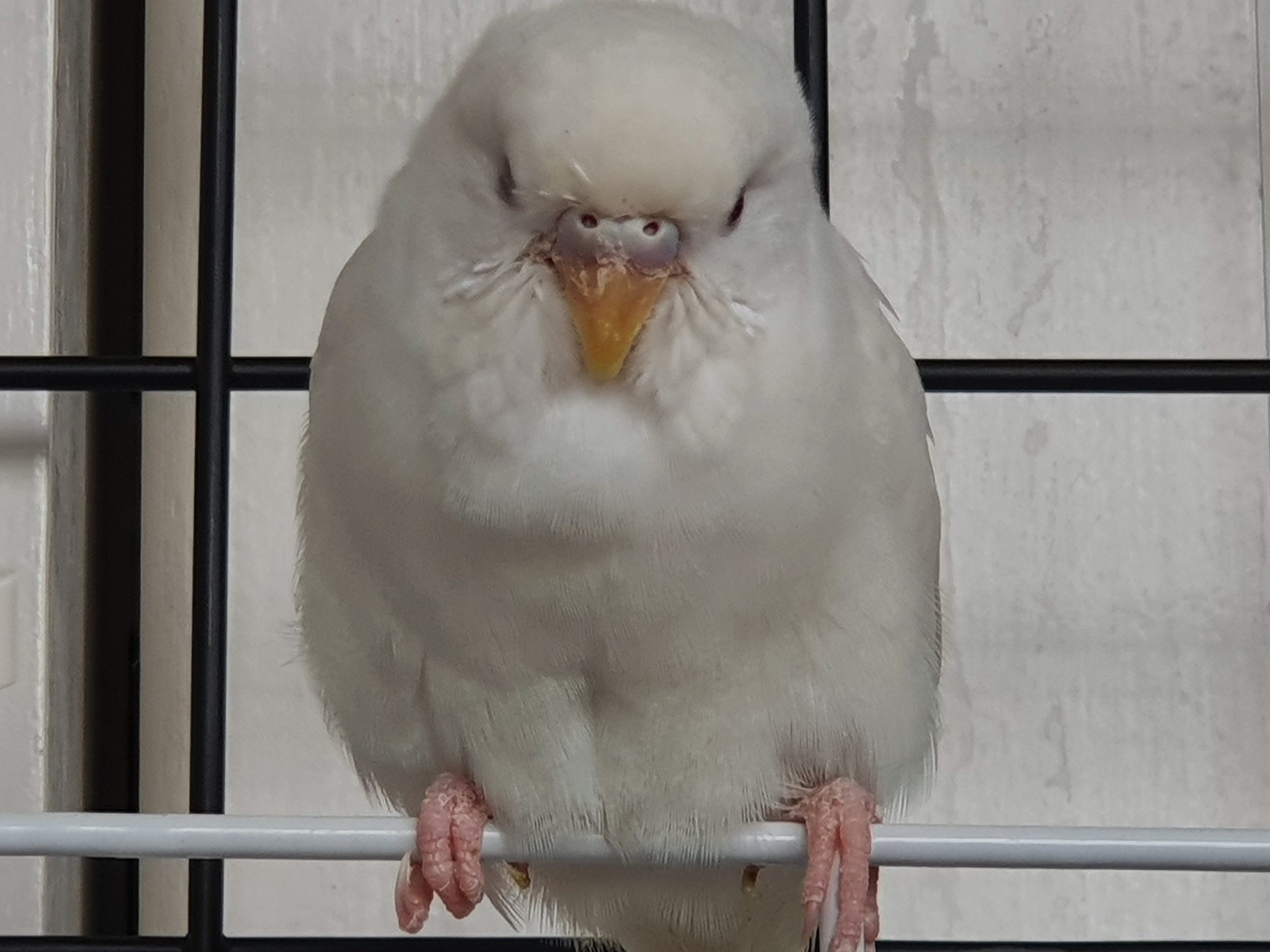
My budgie friend, Ginko

Pepper had alot of folds and wrinkles in her face and was the major source of inspiration for the brush pen in my drawing to achieve texture and volume in the creatures! Ginko (and Hokusai) was good reference for the fierce look and textures of the creatures.

(5) MEDIUM

The tools I used were: Micron pens (0.03mm – 0.1mm), Brush pens, Adobe Photoshop (with natural brush textures) and Adobe In-Design (compilation)

— WORKING PROCESS —

(1) USER PERSONA & MOOD BOARDS

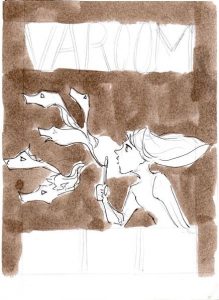
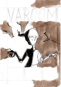
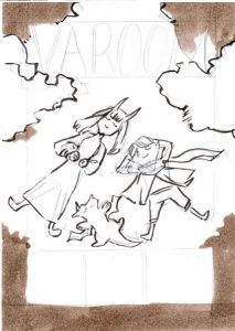
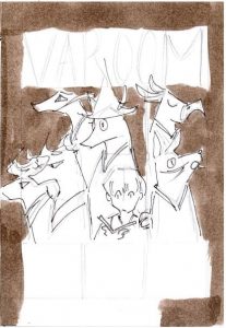
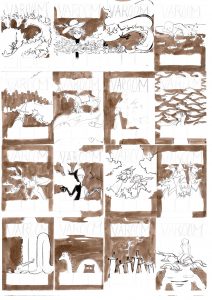
(2) THUMBNAILS

My 16 Thumbnails

Thumbnail #1: Hero and dragons

Thumbnail #2:Wearing fantasy


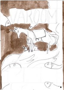
Thumbnail #3: Traveler and a twisting dragon


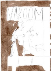
Thumbnail #4: Sleep

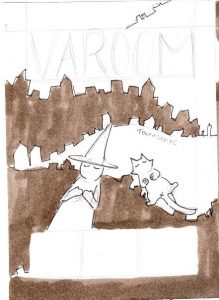
Thumbnail #5: Witch, her Cat and the City 

Thumbnail #6: Traveler and her sea


Thumbnail #7: Thinking

Thumbnail #8: Spirit Parade

Thumbnail #9: Bubbles

Thumbnail #10: Day and Night

Thumbnail #11: Dreaming with friends

Thumbnail #12: Things around You


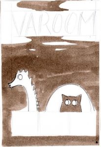
Thumbnail #13: Cat and Twisting Dragon


Thumbnail #14: Loch Ness and Cat

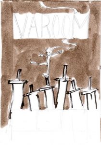
Thumbnail #15: Swords

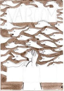
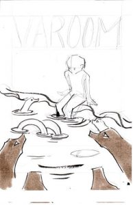
Thumbnail #16: Sea of Monsters

Concept behind the thumbnails:

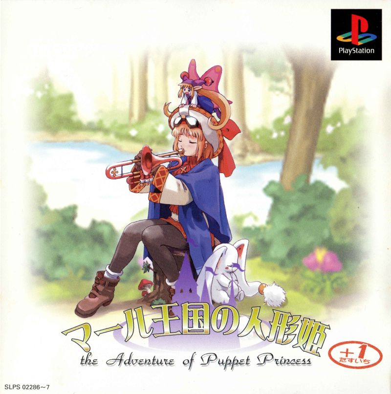
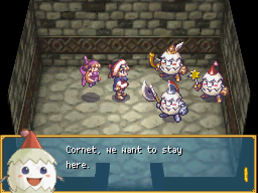
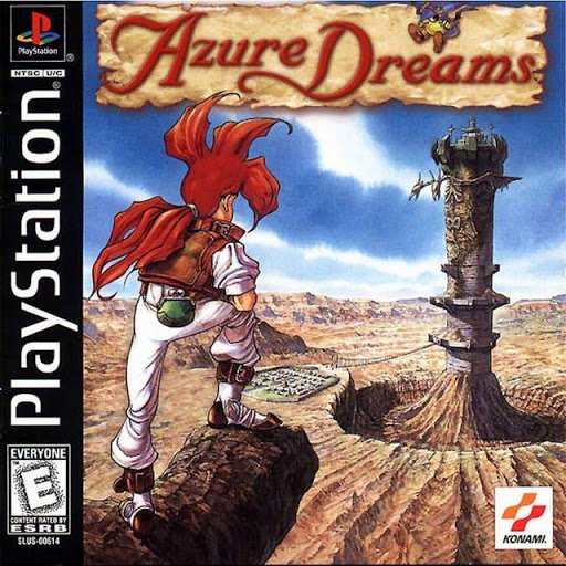
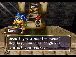
My thumbnails were generally based off on my experience with the fantasy genre (in games and novels). During the thumbnailing process, I focused alot more on creating visually interesting compositions and not so much about the individual concepts. When I think of fantasy, I think of fantastical creatures in my childhood. I loved monster-taming games like Pokemon, Rhapsody: A Musical Adventure and Azure Dream.

Rhapsody: A Musical Adventure

Rhapsody: A Musical Adventure (Gameplay Screenshot)

Azure Dreams

Azure Dreams (Gameplay Screenshot) 

My thumbnails generally revolve around animals as friends and companions, or creatures as an anthropomorphized aspect of myself or a journey to overcome. As a kid and teen who never traveled much last time, these creatures were simultaneously my best friends and worst fears at the same time because I could relate to them in stories but they also confronted things and concepts I didn’t have much exposure or access to – such as responsibility, power, loss, and more.

This was also why I related to the passage in Hokusai’s sketchbook since he lived in a time where the world was not so accessible yet and had to rely on his imagination to fill in the rest – which made things alot more polar and led to the creation of extremes, absurd creatures and concepts.

(3) PENCIL COMPS

The three chosen pencil comps after the thumbnail feedback session are as follows:

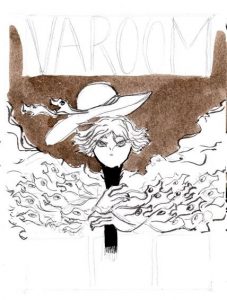
Pencil Comp #1: Spirit Parade


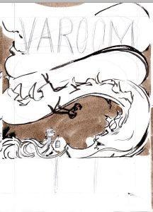
Pencil Comp #2: Traveler and a twisting dragon


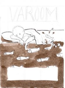
Pencil Comp #3: Sleep

(4) WORK-IN-PROGRESS

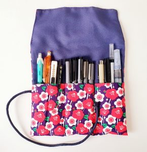
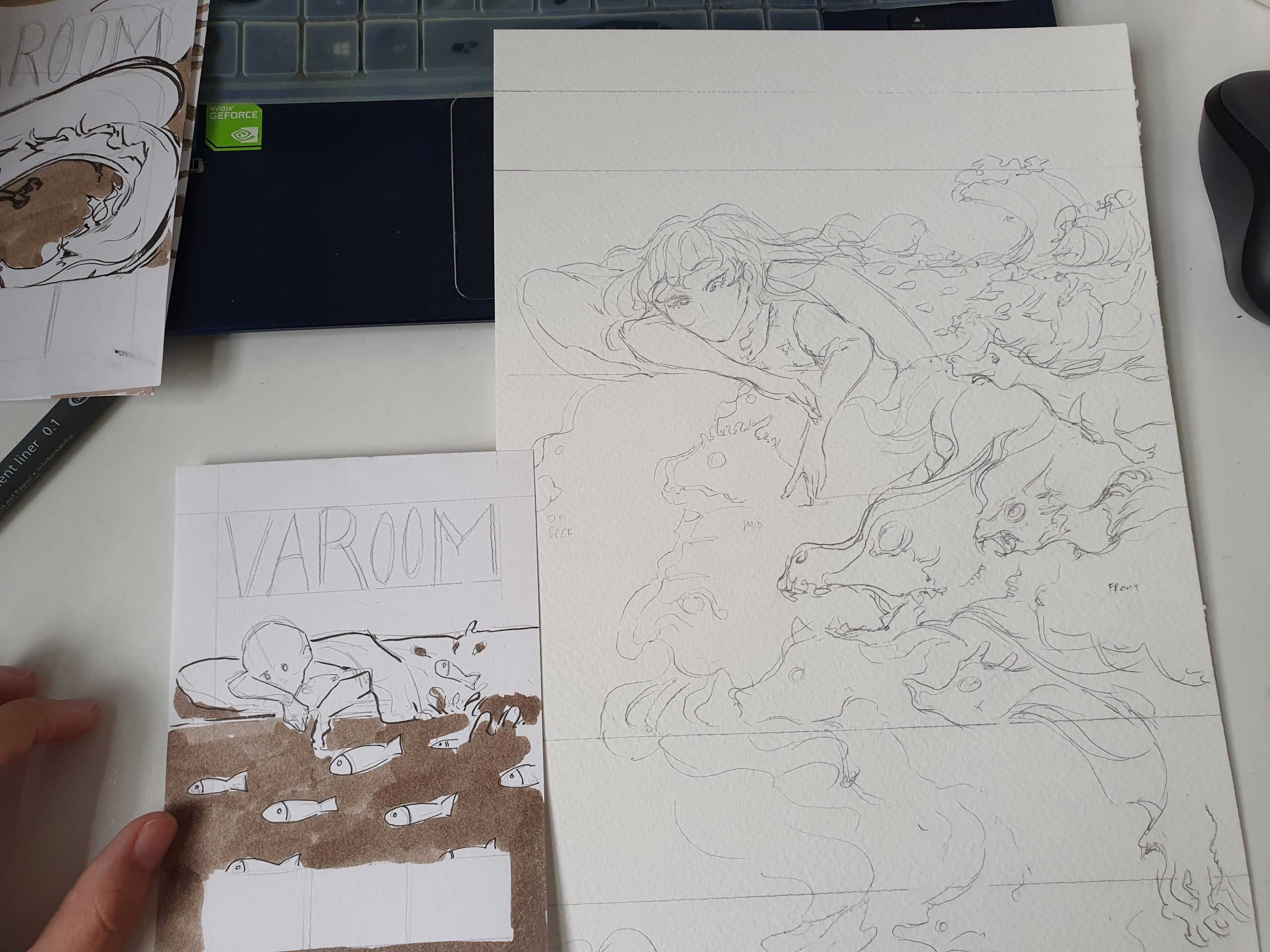
My materials

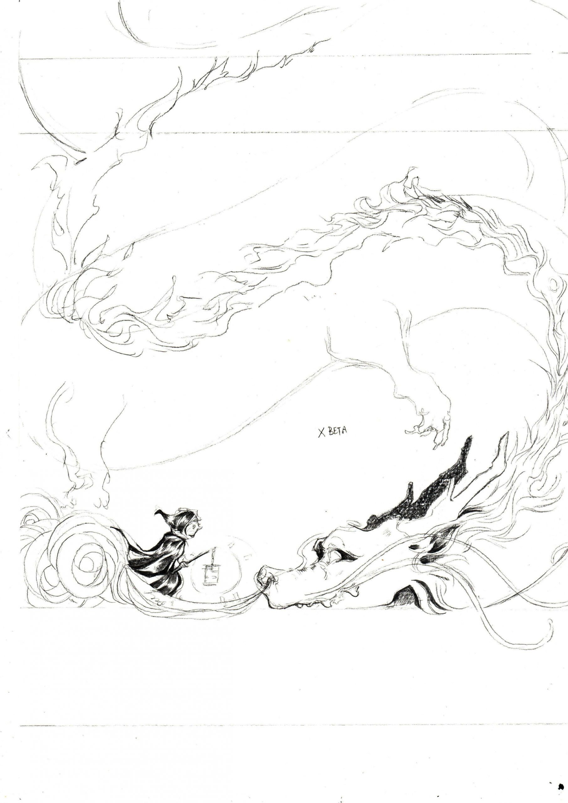
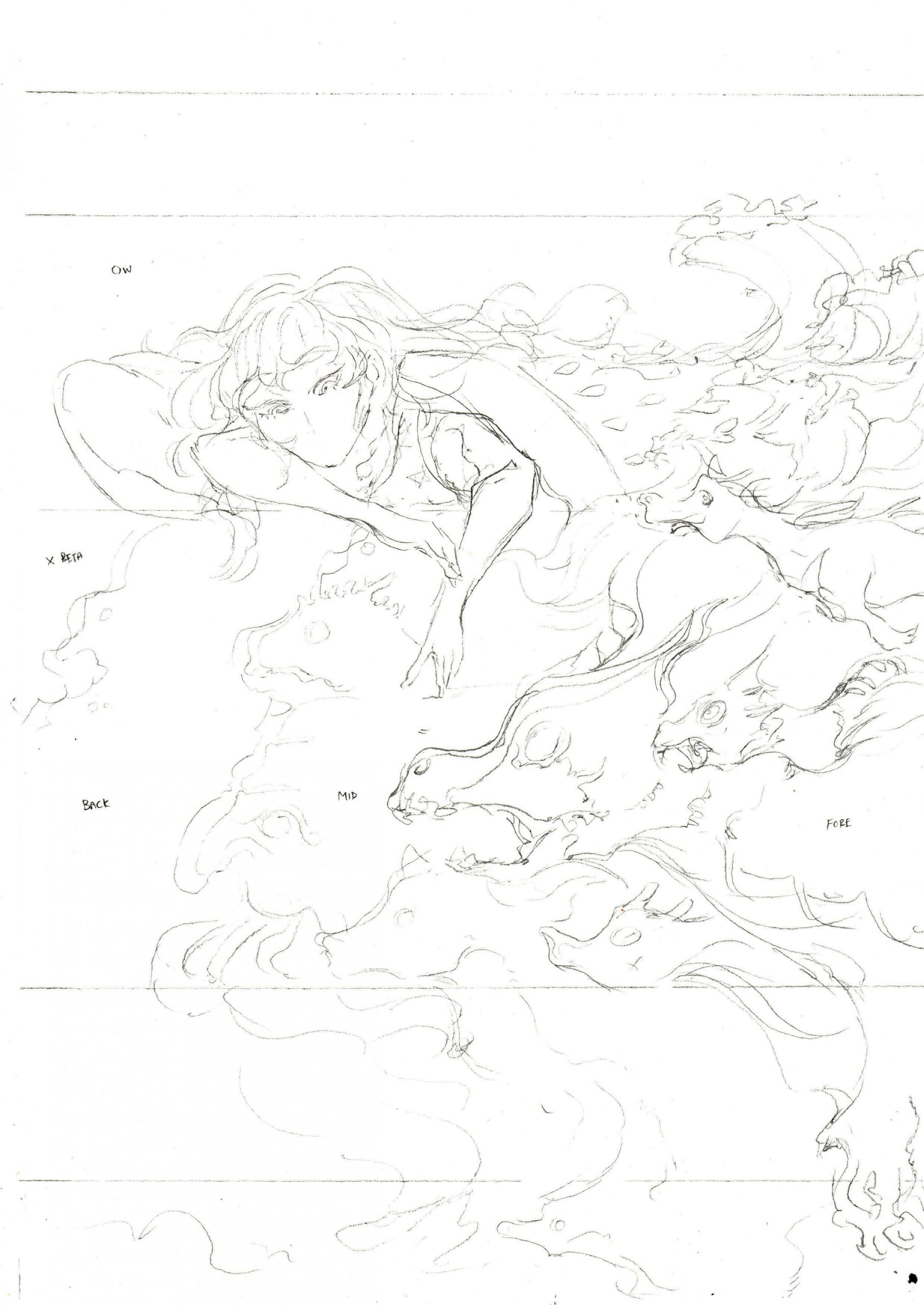
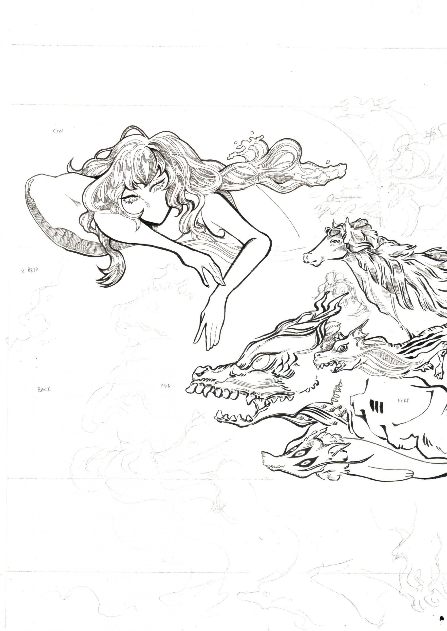
I worked directly on the pencil comp with black brushes and microns, before scanning in the drawing, increasing the contrast to extract the black lines.

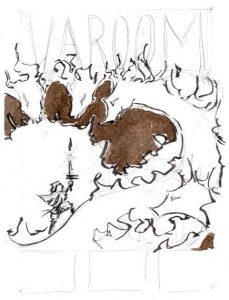
From thumbnail to pencil comp

The pencil and ink scan


Initial draft for Week 9 review

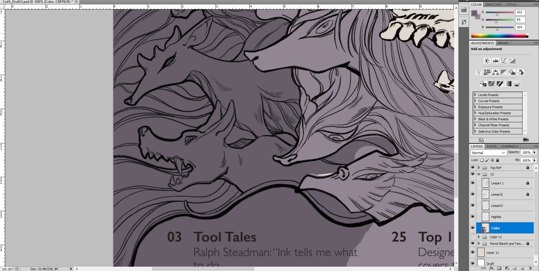
I filled in the rest of the rest of the image digitally on Adobe Photoshop and also filled in the purples and orange/yellows to work out the composition!

Adobe Photoshop: continued work-in-progress

Final – overlay with paper texture

Link to Varoom Research: https://oss.adm.ntu.edu.sg/laum0005/illustration-for-designers-varoom-artist-research-week-5/

Illustration for Designers: Varoom & Artist Research (Week 5)

Activity 1: Varoom Articles

About Varoom Magazine:

The Varoom magazine is a biannual publication by the Association of Illustrators. The magazine features insight and analysis of the illustration, design and animation industry, with content such as interviews, recommendations as well as commentary. Each magazine’s illustrated content come from a variety of artists and revolves around a singular theme.

Varoom’s latest Fantasy issue

What type of information is in the magazine?

As an example, the latest issue Fantasy features articles on games, graphic novels, the TV series Game of Thrones, Ram Han and all that is related to the fantasy genre or fantastical in nature.

What do I find inspiring?

The variety and freedom in stylistic choices employed by the artists who have contributed to Varoom is amazing!

Who’s the target audience?

Art enthusiasts, educators and practitioners


Selected Articles:

(1) Hail Herman Inclusus

The article is about Herman Inclusus (Stuart Kolakovic) and the inspiration for his style – traditional Christian manuscripts, icons or Islamic miniatures. The content explores his rebirth and discusses what he derives and gleans from these traditional works.

It also announces how Lichen, his graphic novel, marks the end of his past aesthetic choices and also his shift into his identity as Herman Inclusus, as well as what that means for him.

The article shows a complicated bond between one artist’s identity and their influences – how their influences and growth would show in their choice of aesthetic style and subject matter. The content is great for people who are interested in his personal influences and where his motifs are derived from.

(2) Cloak of Fantasy

The article excerpt is an interview with Victo Ngai on her art creation process.

It provides insight to her personal journey and steps to art-making – such as how she goes about conceptualizing for the image and her thought process and influences (stage play).

The article is wonderful for those seeking to go into a similar field of work or to achieve a similar art direction or struggling in the same format that Victo Ngai works in. Alternatively, it is also good for people looking to change certain aspects of their production to organize their personal working processes.

For enthusiasts, it promotes Victo Ngai’s work as the article features a work that the network of Game of Thrones commissioned her to illustrate. Those who have watched Game of Thrones, in turn, would be drawn in to know more about Victo Ngai.

Activity 2: 3 Artist Research

(1) Victo Ngai

What do you find inspiring?

Her works are intricate, colorful and gorgeous. The way she seamlessly integrates traditional and digital mediums to make use of the strengths of both mediums (the raw intricacies of traditional, and vibrant colors and clean look of digital) is extremely inspiring for myself as I love working traditionally but struggle to find a way to reconcile it with digital programs after scanning it in.

What mediums do they use?

Traditional, Digital

How do they creatively interpret the text for the article?

The article The Burden of Beasts discusses the surging population of donkeys and how they are being relocated. The illustration by Victo Ngai represents this as huge human hands picking up the donkeys and their fences, signifying human intervention.

Victo Ngai’s way of depicting the literal in a serene but intricately illustrated scene makes the content look like a tale out of a storybook and creates intrigue with how ridiculous, but elegant it looks.

(2) Tess Stone

Hanna Is Not A Boy’s Name, a webcomic by Tess Stone.

Comic panel from Not Drunk Enough

What do you find inspiring?

Tess Stone has gorgeous comic layouts, harsh colors and and hand lettering that makes every page and panel exciting to read. There’s no wasted element, and the characters and text complement each other extremely well as both their designs carry a similar intensity in the types of lines used (generally with thicker/harsher shadows on characters and good line weight distribution between what’s focused/not in focus).

What mediums do they use?

Digital

How do they creatively interpret the text for the article?

Tess Stone is a comic artist and writer with very cool character designs, hand lettering and color design for his comic pages. In terms of interpreting text, Tess Stone is amazing at delivering the speech of characters and sound effects that gives text just as much animations as the story’s characters do.

Other than the text, the panels (dividers) add so much value to the delivery of the story as well with how they are designed in each page!

(3) Tatsuyuki Tanaka

What do you find inspiring?

Tatsuyuki Tanaka is an illustrator, concept art designer and animator. He known for many things – some of them being key animator of the Japanese animated movie Akira and being part of an animation team called Genius Party responsible for a series of extremely interesting and exploratory animations.

Genius Party: Dimension Bomb

I find that his works are incredibly detailed and he’s able to deliver subtle commentary about the current state of the world through his works. His personal works are interesting because they don’t seem to deliver the message directly, rather, his image builds up an environment that allows you to establish your own set of expectations (dystopian, post-apocalyptic) and your imagination/speculation provokes you to make something out of the images he provides.

What mediums do they use?

Digital, Traditional

How do they creatively interpret the text for the article?

He has done quite a covers of short novels. A running theme in his art are clutter, the mechanical and a universe that seems almost dystopian/post-apocalyptic. His palette is also muted to highlight the excessive detail in the linework (backgrounds, subject matter).

From these three covers, two of them feature the world of the novel and one cover is more character-centric. Personally, I find that the interpretation of a scene with the setting featured as ‘the character’ (the main subject) quite creative as it provokes alot of speculation and work from the reader’s end through creating many points of interest (since there is no living subject to instantly create a bond with).

Link to Assignment 2 (Final Artwork + Process): https://oss.adm.ntu.edu.sg/laum0005/illustration-for-designers-assignment-2-final-varoom/

Illustration for Designers: Assignment 1 Final & Process

Assignment 1: Final & Process

Context: (1) A portrait of a friend and (2) a self-portrait

(1) Portrait of a Friend (Quistina)

Interview Q&A – A summary
Qn 1: What kind of animal most represents you?
Ans: Mix of panther and/or deer. She admires the strong, head-fast and intimidating qualities in the panther. She can also be nice, so she compares herself to a deer as well. 🙂

Qn 2: If you could live on any spot on Earth, where do you want to live?
Ans: Finland – because it’s the happiest place and she wants to find out what makes the people in Finland happy even though she has no idea what’s going on there. She likes hot weather, and also said she prefers the seasons spring and fall.

She also mentions that while she’ll have a house somewhere to park at, she’ll also ideally get to travel to many places.

Qn 3: What’s the most memorable (or your favorite) book/film/media you’ve read, seen or experienced?
Ans: Pan’s Labyrinth, the Hunger Games series and similar fantasy fiction/fiction with dystopian universes. She enjoys media with strong women characters, and them stepping up for a good cause and stand up for themselves. She also appreciates a good romance. She also mentions that she treasures kindness and sincerity alot.

“That’s my safe space; I can be whichever narrator/character I choose to be.” – on the fantasy genre.

Pan’s Labyrinth has alot of metaphors that she enjoys (the psychological aspect). She also emphasizes on her appreciation for the duality and balance within the media she consumes.

Qn 4: What’s something that always gets you or makes you laugh? (OR What brings you immediate joy?)
Ans: She makes herself laugh sometimes. Food (Boost) and people she loves (her family and her partner). Also a highly sensitive individual, so she treasures personal time, peace and space.


Research, sketches and drafts

I did some studies of the panther before going into the drawing, and exploring how a panther could represent family, closed ones and warmth. I felt that the panther would be sufficient in representing Quistina’s strength, warmth and also kind/gentle qualities. I did abit of looking into Alphonse Mucha and cheesy fantasy novel book covers for the layout.

Alphonse Mucha’s Dance (1898)
Link: http://www.alphonsemucha.org/dance/

Eye contact/facing each other seems to be a common theme in novels of the romance + fantasy genre

I started off my sketch traditionally with pens and brush pens on bristol paper before scanning it, extracting the black lines and moving in to fill in the larger black areas digitally.

I chose to do the subjects in traditional medium as I felt that the micron and brush pens’ created lines and hatching would be able to create a unique texture that could express the fantastical and fictional aspect of her better.

Sketching and inking traditionally!

Scan

Tradigital draft for consultation


Final Portrait and Concept

Final Piece
Mediums: Copic Multiliners (0.03-0.1), Brush Pen, Adobe Photoshop

I based the portrait on the composition of fantasy novels and chose a more decorative way to frame the piece. The two panthers are based on her and her warm bond with the people around her who are her guides and people she want around, and how she really looks to them for acknowledgment and rely on them.

The flowers are based on some common flowers of Finland (such as petunias) where she really want to go, and also how she really wants to travel and be surrounded by nature. The quiver and the panther’s robes are to signify adventure, courage, strength and her journey.

(1) Self-Portrait

Interviewed my friends and myself to know myself better and also about what others thought of me (because I believe that my friends shape me the most as well)

Interview Q&A – A summary
Similarly to Quistina, I answered my own questions but also asked my friends to pair adjective+animal/object to understand how I came across to others. I found out that it wasn’t really helpful.

Screenshot of friends who tried their best

I’ve always been a visual person, so I decided to leave it at that and just move on to do some soul-searching in my sketches instead.

Back to the self Q&A!

Qn 1: What kind of animal most represents you?
Ans: Probably birds or animals with terribly awkward faces. I can relate to the birds’ anxiety, restlessness and the thing I can’t deal with the most is boredom in my life. I often can’t sit still as well. I also use bird as part of my social media handle.

Qn 2: If you could live on any spot on Earth, where do you want to live?
Ans: Probably some ulu kampung that’s close enough to a city. I want the peace of a kampung but the convenience, amenities and most importantly good post offices and medical facilities. I think it would be most ideal for me to live in a place that lets me travel between both.

Qn 3: What’s the most memorable (or your favorite) book/film/media you’ve read, seen or experienced?
Ans: Games has affected me alot in life. My biggest influences are games such as Final Fantasy 9, Kingdom Hearts and Shadow of Colossus. Most of them are epic games of the fantasy/dark fantasy genre (quite similar to Quistina actually! I also love Pan’s Labyrinth).

I love fantasy, the escape, the adventure and I think that’s why I sometimes consider myself and situations in 3rd person. I do find myself ‘gamifying’ things sometimes as well. I really appreciate the values that games have taught me – such as the importance of friendship, diligence and also alone time.

Qn 4: What’s something that always gets you or makes you laugh? (OR What brings you immediate joy?)
My friends! I love it whenever people talk to me about their personal comic/game projects, whacky ideas, or my project as well. Especially when they draw my original characters – it makes me absolutely crazy happy for many weeks and months to come. (never fails)

My pet budgie also makes me laugh alot.

There was a couple of days where I only changed her food, water and cleaned her tray because I was busy with work… One day I came back to her growing a beard…
(actually it’s just a loose feather that was stuck on her chin)

Research, sketches and drafts

I was very inclined towards the idea of comics and games but I wasn’t super attracted to the mechanical aspect of games so I almost immediately tossed aside the idea of using mechanical things in my self-portrait. I was alot more drawn to the storytelling and characters. I explored a few of my favourite JRPG game covers (e.g. Final Fantasy 9, Tales of Symphonia, etc) and thumbnailed a few compositions and did some other rough sketches too – of anthropomorphic birds representing facades of myself.

Drawing grass and also manually doing the stroke for the image

As the project brief was alot about inanimate objects, I decided to look into using silhouettes and shadows as representations of my mindspace and motion.

Final Portrait and Concept

Final Piece
Mediums: Copic Multiliners (0.03-0.1), Brush Pen, Adobe Photoshop

I did my self-portrait after Quistina’s but stuck with the same mediums, except relying on Photoshop more for this piece.

The main motifs in this piece are anthropomorphic bird shadows, the cat skull, foliage, seal/gate and fire.

The bird shadows represented the different roles I see myself fitting into when I’m in different situations (with family, with close friends, with school, etc). To me, shadows represent the notion of always being in flux and dancing around. This is similar to the fire in the eyes of the cat skull – I feel like I’m always moving, always changing and I’m glad for this because my biggest fear is being bored.

I always occupy myself with something, like with drawing, with picking up a ton of random things like Japanese, calligraphy, Russian, archery and more. I tend to start them alot, but the only thing I really go back to is drawing, the rest I tend to just start, drop, and sometimes go back to them.

About the puppetry and shadow motif – I’m always blown away by how different wayang kulit is in different parts of Asia, and the amount of meaning in the visual motifs. Currently, I’m also actually working on my own pet project that’s based on Southeast Asian art in my own time because I’ve grown to appreciate Southeast Asian art and shadow puppetry quite alot and I hope to study them in greater detail. Shadows also mean alot to me because the games that have impacted me alot in my life [Kingdom Hearts(2002) and Ico(2001)] both have very meaningful enemies based on shadows.

Screenshot of Kingdom Hearts’ battle gameplay:
Fighting the shadow enemies called Heartless

Part in Kingdom Hearts 2 opening where they cut through the Heartless
Link: https://youtu.be/rgCSgNakvlo?t=160

Another Heartless variant

Ico’s game cover – a super gorgeous and haunting game I played as a kid!
Ico Trailer Link: https://youtu.be/DTweY16e3W0?t=37

Ico’s concept was very inspired by metaphysical paintings too, so just like in the metaphysical paintings, shadows serve as very meaningful motifs in the game as well.

This links to the skull and the foliage, which to me, represents the back and forth between life and death. I usually see representations of death as a symbol of change in my life – such as fall, skulls, skeletons, tarot-stuff and all. The skull also represents a gate of trials of some sort for myself because I find that I’m always looking for validation from my close friends regarding my personal improvement when we talk about our projects and stroke each others’ egos.
I sometimes find that I have terrible relationship with validation and anxiety because I want to be acknowledged and at the same time I don’t want to be rejected. Logically, I know failure is the best way to improve so I constantly try to find a way to balance that relationship with movement and diligence in order to stay sane. The birds reflect that inability to stay still and my personal insecurities, but also my want to be free from these emotions and have fun doing whatever I want to do.

The bird shadows are anthropomorphic because I started off by basing them on different facades of myself if I were to be a game character – me as a ‘Hero’ to tackle my own problems, a ‘Healer’ to my friends when they need me, a ‘Mage’ when I’m tackling commissions and at conventions, and more.

I did try to imagine myself with more inanimate objects but I found it really hard to relate to (e.g. my friend’s cucumber suggestion, game consoles, etc), so I ultimately went with skulls, shadows and plants instead.