Aster: Graphic Form Gallery

Project 1

I expressed the characteristics of 4 ideal jobs interwoven into 4 characters, based on Japanese game concept art!

Link to Project 1 Outcome: https://oss.adm.ntu.edu.sg/laum0005/graphicform-project-1-part-2/

Project 2 Part 1 (Locale)

I did research on Sungei Buloh Wetland Reserve and created 4 pieces of infographics with the collated data featuring anthropomorphic characters and a layout inspired by the reserve!

Link to Project 2 Part 1 Outcome: https://oss.adm.ntu.edu.sg/laum0005/graphic-form-project-2-locale-2/

Project 2 Part 2 (Zine)

Based on Sungei Buloh Wetland Reserve, I created an 8-page zine personifying the emotions and experiences of the 7 senses!

Link to Project 2 Part 2 Outcome: https://oss.adm.ntu.edu.sg/laum0005/graphic-form-project-2-part-2-zine-2/

Graphic Form Project 2 Part 2: Zine (´・ᴗ・ ` ) (Research & Process)

Early Concept Ideas

This was the first two pages I created for this concept – based on how I could tell the information in the signs at the wetland reserve. I wanted to tell the information of the nature reserve through containers at the reserve. (Or was it the information of the signages of the nature reserve through marks at the nature reserve?)

Anyway, I think I overcomplicated the criteria for myself and got myself so confused with the zine criteria. I had a difficult time working with this, so I decided to take a step back and review what I could do with a zine and with my location.

Early drafts

start over with my concept based on my 7 senses – which I felt was closer to heart.

Research for 7 Senses

I decided to think about the fundamental elements of a zine (8 pages, etc) so that I could tap on the elements of this zine’s criteria and go on to  personifying the 7 senses.

I decided to draw inspiration from the moon gates that you can find in China or Japan. These doors are found in gardens and I think it’s interesting because of how it controls what you can see of the garden and how it creates a very curated scenic view!

Image of a moon gate (Japanischer Garten).

Image of a moon gate by Alec Finlay.

I also did some research on parts of the eye and how the eye worked:


There was an interesting article I read about ‘forbidden colors’: red-green and yellow-blue. This was an excerpt:

“While most colors induce a mixture of effects in both sets of neurons, which our brains can decode to identify the component parts, red light exactly cancels the effect of green light (and yellow exactly cancels blue), so we can never perceive those colors coming from the same place.”

I decided to experiment with these basic colors for my concept later on.

Zine-Making Process

Conceptualizing

As mentioned, I had alot of difficulties working with my initial concept and decided to revise and start the conceptualizing stage over. I decided to piece the format and each piece together a little by a little, standardizing that the ‘focus’ would depict the physical sight I saw/experience I felt, while the ‘peripheral’ would express my emotions towards that impression, emotions and the location.

Early revised concept:


Motion blur for movement!

Creating Focus: Photo Manipulation

Started off with making trippy images out of the photos that I had of the most impressionable parts of the wetland reserve!

From this:

To this:

Lily Pond (Hear):

After that, I used Audacity to play an MP3 of the video of the lily pond sounds, and screenshotted the soundwaves of the place to impose it and create a pattern for ‘Hear’!

Golden Orb Spider Silhouette (Touch):

I made a spider wallpaper. 🙂

And the aquarium image I used for ‘Smell’:

Warping the image of berries (Taste):

Proprioception (Spatial):

All:

I was really surprised when I placed all the layers together and they looked like a painterly Sungei Buloh! (‘o’) I did receive feedback during consultation that it looked too green – like it was too much slanted towards the pages ‘Balance’ and ‘Hearing’ because it was very green and yellow.

However, I do want to slightly draw it back to my visual experience at the location, so I wound up trying to work around the proportion of green instead.

During the early consultations, I also made the choice of including words because I was worried about how the zine has to be a ‘show-don’t-tell’ book – but I was informed that we’ll be explaining our zines, so I decided to just take out the explanatory content completely.

Early draft with caption

Creating Peripherals: Mark-Making

I couldn’t take anything from the site for mark-making, so I decided to take more photos and recreate them instead!

Honestly they look nothing alike HAHAHA.

The wings that took the most effort but also looked the most hideous.

This one’s based on the shadows of leaves!

My hand is my mood – icky.

I THINK IT’S READY???

Also – other marks that I tried with gouache and rope but didn’t work out so well.

Ripple marks didn’t end up being very suitable either. :’)

Intended to draw a structure to impose for every piece but it didn’t work out very well aesthetically, so I just extracted the flower in the middle to use as a mark instead.

It was pretty challenging working with the concept and timeline, but I had alot of fun. To view the outcome of this project, go to ‘Project 2 Part 2 Final Design’! 🙂

Links

Project 2 Part 2 Final Design: https://oss.adm.ntu.edu.sg/laum0005/graphic-form-project-2-part-2-zine-2/

(Previous) Project 2 Part 1 Process & Final Infographics: https://oss.adm.ntu.edu.sg/laum0005/graphic-form-project-2-locale-2/

References

Moon Gates: https://insteading.com/blog/moon-gate/

Image of moon gate: https://upload.wikimedia.org/wikipedia/commons/d/d6/Japanischer_Garten_IGA_Rostock.jpg

Parts of the Eye: https://lookafteryoureyes.org/how-your-eyes-work/parts-of-the-eye/

Graphic Form Project 2 Part 2: Zine (・∀・*) (Final Design)

Final Pages

My concept is ‘If Senses could See’.

I wanted to take advantage of the fact that the zine is a visual look-book and I decided to personify the senses (excluding sight).

Our seven senses, based on 7 Senses foundation.

I based my individual page format on the idea of having a clear ‘focus’ and a blurred ‘peripheral’ – much like an eye. The circle in the middle, ‘focus’, depicts the best physical impression, and the ‘peripherals’ are expressed through marks that I create based on aspects of the wetland reserve.

Each page is broken down into a single color to convey the idea of isolation and the solitary sense. More about the color choices will be explained under the ‘Color Meanings’ section!

Overall

Page 1: Front Cover (all senses)

Concept: A compilation of all the other senses fused/imposed into a single piece – If you had all your senses, this is what you would see! I wanted to convey the idea of the eye and have the other emotions creeping into the circle of vision.

Execution: The cover is in monochrome to show the all-encompassing nature.

Page 2: If Hearing could See

Concept: In the ‘focus’ circle, I have the image of an edited lily pond because that was the most impressionable sound! My emotions are expressed through the wings – to express the beat, rhythm and lightness of the sounds there. Overall, I also wanted to convey how otherworldly the place looks – therefore making the image feel a little like a moon or little planet!

Execution: I imposed a picture of the lily pond that I took at the wetland reserve and imposed it with the sound waves of a video I took at the pond there. Inspired the wings of the birds and the map of their migratory patterns, I used them to express how the the sounds there have a rhythm that comes and goes when you are in different parts of the nature reserve. The background is also part of the lily pond, but out of focus.

Page 3: If smell could See

Concept: The wetland reserve smelled very thickly – of animal waste, heat and also my exhaustion. Walking alot generates saliva and foam in your mouth and also makes breathing difficult. I felt that the best way to convey that is through mud and water.

Execution: I took a picture from the Visitor’s Center Aquarium for the ‘focus’ circle in the middle – frosted glass effect to show murkiness and crack lines to show even though the environment around me is seemingly crisp and refreshing, experiencing it for yourself is actually kinda harsh.  The ‘peripherals’ are from a picture of a mudskipper photo to show the effect of thickness and choking – I’ve used ink and soap foam to mark-make the thick consistency of mud.

Page 4: If touch could See

Concept: The most impressionable experience I had of touch was almost walking into the Golden Orb Spider the size of my palm! The spider makes its web really low so it made me feel a little paranoid throughout my walk – because there was alot of them.

Execution: I took a photo of the Golden Orb Spider that I had and created a pattern out of the shape of the spider, and half-toned to create the paranoia and feeling of ‘there but not there’. I used ropes to feel how I felt super paranoid and confined by my own impression of how tingly and itchy the place made me feel after my encounter with the spider. The ‘peripherals’ are the environment where I found the spider.

Page 5: If balance could See

Concept: The most impressionable feature when it came to balance was the Mid-Canopy walk – it was very jiggly and it gave me motion sickness, but yet it was a really fun walk!

Execution: The photograph in the middle is edited from a Mid-Canopy walk photo. I used motion blur and tried to find the right balance of movement that matched the video I took of my experience on the bridge. To show my motion sickness, I replicated the lines from meandering waters and ripples at the reserve. There is also an imposed falling flower to express how motion sickness causes an illness and causes the sick feeling of wanting to throwing up.  Green is also the color of nature/good health but also of sickness.

Page 6: If taste could See

Concept: I based it on the berries I found at Sungei Buloh. Despite being inedible, I imagine that they would taste refreshing and juicy, like the breeze at the reserve. The small little berries seem like they’ll go pop in your mouth – which gave me a sort of crystal/gem-like feeling because they look like tiny treasures.

Execution: To show the gem-like quality, I used the clean, crisp cut of leaves to express the refreshing quality of fresh berries and breeze. This page faces Proprioception, because it’s the only sense that doesn’t help you to perceive a external sense of space, which contrasts with Proprioception.

Page 7: If proprioception (space) could See

Concept: To express proprioception as the sense that controls other senses and a spatial interpreter. I decided to find the place that gave me the best sense of place and made me extremely self-aware of how small I was standing in the wetland reserve.

Execution: The central circle is a manipulated photograph of one of the most stunning shots I have of Sungei Buloh Wetland Research – the open roof of a viewing pod. I chose the roof because it made me feel short and small.

For my feelings, I imitated the outline of the lily pad (rest spot for frogs!) with copic pens – to emulate the small frog-in-well feeling.

Page 8: Back Cover (Absence of senses)

Concept: An amalgamation of my emotions at Sungei Buloh Nature Reserve. I wanted to express it as ‘my mind’s eye’ and a party/firework of senses, therefore it’s an abstraction of lines and colors, and does not contain any photos.

Execution: The back cover is created purely out of the previous marks I’ve made for the other senses, on a black background with the stone path texture from Sungei Buloh’s entrance.

Color Meanings (in order of pages)

White: All-encompassing (reflection of all colors when the eye is open)
Yellow:
 Sense of Hearing (Sharp)
Blue: Sense of Smell (Deep)
Red: Sense of Touch (Agitation)
Green: Sense of Balance (Yellow + Blue = ‘balance’ between the light, uplifting sounds and heavy, drowning scents)
Purple: Sense of Taste (Red + Blue = ‘taste’ is only possible through interacting with ‘smell’ and ‘touch’)
Orange: Sense of Proprioception  (Yellow + Red = ‘hearing’ as the uncontrollable input from the distance, ‘touch’ as the closest self-initiated sensory output)
Black: Absence of all colors (Absorbed and devoured by the senses)

Pic of the physical zine!

Feedback

Lecturer’s (Joy) Feedback:

  • Placement of senses; perhaps place the more common ones first
  • Put the ideology behind choice of colors on OSS (done!)

Classmates:

Reflection

I think the most difficult part of this project for me was definitely understanding the criteria for this project. I thought I had it in a bag during the first consultation but things didn’t go too smoothly. I’m glad to have found a straightforward direction with ample time to work on the spreads!

This project definitely taught me alot about preparing a good rationale and understanding your own idea fully before starting on your work. :’)

I’m also semi-sad I can’t take anything from Sungei Buloh Nature Reserve for mark-making (or I’ll be fined/arrested)… but I took alot of photos and it was fun recreating the marks!

Links

Project 2 Part 2  Research and Process: https://oss.adm.ntu.edu.sg/laum0005/graphic-form-project-2-part-2-zine-1/

(Previous) Project 2 Part 1 Process & Final Infographics: https://oss.adm.ntu.edu.sg/laum0005/graphic-form-project-2-locale-2/

References

7 Senses Foundation: http://www.7senses.org.au/what-are-the-7-senses/

Graphic Form Project 2 Part 1: Locale (・∀・) (Process and Final Infographics)

INFOGRAPHICS – An Overview & Final Designs


The overall color scheme of the infographics are heavily based on the colors of the nature reserve – namely greens, blues and browns.

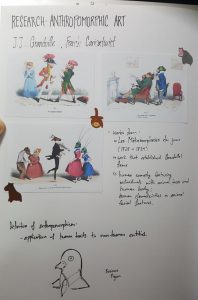
I chose to use anthropomorphic animals as loose figurative representations of the demographics of the nature reserve (photographers, tourists, family and elderly). I drew inspiration from the educational worksheets from NPark’s website – they had alot of animal-coloring worksheets! On the side, I had also done some research on artists who do anthropomorphic animal art.

After my first trip, I tried to work out my layout before I went to Sungei Buloh Wetland Reserve again (since the return trip would take place on the Saturday before the presentation(Monday)).

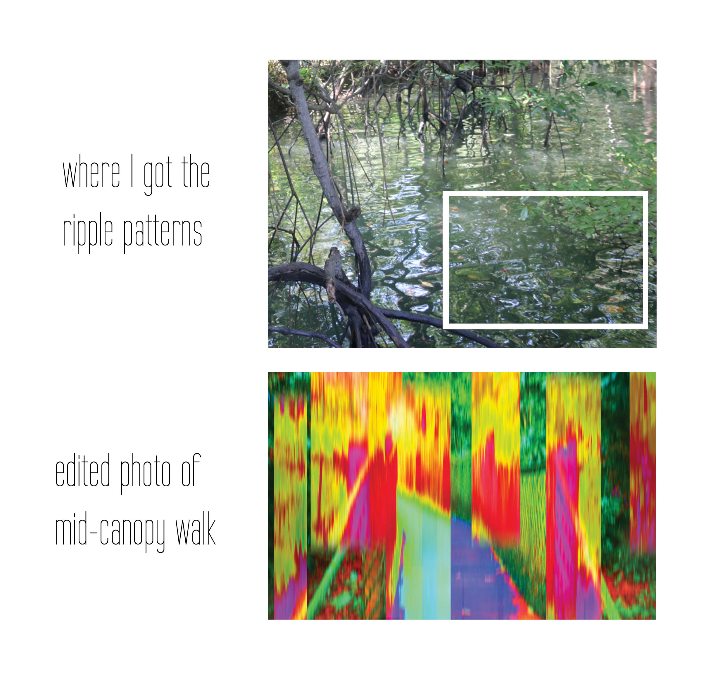
I used elements found throughout the reserve to create the frames for the backgrounds – such as patterns from the Visitor’s Centre tapestry, shadows of leaves and pathways.

Each piece features a trivia. I’ve always loved trivia section of learning sites  and it’s something I find unique to educational materials. I took note of trivia boards throughout the reserve and decided to incorporate that as a recurring element for the infographics.

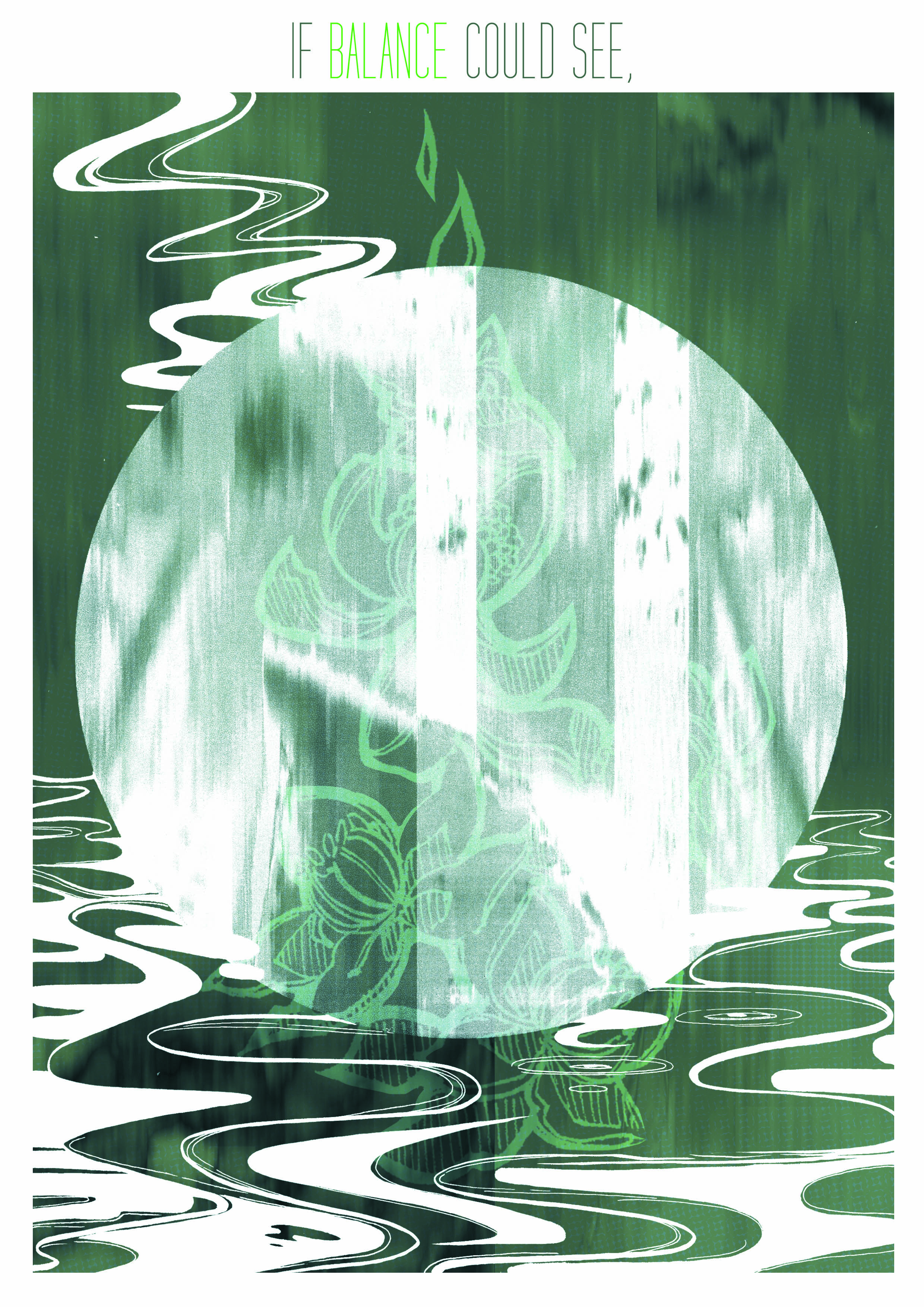
The information I’ve collected and selected are split into 4 sections: Overview, Timeline & Activities, Amenities & Facilities and Learning Resources.

Concept behind the Final Designs
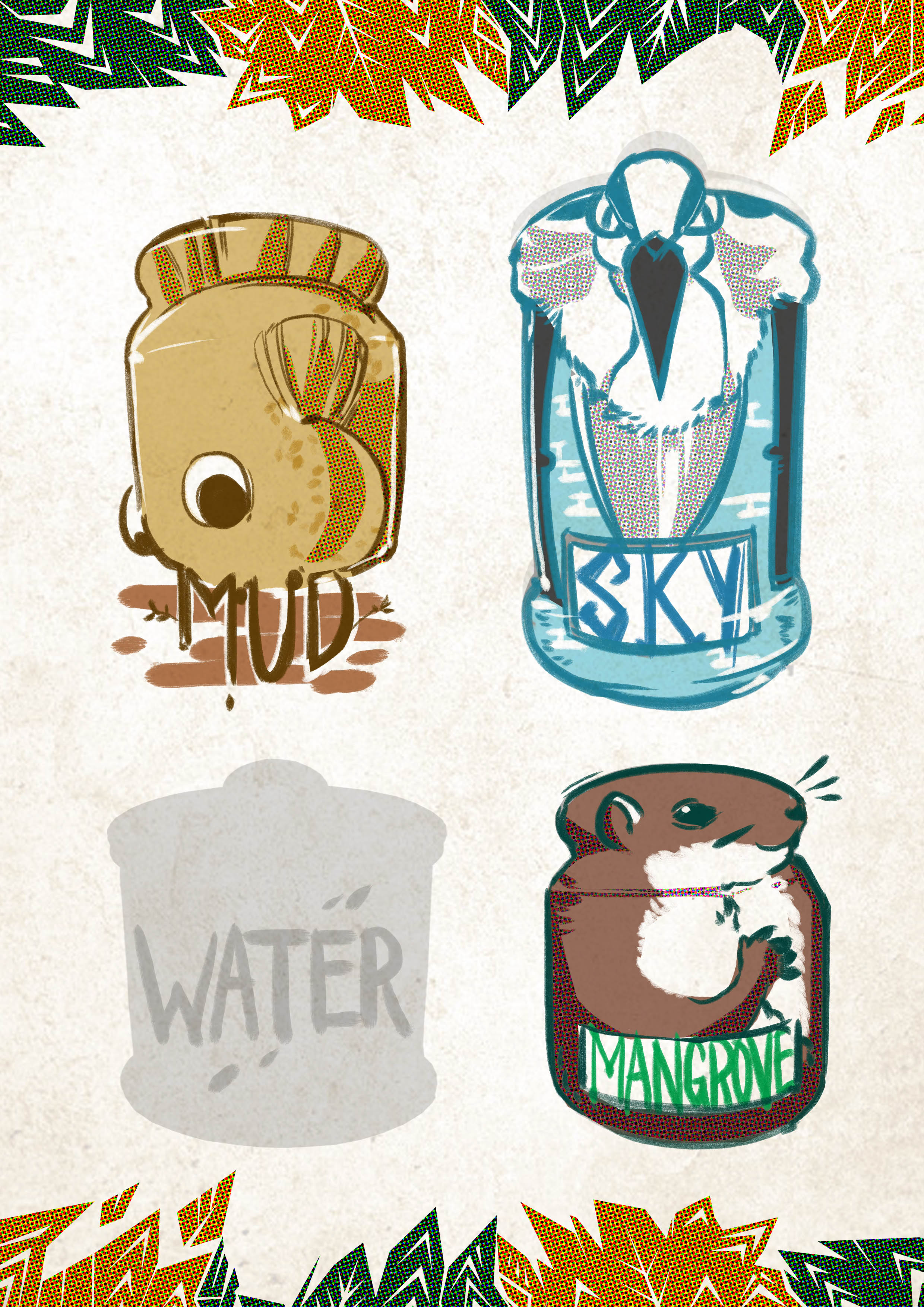
►Mudskipper Slide

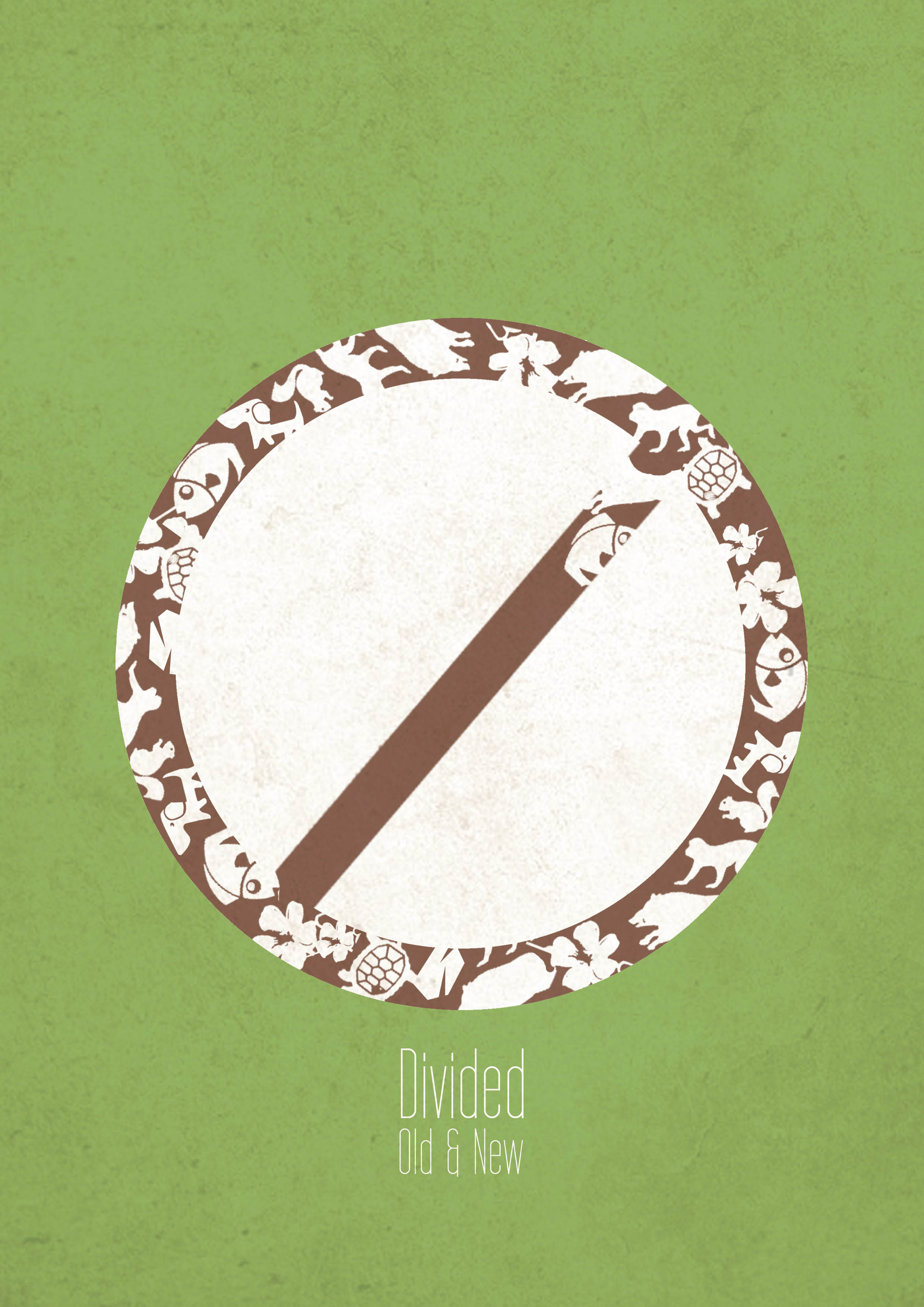
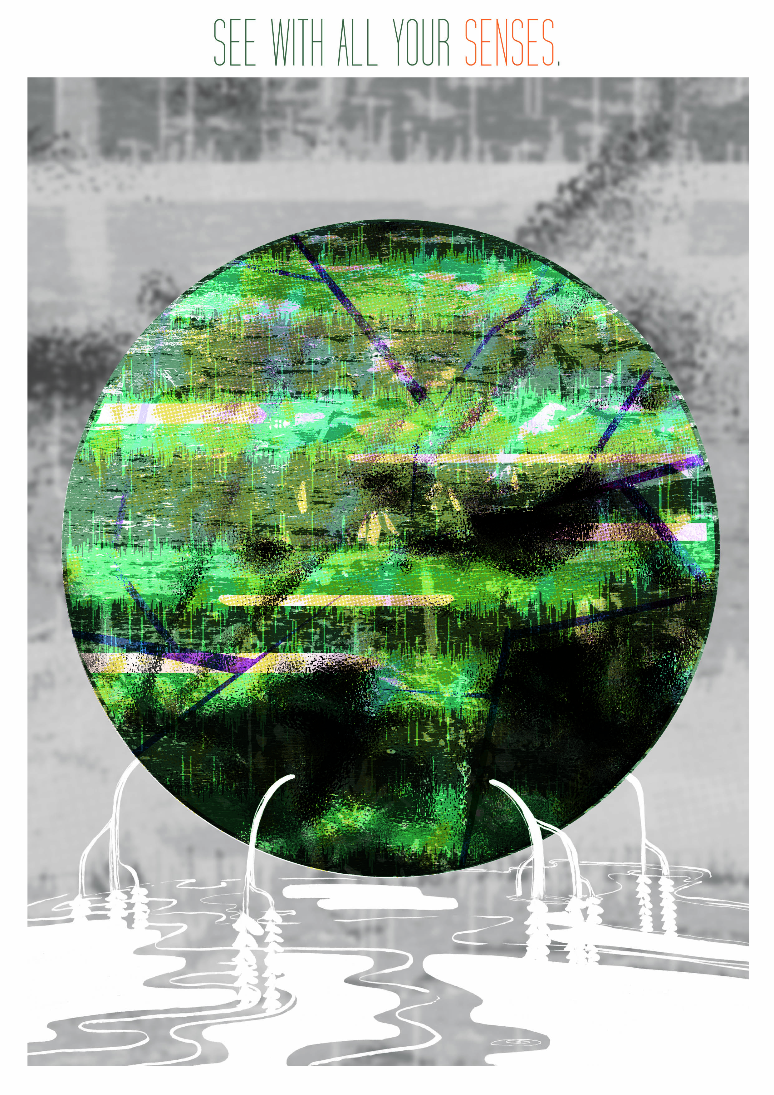
I chose the Mudskipper to represent the overview as the Mudskipper was the mascot and face of Sungei Buloh Wetland Reserve.

In this piece, I’ve also selected information that would convey Sungei Buloh Wetland Reserve as the only wetland reserve in Singapore (out of 2!) that is focused on education. It is also a pioneer in many areas in regards to wildlife education – such as being the first to introduce wireless learning in this region.

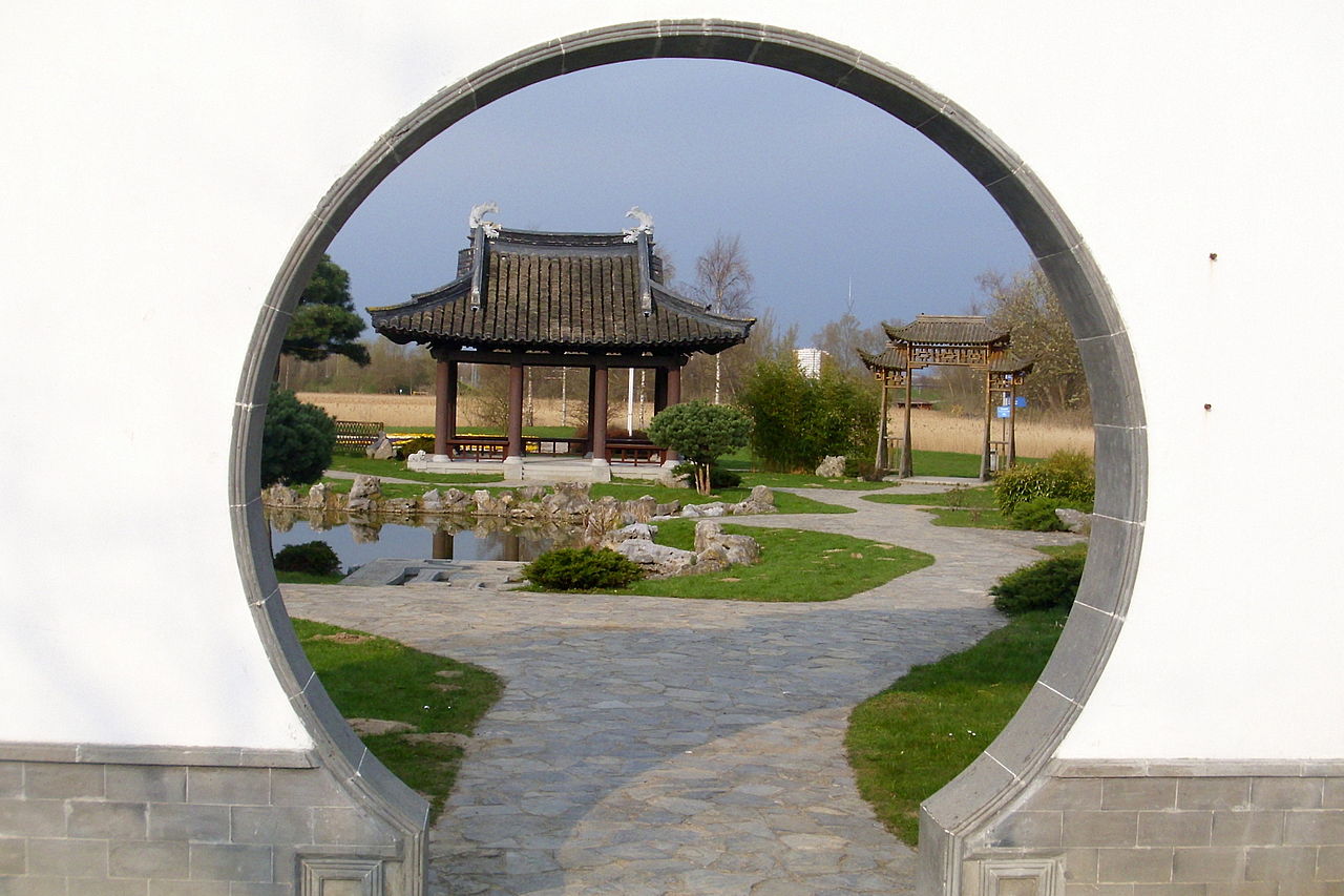
The layout’s frame is derived from patterns that you can find at the Visitor’s Centre office – one of the first buildings you see when you enter Sungei Buloh Nature Reserve. I based it off the flower images on a piece of tapestry you can inside the Visitor’s Centre:

The slide aims to introduce Sungei Buloh Wetland Reserve  as the largest tract of mangrove forest, Singapore’s first ASEAN heritage park and an internationally recognized migratory site for birds. It also identifies the demographics of the nature reserve.

I started off with an easy trivia as well to ease the viewer into the graphics.

► Grey Heron Slide

The second slide shows a grey heron. As there are many migratory bird species in Sungei Buloh, I wanted to show one of them representing the foreigner as a part of Sungei Buloh Wetland Reserve’s demographics.

In this slide, I wanted to introduce Sungei Buloh’s educational activities and how they are linked to the nature reserve’s unique timeline.

Timing is everything! Coming on different days, weather and timing affects what you see, hear and even smell. The timeline is the heartbeat of the events happening at Sungei Buloh – without people monitoring the timeline, it would be hard to organize activities that would optimize the time of visitors.

The slide’s frame is based on leaves:

It was initially more accurate to the space between leaves, but leaving a large amount of negative space pulls the eye away from the text, so I’ve made the frame alot more packed by taking the general shape of the leave instead.

► Otter Slide

The otter slide conveys the amenities and facilities of the nature reserve. I also used the otter and a baby otter to convey a sense of community – how the place is built for education, groups and family.

The individual sections are also represented by icons that are created from actual structures – the viewing pod icon is based on the shell-like shape of the pods at Sungei Buloh.

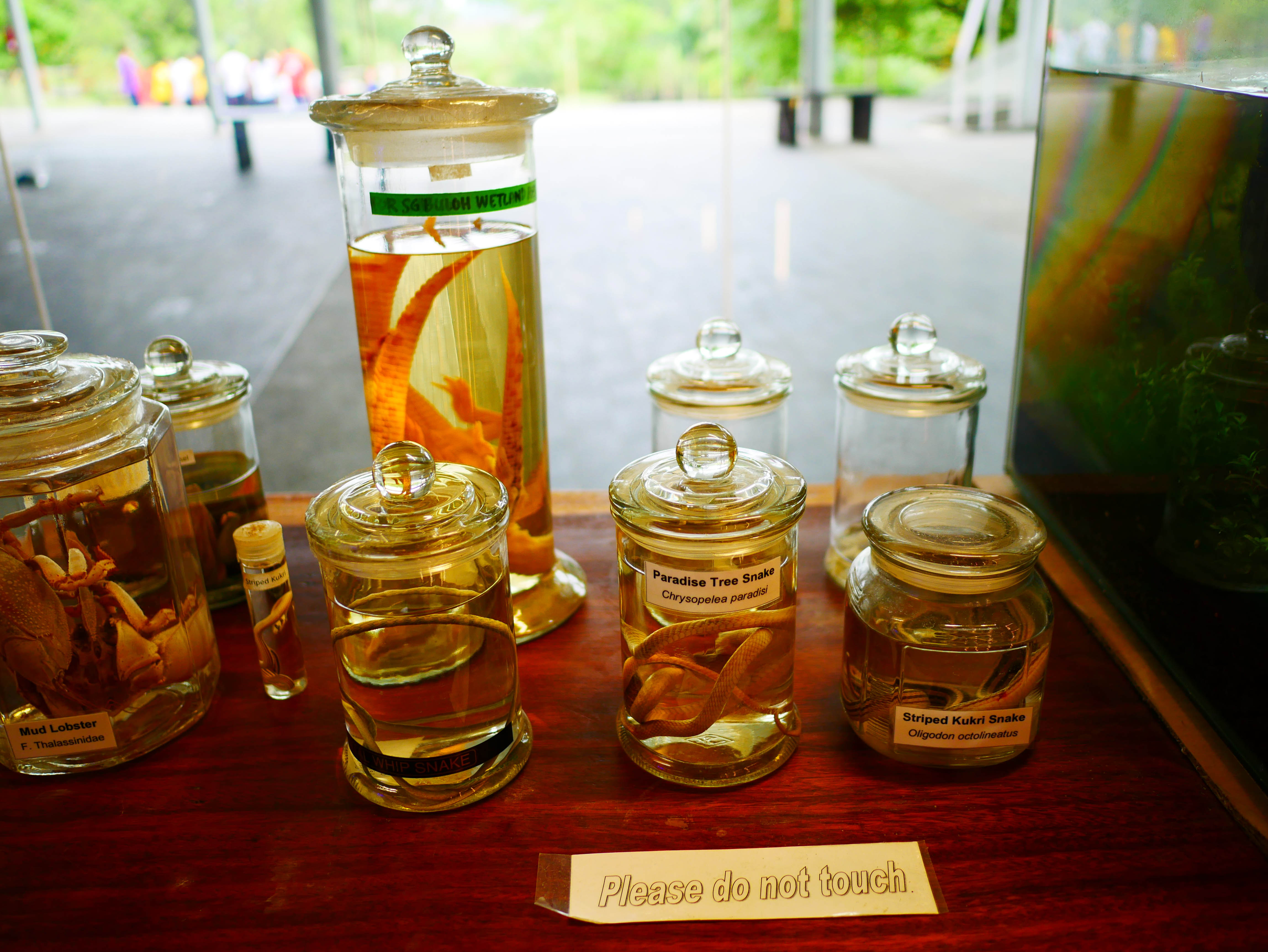
The background patterns are based on the stone path of the Information Center that carries extensive information and a detailed map of the entire reserve:

► Crocodile Slide

The crocodile slide shows the different types of online and on-site resources that the nature reserve provides and the steps they take in order to provide visitors and nature enthusiasts with a wealth of information.

Resources such as the e-newsletter includes articles on events such as Bird Migratory day, Earth Day and also carries periodical fish/habitat field surveys. There are also educational worksheets for kids – such as coloring worksheets and fact sheets.

The background patterns are based on shadows of leaves on roads:

My Take

After interviewing the people on-site, I found out that people wished that the nature reserve was better publicized.

In my own opinion, I do feel that the nature reserve is a little confused as to what demographic they are trying to get.

One interviewer actually voiced his relief that there are few kids around so that animals would not be scared away.

Due to this, I think Sungei Buloh Wetland Reserve ends up being more of an educational site for adults, despite how they are trying to target children and schools sending down buses of kids to learn. People who generally end up coming back multiple times are the older crowd.

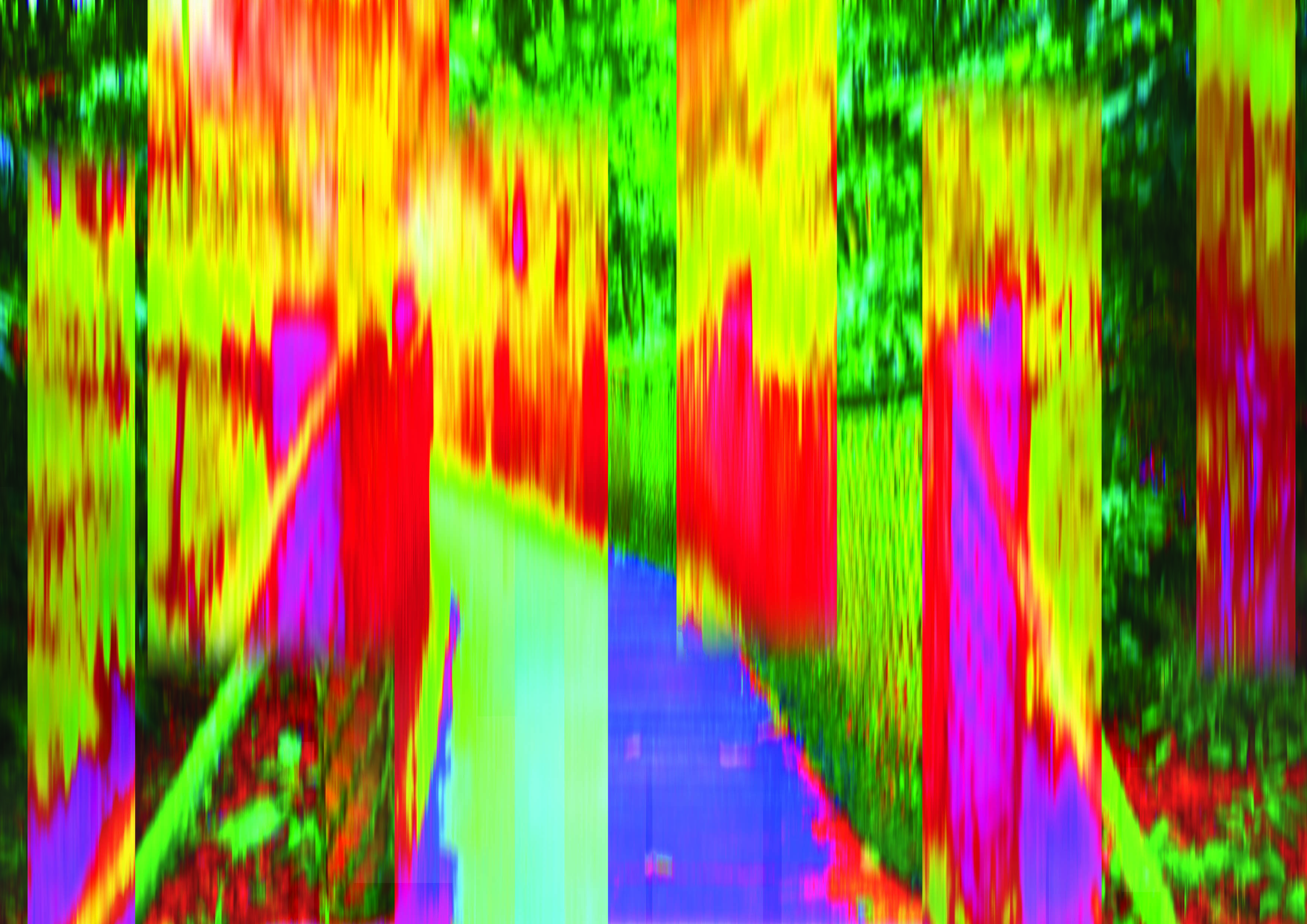
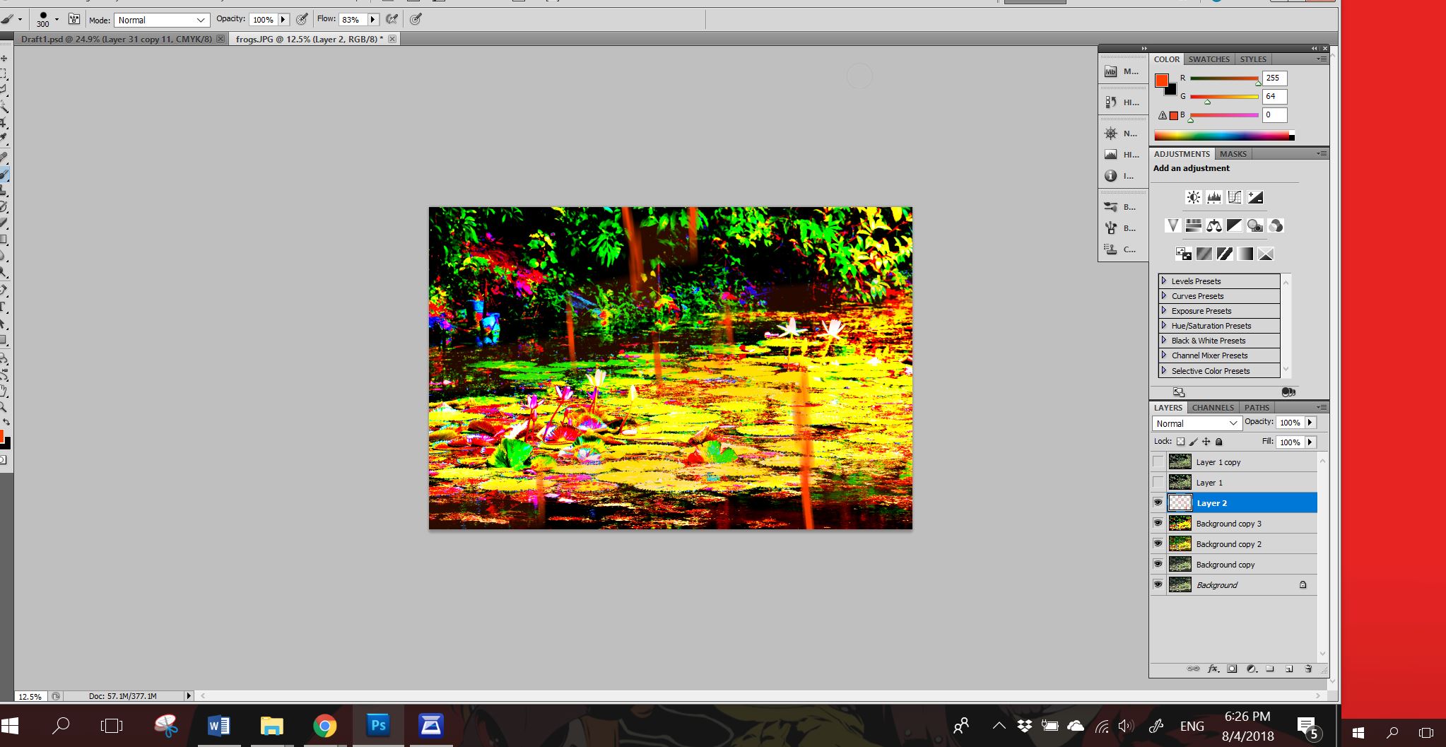
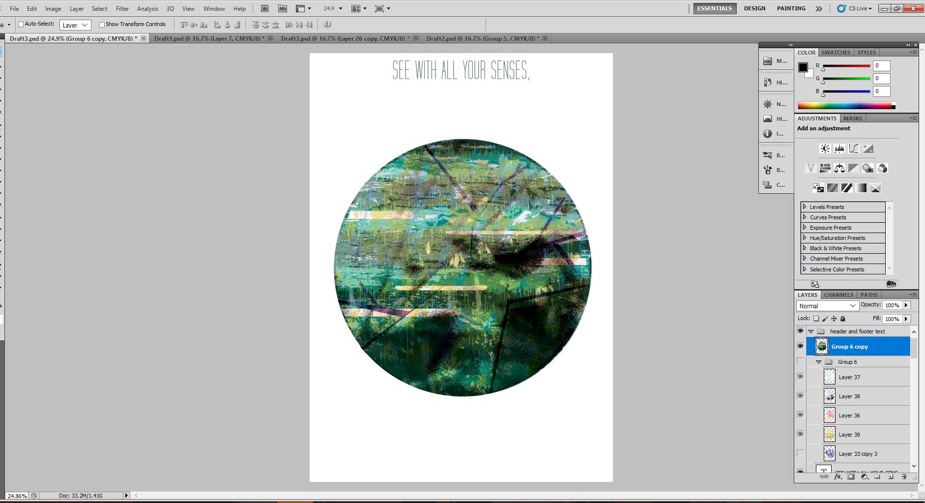
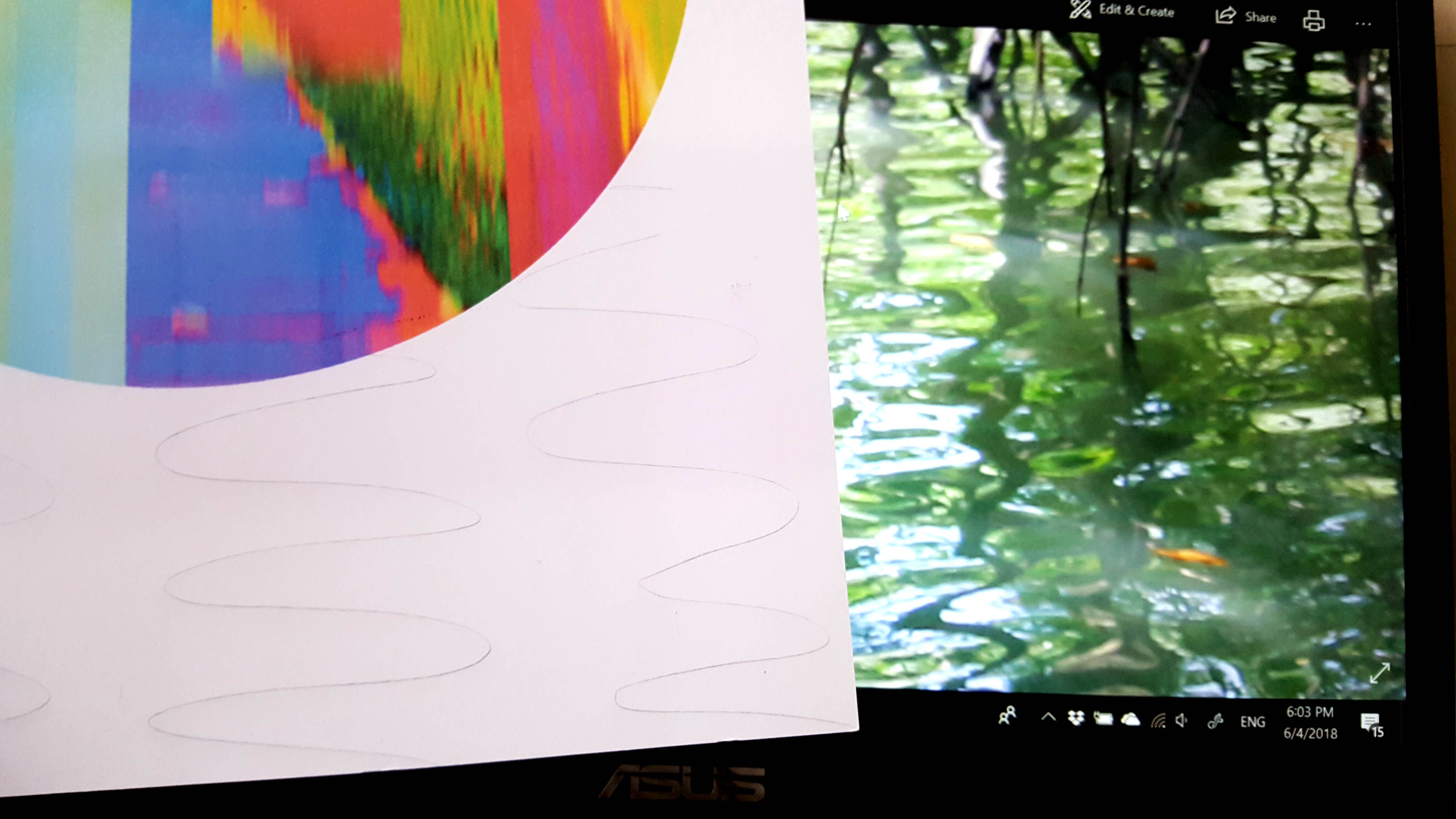
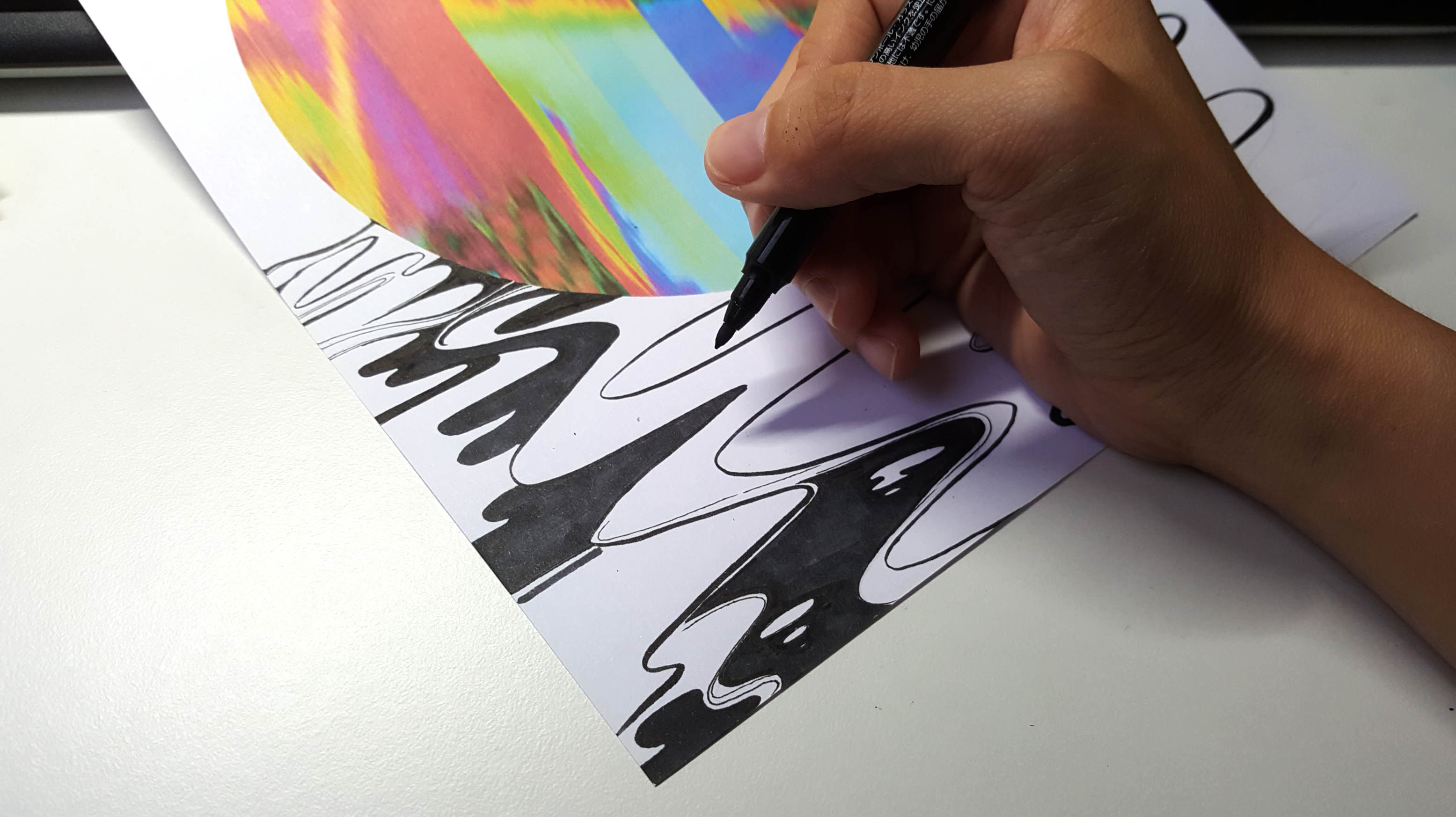
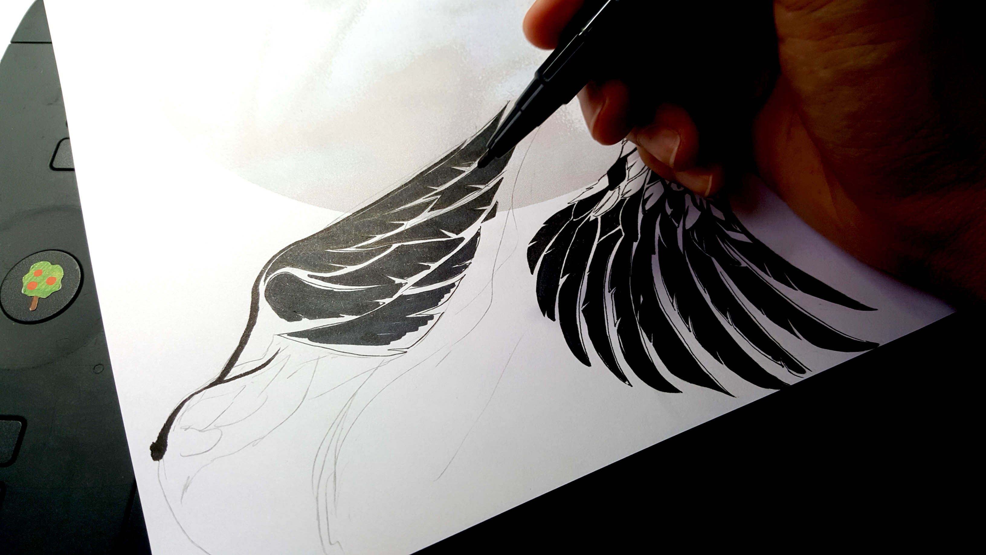
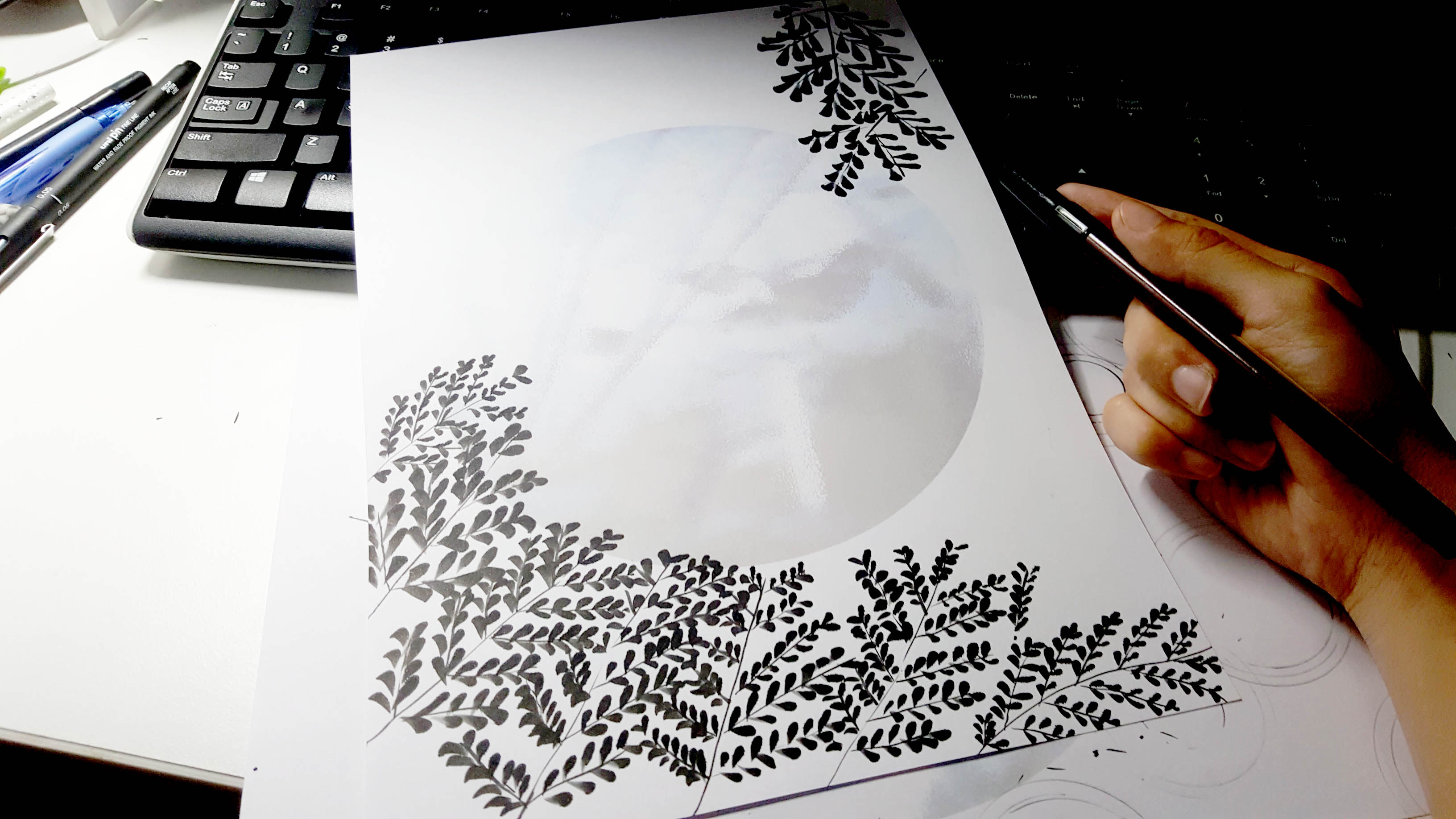
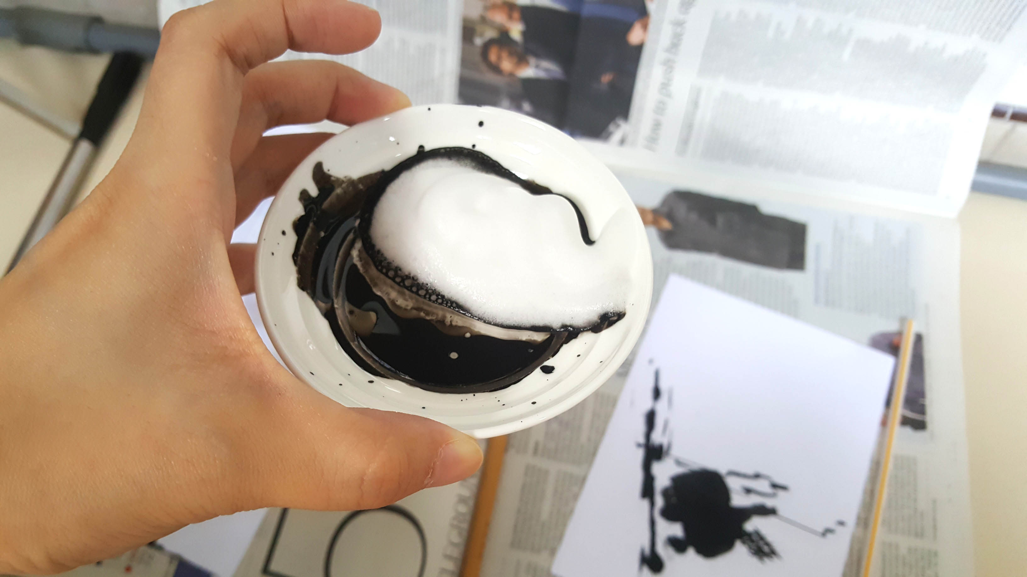
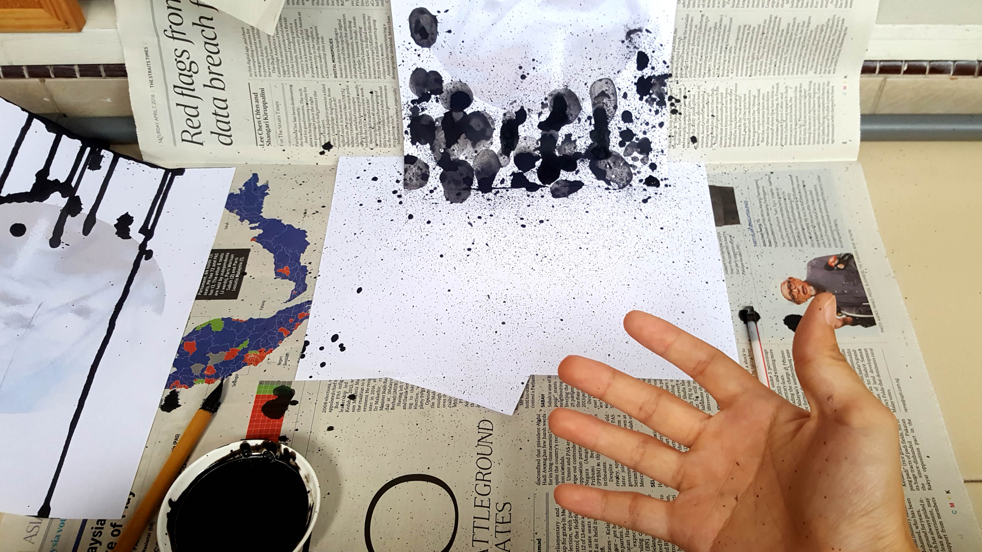
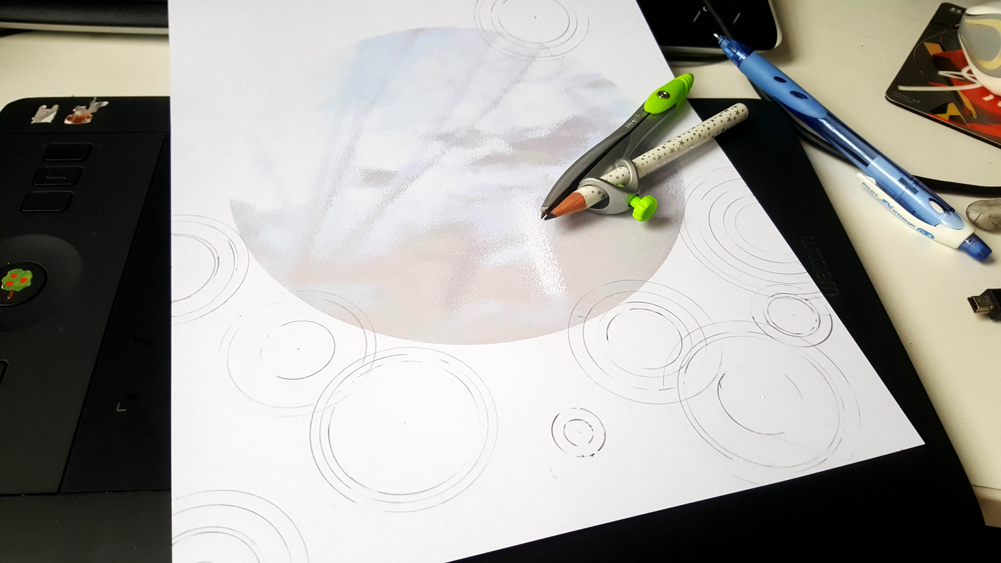
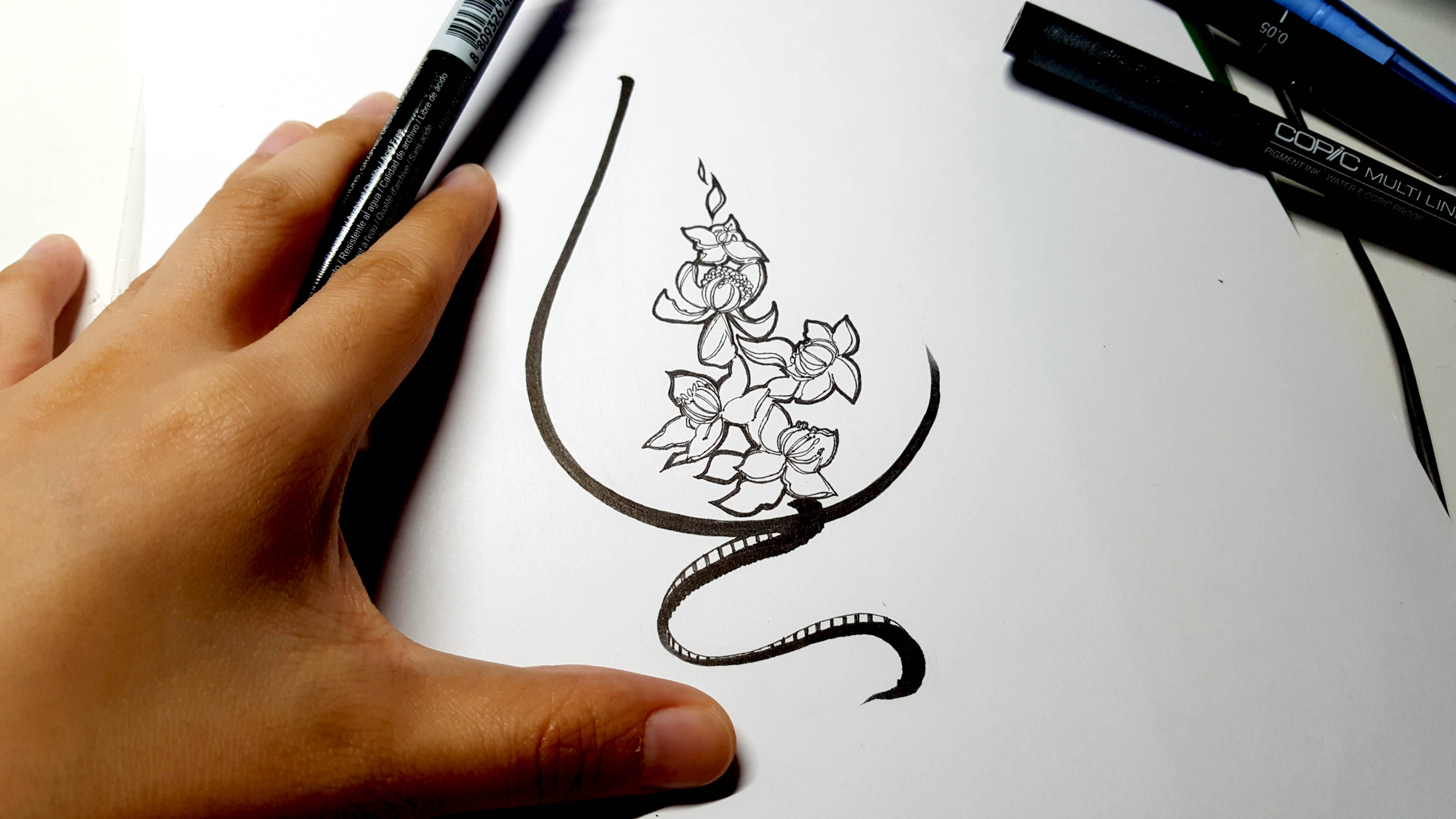
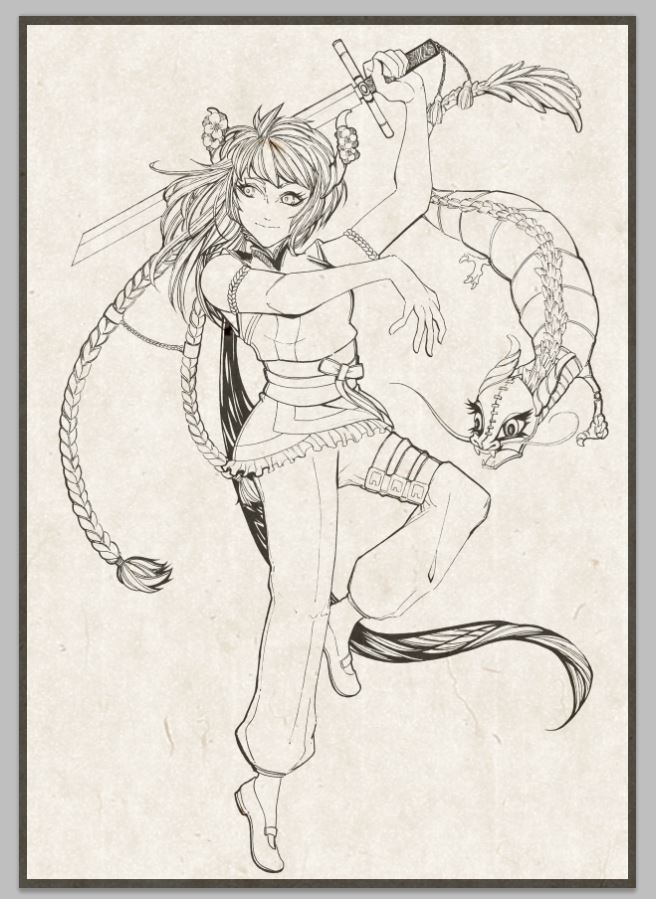
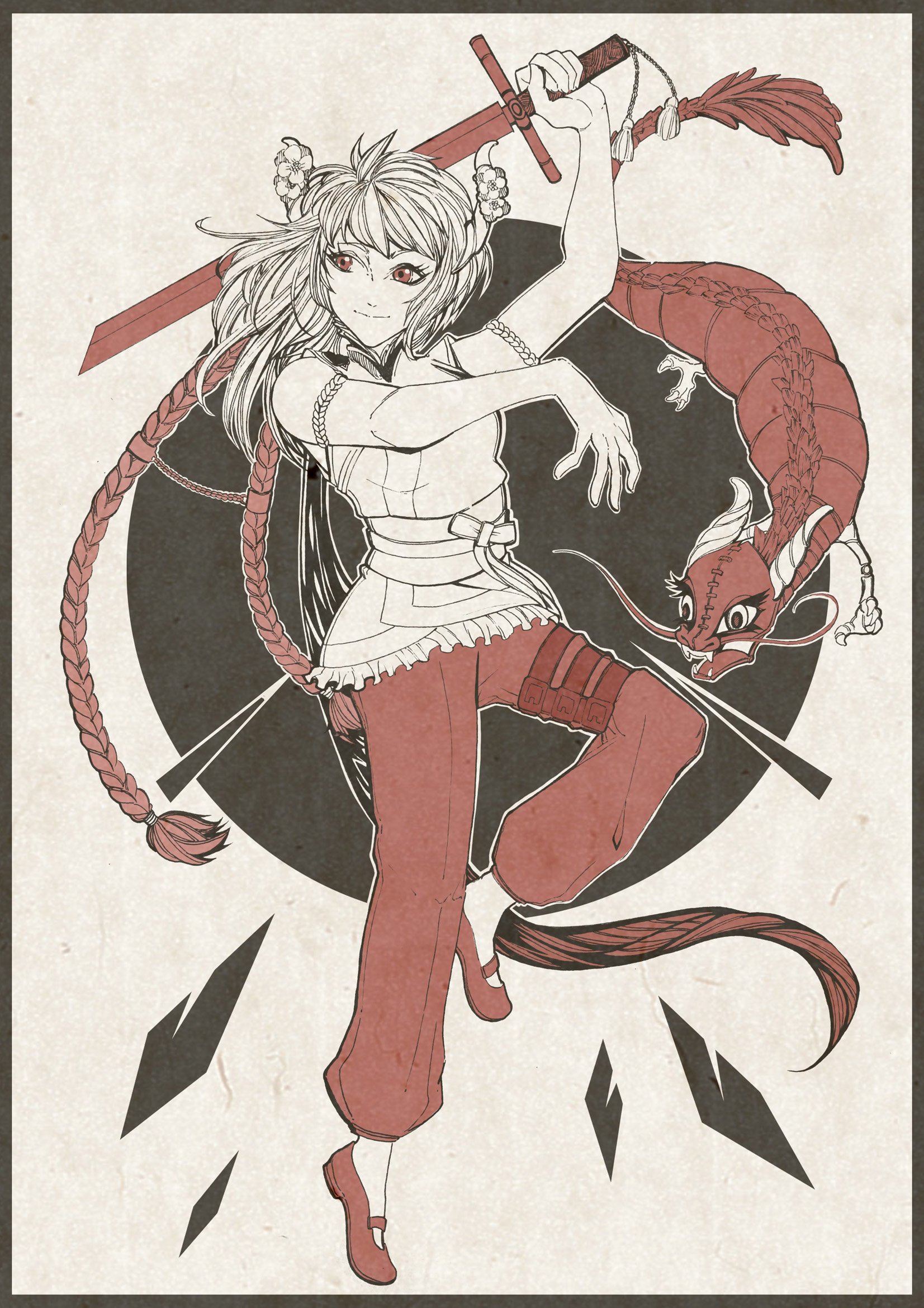
Process behind the Final Designs(Images)
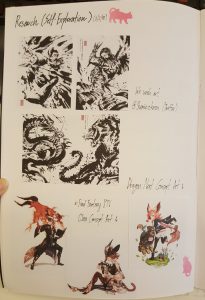
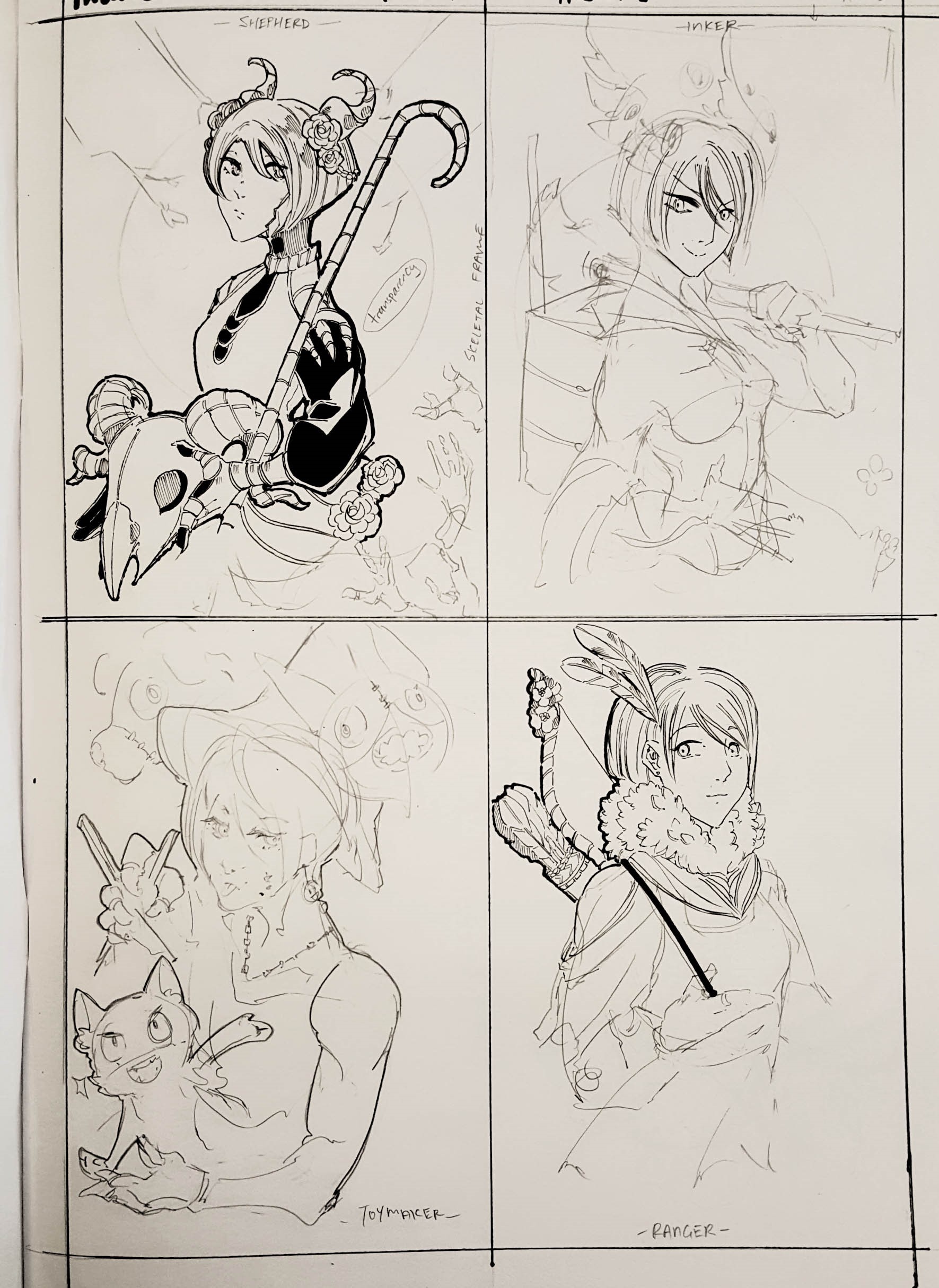
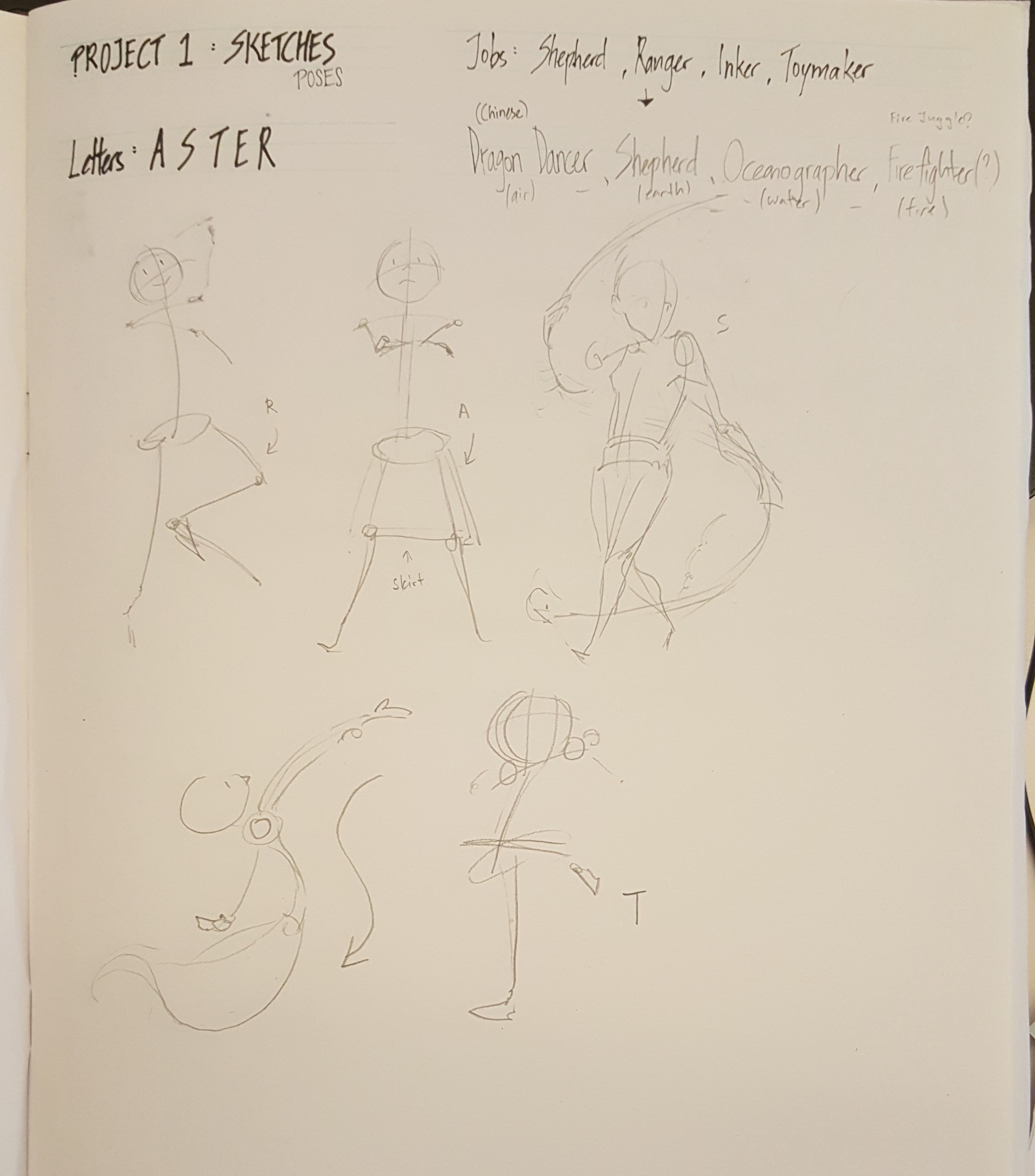
Sketches:

Extracting patterns/marks to use as frames and backgrounds:
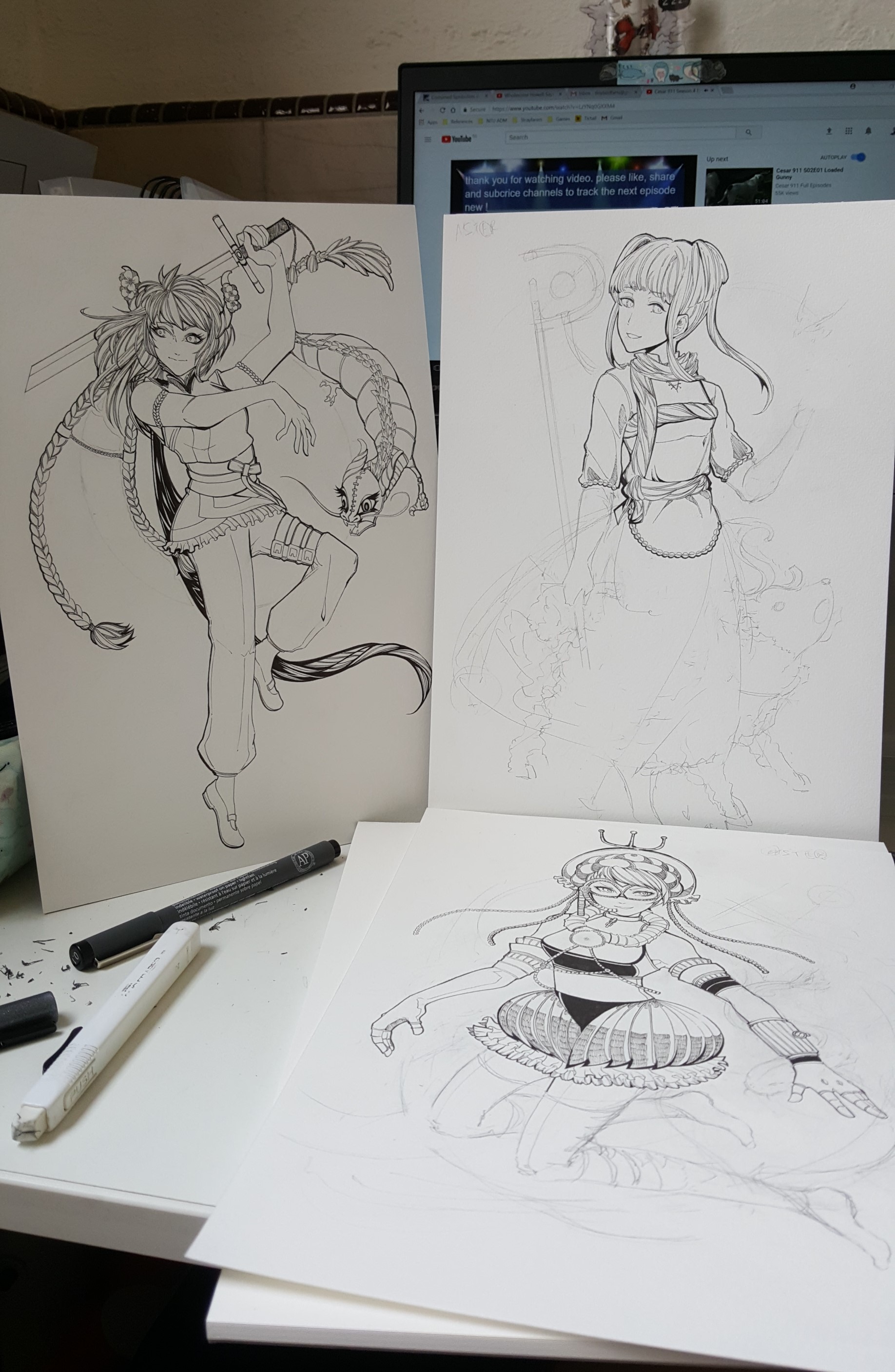
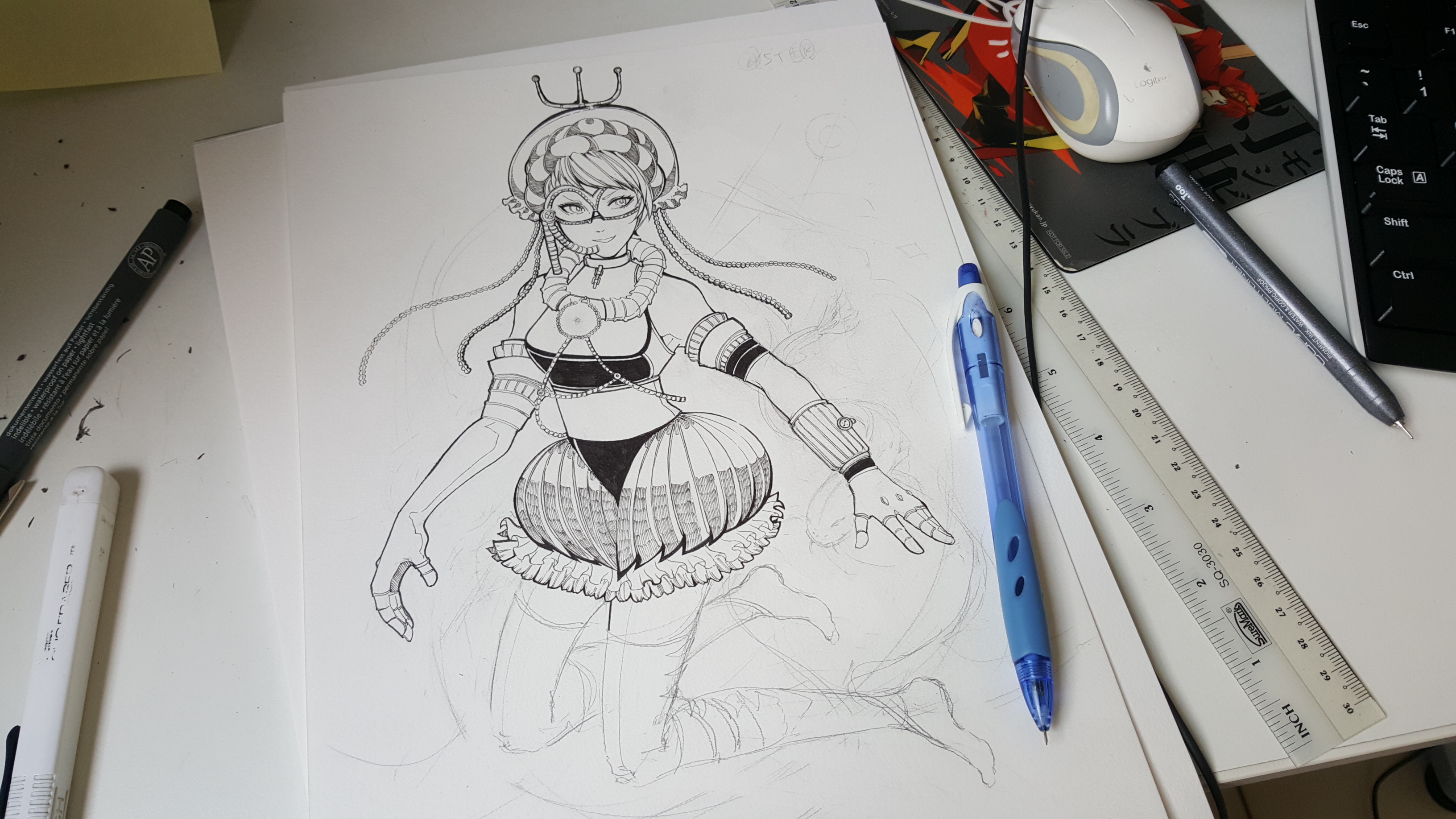
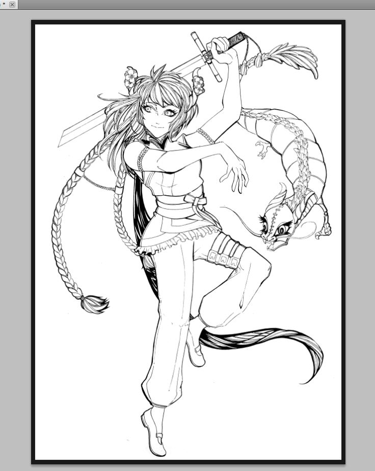
Work in progress:

Initial design turned out looking alot like a horror night at Sungei Buloh instead (;u;)

Feedback

Lecturer (Joy):
• Find a main focus
• Pick out ways they tried to be educational
• Pick out recurring motifs
• Perhaps can try using the trivia aspect as a potential element for zine? (but not make it bulk of the upcoming zine)

Peers:

Thank you so much for the feedback! :’)

Personal Takeaways

Struggles: I struggled to make the color palette work in the beginning as I didn’t want the colors to end up like a tacky nature pamphlet.  I tried unconventional colors that went outside of Sungei Buloh’s colors, but they just didn’t work as well. In the end, I wound up looking at designs based on citrus colors and fashion in hopes of making the visuals work.

Reflections: It was a trying, but very educational experience. Everyone in class had a different interpretation and outcome of their choice of location and it was really cool!

I do hope to improve on keeping to my time during my presentation so that I would be able to show more research that I had done. I had alot more material that I didn’t get to show – videos, interviews, photos and some of the nature reserve’s cool online resources.

It was tough curating an interesting focus!

Others

• Link to Project 2 Part 1 Research: https://oss.adm.ntu.edu.sg/laum0005/graphic-form-project-2-locale-1/

Graphic Form Project 1: My Name ( ` ω ´ ) (Research and Process)

ART DIRECTION & Research

This was a personal project and I naturally swung towards Japanese comics and game art upon starting on the research for this project! Japanese RPGs are my life and I really want to let my love for games decide where to swing for this project!

Seeing as I was assigned to the first week for the weekly presentations as well, I decided to incorporate extensive research of Russian Constructivism, Suprematism and De Stijl into my works as well.


I did some research on brushwork and practiced some calligraphy too to practice discerning line work and improving my line expression for this project.

I decided to base my Project 1 on interpreting real life jobs as a utopian fantasy much like fantasy jobs such as Mages, Swordsmen, Bards, and more!

PROCESS

Sketches:

Deciding the occupations was definitely the toughest part of this project – but I didn’t expect sketching and composition to take so much time! It took me the entire Chinese New Year break (at the rate of approximately 1 drawing a day, at least) to complete the pencil work and line art.

I proceeded to scan in the drawings and repurpose them into digital portraits for printing through Photoshop.

I initially planned for it to be monochromatic, but it didn’t turn out so well. After consultation, I decided to have larger percentages of color and…

It worked out decently – I think! 🙂

… now just need to repeat consistently for 3 more.

After finishing up the four portraits, I went down with Nic to Sunshine Plaza for printing!

Introduction Activity: https://oss.adm.ntu.edu.sg/laum0005/graphic-form-introduction/

Other Research: https://oss.adm.ntu.edu.sg/laum0005/research-artist-and-unconventional-art-material/

Final Designs: https://oss.adm.ntu.edu.sg/laum0005/graphicform-project-1-part-2/