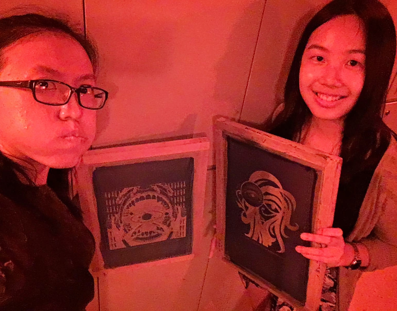
2D Project 3: Final Designs


Final Designs


20161115_161504

20161115_161505

My general concept for this project was to emulate a comic and game style for my images to link it to my narratives – which were alot about my daily life.

I wanted to go with an expression in comic art style – like how different artists for different comics could change the genre of the comic.

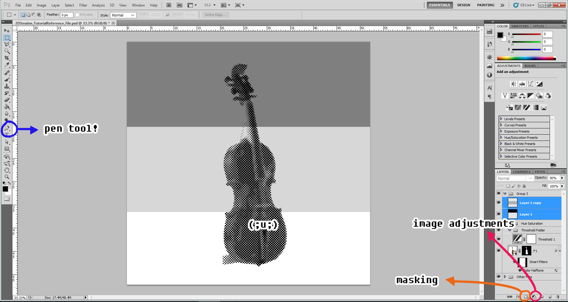
Some of the panels have an interactive element to it. (‘u’)✿

(The video is actually 20 seconds but YouTube is mean (;u;) There’s nothing but black for the rest of the last 3 minutes. )

(On a side note, it would be super cool to make GIFs for a school project next time ♡)

Here are my four sets of panels:


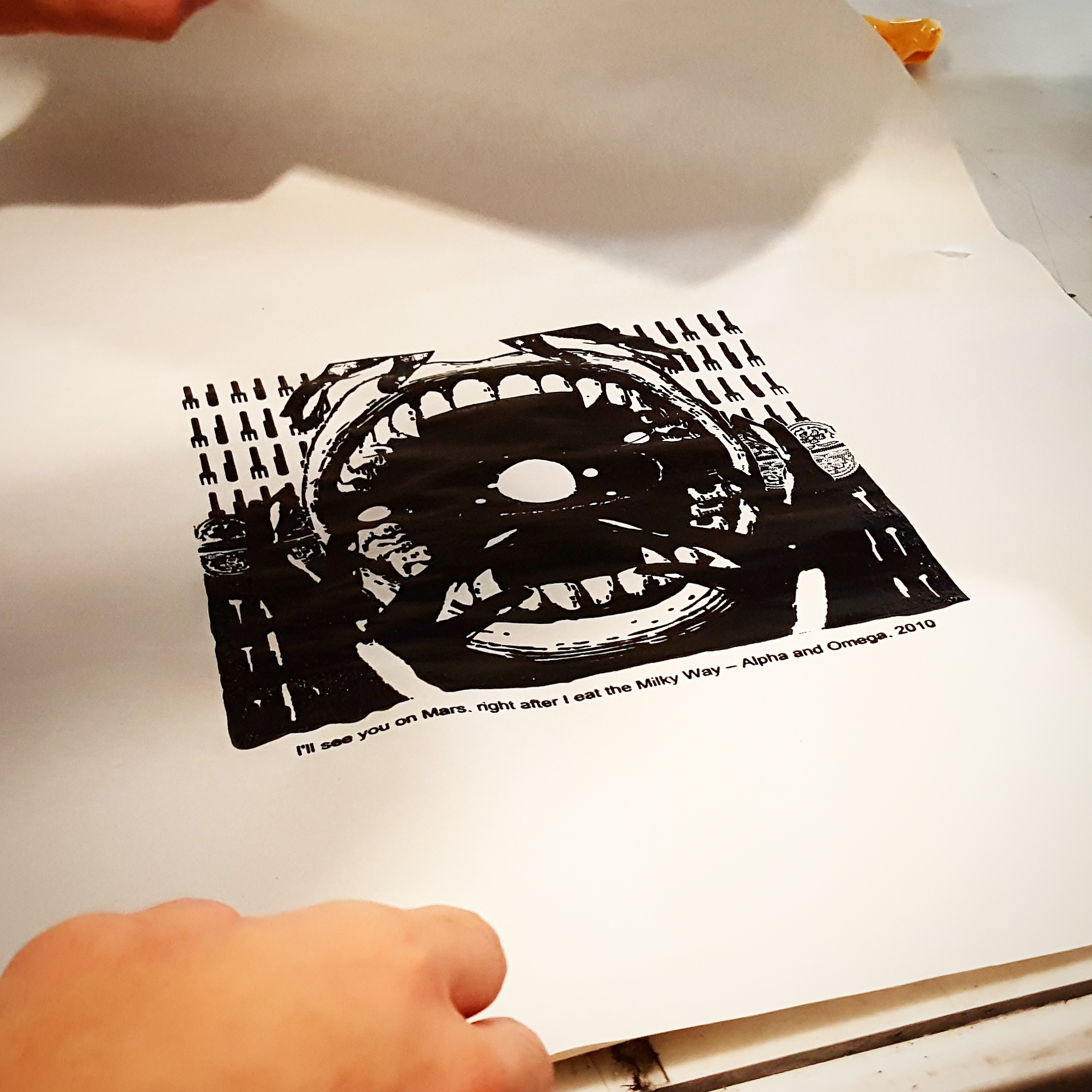
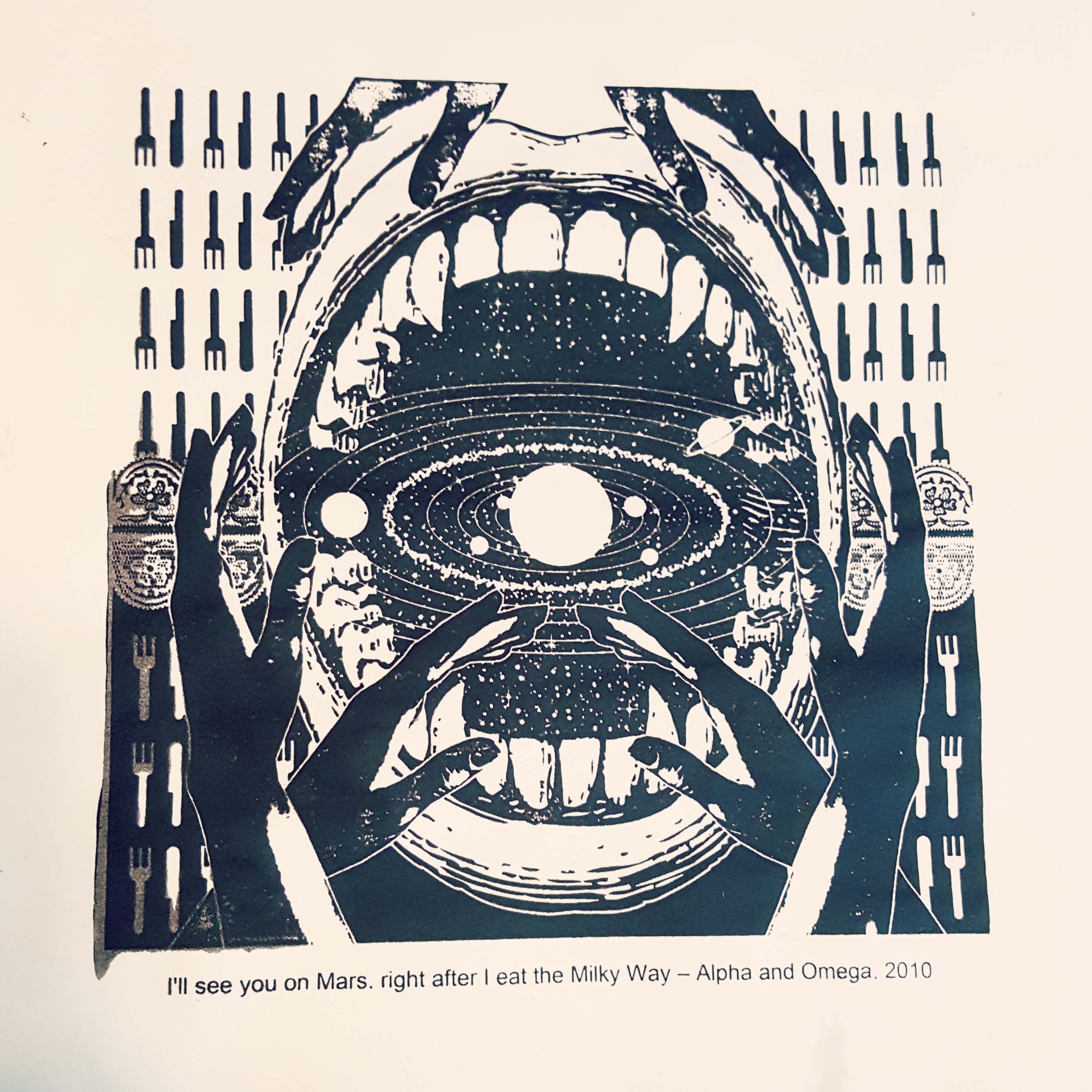
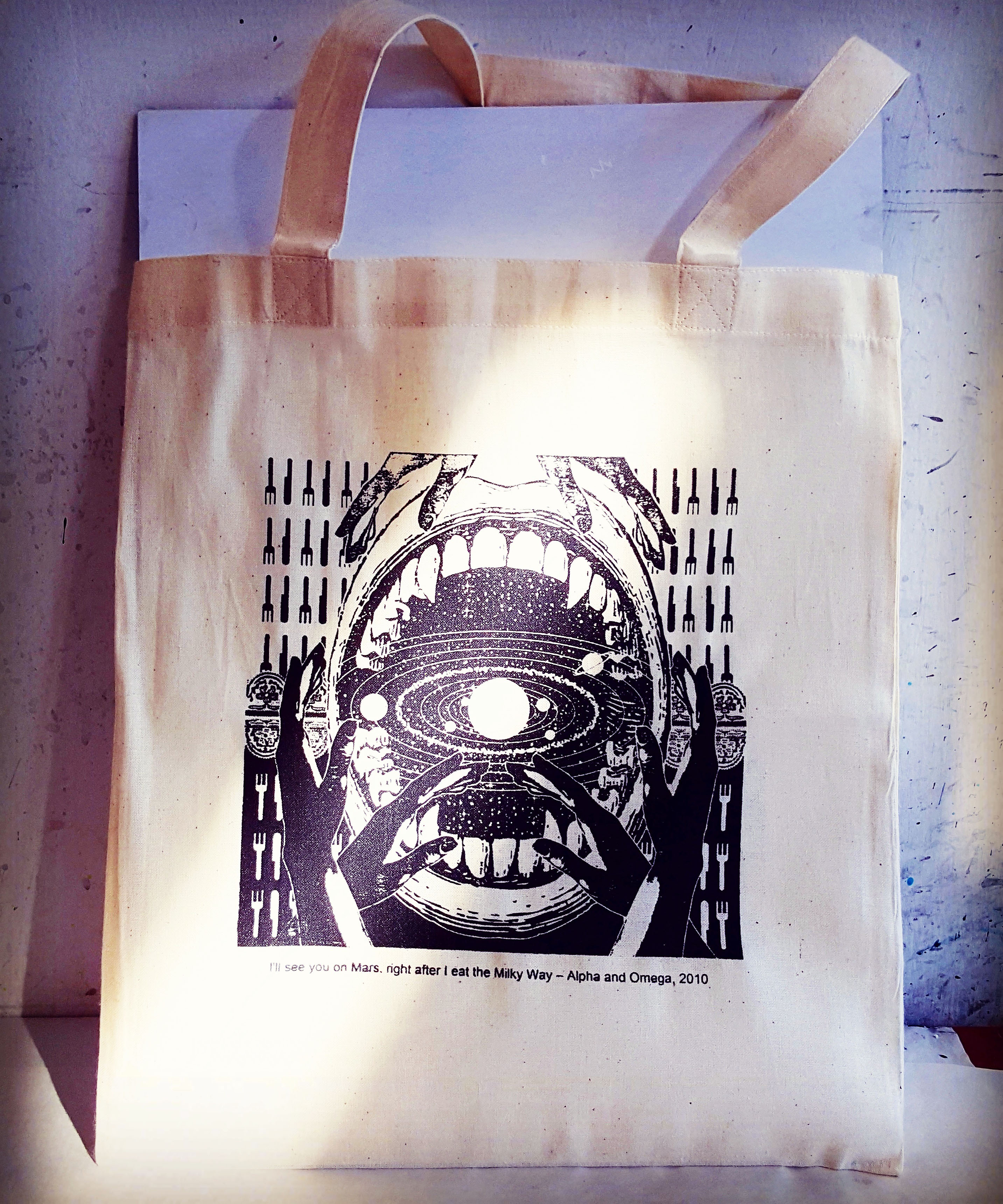
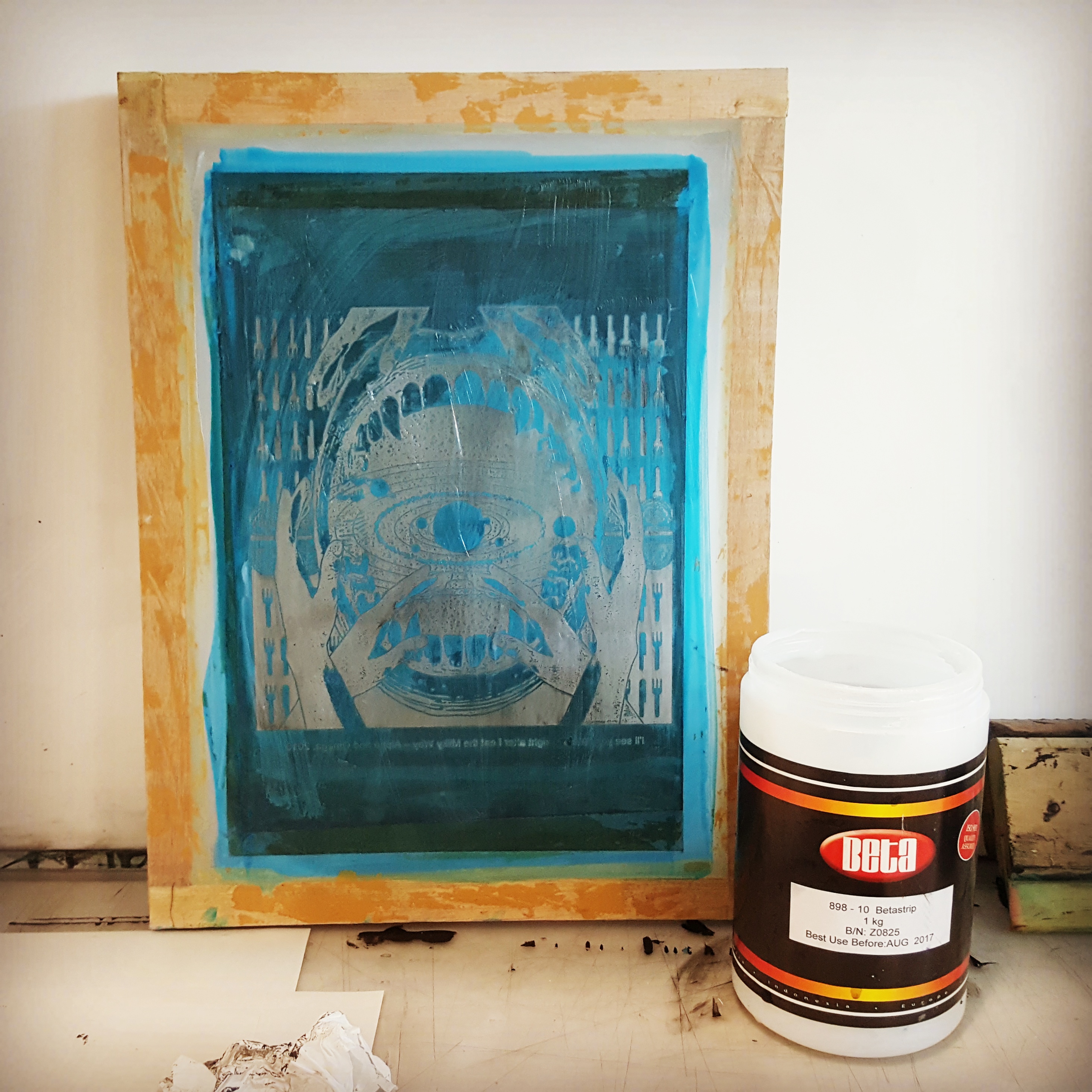
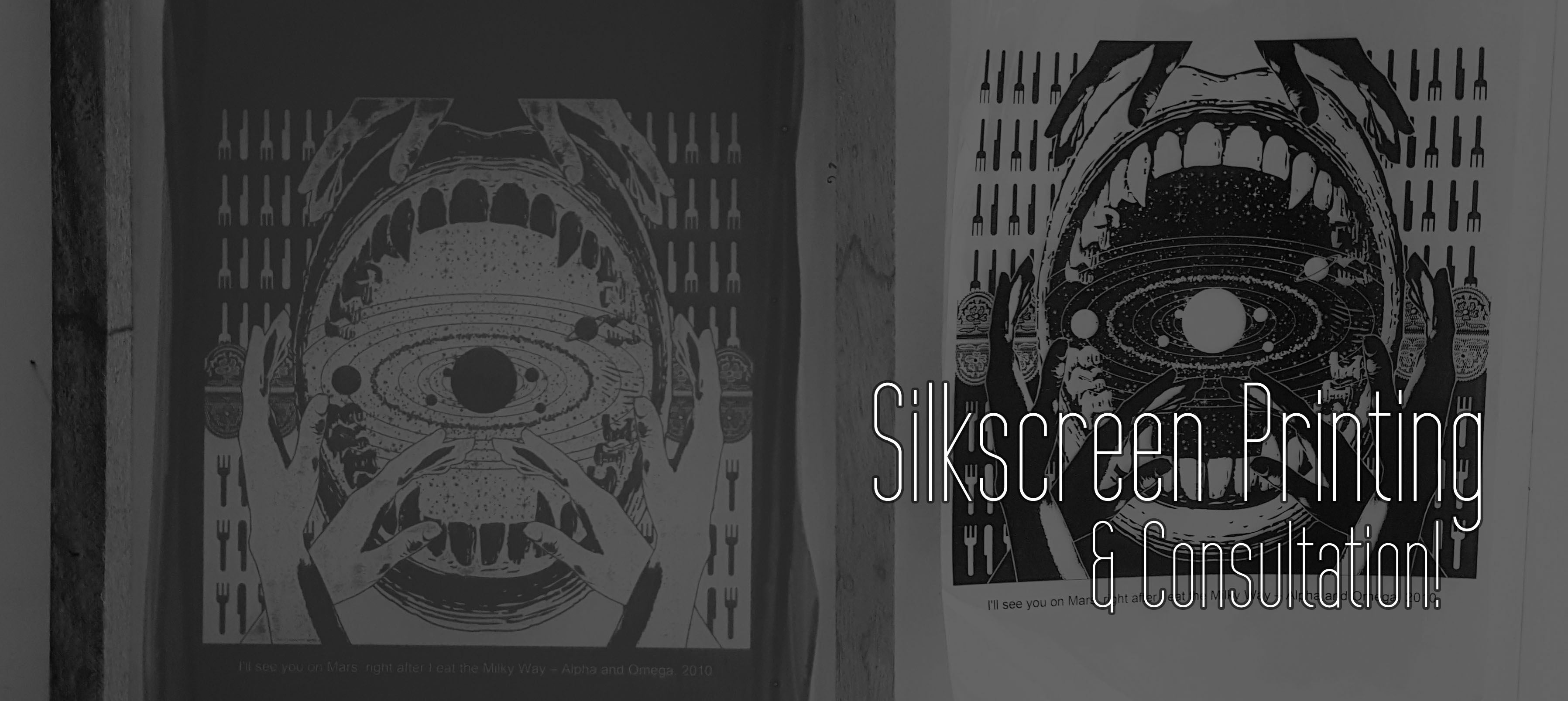
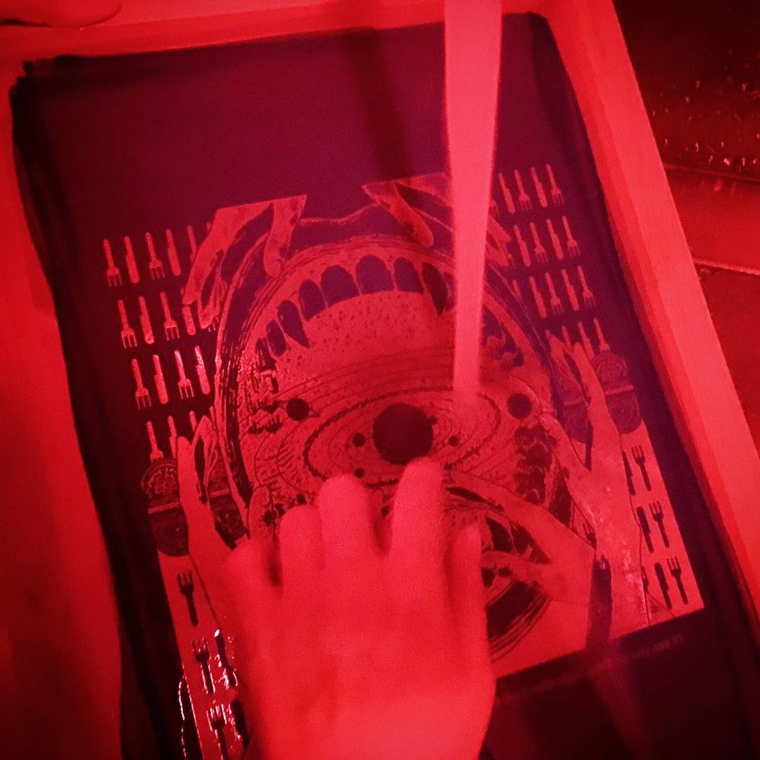
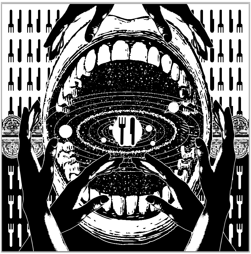
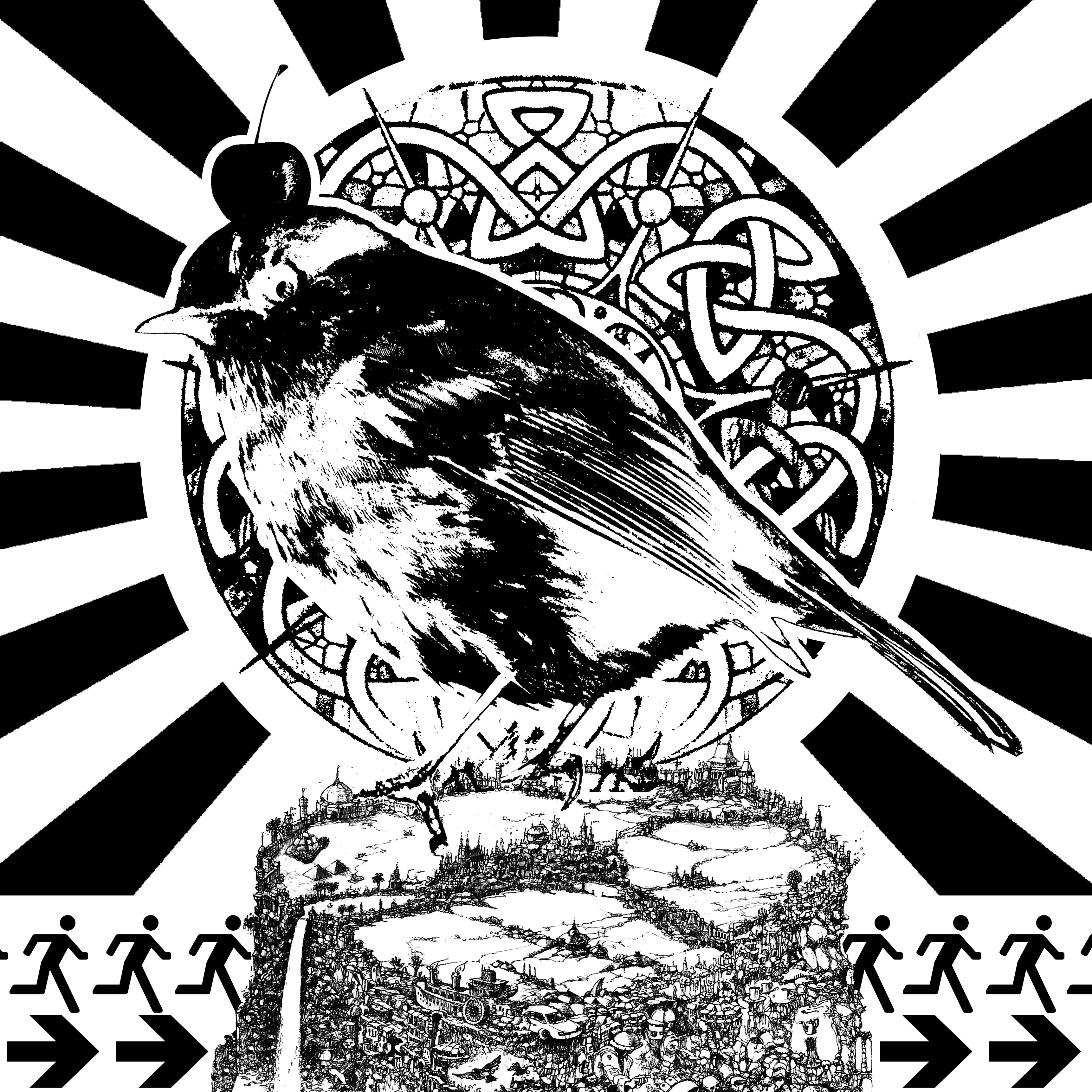
“Me, An Atheist” + “Cult of Corgi Butts” = “Suddenly Religious”


1_me_an_atheist

(Interactive Element: The white ring with planets extends outwards, to show that I’m free to think, and science is all around me.)

1_cult_of_corgi_butts

1_suddenly_religious

Materials Used
“Me, An Atheist” : Sakura micron pens, watercolor on watercolor paper, wire + acrylic, gold foil, nail polish
“Cult of Corgi Butts” : Digital
“Suddenly Religious” : Sakura micron pens, watercolor, gold foil

Behind the Image
I’d decided to use corgi butts as a topic. I’m a super huge fan of corgi butts, and converted because I like their short legs and fluffy butts!

I wanted to show my deep adoration for corgi butts like a religion – I fervently worship the fluffy butts, so I decided to convey these set of panels through inked pieces mounted onto a paper. I tried to convey a sense of 3D to make the portrayals of myself pop out – since I wanted to make it seem like a religion and about personal beliefs, which is very close to heart. The eyes are also cut out – transparent to reflect and mirror my heart and thoughts.

In the first panel and last panel, I specially wanted to show the noise of the world, and the contrast as it quietens down into singular devotion – hence the line of flowers.

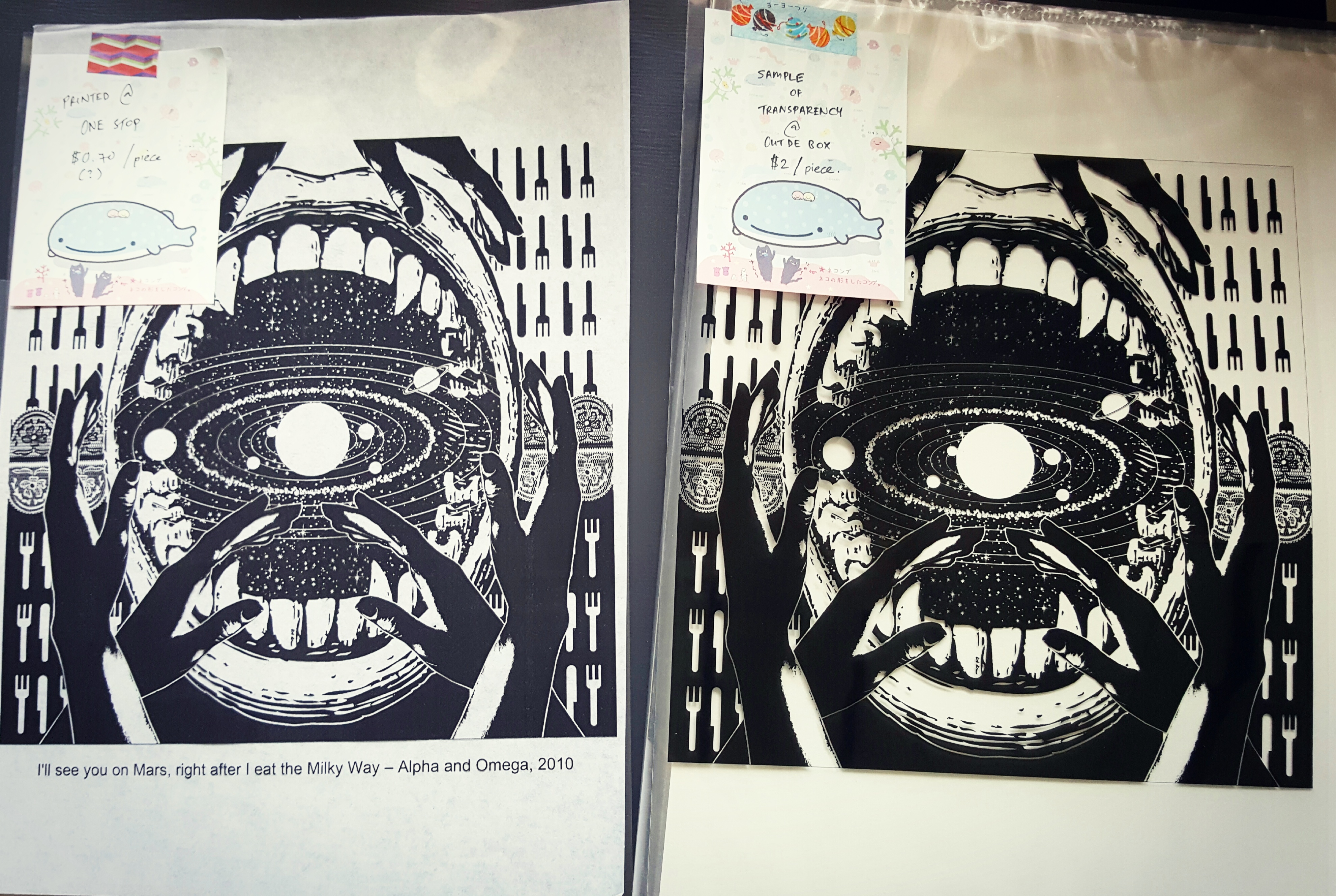
For “Atheist Me”, I pierced a wire to imitate the rings of a solar system diagram, and cut small circular pieces. I then painted glittery nail polish on them so that they’ll be silvery and look like little moons and space-like.

20161115_164818

Color Palette Selection and how it enhances message
I used analogous harmony for all three images- where the colors are right next to each other on the color wheel, and of the same-ish family (warm colors).

In ‘Me’, I portrayed myself in the colors of space (blues and blacks), as when I think of science, I think of space!

In ‘Setting’, I chose to portray The Cult of Corgi Butts in the color of a Pembroke Welsh Corgi (light brown). Also, I used light rays to show the ‘holiness’ of the cult, as well as enlightenment.

I used cool and warm colors to show opposing beliefs, and a change of cool to warm to show my change in belief and religion.


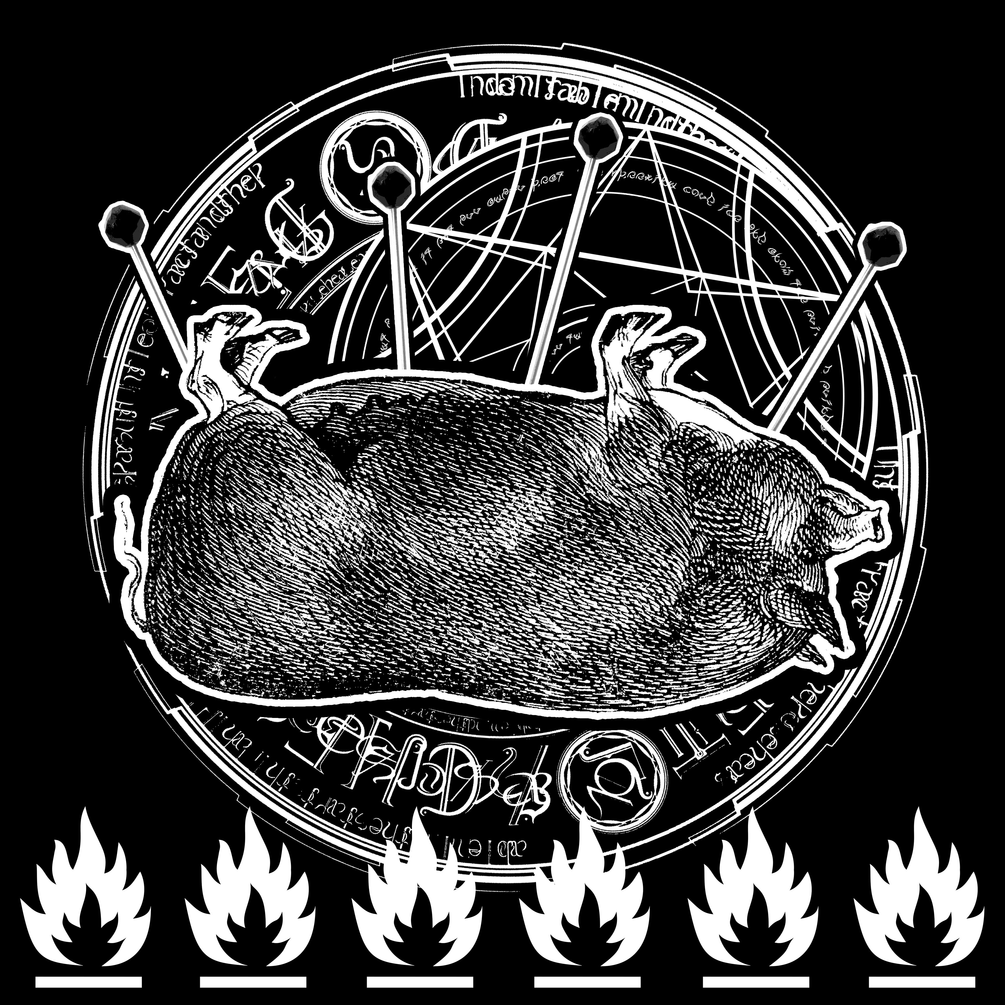
“Acrophobic Me” + “Room of Roaches” = “Up, Up and Away!”


acrophobic3_room_of_roaches

(Interactive Element: Includes the door – Surprise! Roaches!)

up-up-and-away

20161115_164738

(Interactive Element: The bird extends outwards, and flutters about when there’s wind or force. Inspired by stratosphere pictures.)

Materials Used
“Acrophobic Me” : Sakura micron pens, watercolor on watercolor paper
“Room of Roaches” : Digital
“Up, Up and Away!” : Wool felt, watercolor, black Sharpie, wire

Behind the Image
I’m scared of heights, but I’m more disgusted by roaches than I am scared of heights. (‘m’)

I’ve decided in “Acrophobic Me”, to portray myself as a chick who can’t fly even though I have nowhere else to go – and everyone around me is encouraging me to overcome my fear of heights. I used blue watercolor as clouds and mist, to convey morning and a sense of coldness – like getting cold feet.

I pierced the wire through the middle, much like the “Me, An Atheist” panel, and put masking tape on the bottom.

In “Room of Roaches”, I’ve decided to go digital and put a bunch of roaches on a floorplan of a house, to show infestation.

Finally in “Up, Up and Away!”, I felt that just a simple chick in space would not be enough to convey my urgency and fear. I decided to have a chick flying high above the clouds and beyond, with speedlines to show me zwooping out of Earth – unwilling to stay a moment longer.

I drew a chick and attached it on wire – it hovers/flutters when you move or blow at it (‘v’)

Color Palette Selection and how it enhances message
I used a triadic color harmony for the first frame, and monochrome canvas so that the colorful subjects would pop.

In ‘Setting’, I used monochromatic harmony for roaches – to show distance and alienation.

In ‘Result’, I combined the coldest color with black speedlines – to show the result of the roaches on my psyche – me leaving Earth for a better place.


“Fearless Me” + “KFC – A Horror Movie” = “Cowardly Me”


2_fearless_me2_kfc_a_horror_movie

2_cowardly_me

Materials Used
“Fearless Me” : Digital
“KFC – A Horror Movie” : Digital
“Cowardly Me” : Sakura micron pens, watercolor, watercolor

Behind the Image
I usually just go for horror movies even though I’m scared of gore/blood. I wanted to go for the look of me a brave challenger (“Fearless Me”), and challenging a horror movie (“KFC – A Horror Movie”), transforming me into “Cowardly Me”, timidly peeking out from a low corner of the canvas and not wanting to be at the center of attention any longer.

Color Palette Selection and how it enhances message
For this set, I used monochrome scheme, with an accent (red or yellow (warmth)).

For the second image, “KFC – A Horror Movie”, I used blacks and reds to imitate the look and feel of a horror movie poster, such as movies like “The Amityville Horror”. Supernatural/horror associated with monochromatic scale (blacks – whites), and red with blood.

I wanted to do a contrast between “Fearless Me” and “Cowardly Me”, so I tried to contrast as much as I could. “Fearless Me” is done digitally, in mostly blacks and reds, and “Cowardly Me” is done traditionally on watercolor paper, to convey a softer and fragile side, almost as if to show that I turned “pale as a sheet”.


“Me, Out of Shape” + “Bus Leaving from the Stop” = “Suddenly Ripped”


me-out-of-shape

4_bus_leaving_from_bus_stop

(Interactive Element: You can rip the bus away – as if it’s moving away!)

suddenly-ripped

Materials Used
“Me, Out of Shape” : Sakura micron pens, copics, watercolor on watercolor paper
“Bus Leaving from the Stop” : Sakura micron pens, copics, watercolor on watercolor paper
“Suddenly Ripped” : Sakura micron pens, copics, watercolor on watercolor paper

Behind the Image
I didn’t want to just talk about my personality and likes, and I felt like I wanted to convey something physical that I did on a daily basis as well – since that might be more fun.

I decided to choose me running for my bus as a setting – I have an affinity for arriving at a bus stop just as my bus is about to leave, and I end up having to run for my buses all the time.

I chose to change my art style to something more malleable, natural and expressive in this set of panels and looked through LINE’s stickers to get some inspiration – to show that my pudge is stretchy and I’m “Out of Shape” since all I do is just sitting around and drawing.

When I run for my bus, I get an adrenaline rush and it makes me feel super ripped and macho, so I decided to draw that literally in the third panel “Suddenly Ripped”. The adrenaline gives me a fake sense of accomplishment even though all I’ve done was just to run for a minute or so.

Color Palette Selection and how it enhances message
In this series, I decided to only color myself (the chicken) in the panels where the chicken appears in “Me, Out of Shape” and “Suddenly Ripped”, so that it would be all about my emotions, feelings and ego of being the only one that mattered.

I chose a monochromatic scheme, with the reds and yellows as accents to define myself. In “Bus Leaving from the Stop”, I used green to


Difficulties and Takeaways (Learning Points)


In this project, I experimented with exploring mediums and colors as a form of expression rather than consistency (mix of digital and traditional art). Hence, I decided I wanted to dabble in mixed media for Project Ego!

I tried doing the images individually and break out of the “same style” mindset in which I would only use either digital or traditional medium. I decided to jumble them up and do them randomly just according to the text I wrote, so that I’ll be impartial to the medium I used for each image as I wanted to fit my traditional works together with digital and see if they worked well together.

However, this experimentation didn’t turn out so well as the digital images looked like they fitted with other digital pieces, but not so much with the traditional pieces. They still kind of fitted, but just not as well as it would have if I had decided to render them all traditionally. It was a great learning point and I’ll be super to keep that in mind next time. (‘u’)

I felt that it was also a great lesson that gelled the technique of conveying a feeling (Project Emo) and a narrative/message (Project Forrest Gump). It was difficult weighing which was more important in Project Ego. At times, I felt that aesthetics should take precedence because I saw a section in the brief that talked about explaining colors. However, I finally decided that I would prioritize the narrative as my colors should revolve around my message. Using the first set as an example (Atheist Me -> Cult of Corgi -> Suddenly Religious), I had decided to match my colors to my state of mind and my subject, and it came quite naturally – probably more so than if I had planned the color scheme for the entire project.

While I felt like I could have done much better and I am a little regretful that I was not able to proceed with my initial plan of inking everything (like I did for “Atheist Me”), I do feel like having a deadline forced me to explore different art and coloring styles and forced me to explore alternatives, rather than just the normal monochromatic inking style that I was used to. I got to use some digital panels and explored colors mostly as accents and symbolic representatives of myself as a character as well.

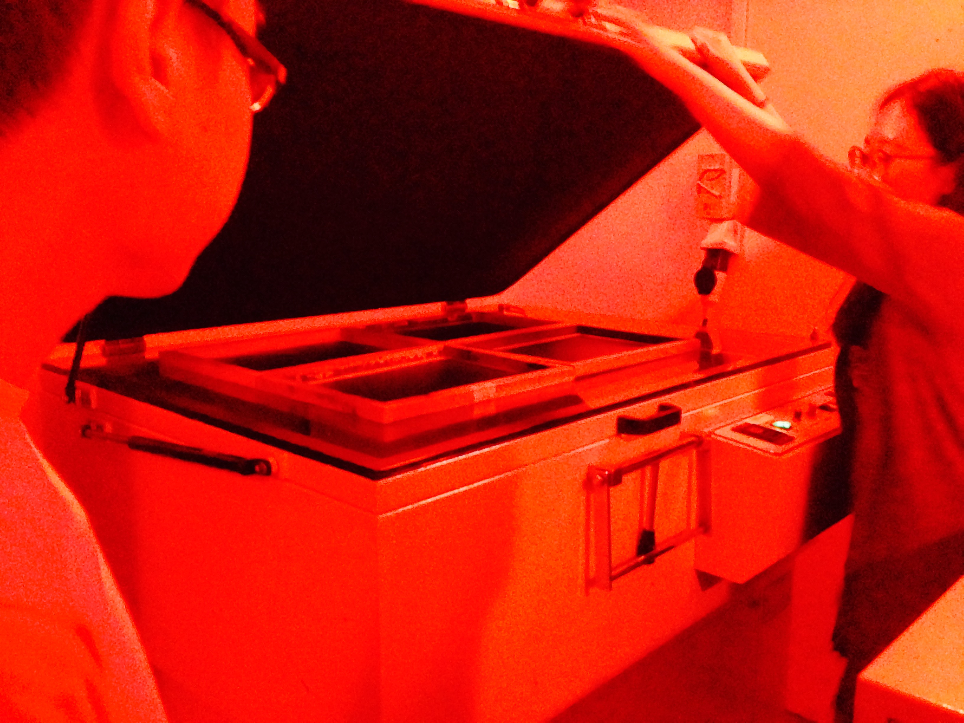
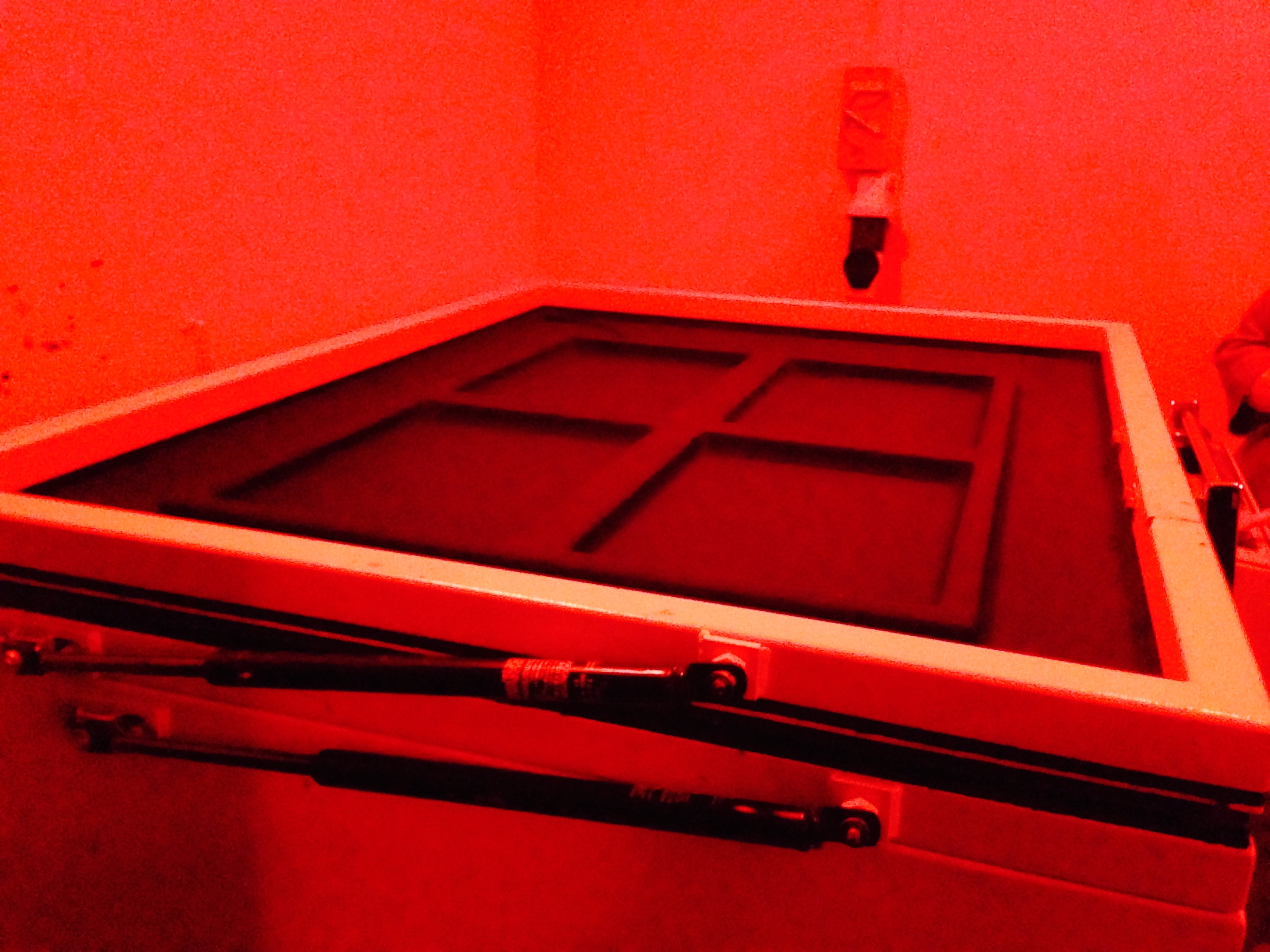
Also, traditional art is extremely time-consuming – it’ll do me more good to plan more time for them and work on the sketches more consistently too! Cutting and trimming took more time than I anticipated since I cut all of them myself.

img-20161115-wa0002

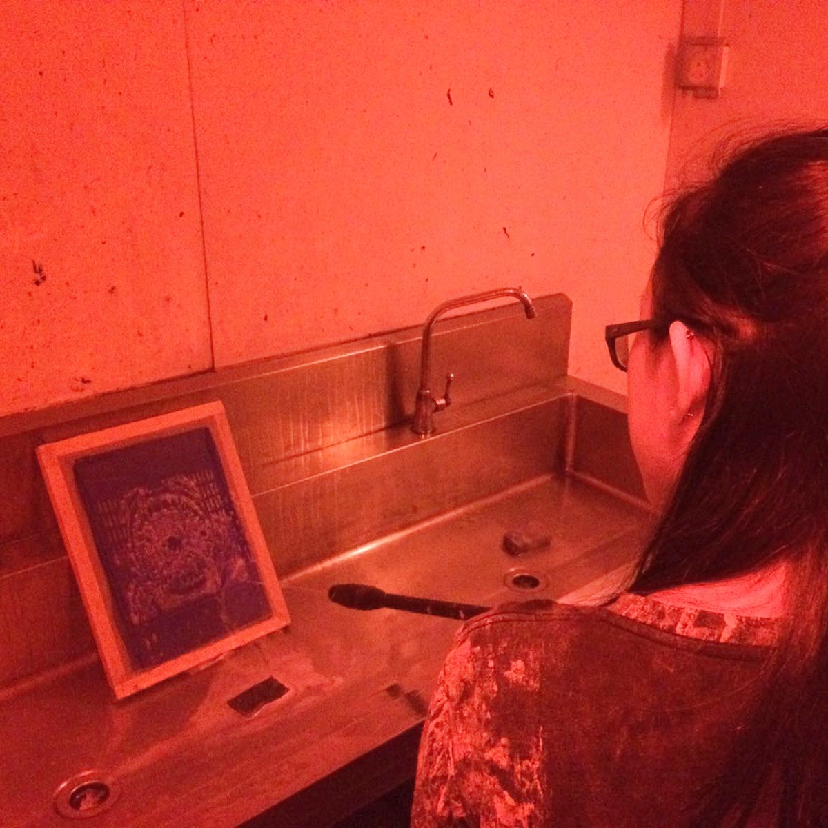
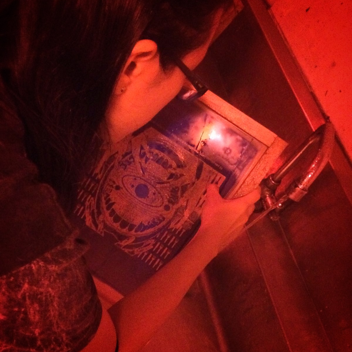
(My dad took a photo of me cutting my stuff at home!)

I’m insanely grateful for the fun consultation sessions and the wonderful 2D projects. I really hope to explore more in upcoming 2D lessons in the next semester! It was a wonderful experience!

2D Project 3: Color Research + Work in Progress (・∀・*)


Project 3: So Far


I’ve made the final changes to the concepts behind the four designs! They’re now:

1. Me, An Atheist -> Cult of Corgi Butts -> Suddenly Religious

2. Acrophobic Me -> Room of Roaches -> Up, Up and Away!

3. Fearless Me -> KFC – A Horror Movie -> Cowardly Me

4. Me, Out of Shape -> Bus Leaving from the Stop -> Suddenly Ripped


Work-In-Progress


Other than the final concept changes, I’ve also worked on quite a few of the frames today. (‘u’)

My progress over the weekends went somewhat like this in the middle:

wop

20161115_015208

I know I photoshopped Colonel Sanders to look creepy but I couldn’t stand to look at his face at night so I had to cover up his face with some leftover pieces of gold foil because black, red with “October Crow” font is too much for me. (;u;) I can’t see KFC the same way again.

2_kfc_a_horror_movie

(This is terrifying to look at; I get a scare every time I step out for water and come back to see this on the floor)

But aside from that, I started work on the traditional pieces at my own pace after finishing up the digital pieces and printing them at Jurong Point.

20161115_004906

Corgi butt is love, corgi butt is life (‘u’)

I also took a break (procrastination ;u;) and found out that pushing the color filter for my traditional mediums make them look so much better – especially analogous colors – for some odd reason. I was also wondering if the 3D element looked cheap, and I tried to filter and testing with Instagram’s filters.

1_me_an_atheist

The colors turned out super crisp and I liked the feel of it. It was really difficult when I was deciding if to scan, push colors and print it or to go with the original piece though. I decided to go with the original piece in the end for the presentation, since the organic feel of the drawing grew on me. I like original copies!

Also, here are some of the other panels!

20161115_164738

I was inspired by some stratosphere pics! I really wanted to recreate the clouds so I decided to make this into a 3D panel, and make the clouds out of wool!

 20161115_075349

Drawing macho chicken

Generally for this project, there was more doing, rather than design changes, since doing my panels traditionally meant that my sketches had to count. I had alot of fun. I hope things turn out well! (‘v’)


Color Research


Last month when I worked on Project 2, it was Inktober.

This month, while we’re working on colors, it’s Huevember!

Rather than looking up old masters or famous designs, I’ve been wading through a bunch of amazing Huevember art and they’re absolutely gorgeous.

There are traditional and digital artists participating in Huevember, and alot of them apply color theories in very interesting manners, or select specific colors to focus on.

huevember_challenge_part_1_by_cylindric-d9hb419

Huevember Challenge by Cylindric

There are those who use colors as a connecting factor in narrative (e.g. colored objects) and also those who use colors as an emotion (e.g. red as anger, blue as sadness, etc). I really enjoyed looking at some of these art, especially ones that look like tarot cards or card game art – because they look extremely well thought-out. They seem to carry an entire message or narrative within one image – I probably want to go for that style for some of my images too!

Other than Huevember, I did some research on Shepard Fairey too. He’s a contemporary street artist and graphic designer, and the founder of OBEY clothing. He works alot with black, white and reds, and dabbles alot in art regarding politics. I found this super cool since informative or propaganda always focuses alot on narratives! It was fun going onto TeeFury for ideas too. (‘u’)

2D Project 3: 2nd Consultation (・∀・)ノ

Conceptualization
I previously got 3 out of 4 of the concepts approved, but I still wasn’t quite happy with them so I revamped them and came up with a different set – but I decided to keep the corgi one!

I’m still not quite sure if the new concepts will be solid at the moment, but here’s the list:

1) Atheist -> Cult of Corgi Butts -> Suddenly Religious

2) Big chicken goes “cluck cluck cluck” -> KFC Horrors -> A tiny chick goes “pi pi pi”

3) Fear of heights -> Room of roaches -> Outer Space

4) Happy birdy -> Zombie Apocalypse -> Happy Meal

I might still tweak some stuff, but there’s that for now! And also the paired sketches:

img_20161101_164714

Layout Drafting and Sketches

img_20161101_164624

“Atheist” panel;

I chose to depict myself as a chicken after gathering some feedback from friends – it’s probably my hair and how I whisper chicken into my friends’ ears all the time. (;u;)

But anyway – I chose to pair myself as a chicken zoomorph with the concept of the planets and galaxy around me. I’m hoping that it will show my appreciation of the beauty of, and the belief in, science and nature.

I’m planning to most likely ink this image after correction.

row1_files_pic1

I quickly composed a digital draft as well for “Cult of Corgi Butts” as well. I’d most likely be drawing and inking this traditionally but I had a boat load of fun doing this panel – I LOVE CORGI BUTTS SO MUCH.

But anyway, I’ll be trying to work on more drafts over the next week or so. I’m really looking forward to working on them!

2D Project 3: Ego Start! ᕕ( ᐛ )ᕗ

Conceptualization
Booked a consultation with Shirley at 10AM – 10.30AM today; I managed to clear some stuff up and got some feedback for my sketches for my new Ego project!

img_20161101_164815

My sketches were a mess (;u;)

Drafts that were okay-ed:
1) Godzilla Bird -> Gathering of Common Interest (Gathering of Small Birbs) -> Tiny Bird

2) Atheist -> Cult of Corgi Butts -> Suddenly Religious

3) I love inking! -> Social Media -> Tiny Bird F-Arts

Representations
I decided to represent myself as a bird, but not limit myself to any particular species. Birds are very special to me – they were the first animals I had a keen interest in, and at one point of childhood I kept some as pets. Even now, there’s a little bit of bird in my social media handle as well. (‘u’)

Style
As for style, I feel like going with a mix of traditional and digital. I intend to ink traditionally, digitally enhance, print out and paint over.

gsa_cdesign_portfolio_file_07

12735642_10153907571964362_1217737752_n img_20160615_183032

Some of my inking art! 🙂

I plan to mix inking with watercolor, and may draw some hatching ideas from these to make my Ego frames!

2D Project 2: Final Designs and Summary

I’ll be expanding more on the individual designs and the thought behind them for this post, to wrap up the second project.


Designs


I’ll see you on Mars, right after I eat the Milky Way – Alpha and Omega, 2010
[Selected for Silkscreen Printing]
milkywayjpeg_lq
Elements, Symbolism and Expression
(and the reason behind them)

I chose to represent a quite-literal meaning of “eat the Milky Way” by portraying a diagram of the solar system in a mouth. The fork and knife pictogram are picked to depict the idea of feasting and finery as well, and the lace to imply a tablecloth. I have hands to represent an embrace and contact – to close up on and devour the food, but also to represent potential touch and contact that would symbolism a potential meet-up.
I was hoping that together, these elements would give off the feel of dining of the more cultured and refined sort – which seemed more suitable for a quote that promises a meeting, wait and civility.
To add to that, I edited the canines in the mouth to sharp teeth – a nod to the movie the quote came from (Alpha and Omega) which was about wolves and predetermined social status. The teeth was to contrast the finery and crassness, but even the the civility to organize a meet-up revolves around the basic wild need for eating.
Design Principles
Balance: I used a symmetrical and central composition. There is also a balance of blacks and whites – almost in 50/50.
Contrast: There is a contrast of tones in black and white, and also of the directions of the elements in the opposing cutlery, as well as hands.
Emphasis: There is emphasis in the sun in the middle of the mouth. It is dead center, and it is the biggest spot of white that is left empty as well – so it draws attention.
Rhythm: The cutlery pictograms oppose each other, and the hands curl and form a space around the center – which leads the movement straight to the images in the middle and center.
Movement: The cutlery pictograms, as well as the hands, are all pointing in opposing directions to lead the eyes to the center. The lines radiating out from the sun in the middle also draws the eyes first to the sun, before the eyes travel along with the radiating lines to look at the smaller planets and stars, and the teeth.
Space: There is a sense of foreground (hands), middle ground (mouth) and background (cutlery and lace). It creates a balance through the ‘distance’ in the nature of the object. Pictograms are the most detached, and hands are warmest, with the solar system in the middle ground as something real and distant, but yet not artificial.
Unity: The elements are physically interacting with each other – like the hands curling around the mouth and the solar system inside the mouth. They are also linked in meaning – we use cutlery, and our hands and mouth to eat that which is gifted to us by nature.

People once believed that when someone dies, a crow carries their soul to the land of the dead – The Crow, 1994 

crowjpeg_lq2
Elements, Symbolism and Expression
(and the reason behind them)

I chose to firstly represent people as ‘hands’ – to avoid individualizing people for this design and also to represent a graveyard and garden of souls, along with the picket fences. Using them together would make it look more earthly, like the mortal burdens. By planting them on the ground, I created a ‘border’ as well, between the human and the beyond that is represented by the floating circular door.
The circular door is to represent the ‘land of the dead’ and the idea of
I used an image of a crow made of different animals to show the crows as the guardians of life, as well as emotions and transparency – as humans are also animals, which may make us no better in death.
Design Principles
Balance: The design is symmetrical – it is almost identical in visual weight and image when split down in half and flipped.
Rhythm: The picket fences and hands are repeated across to ground them in the lower half of the picture – to mortality, as well as to separate them and show a boundary.
Value: The door is shown to have half-tones that radiate outwards; to emphasize it’s centrality and depict rays.
Movement: The picket fences and hands pointing upwards to create a visual line upwards to the crows and circular door, and also to imply the rising action of the eyes.
Contrast: There is a contrast in the darkness of the bottom half of the image, versus the light in the top half of the image – one is mostly blacks, and the other is mostly whites. I also used a strong contrast for the hands against the picket fences – the whites to show the idea of life, and the black picket fences to show the inanimate.
Space: There is a clear split in the middle of the divine and mortality in the middle.

Here’s another curse for you – may all your bacon burn – Howl’s Moving Castle, 2004
burnbaconjpeg_lq
Elements, Symbolism and Expression
(and the reason behind them)

The first element in this is the pig and it represents the bacon! By choosing a live pig instead of bacon makes the image darker and meaner as roasting something alive implies pain and suffering. Along with that, there are cracked textures on the background to complement the pain and suffering.

The magic circle, yarn pins and roasting fire all come together to show the meaning of a vengeful, dark curse.

Design Principles
Texture: A cracked texture is placed on the background to show pain and suffering, and there is texture on the pig and fire as well to show action that is hot in nature – charring and crackling.
Movement: The fire directs the viewer’s view upwards, and the pins stuck in the pig directs the viewer’s gaze downwards onto the pig. The magic circle also closes in on the pig.
Space: The magic circle in the background and the pig in the foreground implies a ritual. If it were switched the other way round, it would seem as if casting is in action instead.

Baskin-Robbins always finds out – Ant-Man, 2015
baskinrobbinsjpeg_lq
Elements, Symbolism and Expression
(and the reason behind them)
The robin has a halo (of a celtic knot and rays) and judgmental eyes to convey a feeling of far superiority and of the robin monitoring your every move – to emulate a “Big Brother is watching you” vibe.
The celtic knot is to be the sun as it represents interconnection of all things, and the stump represents a land. The stump also has a design of the city to imply a civilization, and the little human pictograms and vectors are to show a ‘checkpoint’. This is to convey that everyone is being very tightly-watched by the robin, a dictatorial figure.
Finally, the cherry on the robin’s head is a nod to the brand – Baskin Robbins – as a stereotypical ice-cream or dessert comes with a cherry on top.
Design Principles
Unity: Every element in the picture are linked to each other. The robin interacts with the rays, the halo and the city-stump, and the people pictogram running through the stump, interacting with it. With the elements all connected to each other in some way, it creates a unified image where not a single element is left out.
Balance: The design’s visual weight is symmetrical if cut by half in the middle – which means that it adheres to the principle of balance.
Scale & Proportion, Dominance & Emphasis: In having the robin contrasting in scale and proportion to the other subjects (the running people in pictogram), it places more emphasis on the robin.
Similarity & Contrast: The space in which the robin sits in (the sun’s rays) and the space in which the pictogram people are running on (the whites and the vectors) are portrayed as two different spaces, which gives off a contrast between the bird and the people.
Also utilizing similarity, the people are duplicated and repeated, which directs attention away from the individual pictogram as it manipulates the viewer into seeing them as a line, rather than an individual pictogram.

 Difficulties and Learning Points
(during the conceptual and production stage, and takeaways)

I had a couple of surface difficulties. While I worked on the designs halfway, I realized that I should not have grey tones in my image, so I had to rework all of them. I overcame this by abusing the Threshold filter and Levels function – which converts everything into black and white, and manipulates the percentages.
I didn’t encounter this difficulty myself but at one point while hosing off and picking at my screen, I did learn that half-tones and fine lines didn’t work in silk-screen printing – they don’t stay, and get washed off. I think some of our classmates had to redo their screens due to this. I was very worried at one point as my screen had some stars and lines that were quite fine.

Another point that I did panic at as well, was when I was pulling the paint down with the squeegee to test-print my design on newsprint. It turned out extremely dark (all the stars went out!) and it was hard to gauge the amount of ink I needed to use to print on fabric.

Miraculously enough – none of the major elements I had were compromised, and even the smallest detail, the lace, was printed out in surprising detail on my own tote bag!
20161018_092448_lq
I lost some of the netted texture,
but it’s better than a black or white chunk! (‘u’)
Thanks to this experience though, I did learn how fine you can actually go for silkscreen printing – what is printable, and what isn’t. What works well on fabric, what works well on newsprint, and more.
I also learnt from Shirley that pictures have warmth and coolness from textures! In the quote from Howl’s Moving Castle (the bacon one!), I learnt about the ‘temperature’ of an image. I used a fire pictogram, but replaced it with a fire that I made with a fire photograph overlaid with engraving texture – because the pictogram didn’t look hot enough. This usage of temperature didn’t cross my mind at all, so it was great learning!
Other than that, when I initially started on the first design, I was bent on using the pen tool, masking tool and half-tones. It was a nasty thing to do, since I ran into many issues with composition after putting in an element for the sake of putting one in, and not because they made sense. I tried to incorporate everything I learnt into an image, thinking that it would create variety. It didn’t work out that way for me when I shifted around the elements in my working file – the half-toned elements didn’t go well with the posterized elements, and wouldn’t go well with the images that had the threshold filter or an engraving patterning as well.
I learnt from this project that coming up with the concept, the subject and the design should take precedence over the aesthetics of the image when I’m starting on the first draft – it’s alright for the starting point to look ugly, and it’s alright to make mistakes! Normally, that would have been the natural thing to do, but after the Photoshop session during recess week, I was blindsided by the new things I had learnt – like how to retain the image size, how to use filters (such as half-tones). It caused me start designing with the filters and effects in mind, rather than using it as a touch-up tool.
From this, I learnt that I shouldn’t be cramping my style with tools. The things I had learnt should broaden the range of things that I can do, it shouldn’t be forcing me into a mold. Your tools should help you, not impede you!
And finally, I also learnt the importance of having friends. I don’t think any of us could have completed this project without a few extra pair of hands – and it’s great to have friends who can hold your screen down for you when you print! You help clean each other’s screens, get to keep each other company and get opinions and help from each other as well. Silkscreen printing helped me to remember the importance of teamwork and I had alot of fun during the project!
Also, Google is a very dangerous place. Choose your keywords carefully 🙁
(Also we’re doing this during Inktober; it’s a beautiful time for doing Project 2 >—>(c’:) )
Thank you Project 2! I’ve learnt so much from you!

2D Project 2: Silkscreen Printing \(・∀・)/ (Part 2)

Pre-Session 2 (9/10/16)

I went to Muji on a Sunday to buy a couple of blank totebags for myself and my friends, so I figured I should put this down here as well so that I can refer to it if I ever need more totes in the future!

img_20161015_142545_lq

img_20161015_142639

Nicole previously went to Art Friend as well to look at the totebags over there, but in terms of both pricing and fitting length – Muji is cheaper and also more aesthetically pleasing.

(I later found out on Tuesday that it was better for printing on (material-wise) as well)

Also on an unrelated note, while shopping for the totes in Muji, I realised that Muji named it “MyBag”. A friend from WKW and I had a conversation over lunch about Japanese slang as well – I learnt more about their tendency to use “my —” in their slang.

Like when a Japanese asks you what is your “my boom”, it sounds ridiculous to us. What’s a “my boom”? Is it some sound? Some audio fad thing?

Apparently “my boom” refers to what’s your current obsession – like what do you have strong interest in – is it Kpop? Basketball? Fandoms?

There’s also “my glove”, which would mean personal gloves in japanese (which could be used when you have a personal bowling glove, etc)

So I guess Muji naming their product “MyBag” is their way of showing that they want to make this bag personal for the customer, in their own way.

It’s rather unrelated to the silkscreen process, but I feel like I understand more about Japanese product-naming senses and fads through shopping as well, so I just wanted to put this down. It’s kinda nice to learn! (‘u’)

Silkscreen Session Part 2 (The important bit!)
I’ve been dying to come back and finish up the silkscreen process!

img_20161015_132531

Today’s session continued off from last week, and we got into pairs. I teamed up with Andree (thanks for being so patient and also for your help, Andree ;u;)

We started off with putting coins at the corners of the screen and putting brown low noise, packing tape over them. Putting coin at the corners helped to give a small distance between the screen and the canvas we were inking, and the packing tape on the sides was to prevent ink from seeping through the borders of the design.

img_20161015_134351

img_20161015_132008With the taping done, there was a demonstration for printing!

The concept of it was easy, but doing it myself kinda destroyed my nerves.
I should have bought more totebags from Muji. 🙁

img_20161015_132340

My tries on paper kept turning out too dark and I was extremely worried for a sec. Each time I tried, I needed to wash and dry the screen as well so I learnt to be careful to make sure the front part of the screen was dry before I attempted another shot at printing – else the print would come out with grey splotches and stains of ink mixed with water. (;u;)

img_20161015_142446

One of the attempts on newsprint; bottom-left is grey because of water.

I finally dared to try printing on the blank tote given by the school. I stuffed a piece of cardboard into the tote and started on it, but I crapped up on my first attempt, so I had to flip it over and do it on the other side. I was so sad, but it was…. okay. It turned out alright… I guess…

But the one I printed on the Muji tote!!!

The one I printed on my own tote turned out better than my attempts on newsprint and on the school tote though!

ALL THE STARS CAME OUT.

img_20161011_172225_lq

IT’S FINALLY DONE.

I shouldn’t scare myself so much next time – but it was really scary to try to print when all my newsprint attempts turned out so dark, and the Art Friend bag turned out either too dark or light.

It turned out alright in the end though! I guess what I picked up from this is that different material would take differently to printing. I have a feeling that since Muji made their bags for stamps and chops, it was probably why it printed better – the surface was smoother and took well to printing. //slaps newsprint to mars

It’s kinda sad to be applying betastrip to clean the emulsion off after working so hard to get the design out on the screen.

In the previous session, I saw Shirley applying emulsion on the front and back of Amelia’s screen to get the design off, so I did the same for mine after removing the tape and coins when I felt like I done.

The blue slowly comes off after the betastrip is applied, so I just left it on the screen as I went to clean up the other stuff – like the newsprints, the table and the screen printing squeegees (the smooth rubber blades we were using to pull the ink down).

I was super curious about the word ‘squeegee’ because it sounds super cute; apparently it comes from the word “squeege”, which meant to press or squeeze – which was in use around 1783. THIS IS SO COOL.

But anyway…

img_20161015_132142RIP my first screen >—>(c’:)

After waiting for awhile, I just dunked it in the sink and started scrubbing until all the blue came off, dried it in The Dark Room and returned the screen.

20161011_160109

It was a blank screen graveyard.  ~~~ଘ(੭*ˊᵕˋ)੭*

I was initially intimidated by the silkscreen process but I’m really glad to have been able to do it for this assignment! I really enjoyed the process, and I have newfound appreciation for people who are doing printing – they must be super patient and meticulous!

img_20161015_140627

I’m not sure what I’m going to use the totebag for since I only printed one for myself, but I think I’ll eventually find a use for it!

I’ll just let my hamster sit on it for now. (;u;)

2D Project 2: Silkscreen Printing 口\(・∀・ ) (Part 1)

Silkscreen Session Part 1
The class started on silkscreen printing today!

After the weekly presentation, we all took a screen. I went with Nicole into the dark room first to coat my screen in blue ink with Jia Hui’s (our super kind student assistant’s) help, and placed it to dry for the next 20 minutes.

img_20161015_162037

I’m sorry for being a public nuisance (u-u);;

While waiting for it to dry, I realised that we had to actually print our quotes together with the image on the transparency. I printed only the image, so I had to go reprint the transparency at One Stop.

img_20161015_155504

After returning with the transparencies, our screens were dried! We grouped up in fours and went in to put the transparency on it so that we can do exposure! I went with Andree, Rochele and Amelia.

I forgot to take my phone into the room so I took some images with Shirley’s phone during the vacuuming process! (‘u’) (And for the dark room parts, we mostly used Andree and Rochele’s phones to take pictures. Thanks guys! ♡)

fullsizerender-6

Jia Hui opening the vacuum machine and putting our four screens for vacuuming!

fullsizerender

Zwoop!

(Thanks for the pictures, Shirley! ♡)

After that, we went to spray our designs with a hose-gun thing and wow, it was sure loud.

Hosing the screen generally got the big parts to come off, but we still parked by the sink so that we can scratch off the leftover emulsion bits that wasn’t supposed to be there.

img_20161015_161933

-pew pew pew-

img_20161015_133014

-scratch scratch dab dab-

img_20161015_133226

WHY WON’T YOU COME OFF.
*scratching intensifies*

The emulsion was surprisingly strong! I scratched it with all my strength and it was still somewhat okay. I’m surprised that some of the thinner details made it as well – like the lace lines and the stars!

img_20161015_162158

And also… BUDDY ROCHELE…!

If I’m not wrong, some of the other classmates had more intricate spots, and the hosing + scratching made those spots come off completely – what a nightmare. (Guys, you’re super amazing for redoing this. (;u;) )

After the hosing + scratching, I dried off the screen abit and just stored it in class – that was the end of today’s session!

Consultation
Other than the process, I also got a couple of feedbacks and notes:

– My designs were very central and safe; I will try to be more adventurous next time!
– I almost printed the designs with the wrong dash (an em dash instead of en dash. These dashes are evil.)
-Also, I got to talk to Shirley more about my other designs as well, other than the main design – like the crow and bacon design.

…And that was all! (‘u’)✿

2D Project 2: Photoshop Session and Recess Week ヾ(・ω・)メ(・ω・)ノ

27th September 2016: Photoshop Tutorial in PC Lab (‘u’)
The session today started off with a quick tutorial by Shirley on pen tool, path, masking, half-tones, etc!

Before this, I’ve never used the pen tool, path and converted my images to smart objects. I abused the polygonal lasso tool and the transform tool to make images, and I end up having to lasso the same areas over and over again. (;u;)

I feel this this session has taught me alot about retaining my image information and quality – I’m super stoked!

file1

Screenshot of my first practice with the pen tool and paths/masking.

I tried it out on a few more objects as well like skulls, and proceeded to try out the different filters on them – half-tone, posterize, threshold, etc.

On another note, I’ve also learned something pretty incredible.

file2

I’m pretty sure that I still can’t tell the difference between these three even if they were shown to me right now. I’ll have to go take another look at them. To people who can see the difference: YOU ARE INCREDIBLE.

ALSO I WOULD REALLY LIKE TO THANK JOYCE FOR BEING INCREDIBLY PATIENT AND SUPER COOL DURING THE SESSION.

THANK YOU JOYCE!!!

1st October 2016: Drafts for Consultation

I dedicated my Saturday completely to working on the four drafts for Sunday’s consultation!

The prototype for the first draft turned out absolutely terrifying.

file4

Abandoned working file for “No music!”
this is terrifyingggg noooooo :'(

I felt like by trying to make too much sense and trying to forcibly use a quote that I already set my heart on, I wound up spending hours on something that didn’t work at all.

I previously had quotes (from Rise of the Guardians, How to Train Your Dragon and Mad Max) from different movies, but I changed them to look for quotes that I could interpret better, instead of something that was a little bit too open-ended, such as “No Music!”.

I was trying to work out posterize as well, and it retained some greys – not good!

So I tried working the other way instead – finding objects that I liked, and finding quotes and looking at how to arranging the elements instead. I quickly wound up with 4 designs!

1. Crow

crow_draft1

Draft that was sent in on Sunday.

file3

From a blurry image of someone’s crow artwork!
Thank you so much for the beautiful work >—>(c’:)

The first one, I worked on it from a tattoo of a crow I liked – then I found a movie quote pertaining to crows, and remembered an old movie that had a really nice quote about them: “People once believed that when someone dies, a crow carries their soul to the land of the dead.”

I chose to interpret:
-people as ‘hands’
-souls as ‘eyes’
-picket fences as ‘mortality’ or ‘burden’
-a circular door as a ‘portal’ or ‘border’
-an image of a crow made of other different animals as the ‘crow’ and the meaning of human/animal ‘actions’

2. Milky Way

milkyway_draft1

I worked on a quote from Alpha and Omega right after this one: “I’ll see you on Mars, right after I eat the Milky Way”.

It’s pretty hard to break down this one in my head since I started running away with my gut/instincts with this one, but it went along the lines of:

-mouth and the solar system in mouth, as quite literally “eat the Milky Way”
-fork and knife pictogram and lace as the idea of feasting, or eating
-hands as the idea of “meeting”

file5

For this one, I only had a couple of minor decisions – like the conscious decision to give the mouth fangs instead of normal teeth so that it looks more aggressive, and also I didn’t give in to temptation do this ridiculous thing and end up overusing/abusing the fork and knife pictogram:

file5_1

…well things could have turned out much south aaahahahaha-

3. Baskin Robbins

baskinrobbins_draft1

I SHOULD HAVE DONE “BASKING ROBINS”.

I really should have…!

But anyway, this design wound up kinda circular as well. I showed it to my dad and he said it looked like some kind of design with political agenda. (thanks dad)

This one was based on the quote “Baskin-Robbins always finds out”.

I wanted to make a nod to Baskin Robbins by placing a cherry on top of the robin’s head as a hat. I also made the robin look extremely judgmental to give off the feeling of being far superior – along with a halo and light rays, and also that the robin is constantly watching everything you do.

The little humans and vectors are to show a ‘checkpoint’ – the feeling like you can run, but you can never hide from the robin.

4. Burn Bacon!

burnbacon_draft1

I had a ton of fun with this one! I was exploring how satanic I could push it.

I’m kinda terrified of googling for satanic magic circles and will probably never print this.

I found a great quality engraving image of a pig, and decided to get some image of yarn pins and combine it with the magic circle element to imply the “curse”. I kinda wound up combining two magic circles to create the image of having something intricate behind the pig as well – it was strangely empty and it wasn’t complimenting the pork well previously. 🙁

Also to show burn, I had used fire pictograms!

2nd October 2016: Sunday Consultation – Compilation of first drafts

baskinrobbins_draft1

Baskin-Robbins always finds out – Dale, Ant-Man, 2015

burnbacon_draft1

Here’s another curse for you – may all your bacon burn – Calcifer, Howl’s Moving Castle, 2004

crow_draft1

People once believed that when someone dies, a crow carries their soul to the land of the dead – Sarah, The Crow, 1994

milkyway_draft1

I’ll see you on Mars, right after I eat the Milky Way – Kate, Alpha and Omega, 2010

2D Project 2: Movie Quotes and Artist Research (╮’-‘)╮

Quotes selected for Project 2

paul-rudd-ant-man-0-0

Baskin-Robbins always finds out – Dale, Ant-Man, 2015

maxresdefault

People once believed that when someone dies, a crow carries their soul to the land of the dead – Sarah, The Crow, 1994

alpha-and-omega-088I’ll see you on Mars, right after I eat the Milky Way – Kate, Alpha and Omega, 2010

910152091_06621933faHere’s another curse for you – may all your bacon burn – Calcifer, Howl’s Moving Castle, 2004

Art/Artist Research

This project is strongly related to dada – an art movement where the artists focuses on not creating and crafting aesthetically pleasing objects, but instead on making works that challenged controversies, social issues, and the purpose of art, amongst many other thing.

Dada artists generally use ready-made objects, and in this project, we are encouraged to use ready-made images available on the Internet as well, and to alter and distort them to fit our purpose – which is to send a message or to provoke certain thoughts and emotions.

One of the most popular examples of the use of ready-mades was Duchamp’s “Fountain” in 1917, which was just a urinal. It apparently was a reference to Baroque and Renaissance artists, and he was the first to use a ready-made.

I would like to just focus more on the aspect of ‘found object’ (‘objet trouvé’ in French), and more specifically – Robert Bradford’s trash art.

514995_rocking-horse

Rocking Horse by Robert Bradford

robert-bradford-interview-yatzer_2

Pug One by Robert Bradford

I’m extremely intrigued by ‘chimera’ art that steals many different parts to form a wholesome piece of art that delivers a clear message and image.

Bradford’s work uses recycled and utilitarian materials, and he prefers materials with a history of weathering – which I find interesting. I find that his use of materials gives some texture and personality to the different parts of the art. It’s interesting to look at his choice of materials for the different parts of the toy – the hooves, the bones, grooves, muscles and more.

His most popular works, in my opinion, are probably the plastic and soft toy sculpture series. It tries to bring across a message about recycling, as well as consumerism waste (with the use of toy parts). Apparently, they are also monuments to uncredited artists who produced the toys used in the works. Other than that, he uses his art to explore psychotherapeutic concepts – art practiced for therapeutic purposes.

I feel that Bradford uses his art for an incredibly gentle, yet strong, purpose and I would probably like to explore art as a wholesome entity for this project with elements that would co-exist well as a body in terms of texture, variety and more.

Hopefully in doing so, my movie quote and purpose would come strongly through the quote and look aesthetically pleasing at the same time!