


My Event: A Prom for Supernatural Creatures
I think I went a little crazy working on this assignment.
Illustrated Item #1: Gif E-Invite (for humans), Physical Invitation Card (for supernaturals)
“Come to prom. Please.” – Spelltown Student Council

*Note: Stay for around 10-20 seconds on this image! 🙂
In an ideal situation in a supernatural junior college, they would probably receive an physical piece of paper with moving images like the newspapers/howler in the Harry Potter books. The next best thing to replicate that effect is probably a gif…
Illustrated Item #2: Prom King Poster

Illustrated Item #3: Prom Queen Poster

Illustrated Item #4: Sticker Set (Prom Favour)
“We’ve got all sorts of clubs – there’s something for everyone!”


Item #1: E-Invite (for humans) / Moving Physical Invite (for supernaturals)
(I imposed it to do a mock-up for how a student might receive the invite!)

Item #2: Prom King Poster

Item #3: Prom Queen Poster


Item #4: Stickers (Prom Favour)
I wanted to go with a very colorful/striking palette for this project!
In the previous post, I started with the stickers first to determine a narrative and look and feel for the rest of the assets (invites + 2 posters). Decided on a more comic book style and I was quite determined to illustrate as much as I can over the different assets so that they would all provide a different narrative over the different medias to tell more about the event!
I started the Ken poster with Ken as a soft, fluffy boy (but gave him some fierce after Lisa said he wasn’t intimidating enough woops). I struggled with his ferocity quite abit…


Then there’s Circe the witch!


Ken and Circe have come very far indeed…

Original Thumbnails
I did the e-invite last even though it was the first thing I planned for in the series of assets. The e-invite was really fun! But also a pain because there were so many issues!

Edited comp from thumbnail (to fit square)

Invert checks
 Still image
At this point, I already finished the poster and stickers so I already had a look I wanted to work off on, but I quickly realised that I’ll have to pay the price in linework if I wanted to add more animated elements. 🙁
I reduced the lines and number of tones to put the characters more in place with the background characters of both posters, but hopefully still in line with the look of the other assets.

COMEEEEE TO PROMMMMMMM… COMEEEEEEEEEEE
I initially wanted to use Live2D and break down the characters by body parts but Live2D crashed my PC multiple times… so I guess I’ll have to settle for Adobe’s animation timeline. This gif is 100+++ of layers and I had a major brainfart at some parts when I couldn’t find the layers.

I did a little ref to the standard animation for seaweed cycle for his wriggly tail hehe.


The pink demon’s skin didn’t export well – noooo!!! D:
There was also another issue with export because there were so many colors. So the colors exported all over the place and I had to try a few different settings. Thankfully I had some foresight to do the invite on a much smaller file (1000 x 1000 px) so that I could keep it a pretty small file and not have to deal with sizing issues – but still have decent quality to the illustrations eep. BUT ANYWAY, IT WAS FUN WORKING ON MOVING THINGS.
I did wish I have more time to bomb on paying more attention to color and linework and making them more consistent – but overall I was super happy working on this project since it was so fun!
Assignment 3: Part 1 (Week 11-12 Progress): https://oss.adm.ntu.edu.sg/laum0005/illustration-for-designers-assignment-3-week-11-12-progress/
Gallery of research and past works: https://oss.adm.ntu.edu.sg/laum0005/illustration-for-designers-gallery-academic-blog/

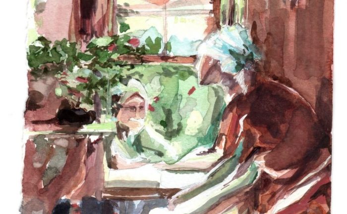
Week 13 update! Painted the topic interior.

Final artwork #2 – embroidery
20cm x 28.2cm
Looked mostly into a combination of Arkhipov and Inness for this topic.

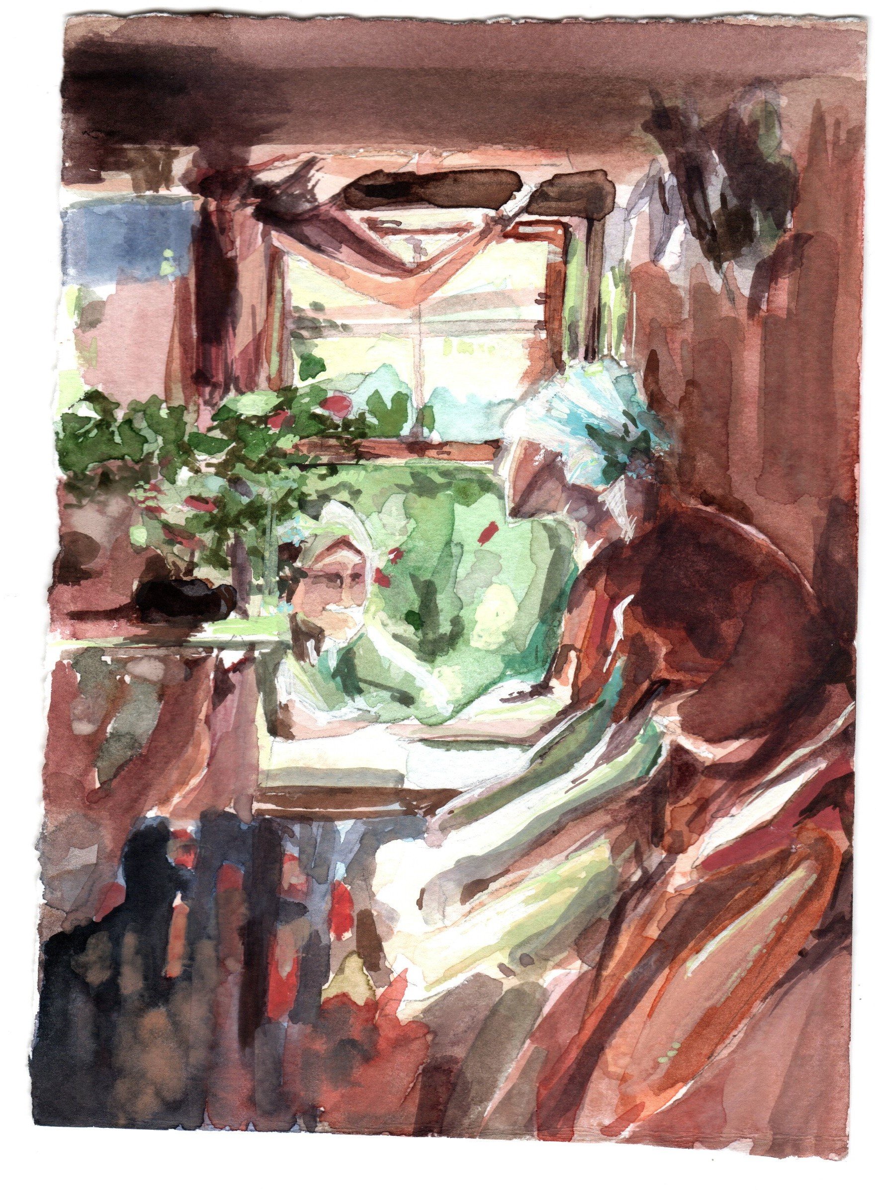
Color test (with a different composition)
(got too excited to try out the colors with the final after doing this color test and the Inness study so I headed right for final after this piece…)


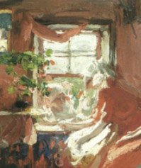
Inness Study
(studying how the transitions are handled on the trunk and retaining chroma but woops with the many green HAHAHA)

Random balance practice (looking into transitional colors – purple/brown)
Reviewed the video on transitional colors and did a super quick practice on my own based on class time’s abstraction practice and view from window

Thumbnails for final / color tests
For the layout of the piece, I liked Arkhipov’s subjects (embroidery/women) and wanted to do something a little similar, so I combined some Arkhipov/embroidery/yangqin poses and embroidery to try to catch the same intimacy in the image.

Images: Arkhipov, Inness, Yangqin player, Chinese clothes, Cheesecake Factory photo from a trip to US, Embroidy close-up

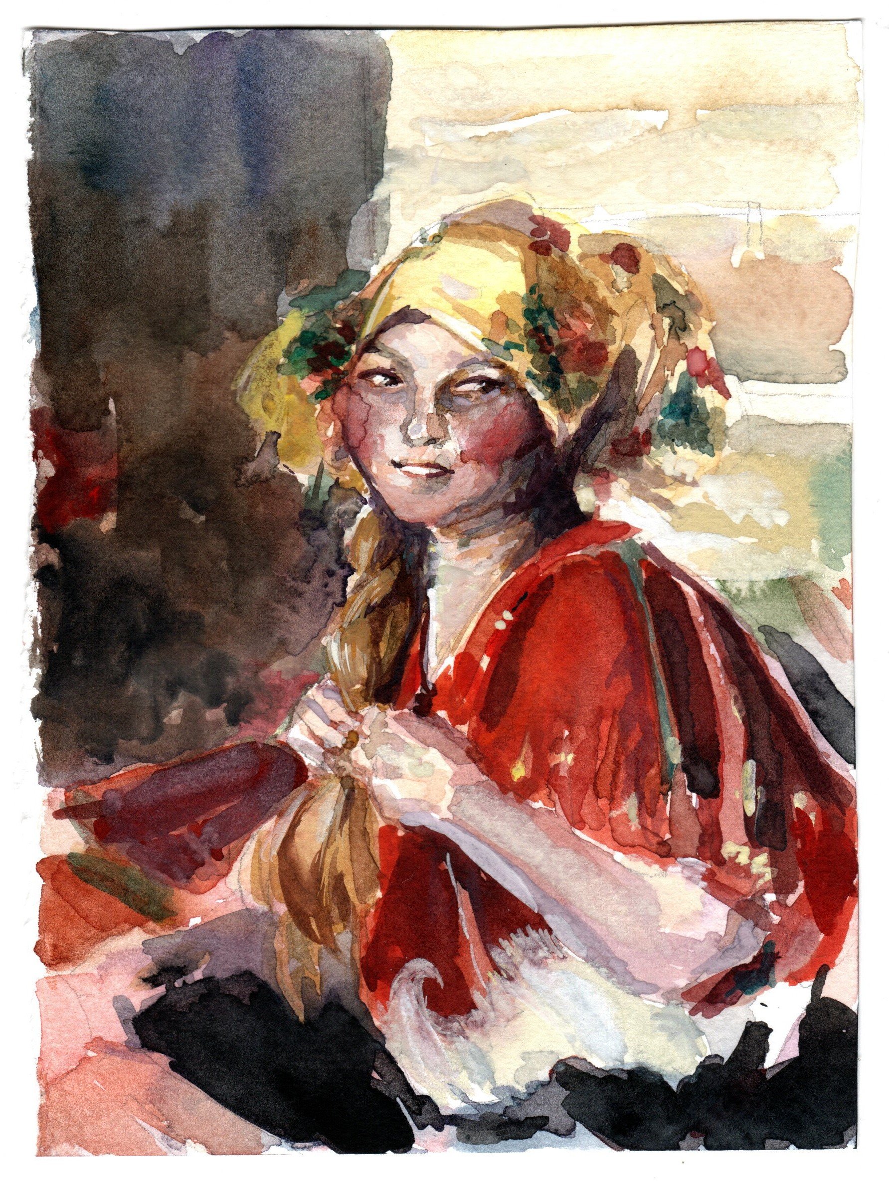
Archipov Study #1

Arkhipov Study #2
Not very happy with how little chroma is retained in the final and also I think I still isolated subjects again… I know some of the persisting problems I have and still accidentally committed them during painting RIP. :’) Need to turn on my brain more during practice and less rushing. I’m so glad I borrowed Inness’ book to study from the school library before circuit breaker.
If time permits, I’ll try to get another piece done for the final (Weather Condition/Tinted) or revisit Landscape/Interior.
(If not, I’ll practice on my own anyway HAHAHA)

I was a little stuck between a tea party for witches or a prom for supernatural creatures ( or even a zombie body parts auction my brain is poot). I went with the prom in the end!
Prom for Supernatural Creatures
I created two user personas – one specific to the event and the other is a real life user persona.


Since I went with the prom idea, I looked back to my unused moodboard from Assignment 2 that I really liked and found would fit the event really well. I wanted the prom to be dark, but still ultimately fun, teen and wholesome!


I dumped a bunch of things onto the mind-map and tried to see what I could use – since the creatures and their representations would set the tone of the party and items.
I imagined myself in the shoes of the student council/staff in order to try to figure out what assets would be needed for a prom… and did lots of research since I went to poly and not JC, so I’ve never really gone to a prom myself. (I will live vicariously through this project I guess)

Stickers Thumbnails:


E-Invite Thumbnails:


Prom King/Queen Poster Thumbnails:

Warning Poster Thumbnails:

I decided to stick with these 4 items for the finals:
Honestly I’d make all the assets move and breathe if I could but I’ll do the e-invite first… and see how about the rest. :’)
I started working on the stickers first since it would be the easier asset to use to visualize what a school of supernatural creatures would be like – their clubs, facilities and space!
Here are some work-in-progress items:


Got some feedback from Lisa that it might be better to simplify since the details may be lost at a smaller sizing (smoke strips/claw), so I removed them and strove to do the other stickers in a similar vein.


Sticker #1: Bone Hockey Student Club
Joining costs an arm and a leg

Sticker #2: Poisons & Venoms Student Club
Tasters get extra CCA points

Sticker #3: Spelltown Junior College Student Council
Working day and night to enhance your student life

Sticker #4: Student Welfare Committee
For the bleeding hearts

Sticker #5: Theatre Student Club
Cultural diversity!
I want to join the wing brigade. :’)

A week 12 update!
Between last week and this week, I suddenly decided to attempt another topic (Landscape) instead because I suddenly got intimidated at the thought of needing to paint a final image. This hopefully helped me to chill abit and warm up for more paintings while painting barns and a field. 🙂

Final artwork #1 – barn by the mountains
28.5cm x 19.5cm

Color tests
I think the thumbnail in my opinion seemed to work a little better than the final due to the smaller range from more tinting and less shaded colors? I lost the field a little between the thumbnail and final for this landscape piece.


Photos of the paintings
I looked into Shishkin and Inness’s fields for reference on colors and foreground and Inness and Monet to paint the field (painting distance as a relative whole; changing colors), but in hindsight should have also looked into being better at managing the mountains and skies – I tried using more purples as a transition and tinting more to hold the image together but the mountains and skies still look abit odd. I got abit too greedy but it was fun… Perhaps I should have done more color tests (and also time to look into more sky and mountain practice)… :O
Also, here are the initial thumbnail sketches for landscapes


Pencil thumbnails for landscape painting
Will probably try another topic first before considering making more attempts. 🙂

Images: Barn photos, Inness, Monet, Shishkin
Out of the 4 topics, I’ve chosen to work on Interior Space and Weather Condition.
If time permits, I definitely want to try out the other topics too! (Or at least study them)
As of now, I only have in mind what I might want to do for Interior Space.
On week 10, prof. Woon Lam mentioned a Russian painter called Abram Arkhipov and I went to check him out. I love the color control in some of his works – the recurring use of reds in his works and how the colors transit from red to greens/blues.
Abram Arkhipov Excerpt
My Abram Arkhipov Study #1
My Abram Arkhipov Study #2
I want to try studying and implementing his color schemes on an interior! Maybe find a way to play with it too. 🙂
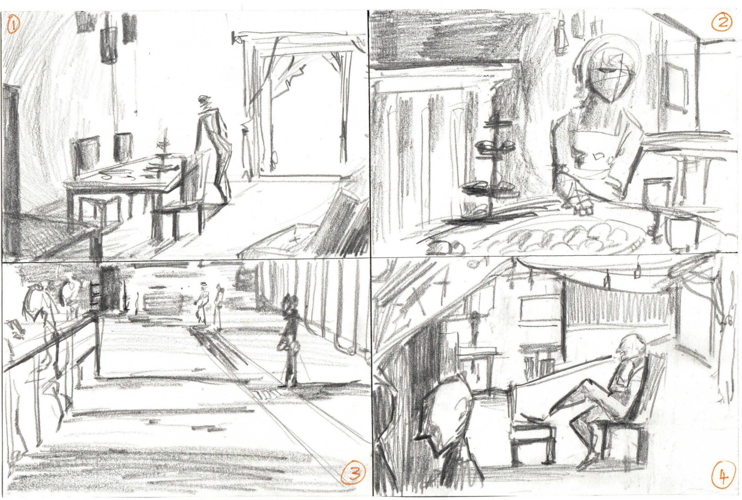
I did 4 quick thumbnails so far that are a combination of photos/live doodles.
No. 1 is a living room space with a glass door/window shining in.
No. 2 is a dining moment with lots of food on the table.
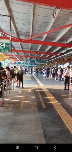
No. 3 is a quick thumbnail based on Jurong East bus station waiting lines.
No. 4 is a combination of windows, chairs and people to make a party-like interior situation. Abit messy here.
Looking to do more thumbnails and try the cutout filter method too. So far I’m more keen on No. 3 because I want to look into painting shadows, or No. 4 because I want to paint more food.
Week 2 to 10 works (In-class practices and self-studies): https://oss.adm.ntu.edu.sg/laum0005/watermedia-landscape-painting-week-2-10-exercises/
Week 5 tonal practice: https://oss.adm.ntu.edu.sg/laum0005/watermedia-landscape-painting-week-5-tonal-exercises/
Week 1 Blog Post: https://oss.adm.ntu.edu.sg/laum0005/illustration-for-designers-week-1-entopic-graphomania/
About: Introduction and entopic graphomania exercise
Week 2 Blog Post: https://oss.adm.ntu.edu.sg/laum0005/illustration-for-designers-week-2-activity-1-2/
About: Drawing each other and artist research
Assignment #1 (Self Portrait – Inanimate Portraits, Week 3): https://oss.adm.ntu.edu.sg/laum0005/illustration-for…gnment-1-process/
Assignment #2 (Editorial Illustration, Week 5): https://oss.adm.ntu.edu.sg/laum0005/illustration-for-designers-varoom-artist-research-week-5/
Assignment #2 (Editorial Illustration, Week 9): https://oss.adm.ntu.edu.sg/laum0005/illustration-for-designers-assignment-2-final-varoom/
Assignment #3 (Applied Illustration, Week 11-12): https://oss.adm.ntu.edu.sg/laum0005/illustration-for-designers-assignment-3-week-11-12-progress/
Assignment #3 (Applied Illustration, Week 13-24): https://oss.adm.ntu.edu.sg/laum0005/illustration-for-designers-assignment-3-process-final-illustrations-and-mock-ups/