

Final Pages
My concept is ‘If Senses could See’.
I wanted to take advantage of the fact that the zine is a visual look-book and I decided to personify the senses (excluding sight).

Our seven senses, based on 7 Senses foundation.
I based my individual page format on the idea of having a clear ‘focus’ and a blurred ‘peripheral’ – much like an eye. The circle in the middle, ‘focus’, depicts the best physical impression, and the ‘peripherals’ are expressed through marks that I create based on aspects of the wetland reserve.
Each page is broken down into a single color to convey the idea of isolation and the solitary sense. More about the color choices will be explained under the ‘Color Meanings’ section!
Overall


Page 1: Front Cover (all senses)
Concept: A compilation of all the other senses fused/imposed into a single piece – If you had all your senses, this is what you would see! I wanted to convey the idea of the eye and have the other emotions creeping into the circle of vision.
Execution: The cover is in monochrome to show the all-encompassing nature.
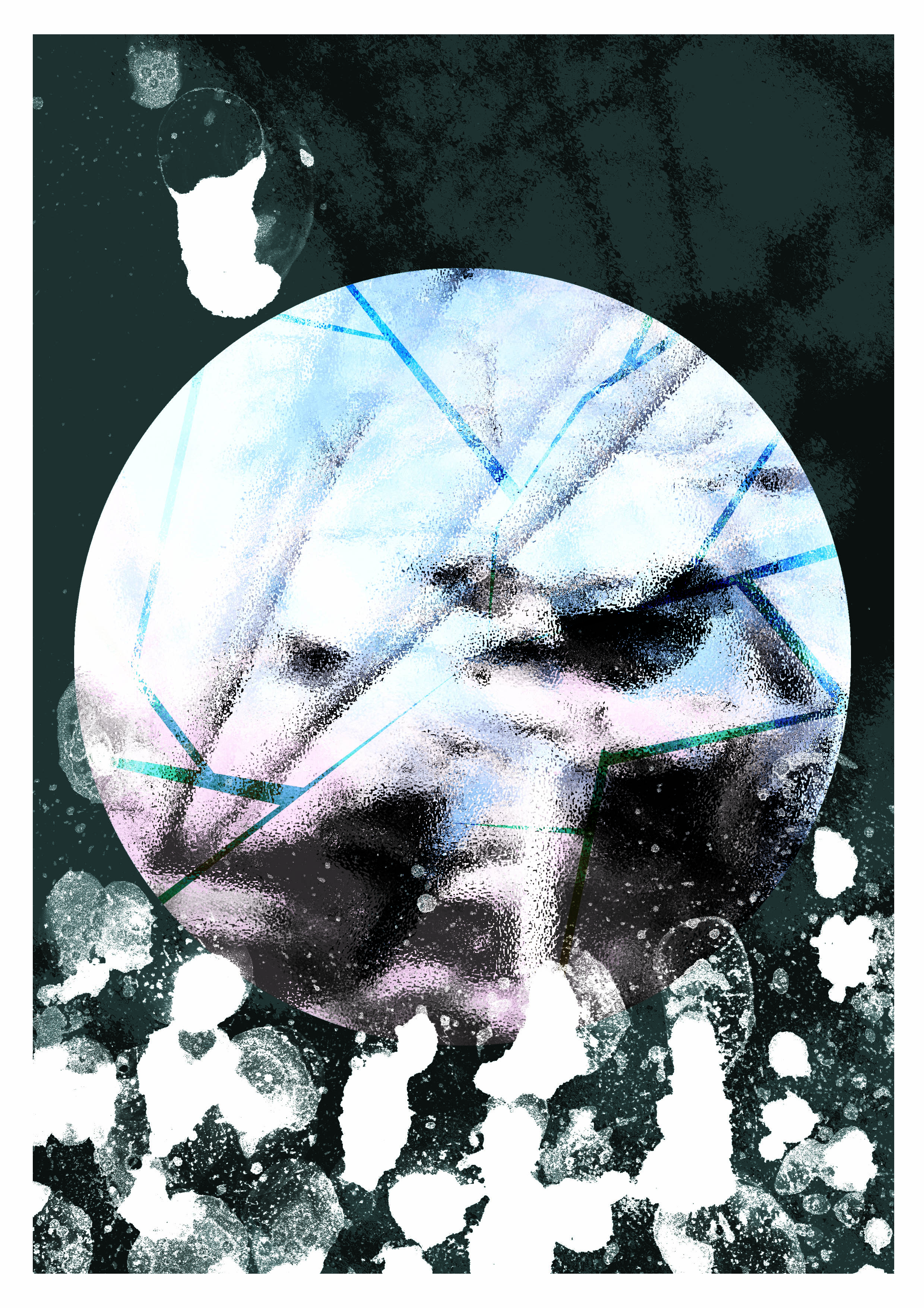
Page 2: If Hearing could See
Concept: In the ‘focus’ circle, I have the image of an edited lily pond because that was the most impressionable sound! My emotions are expressed through the wings – to express the beat, rhythm and lightness of the sounds there. Overall, I also wanted to convey how otherworldly the place looks – therefore making the image feel a little like a moon or little planet!
Execution: I imposed a picture of the lily pond that I took at the wetland reserve and imposed it with the sound waves of a video I took at the pond there. Inspired the wings of the birds and the map of their migratory patterns, I used them to express how the the sounds there have a rhythm that comes and goes when you are in different parts of the nature reserve. The background is also part of the lily pond, but out of focus.
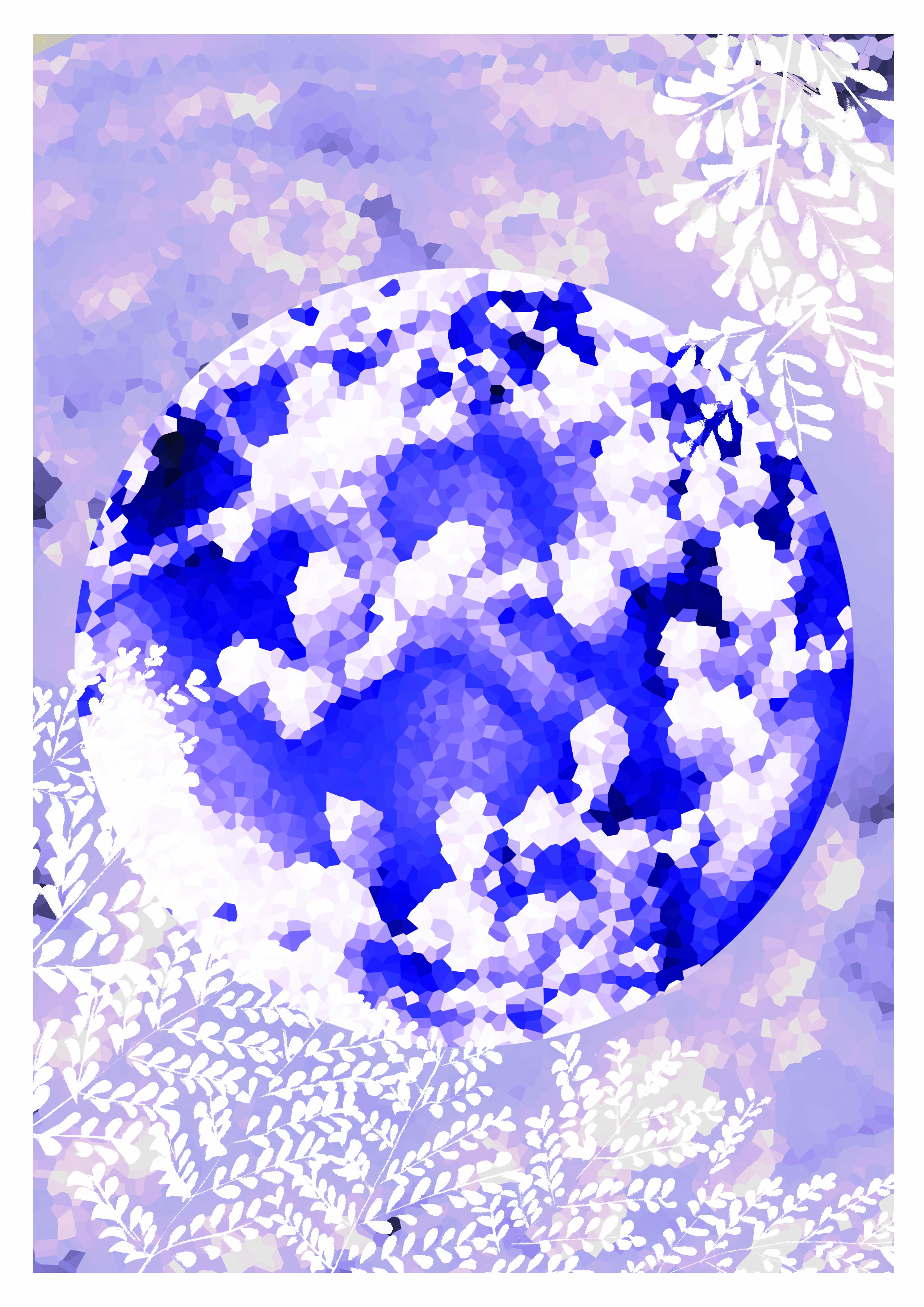
Page 3: If smell could See
Concept: The wetland reserve smelled very thickly – of animal waste, heat and also my exhaustion. Walking alot generates saliva and foam in your mouth and also makes breathing difficult. I felt that the best way to convey that is through mud and water.
Execution: I took a picture from the Visitor’s Center Aquarium for the ‘focus’ circle in the middle – frosted glass effect to show murkiness and crack lines to show even though the environment around me is seemingly crisp and refreshing, experiencing it for yourself is actually kinda harsh. The ‘peripherals’ are from a picture of a mudskipper photo to show the effect of thickness and choking – I’ve used ink and soap foam to mark-make the thick consistency of mud.
Page 4: If touch could See
Concept: The most impressionable experience I had of touch was almost walking into the Golden Orb Spider the size of my palm! The spider makes its web really low so it made me feel a little paranoid throughout my walk – because there was alot of them.
Execution: I took a photo of the Golden Orb Spider that I had and created a pattern out of the shape of the spider, and half-toned to create the paranoia and feeling of ‘there but not there’. I used ropes to feel how I felt super paranoid and confined by my own impression of how tingly and itchy the place made me feel after my encounter with the spider. The ‘peripherals’ are the environment where I found the spider.
Page 5: If balance could See
Concept: The most impressionable feature when it came to balance was the Mid-Canopy walk – it was very jiggly and it gave me motion sickness, but yet it was a really fun walk!
Execution: The photograph in the middle is edited from a Mid-Canopy walk photo. I used motion blur and tried to find the right balance of movement that matched the video I took of my experience on the bridge. To show my motion sickness, I replicated the lines from meandering waters and ripples at the reserve. There is also an imposed falling flower to express how motion sickness causes an illness and causes the sick feeling of wanting to throwing up. Green is also the color of nature/good health but also of sickness.
Page 6: If taste could See
Concept: I based it on the berries I found at Sungei Buloh. Despite being inedible, I imagine that they would taste refreshing and juicy, like the breeze at the reserve. The small little berries seem like they’ll go pop in your mouth – which gave me a sort of crystal/gem-like feeling because they look like tiny treasures.
Execution: To show the gem-like quality, I used the clean, crisp cut of leaves to express the refreshing quality of fresh berries and breeze. This page faces Proprioception, because it’s the only sense that doesn’t help you to perceive a external sense of space, which contrasts with Proprioception.
Page 7: If proprioception (space) could See
Concept: To express proprioception as the sense that controls other senses and a spatial interpreter. I decided to find the place that gave me the best sense of place and made me extremely self-aware of how small I was standing in the wetland reserve.
Execution: The central circle is a manipulated photograph of one of the most stunning shots I have of Sungei Buloh Wetland Research – the open roof of a viewing pod. I chose the roof because it made me feel short and small.
For my feelings, I imitated the outline of the lily pad (rest spot for frogs!) with copic pens – to emulate the small frog-in-well feeling.
Page 8: Back Cover (Absence of senses)
Concept: An amalgamation of my emotions at Sungei Buloh Nature Reserve. I wanted to express it as ‘my mind’s eye’ and a party/firework of senses, therefore it’s an abstraction of lines and colors, and does not contain any photos.
Execution: The back cover is created purely out of the previous marks I’ve made for the other senses, on a black background with the stone path texture from Sungei Buloh’s entrance.
Color Meanings (in order of pages)
White: All-encompassing (reflection of all colors when the eye is open)
Yellow: Sense of Hearing (Sharp)
Blue: Sense of Smell (Deep)
Red: Sense of Touch (Agitation)
Green: Sense of Balance (Yellow + Blue = ‘balance’ between the light, uplifting sounds and heavy, drowning scents)
Purple: Sense of Taste (Red + Blue = ‘taste’ is only possible through interacting with ‘smell’ and ‘touch’)
Orange: Sense of Proprioception (Yellow + Red = ‘hearing’ as the uncontrollable input from the distance, ‘touch’ as the closest self-initiated sensory output)
Black: Absence of all colors (Absorbed and devoured by the senses)

Pic of the physical zine!
Feedback
Lecturer’s (Joy) Feedback:
- Placement of senses; perhaps place the more common ones first
- Put the ideology behind choice of colors on OSS (done!)
Classmates:

Reflection
I think the most difficult part of this project for me was definitely understanding the criteria for this project. I thought I had it in a bag during the first consultation but things didn’t go too smoothly. I’m glad to have found a straightforward direction with ample time to work on the spreads!
This project definitely taught me alot about preparing a good rationale and understanding your own idea fully before starting on your work. :’)
I’m also semi-sad I can’t take anything from Sungei Buloh Nature Reserve for mark-making (or I’ll be fined/arrested)… but I took alot of photos and it was fun recreating the marks!
Links
Project 2 Part 2 Research and Process: https://oss.adm.ntu.edu.sg/laum0005/graphic-form-project-2-part-2-zine-1/
(Previous) Project 2 Part 1 Process & Final Infographics: https://oss.adm.ntu.edu.sg/laum0005/graphic-form-project-2-locale-2/
References
7 Senses Foundation: http://www.7senses.org.au/what-are-the-7-senses/