Category: My Work

3D II – WK 11 [Installation in-Progress 2]

Moving on from the sealing of the plastic, we worked on the contents.

We aimed for a glowing water effect and then researched on how to produce that visual. There was a tutorial which taught us that by placing purple and blue cellophane paper over the light source, tonic water could appear as glowing! 

So, we test it out! 

For a test, we cut out small pieces of cellophane (in purple and blue),

Over the light source and in a dark space. We can see the light appearing different already!

Finally, it works with tonic water in a bottle! We were so excited.


Then, we transferred the water into the bag but due to contact with the air over a long time, the tonic water has lost its effect :'( So we had to give up the idea, and proceed with an alternative, and MOVE ON.

Our initial idea also included to clamp and suspend the structure so users could interact with it from under it. 

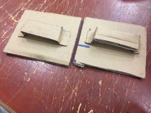
Working on some wood.

Carpenters!!! 

We were going to stick and nail 4 pieces of wood together as a clamping structure.

However, the suspension would cause water to only concentrate on the centre of the piece, causing huge pressure and a great reduction in fluidity ): This contradicts our central concept, so we decided to scrape this off. 

The optimal solution we decided on was to lay flat on the table surface to allow almost full control of the movement of the water. To enhance the user experience, which is to allow him to feel the motion, we will create 2 layers: above & below the hand. 

Which means… making one more water bag!!!

On this added piece, we mixed glitter and crystals into the water to contribute to a shimmering glowing effect of the relaxed water smile

video_2017-04-08_15-27-43

Looks cute!!!  

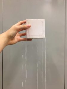
Finally, we sealed the second piece. BUT TO OUR HORROR, when we tried to put the 2 pieces together, the first one has spilled!!! 

It’s okay we took care of it. 

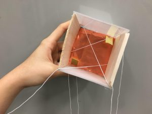
Now that we have finished the 2 waterbeds, it’s time for the set-up: Lighting!
Using the same concept for the bar lights we produce a purplish-pink kind of gradient light which is reflected by the water.

This final piece appears like this: 

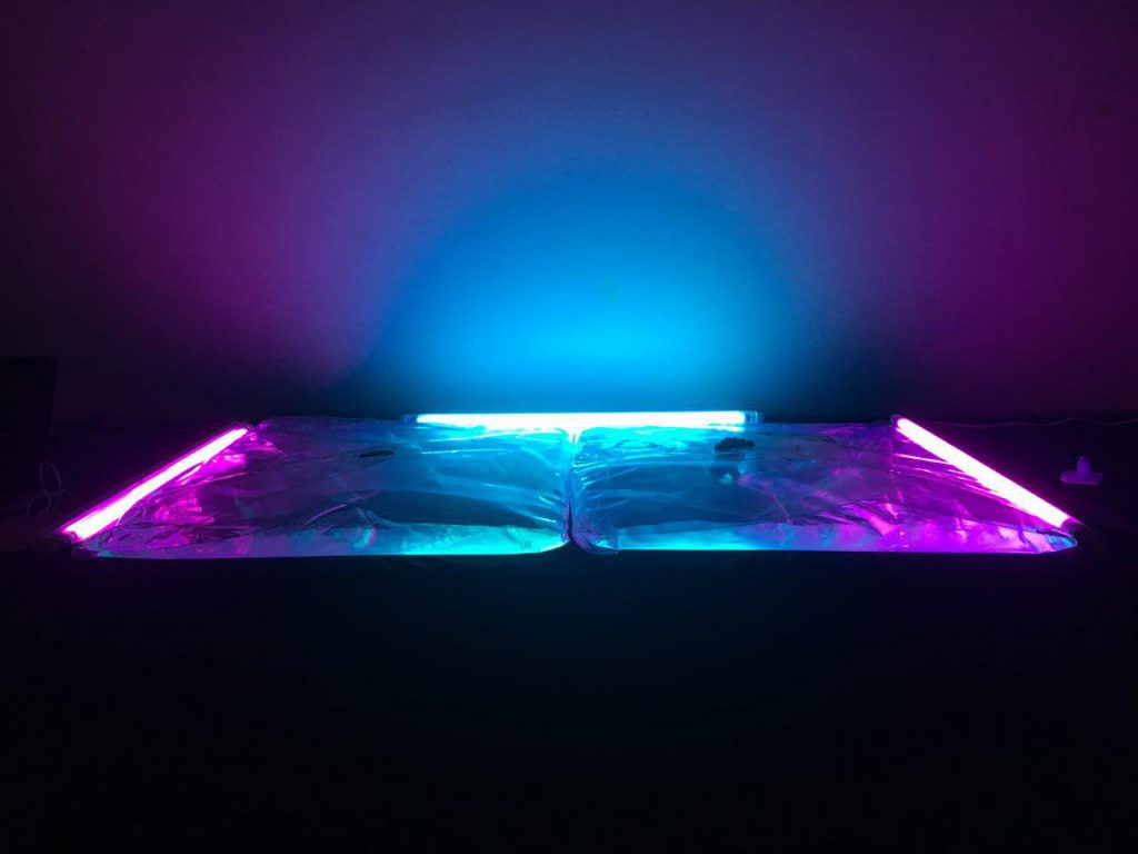
It looks absolutely amazing laughing

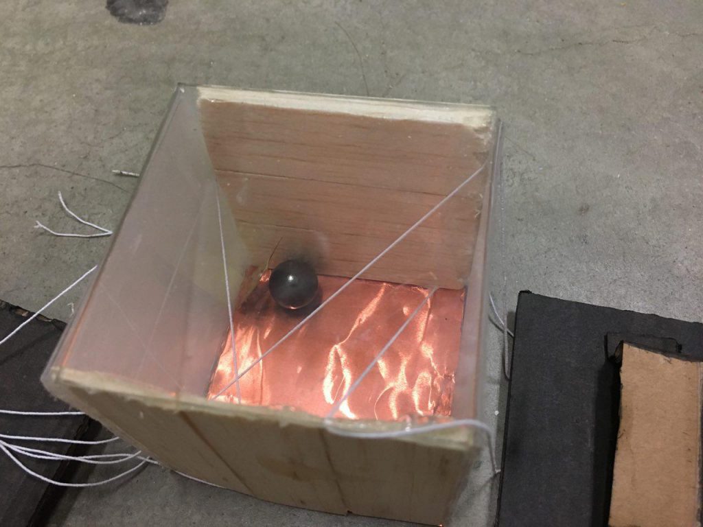
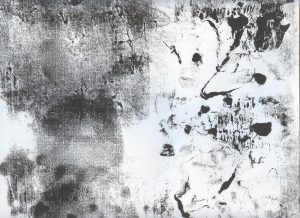
The ferroxide is then scattered over the surface, when the hand holds onto the magnet hook to interact with it. 


3D II: SOUNDTEXTURISER 2.0

Improved edition of GAYO


The Making

To improve, I have to first identify the problems or weaknesses of the current model. After feedback from the class, I have finalised on a few points:

  • A lack of different materials to give layers in sound & visual
  • Too simple

I then worked on it, by drafting out new designs which eventually turned to a musical cube idea with stretchy ends! I am inspired by:

An Accordian

the mechanism of the accordian to trigger sounds! 

As for the cube, I planned to use materials of different densities/ opacity/ and abilities to reflect light. This would encapsulate many visual effects as well as sound difference. 

Materials picked:

  • Translucent hard plastic
  • Rose gold aluminium/copper paper
  • Square glass
  • Elastic strings
  • Soft wood of 2 thickness
  • Board


FINAL TESTING

PROJ 1 EMO – PRODUCT

18 Lines of Emotions

Amazement

Amazement

Arousal

Arousal

Attraction

Attraction

Awakening

Awakening

Depression

Depression

Gladness

Gladness

Enthrallment

Enthrallment

Hysteria

Hysteria

Irritation

Irritation

Insecurity

Insecurity

Jolt

Jolt

Longing

Longing

Nervousness

Nervousness

Mortification

Mortification

Outrage

Outrage

Relief

Relief

Remorse

Remorse

Revulsion

Revulsion


I personally like Arousal, Enthrallment, Hysteria, Mortification, Outrage, Remorse and Revulsion a lot.

Thanks for the digital edit, I really loved how all my lines turned out from monoprints and scans. I love how there can be even more edits and changes made to a single print which can easily turn out to be describe different emotions!

Also, thank you for viewing. Please feel free to leave comments, you can definitely share with me how you feel about my work! 🙂

PROJ 1 EMO Submission – PROGRESS

Finally it’s the submission for Proj 1 – MY LINE IS EMO !
*cheers*

It’s been a long 5 weeks working on this project, and making progress from mark-making and monoprint to digital alterations on our lines and to finally printing them out on D-DAY! laughing

Have been rather busy on working on projects, and thus lacking the time to document my process along the way on OSS. But I did not forget to take photographs while I was working so here’s some for sharing!!

EMO 1

First rough sketch upon tasked with Proj 1

Starting on my Visual Journal, I drafted out certain line works using pen and pencil:

EMO 2   EMO 3

EMO 4

After being exposed to monoprint, below are some of my experimental monoprint works!

EMO 5

The marks on the print was from torn cotton wool dipped in paint!

I thought the marks made from the torn cotton wool was rather pretty and could represent fluid and soft emotions.

2 001

The print was done by hand scratches, paper towels and pressure on the paper

^ I was thinking of “despair” and “exasperation” to be represented by scratch marks..

1 001

I made use of cotton wool and the scraping of the paper to create marks on the right

^ I thought of “disgust” when I did the scraping of the paper at the top right corner and thus those marks haha

3 001

I made use of the raffia string and different objects to apply pressure and create marks of different intensities

9 001

This was done by dabbing of the paint brush and drawing lines across using different tools

With the use of Photoshop, I was able to pick out amazing marks from the prints and play around with them to create my EMO LINES. I could pick out the designs and marks from different prints and then blend and merge them together to produce fresh and creative expressions smile Photoshop and monoprint is AMAZINGGGG.

Yet, I still wanted to do some hand-drawn/ handmade works apart from digital temptation. I was inspired by the first group’s presentation on DOTS

An infinite number of forms, with infinite variation, may evolve from a tiny little dot
It is also the beginning of graphic design

and I wanted to try to create an emotional line using just dots… 🙂

IMG_2217

Dots of varying sizes to create both space and density on a strip of paper using 02 and 05 pens

It sure was tedious to use dots to fill up a 25.7cm by 6cm piece of paper, but it was FUN and I was quite pleased with my end product! tongue-out

Also, here’s my amateur mark-making progress and results:

I related emotions to the human body and thus I primarily thought of using different body parts to create very natural marks and then make patterns or exaggerate these distinct prints for a design

IMG_1869

Using my very own hands, HANDS-ON!!

Hands can be use to create rough and smooth textures giving tough and soft emotions. I decided to use define prints and overlap them as seen in the photo below (the last print on the second paper)!

IMG_1870

my thumbprints!

IMG_1868

(top to bottom) Using hard brush, calligraphy brush and finger mark!

I also used toothbrush and bottle cap to create lines and patterns.

IMG_1874    IMG_1875

These are some of the beautiful patterns I’ve produced from these very simple household items laughing

6 001

The top 2 marks are made from the bottle cap!

7 001

The top one was from the toothbrush while the bottom was using lines!

The following is a scan of my lip marks HAHA. Trial and error you can tell tongue-out

LIP colour

Colour

LIP b&w

To Greyscale

Check out my next post for the final compositions!

PROJ 01 – Curating Self

In Project 1Curating Self, we were tasked to take a series of photographs to basically tell a story about ourselves and we would have to appear in our photographs…

wow that was certainly a challenge for me because I don’t usually take photographs of myself (so I’m not a good model) and it’s not going to be easy to direct your own photographs without you yourself behind the camera.

But with some help… TADA
here are my photographs for submission!

Task 1: Me

Me.1

This is me! At work. I deliberately picked out this to be the first photo to introduce myself because it was rare shot of me in front of the camera looking candid haha. Also, as a photography enthusiast and events photographer, we were often behind the camera and hardly photographed of. So I thought this would be an apt photo describing me, and the work I’m passionate about 🙂

Me.2

I enjoy viewing the scenery, especially during dusk. I love how the sky changes and transcends from a bright yellow sky colour to gradually a deep blue one. I like sitting near the waters, just enjoying the breeze and the little lights, and it’s precious I give time to myself just chilling and relaxing. I believe in appealing to emotions in photographs, and I think this photograph sends a slight sadness – a message of how I am. I think I appreciate sadness. We won’t be happy and blissful all the time, there will definitely be times you feel down, and that is the emotion which hits me the most and it is important that we learn to cope with unhappiness and move on from it.

Me.3

Yet, though I like to spend time alone, I have very fortunately found someone special to keep by my side who loves me for who I am :’) And thank you for appearing in my life.

Task 2: Object and representation of self

For the second task, I have chosen my first and only DSLR camera as an object I feel very important to me. I first took up photography and videography as a CCA in primary school and learnt really elementary video and photography skills. It helped build up my foundation and interest, nonetheless. 🙂 Then, I continued pursuing my interest and passion in secondary school where I joined Infocomm Club and further exposed myself to media. In Sec 2 just 5 years ago, I got my baby Canon 60D!! It’s my first owned DSLR and thanks to this baby, I took up greater responsibility in my CCA. I learnt from my seniors, and as I gained experience, very quickly I took photographs for school and class events as a main photographer.

This is an immensely treasured opportunity in school to hone my photography skills and techniques and also build up my portfolio. And then finally getting to ADM to further study on film and photography laughing

Object.1

Object.2

Object.3

Task 3: My World

The Hive. An icon of NTU. I’ve always liked to challenge myself to present alternative views of a familiar or popular place through different photographic angles.

World.2

World.1

World.3

World.4

World.5

Other photos for sharing

IMG_0121 IMG_0301

IMG_0166 copy IMG_0168

IMG_0275 IMG_0300

IMG_0139  IMG_9657

IMG_2104

Now I see and feel THE HIVE differently because of the memories built with this guy over here :’) who helped me take some of my photos for submission.

THANKS FOR VIEWING
Feel free to leave comments/ feedback laughing

PROJ 001 – Rectilinear Volumes [Sketch Models]

In this Project, we are tasked to position 3 rectilinear volumes of overall, inherent and comparative proportions in satisfactory compositions using foam boards to create sketch models, while displaying concepts of D, SD, SO relationships as well as wedging, cradling, piercing techniques.


SM 1.1

2D sketch analysis of first sketch model – SM 1.1

SM 1.1 shows the original first 3D sketch model that I have made from foam boards, trying to show D, SD and SO in y, x and z axes respectively.

SM 1.2

2D sketch analysis of first sketch model – SM 1.2

SM 1.2 shows that I wanted to attempt piercing of the SD into the D and the have the SO wedged on top of the SD. However, I realised i have issues with seeing all 3 components of the model at certain perspectives. So I turned to wedging of the SO on SD, and then SD on D while removing 1/3 of the SD to show clearer distinction of the 3 proportions smile

This is the result of my first sketch model:SM 1.3

SM 1.4


For my second sketch model, it was an unsuccessful one due to similar shapes and proportion, lying in parallel axes. Also, there was confusion in SD and SO in one of the perspectives. frown

SM 2

2D sketch analysis of second sketch model – SM 2

Making use of the rule of thirds, I tried to remove a third of the SO and have it wedged at the side of D while arranging the pieces with varying axes. Yet, the sketch model lacked interest.


Looking at the third sketch model,

2D sketch analysis of third sketch model - SM 3

2D sketch analysis of third sketch model – SM 3

there is an interesting perspective of the 3D sketch model through the cradling of pieces, with the SO cradled in between the larger SD and D. It seems as though the SD is hovering!

The sketch model can be improved by correcting the length of the D as shown in the analysis above because it is too long and thus leads to instability in the model as it cannot withstand and support the weight of the SD and SO attached to it.

Finally, this leads to the finishing piece:

SM 3.2

SM 3.3

SM 3.4

Ultimately, I picked the 3rd sketch model as my final product to work on the material, textures and giving it function.

Further information may be accessed from the PDF document uploaded onto google docs laughing