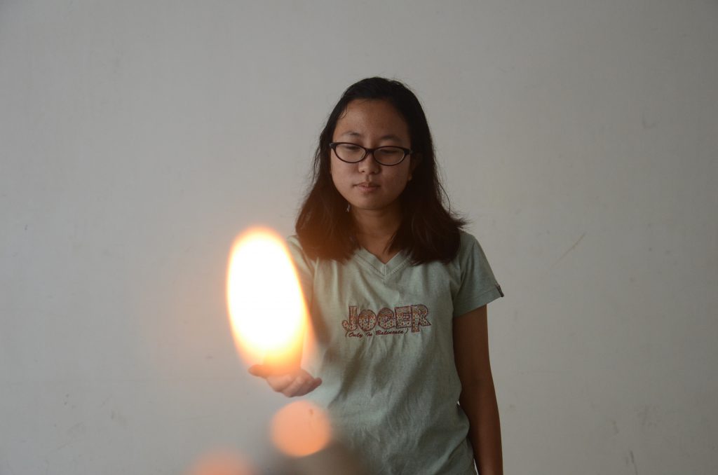
To conclude this project, here are my final 4 compositions:

With special mention to my favourite piece: 
Thank you.
get high get away.

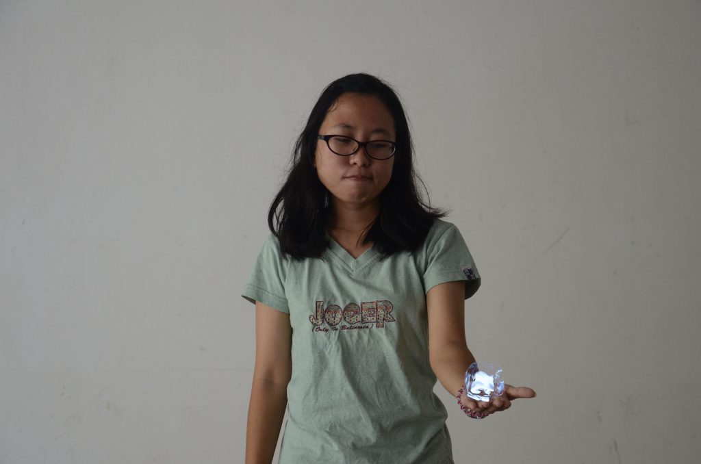
To conclude this project, here are my final 4 compositions:
With special mention to my favourite piece:
Thank you.

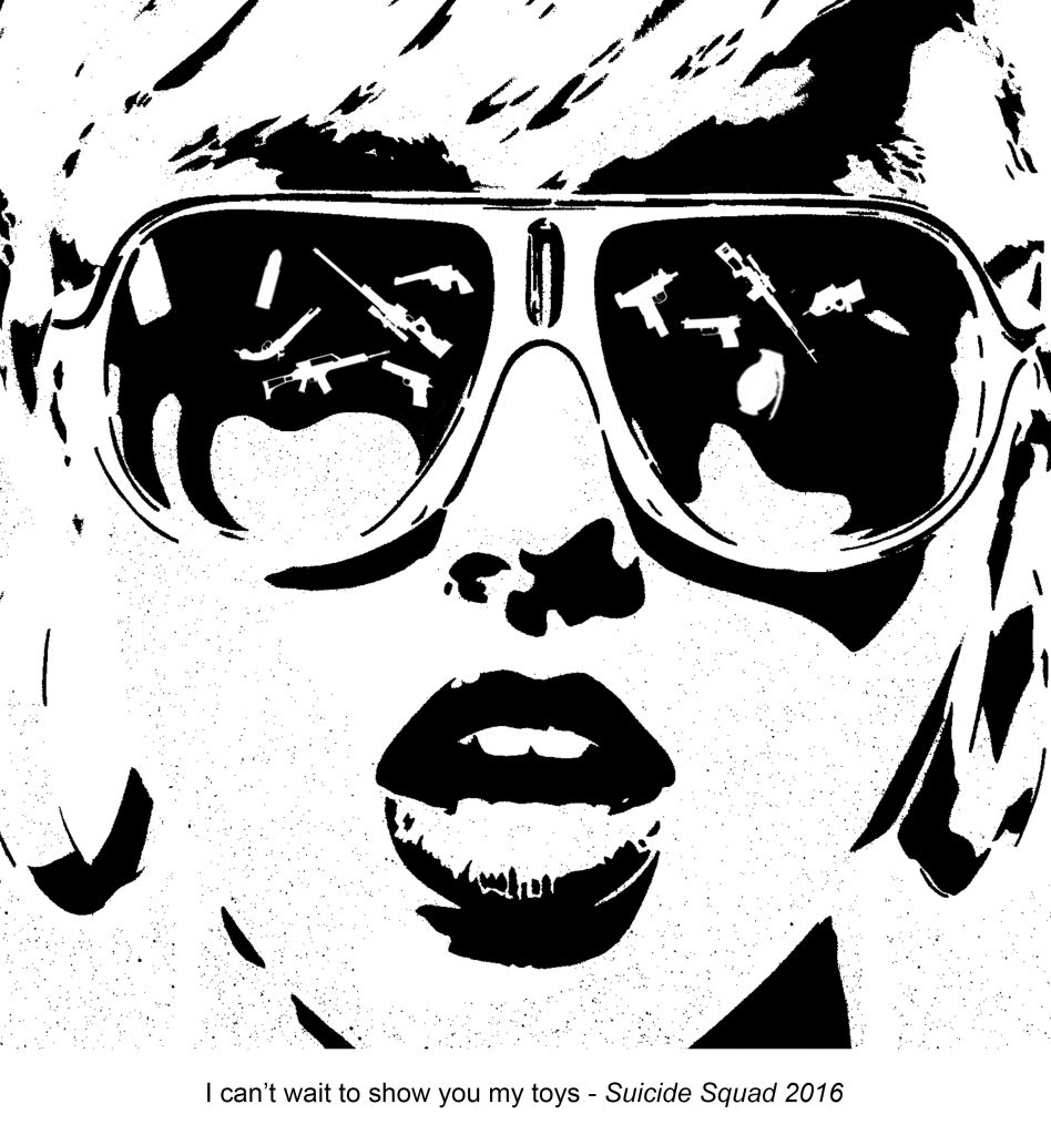
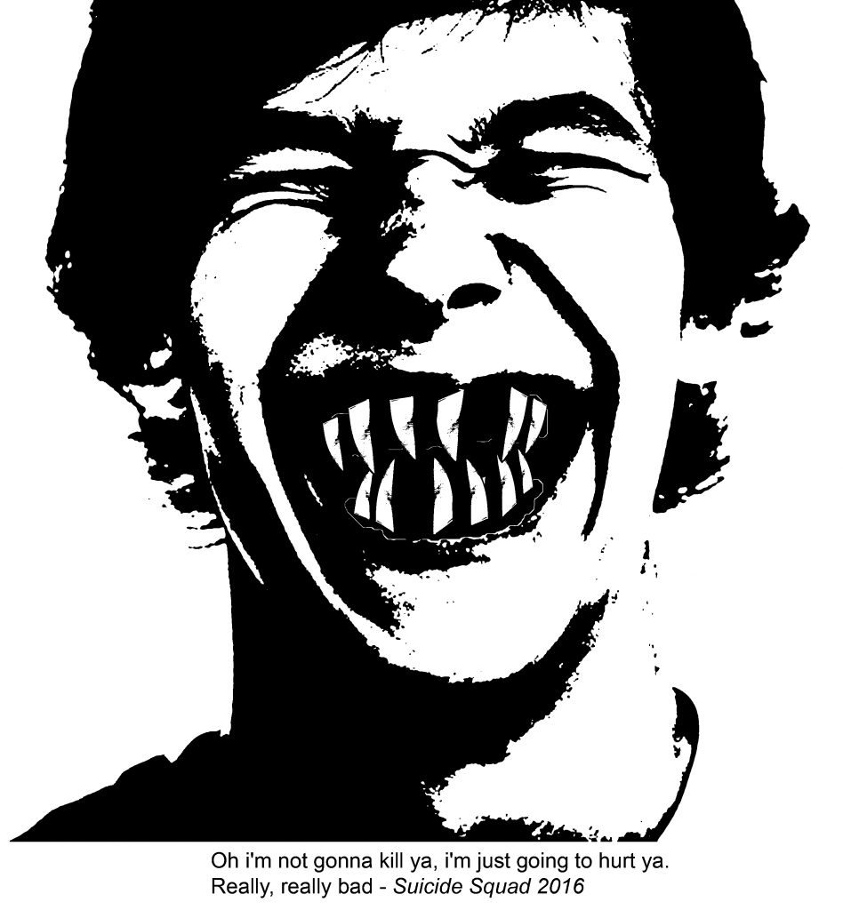
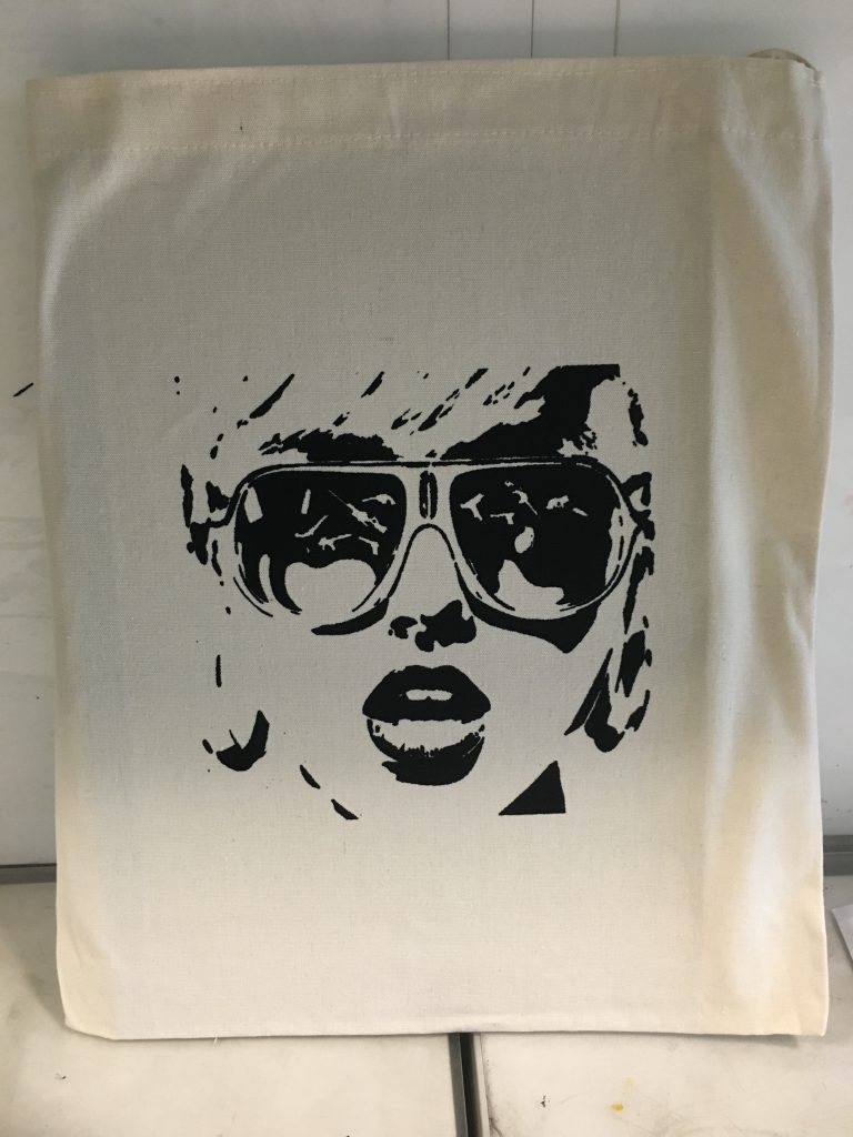
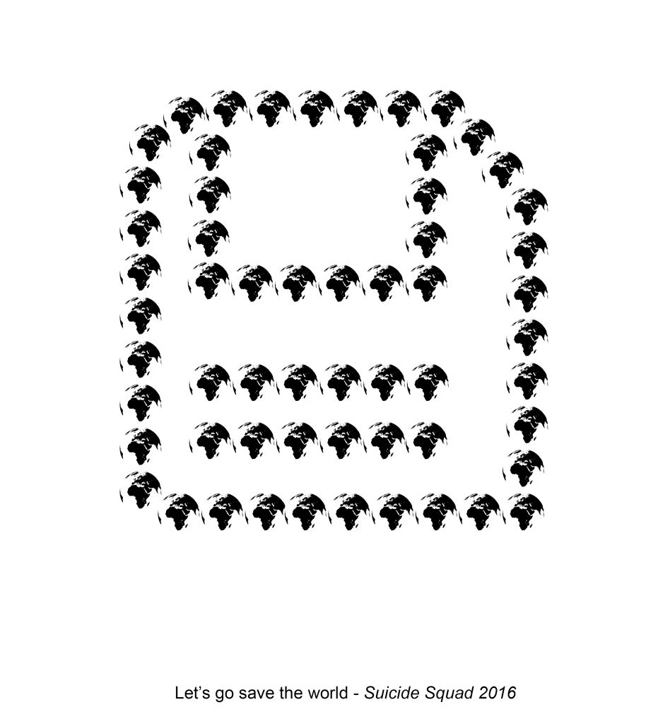
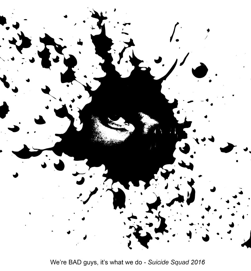
For this project, I picked the movie: Suicide Squad (2016)
This movie is very recent, so I remember clearly the few really bad/sick yet powerful quotes:
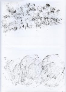
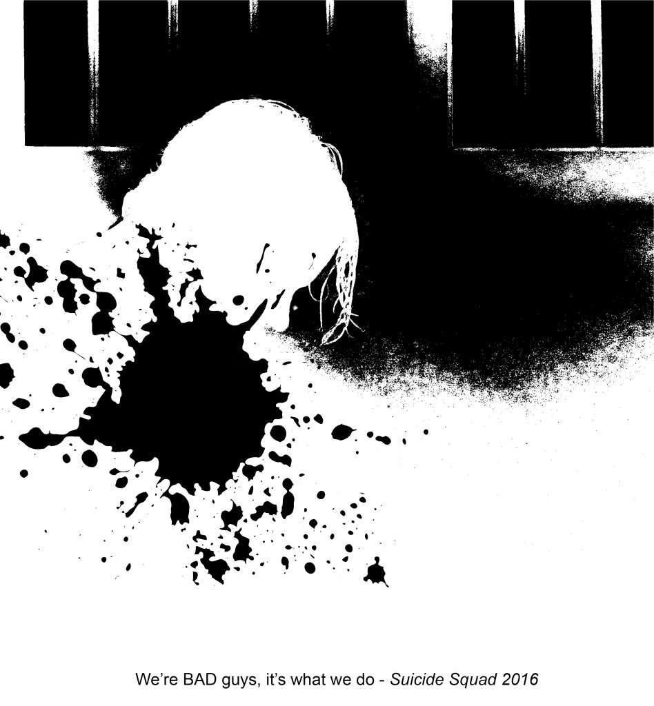
Drafts:

^ By the second week, these were what I only have. Really bad, I didn’t know what I wanted ):
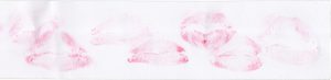
Then, we had to print transparencies for our draft to do silkscreen on our tote bags!!!
Never tried it before, and it was really fun! And accomplishing to have a tote bag of your own design  Then moving on to producing more and improved designs!
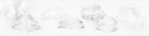


I liked that I was making improvement and being closer to finalising the project 🙂 But, I didn’t like the last few designs as they were either too simple and too messy. They weren’t appropriate. I continued with more
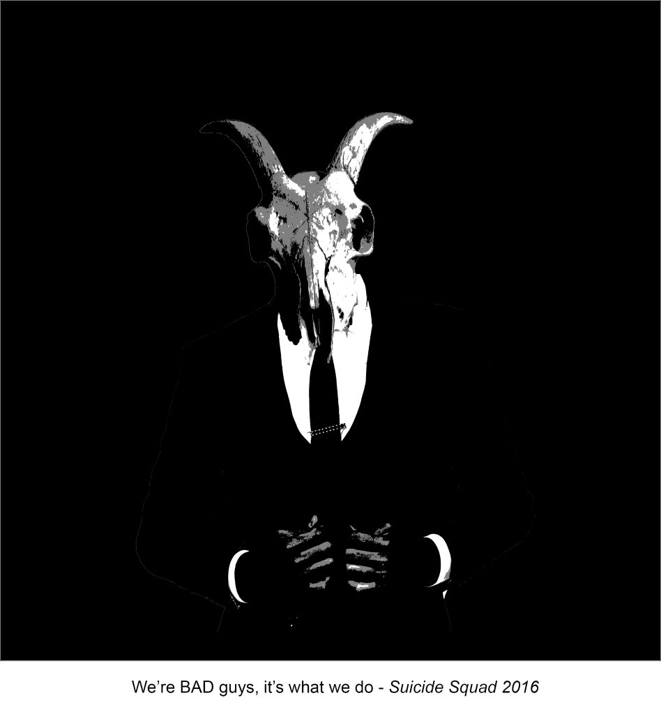
I especially liked this last design the most, it gives a very clean and modern look yet with a deep meaning: A man well dressed up in a suit may give the appearance of a kind gentleman, but who knows, he may just harbour evil thoughts (represented by the cow/goat skull as the head) and plans to do harm to you instead? We don’t know who he is or where he is, he may be just anyone around us? And that is why I didn’t give a definite shape to his body. (a hint as to his unknown identity around us)
I am overall pleased with my final work, I hope all of you enjoy my process as well. The final works will be in a separate post.
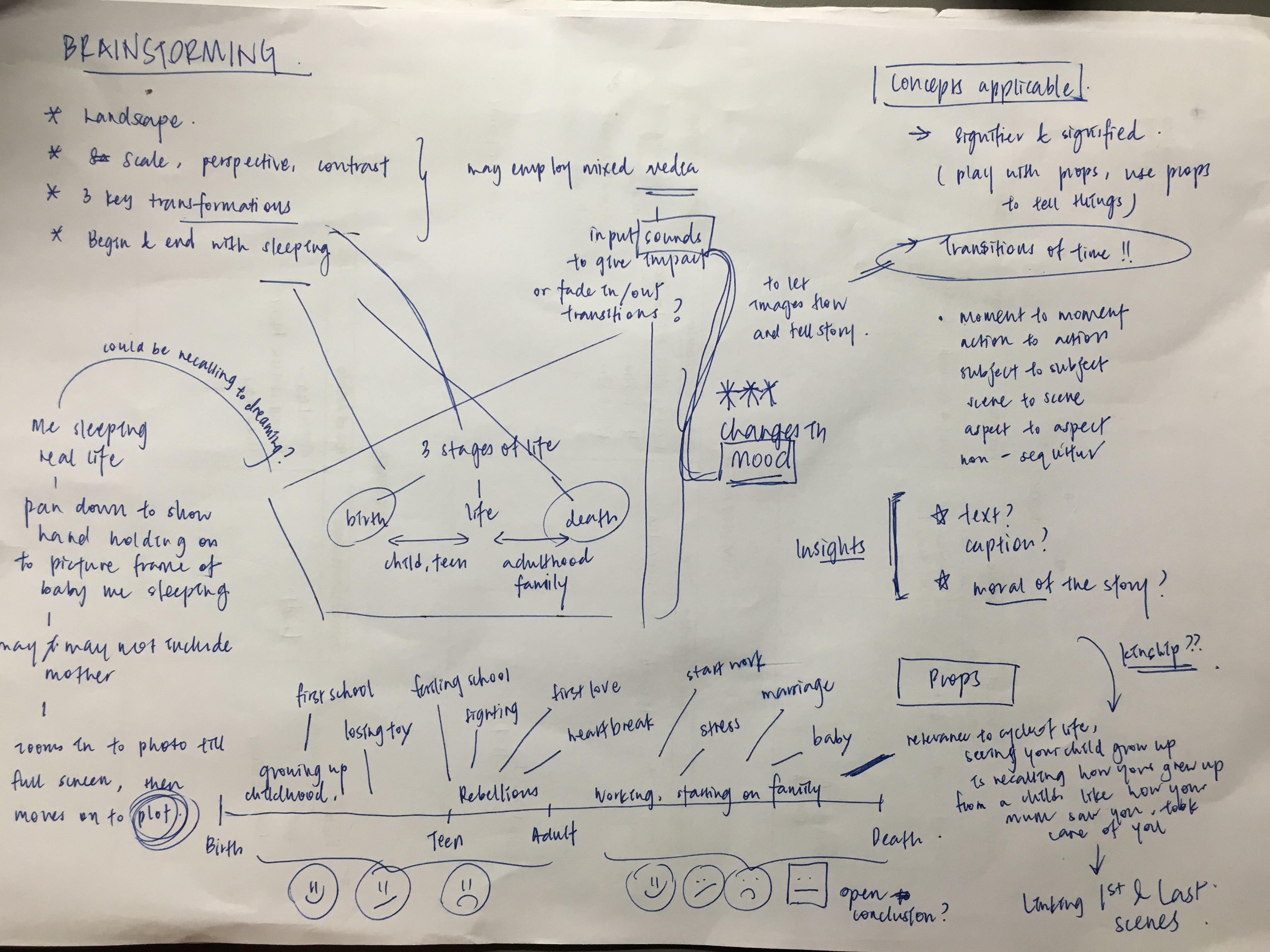
90 still images
yourself sleeping in first and last image
tell a story
wow, I did it!
Brainstorming to storyboarding and filming, I finally realised my idea and delivered the final project piece!
And yes, it all begins with the most important step:
Story plotting is difficult, but the most crucial step and the key I would say, to a good piece of work. In my opinion, I need meaning in a film and a good plot is important to help you convey your meaning. Therefore, I am always willing to spend a lot of time to develop my ideas and to fine tune my ideas anytime in the production.
This was my initial brainstorming, but if you have experience in video-making, you should know that for most of the time, you cannot follow your ideas strictly as there is bound to be unknown factors that will twist and change your plot during production ad actual filming. Still, it is a step not to be missed. Planning includes your sounds and pace of the film as well 🙂
After finalising the plot, I quickly moved on to filming and then editing. And here you go, my final submission for 4D-02: Everyday
Working on this project, I have thought of what kind of style would I use to engage audience and to tell my story? Humour, sarcasm or fiction?
Then, I thought that I was lacking personal touch in my previous 4D project. So I decided to tell more about myself with this chance.
Honestly, my relationship with my family is not good at all. I am the middle child of my family, there have been issues. Everyday before I sleep, I have a habit of reflecting on my day, on my life and it has always bothered me that I feel I am a disappointment to my family, and especially my mother. She has given me a lot, sacrificed a lot, and I just wished I could let her know that I appreciate all of her actions and her love. She is my motivation to graduate Uni. This is a short story for her.
Also, I hope all of you don’t waste any more time like me just regretting and wishing you could go back in life to make things right, but do something about it today. Then you would finally sleep with a smile… 🙂

In Project 002, we would have to open up our ‘designer eyes’ a little more and to take note of diagonal axes and curved surfaces apart from just recognising D, SD and SO. In a short span of 2 weeks, we are to create a composition using 3 different volumes of varying sizes: cones, spheres and cylinders 🙂
2D SKETCH ANALYSIS
3D Sketch Model #1 [Over The Top]
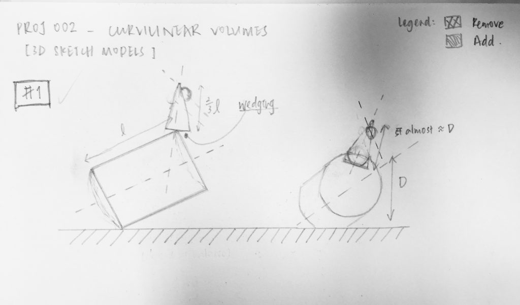
2D sketch analysis of sketch model #1 – SM 1
SM 1 helps me to see that the axes of the volumes are diagonal and non-clashing (no parallel/perpendicular axes).
Length of SD is 2/3 of D, length of SO is 1/3 of SD.
Diameter of SD is less than 1/3 of D, diameter of SO is about 1/3 of SD.
Proportions are okay, so I proceeded with my model to produce this final model!
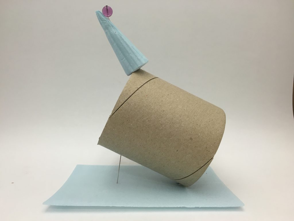
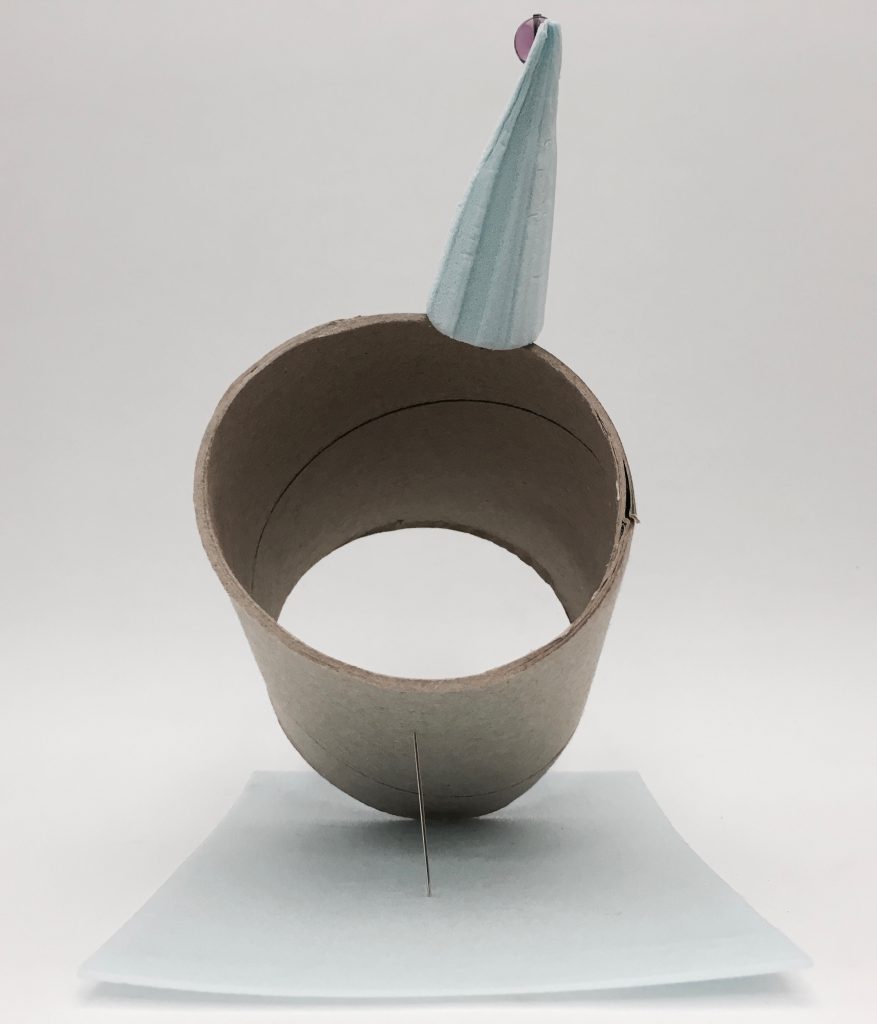
3D Sketch Model #2 [Coney Island]
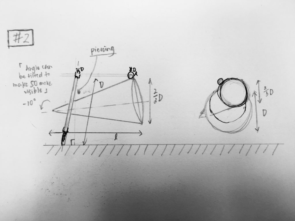
2D sketch analysis of sketch model #2 – SM 2
SM 2 shows that the SD was slightly too long in its length and diameter, as it was almost similar to those of the D (the cone). From the analysis, I edited my thin cylindrical plate (SD) smaller in diameter, for its length to be 2/3 of D, and also to adjust the angle in which the D pierces through SD.
The SO was originally too small instead, and the SD could block viewers from seeing the SO at certain angles. Therefore, I changed the SO to be just slightly larger.
After amendments, this is the second sketch model derived from the sketch and edits:
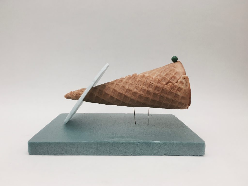
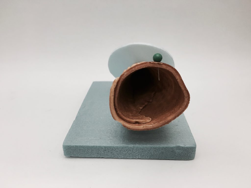
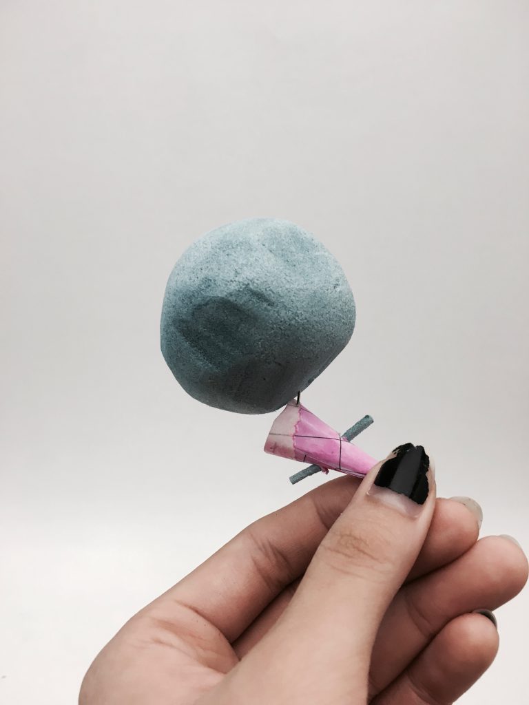
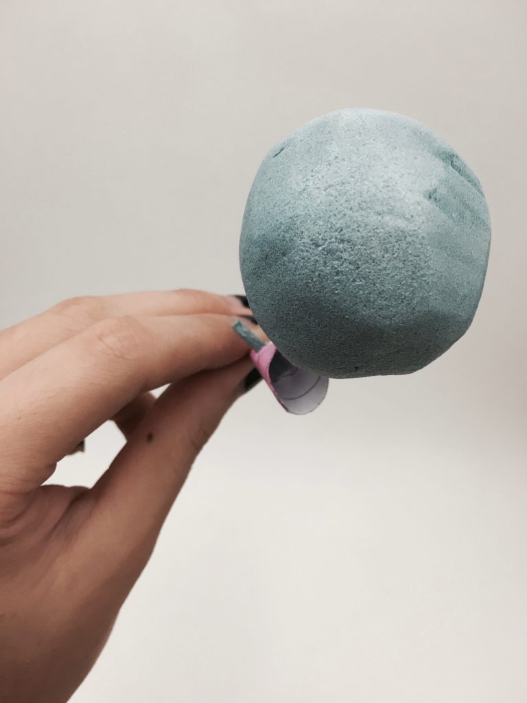
3D Sketch Model #3 [Ice-cream Man]
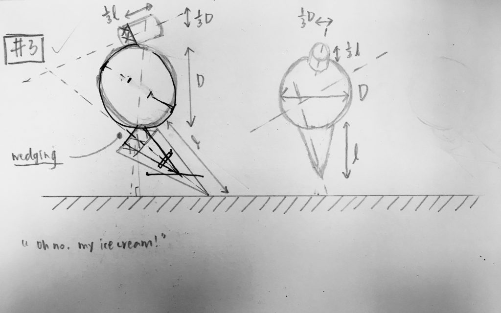
2D sketch analysis of sketch model #3 – SM 3
SM 3 shows the arrangement of the axes of the 3 volumes.
I initially decided the cone to be the D and then the sphere to be SD, followed by the cylinder to be the SO. Yet upon looking at the arrangement from the 2D analysis, it looks really plain and common and lacks an interesting point to the composition. Also, the length of the cone is close to that of the sphere.
Hence, I decided to switch the roles of the volumes to: sphere as D, cone as SD and cylinder as SO. The shapes were plainly stacked up in the original arrangement, so I also made a change to pierce the SO through the SD to give the final look like this.
In Conclusion
I picked Sketch Model #1 [Over The Top] as my final workpiece to apply textures and plausible functions to it. Details are presented in the PDF document uploaded to google docs 🙂
Some say the world will end in fire,Some say in ice.From what I’ve tasted of desireI hold with those who favor fire.But if it had to perish twice,I think I know enough of hateTo say that for destruction iceIs also greatAnd would suffice.

Some say the world will end in fire, Some say in ice.
From what I’ve tasted of desire I hold with those who favor fire.
But if it had to perish twice, I think I know enough of hate
To say that for destruction ice Is also great
And would suffice.
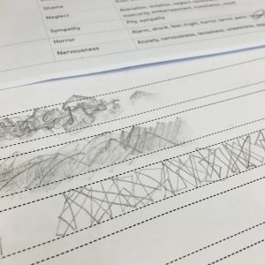
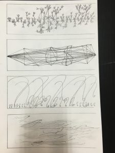
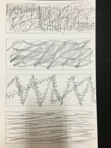
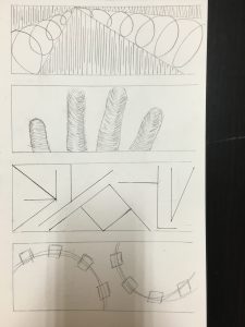
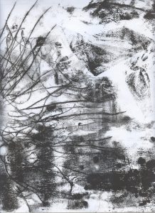
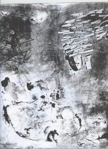
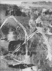
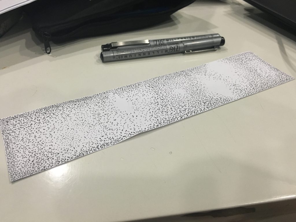
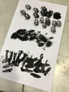
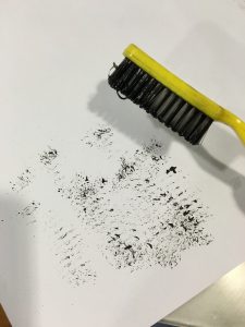
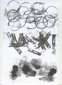
In-Class Activity
Pair work: Natasya & Candy

18 Lines of Emotions
Amazement

Arousal

Attraction

Awakening

Depression

Gladness
Enthrallment

Hysteria

Irritation

Insecurity

Jolt

Longing

Nervousness

Mortification

Outrage

Relief

Remorse

Revulsion
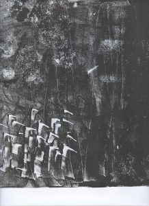
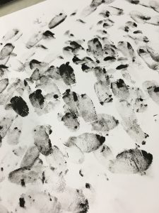
I personally like Arousal, Enthrallment, Hysteria, Mortification, Outrage, Remorse and Revulsion a lot.
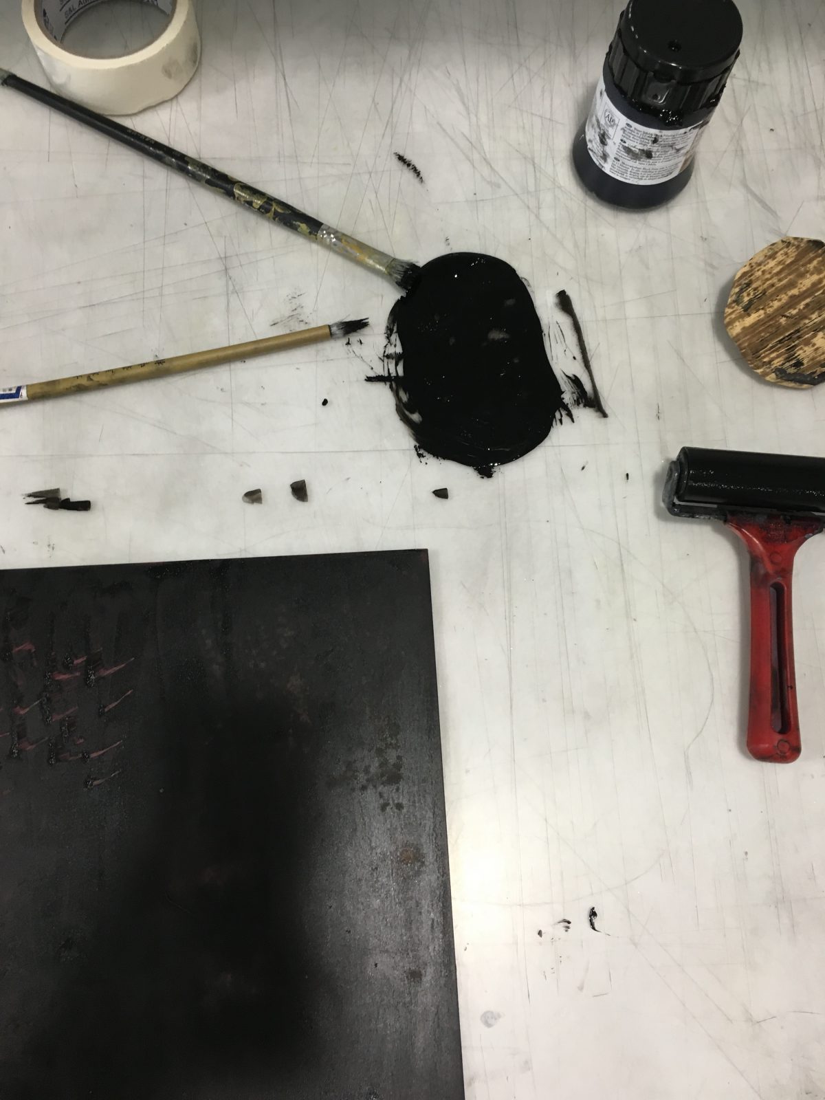
Thanks for the digital edit, I really loved how all my lines turned out from monoprints and scans. I love how there can be even more edits and changes made to a single print which can easily turn out to be describe different emotions!
Also, thank you for viewing. Please feel free to leave comments, you can definitely share with me how you feel about my work! 🙂
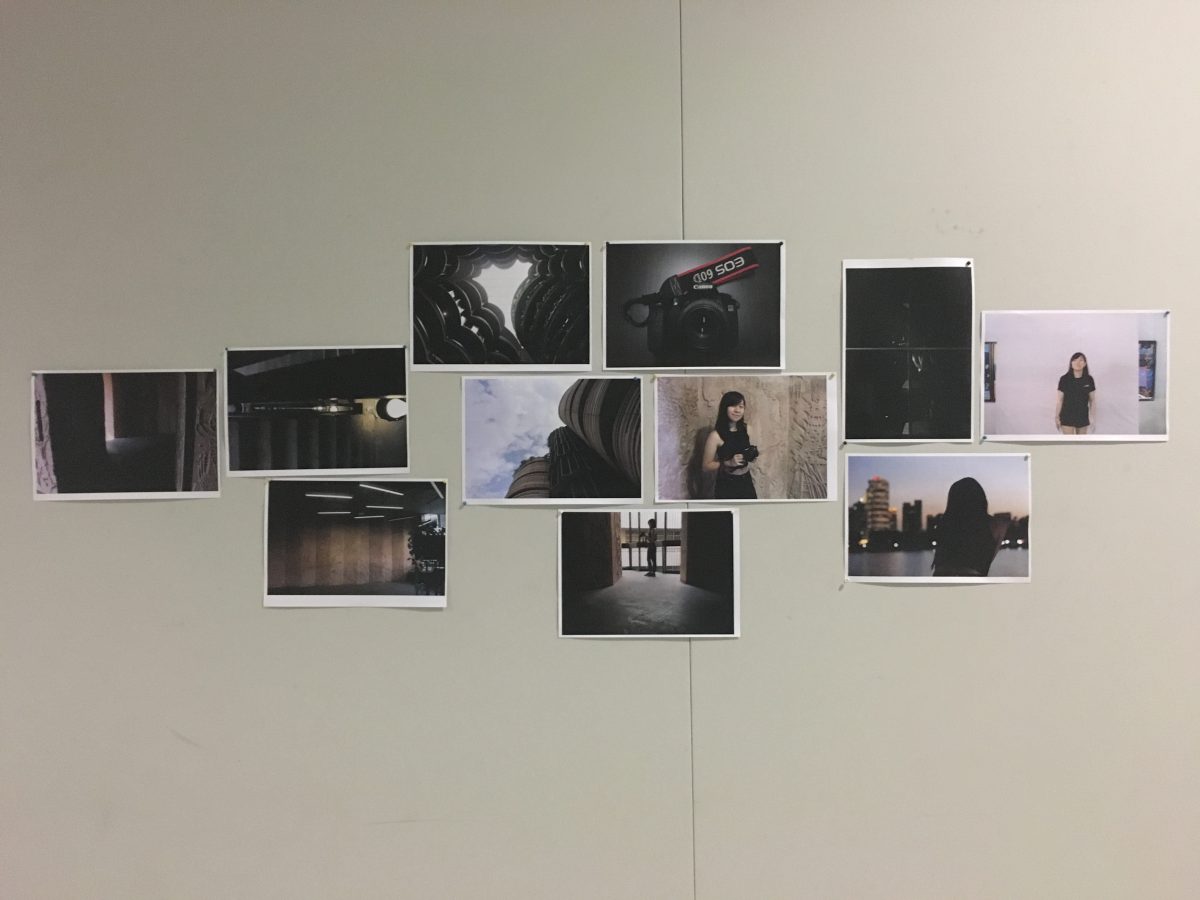
In Project 1 – Curating Self, we were tasked to take a series of photographs to basically tell a story about ourselves and we would have to appear in our photographs…
wow that was certainly a challenge for me because I don’t usually take photographs of myself (so I’m not a good model) and it’s not going to be easy to direct your own photographs without you yourself behind the camera.
But with some help… TADA
here are my photographs for submission!
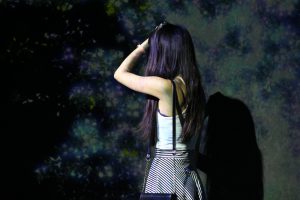
Task 1: Me
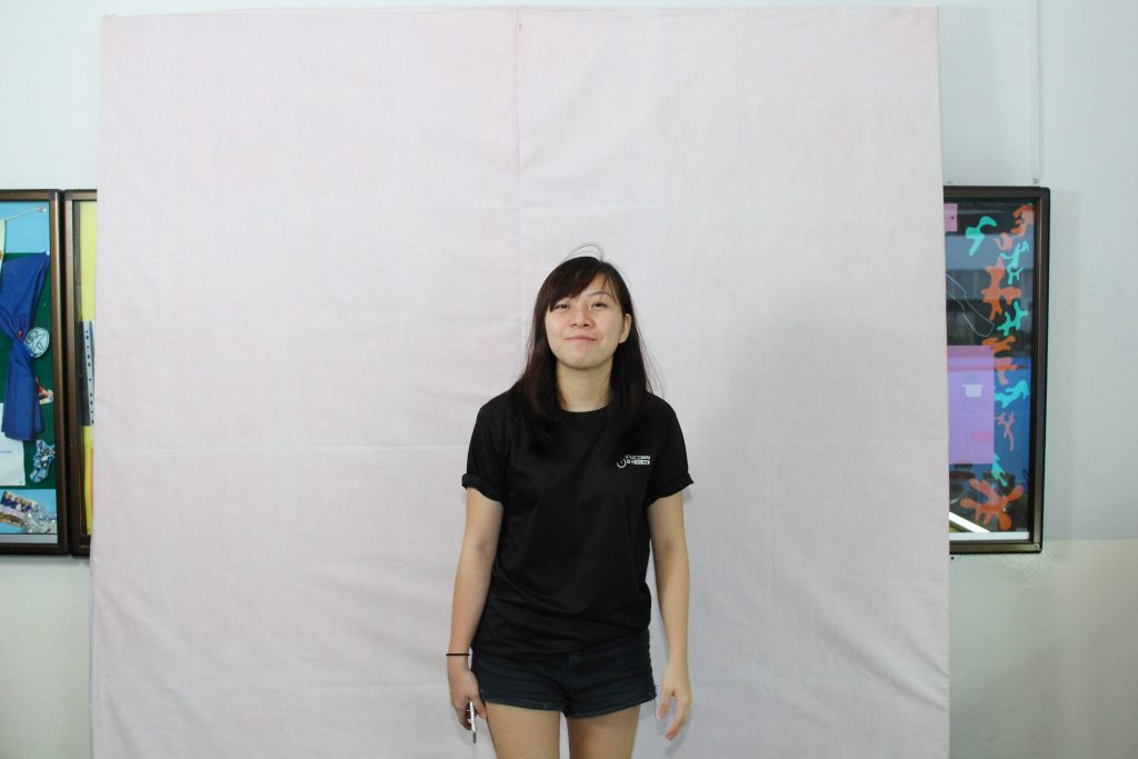
This is me! At work. I deliberately picked out this to be the first photo to introduce myself because it was rare shot of me in front of the camera looking candid haha. Also, as a photography enthusiast and events photographer, we were often behind the camera and hardly photographed of. So I thought this would be an apt photo describing me, and the work I’m passionate about 🙂

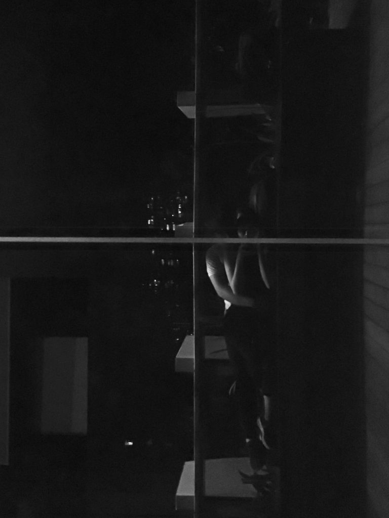
I enjoy viewing the scenery, especially during dusk. I love how the sky changes and transcends from a bright yellow sky colour to gradually a deep blue one. I like sitting near the waters, just enjoying the breeze and the little lights, and it’s precious I give time to myself just chilling and relaxing. I believe in appealing to emotions in photographs, and I think this photograph sends a slight sadness – a message of how I am. I think I appreciate sadness. We won’t be happy and blissful all the time, there will definitely be times you feel down, and that is the emotion which hits me the most and it is important that we learn to cope with unhappiness and move on from it.
Yet, though I like to spend time alone, I have very fortunately found someone special to keep by my side who loves me for who I am :’) And thank you for appearing in my life.
Task 2: Object and representation of self
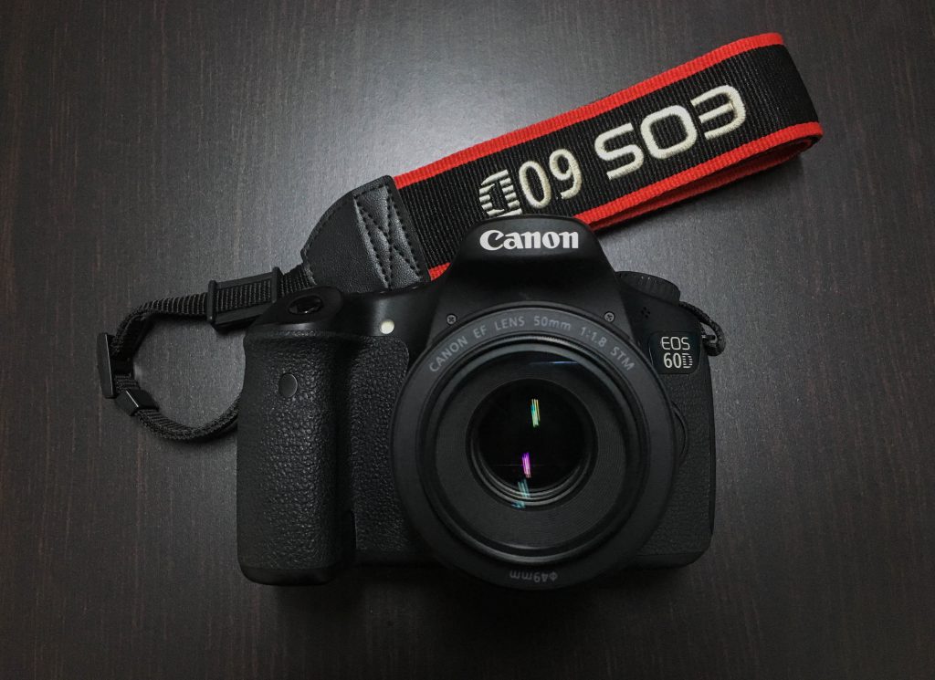
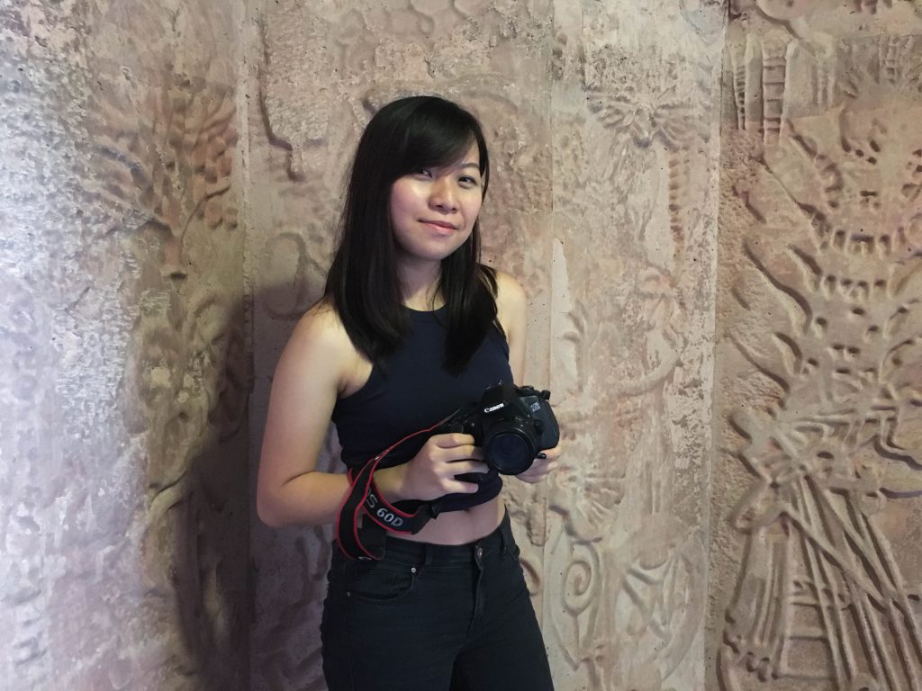
For the second task, I have chosen my first and only DSLR camera as an object I feel very important to me. I first took up photography and videography as a CCA in primary school and learnt really elementary video and photography skills. It helped build up my foundation and interest, nonetheless. 🙂 Then, I continued pursuing my interest and passion in secondary school where I joined Infocomm Club and further exposed myself to media. In Sec 2 just 5 years ago, I got my baby Canon 60D!! It’s my first owned DSLR and thanks to this baby, I took up greater responsibility in my CCA. I learnt from my seniors, and as I gained experience, very quickly I took photographs for school and class events as a main photographer.
This is an immensely treasured opportunity in school to hone my photography skills and techniques and also build up my portfolio. And then finally getting to ADM to further study on film and photography 
Task 3: My World
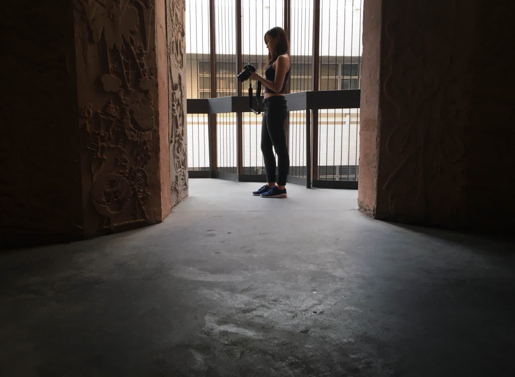
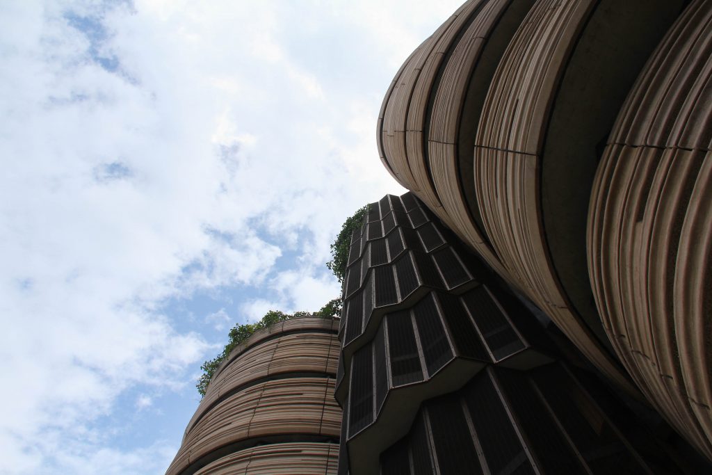
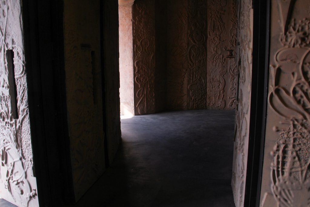
The Hive. An icon of NTU. I’ve always liked to challenge myself to present alternative views of a familiar or popular place through different photographic angles.

Other photos for sharing


Now I see and feel THE HIVE differently because of the memories built with this guy over here :’) who helped me take some of my photos for submission.
THANKS FOR VIEWING
Feel free to leave comments/ feedback

In this Project, we are tasked to position 3 rectilinear volumes of overall, inherent and comparative proportions in satisfactory compositions using foam boards to create sketch models, while displaying concepts of D, SD, SO relationships as well as wedging, cradling, piercing techniques.

2D sketch analysis of first sketch model – SM 1.1
SM 1.1 shows the original first 3D sketch model that I have made from foam boards, trying to show D, SD and SO in y, x and z axes respectively.

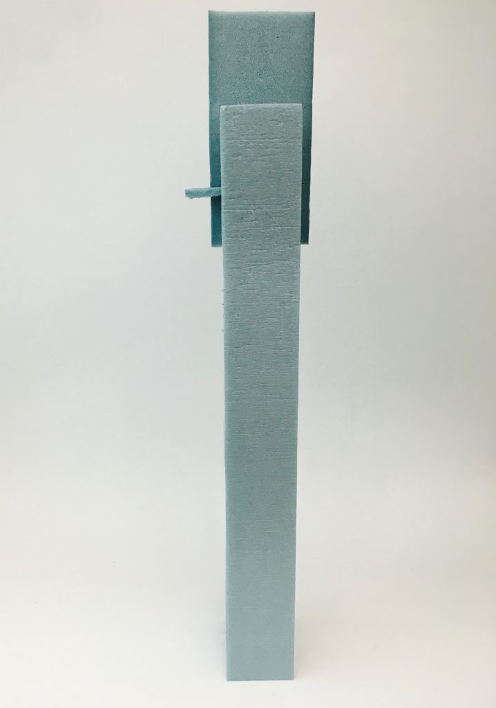
2D sketch analysis of first sketch model – SM 1.2
SM 1.2 shows that I wanted to attempt piercing of the SD into the D and the have the SO wedged on top of the SD. However, I realised i have issues with seeing all 3 components of the model at certain perspectives. So I turned to wedging of the SO on SD, and then SD on D while removing 1/3 of the SD to show clearer distinction of the 3 proportions
This is the result of my first sketch model: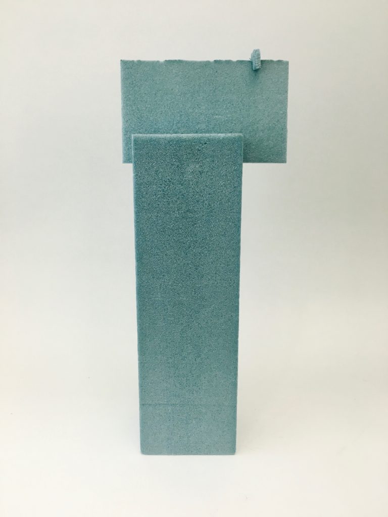

For my second sketch model, it was an unsuccessful one due to similar shapes and proportion, lying in parallel axes. Also, there was confusion in SD and SO in one of the perspectives. 

2D sketch analysis of second sketch model – SM 2
Making use of the rule of thirds, I tried to remove a third of the SO and have it wedged at the side of D while arranging the pieces with varying axes. Yet, the sketch model lacked interest.
Looking at the third sketch model,

2D sketch analysis of third sketch model – SM 3
there is an interesting perspective of the 3D sketch model through the cradling of pieces, with the SO cradled in between the larger SD and D. It seems as though the SD is hovering!
The sketch model can be improved by correcting the length of the D as shown in the analysis above because it is too long and thus leads to instability in the model as it cannot withstand and support the weight of the SD and SO attached to it.
Finally, this leads to the finishing piece:


Ultimately, I picked the 3rd sketch model as my final product to work on the material, textures and giving it function.
Further information may be accessed from the PDF document uploaded onto google docs

For the first lesson, we were asked to bring an interesting 3D object to class for sharing. I was looking around for a special handcrafted sculpture or so, but then I thought maybe I could find a noteworthy everyday object.
So, I turned up with…
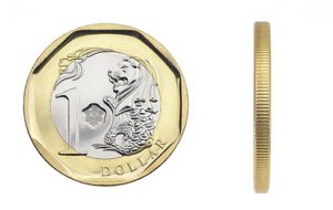
Yes, it’s our Singapore’s third series $1 coin.
I thought it was interesting to me because of the shapes it has. On the front surface of the coin, there are 2 circles of a different radius, and also an octagon with it’s edges touching the circumference of the big circle. There is contrast in the shapes in the sense that the circles are edgeless and smooth while the octagon seems rigid and fixed in its shape with its pointed edges. Yet, there is harmony probably due the position of the shapes.
Turning the cylindrical coin, you can observe little ridges well spaced out and arranged on the outside. One interesting observation from me is that though the ridges may appear to be convex/ protruding out, it is created by the negative space that is concave instead!
The colours of the coin also helps give the $1 its uniqueness and differentiates the $1 from the other coins right away. There is incorporation of 2 colours: silver and gold. I felt it was interesting that the coin was a bi-metallic composition (outer ring is brass-plated and inner circle is nickel-plate).
As the class went on, we were taught to appreciate objects using the basic concept of Dominant (D), Sub-dominant (SD) and Subordinate (SO).
I guess my object is not exactly a good exhibition of D, SD and SO, but if I try:
Dominant – outer brass-plate
Sub-dominant – engraved Singapore merlion
Subordinate -inner nickel-plate
Learning these concepts really helped me look at things in a different way, and appreciating objects in my everyday life. It also helped me in designing my foam models, keeping these key concepts in mind 🙂