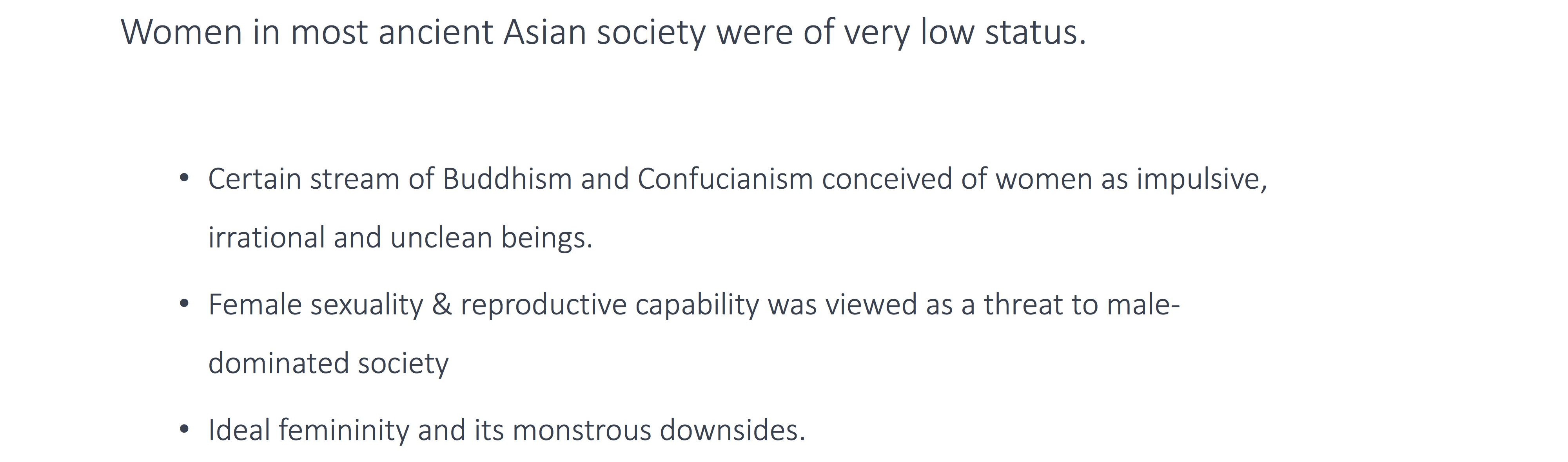
My Work
There are 25 posts filed in My Work (this is page 1 of 3).
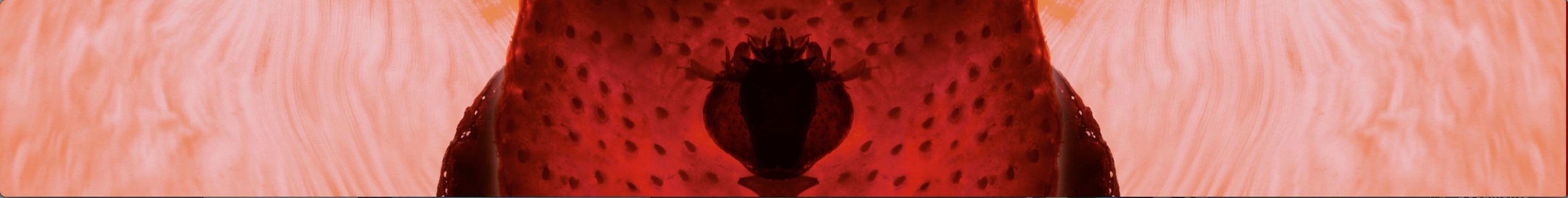
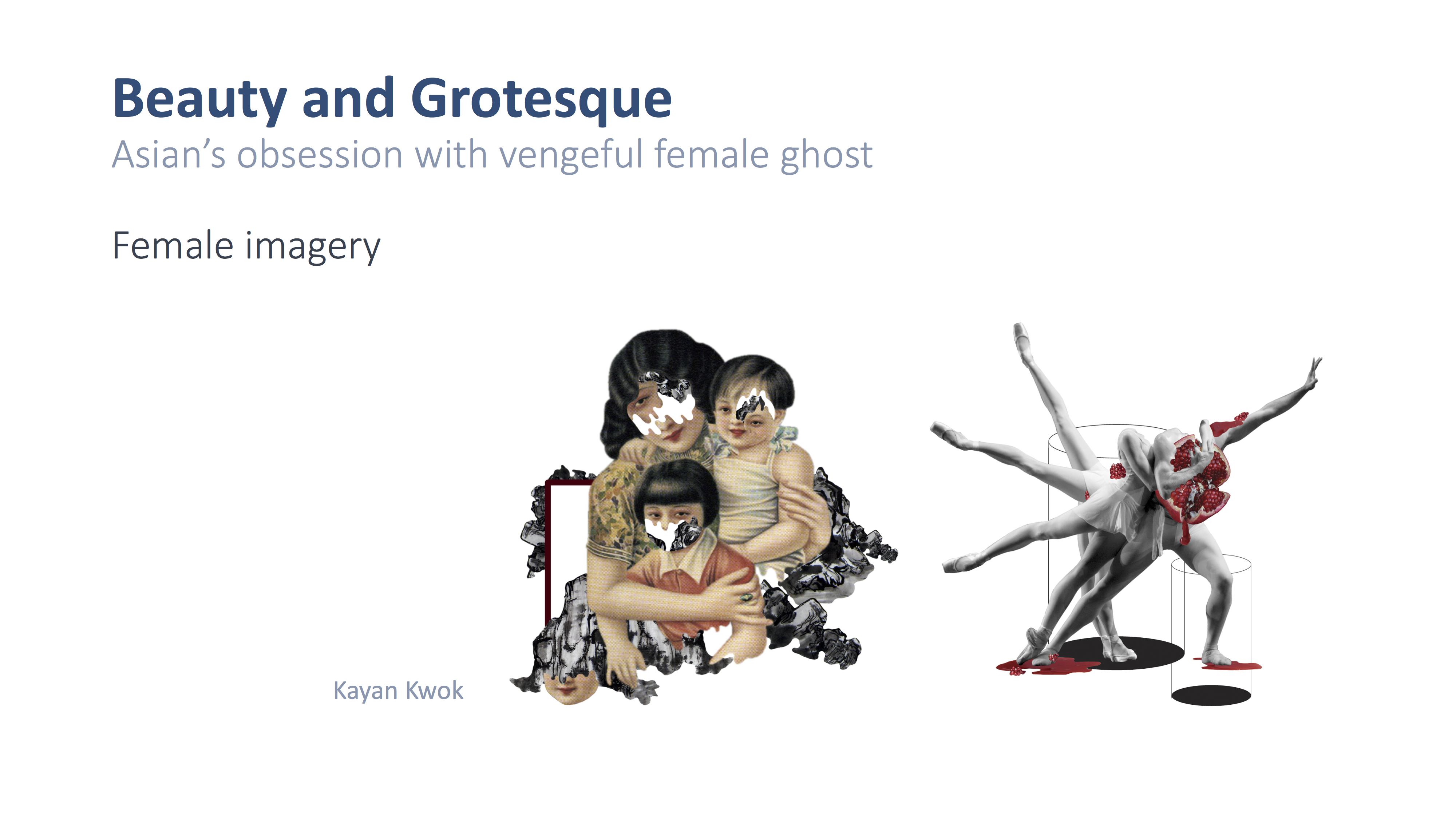
GIVE ME BACK MY BABY
GIVE ME BACK MY BABY is my approach on re-looking at the trope of female ghost in Asian Horror films, by portraying the frequently used characteristics of the female ghosts in a new light, showing their roles as empowerment despite the negative connotation and celebrating their womanly ability to reproduce.
The work is inspired by the research that looked into the reason behind the frequent occurrence of vengeful female ghost in Asian myth and folklore
More details in my previous research post:
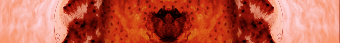
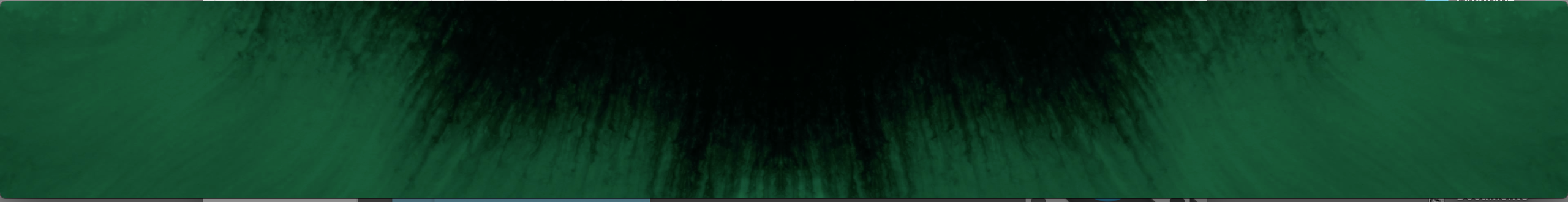
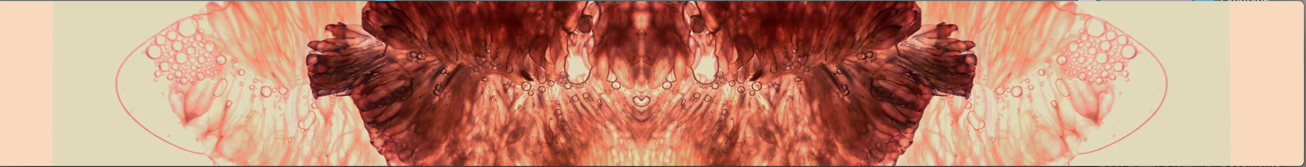
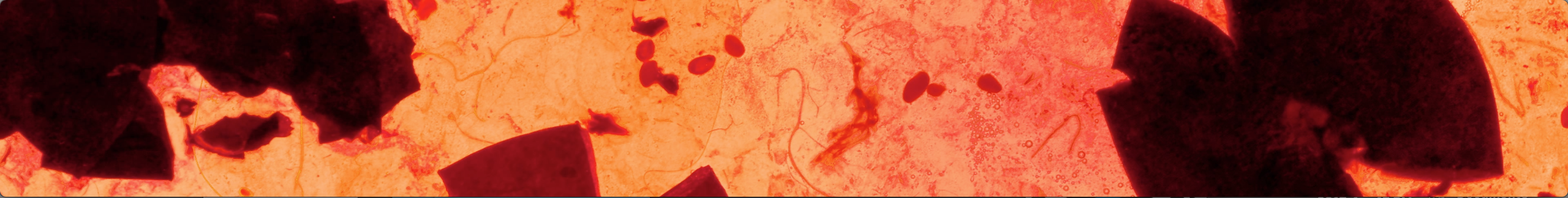
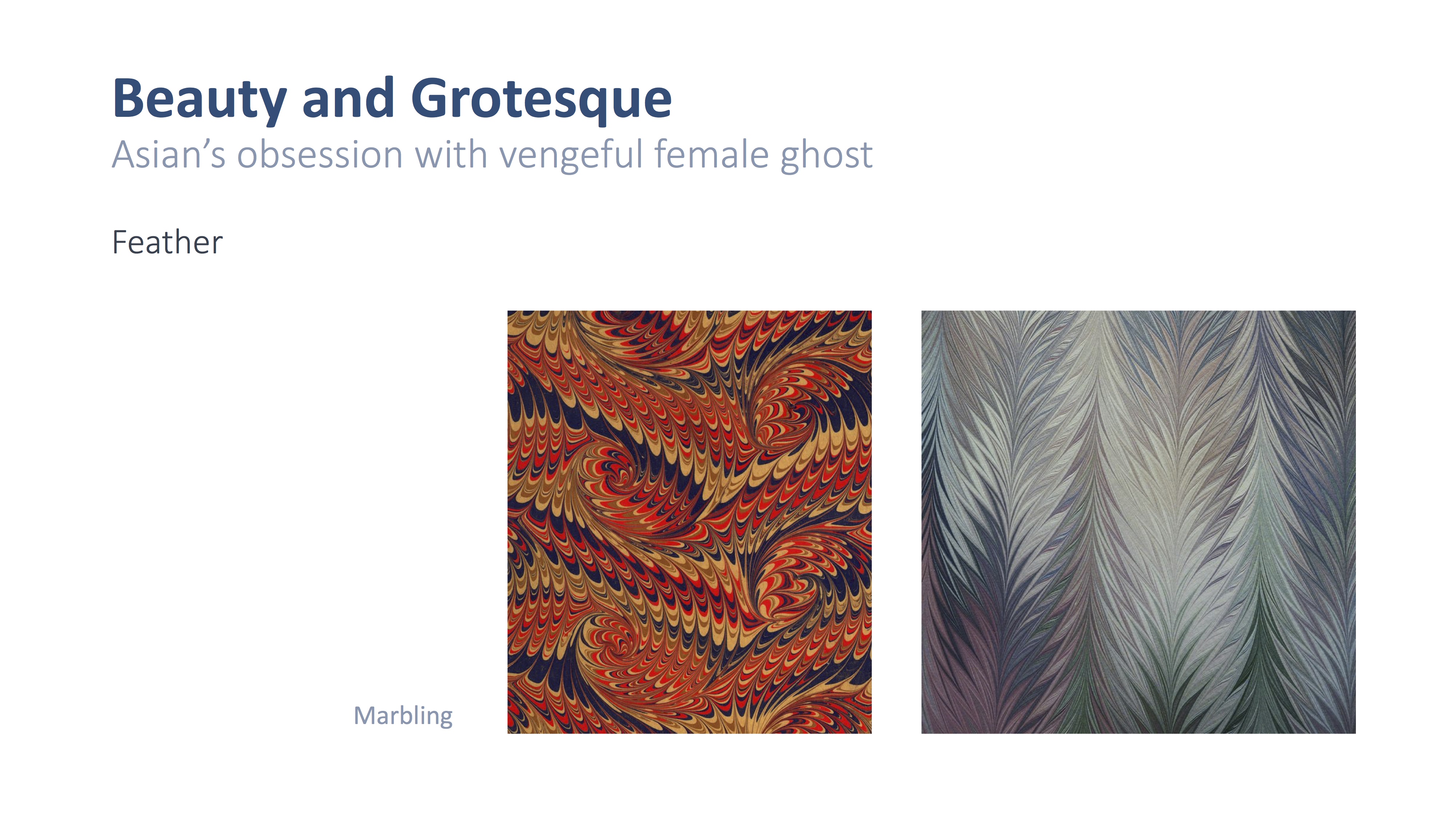
The different visuals are timelapse of either ink spread on wet paper or fruits being squashed between glass panels, the fruits are placed above the light source to get the desired translucency.
The earlier attempt of such method is recorded in my process post:
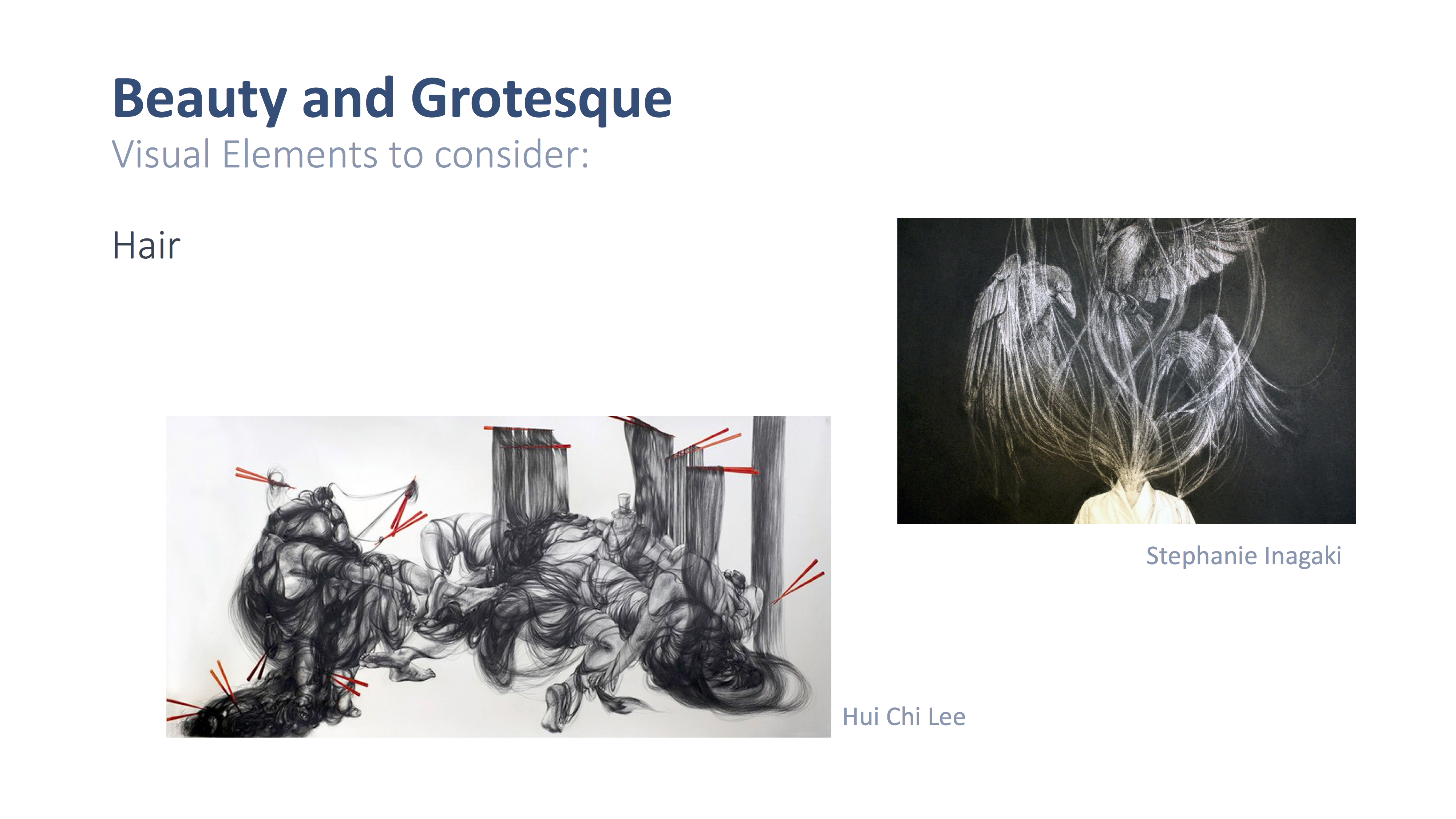
Here are some of the female ghost features that are portrayed in the video.
Black hair
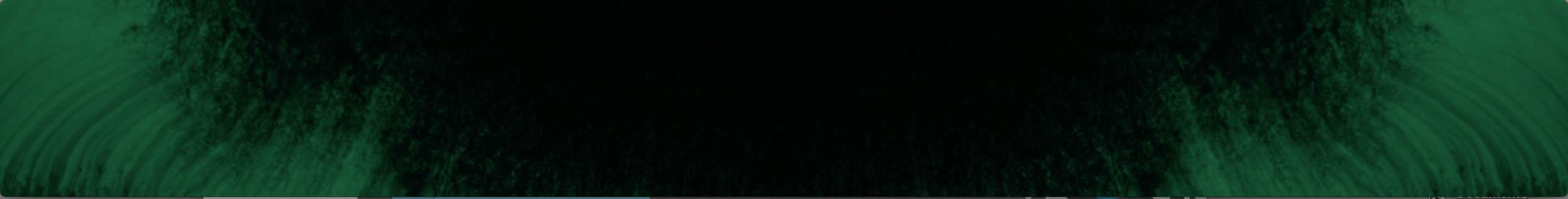
Blood
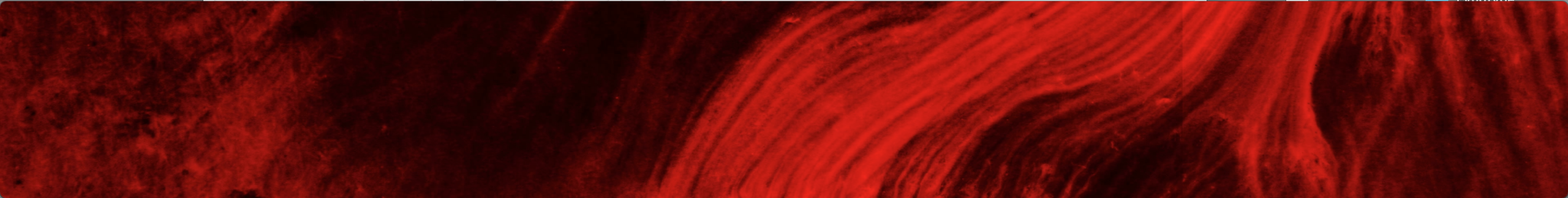
Lips
Teeth
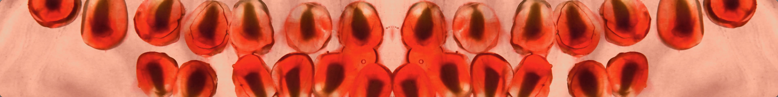
Hips and the female genital
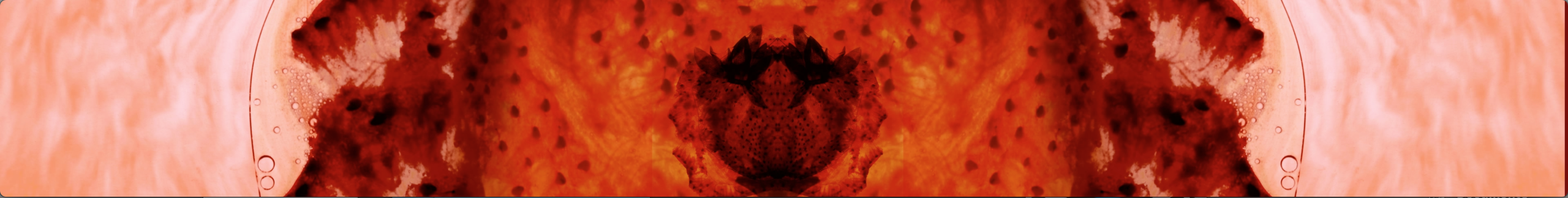
The blueberry bursting with the seeds form an ambiguous visual to suggest the process of childbirth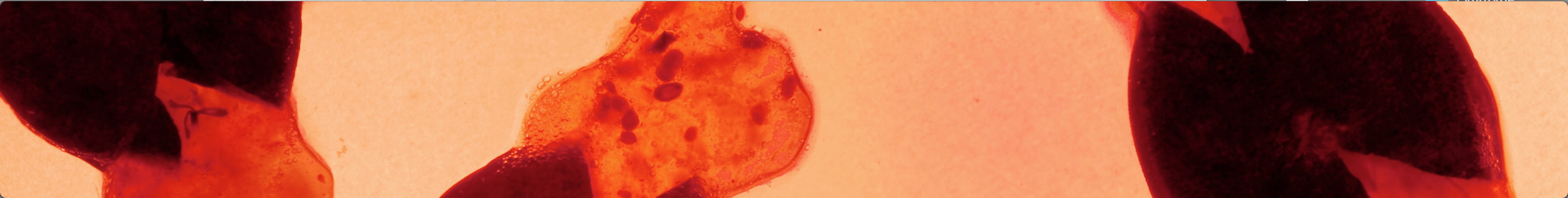
And finally the work on the media wall:
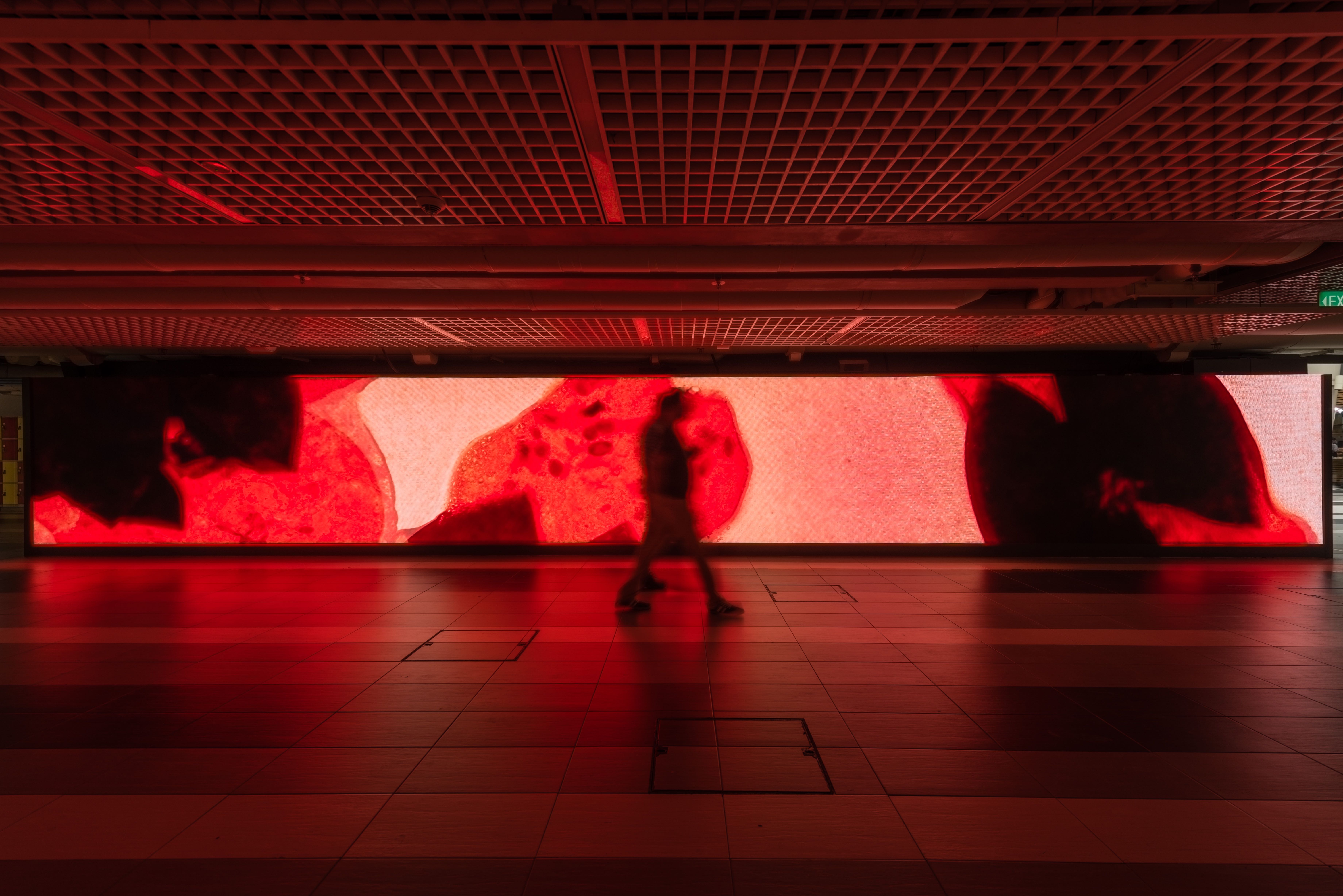
GIVE ME BACK MY BABY , MAN NTU LED, 15m by 2m, North Spine Plaza NTU Singapore 2017, Photographed by Solomon Quek Jia Liang
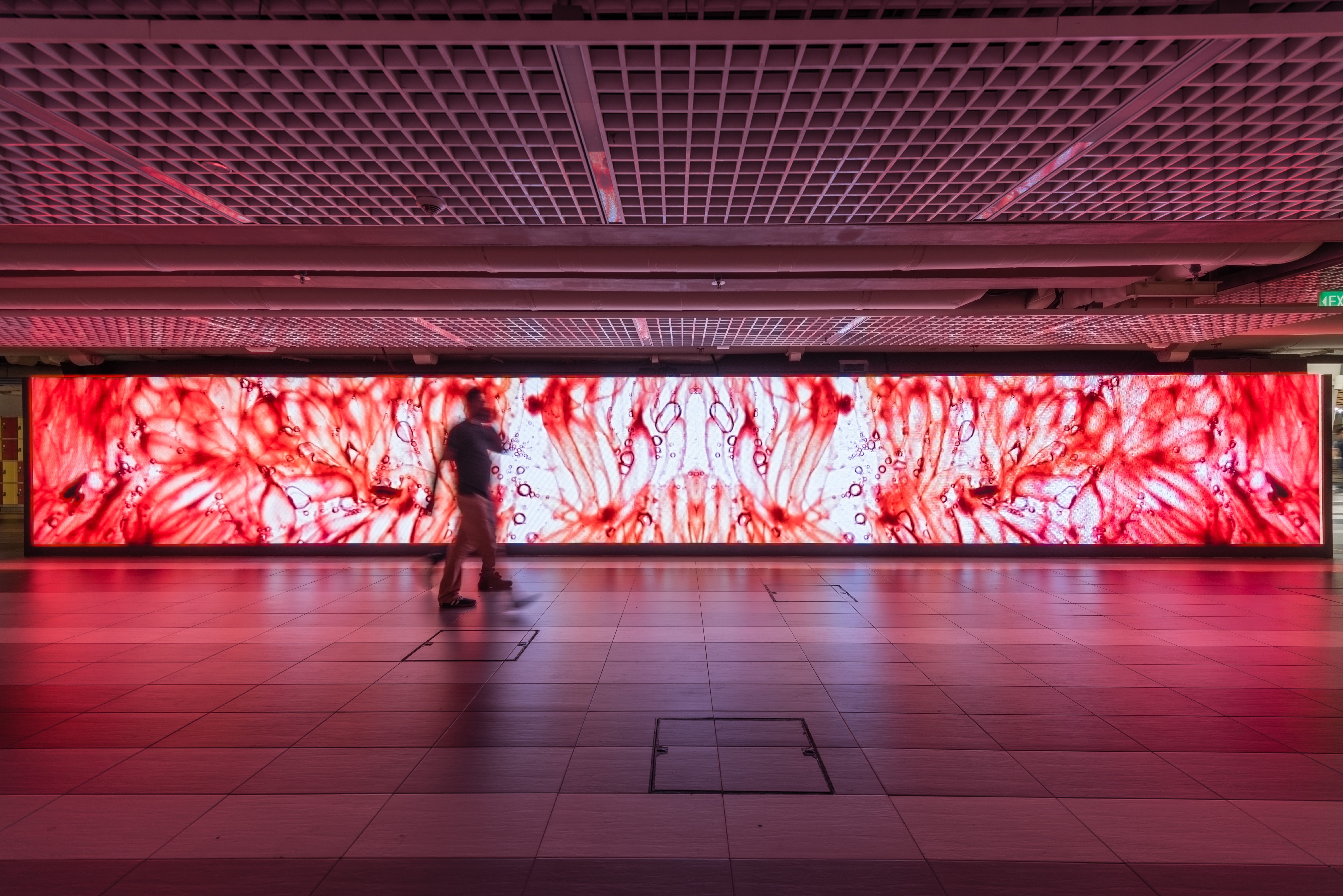
GIVE ME BACK MY BABY , MAN NTU LED, 15m by 2m, North Spine Plaza NTU Singapore 2017, Photographed by Solomon Quek Jia Liang
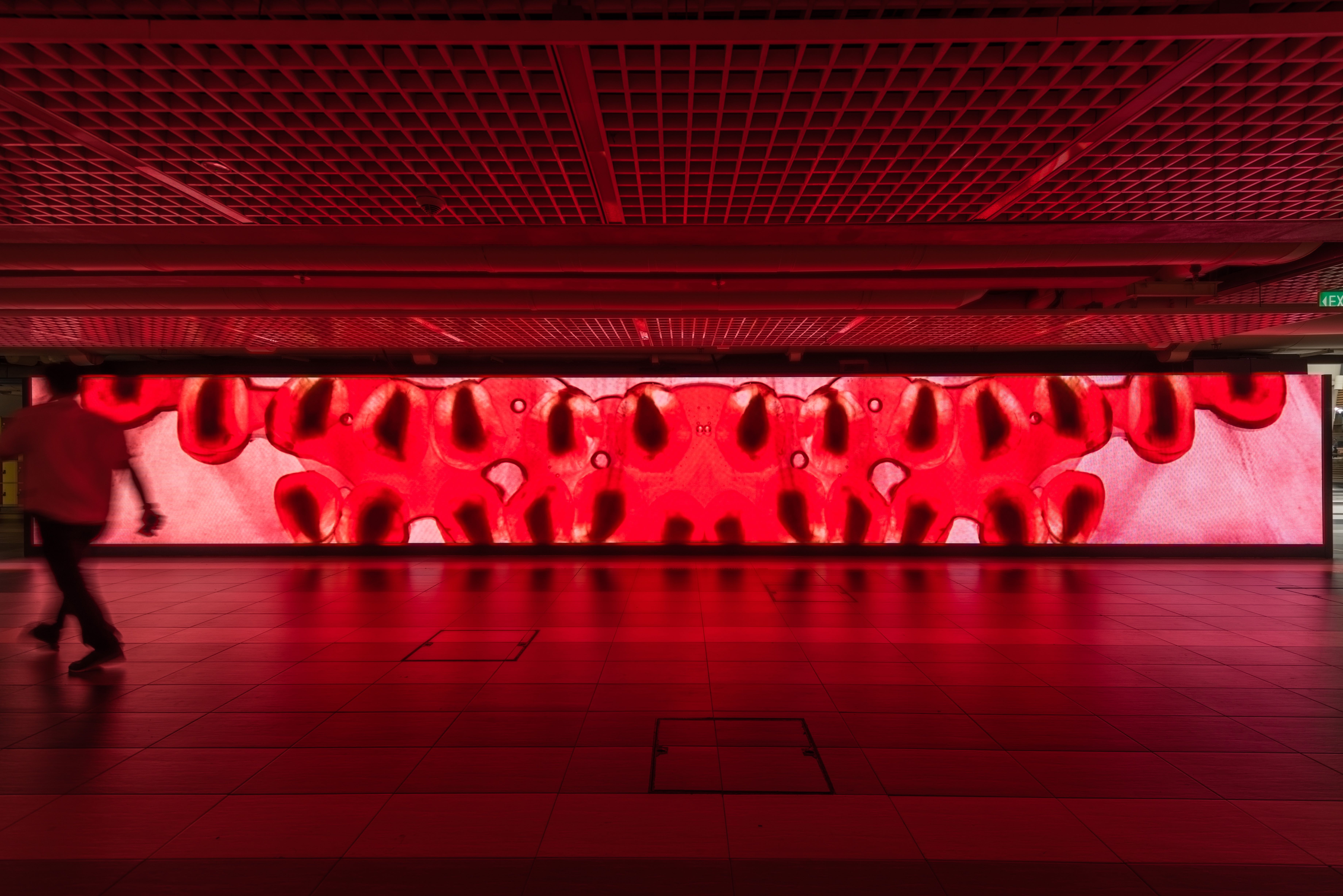
GIVE ME BACK MY BABY , MAN NTU LED, 15m by 2m, North Spine Plaza NTU Singapore 2017, Photographed by Solomon Quek Jia Liang
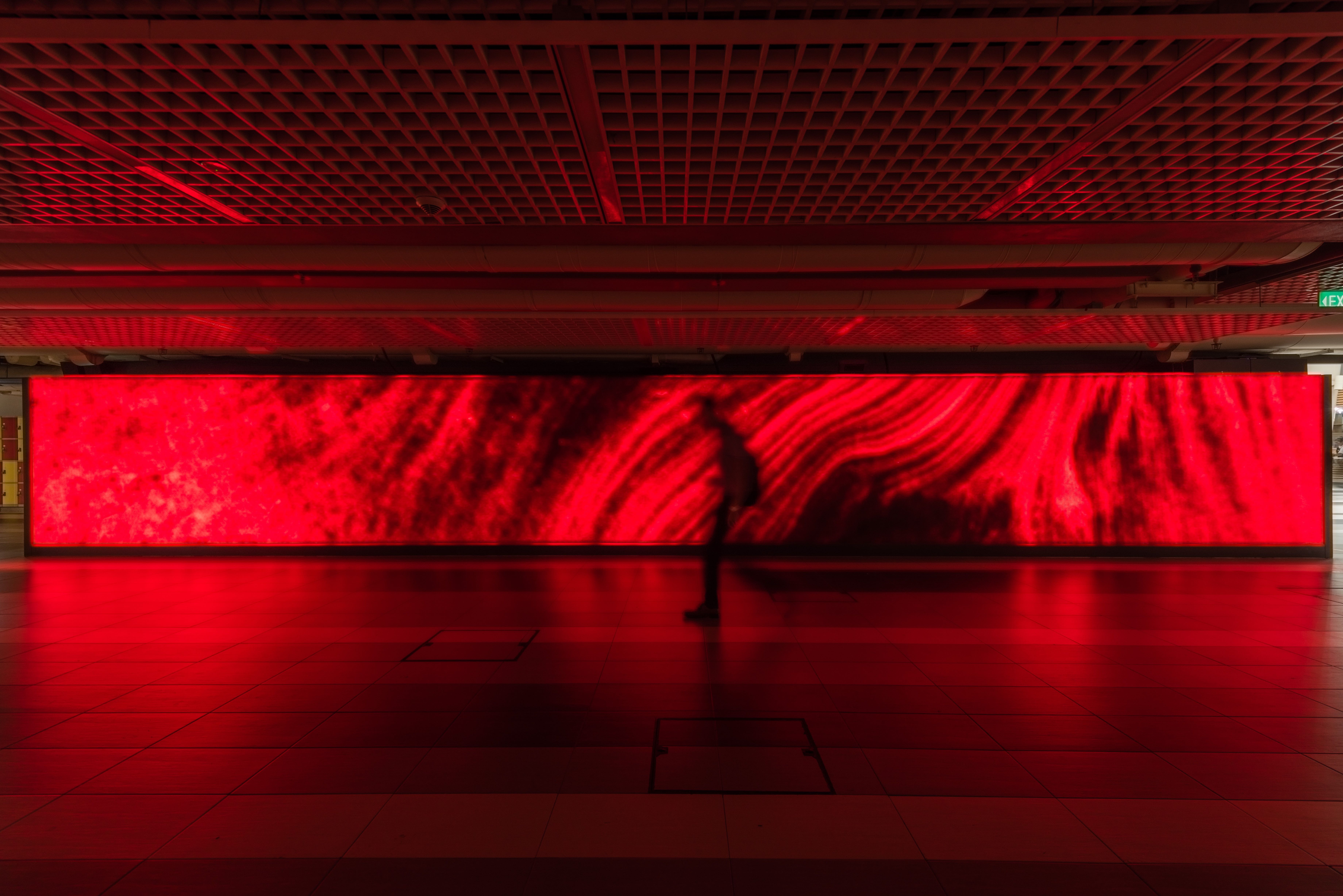
GIVE ME BACK MY BABY , MAN NTU LED, 15m by 2m, North Spine Plaza NTU Singapore 2017, Photographed by Solomon Quek Jia Liang
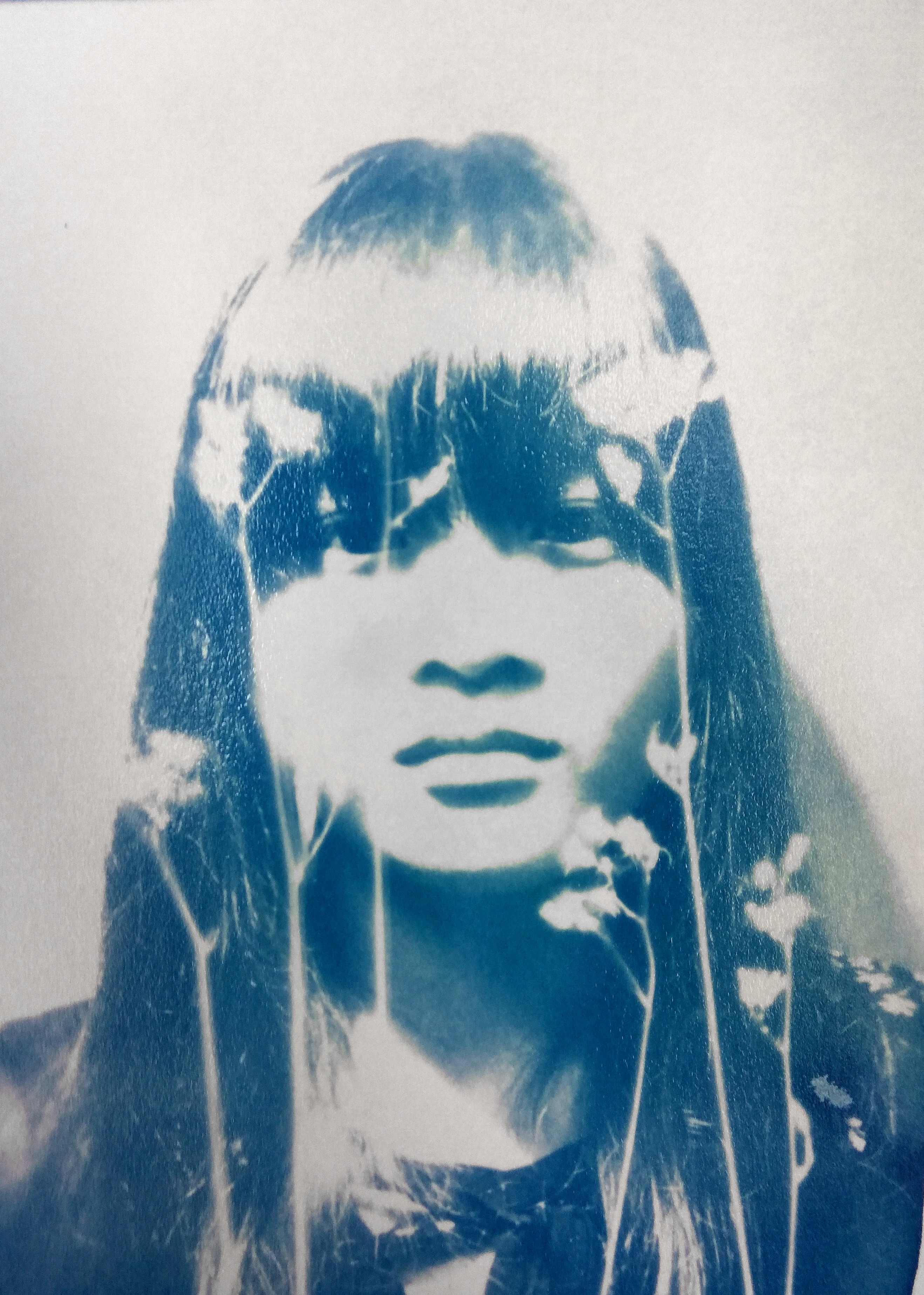
In the style of Anna Atkins
The artist that I looked into was Anna Atkins. She seemed to have a Anna Atkins’ father, John George Children, and her husband, John Pelly Atkins, were friends of William Henry Fox Talbot. It was said that she learned directly from him about his two inventions, the salted paper and calotype processes. Atkins was also friends with Sir John Herschel who invented cyanotype in 1842. She was knowned to have had access to a camera by 1841, sadly no camera based photographs by her survived, what she was famous for was the series of cyanotype photograms she did with algae as the subject matter.
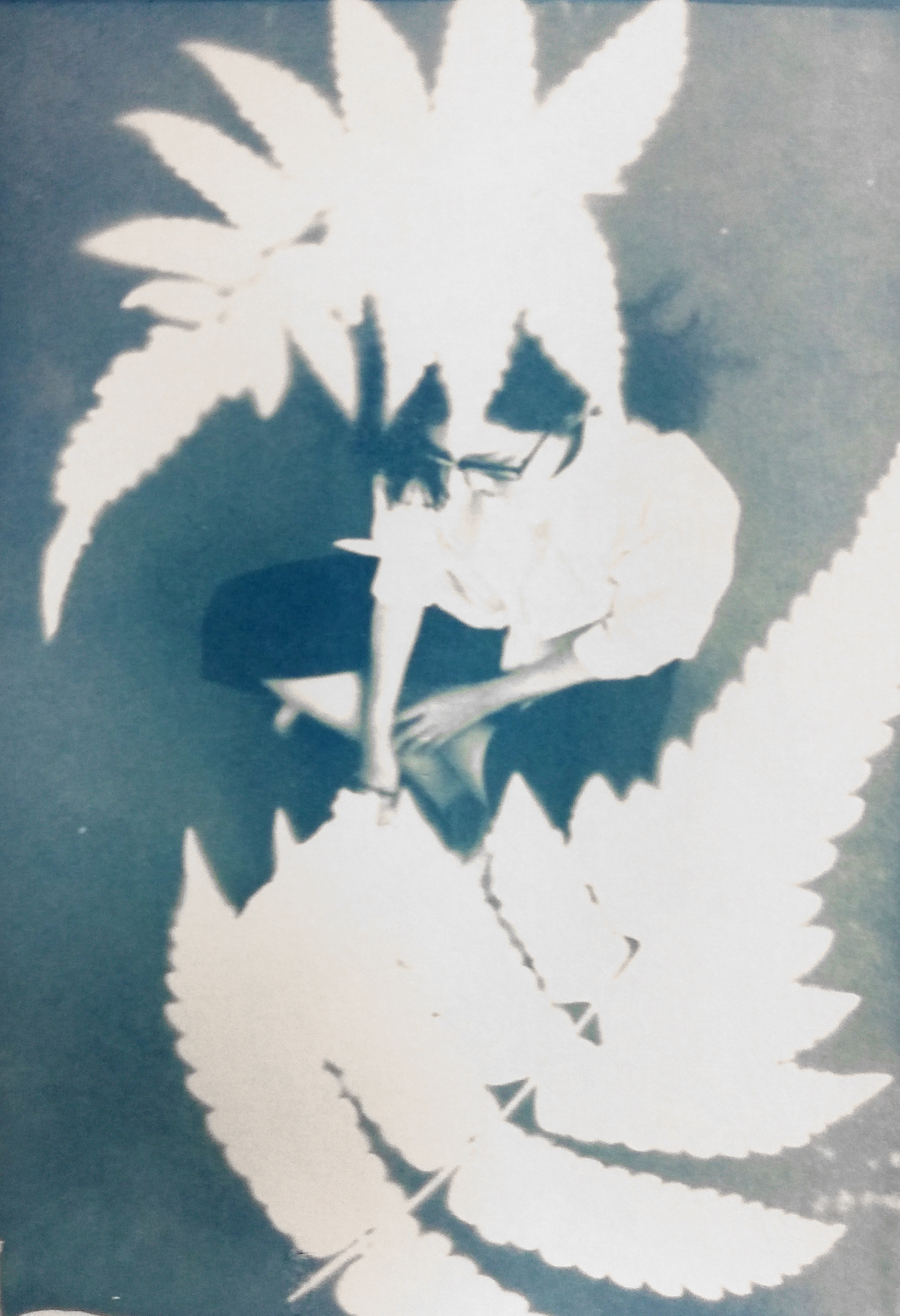
For the very first step, I tried re-creating the photograms using plants found around campus, which resulted in visuals that are similar to that created by Atkins.
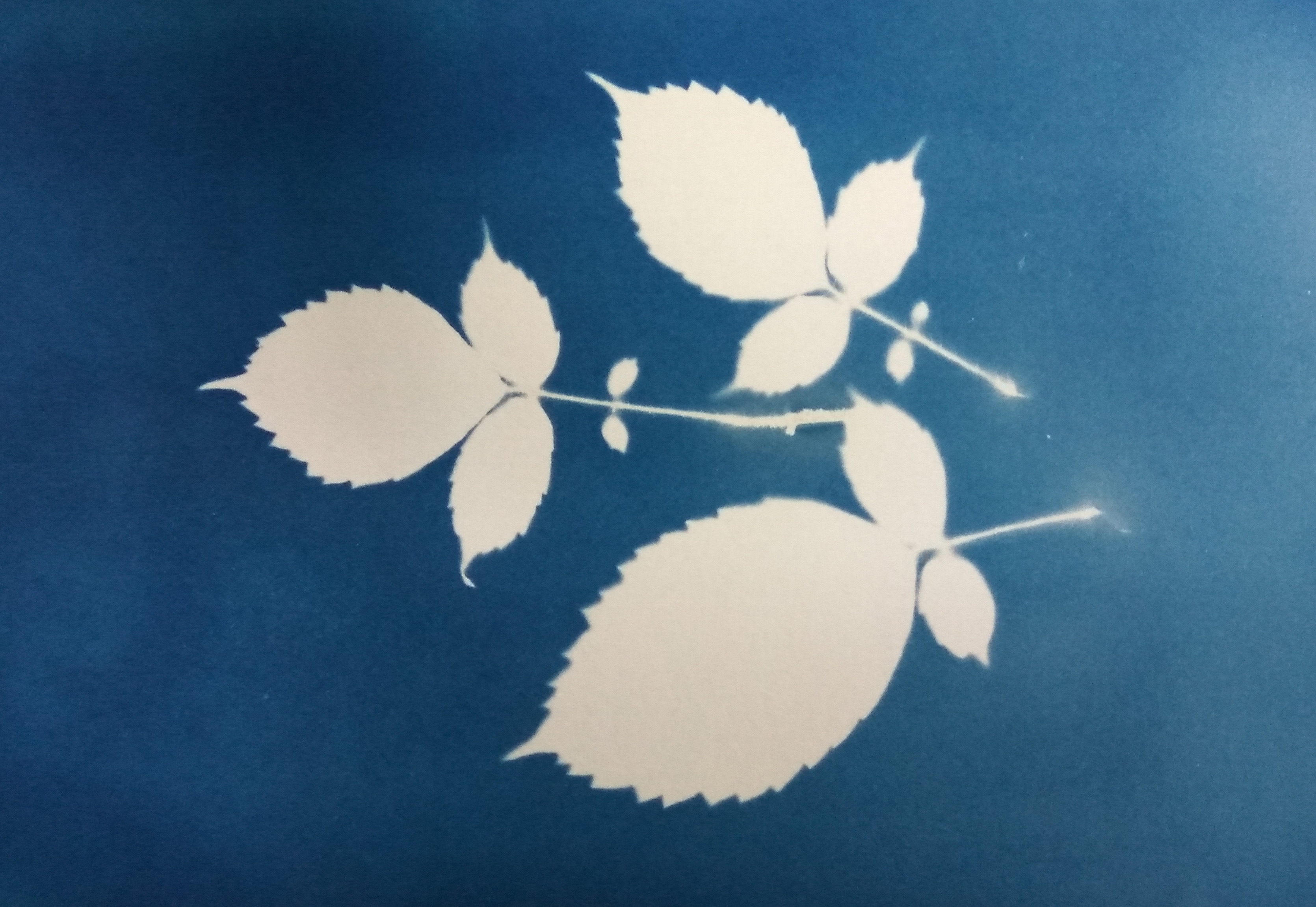
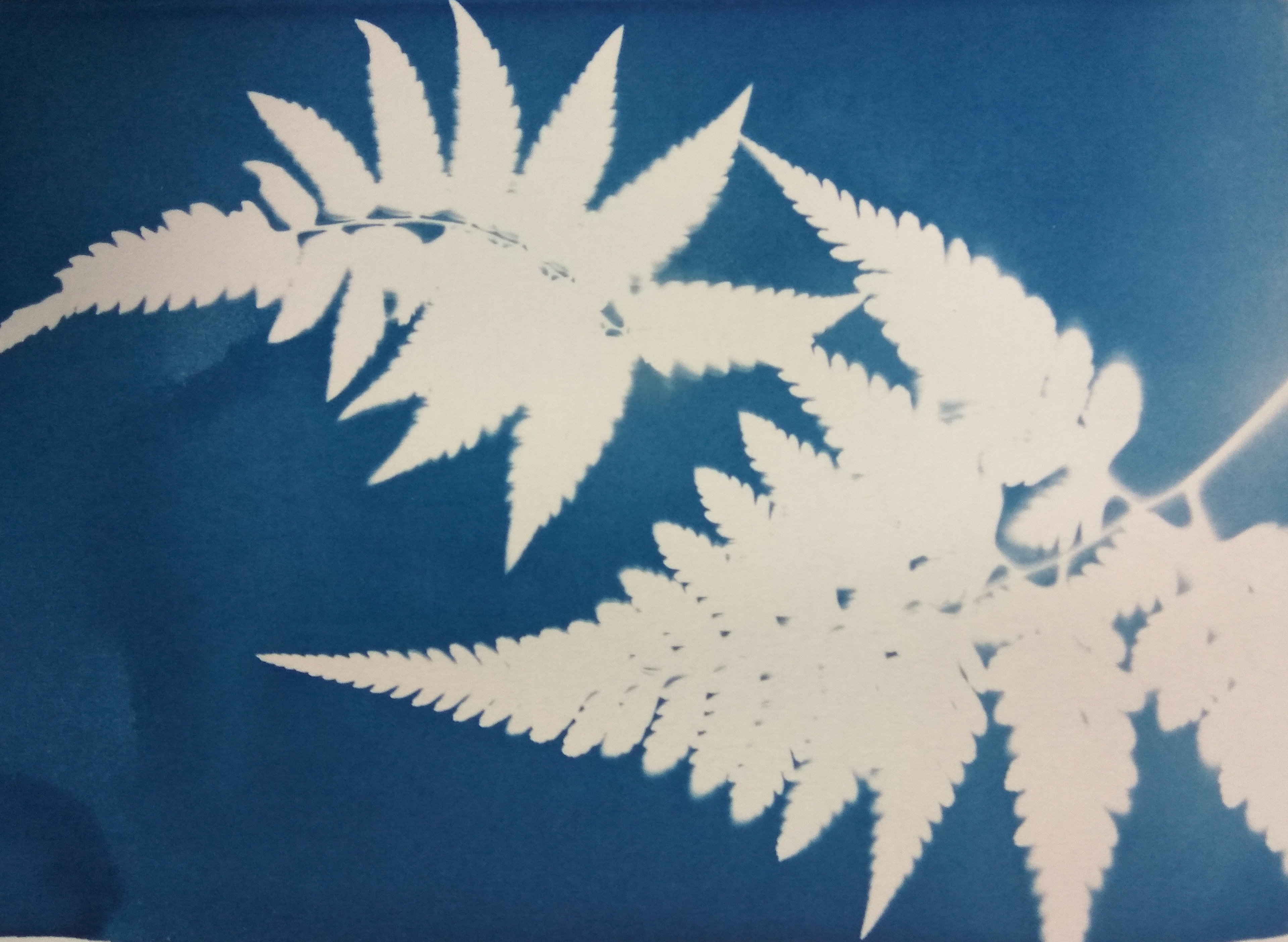
In her prints, Atkins used long exposure to obtain the details of the subject matter, as enough light is able to pass through the object and expose the chemicals. Unfortunately I didn’t get to extend the exposure time long enough for such effect, hence the stark blue-white contrast in my images.
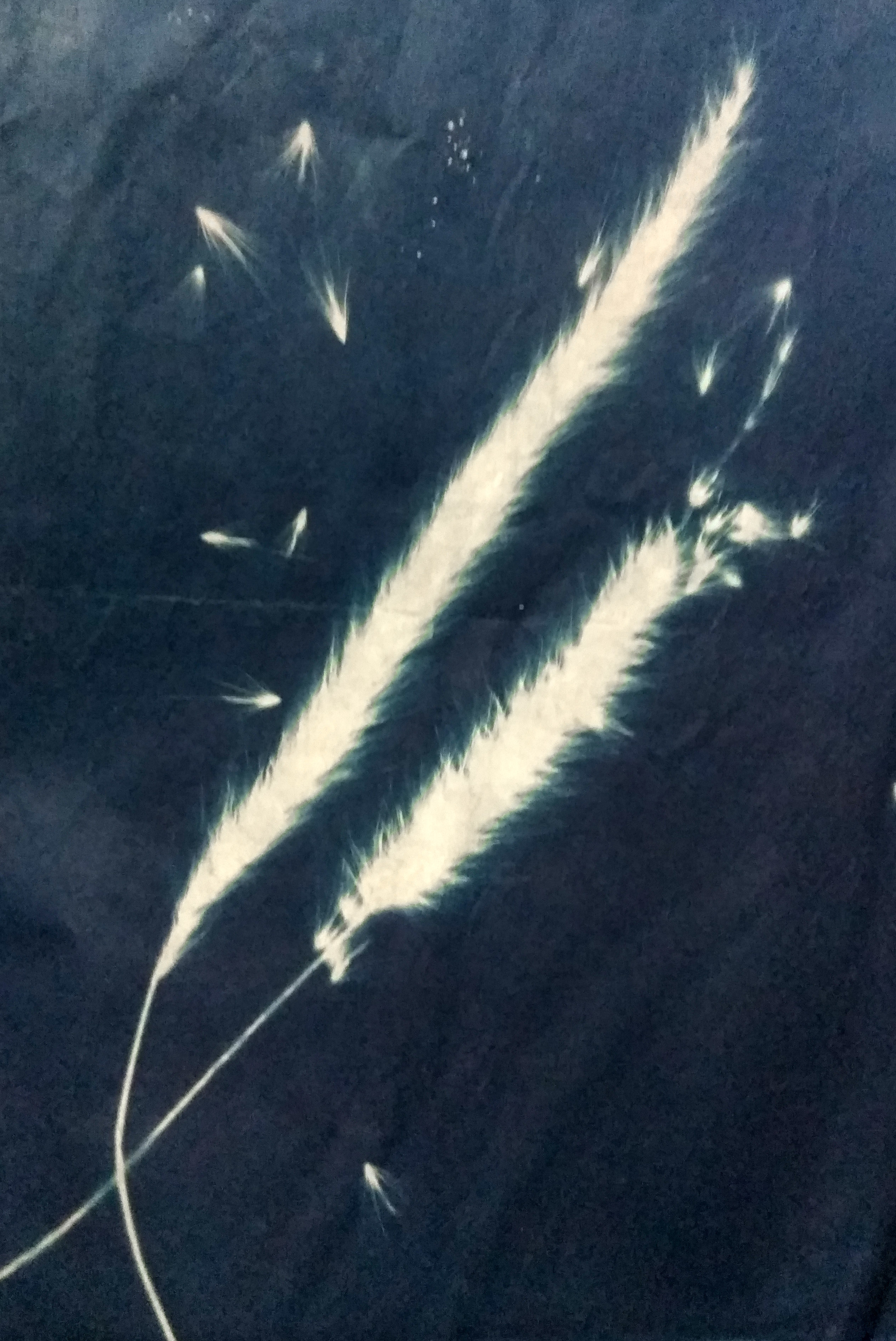
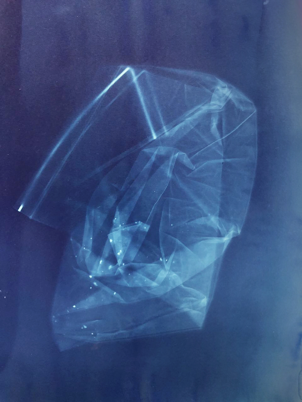
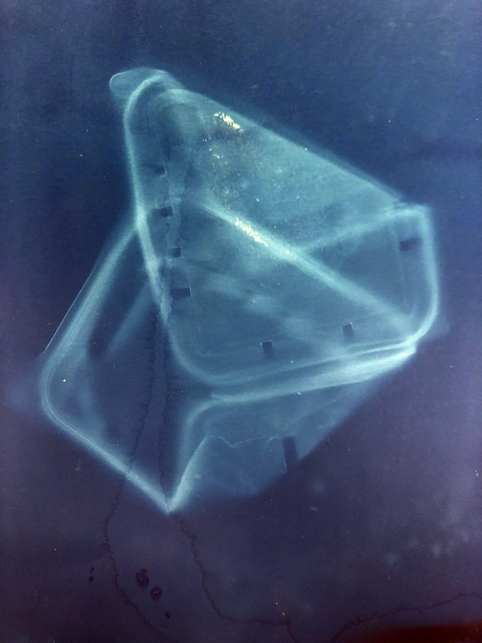
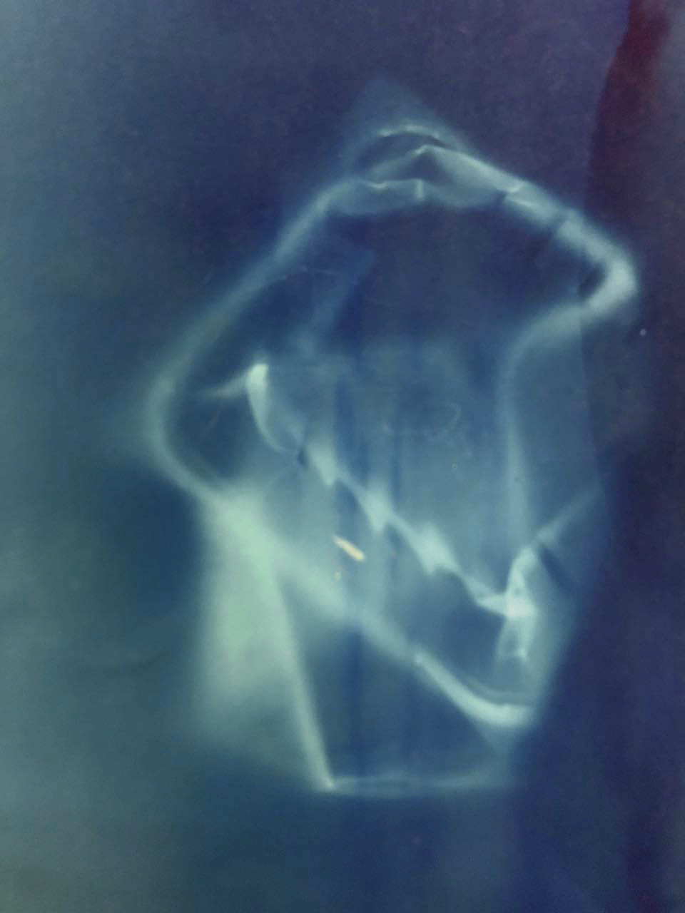
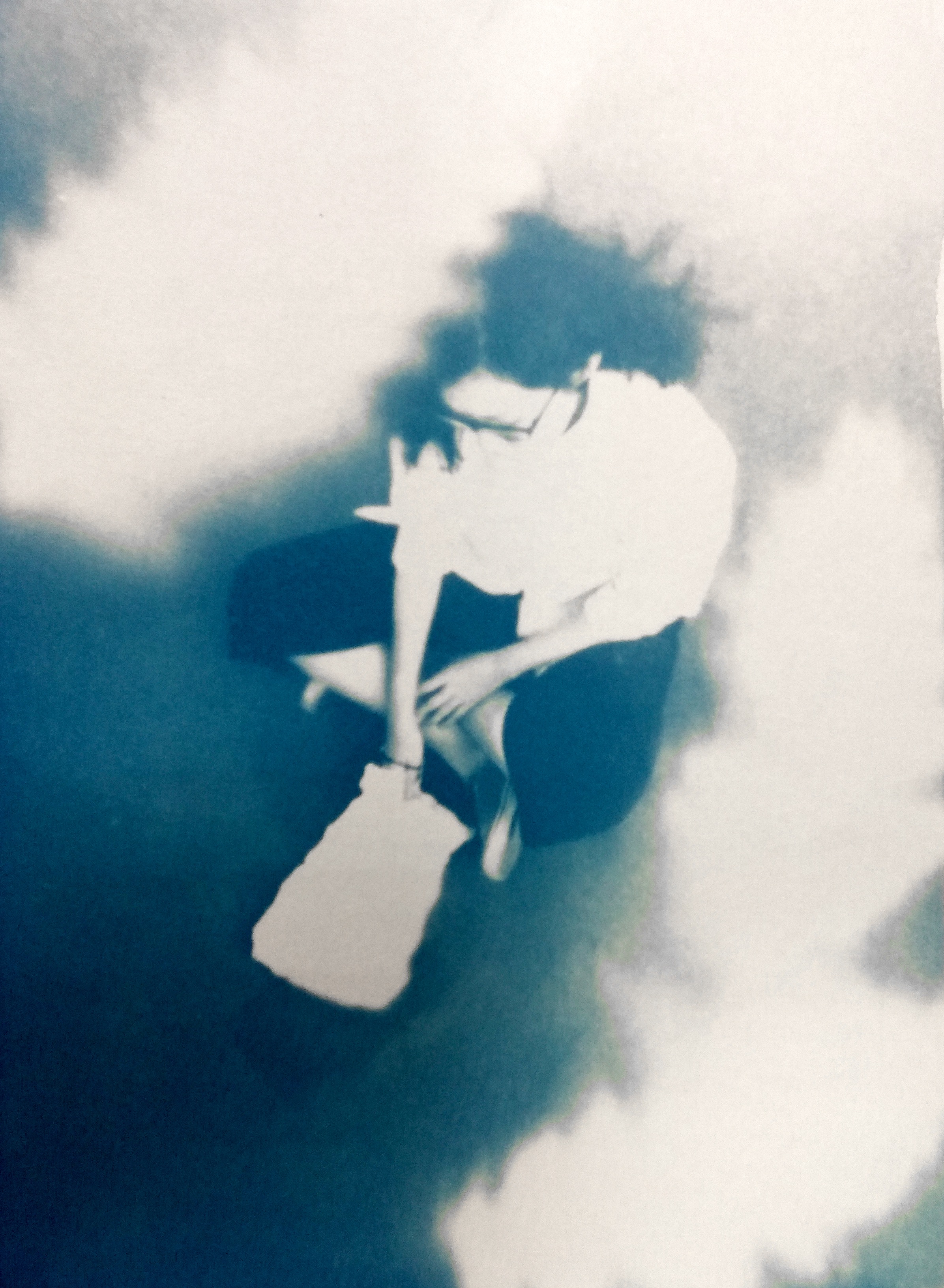
But since the main idea of it is to make use of the translucency of the material, I changed my subject and used daily objects which were translucent to create the photograms. The result was interesting texture and ghostly prints.
And perhaps what interest me about Atkins’ works was not that much about the process, but her choice of subject matter and presentation. To me there was beauty in the way she arrange the subjects. They were not merely documentary, but also beautiful imagery.
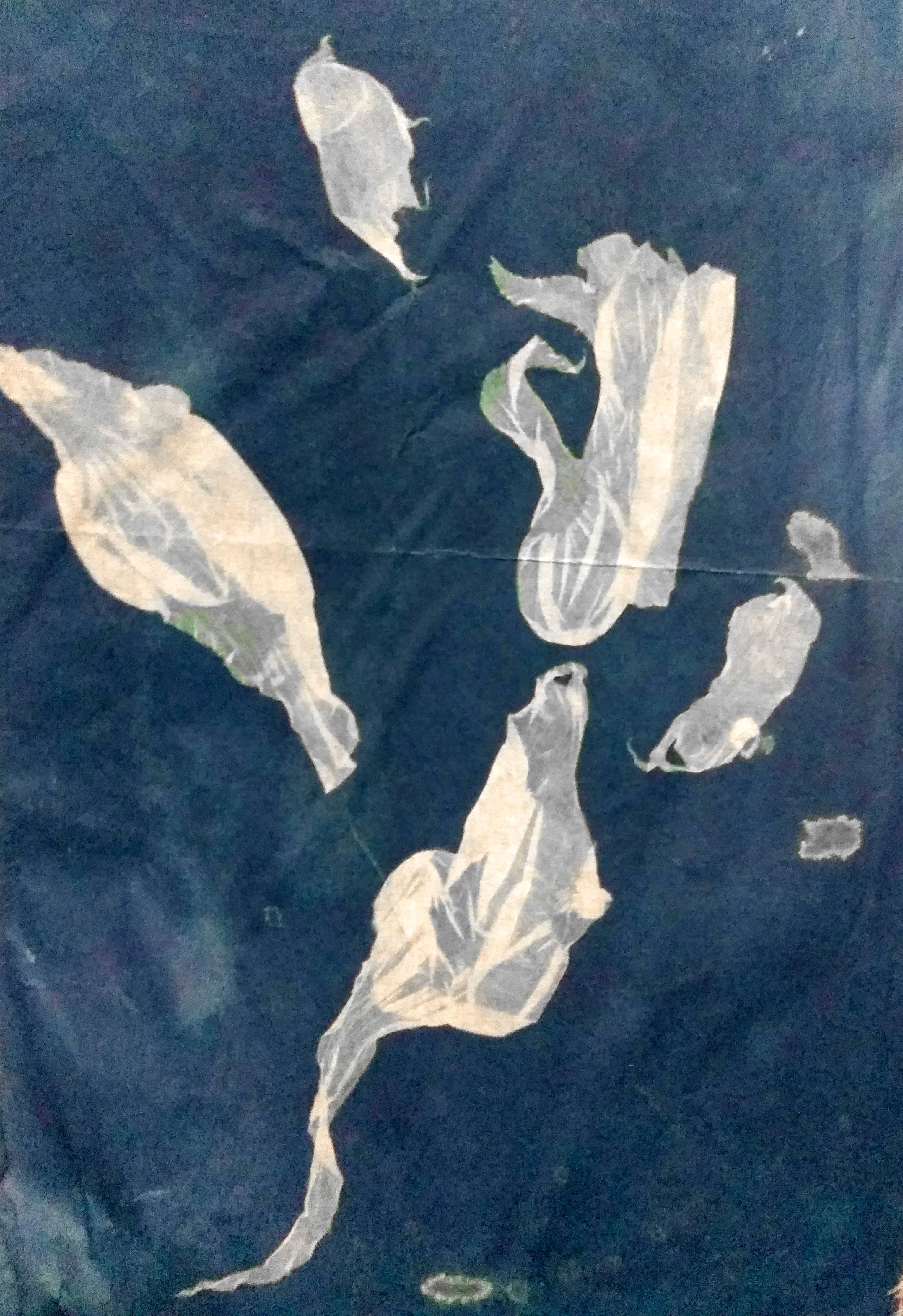
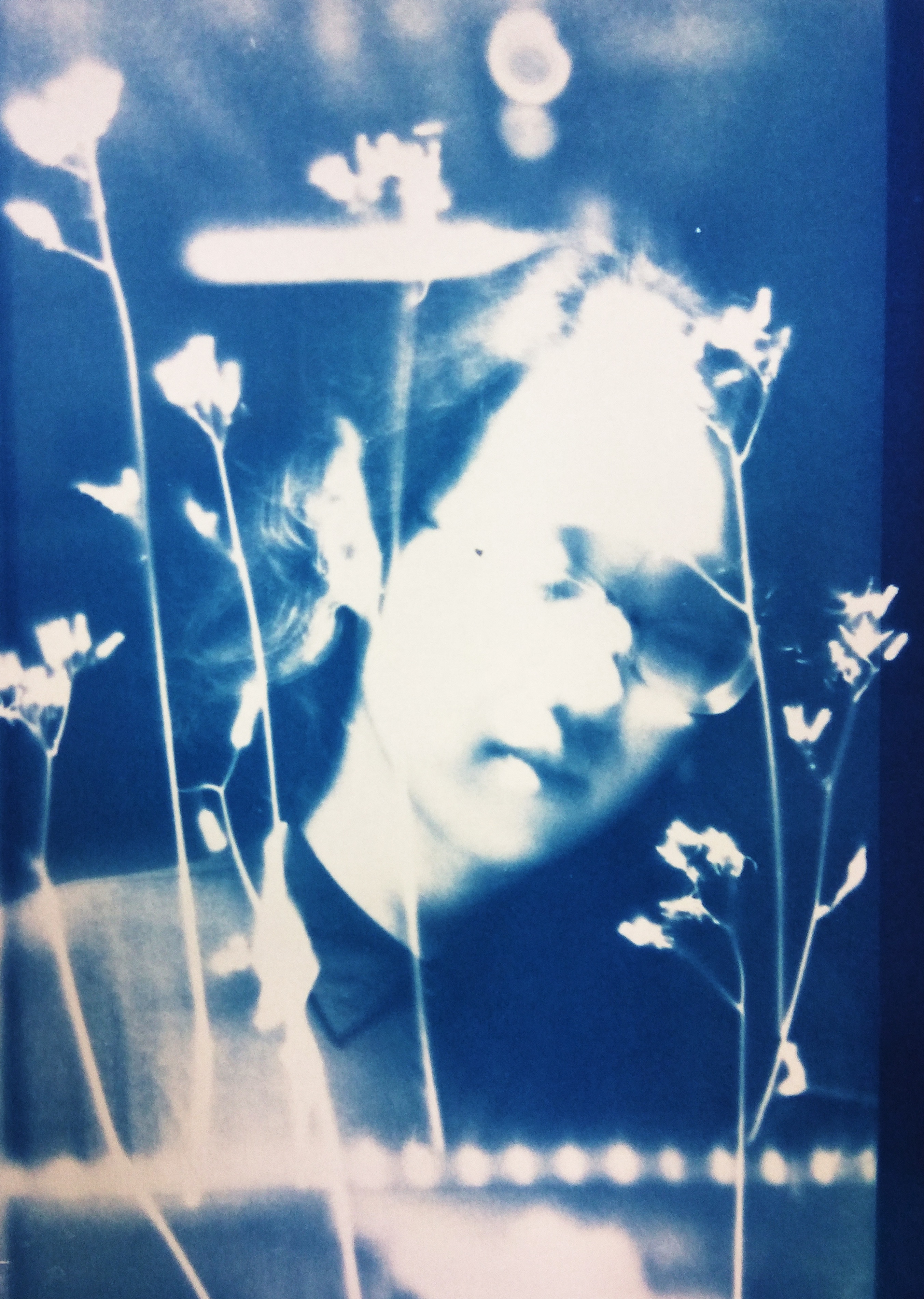
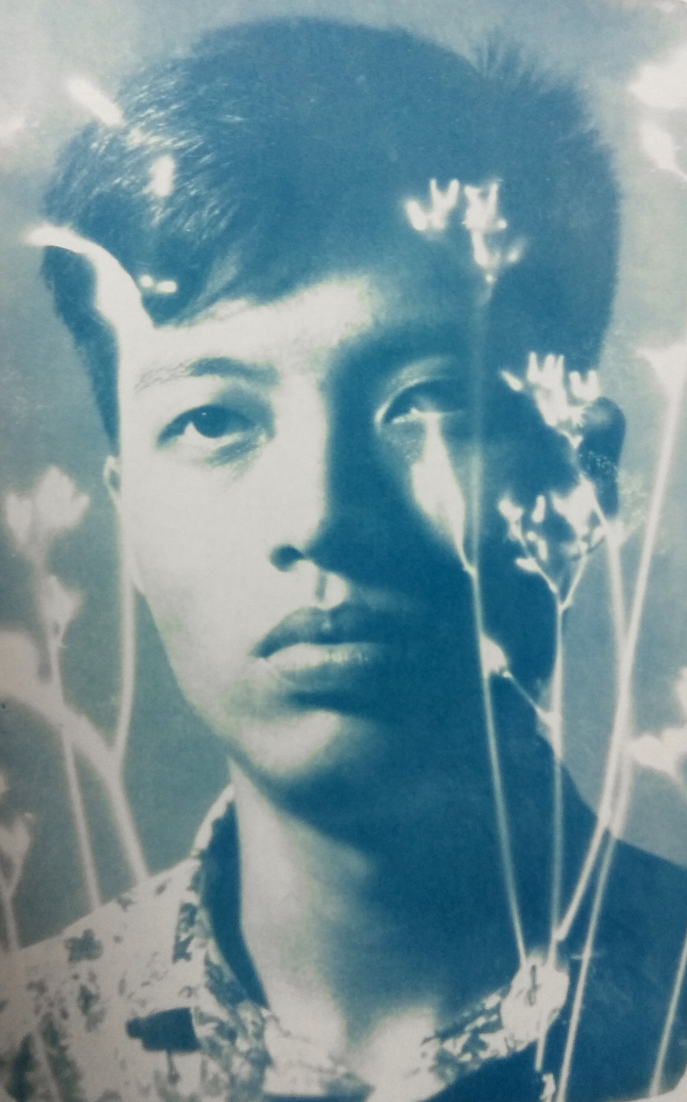
For the next step, I printed photo negatives on transparency, and overlap them with the plants I collected .
Distancing the object from the cyanotype coated paper creates a more ambiguous shape with blurry outline
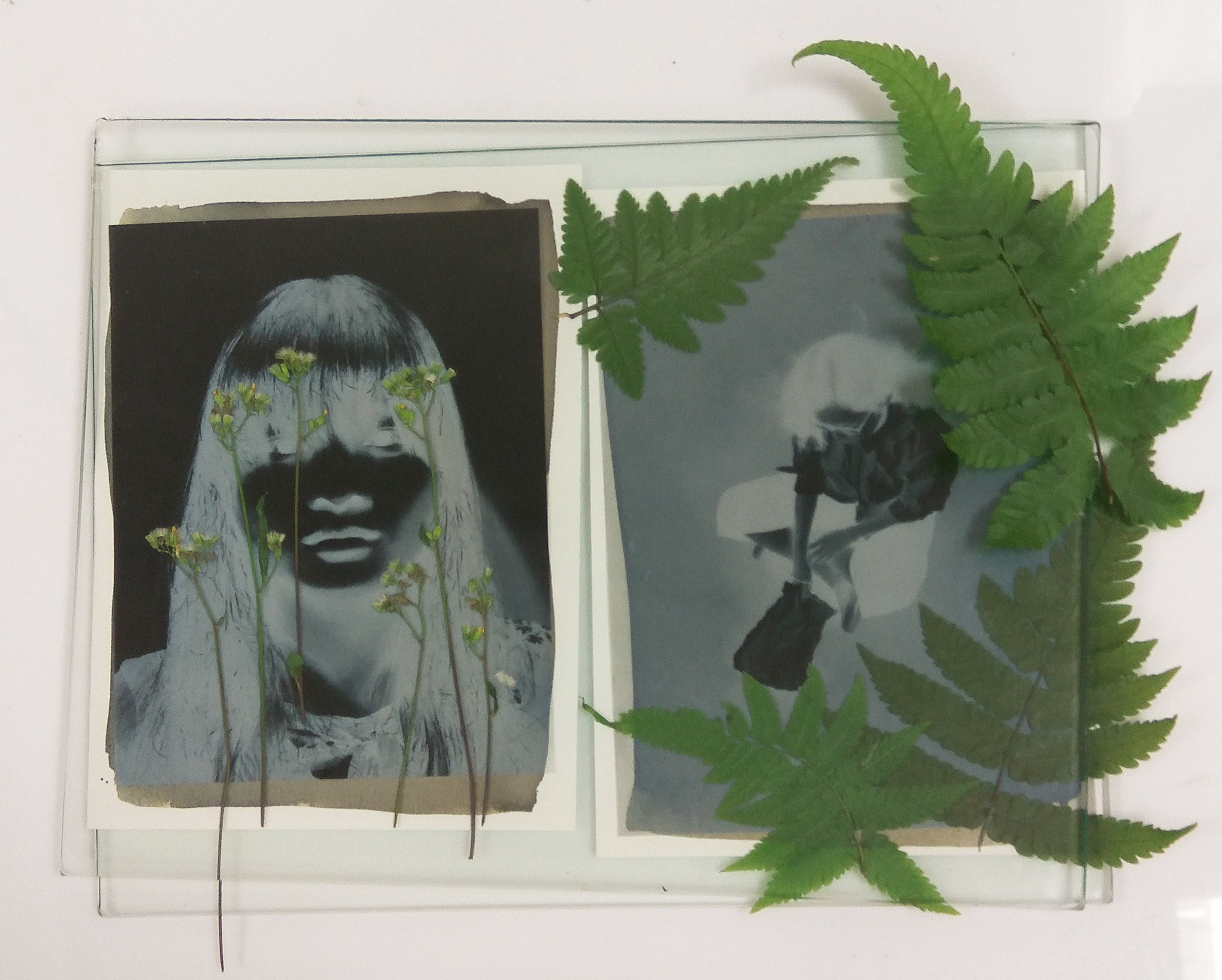
And finally these are the three images that I was most happy with.
It was interesting how when I overlap the negative with the object, it became a calculation of light deduction.’
What i was doing it not to document the plant or simply create a photograph using photonegative and cyanotype, I feel that in this case the object i use becomes a pattern, and by combining the images I feel like I’m creating somewhat between a photograph and a painting.
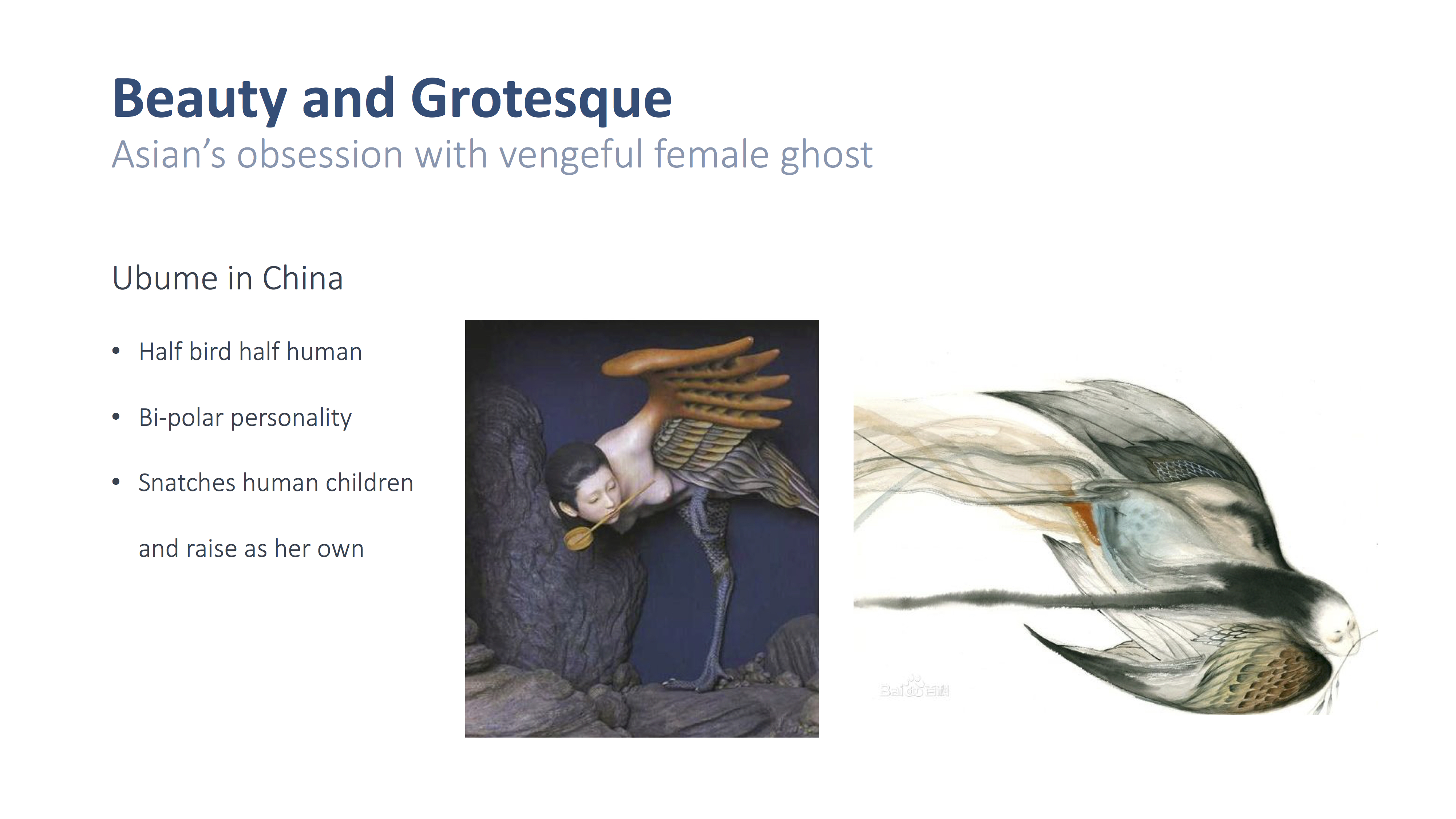
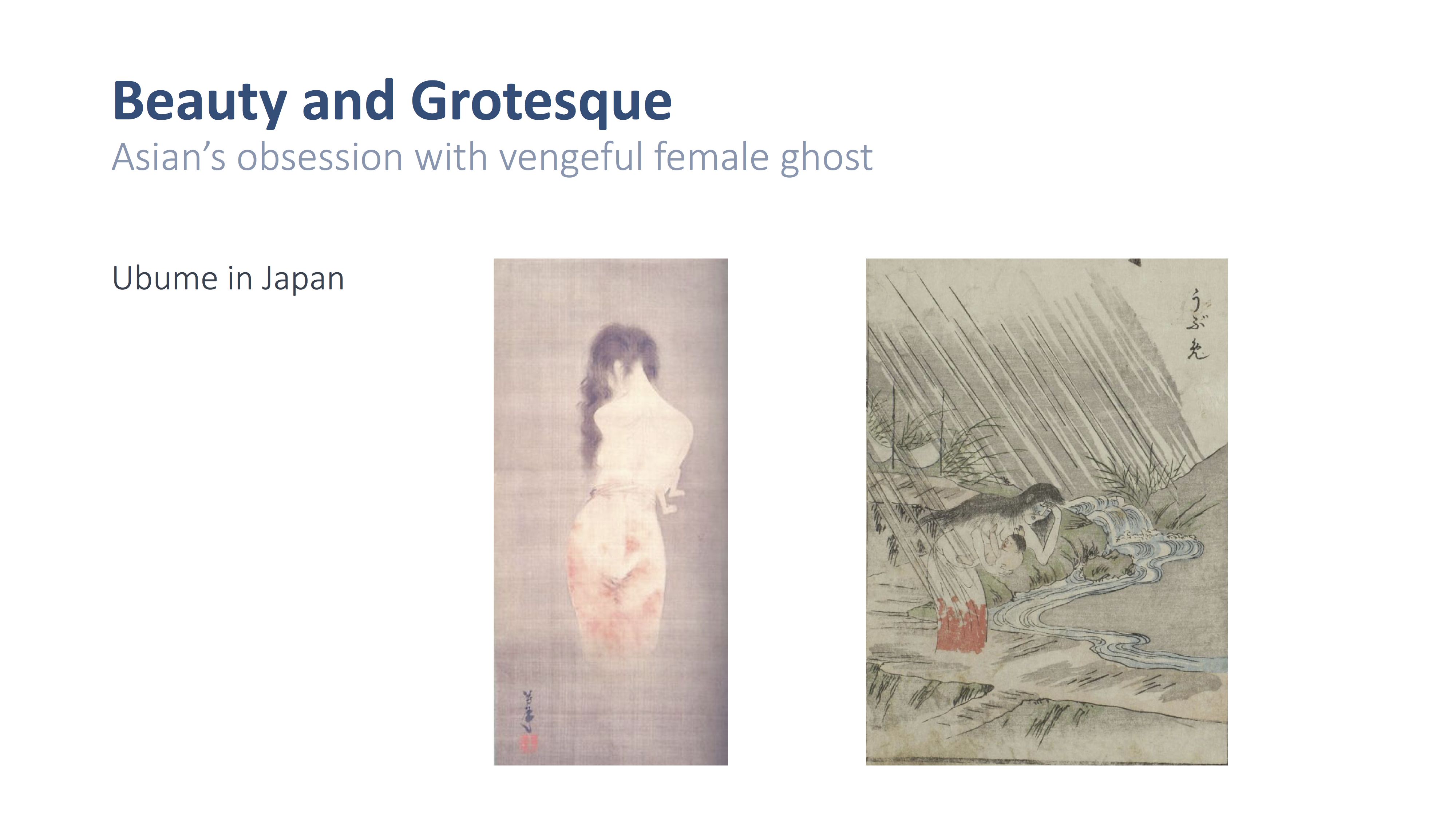
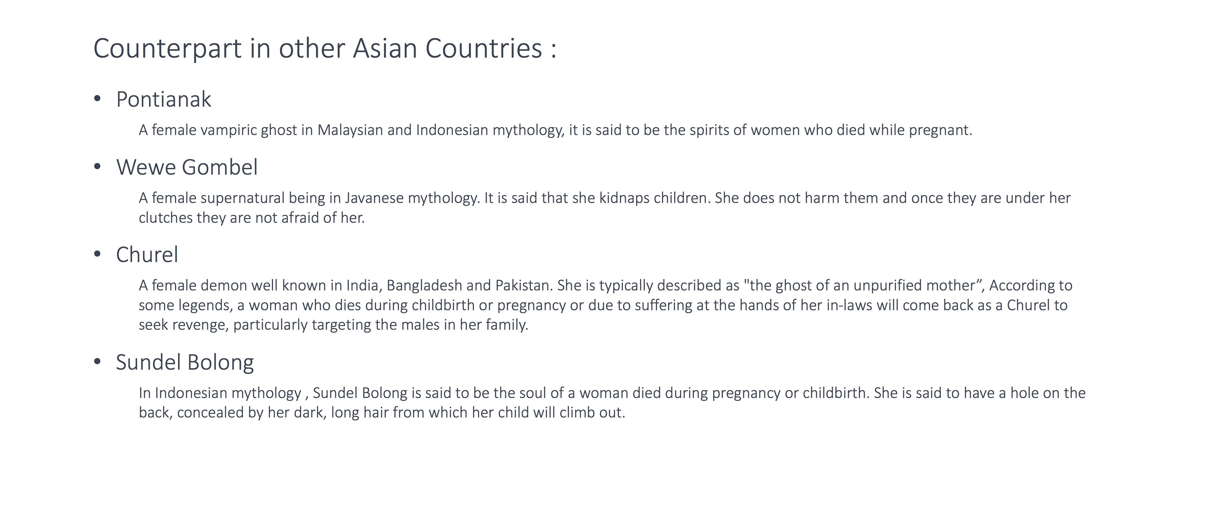
WHY IS (almost) EVERY ASIAN GHOST EXACTLY THE SAME GHOST
Inspired by The Summer of the Ubume by Natsuhiko Kyogoku.
Animation by Cyriak
fortunately he has recorded stream of his working process on his channel
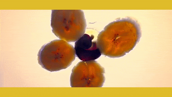
Time lapse of crushed fruits
NO, REALLY, DON’T THINK TOO MUCH
2 lessons from the consultation with Michael:
1. Don’t speculate.
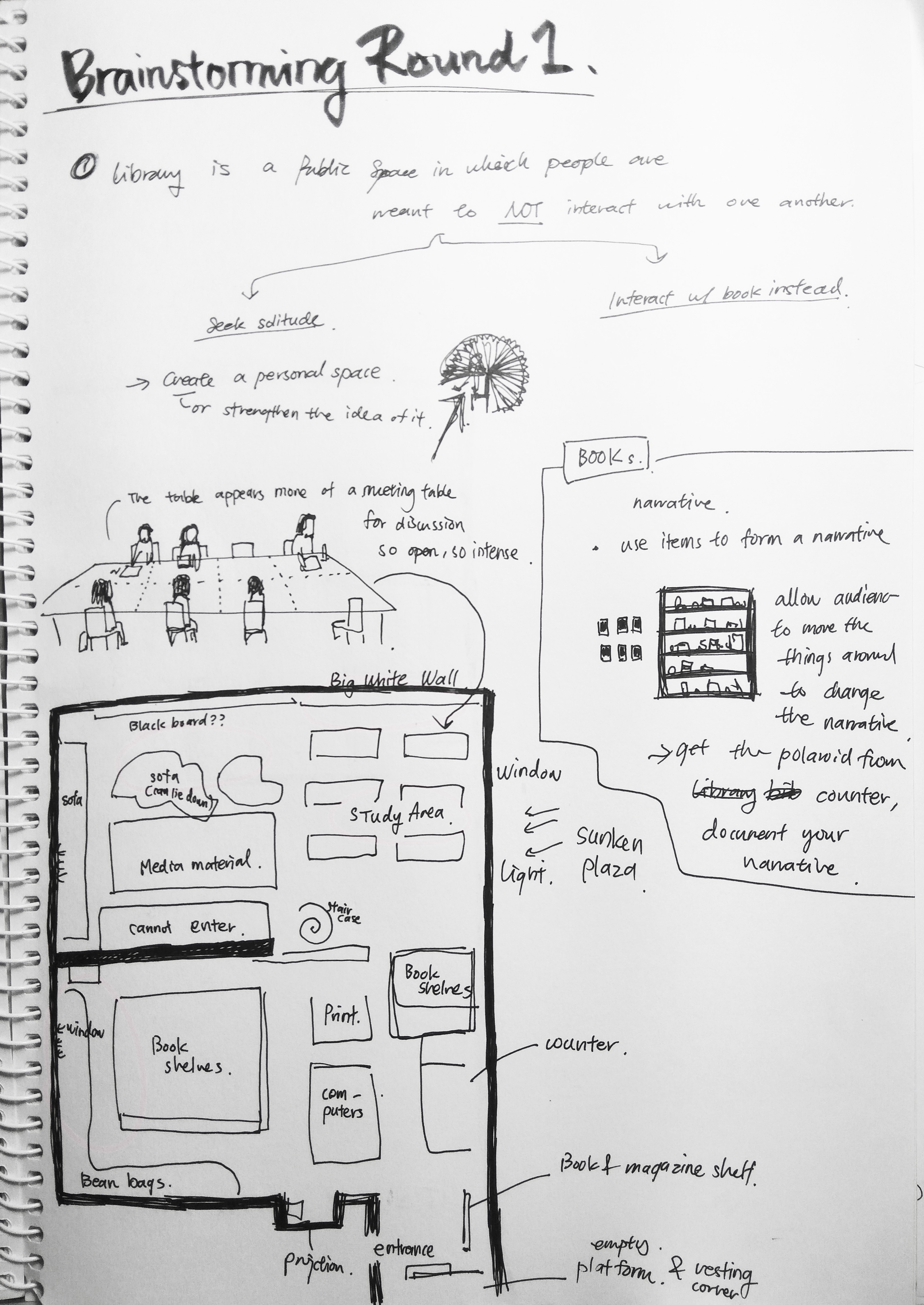
My initial idea include commentaries on how the library is a stressful place, how people don’t read the books.
But is it really?
All these perception perhaps only applies to small group of people.
It is a regret that I didn’t spend enough time in the library to understand and appreciate its true nature. I didn’t spend enough time observing what people do in the library, I didn’t spend enough time interviewing people on how they feel in the library.
2. Involvement of the space and experience
“You are focusing too much on the artwork”
Instead of using the space to create a work, what I did was creating a work to be exhibited in the space.
Based in the advice I worked out another idea:
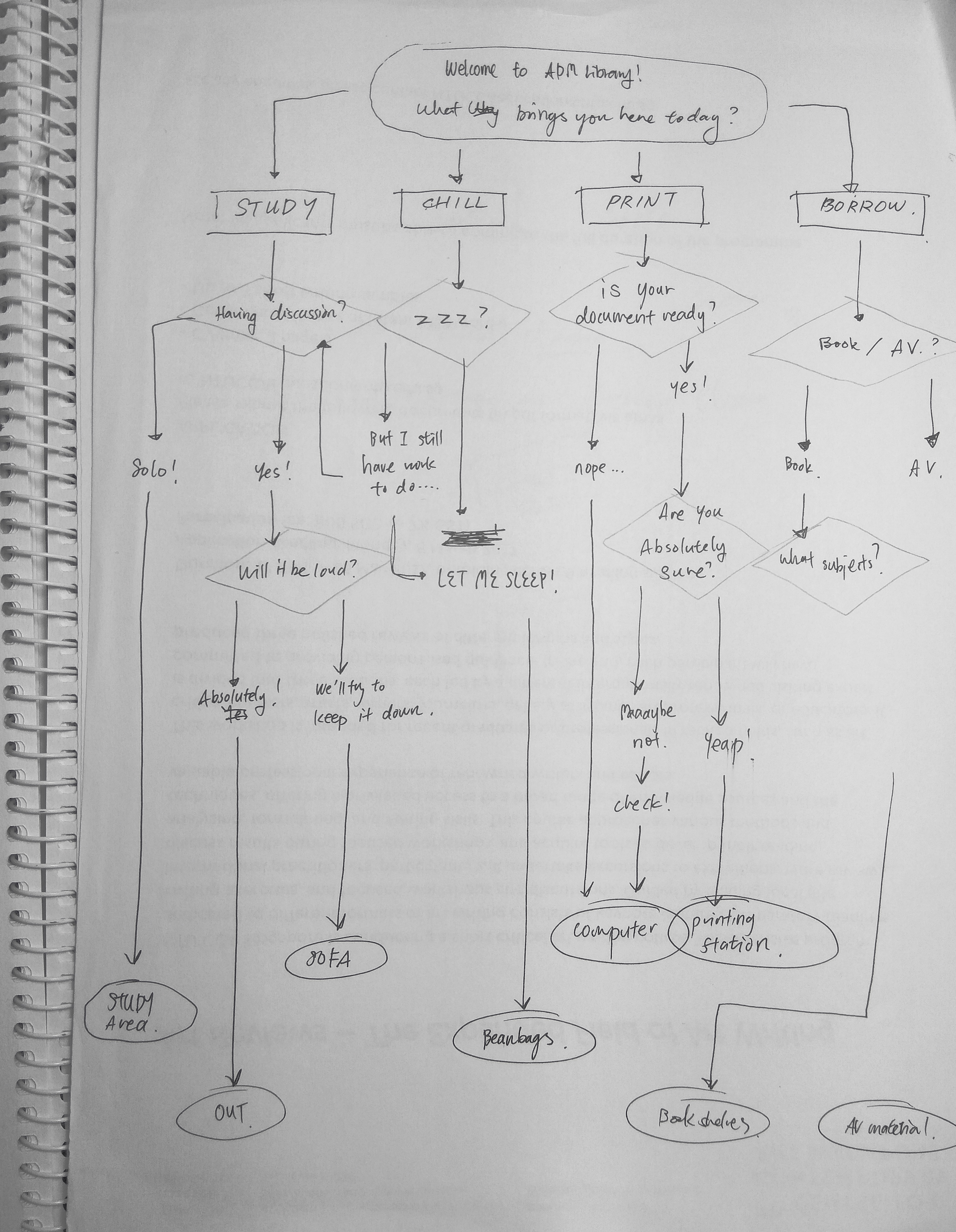
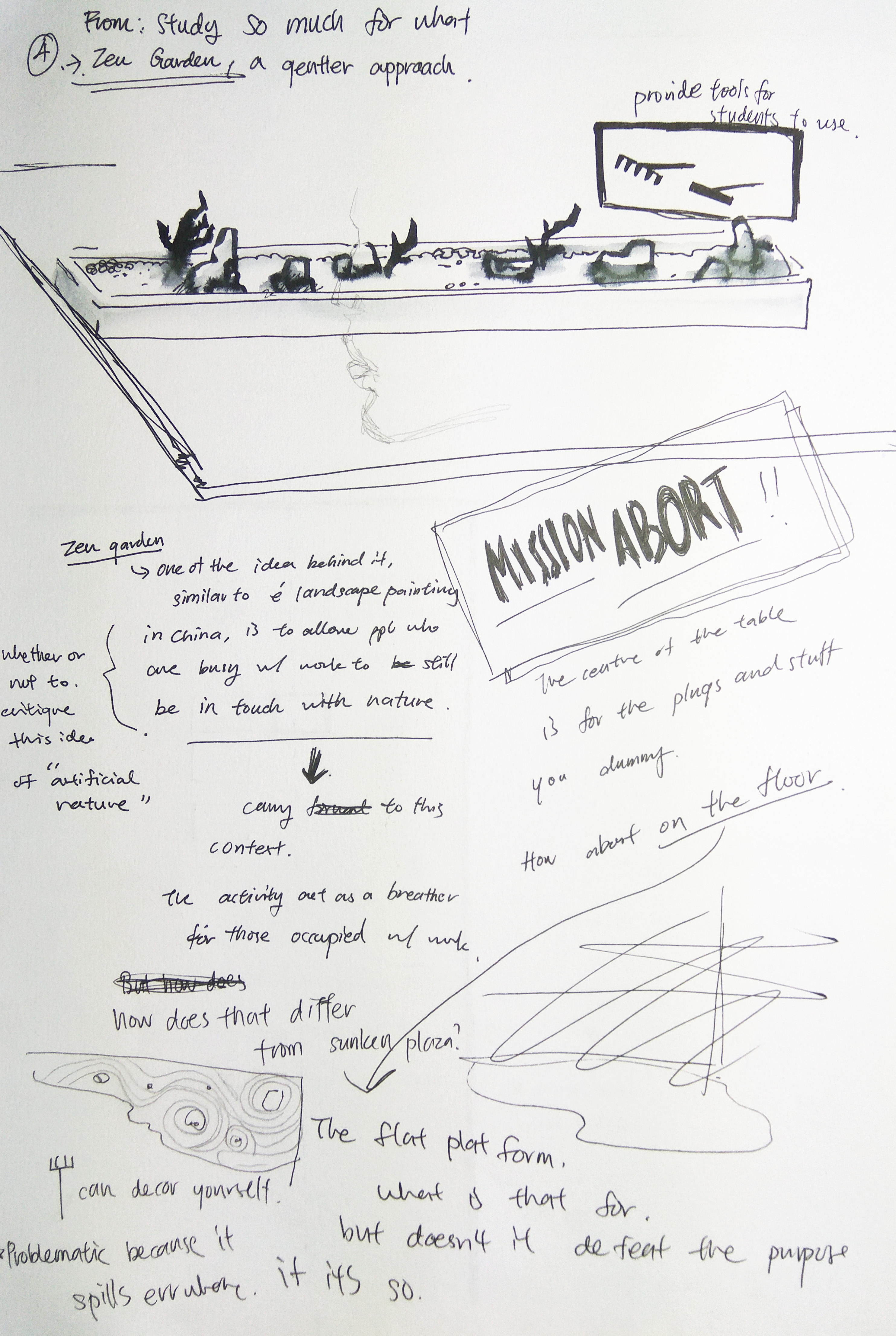
The Conversational Flow Chart
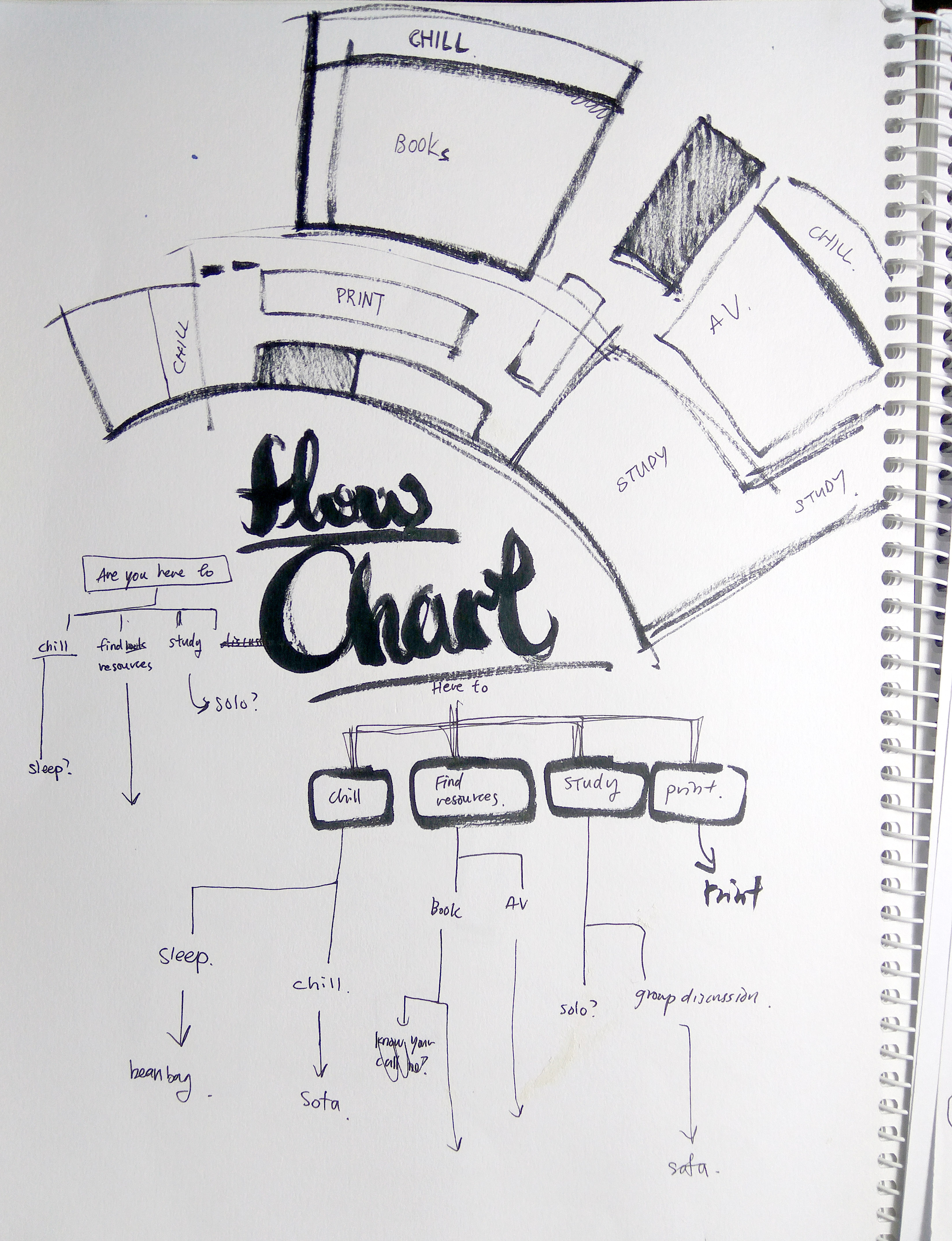
People come to ADM library for various purposes, and there is a place for each activity in ADM library, some are bounded by the facilities and resources present, while others follows the unspoken rule we observe in the library.
My plan is to create a flow chart that spread across the floor of ADM library that engage the visitors in a conversation while directing them to different areas of the place.
This flow chart does not serve as a directory for visitor, but rather challenge them to think about their purpose of coming to the library, as well as high lighting some of the unspoken rules in the library, evoking thoughts on how they were derived.
Below is the initial plans for the flowchart. (Click to see details)

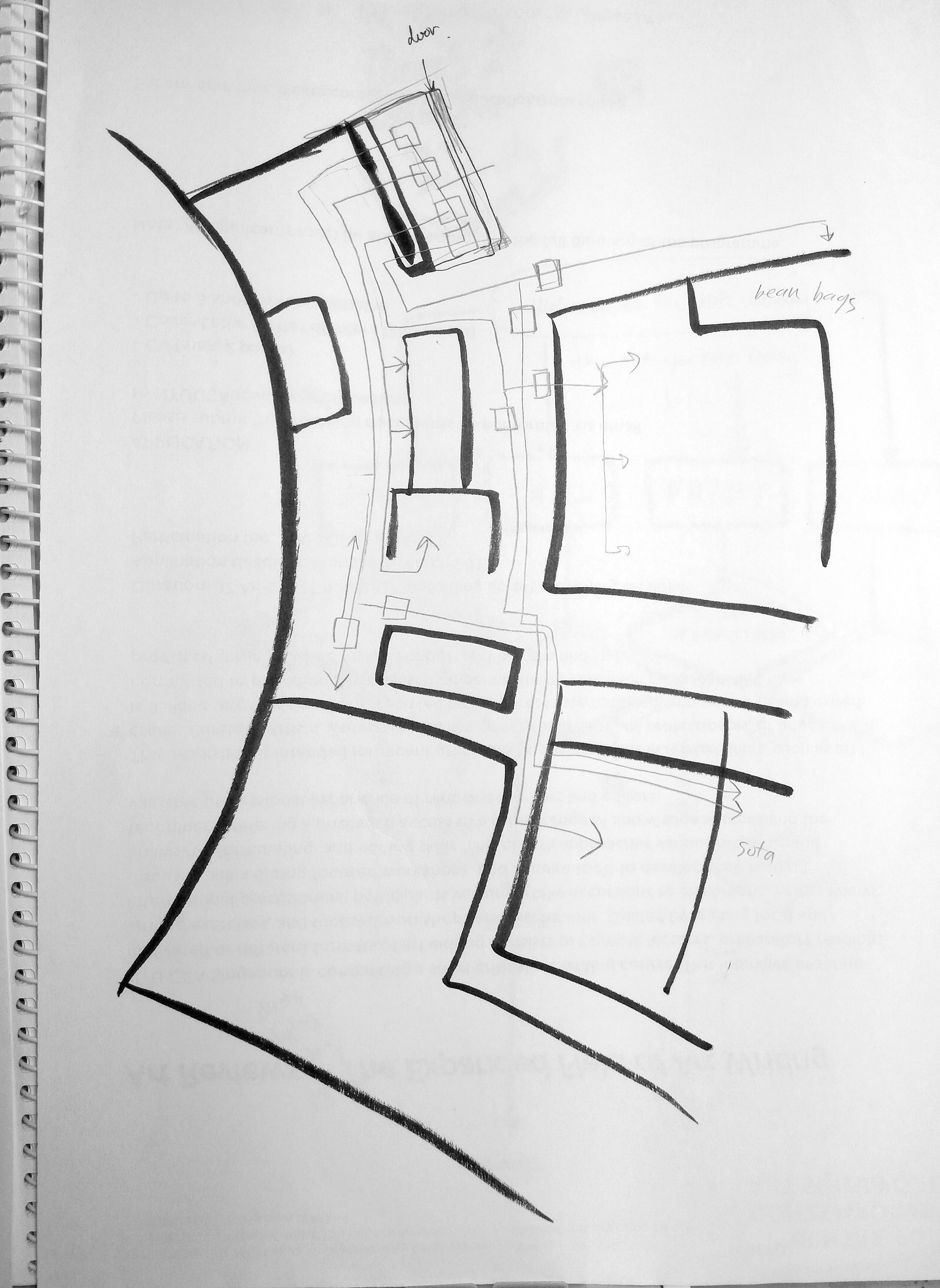
However the choice of dialogue used is not strong( or edgy) enough, and it seems to become a way-finding tool.
Here’s some sketches of the initial ideas for project 3, sadly none of them seemed coherent or strong enough to be developed into the final work.

THIS IS HOME, REALLY?
Home is an abstract idea that could be transient and fluid at time. It is fascinating to me that something that is suppose to provide stability and security can be so fragile and unstable. What makes a place our home? What makes it no longer home? When and how does a foreign place transit to home?
Looking at the experience of a Chinese working in Singapore and a Singaporean studying in US, the switch of perspective not only invite us to reflect on our opinions on the foreigners, but also evoke thoughts on our definition of home. This might be our home, but what make it our home?
THIS IS HOME, TRULY (Footages)

I went on looking for footages to pair with the audio, the choice of almost-still images is to capture the scenes of mundane we see in the everyday life in Singapore, as well as to minimise distraction from the audio, below are the stills from the clips. (BUT TOO LAZY TO EDIT THEM FOR THE POST OOPS)
About moving abroad
hoping for the better but not actually knowing what’s in store
it’s a billboard near my house for the new condo, the promising future we had in mind before moving abroad is often crushed by the harsh reality, here the idealistic nature of advertisement captures that naive hopefulness


About calling home from abroad
distancing from the family and friends
This is the public phone under HDB, sometimes I see foreign workers using them


About Asian food and home-cooked meal
Featuring mama Lin


Before Meredith mentioned, I didn’t notice how the hawker centre’s always filled with Chinese, she said she felt weird and alienated ordering food at hawker centre
(now that i think about it i probably could use editing and composition to make it look more overwhelming )

I was interviewing Meredith on the 28th , and she had to check the calendar before realising that it’s Chinese New Year for her


Also here’s the MOST HORRIBLE attempt at lou hei by my friends
Ms Huang Talking about settling here
being welcomed and finding purpose.

I wanted to use the windmill spinning fast in a stormy day to show that , like how Ms Huang did, sometimes we find our work more meaningful in more difficult environment

About being alienated, being neglected


A post of words describing words

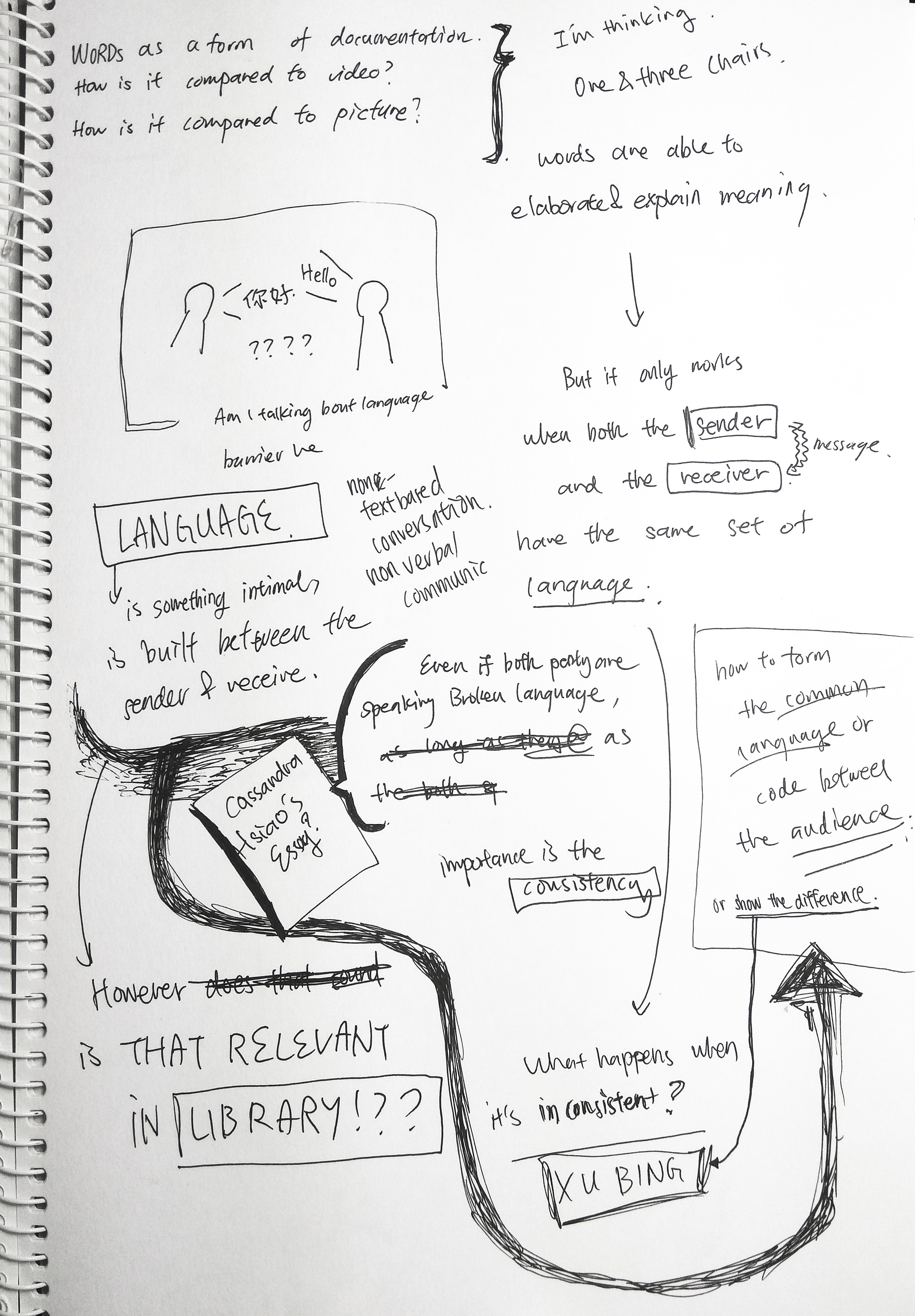
When I ask Dawin what he thinks about library, he said there’s too much words and he’d prefer all information to be in the form of graphics.
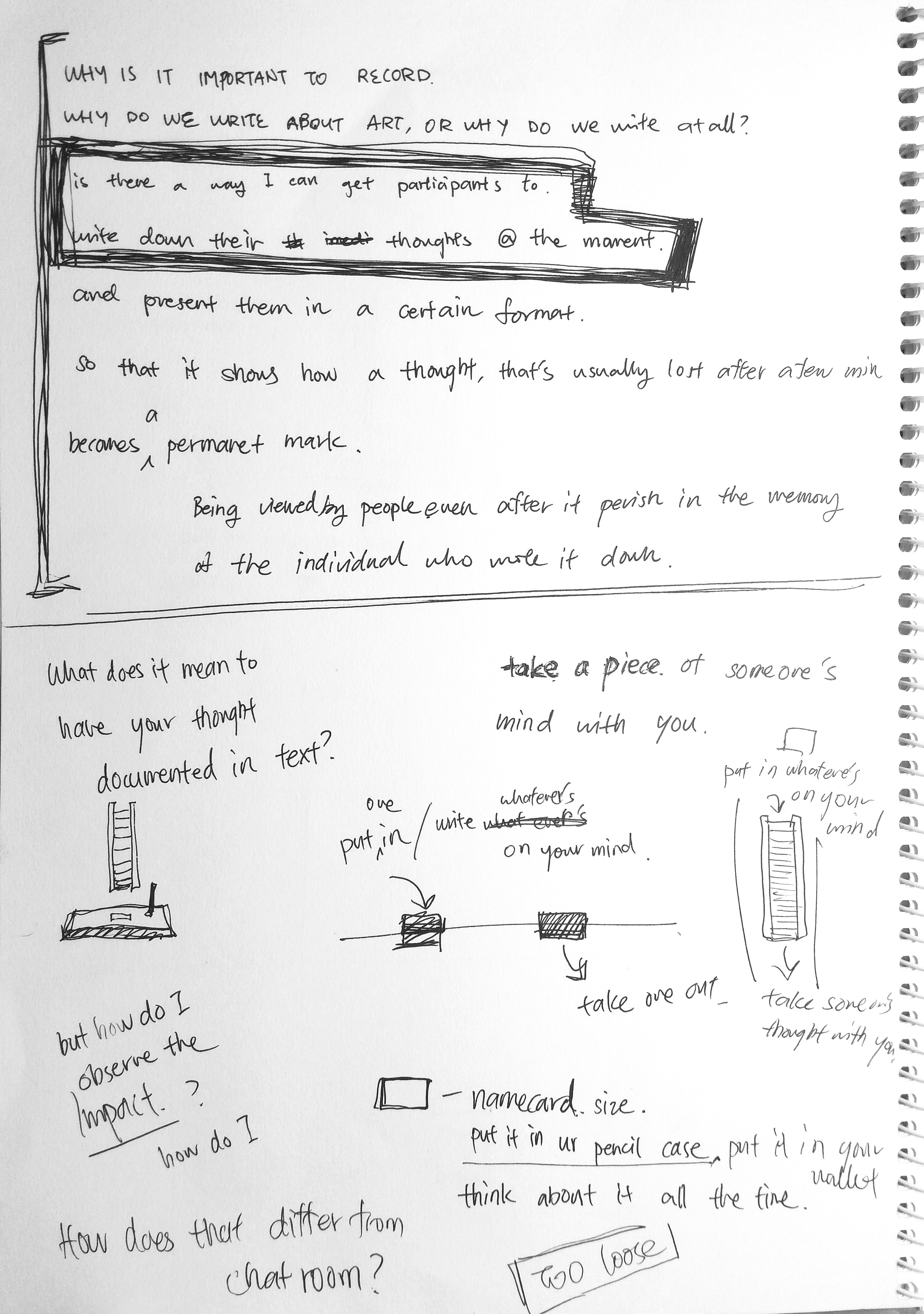
Why are words important, why do we record things in words? What is the significance of texts?
library is where the knowledge from the past are being kept alive, where ideas are delivered from past to present via text on paper. Therefore the first round of research I did revolves around artist who deals with words.
Here are the selected artists and works from my research:
TEXT ON BILLBOARD IS A SILENT ROAR
Jenny Holzer
Truisms

Truisms is a text series of nearly 300 aphorisms (or not) that Holzer had devised, with the intention of generating debate and evoking critical thoughts. These sentences or phrases are printed on paper and pasted anonymously in public areas. The project was later expanded to include more public communication device such as posters, stickers and t shirts. In 1982, the series of test were displayed, with time intervals between each sentences, on a LED signboard in Times Square.
IMHO, even though I do enjoy her list of sentences, the earlier presentation of the work did not appeal to me. There seems to be an intention to blur the distinction between everyday life and art, based on the crude and unrefined method of presentation. I can’t help but feel that, as thought provoking as the words are ( and as true as I find some of them are), the act of placing them in public domain using posters appears more as intervention, and printing them on shirts makes it seem like another product that tries to show off “individuality” using statement. (But again it might just be me being judgemental) When the presentation fails to do justice to the words, they fall short of the desired impact, and become just another statement you find during a protest or printed on commercial product.
In contrast to that, her most iconic medium, the LED lights, already has its implicatioin. The LED light sign board are usually designed for public announcement, be it for weather, time or traffic condition, while the billboard are usually for advertisements. None of them are designed to make personal statement or even slightly radical thoughts. That jarring difference between the nature of the message and the medium is what makes the viewers stop and go “what?” , allowing it to intrude the thoughts of the viewer and provoke thinking.
List of sentences from the Truisms
WHAT IS TEXT WITHOUT MEANING
Xu Bing
Book from the sky

Upon entering the installation, one might be intimidated by the overwhelming presence of the words surrounding them. The words, black in colour, high in density, draping gently overhead, impose an invisible weight on the viewer.
In Chinese, Book from the sky (天书) is a term used to describe text or idea which are too difficult to understand. A closer look at the work would reveal to the viewer its nonsensical nature and how the work fit into this title. Every character found in the room is formed by elements of Chinese characters, making it look like Chinese. But none of them are existing Chinese word, rendering the sea text unreadable and impossible to comprehend.
The clear irony here draws a big question mark: why should there be words when we can’t read them? What happens when we can’t read the existing words? The choice of medium, books and texts also brings to mind question regarding the significance of education and text. How does works and meaning appear in the eye of illiterate and foreigner?
TEXT GIVES MEANING, TEXT CREATES REALITY
Joseph Kosuth
One and Three Chairs

One of my peers once asked “What’s the point of writing about art, especially when people either ”
In One and Three Chairs, viewers are presented with three different forms of “chair”. An actual chair, a photograph of a chair and a dictionary explanation of the words “chair”. When all three forms are put side by side we can’t help but ask ourselves: which is a better representation of the chair itself?
“The actual chair is a chair because I am able to sit on it, it is able to fulfil its purpose.”
Does that mean being an artwork in the museum makes the chair not a chair , since the audience are not allowed to use it like a chair? In that case the actual chair is degraded to nothing more than the other two forms.
To me the work is simple and effective in provoking thoughts on reality.
What we see must be real. What we know must be real. What we touch and use must be real. But are they?
He say he can’t sleep

Inspired by Mona Hatoum’s works that altered furniture (and the experience of my friend Dawin, Who’s been having trouble sleeping in hall).

A bed should be a place where an individual finds comfort. It should be safe, warm and cozy. This bed is anything but.
The flimsy material, aluminium sheet, makes it fragile, impossible to hold the weight, yet the metallic surface gives off a cold and harsh appearance, creating jarring reflections. The sound created by the fan blowing at aluminium sheets sound like whispers and chattering, enhancing the unsettling atmosphere around the bed.
The irony highlight the insecurity, the worry, feeling unsafe even in the place that should provide comfort.
Taking a form of an everyday object, the work should be relatable for the audience, and create open-ended meaning for each individual.