To read the soft copy version of my final work, please click HERE.
OSS is ♫ cool ♫, you get to do these kind of things good thing I discovered it on last week of school :^))).
I’m not quite sure where to start on this, this whole project has been wild due to the short time frame and falling sick, missing out on the 2nd consult and various other terrible things happening that eventually snowballed into the fiasco involved with the printing and putting everything together.
Also I turned in my visual journal without taking a photo of it first so I have no idea where to begin talking about this but I shall Try:
- The concept: Why an astronaut
- Content: The writing & typing
- Content: The illustrations
- The thing about binding and tracing paper
- The part where everything went ♫ wrong ♫ :’^)
- After thoughts (feat. lots of Regret™)
THE CONCEPT: WHY A SPACEMAN
As mentioned during presentation, way back during the first week of classes, when Joy was briefing the class about the course outline, I already had the idea of doing an anthology or a comic when I saw the word “zine” on the outline.
Ultimately, I went with the idea of creating a zine that was a short collection of some stuff I had written. The comic thing became my Foundation Drawing final (also about a spaceman but not this particular one) which I Regret™ because I’m still working on it right now.

Back cover.
Now you may be wondering, “Why a Spaceman?”?
Honestly I don’t really have a proper answer to that; space exploration is literally one of my least favorite movie genres. It’s just a recent fascination after playing Lifeline (an iOS interactive narrative, I highly recommend), reading a heart wrenching story about someone crash landing on a foreign planet and feed back from writing class that I use a lot of “science-y” words in my poems.
Aside from the “science-y”ness of the poems I’ve chosen, they all thematically explored ideas like breathing, mortality, communicating and uh, fatigue… Which from my perspective, all seemed very astronaut-ish. So stuff kind of added up on that end but I still couldn’t figure out just what this had to do with everything I’ve been doing in 2D so far: I’ve kind of been exploring point-of-views and framing all this time. There was that bit of social commentary about privacy (from Rhymes) and suddenly music (in Typographic Portrait).
That’s where the idea for the narrative to tie the whole anthology together came in. I’ve always enjoyed unreliable and biased narrators in books so I thought it would be interesting if say the poems came from the astronaut but hey, plot twist! I’m the astronaut too!
While this dual identity of the narrator isn’t explicitly shown visually, I did try to hint at it through the writing (the parts where I refer to the Spaceman in a meta way), the type choice and incorporating the foldout on the back cover… All of which I’ll elaborate on later.
CONTENT: WRITING & TYPING

The Spaceman fold out feat. ugly bleed still there because I was an idiot.
Here’s a list of the written works I had in the zine along with who supposedly wrote what:
- Quote from Neil deGrasse Tyson
- Preface (Lewin)
- A Spaceman in Crisis (Lewin)
- & the contrails (The Spaceman)
- Signal (The Spaceman)
- moon-ish (The Spaceman)
- Quote from Allen Ginsberg
- Fold out about The Spaceman (Me, as the creator outside the work)
- Hidden fold out about Lewin (Me, as the creator outside the work)
Now that is obviously way too many things going on and I don’t think anyone would have paid that much attention to the writing to figure that out so I felt the type chosen really has to make it clear for the readers that these are different people’s words.

An excerpt from A Spaceman In Crisis where I tried to draw attention to my font choice and subtly hint that both Lewin and The Spaceman wrote this. Incidentally, this is a tribute to Allen Ginsberg’s A Supermarket in California. Also, I made a typo in the printed version of this (the bracketed line), RIP.
I tried to convey this through the typeface because I obviously can’t have the zine in pt 12 Times New Roman, double spaced. I love the fonts Roboto and Futura and ended up going with the following:
- Roboto light – things written by in-book Lewin & me
- Roboto condensed – things written by The Spaceman
- Minion Pro – quotes
- Corbert Light – who wrote/said what
For The Spaceman and Lewin who’re different sides of the same coin, I wanted to use different styles of the same font but still have their own typefaces completely distinct, serving as their “voice” on-page.

The hidden fold out feat. Widad’s hand.
In order for something to qualify as a twist, you still have to reveal it so I considered having the last page of the zine, the back cover (that isn’t the backing) to have a fold out; like how books have information about the author. I wasn’t conscious of it but looking at the zine now, the whole dual identity of the narrator and author is very A Series of Unfortunate Events, my favorite book series ever.
So in it, Daniel Handler (the author) writes in-character and under the name Lemony Snicket (I can’t believe there are still people who don’t know this, sorry if I spoiled you) who’s the supposed author of the book series but also a character in the book. At the end of every book, there’s a page where they credit Lemony Snicket (the supposed author) and Brett Helquist (the illustrator). I’m not sure whether this was consistent in all versions of the final book but I do recall book 13 (or one of the many additional books to the series) having two of these where one credits Snicket, the other credits Handler.
In a similar vein, I guess that’s what I was subconsciously trying to do.
CONTENT: ILLUSTRATIONS

Process gif.
This was literally the easiest part of the book… I’m personally still the most confident about drawing and for this, I just had to illustrate the Spaceman in relation to what I’ve written.
The only problem being this page, the illustration spread to & the contrails. I wanted there to be a spread somewhere in the zine because majority of it was just plainly image on page and text on page, which could get kind of boring visually since the visual aesthetic is already very minimal.

Except, you probably shouldn’t do page spreads if you have to leave a 2.5 cm space for the spine so this (pictured above) was my solution to it. It turned out pretty well in the actual physical work so this was pretty much the ONLY part of the printing that actually went Just As Planned.
THE THING ABOUT THE BINDING AND TRACING PAPER
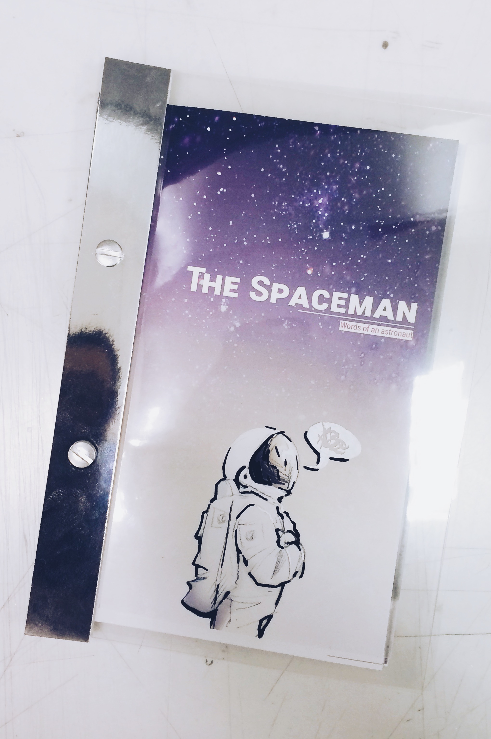
If I remember correctly, there were only two people who went with screw binding for the project, which is entirely understandable since you need a certain amount of thickness in your papers to match the width of the screws so your papers don’t slide up and down the screw loosely.
I already exceeded the 8 page limit of the brief but I didn’t want to over do it far too much so I opted to try and compensate by having a thick acrylic backing and using reflective cards on the front and back areas of the spine.

The acetate cover.
Which visually looked great, functionality wise… maybe not too great.
I think it was Junyuan who gave the feedback during class time that it got a bit hard to flip the zine with the reflective card on the acetate but the zine was already hard to flip without the reflective cards anyways so I just went ahead with it…
I think I mentioned that the paint on the acetate coming off during presentation as well and how I just went with it and scratched it off even more so there’s that as well.

& the contrails with the tracing paper.
So here’s another thing about & the contrails. I was pretty worried the lines wouldn’t match up because the whole spread was meant to be read as a whole not two separate pages… While the tracing paper actually worked great visually here, in hindsight, it kind of separated the two pages so maybe it was a mistake after all. This probably could’ve been addressed during group consults but I couldn’t make it so… Regret™.
THE PART WHERE EVERYTHING WENT WRONG #RIP

The thing that everyone got to see me yell angrily about on Facebook on Wednesday.
So during my first round of printing, this happened. It looked fine on my screen, on the printing store’s computer screen, and then a ghost possessed the printer or something… Literally everything, the page order and lining up the double sides worked out perfectly except for THIS.
It was probably due to the font (which doesn’t make sense since Corbert looks oka but the Roboto were the ones with a problem) or text formatting for large and small caps and the PDF embedding or something but lesson learned here.
So yeah, I don’t really have much to say about this because it was entirely my own fault for being too trusting and not doing a test print and also printing on the day before submissions. Just wanted to share it because it was really bizarre that the text flipped itself then squashed itself.
AFTERTHOUGHTS
Unlike the really long post, I can sum up my afterthoughts for the zine project into one sentence:
I really should have completed and printed at least 2 days earlier.
I’ve also noticed that I’ve made a printing mistake in every single project this semester: I think I printed the wrong file for the Typographic portrait, I didn’t print enough numbers and actually printed a typo for Point of View… and I don’t even want to talk about the zine anymore… :’^I
This whole semester in 2D was basically this huge aesop on time management…
Some other reflections that aren’t about printing or time management mistakes or Regret™:
It just occurred to me that I could’ve had a Hitchhiker’s Guide to the Galaxy shout out or quote in it but I missed that opportunity, shame. Neil deGrasse Tyson was good though.
I’m glad most of the people in class enjoyed the zine and the use of different materials to bring out the sleek sci-fi feel (or they could be saying that because they felt bad for me for the printing). Also a little surprised at how many others are interested in reading and/or poetry!
I’ve been checking out some of the works from the other classes and I think because of the scale and depth of this project, you can really kind of see what everyone is passionate about, their personalities and styles so I feel like I kind of understand every better now!
I still have two more submissions to go so honestly I feel like it’s way too soon to try and think about the end of Year 1 so I’ll add on to this once I survive next week!
Recent Comments