Research
Values
There are so many values that I feel is admirable of a respectable person. However, I feel that someone who has a never give up attitude wins it all. If a person has integrity and diligence, but is pessimistic and gives up easily, he/she could potentially make it far in life, but due to not having perseverance, did not make it in doing what he/she wants to do.
Thus, the value I chose is: Perseverance.
When Thomas Edison did not succeed in his creation, he says:
I have not failed, I’ve just found 10,000 ways that did not work.
His sheer perseverance is a motivation to all of us, that no matter how much we fail, we should always continue to persevere through life’s obstacles. He is highly respected for his work and contributions to the world. If he had given up just one time, the world today may not have this many inventions.
With that, I picked the following quote,
When life gives you lemons,
make lemonades.
Visual
I then went ahead to do some visual research.

For the first inspirational work, it is made up of three circles and one straight vertical line connecting the red to the bottom outlined circle. Also, there is a colour contrast of using only red while the rest of the circles did not have a fill. Could you tell what it is?

That’s right! It’s a wine glass. I like how satisfying it is to see all these simple shapes illustrating an object.
The next poster that inspired me was this one that says mouth Fuji. I really liked how they used the shape of lips and between the mouth, it kind of looks like teeth and an opened mouth, and yet it also looks like Mount Fuji. This poster is nice because it plays with the negative space between the mouth. The colours used are only red, black and white. A very safe choice of colours.

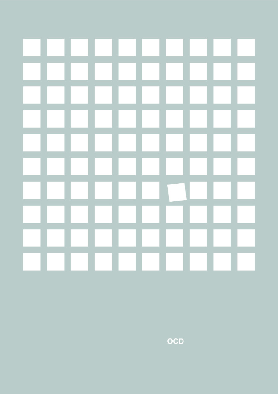
The next poster I saw also really attracted my attention. It uses the rule of third where the squares are all in the top 2/3 of the poster. The squares are also placed side by side to create a neat pattern. This poster speaks so much to me, although I am not diagnosed with OCD, but I believe everyone has this little OCD in them in different situation. And for me, the one misaligned square did get on my OCD nerves. By having only one square tilted, it was able to create emphasis on it.
The word OCD at the bottom 1/3 of the poster, although small, speaks a loud voice.
During our illustrator workshop, I created these icons accordingly to the class exercise examples. I also chose pastel-ish colours as I really like colours with lower saturation.
 Some other shapes I created to try out the functions of illustrator:


 A hand I created using square, rectangles, polygons and ellipse tool only!
Sketches & Mood board
I wanted to come up with a design revolving around lemons. Thus I did some sketches with lemons and lemonade (juice) in it, trying my best to sketch with simple shapes like triangles and circles.


That’s about it for my research, next up will be the actual work on the final piece! 🙂