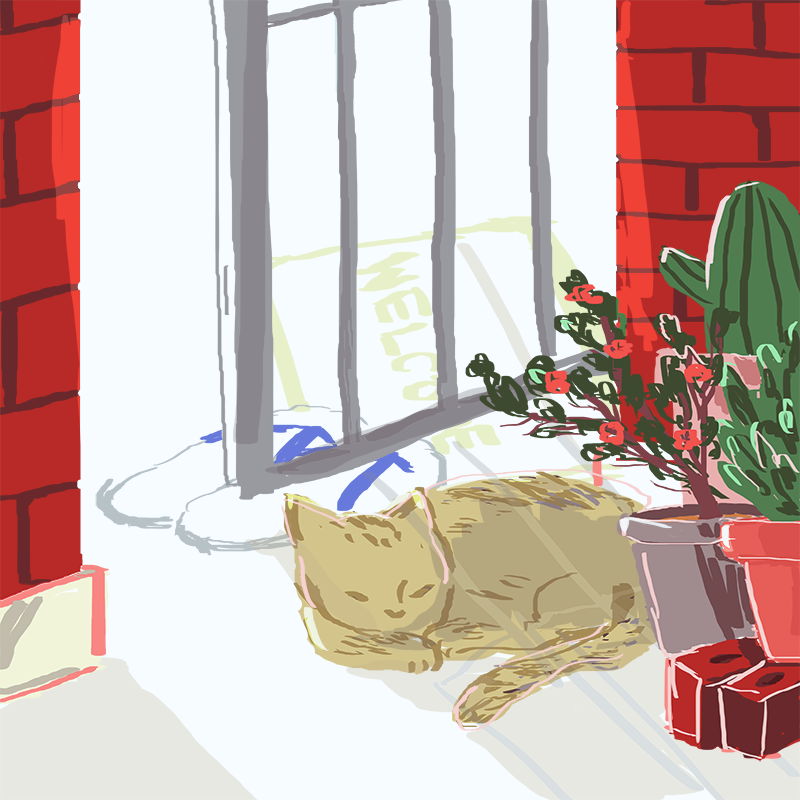
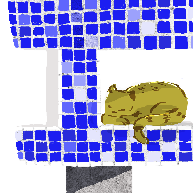
My work focuses on bringing the familiar aspects of the ordinary Singapore heartland to the hospital, providing comfort to the patients and staff who spend most of their time away from home. The windows into a more homely environment elsewhere, shape the sterile and stressful environment of the hospital into something warmer. At the same time, it provides a Singapore flavour which is unique only to Singapore hospitals.
Stray cats are often found around the heartland, in environment close to people. The presence of the cats in my illustrations hopefully act as a bridge for the viewers to be drawn in, like how anyone would stop and slow down to watch the cats resting or moving around at their void decks.
The illustrations were done on Photoshop, with more organic strokes and bright colours to bring a less rigid and restrictive feeling to the images.
We have taken an interest in exploring the social situation in a community put together by a common space, especially in the local context, and so in this research paper, we will present our findings, with regards to our project concept.
A study had been conducted to find out more about the commuting experience, exploring the behaviours and thoughts of commuters, through having participants photograph whatever they want to during their commutes. Results of the studies have shown that “the reality is that transit environments are complicated social spaces with a multitude of physical, verbal, and emotional exchanges transpiring at any moment” even though “people may work to disengage during much of their time on transit”. (Fink and Taylor 37)
Despite the study being conducted in an American context, we can still relate to the commuters’ general tendencies to disengage and stay isolated in such a communal space, especially with the pervasive use of phones as a barrier. We identify that a concept of personal space has been established by the commuters, as they “felt uncomfortable or self-conscious about taking photos of other passengers” (Fink and Taylor 23), yet their photos “suggest that people are aware of the social life surrounding them as they move through transit space and time.” (Fink and Taylor 37) This has proven how, despite the isolated headspace that each commuter has, they are aware and in touch with the social situation, even when nobody is actually interacting. Our concept adopts the same idea, and hence, this piece of research serves to support it strongly with evidence.
We have also found parallels in Shannon Lee Castleman’s Jurong West Street 81 and our work, in relation to the Singaporean context. Both works focus on the familiar and inseparable elements of the Singaporean lifestyle – commuting in our work, and residence in Castleman’s.
In Jurong West Street 81, residents of two directly opposite HDB blocks filmed each other carrying out their daily activities at home. The participants were then invited down for a lunch together, adding a deeper layer of interaction behind the work. In the words of Castleman, Jurong West Street 81 “breaks down an invisible barrier between residents, the empty space between them… it is about neighbours discovering neighbours, looking at each other from across a void.” (Ho 29)
In a similar fashion and spirit, our work tells of a rather special communal space many tend to neglect – the MRT train. It is also a space where people have the tendency to be similarly voyeuristic, as the interior of the MRT is designed as such that the two rows are facing each other. Thus despite each commuter’s isolation from one another, they are inclined to observe each other in the narrow space. Furthermore, alike to each of the unit of Block 81 filmed, each of the MRT seats carry a narrative capacity.
Castleman’s work has also delved into the unique social situation of watching another home, from their own, in a common space of their neighbourhood. We are particularly intrigued by the additional layer of having the participants down for lunch together, as it brings the indirect interaction previously held by the act of filming each other, to another level, where they can discuss and talk about their experience outside the confines of their individual homes.
We have, therefore, enhanced our work with the aim to initiate extra interactions among the participants, by inviting them to share their virtual commuting experiences after they have gone through the entire simulated train journey, and hence transforming the indirect interaction present in each of the character’s headspace into a direct discussion, to pull together the narrative present, as mentioned. This serves to highlight the consequence of what our main focus is. When individuals live in their headspace in the community of the commute, there lies the potential for assumptions and hence, showing the breakdown of physical barriers between the commuters.
In conclusion, we have found useful evidence to support our concept and verify claims, as well as research on an artist’s work to strengthen our concept of the social situation in a community put together by a common space.
(Word count: 677)
Bibliography
Camille N.Y. Fink, Brian D. Taylor. Zen in the Art of Travel Behavior: Using Visual Ethnography to Understand the Transit Experience. Final Report to the University of California Transportation Centre. California: eScholarship, University of California, 2011. Ho, Louis. After Utopia: Revisiting the Ideal in Asian Contemporary Art. Singapore: Singapore Art Museum, 2015. exhibition guide, 1 May-18 Oct 2015.
[Note to future self: This post was entirely written after the crit.]
—
Finally, I was able to do illustrations for this assignment, after meaning to do so since last semester’s Ego project.
Creative direction
Even though I listed out numerous concepts in my previous post, the concept I concentrated on is the one on mythologies across space. (I guess it’s pretty apparent haha)
At first my intention was merely to extend on my idea from assignment to do a collection of illustrations of mythologies and fictional stories I know of related to ghost. (Yes if anyone bothered to read and remembered my previous posts, it’s the one I said I would rather not post here. I guess I have to do it anyway.) I don’t think I would elaborate on each of them, but as you might have already noticed, it spans across different time eras.
(Chang’e and Hou Yi have been here from the start, yeah!)
—
As a (ex-)Geography student, I’ve always awed at the idea that many things could be considered on the scale of time and space. (Quoting my JC Geography tutors, Geography is the study of everything under the sun, and including the sun.) So I had considered the same concept across space instead, which is how I ended up with the three mythologies: Echo & Narcissus from the Greek myths, Chang’e & Hou Yi from the Chinese, and finally, Izanami & Izanagi from the Shinto myths.
Tracing back to my assignment 2 as well, I unified the three stories with the concept from the Chinese folk beliefs on the afterlife. One of the concepts I had come across during my research was 三生石 (the stone of three lives). It was something I had vaguely knew of before but only from my research, I knew what exactly it is. Furthermore, it ties in with the mythical nature of the mythologies really well, especially as a setting/background.
三生石
As I’ve mentioned, the myths all ended as different kinds of tragedies/didn’t end well. The whole concept eventually developed and matured into a representation of my cynicalrealist + hopeless romantic face. (I know I said cynical during the crit but that was sort of inaccurate, and it had bugged me on the way home.) They’re kinda two conflicting/contradictory traits (but I believe we are all contradictions) but I feel like my concept could embody both perspectives relatively succinctly as it touches on a realistic truth to human condition yet by lending the poetic/romantic nature of mythologies to convey it.
I’m a big fan of romance genre stories. (Important: Not the Western sort of romance stories, it’s the Asian ones. I find them vastly different. Western values differ way too much from my taste/preference more often than not.) But quite selectively. I enjoy the well-written convincing ones (by my own standards), and can get swept away by them completely. But on a lot of times, as a fundamentally rational person, I find myself seriously doubting hella mushy lines like “I will love you forever.” (For realz bruh?)Of course, this is a hint of a not-so-good written romance story (suspension of disbelief, you know) but regrettably, there are more not-so-good ones than the good ones.
Some people may protest like: There are loving old couples I still see holding hands while walking together! Yeah, but I’m quite a skeptic, from my current perspective, towards the possibility of “eternal love/romance”, especially when it extends into marriage. I’m more inclined to believe that love/romance evolves into a habitual companionship. I don’t know if anything is going to change my mind in the future, but I’m sure I will get to know in time.
Well, my point is that, change is the only constant. Everything changes in the face of time, even love and feelings. Even though I concentrated on romantic love in my subject presented, but my message was not restricted to it, but also applies to any form of love – friendships or whatnots.
Thus I wrapped up this concept with these phrases in Chinese which I had particularly liked for some time: 时移世易 and 物是人非. They generally lament about the fleeting, transient, impermanent nature of the world with regards to time; and that things are never the same as it used to be. And I’ve ultimately included it in my work as part of my illustration.
On a related note, many other related things surfaced to my mind when I was doing this project. I don’t know whether there are people who may be against the film, The Theory of Everything, for its Oscar-bait nature or alleged incongruity with the facts (but one has to admit that its cinematography is simply gorgeous. It was one of the very main motivation behind why I got myself to catch in the cinemas.) If you’ve watched the film too, you’ll understand how it aligns very well with the concept and spirit of my work.
At the same time, it was also because of that film that I was acquainted with the phrase 没有永恒 只有不朽 from a review on it I read somewhere. Similarly, it encapsulates the spirit pretty well too. x
As much as I wanted to try the string binding methods since assignment 2, I settled on accordion fold despite the technical difficulties of making one because:
Expansive spread. I already had a visualisation of my illustration in this particular fashion so the three stories would be represented in a monoscenic image.
The traditional Chinese feel to it. It sort of reminds me of a 奏折, you know? Once you put hard covers to the ends. Yup.
奏折
Also an article featuring a number of cool ideas/examples of accordion folds: x
Content
Echo & Narcissus
Narcissus (flower) symbolises rebirth and new beginnings.
Chang’e & Hou Yi
((There are many many illustrative portraits of Chang’e, which is good, but there are not as many of Hou Yi’s which is not-as-good.))
Willow trees symbolise immortality, grief, death [x], resonance and harmony [x].
Izanami & Izanagi
Sakura symbolises time for renewal, fleeting nature of life
The Chinese style clouds can also be defined as Japanese style clouds but I chose this one as it’s more unique to Japan.
—
Character designs + layout planning
The prototype I brought to group consultation:
Revised illustration:
During the group consultation, Joy had advised that I made stylistic distinction and references for each of the stories to their origin cultures. Thus despite it being monoscenic and drawn in a neutral/modern art style, there could be subtle hints to tell that they’re of different mythologies.
Therefore, I included the elements of different flora/fauna and the styles of clouds drawn which are iconic/representative to each of the cultures. What made them better was each of the flora/fauna depicted carries symbolism which were pretty related to the concept as well, so it helped to bring another layer of meaning to my work. (Flower/plants symbolism brings us back to my sem 1 Ego project!)
Greek – Narcissus flower: rebirth and new beginnings. (Reincarnations = 三生)
Chinese – Willow trees: immortality, grief, death [x], resonance and harmony [x]. (Encapsulates Chang’e and Hou Yi’s stories and feelings.)
Japanese – Sakura: time for renewal, fleeting nature of life. (The overall claim of my work.)
I went with the method of scanning the illustration and making some clean-ups on the digital copy, changing to red and then printing it.
Original scan
Edited and finalised version
Since I drew on tracing paper with pencil, there were a lot of smudges. But I chose to retain a bit of them to add texture to the illustration. A bit of a ghostly feel. Haha.
Joy had also addressed the possible issue from the translucency of the tracing paper, and as suggested by a friend, it would be good to include the stories, given the heavily contextualised nature of my concept. Thus, I made use of the alternate side of the accordion fold to include more contextual info to the work.
I’ve included:
1) a pocket containing three pieces papers, each including the respective featured mythologies
If anyone actually noticed, the line patterns for each of the mythological couples differ, and they actually do have some significance behind them.
Echo & Narcissus = parallel lines = travels alongside but never meets = parallels/mirrors each other in their fates of being plagued by the grief of unrequited love, and never managed to share mutual affections
Chang’e & Hou Yi = intersecting lines = meets at a point but never to meet again = how they shared mutual affections but then were forced to separate forever
Izanami & Izanagi = zig zag lines / oscillating waves with peaks and dips / (sine curve? hahaha) = a bumpy relationship; their union didn’t succeed the first time (because sexist reasons ugh) then Izanami died and Izanagi abandoned her, and then they engage in a never-ending marital spat
2) the “poem”. It’s so cheesy I cringe because of my inability to write in general. Trust me, I’m not a big fan of poems. But I thought it’s definitely helpful to understand the concept so I had to add it in.
In one life,
I longed for you to love me back but you did not.
In another, you finally loved me
as I had always loved you
but we were taken worlds apart.
Finally, in another
we were creating legends
it seemed like nothing could come between us
but little did we know
things would drift apart
feelings would fade
along with the stream of time.
3) a background of Japanese-inspired wave pattern
As a decorative purpose to fill up the space, and simply because I love Japanese patterns + since it’s sorta fits the theme, I wanted to try creating a Japanese pattern, and so I did. I chose the motif of waves, corresponding to the “poem” about “stream of time” which occurs a lot in Japanese patterns as well. (orz)
References:
My (failed) attempt (but I’m glad I tried):
It failed because of the misalignment which didn’t allow it to become a seamless repeated pattern. I tried, really. Even though I tried to Google for tutorials to make a pattern, most of the tutorials weren’t exactly what I was looking for or were helping too much…so now I’m just orz-ing that now I found this. But okay nevermind. The misalignment wasn’t extremely jarring unless you really blow the image up. I think.
I edited it to include the red streaks so to sort of make up for the misalignment and also to go with the reds in the alternate side.
This was actually the part which I finalised last in this project.
At first I wanted to go with something minimalist and abstract, with like embroidery of three long simple vertical rectangles in red or stuff like three hearts, to represent the three lives. And there were a lot of playing around with making the threads interact with the opening of the pages… unrealistic. Exactly why I had the most probably with the conceptualisation of the cover even though what I had in mind was supposedly the most minimalist out of all.
Eventually, I settled on making a really minimalist cover with just the words: 解三生. 解三生 literally means to unravel/untie/understand the three lives, which went hand in hand with my concept of incorporating the red string of fate motif. It’s there as a standalone to act as kind of an invitation to untie the red ribbon, and as the title of the zine.
Actually, the title was inspired by the title of this reaaaaally old local drama by the name of《解连环》. Imagine you’re just chilling, working on your 2D project about 三生三世 past midnight, and this super old local drama comes on TV, you’ve literally never knew about its existence, and just from a few minutes of it and a good Google search, you found out that it’s a mystery/suspense story about the entanglement of fates over the span of three lives. What a coincidence, right? What do you do? ….nothing actually.
Of course I did nothing except made a mental note that it seems interesting, until one day it suddenly surfaced to my mind again. So it kinda inspired the title for my zine and also became the subject of its cover, and solved a headache for me. Moral of the story? Don’t get too wary about being distracted, especially when you’re an art student.
A technical concern which lingered on from the beginning was that you can’t actually conveniently print on hard covers. Some of the possible solutions I had conceived are: image transfer printing, hand-drawing, embroidering, or dealing with an outer layer of tracing paper or something…
My original plan was to hand-write 解 in white ink and sew 三生 in red thread…….but time constraints. Uh yeah. Sometimes you got to compromise, but I guess it still turned out acceptable.
Printing + assembly process
This part of the entire process was what gave me the most headache, to be honest.
In order to avoid having to reprint, out of time constraints and economic efficiency reasons, I’ve been cracking my head over the planning of the prints like what to print on what sort of papers, the consideration of colours and textures, and what could be feasible for printing – thus having to come up with alternative. Good riddance, now that it’s done. (But I know there’s more to come.)
I knew all along that I want to print my line art layer on tracing paper, and have several layers. But given that it is an accordion fold, the dimensions of the paper which I can attain are limited and technical restrictions of printing exists.
The biggest size of tracing paper I could acquire at Fancy Paper was A2. And so I bought two, each of different gsm… still naively thinking that I could print them all on A2 since the most desirable outcome was that having a single piece of accordion fold. However, I was advised by the printing shop that you would need an A1 to print an A2 since the margin would be a massive 10cm. I knew that there would be margin… but not a flippin’ 10cm… so okay I resorted to the next best alternative of printing on and piecing two A3 together. Thankfully I had visited Fancy Paper again right before going to print, and bought papers in excess. (This is how I’m spending so much money on more paper than I need.)
And the feeling when you get all the printing done after all those difficulties and worries….!!!!!!!!!! Simply liberating!!!1
Ta-dah~
Great, now you have to do the assembling, which is no joke as well, as I’ve been proven. Even though it wasn’t pointed out during my crit, my workmanship wasn’t totally desirable since the gluing wasn’t evenly done, kinda due to the multiple layers as well, even though I had been really careful. Um. But alright, I used normal Uhu glue and double-sided tape… haha… *sweats profusely*
Other than that, it was also a bit of a difficult to cut the stuff to exact dimension cleanly by hand. So there were a bit offs here and there. Kinda bothered by it.
Top tracing layer done.
Middle layer done after killing my fingers with paper cut. Somehow I keep going back to paper cut. Tsk.
Sticking the top-middle-bottom layers together.
It’s also interesting how you can see the pattern through from the tracing layer in the light. I like the effect which shows since it’s supposed to represent the “stream of time”.
Attaching the covers.
(Double-sided tape. )
Making the pocket.
I used an orange-red for the pocket also to go with the motif of reds. The gold translucent paper wasn’t part of my plan at all until I visited Fancy Paper the second time right before I sent the stuff for printing. I just thought it looks really nice, and it turned out to complement the pages wonderfully.
As commented by Joy, the pieces of papers with the mythologies written on could have been of a thicker material.
Final
This zine project was an extremely fruitful one. I actually had many other ideas, and was excited to try it out. But anyway, I’m happy for my own work given the time limit, and for everyone else too. These were things I didn’t know I could do before. And most importantly, I wish to express a big thanks to Joy for being an incredibly encouraging tutor who always provides us with helpful feedback, and also giving her best in everything. For real. It was super important for us as it really gave us the freedom and spur to develop any ideas we had, and allowing us to realise our potential, so it helped a great deal. Thank you, Joy!
I was pretty nervous during the presentation, I don’t know why. Despite my weakness with public speaking, I’ve always believed that I don’t really have to excessively prepare for presentation on my work. Since we are the ones you know it the best, it will make you a natural orator. But I found that my concept this time was slightly more abstract that I had to write out a sort of a guideline script. Especially when I realised I tend to miss out quite a few points in my previous presentations. I didn’t want to miss out anything so in the end I was fumbling over my script and stumbling over my words. Oh public speaking.
Thank you for all the kind comments!
My OSS posts have evolved to become ridiculously wordy as I attempt to pen down every single detail of thought which had gone through my mind (I attempt). As much as I value every 2D project and my work, I thought it’s worth for me to document every worthy thought process and any stray ideas I had. Who knew they could be of help in the future? Or even if it were simply for future me to look in retrospective on myself in this moment. (Probably laugh/cringe at myself for being so ignorant or whatever.)
I had taken way too much time for these OSS posts, and it has become quite a personal space for me, as you can see, throwing in song references and all. (Funny how despite that I’m the kind of person who absolutely fails to keep a journal. I think it’s precisely because I’m pretty stubborn on recording literally everything which is why my lazy perfectionist ass can’t do it.)
For my O-level coursework back then, we were given one-word prompts as questions. The words were completely opened for any form of interpretations, and it is very often that one word could hold multiple definitions or nuances. It’s okay even if the interpretation one derived with doesn’t have a very apparent direct link to the word. (For example, my coursework was an installation about people’s relationship with the Internet, which was a response to the word “Instruments”. Gosh, this all feels really nostalgic. I could go on and ramble fondly about O-level Art days. Have been acquainted with Fancy Paper since then thanks to my paper cuts. I used to call it paper haven but honestly now it has been taking my money more than I like.)
As someone who is bound to get a creative block when being thrown at ambiguous instructions, like “you can do anything you like” prompts (hearing that already makes me nervous), it’s really important to me that I had a scope I could narrow down and focus on. So it seems like I had applied the O-level approach to the word “ghost”, and really, it ended up helping immensely with my development of ideas.
I didn’t consciously employ the whole framework, but somehow I just kept going back to the word, which had so much potential for exploration and interpretation. Even after four assignments (including the name tag exercise), I still had many more ideas I derived from the word “ghost” which I have yet to execute. This could be one of my biggest takeaway for this semester, I believe it will serve to aid in my creative processes in the future!
I’ve been sitting on this post since last week, adding stuff as I go, so it’s going to be really long but certainly packed full of my thoughts and process.
—
Before I continue with the actual content, I want to start with an anecdote. Gosh why am I telling PRACTICALLY EVERYTHING on OSS?? But to be fair, it was amusingly related to this project.
So it was this February, my lovely dear group of friends (you know who you are if you’re reading this) threw me a birthday surprise with a food party. I was really touched!
When I arrived at the party table, and I was greeted by this sight:
A BRIGHT RED TABLE, THE LINE-UP OF STYROFOAM CUPS, TWO CANDLES AND TUTU KUEH (i love it). When I saw this sight, the first thing which came to my mind was: this resembles… you know, not very auspicious stuff (aka my concept for this project). No worries though, I was definitely more amused than offended or bothered. I think afterwards I had one of them agreed with me on this as well.
So yeah, the message I intended to convey with this anecdote is, how the set-up, colour, certain objects, or other elements presented can send a very specific mood and message given that the audience is equipped with the cultural knowledge. It could be immensely meaningful in a very specific way to a selective audience, but to those who are not the target audience, they wouldn’t be receiving the same message instinctively or without explanations.
Hmm, maybe we shouldn’t have chosen red tables. Don’t worry friends!! I don’t mind at all, red can also be interpreted as celebratory. And after all, all of us ate these together… and we are still good.
—
Anyway, here’s a song to set the mood before I go into the actual content: It’s titled L’Enfer Et Moi, which translates into “Hell and me” from French (according to Google, I know no French), so you see why I chose this song. (You may play this while you’re reading the rest the post. Haha. Ok maybe this is just a poor excuse to share a song I like.)
Overarching idea
Building upon the motive and reason behind working on this concept which I’ve mentioned in my previous post, I want to portray a juxtaposition of the modern and tradition found in Singapore. By portraying something as traditional and old as Chinese legends/mythologies and cultural practices in a modern style and way such as publications and guides, I wish to highlight the curious and interesting phenomenon of how a modern society Singapore is today, traditional practices are still found to be going on today. It’s much less of either believing or disbelieving the existence of supernatural, and more of a tribute to the Chinese mythology and cultural belief surrounding the underworld.
Even though the concept is stemmed from a Chinese culture, I think my work extends out to every Singaporean regardless of race, who are familiar with this annual practice.
My aim for the work is to make a series of items targeted to the ghosts, yet without explicitly stating so. Thus, I’ve included a lot of cultural cues done through imagery and subtext.
Truthfully, this concept of taking our contemporary everyday life objects and spinning them into something targeted to what are believed to be the residents of the underworld, isn’t actually entirely new. Existing products used in offering like the hell notes does something similar, like crafting a whole new but non-functional currency. It emulates the objects of our world with words like “冥通银行” which seems to hint on an existing “hell bank”. After all, all spirits, if they do exist, were all humans before. It makes full sense to recreate a whole set of items they’re familiar with dedicated to use in their afterlife. (Actually an age old concept dating back from ancient China era as reflected by tomb art, as we’ve learnt in Asian Art History. I’m digressing.)
Mood board
博山香炉 Fairy Mountain Incense Burner
I just saw this image of an ancient Chinese incense burner which was introduced during our Asian Art History lecture the other day, and my mind just instantly related the whole vibe of it to my concept for this project.
Its hints of gold decorated stylistically on the bronze vessel, which is of an oxidised greenish hue, along with the carving of the mountain appealed to me a lot. Even the red background contributed to the elegant/mysterious vibes of it, even though it isn’t part of the work itself. The fact that this object itself is an incense burner is closely related to my concept as well. At some point of time, I’ve taken a mental note to maybe incorporate this object somewhere (but did not really got the chance to).
—
On a related note, the colour scheme I had shortlisted for the project from the start included:
red (ghost being attracted to the colour red, joss paper colour)
yellow (joss paper colour)
gold (joss paper)
black, brown (or from kraftpaper), white, grey
They’re all the relatively more muted or darker colours which I think would successfully portray and suits the vibes of such a subject. There were certainly some changes of which colours are eventually adopted along the way.
Fangsong (Chinese system font – used most prevalently)
yuweiji (Chinese font which I can’t recall where I got from… probably from Weibo)
FZLanTingHei (Chinese system font)
and a lot of my own handwriting
Programme used: Photoshop CS6
(updated) lines
lunar july the 14th in the pov of ghosts is a long awaited outing – poster advertising for festival which doubles as a ticket/document holder (folded and tied together to resemble joss paper) for the event with general rules to observe etc.
bukit brown and changi beach from the pov of ghosts are crowded tourist attractions – isothermal map which highlights the haunted spots in singapore in blue (because of the absence of body heat)
getai from the pov of ghosts is concert under the stars – concert ticket pass + list of timings of other shows throughout the event
roadside offerings from the pov of ghosts is a free-of-charge buffet – “eat all you can” buffet promotional flyer / carnival food coupon
burning incense from the pov of ghosts is a delivery package – delivery notice
15 days after from the pov of ghosts is going home – event calendar striking off the dates except the last day
ONE: promotional poster doubled as ticket holder
references
I wanted to have a ticket holder so it could go well together with the rest of the work, ie. something to hold them together. Ticket holders are when you buy concert tickets or air tickets, and they usually come with information, so that’s why I also extended the whole idea into a poster informing of the actual event + guidelines.
Incidentally, the elongated shape of the ticket holder resembles folded joss paper when people burn it so I also intended to emulate the design of the joss paper in some ways, eg. yellow/red or black on red (usual joss paper colours), gold foil, red border rims etc.
Toner Reactive Foil
The gold foils can be done using toner reactive foil, and the effect is really pretty. I didn’t get a favourable answer when I inquired about it in Art Friend, so I ditched the idea. Even so, I’m still going to share this here for the record and everyone’s reference. (But if anyone do know where to acquire it, maybe you could let me know!) Some ways to apply the foil included using an iron or laminator or printer.
execution
prototype
I visualised scenes of (an Asian) crowd in the background of the poster. Strangely, I don’t think I’ve taken crowd photos in Singapore, so I used some of the photos I took in Tokyo last March.
Joy had also interestingly noted that the use of the font Delicate, complements the fleeting characteristic of “spirits”.
final design
test prints
Final print: Laser on yellow textured paper with border left
Final design for guidelines on the flipside
image transfer pen test prints
I tried the image transfer pen which Joy suggested, but it didn’t turned out well on kraftpaper. I used the laser-printed version, cut and pasted on the back of the poster instead.
I used raffia string (instead of say, ribbons), which is commonly used to tie joss papers together, also to strike the juxtaposition of modernity and tradition.
From the beginning, I wanted to incorporate a Chinese seal like image of the 成语 “出入平安” (which makes complete sense for this context lol) on the poster, but through the process, I got rid of the idea until I saw the final product and felt that something was still missing. (As seen above.)
I could still vividly remember that when I was much younger, my mother often took me to the temple at 四马路 and the people there would stamp similar image with the same phrasing on the back of our shirts.
reference image
So at the very last stage of my project execution, I decided to cut my own “seal” for printing on foam. (I actually gotten this idea from June who was in the same group consultation as me and she brought up this alternative which I thought was really smart, so I took note. So shout out here to her!) I drew the template directly on the foam and started cutting.
Some very minor but interesting to note, each of the characters are actually symmetrical to each other (which means the template doesn’t have to manual reversed either)! Except for 入 which is closely symmetrical, but I tweaked it a bit to make it look more symmetrical. (I know that turns it into another character.)
I used red watercolour actually, so my first attempt turned out too thick and wet, because I stupidly overlooked that the paint I coated on was too much because all I was thinking was I got to get the image on!! The next attempt look way better after mixing some water in and diluting the paint coat. I’m actually super happy with the outcome for this, especially with the texture!
Instead of listing out the “popular tourists spots” (which are actually famous haunted places in Singapore), I wanted to portray the idea using the thermal mapping concept. The coldest parts, marked by purple and blue would imply the idea of the presence of “ghosts” as they technically lack body warmth, as compared to the rest of Singapore which would be mostly in orange or green.
execution
I had quite a problem with this one so it was the last piece I completed. Due to the thermal mapping concept, a lot of colours had to be used to it turned out tacky, like in the first version. Eventually, I explored around the brushes which I realised would make a difference.
Anyway, I think I might have tried adding short write-ups on each place as if it’s like an actual magazine publications, but again, time constraints, and I thought this might be good enough alone.
(A): I used the word 人气 which means popularity, but also literally means the “presence of humans” as a subtext as well.
(B): I must confess, being a science idiot, I have no idea what exactly is this thermal inertia term, and I’m like 50% sure it’s not used correctly. I took it directly from the thermal map reference. I should have Googled on it, though this would probably make my work look sort of intellectual on the surface hahahaha. I like the rainbow scale/bar thing I recreated with the brushes though.
final design
final product – laser on grey paper
The print out was initially just the actual grey image. I didn’t planned to stick it on kraft paper, but without it and the tracing paper, it looked really unsophisticated. I had actually made the mistake of printing the image a tad smaller because I printed it on an A4 size along with my sixth piece, so I thought I could save it by sticking it on a piece of kraftpaper. It ended up enhancing the look.
As for the tracing paper layer, I had already initially planned to do so for this piece from the start, so I did it as well for the sixth piece even though I didn’t intended for that one. It really made the pieces look more sophisticated than they actually are, so really, don’t be fooled. Haha. That being said, I love the effect it gives, further enhancing the “ghostly” feel to the pieces.
I know the staplers were probably a bad choice to hold the pieces together but I tried to use red staplers to minimise the impact of bad choice lol. I couldn’t really think of another better way given time constraints.
—
THREE: (getai) concert ticket
reference
The visualisation I had was particularly inspired by this particular piece from the Festival Silvestre Indie Folk works I had been referencing from, but with the iconic front row seats at 7th month getais instead.
execution
This one took pretty long actually because I tried out a lot of brushes for the writing of “Concert under the stars” + the chairs is a problem.
final design
Creating perforation line with sewing machine
test print with inkjet on gloss paper (i think)
final product with laser printing
—
FOUR: ‘all you can eat’ buffet promotional flyer
reference
execution
final design
test print with inkjet on dark yellow paper
final product with inkjet on light yellow paper
—
FIVE: delivery notice
reference
This one was really straightforward, actually.
execution
final product – inkjet on kraftpaper
This one wouldn’t have looked as nice or suited to the theme if it weren’t printed on kraftpaper, just saying.
To be honest, I think this was my weakest piece in terms of aesthetics and presentation, and maybe conceptually too, I don’t know. Without the addition of the kraftpaper backing and the tracing paper cover, it would have looked infinitely unflattering. Lol. There must be some better ways to execute this piece.
FINAL
I can say that I’m relatively satisfied with the outcome of my work, aesthetically and conceptually. But to be honest, there weren’t really any breakthroughs in technical skills since I’m doing what I’m the most familiar with, Photoshop which I love playing with and since I was in charge of the designing when I was Publications during my JC days.
Apart from that, the concept was a relative breeze to build on because it is a whole wealth of existing culture I am drawing from. It makes it much easier to build and adapt ideas and turn them into visuals so conceptualising the visuals for this project wasn’t as nervewrecking as the other projects before.
One of the biggest takeaway from this project was that I now understand the difference between laser and inkjet printers! (Lol) I had difficulties with my print quality for my last two projects, so this project was quite a confident booster for me given that I had (seemingly) managed to overcome that.
It was quite a dream for me to think that I had managed to complete this project in just 4 weeks, especially when I think about myself being pretty lost for the first two weeks. Thank you everyone for the kind comments written and in person during the critique!
—
p/s: Just a little before I finally post this, I found out that NTU CCA will be having an exhibition on the same exact subject I worked on! A little too late. Haha. But it sounds really interesting. I’m tempted.
Having tried cutting directly on the calendar paper, I realised its thin material is prone to creasing and being easily torn, so I overlaid a template printed on normal cartridge paper to cut out the pattern.
You bet that I had heaved a sigh of relief after cutting this because I had to be extra wary about not shifting the template even by the slightest bit and due to the fragile nature of the paper.
The paper cut is incredibly fragile alone, so the cut out template was laid below the actual calendar page to provide some extra security.
Final
Some minute details: I chose the Chinese New Year page as to signify desirability to stay within the house, as opposed to the feeling of being locked up just because a view of the outside world is being presented. Relating back to my concept, in the ‘advice column’ at the side, it says “Avoid: Move one’s residence” which is an exaggerated reflection of our attachment to our house. On the other hand, “万象更新” means that everything is new and refreshed.
What Joy brought up about this piece, which I agreed could have improved this, was the orientation of the piece. At first I was too preoccupied with the thoughts of following the actual orientation of the calendar page so I went with landscape instead of portrait. After finishing this piece, I had the issue with it that it didn’t quite bring out the feeling I wanted of it being a gate. Perhaps a portrait would have done it better due to the shapes of doors. A landscape orientation might have better represented a window instead. This was indeed something I’ve overlooked, and pleased to have noticed as a learning point.
2 | Mother
Experimentation + Execution Process
Thinking of creating negative spaces in the pounded to form my name was kind of impromptu idea while I was pounding the chilli. Then when I was trying to get something to hold excess chilli, I instinctively grabbed the condiment plate which I discovered could also be an element incorporated into the composition.
However, something I planned to try kind of failed, which was trying to create “monoprint” the marks of the stone pestle due to coarse nature of the chilli. The water/oil from the chilli could have made an interesting elements somehow though it tends to get a bit too messy and out of control.
(Aftermath of playing with chilli: Hands plagued by burning sensation for the rest of the day which had to be relieved by submerging them in ice cold water. So avoid trying it.)
Final
Eventually, I have chosen to adopt the first approach from my experimental process, and composed an image digitally. The background, which was the place I have been executing this piece was in a corner of our kitchen where my mum also does her chilli-pounding whenever she does.
The composition of this image is mirroring this close-up map of Singapore and Indonesia, where Singapore is a small piece of land on the top right corner, cradled by the vast lands which is Indonesia. My mother’s hometown is Pulau Bengkalis, as depicted in the top centre portion of the map screenshot, thus I have used this closed up version.
The composition is presented in the set-up as a scene of preparing food in a kitchen. The stone mortar and pestle mirrors Indonesia on the map while the condiment plate mirrors Singapore. Apart from the proportional size, my mother’s hometown is still somewhat of a village, so it feels like the image of the stone mortar would better reflect its rustic flavours. As we present the pounded chilli ready to be served, the chilli had gone through the process of being treated at the mortar; relating to the idea of origins.
I had the initial idea to make a background with topographic pattern likening the shape of the map so to make the mirroring more apparent. Though I’m not sure if that would be too in-your-face.
My concern with this was that it would be incongruous with the three other works, which unlike this, weren’t printed out.
3 | Grandfather
Process
After weaving the pattern with the printed rattan strips, I (painstakingly) tore out necessary portions of the pattern in order to form my name, and to imitate a damaged rattan chair surface.
As I have intended, I tried using stickers on the pattern but they turned out really messy despite me trying to meaningful place them in some sort of order. So I decided to remove them from my final composition.
Even so, I think it can still hold my message as the presence of my name implies a sense of attachment I have to the object despite the fact that it is broken. I guess this is the case where the typography can value add to the image rather than just inserting it for the sake of doing so, which is an ideological struggle I face the whole time I am doing this project.
Besides, I think the damaged effect I got wasn’t as sophisticated as I had in mind since it’s hard to imitate the damage effect done naturally.
Final
4 | Father
Final
A friend of mine have pointed out that this piece could have been further developed as compared to the others, which I agree as well.
—
Reflection
Reflecting upon the project as a whole, I am relatively happy with my process while I am largely unsatisfied by the aesthetics of the outcome. The former, because I was working with different medium, having an easily relatable theme+motif tying the work together, and was more conscious in the designing thinking process. The latter, is because I think the aesthetics of the work and craftsmanship still possess a great space for improvement, and needs a lot more refinement. It is peculiar and amusing because my opinions towards my works last semester was pretty much the opposite of this time’s. I believe that I am in the stage of exposure and transition, trying to experiment and explore, so hopefully my final works would be executed with increasing sophistication as time and experience accumulates.


 )
)


 Eventually, I have chosen to adopt the first approach from my experimental process, and composed an image digitally. The background, which was the place I have been executing this piece was in a corner of our kitchen where my mum also does her chilli-pounding whenever she does.


