VCIII: the water project

(EDITED on 23/11/17) This is a final presentation post + process/research dump at the end of the post.

The Water Project: CommonCulture

water as the commonality of cultures and thus a medium to bond cultures + fluidity of cultures


PROBLEM STATEMENT

With growing pressures from globalisation and immigration, added to Singapore’s existing multicultural landscape, there is a crucial need to promote more open conversations and deeper understanding in the Singaporean society among ethnic groups and also between residents and immigrants.

OBJECTIVES

To facilitate intercultural dialogues with the use of participatory design

  • As most people would acknowledge that they don’t actually know much about their other cultures, and they wouldn’t know what to ask:-
    • Provide as an open platform for people to share their perspectives and stories related to (cultural) identities
    • Spark interest and curiosity in people towards other cultures – to ask questions 
    • Hopefully meaningful interactions arise from facilitation and engagement by the use of different topics/themes relevant to cultures on the platform, and have people who are able to answer existing questions to contribute
  • A softer approach of gathering getting people to understand each other through personal stories, and getting people to identify shared experiences or spark curiosity on their own
    • To shift the approach with intercultural promotion from a more top-down + pigeonholing the CMIO races approach Singapore has been used to, to a more ground-up one and de-emphasise on racial groups
    • Stories and personal experiences are what can spark the empathy of people towards other cultures and their own

DELIVERABLES

(1) Website: ONLINE OUTREACH

What

  • Main platform/anchor of the project – introduction to the intention of the project, platform for archival and interaction
  • Interaction and dialogue: Dialogues are facilitated by having a conversation topic set every 4 months to prompti people with questions which are geared towards discovering and sharing their identities and cultures.
  • Collecting responses and questions + responses to questions.

Why online?

  • Can happen in the long term, sustained, renewed, and changed – not an end point like physical materials are
  • Online chat rooms can allow interactions and exchange of thoughts without primary judgement of one’s race or appearance – more receptive

(2) Spatial design: PUBLIC OUTREACH

What?

  • First level interaction, basic engagement in the heartlands – act as a fringe project to engage the public physically, notifying them about the project
  • Active engagement: Approaching people with response sheet to respond to questions
  • Passive engagement: A space to explain project and for responses to be collected from the public

Why physical space? Why heartlands?

  • Situated in the heartlands where the demographic is desired – able to reach out to more people
  • The heartlands are symbolically known to be the Singaporean cultural identity + attempt to create meaningful everyday encounters (Reconstructing Singapore as Cosmopolitan Landscape)
  • Something physical, something tactile can be more easily engaging, and gives people a sense of human touch to the project; to be closer to the people
  • To publicise project and highlight the existence of the website

(3) Curation: ZINE

  • Released following every topic as a compilation/summary, more in-depth information and discussions into the topic to conclude the conversation round
  • Curated responses and relevant articles

BRANDING: CommonCulture

Common: “belonging to or shared by two or more individuals or things or by all members of a group”, “relating to a community at large”

Symbols and motifs of void decks
Heartland > Neighbourhood> HDB flats > Void deck


The CommonCulture logo is designed based on the communal chess table, a common motif of Singaporean HDB void decks. Both sides of the chairs also represents two Cs of the brand name – and being brought together to the centre.

The void deck motif is reflected also on the website, which built on the elements and aspects of the void deck and neighbourhood.

The overall style of the project is an interweave of neat and clean vectored lines with hand-drawn doodles and writings – as to represent the idea of a “meaningful everyday encounters” in our urban setting. Despite the void deck being a concrete, empty grey space, it is the spirit of allowing a space for interaction for people which it represents – like Singapore which is an urban, concrete environment, but there are touches of warm, human interactions in our daily lives.

The blues are taken from the common colour of the communal tables, and red to represent Singapore, while yellow is used as a highlight. Patterns based on the communal table is also made.


FINAL

Despite the ideal concept of void decks being meant as common spaces for social interactions, it is more often true that we don’t actually utilise it that way it should. In order to maximise and carry on that spirit, we bring the void deck to the virtual, and to the centres of heartlands (near shopping malls and interchanges where there are more people) – with the intention to bring people together.

A project for the people also has to be driven by the people – thus it has to be participatory in nature. The design of the project is to create an available platform with facilitation to spark off interactions. While most Singaporeans would admit that they don’t know enough about other cultures, and there may be a sense of curiosity and desire to understand better, but the problem of not knowing how and where to start – is what this project intends to answer.

Conversation Topic: Names

  • In order to have something which accommodates and relate universally
  • And it’s intimate, and closely linked to identity and cultures

(1) Website: ONLINE OUTREACH

WEBSITE LINK HERE


The website contains an intro page > about page > a page for the three deliverables each. The main function is for its response submission and response archival, as the space is used for a platform of interaction:

(left: Response submission page / right: An example of a submission entry containing responses to the prompts + questions raised to the community)

(2) Spatial design: PUBLIC OUTREACH

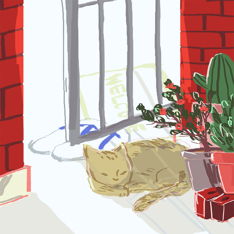
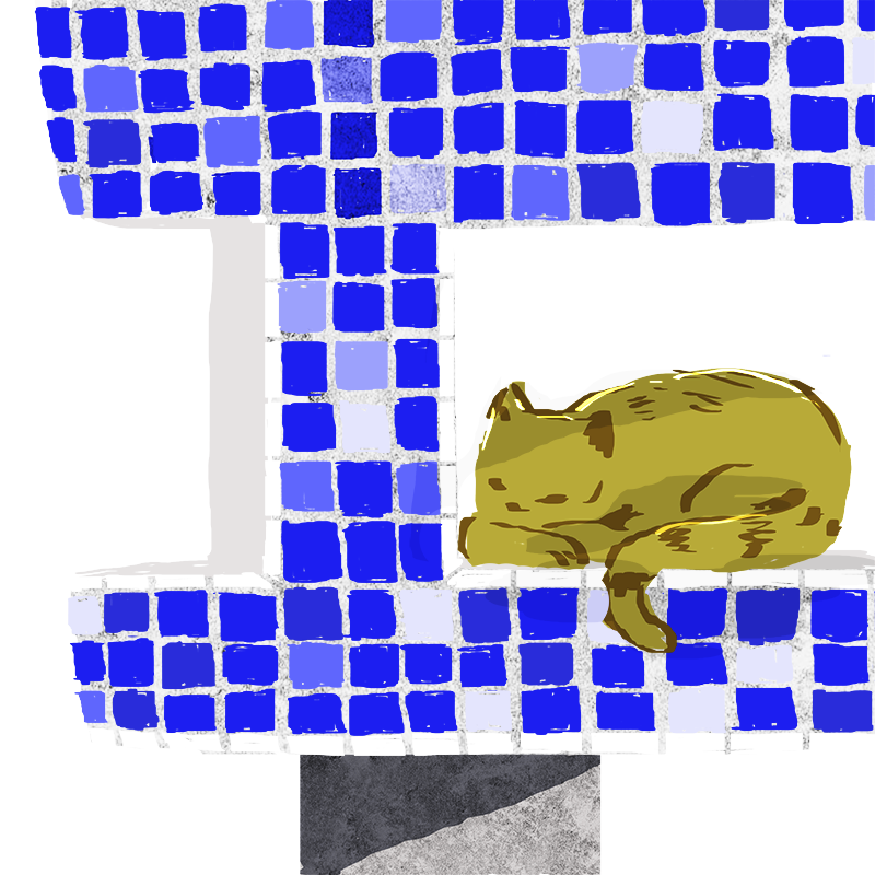
The public outreach is intended to be brought to various neighbourhoods from time to time – thus made to be simple and condensed in a certain space. Though simple, its design is also made to emulate the feel of a void deck – the metal frames to act as walls to hold up the graphics, the iconic communal chess table, and the mailbox.

Overview of the space

The public can take a slip of the response sheet, and use the tables to pen their responses – then deposit it in the mailbox beside.

In a potential location where it might be a placed – the place photographed is in Hougang.

Response sheet

Graphics used in the exhibition space:

Response sheet

(3) Curation: ZINE

CLICK HERE TO READ THE FULL ZINE

Published at the end of every conversation round to conclude the topic, and to further engage the public in the significance of the topic. The content of the zine is separated into three parts:

  1. Personal names and the struggle with identity: Personal names can have more impact and significance to one’s identity than thought sometimes. Some people in other parts of the world have struggled and found peace with their name(s) – how they perceive their own identity and how others towards them. Personal names are often related to cultural identities, and this is a part of what separates us into “different communities”. One can identify similarity in how personal names impact identity, despite having different names despite different cultural naming conventions etc.
  2. Curated responses which were collected over the conversation round
  3. Names and collective identity of a nation: Beyond making sense of each other as individuals based on personal names, there is also the level of how names have shaped nations – particularly Singapore. This fosters a sense of how names can help us find a collective identity, as a nation. Not only what makes us unique and different (personal names) but also the names which relates to us collectively – in order to bring us together, by recognising our differences and commonalities.

Physical copy:

Bound by saddle stitch with thread


RESEARCH & PROCESS

Ideation

I came all the way from the first few weeks of research about the duality of water – all the way from chengyu, Taoist philosophy and Fengdu Ancient city (I shan’t be elaborating that in this post) to this now – but with the intent of cultures as and always.

Water connects people across time and space.

…is what I have on my mind always, as I think the relationship between water and culture is what is more interesting to me. But of course I had been mostly lost, and unsure what aspect I really wanted to do.

With the idea of:

Water as a medium of connection

I researched on multiculturalism in Singapore + intercultural dialogues + participatory design (here are a few more significant ones):

Intercultural Dialogues

Multiculturalism in Singapore

Participatory design and art

  • Participatory artist Lee Ming Wei
    • The Travellermuseum visitors take a notebook home and write their thoughts about leaving home
  • Singapore Memory Project
  • Migar es Cultura (Migration is Culture) – Museo de America: web-based participatory design collecting stories of migrants and their descendants

Culture and Campaign Communication: Toward a Normative Theory (Jianglong Wang)

“Culture, on the other hand, is intimately related to campaign communication since campaigns cannot be run without culture as a context. Culture and campaign communication are inseparable because the occurrence of one phenomenon must necessitate the happening of the other. In other words, without considering a given context for a particular communication campaign, it is very difficult, if not impossible to understand the success or failure of a campaign. Likewise, without considering culture, campaign communication becomes a senseless occurrence as culture provides the necessary environment within which campaign sponsors create and share meanings with others in their societies. The importance of culture to campaign communication is therefore apparent.”

But of course there was still a huge mental blockage in terms of approach despite knowing that I was heading into the direction of intercultural dialogues. My main struggle was also how do I create something with the aim to accommodate all different cultural contexts, universally, to have a meaningful meaningful exchange? It is tough to even think of things which could bring different people together. Some exploration:

Approaches

  • Playing with the roots and fundamentals of languages (main function is to communicate across time and space): Everyone invited to draw their own interpretation of something (eg. water) or contribute to it
    • Paralleling to the creation of pictographic Chinese characters
    • Everyone has their own visual interpretation and perception of the world around them (ie. may be due to their cultural background, etc)
    • But they are in fact all the perceiving the same thing
    • Eventually being standardised to make up a collective logographic written language – finding a common ground
      • Stemmed from the need to transcend modern day languages which are strongly related to cultural differences – using relatively universally understood visuals of logos/icons instead – if there’s a need for intercultural dialogues (impossible to include ALL languages)
      • Artist reference: Xu Bing
  • Folklores and cultural narratives: the shared and unique ones
    • Could invite people to fill in with the languages they want – participatory design + people could volunteer to translate into English to help each other understand – crowdsourcing
    • Highlight the differences and similarities in the stories (finding a common ground while retaining our own uniqueness)
  • Promoting interactions
    • People invited to pick the drawing they like the best, and learn the stories attached to each of them
    • Pass down the story to another person

Eventually, I was settled on the facilitation of conversations with different conversation topics. I was still groping around in the dark with the deliverables along the way, though.


Execution

First started off with creating brand identity, and playing with the motifs as I went along.

And then the website first and foremost as it is something I was sure I’ll have as my deliverable ultimately.

trying out styles of illustration


The style of the text used for the illustration and the logo were edited to match each other.

Also, after testing the water with the first set of questions I had with a smaller, controlled group of people – in the last few weeks, I then had a crisis with my project. A good number of people gave pretty meaningless responses. It wasn’t like I didn’t expect and foresee this problem, but somehow I realised I might not have thought about my project as well as I hope I did – I wished I could revamp my approaches but I was already stuck a few times. I cut off the responses then, even after trying to revamp my questions and getting stuck. After that, I decided to work on the proof of concept with whatever I have.

  • V_1.0
    1. Do you think you know enough about other cultures (of the four races and new immigrants) in Singapore?
    2. What are your thoughts? (v.1)
    3. What is your name? (if available, include variation in native language)
    4. Do you know what your name means? Is there a story behind why you were given it? How do you think it reflects yourself and your identity?
    5. What kind of questions and issues have you encountered with other people (especially with people of a different culture or nationality in Singapore) regarding your names?
    6. What is something about your name (related to your cultures) which you would wish you could let them know?
    7. What do you know about the names from other cultures?
    8. Curious questions you might have about other cultures in Singapore or new immigrants (can be about names particularly or not).
  • V_2.0
    1. Do you think you know enough about other cultures (of the four races and new immigrants) in Singapore?
    2. Do you think it’s important to learn more about other cultures? Why or why not?
    3. What is your name? (if available, include variation in native language)
    4. Do you know the meaning of your name? (Especially their cultural links?) Do you think it has any relationship with your cultural identity?
    5. What kind of experiences or issues have you encountered with other people (especially with people of a different cultures or nationalities in Singapore) regarding your name(s)? Or are there any of your personal experiences/stories with your name?
    6. What is something about your name (especially related to your cultural identity) do you wish you could let them know?
    7. What do you know about the names from the cultures in Singapore (your own and others, which you might have heard from your friends)?
    8. Curious questions or insights/thoughts you might have about your own or other cultures in Singapore or new immigrants (can be about names in particular or not).
    9. Any other comments on the topic of Singapore and culture?

I used Google Sketchup to create the visualisation of the exhibition space.

PERSONAL REFLECTION

This is going to be an extremely honest reflection.

I really valued the project’s openness, and emphasis on the ‘why’ of our design. I learnt a lot from that alone. And really appreciate the devotion into research and conceptualisation, enforcing the meaning of what we are doing – because it’s what I believe in too.

Through the project, I *was* glad I tried out things I never did before like – Wix, Google Sketchup, and finally getting to illustrate more for a project.

But, ultimately at the end of the day, I think I still have a long way to go. Very long. Things are still falling short from my own expectations. I think I still didn’t push myself enough. To think about it, I haven’t really fully utilised my research, or maybe I have yet to use them well. And at the end of the day, I find myself still asking why I did what I did, and is there a point in it. This is in terms of both concept and execution – I’m not the proudest of it, not the happiest about what I’ve done.

So, in fact, beyond learning about the techniques etc, the class made me think a lot more than that, about my role as a designer. I think that I do think too much, but I’m still trying to find myself while trying to strike a balance between that and the purpose of design – to serve an audience. This is the second time we’re designing a whole system of deliverable – I think we’re just getting started – so I’m still finding out what I really want to do, and what I can to contribute to the world as a designer or whatever it takes.

I hope that in the next VC class, I would be able to push myself further, closer to what I would be content with.

Nevertheless, it was still a fruitful class. And I’m grateful for the support of Nanci and the class for the support and the wonderful semester together. 🙂

03 / get well wishing card

brief: explore visual communication on a single page and layout composition on multiple folds of a single sheet

to conceptualise a get well wishing card for proposal to ng teng fong hospital


artist references

I was mainly looking at Japanese designs which are simple, minimal, clean but creative and sophisticated. Some of them have clever ways of playing with folds, which are very straightforward yet unique.

It is also an idea and essence I want to draw from as hospital-related designs should ideally not be too cluttered or flamboyant. 1) It affects the mood of the patients. 2) Hospitals are socially expected to focus their work (and funds) on patients instead of being too showy.

(japanese designs – a few of my favourites!)

Kotohogi Design

dm_kd_0401 dm_kd_0402

Moe Tsukada

hoshizora-starry-sky-envelope-1 hoshizora-starry-sky-envelope-1-1 hoshizora-starry-sky-envelope-5

Goodbymarket

works-ieyasu003 works-ieyasu005 works-visit001 works-visit003

fworks02 fworks005 works-bougiee003works-yamamarubox02clematis-no-oka clematis-no-oka1

Draft

mos-goods mos-goods2 mos-goods4

Uma Design Farm

1209_oyama_001_m 1209_oyama_003_m


(others)

Sofia Dias

zippyzippy2

Rabbit Duck Design

Keith Lowe

8b761015899933-5629883a4e47c 76e63715899933-5629867f5e3eb

Li Inc

moca_1 moca_2

Trilingua

topography1

your mind

hatopress_inthegarden_d_

I knew I wanted my design to be simple and clean, yet still able to convey positive/calming vibes, and a pinch of wonderment (surprise), possibly by colours – vibrant/soothing/bright colours which can immediately light up anyone; almost universal. It has to be so as we have to make sure it could be connected by anyone of any race or age, transcending languages and cultural cues, given the hospital environment.

I was mainly exploring the ways of folding at first, so it sort of turned out that I subconsciously came up with lots of way too complex (and probably not technically possible) designs with perforations tearing what-nots.

2016-11-10-23-35-05 2016-11-10-23-35-30

My initial ideas involved a lot of perforation, and tearing to reveal a bright burst of colours as opposed to the plain outer appearance of the card before tearing:

  • an ordinary envelop-shaped card when torn along the perforation, will become a long strand of paper, revealing message and colours on the inside, resembling a colour piece of confetti – probably inexecutable and would be inconvenient for patients to keep after tearing – though i enjoyed the transforming of forms and the revealing of a surprise inside
  • card shaped in circle, with perforation which will open up and fan like a sun, and revealing bright yellow/orange rays and message
  • card of a diecut shape of hopscotch, and it folds according to the squares of the hopscotch, slowing revealing message square by square when opening, signifying the steps to recovery

What I learnt about my input of crazy impractical ideas was that it definitely contradicted what I wanted the outcome to be – simple. Fundamentally, the card has to be easily handled by the patients – user experience. When there are more folds, there will be more pages, which means more things to handle with too. It will definitely help anyone to have less goals, as it will make user experience straightforward and reduce obstructions in trying to convey your idea.


2016-11-10-23-35-40 2016-11-10-23-35-54

  • simplifying page layouts/folds
  • streamline motifs
  • tried playing around with the hopscotch idea a bit but the folds and the outcome i expect to get out of, was really tedious and tough to work out
  • from confetti, the idea of celebratory mood, in response to the patients being given this card upon their discharge, related to gifts
  • thus “health is a gift” – a congratulatory note but also a gentle reminder to value health – health gifted to patient like a present – to be treasured
  • focusing on the motifs: gift + confetti
  • the fold is extremely simple, like a normal card fold, squared shape, with the front imitating the cover of a gift box, then opening to reveal the content of the box (with the message and confetti)
rough draft

rough draft

what could be improved:

  • details of confetti – shapes, scale, orientation
  • unity in the interior pages
  • façade – what appeals as a gift box

2016-11-10-23-36-05

2016-11-10-23-36-29

mock ups

xxx

  • experimented with capturing a sense of depth, making a 3d-like box
  • contrasting blue on the outside and yellow in the inside, red as highlights (red also the colour of the hospital’s identity) – i actually really like the contrast as blue is calm and soothing, tinged with an outstanding red and then it opens up to bright warm lively yellow
  • red ribbon – like a red cross?
  • cover could be more personal, could be a prelude to the narrative going on inside – related to the confetti, light rays
  • could increase colour/visual contrast between white text and yellow background

packaging a gift box of sunlight/warmth?

The sun, the sun rays, could be instinctively associated with sunflowers, or clouds.

2016-11-10-23-36-56

  • incorporating cloud motifs as the facade of the “gift box” as it could be worked in with the sun rays
  • making it into a gift box
  • to interact with the rays in the inside – die cut shape

process

  • added texture (polka dots) to the white front page to make it looks less plain
  • to be honest, i struggled a lot with the cover, and here were a few of the variations:

p2 p4 p5

The was having to incorporate the clouds and gifts motif together. At some point of time, I was worried that the cover no longer have the sense of a gift box, and that would make the “Health is a gift” slogan(?) unconnected to the form of the card.

x

final template

2016-11-07-12-19-29

final – cover

2016-11-07-12-19-39

final – interior


  • “from your care team at Ng Teng Fong Hospital” was arranged to show on the front cover, due to the die-cut; go with the “to you” on the cover
  • rays peeking through clouds – giving a peep into the content of the card – narrative
  • at first it was just “health is a gift” which was handwritten (digitally), but then i converted the rest of the card’s text into the handwritten quality as well, to give the card a more humanistic and personalised touch. if the card were delivering warmth, it would be nice to bear a closer resemblance to handwritten cards.
  • i still wanted to keep the luminescent quality of “health is a gift”. even though it’s the biggest text of the page, i don’t want it to ultimately steal the message from wishes for speedy recovery, so it’s kept light.
  • i still love the general colour scheme i was going for, because it sort of did achieved what i was aiming for. even though the printer had the blue inside came off way lighter than intended.
  • could probably add more burst of colours in the interior. at first i didn’t think of adding more colours or more rays because i was afraid of the page over-cluttering and i was thinking “sun rays” so not much colour apart from yellow and white. but having more colour in the page would definitely look much better, giving a stronger impact upon opening.

If given more time, I would definitely want to work more on incorporating the cloud motif as a gift box more thoughtfully and smoothly. (I do have some image in my head.)

Also, due to some my own careless mistakes, there are some alignment and arrangement issues which had the print out not come out as I exactly intended. That too, definitely needs to be addressed.

I have to say too, that die-cut made miracles! At first I was pretty disappointed when I got the print-out. But when I cut the shape, the sense of wonder and surprise seeped in, as I see hints of the blue and sun rays from the interior. It worked rather well together, (save for the alignment error).

Even though this is nowhere close to the best representation and version this concept could be done, I think I’m still relatively glad for it and don’t find it a complete disappointment because I liked the outcome with the colour, type, and the die-cut. The long portrait format is something I’m also relatively pleased with, because I was aiming to not go for the typical card formats.

Again, like every other VC assignments before, I would say again that I hope to have done better at this, and there was so much more which can be done. I always start out being too overly ambitious, and having way too high expectations for my brain and skills to actually realise. Then again, this is all part of the learning journey, and it was a great semester of honing my sensitivity towards graphic design.

02 / combating zika: process + final

Following the ideation post,

Preliminary sketches

2016-09-12-00-52-23

2016-09-12-00-52-50

2016-10-27-23-33-46

untitled-1untitled-2

  • focusing on preventive measures
  • emphasising on the dangers of zika; how close it is to us now that it is here in singapore around us
  • trying to relay a message concerning zika without literally portraying mosquitoes as much as possible

1: Don’t Let Zika Stay With Us

  • focusing on preventive measure
  • water vases filled with water placed conspicuously among communal spaces
  • isolating objects we are prone to overlook but is the source of mosquito breeding to highlight the unnoticed danger around us
  • singaporean everyday life objects to highlight the context and bring attention to the specific situation we are in
  • intended style and palette: illustration or perhaps could work in photography; pop art/bright colour scheme – contrasting with the gloomy and ominous colour of the water vase (this is me wanting to do a zika warning poster which doesn’t have to be gloomy-looking)
  • could better work on introducing a sense of danger and criticality of zika

2: Zika: Bigger Than it Looks

  • focusing on the danger of the mosquitoes despite the insignificance in their size
  • typographic design (??) playing with black and white striped motifs of aedes mosquitoes
  • red circle was supposed to be the red bucket which singaporean households usually use, like a pothole peering into zika but you could only see a portion of it as it’s bigger than it looks (literally haha)
  • could have worked out more on portraying the large scale of zika

Zika Has No Future With Us

When I came up with the slogan of “Don’t Let Zika Stay with Us”, I had in mind how Zika is going to potentially leave the future generation the most detrimental impact if it were to proliferate, more than for the grown-ups of our time now. Thus, I eventually associated this and thought of incorporating the motifs of children in my design, and altered the slogan: Zika Has No Future With Us.

Some health and environmental awareness campaigns and artwork highlighting detrimental impacts by showing children as subjects  x x x

Portraying children in dire situations which needs attention to, are often rather impactful, as it is a way to invoke sympathy in the viewers. It juxtaposes the innocence of children with the undesirable condition of their living environment, urging for people to improve upon it.

unicef-print3_aotw

Unicef’s #NoFilter by Happiness: raising awareness on river pollution

60875d7741889-56eda1768c805

Anti Passive Smoking Awareness by Lee Høwell

90

Smoking Kids by Frieke Janssens

2016-10-27-23-34-53

wp collage1

collage1

This one was still a bit of a mess as I incorporated a dozen motifs and there was no streamlining of what message I wanted to bring across. There are:

  • children playing
  • red spots – mosquito bites lol
  • blood depletion (?? doesn’t make sense in this context of course)
  • covering the children’s face as an attempt to make mildly unsettling imagery – to emphasise on the seriousness (haha)
  • grim blood red background which also doubles as…
  • red bucket – preventive measures
  • upside down “leave no bucket unturned” – stupidly thinking anyone could turn the poster around, as if you are flipping the bucket over

The text was too small for a poster, making it unreadable from a distance. It was also commented that the red bucket was not readily recognisable.

collage2proto

Some scrapped concept of children jumping over puddle of water… conquering the evil puddle of mosquito spawning ground…? Okay bad idea.


2016-10-27-23-35-13

collagev2 collagev2acollagev2

  • retain focus on the preventive measure – call for action to ensure no still water lying around in order to curb mosquito breeding
  • retained children and bucket motifs
  • minimalist style to draw focus on the subject and the slogans
  • children sitting on turned over buckets – signifying the stability and safety of the children being reliant on the turned over buckets; the children being able to have a future with turned over buckets aka not having zika in the picture of the future
  • composition could do with more dynamic – non-centralised composition, using image of children being more lively
  • bigger text
untitled-1

some photos I took of the buckets/containers


collagev3aa-copycollagev3a-copy collagev3-copy

Was playing with the composition a bit (don’t have all of them documented)

  • a more asymmetric composition
  • added blue buckets for variety (was going for a bit of the kitschy feel) and also to draw attention to the call for action
  • comments: blue buckets distracting and redundant?
  • could do with more contrast between background and bucket – change in colour
  • change to a bolder typeface

collagev4

Final

collagev4a

  • rearranged composition with a pail at the right instead of the left, to make a heavy right
  • a more natural reading sequence to the eyes: text first then to the pail in the right and down to the call for action which should leave the final impression
  • background colour changed to blue for more contrast with the pail, allowing it to stand out
  • tried other colours such as yellow, didn’t prefer it as much, as blue felt more calming and cool, wouldn’t fight for attention from the red pail
  • played with typography of the slogan ‘zika has no future with us’ and changed to bolder typeface
  • varying fonts and sizes to create a more dynamic feel in conjunction with the lively children (possibly influenced had russian constructivist typography as the back of my mind – it conveyed a sense of dynamism and voice with just typography – suitable for grabbing attention) 70f7585f-f8a7-4cd7-b317-74d
  • tried a darker text for contrast with background, responding to a suggestion, but preferred the white more as it went better aesthetically in my opinion. at the same time, having it to not grab so much attention, allowing the final attention to finally rest on the call to action which contrasts and pops up eventually against the red pail
  • ornaments of light rays – to ornament and also give a sense of ‘light’, like a bright future for the children, adds to sense of liveliness

I think this project is meaningful in allowing us to directly apply the function of design to a current affair. Having to design a health communication poster requires a specific tone and attitude, as it is crucial for it to be easily understood and accepted by the masses.

At the same time, we were able to focus on dealing with composition of our images. There are also things we need to be aware in making posters, different from making smaller scale designs, which I have became aware through this project.

I’m certain that I still have an abundance of room for improvement in this project, and I look forward to working on that in future projects.

final product!

final product!

02 / combating zika: task one

Aim: Design a poster to raise awareness on Zika and highlight preventive measures to combat it.

1A visual research

health communication poster

aa6f0ebc6be1db0a1081fbfaae0609ef

I noticed that most of general, more old school ones tend to be pretty straightforward, stating their intent directly as in about what cause it is raising awareness of and what action taken by the public they wish to promote. Some are wordier, which may hinder the reception of information by the viewers.

It may sound strange but a lot of them lean towards a passive aggressive tone, which feels more like spiteful towards the audience. More often than not, bold and strong typefaces are used to assert a sense of importance and authority in the message which is being delivered.

Aesthetically, the ones which tend to catch my eyes were the minimalist ones, with plain background, focus on a strong point of visual, as such:

Diabetes Association of Thailand – Ogilvy

vanilla_aotw_aotwstrawberry_aotw_aotw

This stood out to me firstly because of its gripping visual image. Its clean background strongly contrasts with the clear subject and its outstanding details, catching the eye instantly. From afar, despite the sweet colour scheme, it is completely instinctive for one to perceive the visuals as grotesque, immediately garnering a sentiment of discomfort and associating them with rotting body parts.

Once looked at closer, we would discover that these wounds are in fact sweets – but rendered to grotesqueness to resemble the rotting wounds of a diabetic patient, if not taken of. Thus, it manages to drive its point home by juxtaposing the effect of diabetes with sweets, and allow viewers to immediately associate the consequences of uncontrolled diabetes to these imagery of disgust.

(Interestingly, a handful of people who left comments on the graphics, expressed that they are disgusted and one said they stopped eating their chocolate, which would probably mean that it worked haha. So even if it were disgusting, it fulfilled its point.)

Hierarchy is also clearly visible as the text message of “Sweet Kills” lastly presents itself in the top corner, making clear the message intended.

I particularly liked how the colour scheme was supposed to be sweet but elicited a completely twisted emotion towards it due to its subject, showing that even desirable and attractive things like sweets can become something horrific and dangerous.

Texas Prevention Partnership

VCBBDK_ VCBBDL

League Against Cancer – Y&R

university_aotwcaptain_aotw

  • Exploitation of emotional response with personal recount style of narrative
  • Play on paralleling objects: Full stop to end a story = a physical mole which may hint on cancer to the end of someone’s life story
  • Single focus on a subject, clean image.

Start Talking – ModPod Creatives

Jaxon_print Ben_print

Unileste: Zika – Oriente Comunicacao

ad-zika_b_aotw ad-zika_aotw

Parkinson’s – J.Walter Thompson

parkinson1_aotw

1B concept

Most of the health communication/public health awareness posters I had came across tend to carry a passive aggressive tone, which I don’t exactly aim to head into. Since most of them have different agendas. They tend to be targeting on voluntary undesirable behaviour due to imperfect knowledge. The kind of tone I want to go for is something lighter and more positive, a gentler approach of calling for the active participation in Zika combat, targeting all Singaporeans (ie. not just pregnant women/married couples who are most heavily concerned as far as the news and MOH websites seem to be).

( CLICHE ALERT )

  • Sucks to have Zika (jk)
  • Zika bites!
  • Don’t let Zika stick with us (LAH!)
  • Zika. It’s your part.

(Concept related to each slogan to be elaborated.)

Also, the overall aesthetics to go for is to be as clean and minimal, and depending more visuals while going for more colours than just the basic ones.

Moodboard (for now…)

moodboard

01 / therapeutic graphics: final

process posts: 1 2

fvd1 fvd2sat

My work focuses on bringing the familiar aspects of the ordinary Singapore heartland to the hospital, providing comfort to the patients and staff who spend most of their time away from home. The windows into a more homely environment elsewhere, shape the sterile and stressful environment of the hospital into something warmer. At the same time, it provides a Singapore flavour which is unique only to Singapore hospitals.

Stray cats are often found around the heartland, in environment close to people. The presence of the cats in my illustrations hopefully act as a bridge for the viewers to be drawn in, like how anyone would stop and slow down to watch the cats resting or moving around at their void decks.

The illustrations were done on Photoshop, with more organic strokes and bright colours to bring a less rigid and restrictive feeling to the images.

01 / therapeutic graphics: process 2

After the first task, I decided to focus on the themes/subjects of local flavour and animals, and came up with an idea to merge them together.

People tend to find comfort in familiarity. Even though we may find the common daily scenes of the Singapore neighbourhood extremely ordinary and nothing out of the special – like HDB void decks, wet marketplaces, kopitiam, etc., they seem to be out of reach in that sterile and prosaic space of the link bridge. Yet, they are often closest to, or feels like a symbol of home. Every corner of the void deck or the daily scene of a busy morning wet market could invoke a sense of familiarity in all (if not most) Singaporeans.

IMG_2113-6-1300x86734468b7b7e2949b1c0991718_original- 2-Mama-shop img_1195 15592649466_b10d6164c1_c15430733540_e87dcdda4f_c 15430210208_7ac09b8f48_c2016-05-15 10.48.04 2016-05-15 10.48.26

Other than familiarity, I had suggestions from friends before that they thought travelling in another country is something therapeutic, which is agreeable as those are the rare few times we can take our minds away from our work in Singapore and purely have fun. Additionally, we find stories therapeutic as they let us escape into another world. Essentially, the idea of being able to transport your mind somewhere else tends to be therapeutic.

By installing images of the heartland environment, I wish to bring an ordinary piece of the heartland, inserting them in the hospital environment, bringing an out-of-ordinary sentiment to the patients, and even staff, who are away from their familiar environment. If they can’t be there, it could be here. Even if one weren’t that familiar with these scenes, I hope that they could find something comfortable in the down-to-earth subjects.

My initial intention of adding animals into the picture was how adorable animals tend to be therapeutic universally. Adorable animals can melt the hardest of hearts and people bond over pets, which were proved to me by the presence of a pet rabbit in my family. Presence of animals can help to soften the environment too.

I also wanted to add a sense of whimsicality to the scenes by adding (domesticated) animals which normally wouldn’t appear in such places. Being surrounded by cute animals sound like a moodlifting experience, like the idea of Okunoshima (Rabbit Island) and the cat islands in Japan. Thus I tried incorporating rabbits into my drafts at first.

cute-bunnies-rabbit-island-okunoshima-11__880 cute-bunnies-rabbit-island-okunoshima-1__880

2016-08-29 00.12.52

2016-08-29 00.13.45

second drafts:

1cats

with cats

1rabbitsparkle

with rabbits

I did the piece with the cats first which wasn’t my initial intention to do so, but eventually I garnered feedback that the presence of the rabbits were not as compatible with the context as compared to the cats. Corresponding to my goal of achieving familiarity, cats would be a comparatively good choice. In this case, I learnt that it would be more important to adhere to what is more logical for the sake of clarity of my intention than what I actually personally want.

During the second round of critique, Michael had suggested that I could focus more on the activities of the cat, how people interact with them and how they possibly interact with the environment. There were also good feedback on the choices of human figures presented.

2016-08-23 18.59.40

I snapped this photo at the void deck on my way home during that week, which served as inspiration for my development thereafter.

When I chose to focus on the cat, I realised that even with close-ups, the environment of the void deck are still recognisable. Furthermore, the only time we would watch the stray cats at our void decks up close is when we slow down and go closer, which is the kind of perspective I find suitable for invoking therapeutic sentiments.

sketches

f_vd_sketch1 f_vd_sketch2 vcvector

I tried doing it on Illustration instead of Photoshop, where a went for a more organic kind of illustration, but it felt more rigid even though it definitely looks neater.

Reference artists

Nguan – “Singapore” photo series

singapore46singapore100singapore11321fdd2801485c14dde010613736925_522791827917894_1181102632_n

x x x


Final

fvd1 fvd2sat

The two scenes I ended up with were simply examples of the look and feel it should involved. I picked the mosaic communal chess table as it is easily identifiable even when closed up. Expanding into a series, I hope I could make a series of images in which we could follow the same cat travelling around the void deck.

As Michael said, I could have considered more into how my image is going to work with the view outside of the windows if the background would be transparent. This would certainly enrich the quality of my art, and was something I regrettably didn’t managed to incorporate in my final.

It was also certainly different from our year 1 projects, that we now make design with the consideration of a context and particular audience to serve.

With this, I hope that I will continue to improve in my design thinking and technical skills! I’ve always been interested in cultures, finding it most meaningful to incorporate local culture in my work some way or another. Therefore hopefully, I would also be able to continue exploring more into the local culture or cultures in general.

02 / point of view [week 4 + final]

[long post warning] 

Previous posts: 1 2

I’ve been sitting on this post since last week, adding stuff as I go, so it’s going to be really long but certainly packed full of my thoughts and process.

Before I continue with the actual content, I want to start with an anecdote. Gosh why am I telling PRACTICALLY EVERYTHING on OSS?? But to be fair, it was amusingly related to this project.

So it was this February, my lovely dear group of friends (you know who you are if you’re reading this) threw me a birthday surprise with a food party. I was really touched!

When I arrived at the party table, and I was greeted by this sight:

2016-03-02 08.25.44

A BRIGHT RED TABLE, THE LINE-UP OF STYROFOAM CUPS, TWO CANDLES AND TUTU KUEH (i love it). When I saw this sight, the first thing which came to my mind was: this resembles… you know, not very auspicious stuff (aka my concept for this project). No worries though, I was definitely more amused than offended or bothered. I think afterwards I had one of them agreed with me on this as well.

So yeah, the message I intended to convey with this anecdote is, how the set-up, colour, certain objects, or other elements presented can send a very specific mood and message given that the audience is equipped with the cultural knowledge. It could be immensely meaningful in a very specific way to a selective audience, but to those who are not the target audience, they wouldn’t be receiving the same message instinctively or without explanations.

Hmm, maybe we shouldn’t have chosen red tables. Don’t worry friends!! I don’t mind at all, red can also be interpreted as celebratory. And after all, all of us ate these together… and we are still good. cool

Anyway, here’s a song to set the mood before I go into the actual content: It’s titled L’Enfer Et Moi, which translates into “Hell and me” from French (according to Google, I know no French), so you see why I chose this song. (You may play this while you’re reading the rest the post. Haha. Ok maybe this is just a poor excuse to share a song I like.)


Overarching idea

2016-03-18 15.45.55

Building upon the motive and reason behind working on this concept which I’ve mentioned in my previous post, I want to portray a juxtaposition of the modern and tradition found in Singapore. By portraying something as traditional and old as Chinese legends/mythologies and cultural practices in a modern style and way such as publications and guides, I wish to highlight the curious and interesting phenomenon of how a modern society Singapore is today, traditional practices are still found to be going on today. It’s much less of either believing or disbelieving the existence of supernatural, and more of a tribute to the Chinese mythology and cultural belief surrounding the underworld.

Even though the concept is stemmed from a Chinese culture, I think my work extends out to every Singaporean regardless of race, who are familiar with this annual practice.

My aim for the work is to make a series of items targeted to the ghosts, yet without explicitly stating so. Thus, I’ve included a lot of cultural cues done through imagery and subtext.

Truthfully, this concept of taking our contemporary everyday life objects and spinning them into something targeted to what are believed to be the residents of the underworld, isn’t actually entirely new. Existing products used in offering like the hell notes does something similar, like crafting a whole new but non-functional currency. It emulates the objects of our world with words like “冥通银行” which seems to hint on an existing “hell bank”. After all, all spirits, if they do exist, were all humans before. It makes full sense to recreate a whole set of items they’re familiar with dedicated to use in their afterlife. (Actually an age old concept dating back from ancient China era as reflected by tomb art, as we’ve learnt in Asian Art History. I’m digressing.)

Hellbank

Mood board 

incenseburner

博山香炉 Fairy Mountain Incense Burner

I just saw this image of an ancient Chinese incense burner which was introduced during our Asian Art History lecture the other day, and my mind just instantly related the whole vibe of it to my concept for this project.

Its hints of gold decorated stylistically on the bronze vessel, which is of an oxidised greenish hue, along with the carving of the mountain appealed to me a lot. Even the red background contributed to the elegant/mysterious vibes of it, even though it isn’t part of the work itself. The fact that this object itself is an incense burner is closely related to my concept as well. At some point of time, I’ve taken a mental note to maybe incorporate this object somewhere (but did not really got the chance to).

On a related note, the colour scheme I had shortlisted for the project from the start included:

  • red (ghost being attracted to the colour red, joss paper colour)
  • yellow (joss paper colour)
  • gold (joss paper)
  • black, brown (or from kraftpaper), white, grey

They’re all the relatively more muted or darker colours which I think would successfully portray and suits the vibes of such a subject. There were certainly some changes of which colours are eventually adopted along the way.

Main reference: x

Fonts used:

  • Delicate
  • St. Marie (used most prevalently)
  • Orator
  • Fangsong (Chinese system font – used most prevalently)
  • yuweiji (Chinese font which I can’t recall where I got from… probably from Weibo)
  • FZLanTingHei (Chinese system font)
  • and a lot of my own handwriting

Programme used: Photoshop CS6


(updated) lines

  1. lunar july the 14th in the pov of ghosts is a long awaited outing – poster advertising for festival which doubles as a ticket/document holder (folded and tied together to resemble joss paper) for the event with general rules to observe etc.
  2. bukit brown and changi beach from the pov of ghosts are crowded tourist attractions – isothermal map which highlights the haunted spots in singapore in blue (because of the absence of body heat)
  3. getai from the pov of ghosts is concert under the stars – concert ticket pass + list of timings of other shows throughout the event
  4. roadside offerings from the pov of ghosts is a free-of-charge buffet – “eat all you can” buffet promotional flyer / carnival food coupon
  5. burning incense from the pov of ghosts is a delivery package – delivery notice
  6. 15 days after from the pov of ghosts is going home – event calendar striking off the dates except the last day

ONE: promotional poster doubled as ticket holder

2016-03-18 15.44.26

references

ticketIMG_2628CIMG403013_03_27-mjs-123rf-malaysian-festivals-3-1534497_l

I wanted to have a ticket holder so it could go well together with the rest of the work, ie. something to hold them together. Ticket holders are when you buy concert tickets or air tickets, and they usually come with information, so that’s why I also extended the whole idea into a poster informing of the actual event + guidelines.

Incidentally, the elongated shape of the ticket holder resembles folded joss paper when people burn it so I also intended to emulate the design of the joss paper in some ways, eg. yellow/red or black on red (usual joss paper colours), gold foil, red border rims etc.

laser-toner-reactive-foil

Toner Reactive Foil

The gold foils can be done using toner reactive foil, and the effect is really pretty. I didn’t get a favourable answer when I inquired about it in Art Friend, so I ditched the idea. Even so, I’m still going to share this here for the record and everyone’s reference. (But if anyone do know where to acquire it, maybe you could let me know!) Some ways to apply the foil included using an iron or laminator or printer.

execution

2016-03-18 15.47.17

prototype

c1c2c3

I visualised scenes of (an Asian) crowd in the background of the poster. Strangely, I don’t think I’ve taken crowd photos in Singapore, so I used some of the photos I took in Tokyo last March.

crowd1 crowd2 crowd3

adcu

Joy had also interestingly noted that the use of the font Delicate, complements the fleeting characteristic of “spirits”.

adcuu

ad

final design

2016-03-18 15.57.24

test prints

2016-03-18 16.55.35

Final print: Laser on yellow textured paper with border left

guidelines

Final design for guidelines on the flipside

2016-03-18 16.00.00

image transfer pen test prints

I tried the image transfer pen which Joy suggested, but it didn’t turned out well on kraftpaper. I used the laser-printed version, cut and pasted on the back of the poster instead.

2016-03-18 16.55.472016-03-18 16.56.572016-03-17 01.36.05

I used raffia string (instead of say, ribbons), which is commonly used to tie joss papers together, also to strike the juxtaposition of modernity and tradition.

From the beginning, I wanted to incorporate a Chinese seal like image of the 成语 “出入平安” (which makes complete sense for this context lol) on the poster, but through the process, I got rid of the idea until I saw the final product and felt that something was still missing. (As seen above.)

I could still vividly remember that when I was much younger, my mother often took me to the temple at 四马路 and the people there would stamp similar image with the same phrasing on the back of our shirts.

images

reference image

2016-03-17 10.51.382016-03-17 11.14.332016-03-17 11.18.272016-03-18 15.51.22

So at the very last stage of my project execution, I decided to cut my own “seal” for printing on foam. (I actually gotten this idea from June who was in the same group consultation as me and she brought up this alternative which I thought was really smart, so I took note. So shout out here to her!) I drew the template directly on the foam and started cutting.

Some very minor but interesting to note, each of the characters are actually symmetrical to each other (which means the template doesn’t have to manual reversed either)! Except for 入 which is closely symmetrical, but I tweaked it a bit to make it look more symmetrical. (I know that turns it into another character.)

I used red watercolour actually, so my first attempt turned out too thick and wet, because I stupidly overlooked that the paint I coated on was too much because all I was thinking was I got to get the image on!! The next attempt look way better after mixing some water in and diluting the paint coat. I’m actually super happy with the outcome for this, especially with the texture!

first attempt

first attempt

2016-03-17 11.26.23

second and successful attempt

2016-03-18 16.55.27

final product

TWO: event map showing “popular tourist spots” using thermal mapping-inspired concept

2016-03-18 15.45.03

thermal mapping reference

day_medit_pv5_D_193_AVE

Instead of listing out the “popular tourists spots” (which are actually famous haunted places in Singapore), I wanted to portray the idea using the thermal mapping concept. The coldest parts, marked by purple and blue would imply the idea of the presence of “ghosts” as they technically lack body warmth, as compared to the rest of Singapore which would be mostly in orange or green.

execution

mapv1 mapv2

I had quite a problem with this one so it was the last piece I completed. Due to the thermal mapping concept, a lot of colours had to be used to it turned out tacky, like in the first version. Eventually, I explored around the brushes which I realised would make a difference.

Anyway, I think I might have tried adding short write-ups on each place as if it’s like an actual magazine publications, but again, time constraints, and I thought this might be good enough alone.

mapp

(A): I used the word 人气 which means popularity, but also literally means the “presence of humans” as a subtext as well.

(B): I must confess, being a science idiot, I have no idea what exactly is this thermal inertia term, and I’m like 50% sure it’s not used correctly. I took it directly from the thermal map reference. I should have Googled on it, though this would probably make my work look sort of intellectual on the surface hahahaha. I like the rainbow scale/bar thing I recreated with the brushes though.

map

final design

final product – laser on grey paper

2016-03-18 17.01.532016-03-18 17.04.26

The print out was initially just the actual grey image. I didn’t planned to stick it on kraft paper, but without it and the tracing paper, it looked really unsophisticated. I had actually made the mistake of printing the image a tad smaller because I printed it on an A4 size along with my sixth piece, so I thought I could save it by sticking it on a piece of kraftpaper. It ended up enhancing the look.

As for the tracing paper layer, I had already initially planned to do so for this piece from the start, so I did it as well for the sixth piece even though I didn’t intended for that one. It really made the pieces look more sophisticated than they actually are, so really, don’t be fooled. Haha. That being said, I love the effect it gives, further enhancing the “ghostly” feel to the pieces.

I know the staplers were probably a bad choice to hold the pieces together but I tried to use red staplers to minimise the impact of bad choice lol. I couldn’t really think of another better way given time constraints.

THREE: (getai) concert ticket

2016-03-18 15.45.03

reference

Excellent-Ticket-Design-07d10f6412952449.5626f6564459c

The visualisation I had was particularly inspired by this particular piece from the Festival Silvestre Indie Folk works I had been referencing from, but with the iconic front row seats at 7th month getais instead.

7edb0032568967.568ae48b5c27b

6040194922_be252dac93_btpp-alvin1e4e7b3718d0cc6ef1dabec6a659a90bcFemale_getai_performer,_Singapore_-_20141006

 execution

This one took pretty long actually because I tried out a lot of brushes for the writing of “Concert under the stars” + the chairs is a problem.

contix

conce

final design

2016-03-18 15.31.082016-03-18 15.32.28

Creating perforation line with sewing machine

2016-03-18 16.46.14

test print with inkjet on gloss paper (i think)

final product

final product with laser printing

FOUR: ‘all you can eat’ buffet promotional flyer

2016-03-18 15.45.23

reference

All-You-Can-Eat-Flyer-2013-212x300201342195327rouge sushi flyer new

7th_Month_Hungry_Ghost_Festival_Offerings_in_Singapore (1)hungry_ghost_festival_burning_hell_bank_notesIMG_20130424_103430

execution

hungry

buffet

final design

2016-03-18 16.47.18

test print with inkjet on dark yellow paper

final product with inkjet on light yellow paper

final product with inkjet on light yellow paper

FIVE: delivery notice

reference

iG4U0sX

This one was really straightforward, actually.

execution

deliv

final product - inkjet on kraftpaper

final product – inkjet on kraftpaper

This one wouldn’t have looked as nice or suited to the theme if it weren’t printed on kraftpaper, just saying.

SIX: festival calendar

2016-03-18 15.45.42

from the book Neo Japanesque Graphics

2016-03-09 22.38.552016-03-09 22.38.502016-03-09 22.38.31

execution

cal

calendar

final design

final product – laser on grey paper

2016-03-18 17.03.04 2016-03-18 17.03.20

To be honest, I think this was my weakest piece in terms of aesthetics and presentation, and maybe conceptually too, I don’t know. Without the addition of the kraftpaper backing and the tracing paper cover, it would have looked infinitely unflattering. Lol. There must be some better ways to execute this piece.


FINAL

2016-03-18 15.43.592016-03-18 23.35.11 2016-03-18 23.36.572016-03-18 23.38.33flatlay

I can say that I’m relatively satisfied with the outcome of my work, aesthetically and conceptually. But to be honest, there weren’t really any breakthroughs in technical skills since I’m doing what I’m the most familiar with, Photoshop which I love playing with and since I was in charge of the designing when I was Publications during my JC days.

Apart from that, the concept was a relative breeze to build on because it is a whole wealth of existing culture I am drawing from. It makes it much easier to build and adapt ideas and turn them into visuals so conceptualising the visuals for this project wasn’t as nervewrecking as the other projects before.

One of the biggest takeaway from this project was that I now understand the difference between laser and inkjet printers! (Lol) I had difficulties with my print quality for my last two projects, so this project was quite a confident booster for me given that I had (seemingly) managed to overcome that.

It was quite a dream for me to think that I had managed to complete this project in just 4 weeks, especially when I think about myself being pretty lost for the first two weeks. Thank you everyone for the kind comments written and in person during the critique!

p/s: Just a little before I finally post this, I found out that NTU CCA will be having an exhibition on the same exact subject I worked on! A little too late. Haha. But it sounds really interesting. I’m tempted.

cca