
FINAL PROJECT: EGO
For our final project, we were tasked to come up with 4 rows of designs representing “me + setting = outcome“.
We were not given any medium restriction for this assignment. I knew from the start that photography was the medium that I wanted to use in my work. However, I was also used to just capturing images in camera without digitally altering them very much. I knew that to incorporate the element of design, I had to push myself beyond plain photography and find new ways to communicate visually.
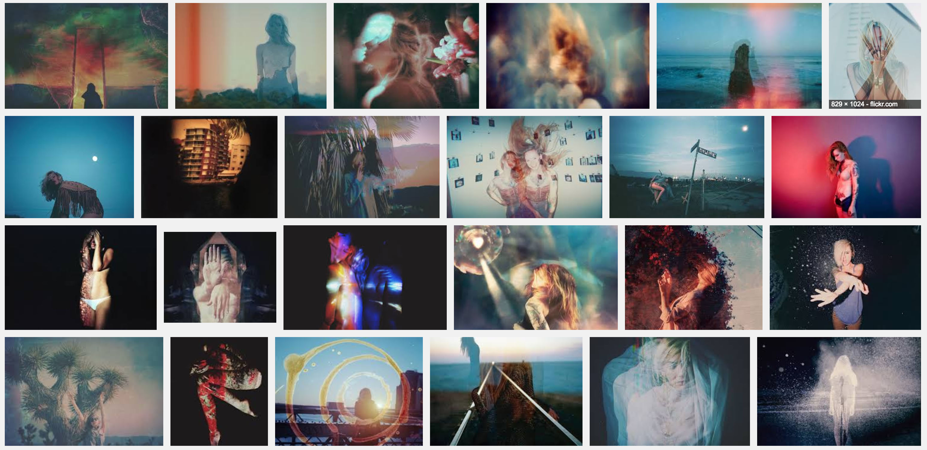
RESEARCH: ARTIST REFERENCE
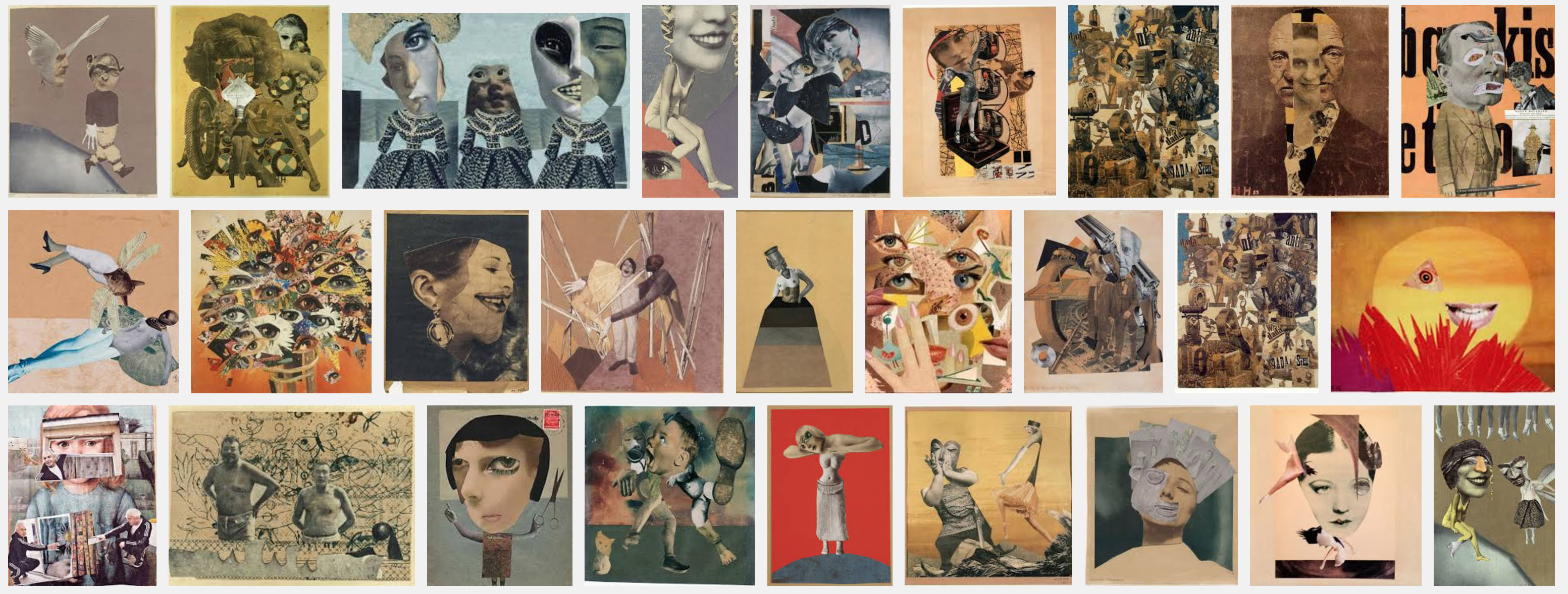
After plowing through many collage artists with varying styles of design, I finally found these 3 artists (and 1 film) whose style and work resonated with me very much.
Artist #1 – Man Ray
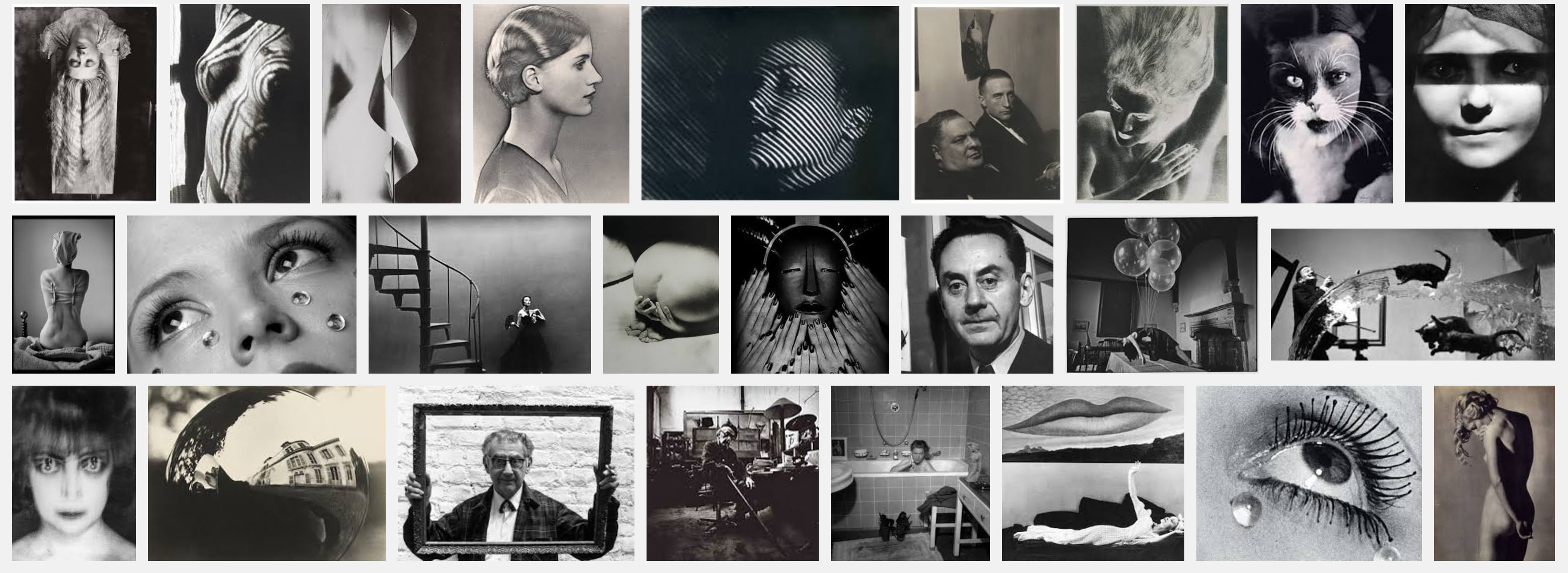
Man Ray was an American visual artist. His artwork spans from paintings to photography, all of which are very surrealistic, and sometimes dark. I have always loved surrealistic and dark artwork. That might be why he was the first collage artist I came across during my research whose work I really connected with.
I was very inspired by how he plays on foreground vs background in the two collages above. By doing so, he not only adds visual interest to the image, but also gives the image depth and focus. To me, this style is very sophisticated as it shows a lot of thought being given to both the subjects and composition. Each image tells a story and provokes thought about the subject matter displayed.
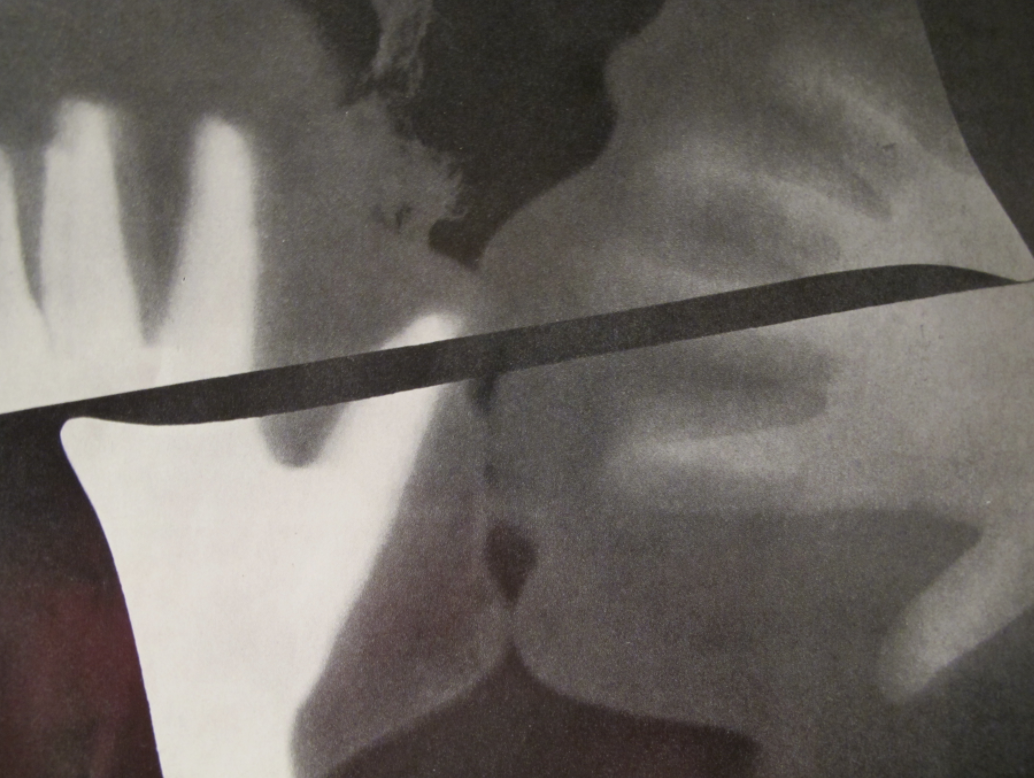
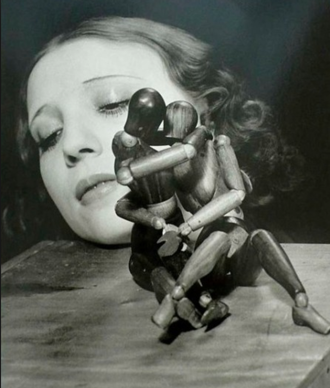
Rayograph (The Kiss), 1922 – Man Ray
To me, the image above is the epitome of the phrase show, don’t tell. The simple horizontal split in the center and the superimposition of hands on top of the faces adds so much meaning to the piece without directly telling the viewer what to think. It evokes curiosity and leaves much room for interpretation, which is something that I strive to achieve in my designs.
Artist #2 – Hannah Höch
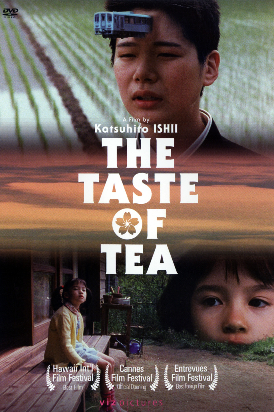
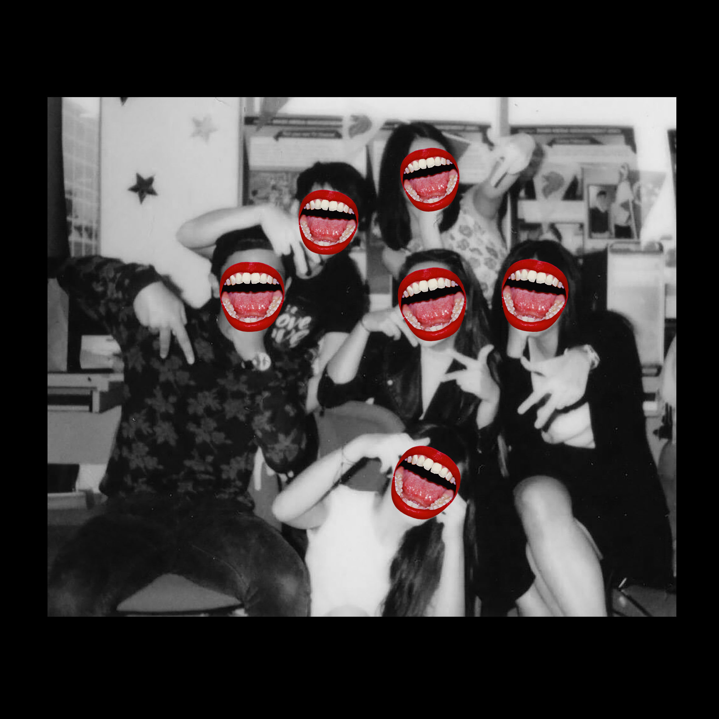
Hannah Höch was a German Dada artist. She was one of the first people that started photomontage, whereby actual photographs are cut out and layered on top of each other to create a collage. 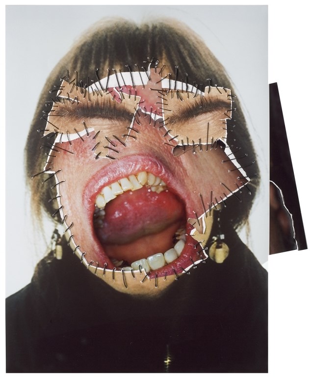 Out of all her collage work, this piece caught my attention immediately. I was drawn to the way she used an extreme close-up of a mouth and blew it up to cover the entire face. The stitching of the pieces together with thread also added an element of pain to the final image, making it a very strong and unique piece for me.
This is the piece that heavily inspired my designs for me + friends = extrovert.
Artist #3 – Davis Ayer
Davis Ayer is a visual artist based in Los Angeles. He does film photography and his works are dreamy and whimsical. I first came across his work on Instagram, and fell in love with his style immediately. I especially love his use of double exposure photography, which adds layer and interest to his images.
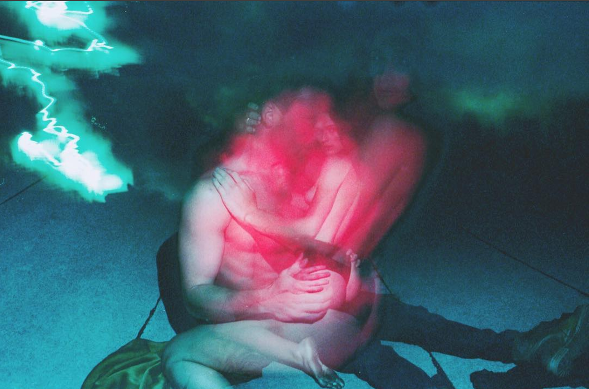
Like the first two images from Man Ray, he uses foreground vs. background to convey the story. The use of the pink in the subjects vs. the blue tones in the background helps to add contrast and interest to the image.
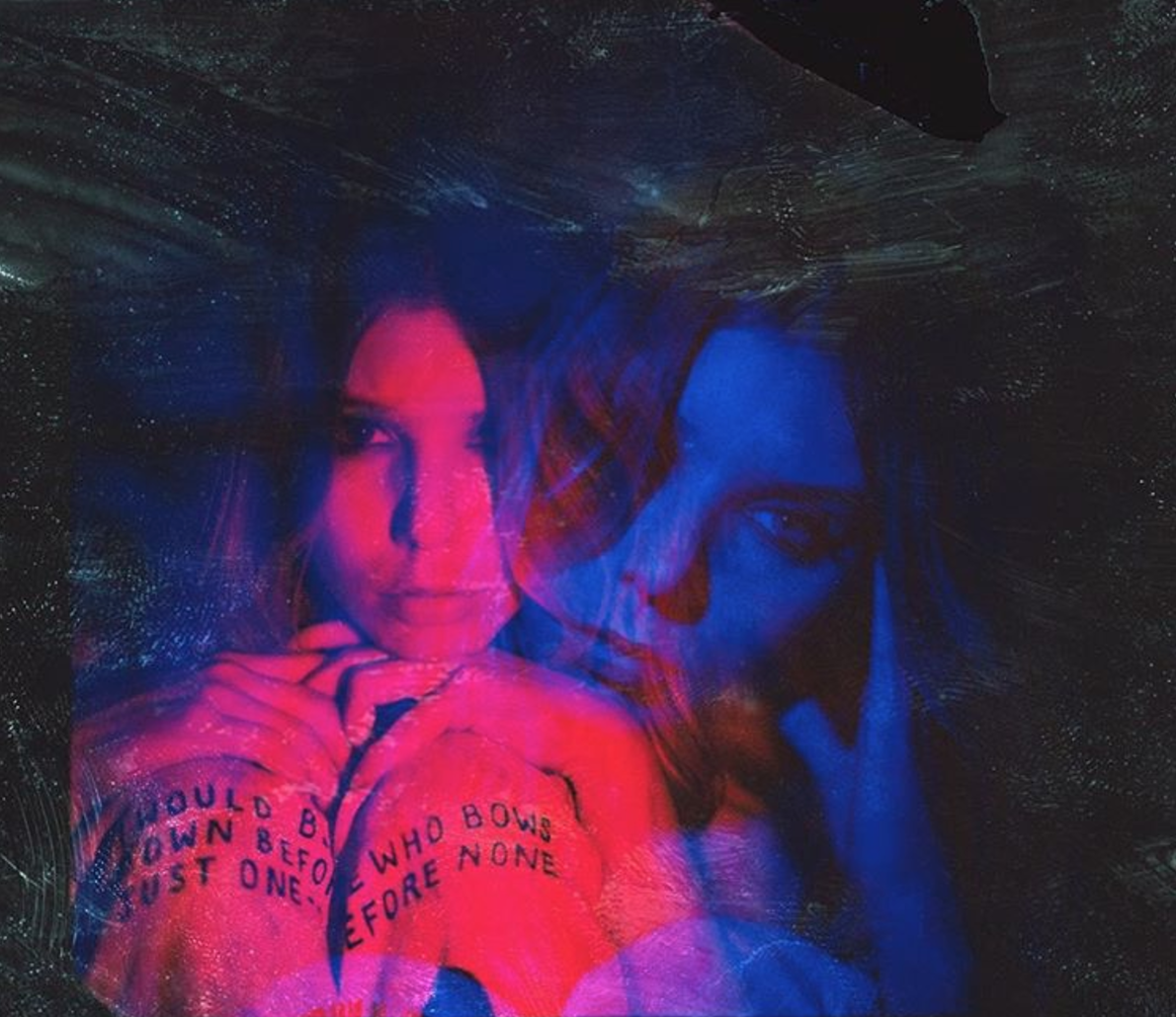
In this image, he layers the image with a double exposure of the girl, and separates them using colour. Though it may be one of his simpler images, this one in particular really inspired me. Here, the complementary colours red and blue are aptly used to convey the message.
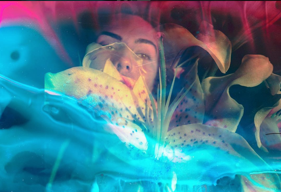
When I saw this image, the first thought that came to me was wow, this is so gorgeous. Again, the complementary hues red and blue are being used. I love how he layered the flowers over the girl’s face, making it look as if she is trapped/suffocated by beauty.
The way Davis Ayer collages using double exposures and his use of colour was a huge source of inspiration for my designs in my me column.
Film – The Taste of Tea
The Taste of Tea (茶の味 Cha no Aji) is the third film by Japanese director Katsuhito Ishii. It’s imagery is extremely surrealistic and unique.
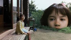
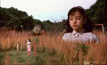
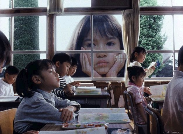
In the images above, the little girl is enlarged and placed in various environments, looking at herself. The quirky, unconventional style of the film is extremely intriguing. The style is something I would expect from an animated movie, where literally any composition is possible due to illustration. I love the way the film juxtaposes the image of a person with different environments.
The style of this film was a major source of inspiration for my entire outcome column, where I used different backdrops to represent my inner feelings.
DEVELOPMENT
Firstly, here are my four lines.
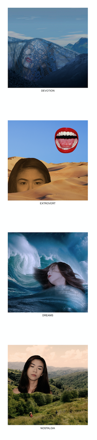
me + cinema = devotion
me + friends = extrovert
me + fantasy = dreams
me + grandma’s house = nostalgia
I chose the four settings, cinema, friends, fantasy & grandma’s house as these are the places and situations whereby I feel for and emote the most in my real life.
me + cinema = devotion
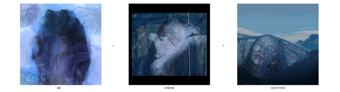
Meaning: I am an avid lover of cinema. It is my passion, and film is ultimately the area that what I wish to work in for the rest of my life. As with all areas of the art industry, film is an extremely difficult one to survive in, especially for women. It is one that requires a huge amount of devotion to the art to be able to preserver and stick with it as a career choice. Hence the line me + cinema = devotion.
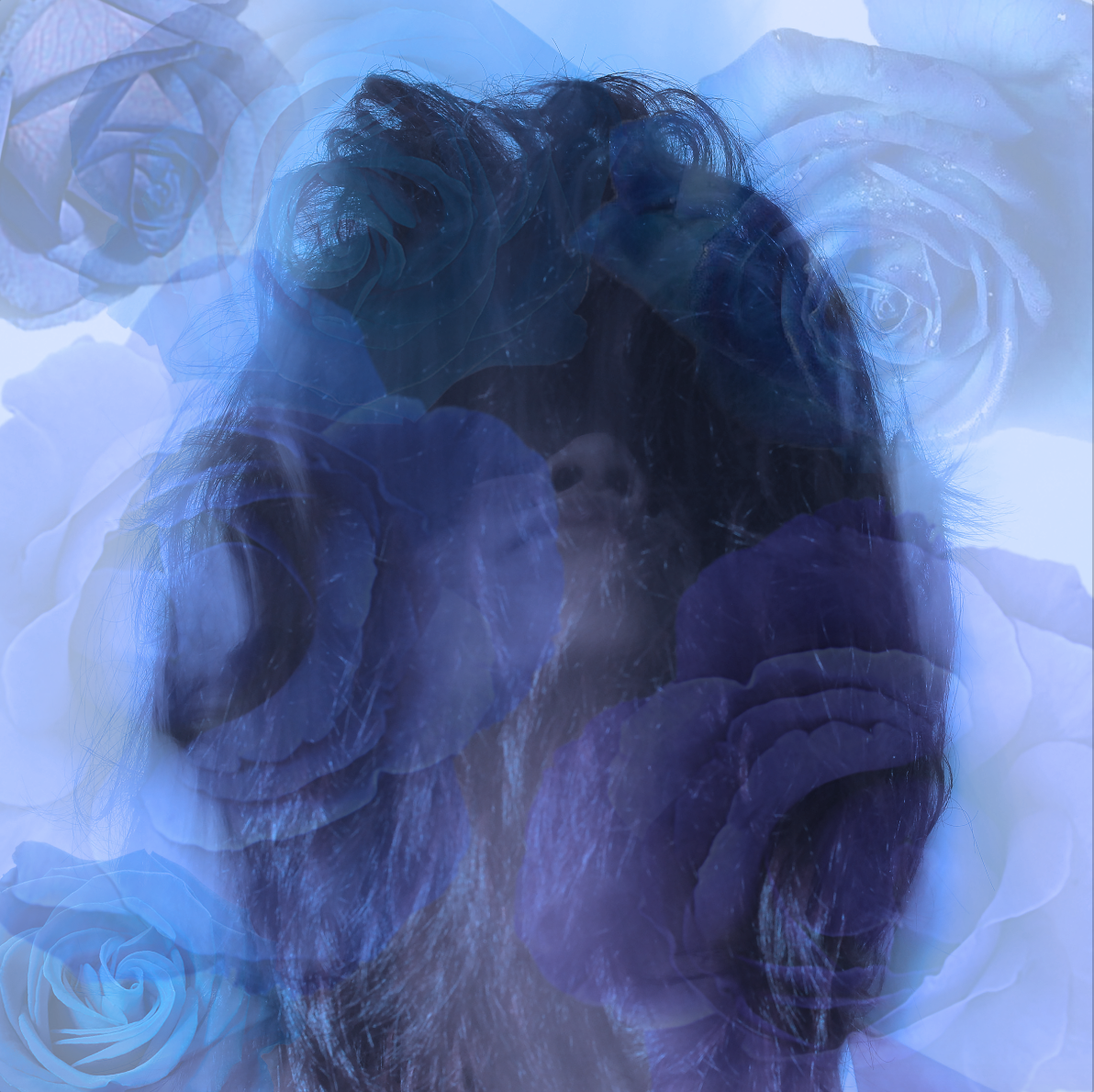
Color Scheme: I chose to use monochrome harmony and colour all the images in hues of blue to represent the aspect of despair in devotion.
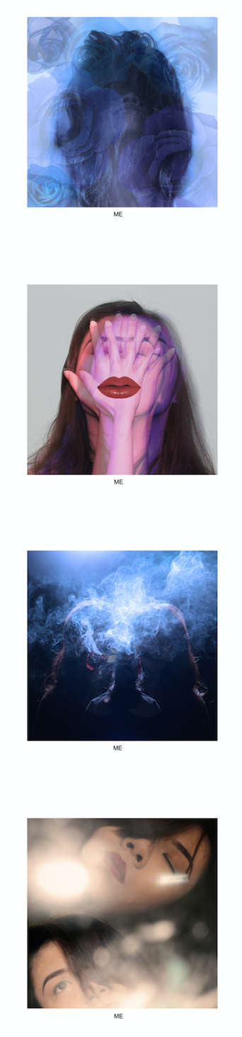
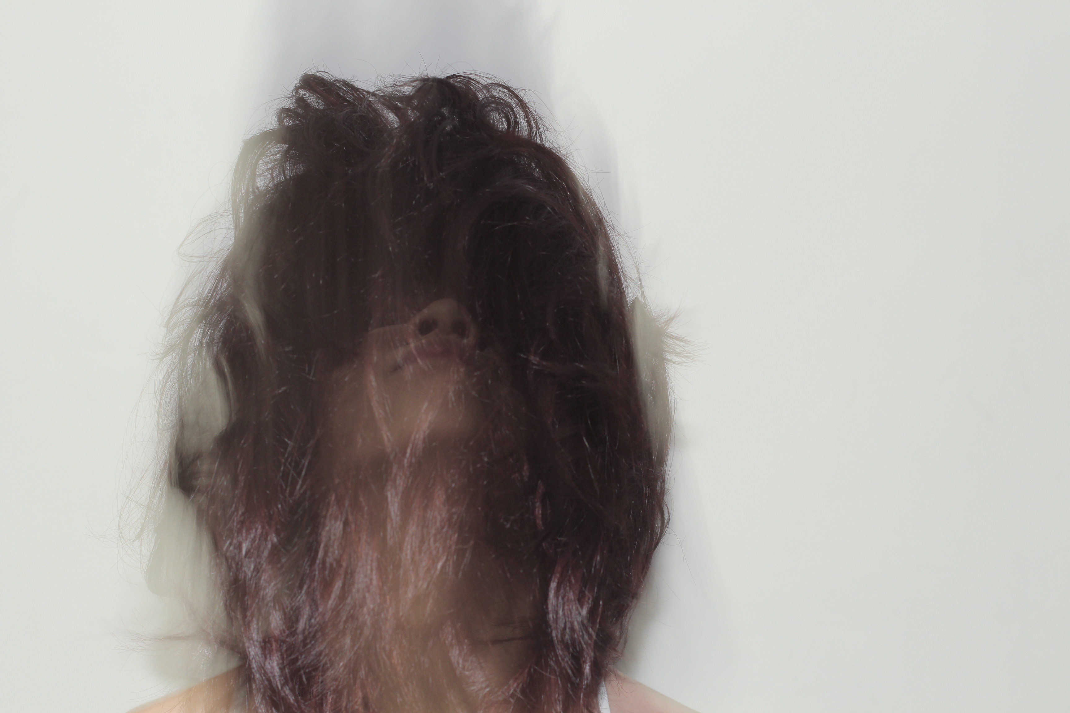
Me: I chose to superimpose roses over a photo of myself. The roses represent the passion and love I have for cinema.
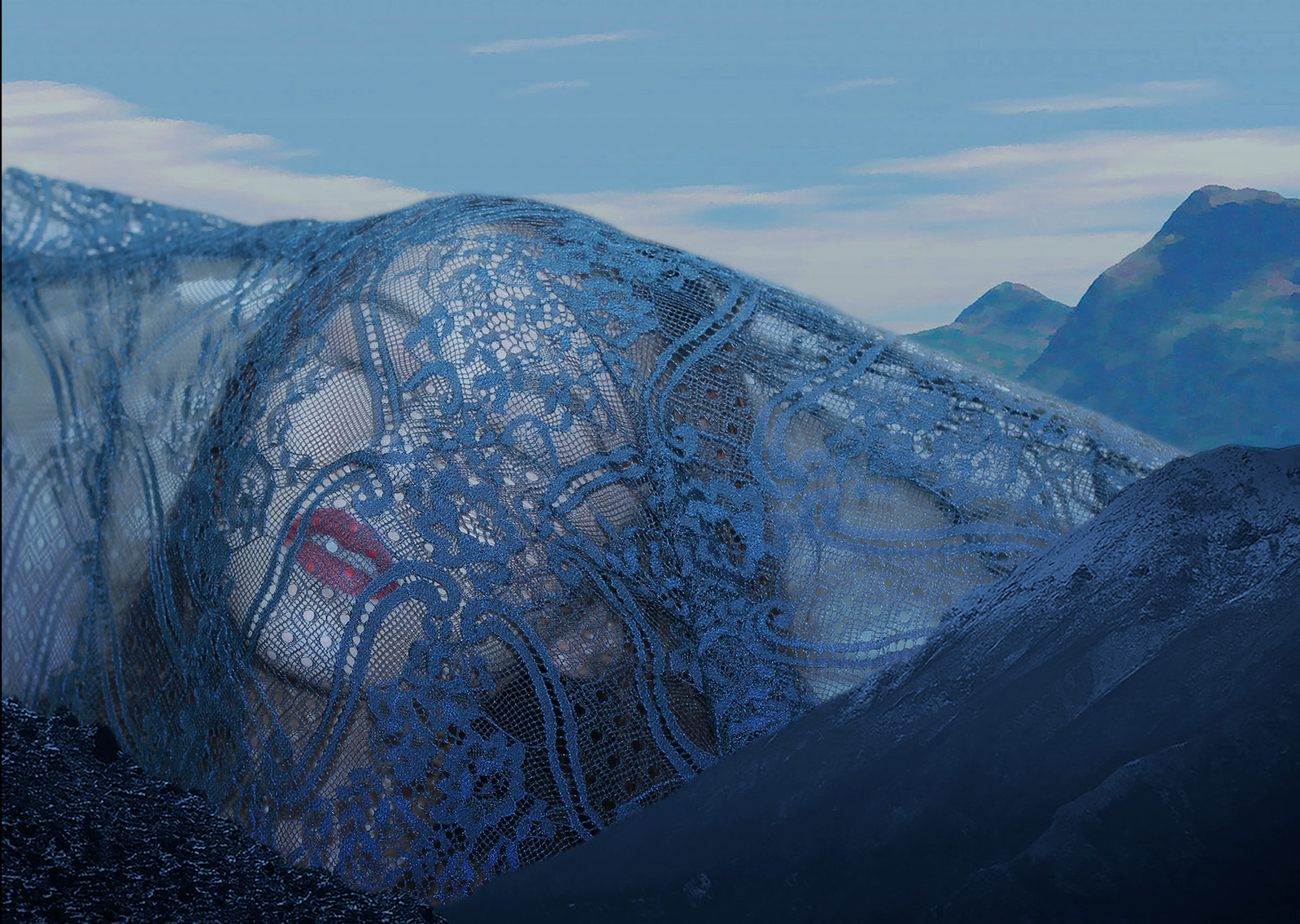
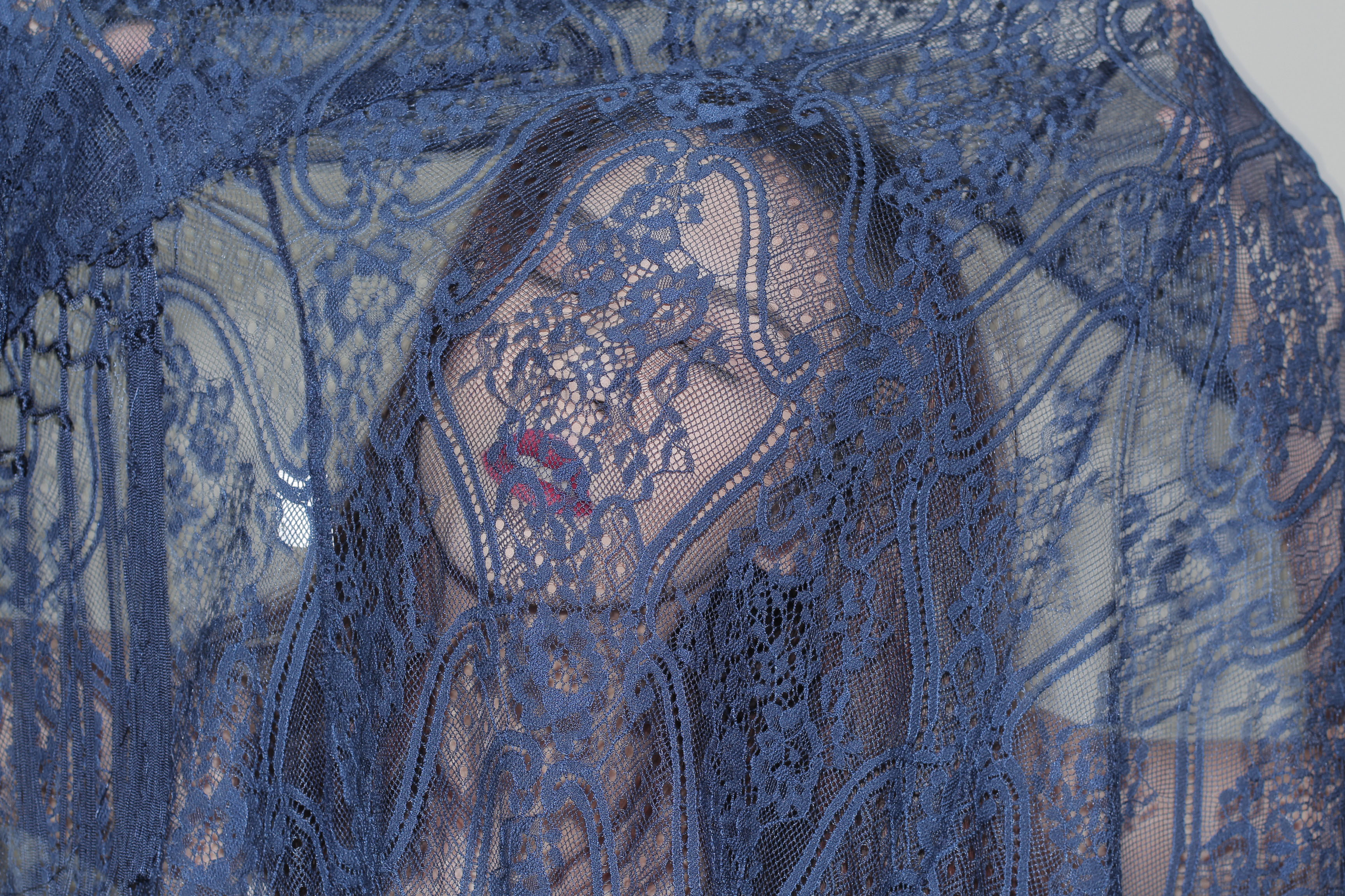
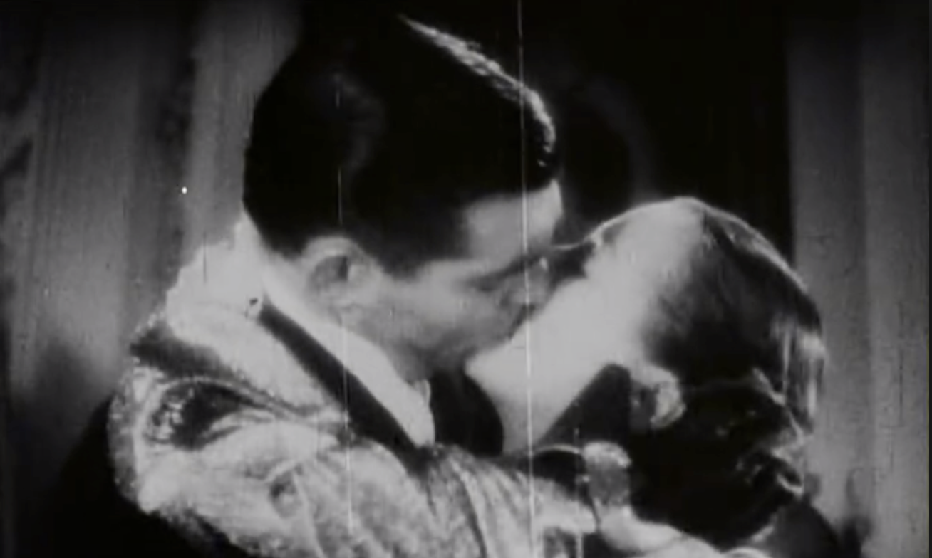
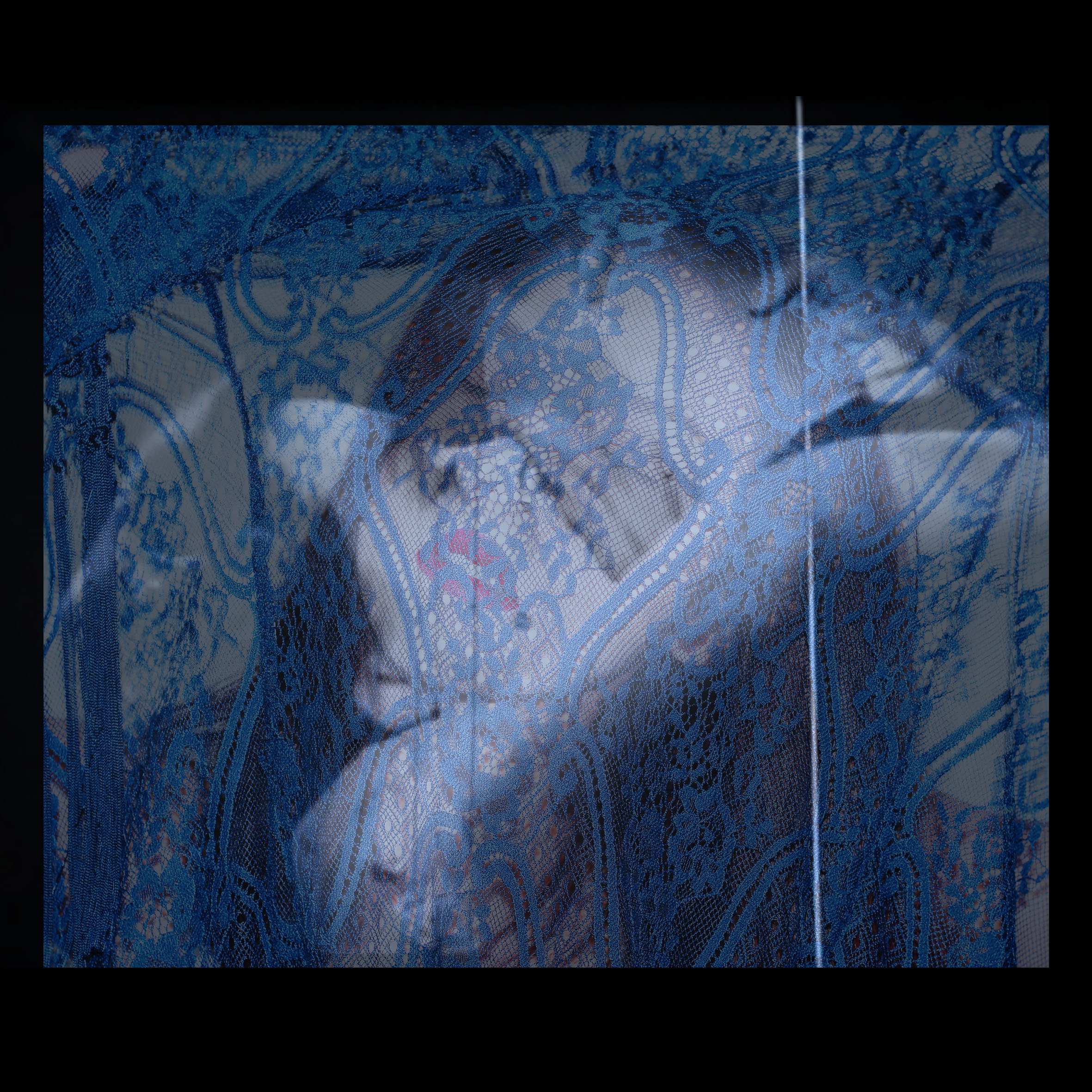
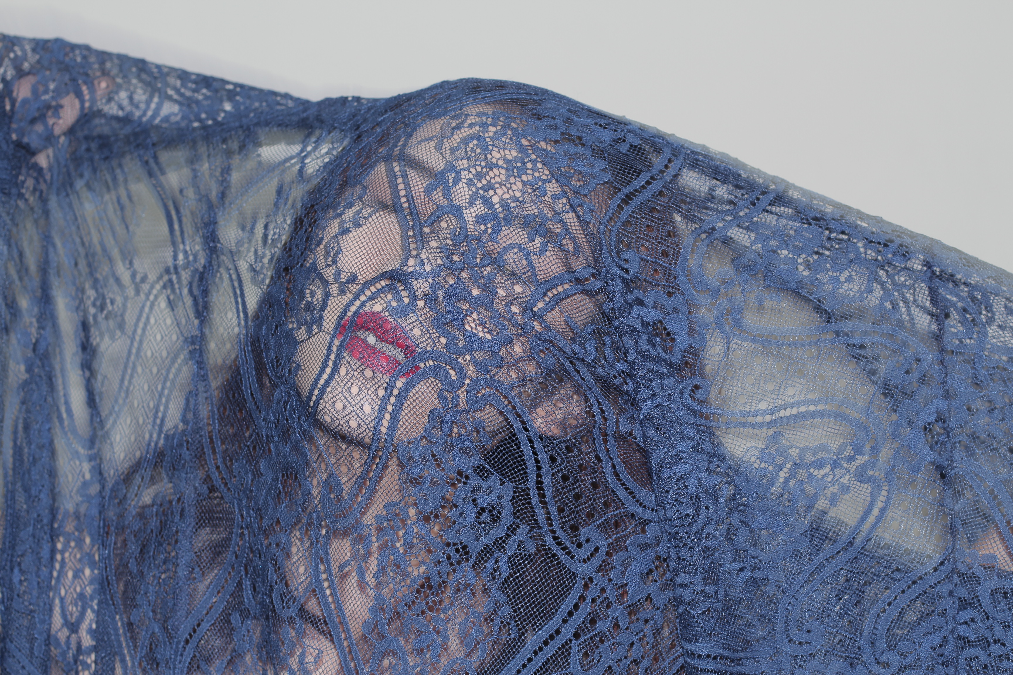
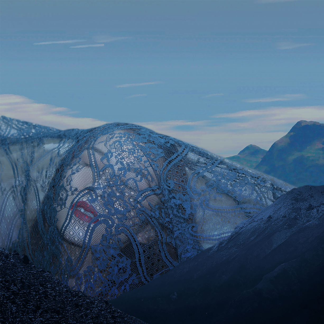
Cinema: I superimposed a picture of a classic old hollywood kiss over an image of myself behind a layer of lace. The image of the classic old hollywood kiss is an iconic image of cinema and it symbolizes cinema. In the photo, I look as if I am reaching out through the lace to kiss the image of the couple on screen. I chose to use lace in my photoshoot as lace represents sensuality and desire. The final composition represents my connection to cinema and my passion for it.
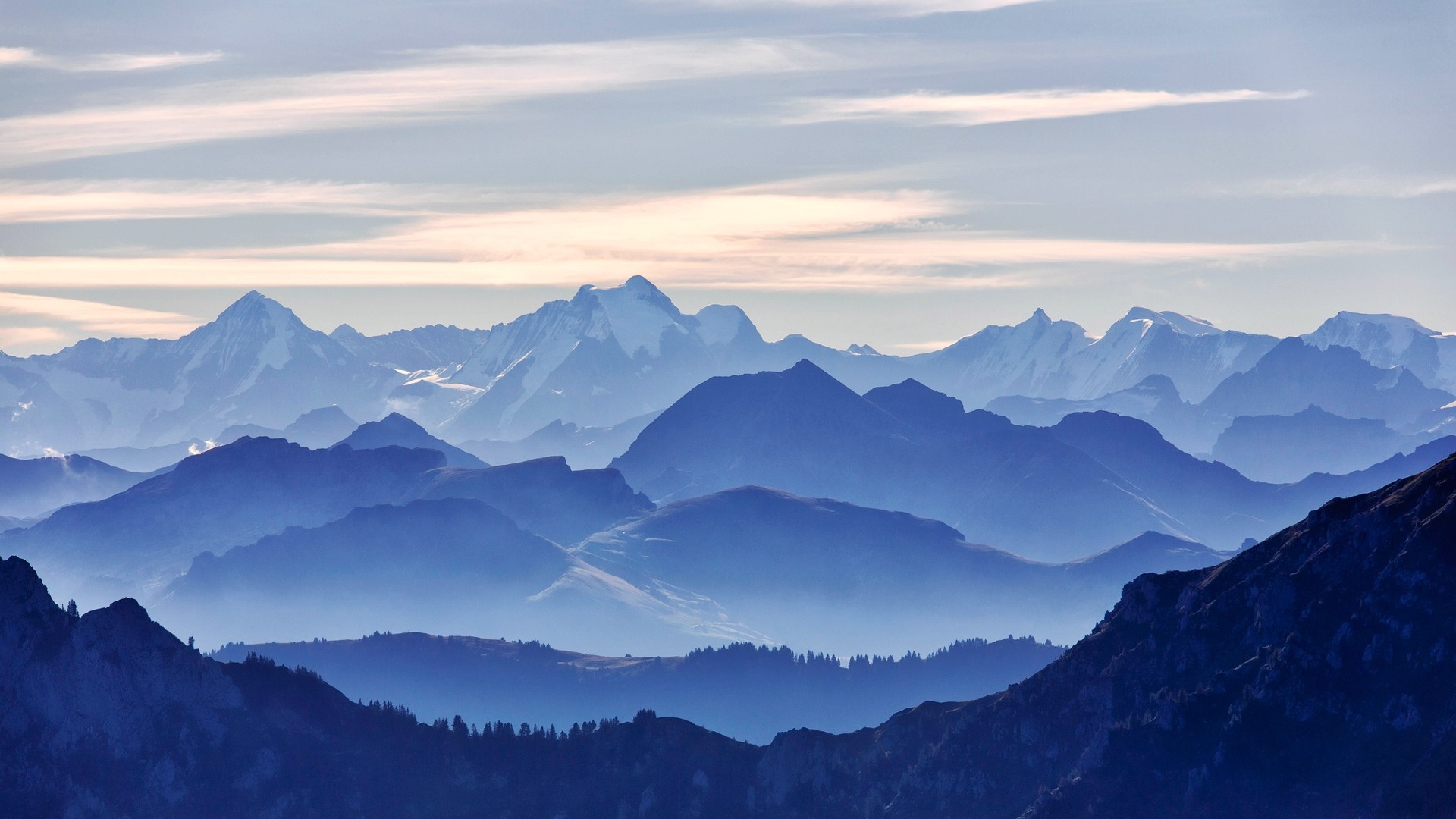
Devotion: I photoshopped an image of myself against a backdrop of mountains. I have always found the image of mountains to be very calming and peaceful. At the same time, they are also tremendous in size. They literally emerge from the ground and stay rooted in one spot for the entire span of their existence. To me, that represents determination and devotion. I digitally manipulated the collage such that it looks as if i am part of the giant hills. It represents my quiet devotion and dedication to cinema.
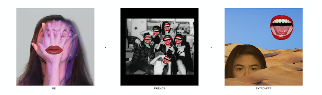
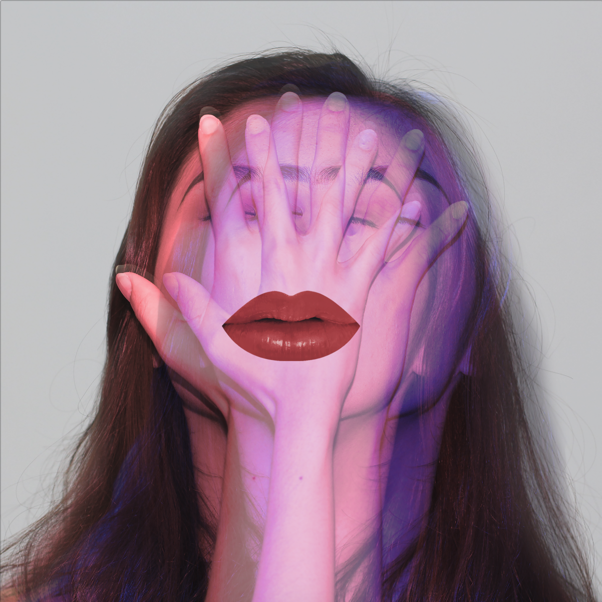
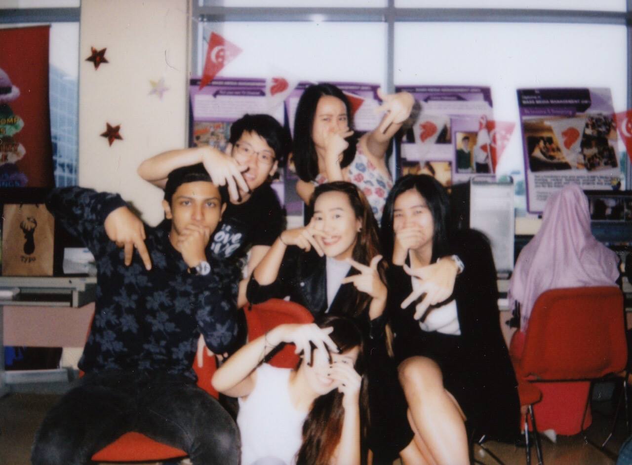
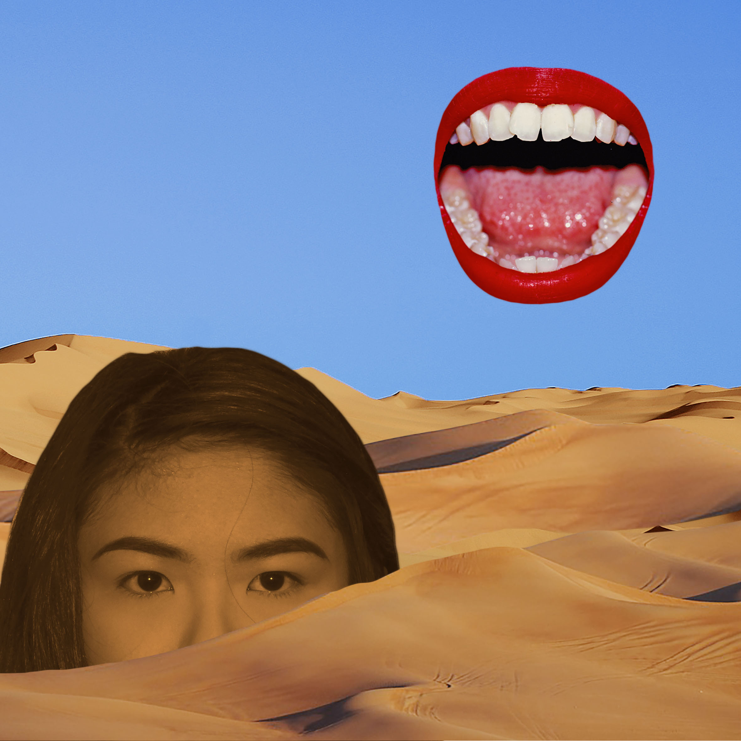
me + friends = extrovert
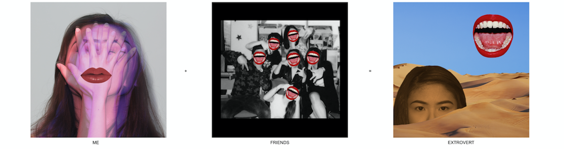
Meaning: As with many people, I feel introverted most of the time, but the extrovert in me is brought out when I am with my friends. These are two vastly contrasting sides of myself and i wanted to bring that out in my design.
Colour Scheme: I used the complementary hues red and blue in this series to show contrast between introverted vs. extroverted me.
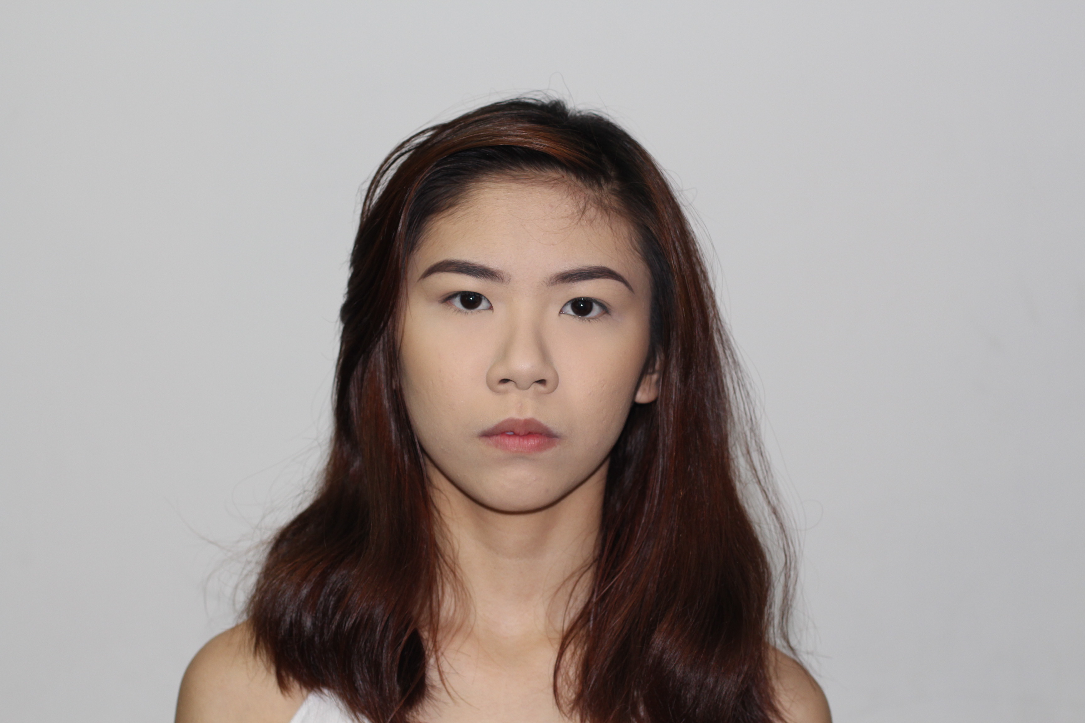
Me: I digitally double exposed an image of myself and coloured one side red and the other side blue to show the introverted (blue) vs extroverted (red) sides that exist within me. I added a closed lip on top to symbolise how I am usually introverted. This image was inspired by Davis Ayers’ one where he used a similar effect on a girl.

Friends: Here I used an old picture of myself with my friends. I layered open mouths over all of their faces to show the extroversion when we are all together.
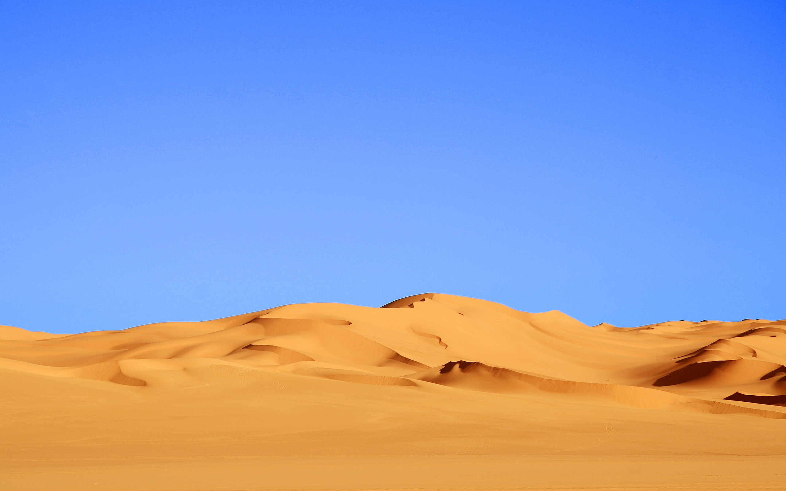
Extrovert: I placed myself within a desert background and placed the open mouth in the position where the sun would be. In a desert, the heat from the sun is so strong that the ground seems to shy away from it. By composing my image in such a manner, I wanted to show that the extroversion brought out in me is so loud that my usual introverted self would shy away from it.
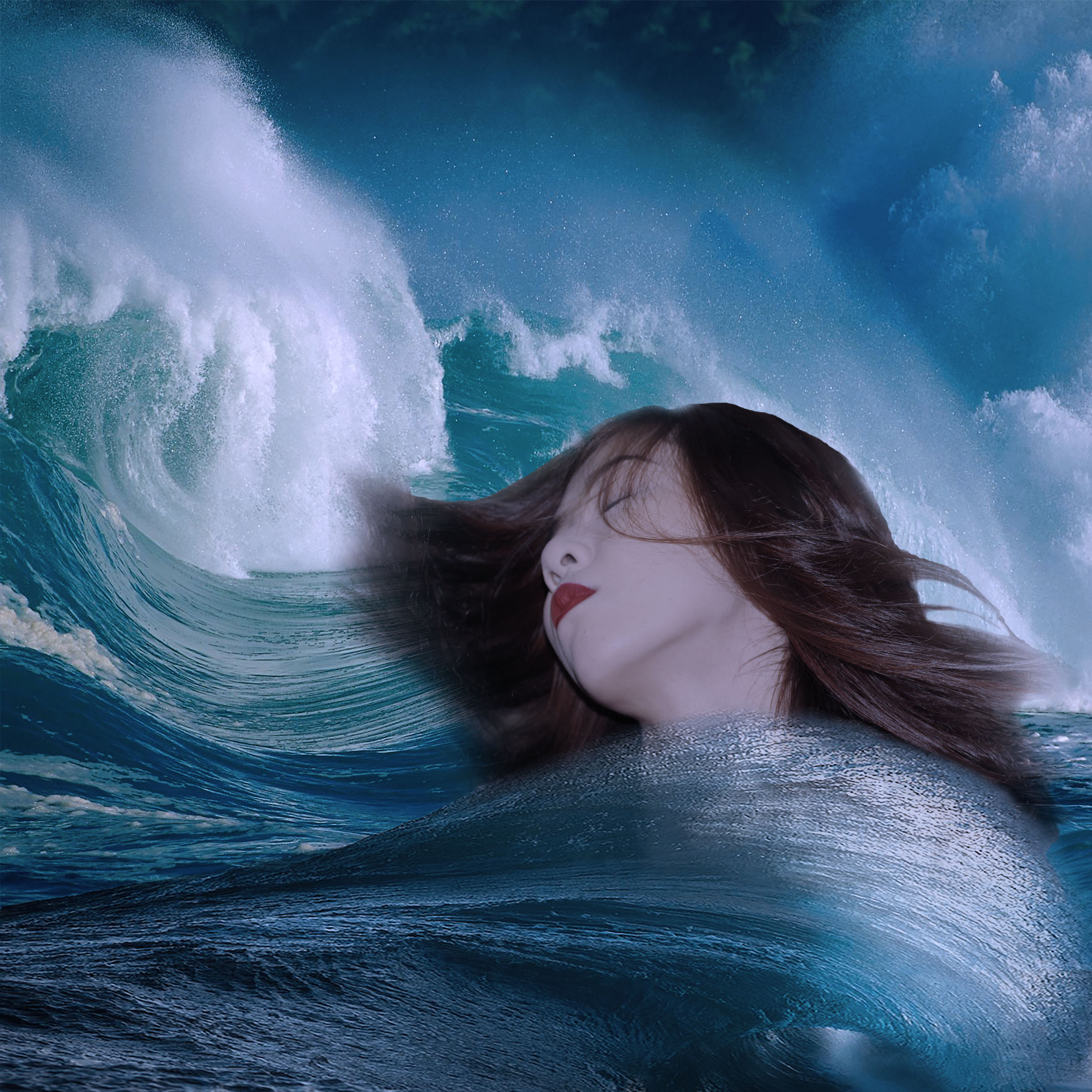
me + fantasy = dreams
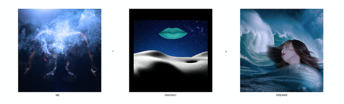
Meaning: I love escapism and enter fantasy worlds through my imagination and dreams. I tried to show my state of mind when I am in my fantasy world in this series
Colour Scheme: I chose to use monochrome harmony and colour all the images in hues of blue to represent the calming effect being in my fantasy world and dreams has on me.
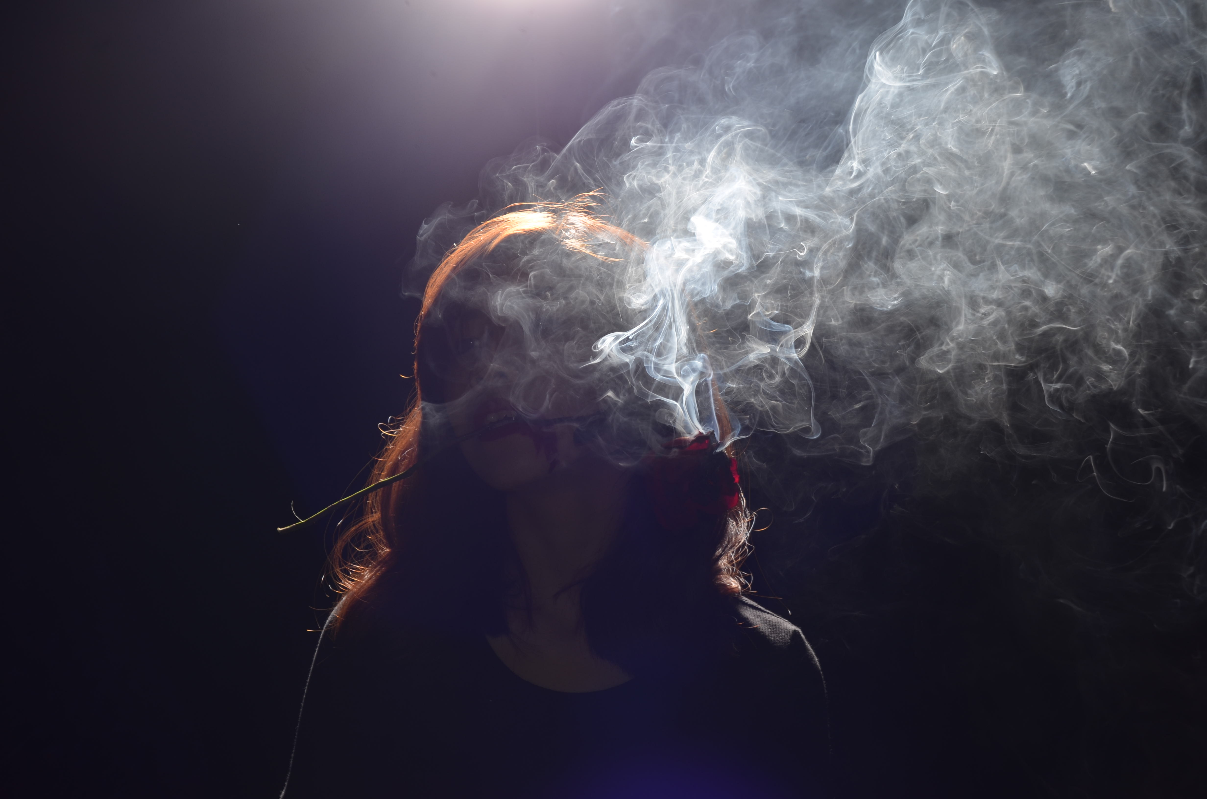
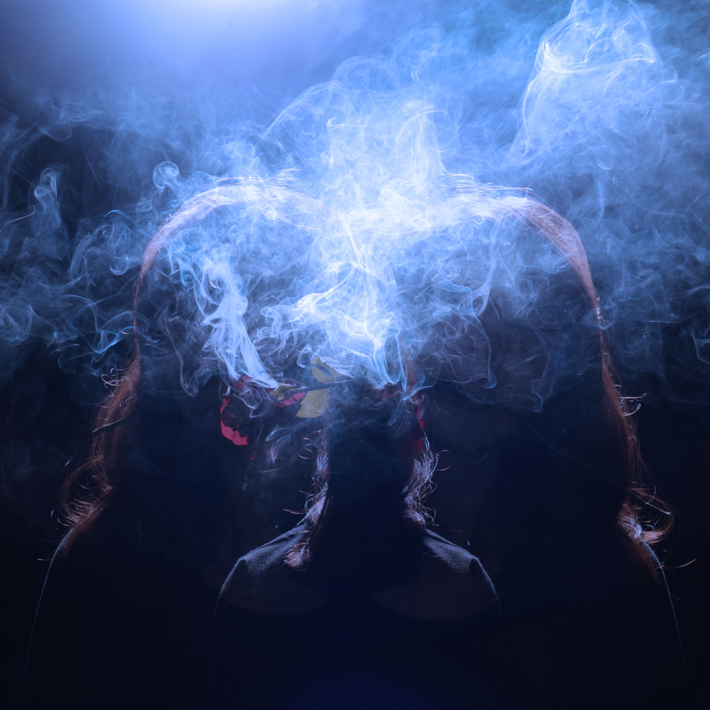
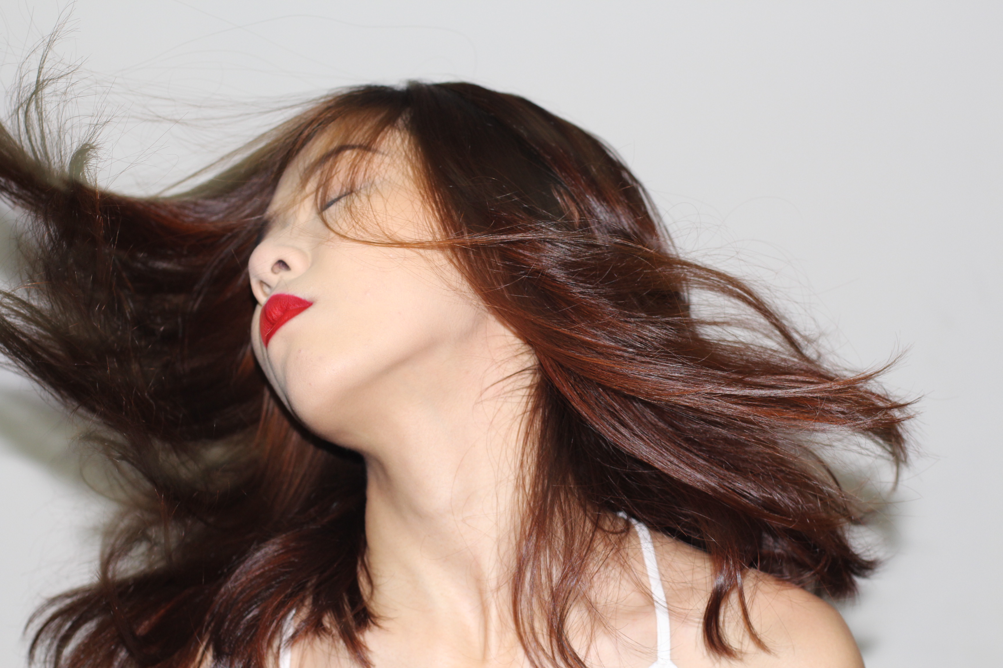
Me: I flipped an image of myself with smoke from a shoot i did previously. I found this image to be very whimsical and dream-like. In the final image it looks like there are 3 versions of me (2 at the sides and 1 in the middle).
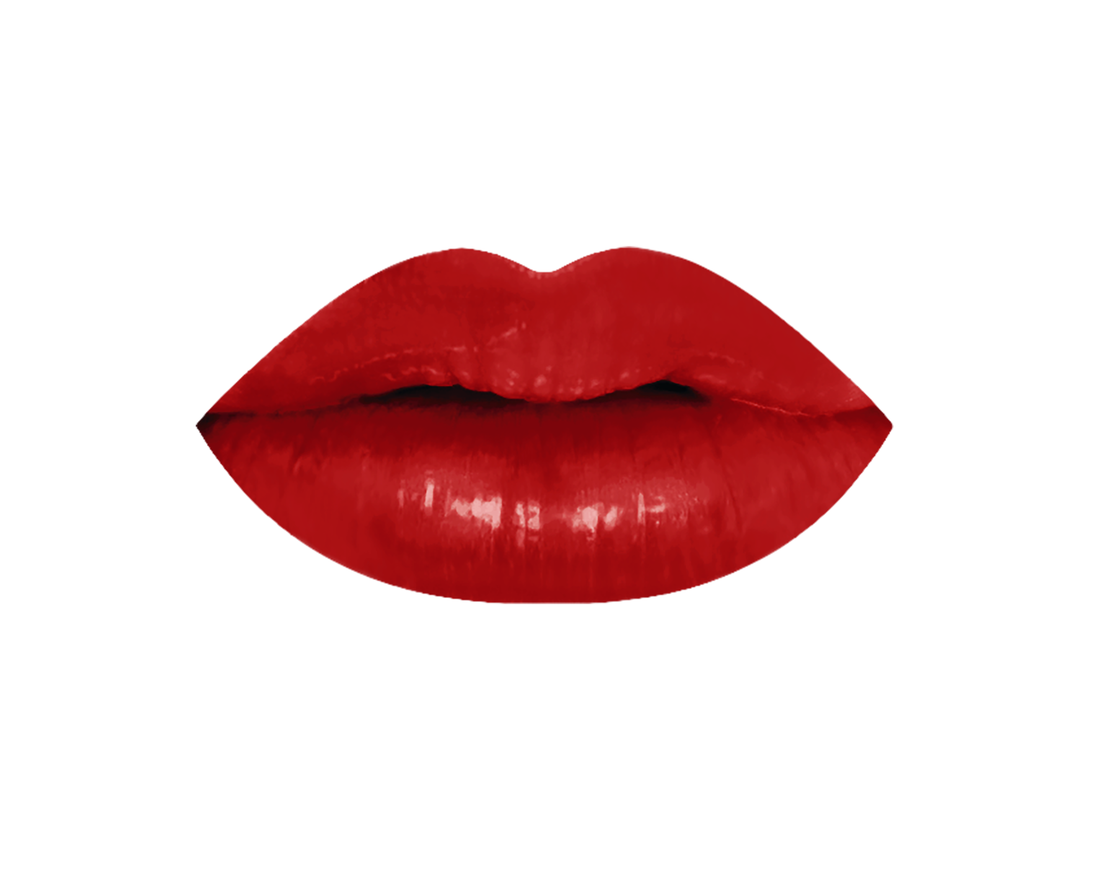
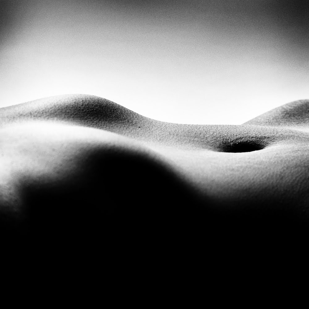
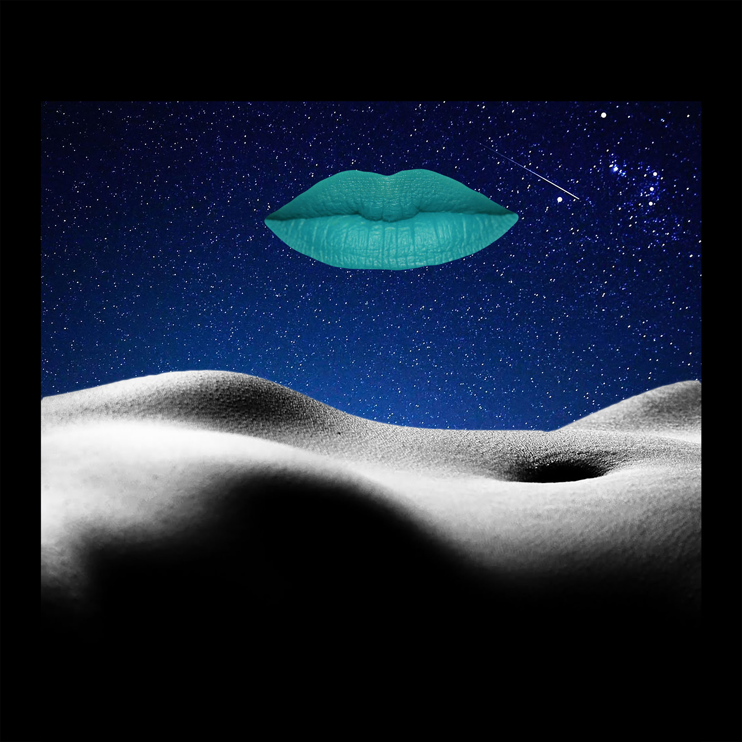
Fantasy: I collaged an image of a body part, my lip, and a space background. Here, it looks as if the body part is the landscape and my lip is the moon. It is very surreal and represents my fantasy world.
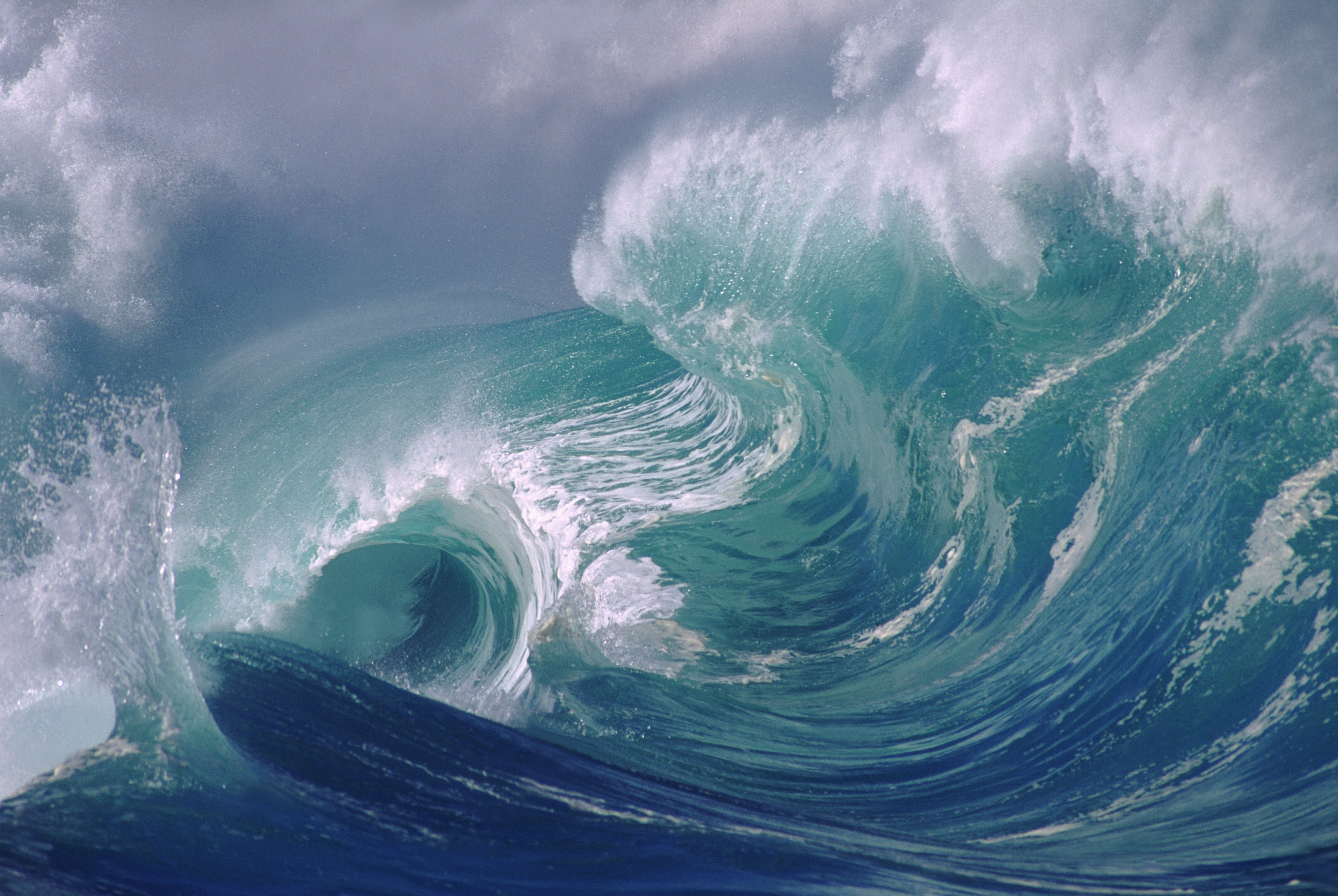
Dream: Here, I collaged myself in a sea of waves to represent my dream-state. I chose to use waves as the backdrop as waves are both calming and whimsical.
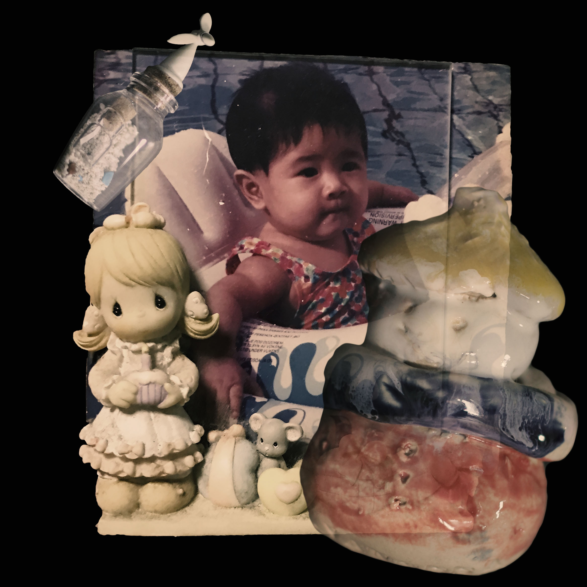
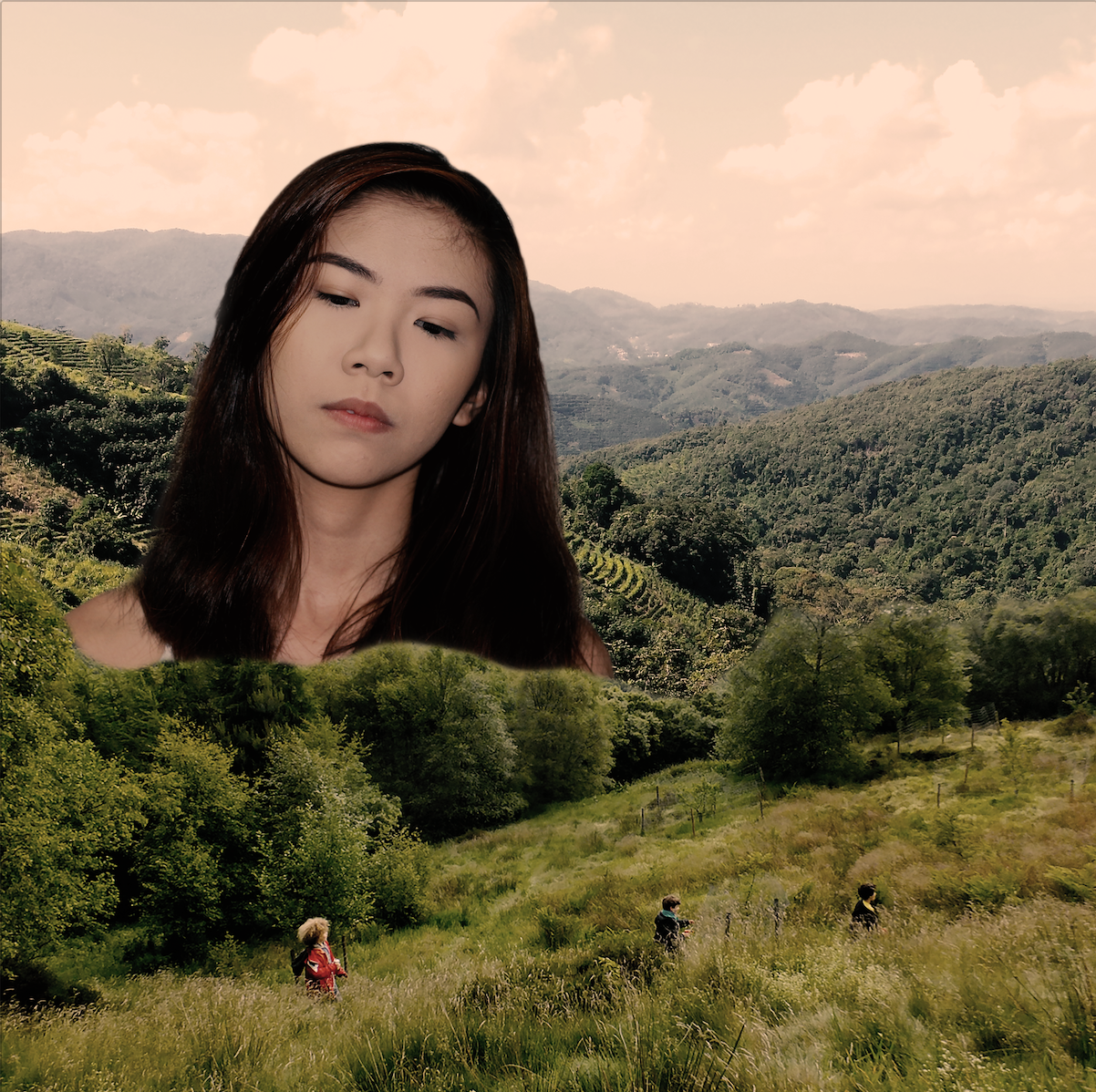
me + grandma’s house = nostalgia
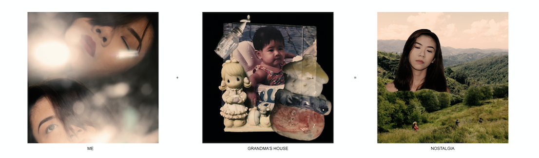
Meaning: When I am at my grandma’s house, i feel a sense of nostalgia. This is triggered by certain small objects throughout the house, and makes me remember my childhood. I tried to bring across the sense of nostalgia in this series.
Colour Scheme: I chose to use monochrome harmony and colour all the images in sepia to give it a nostalgic touch.
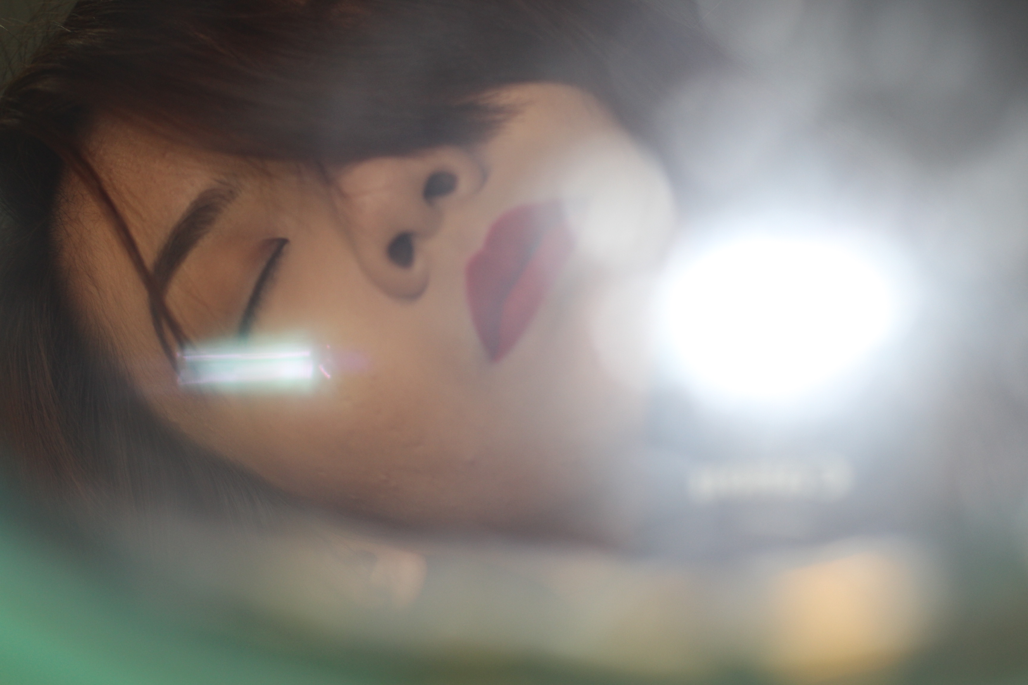
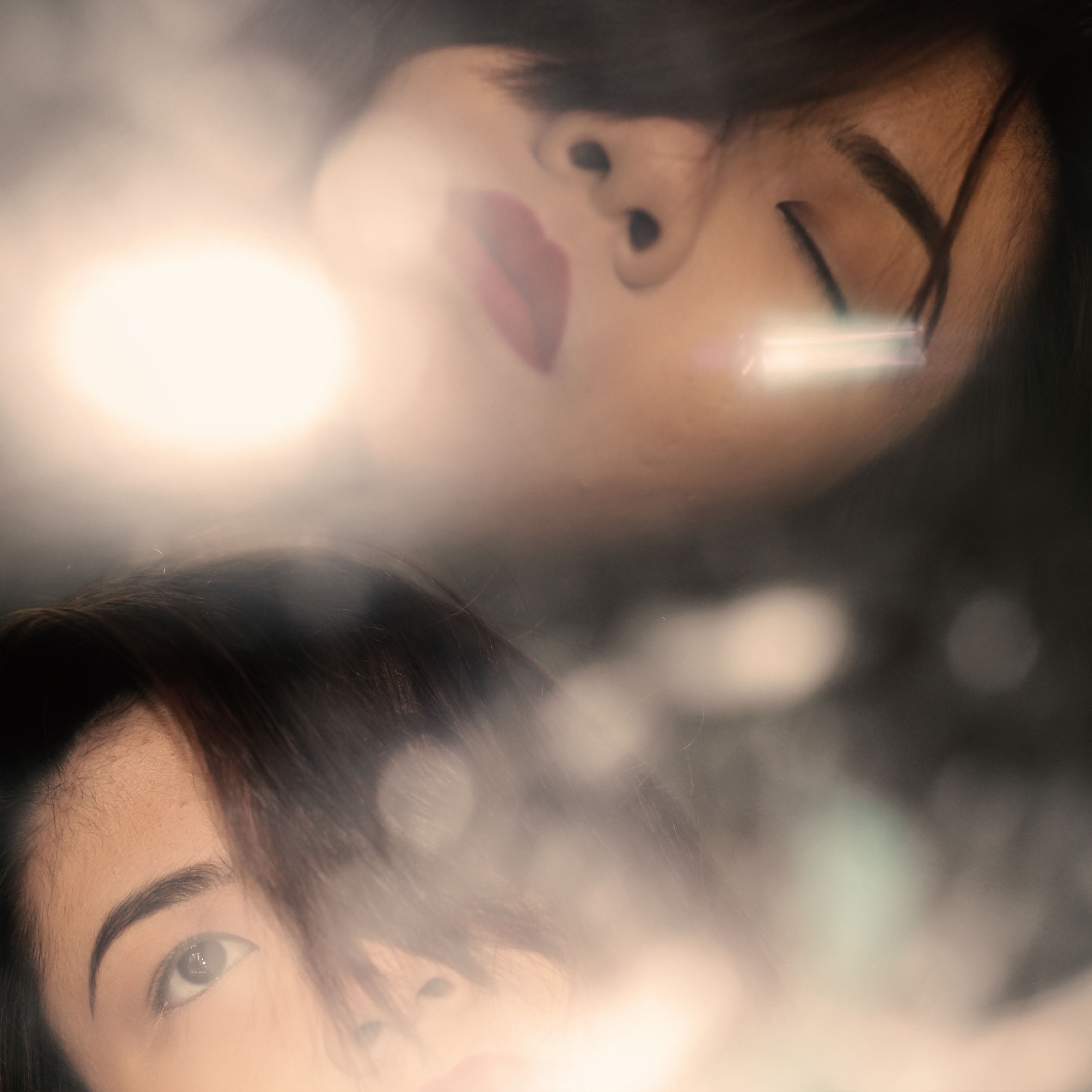
Me: I collaged two photos of myself and that were layered with bokeh in-camera. It represents me looking at myself from a different perspective.

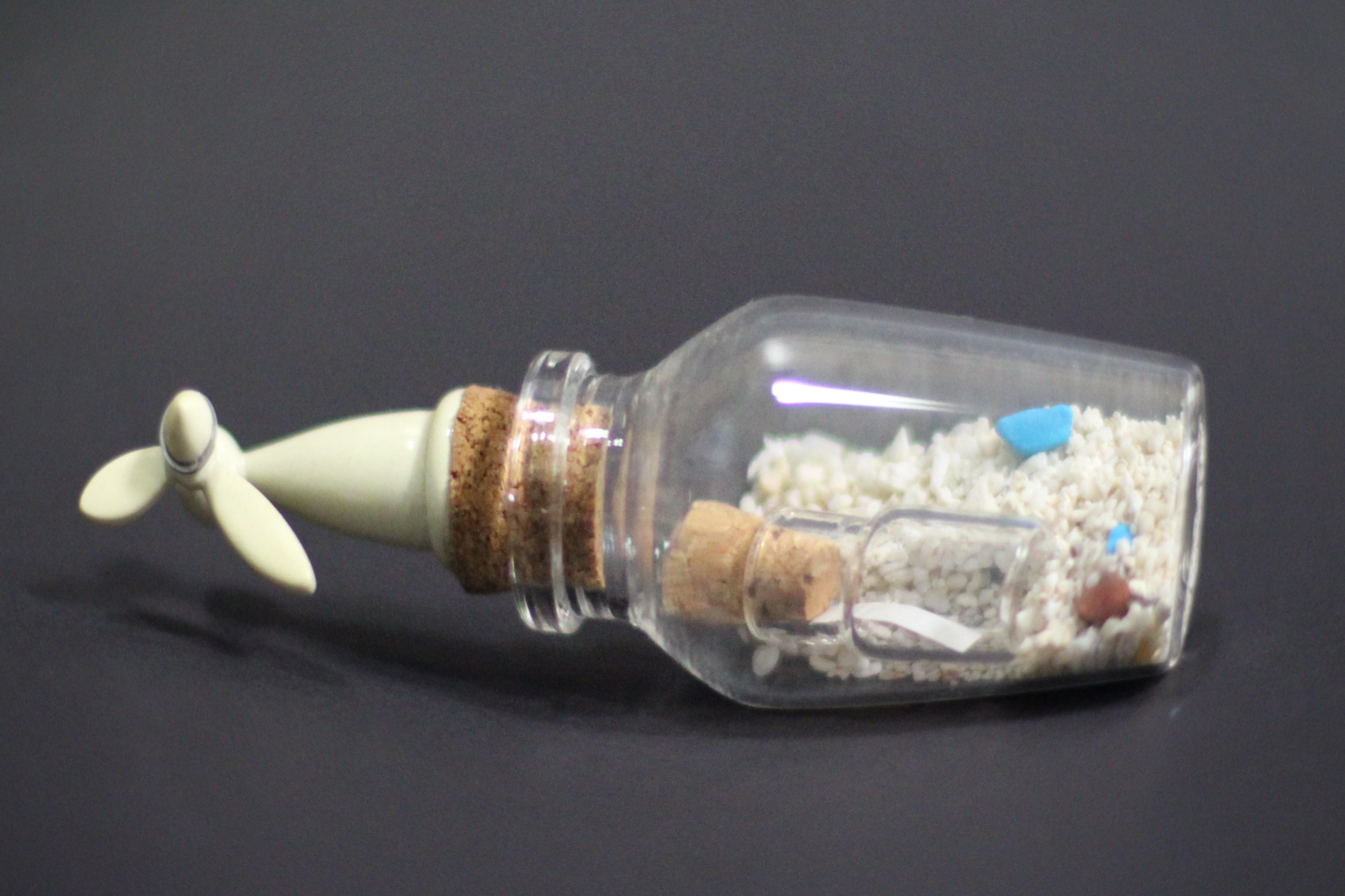
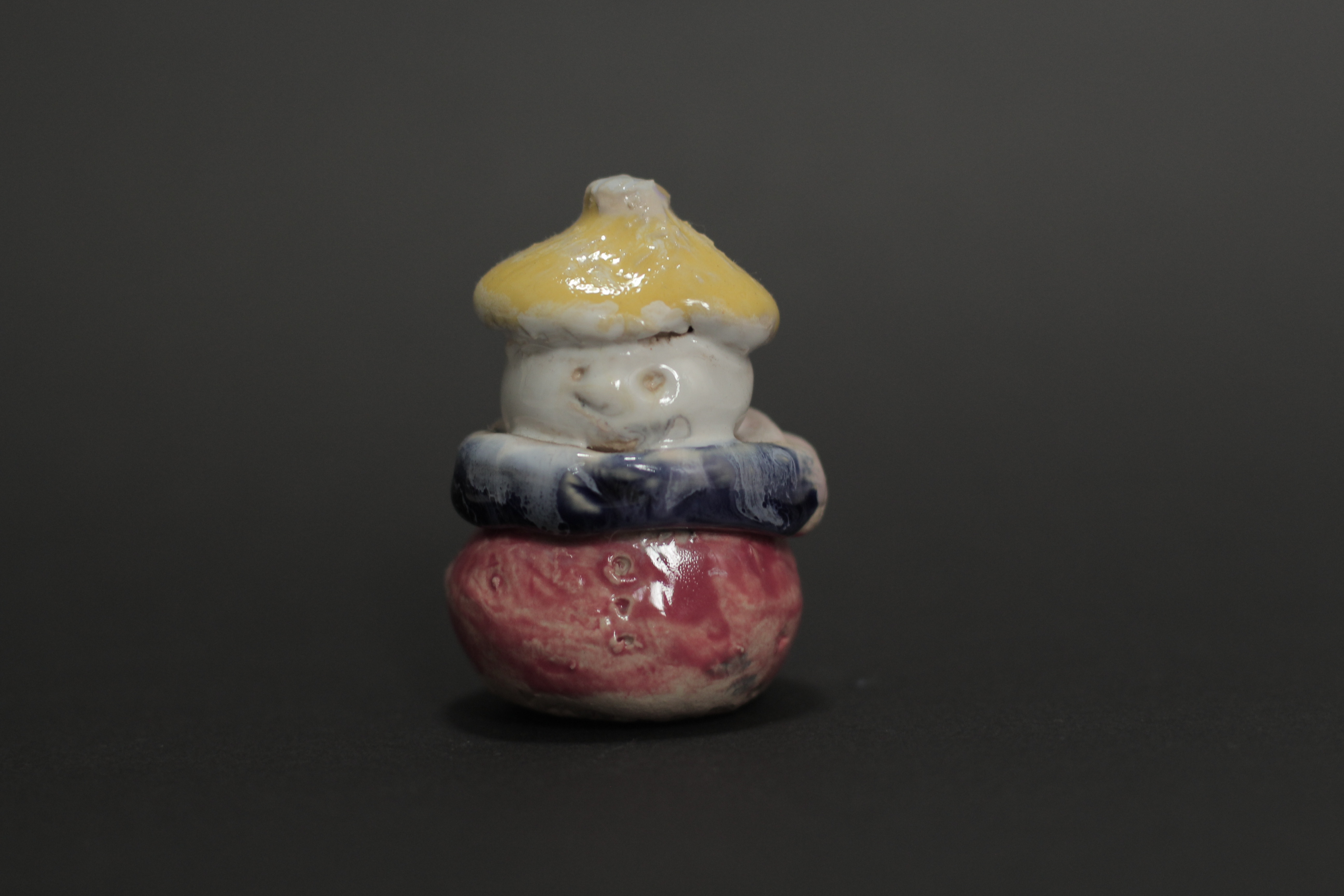
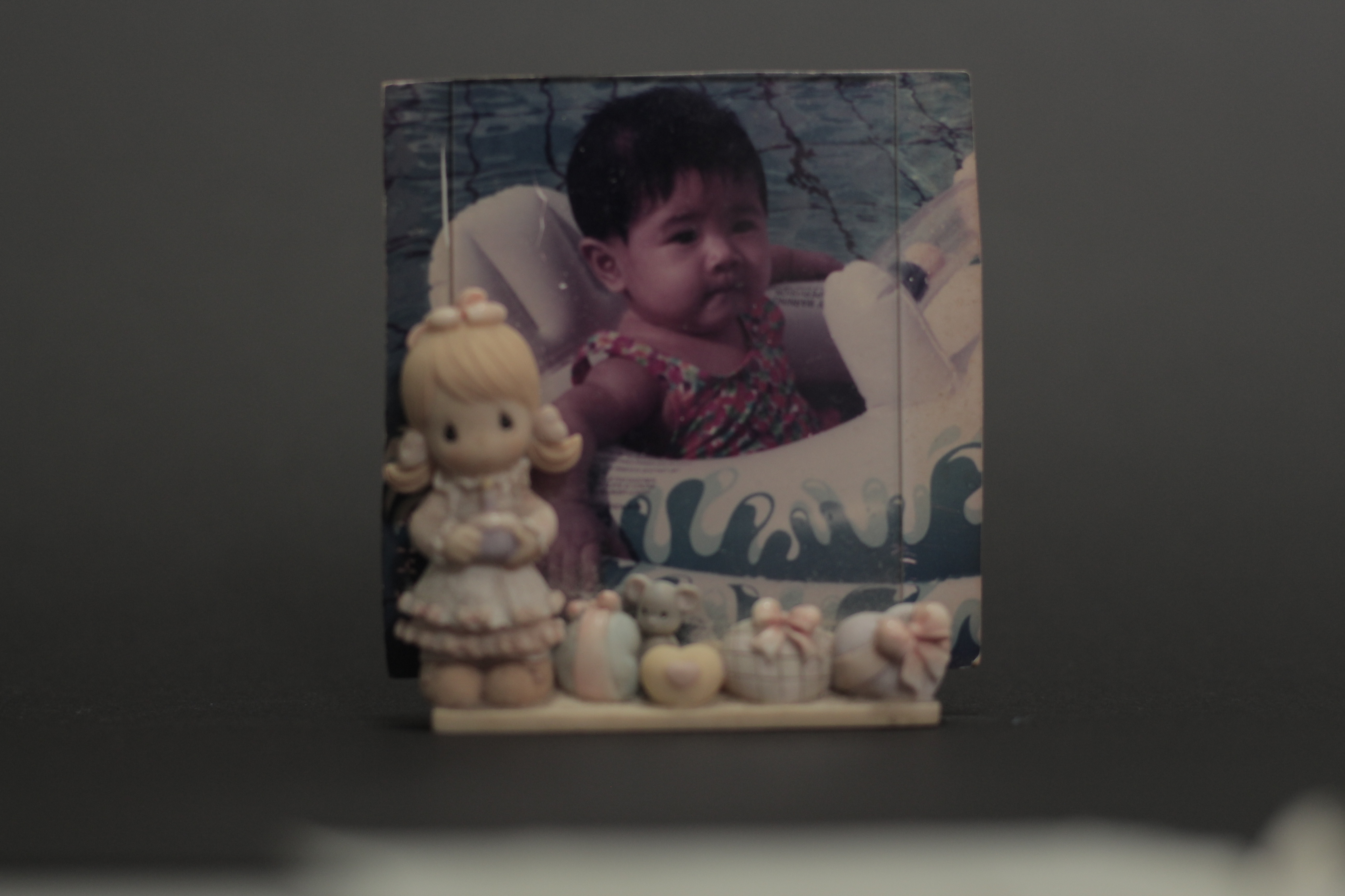
Grandma’s house: Small objects around her house trigger this sense of nostalgia towards my childhood. I took photos of a few of those items and collaged them together.
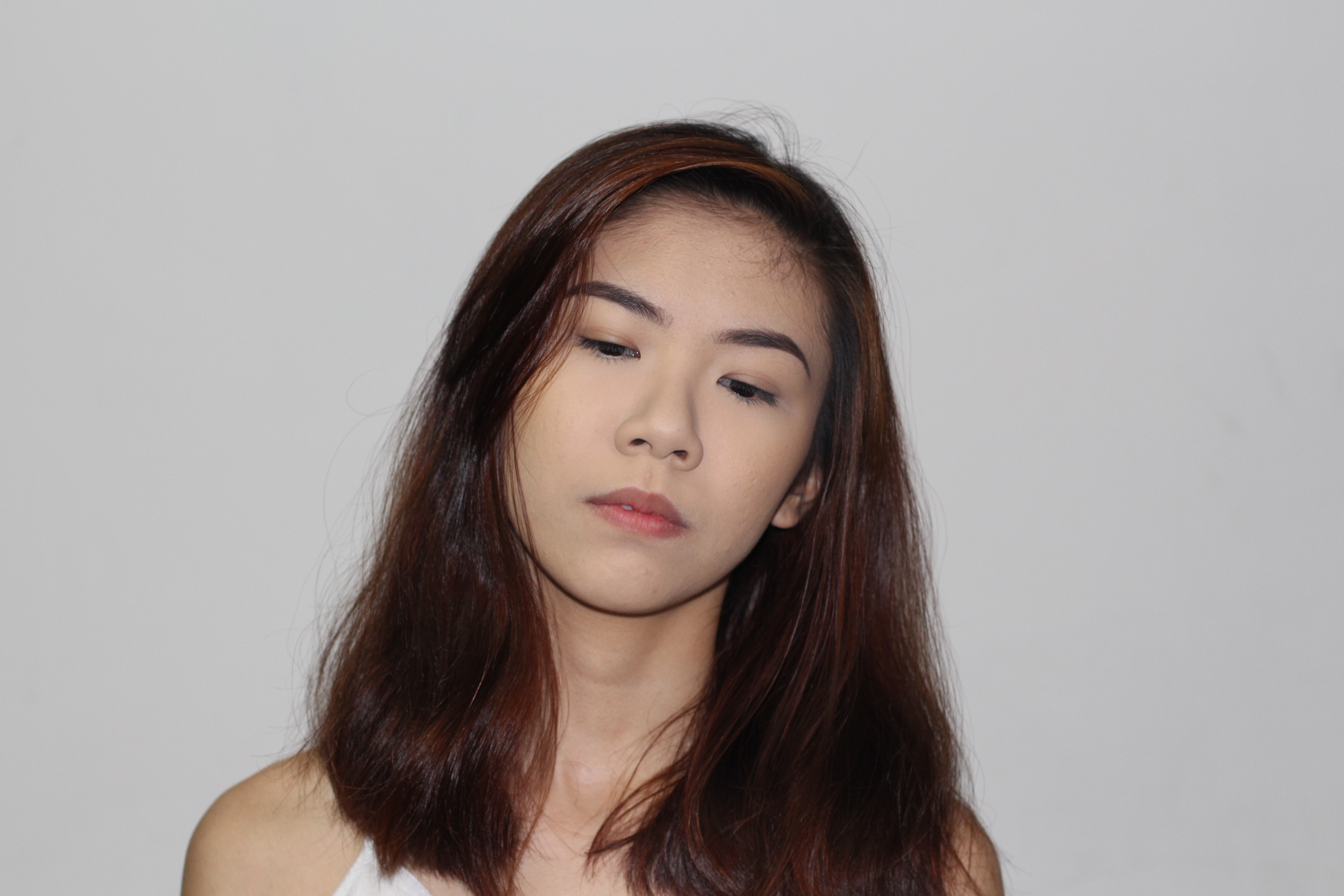
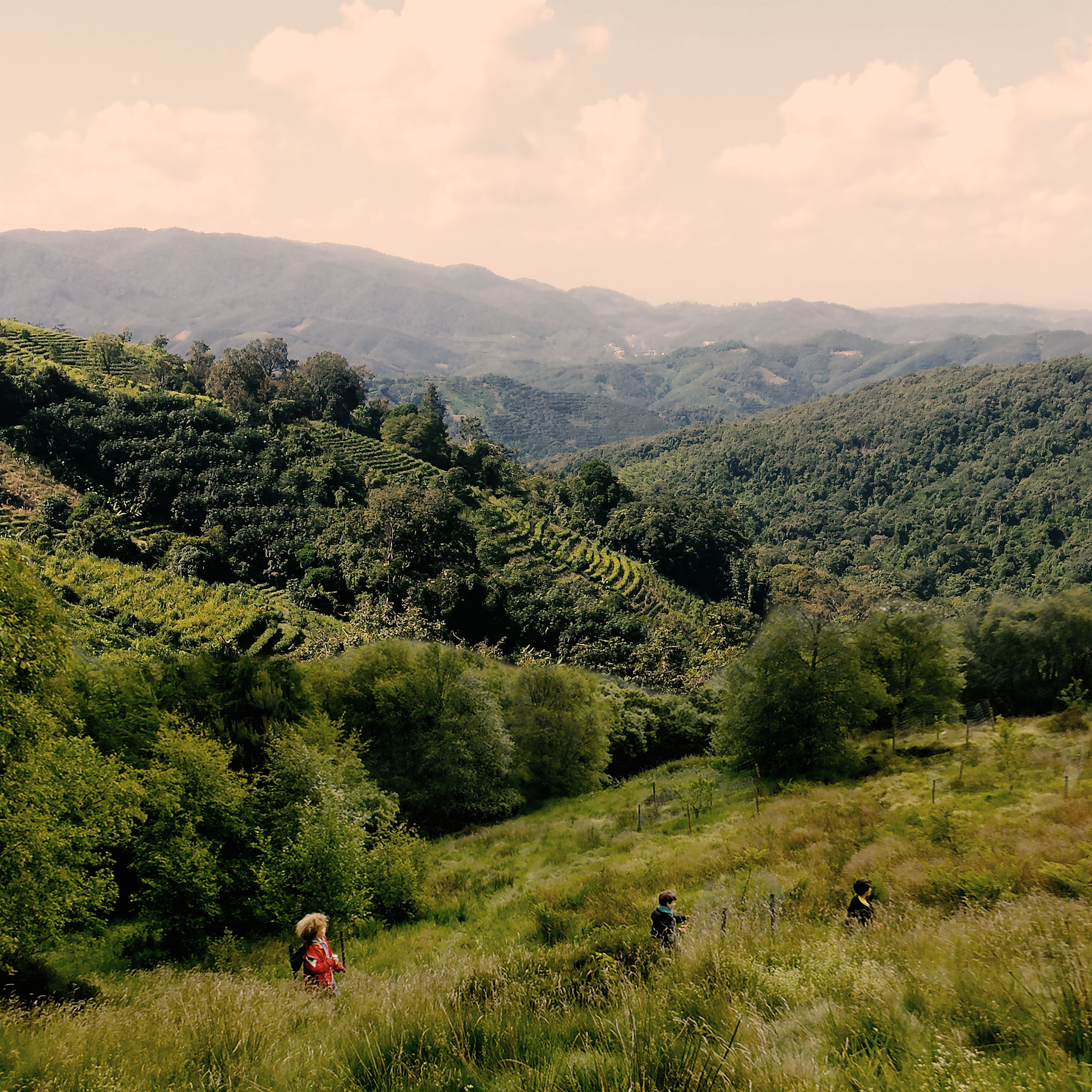
Nostalgia: I photoshopped myself in a background filled with green hills and little children running in the foreground. I chose to use the hills with little children to represent an earlier time in my childhood that I can never get back again. The final composition shows me looking down at myself in the past, a visual representation of my nostalgia.
FINAL OUTCOME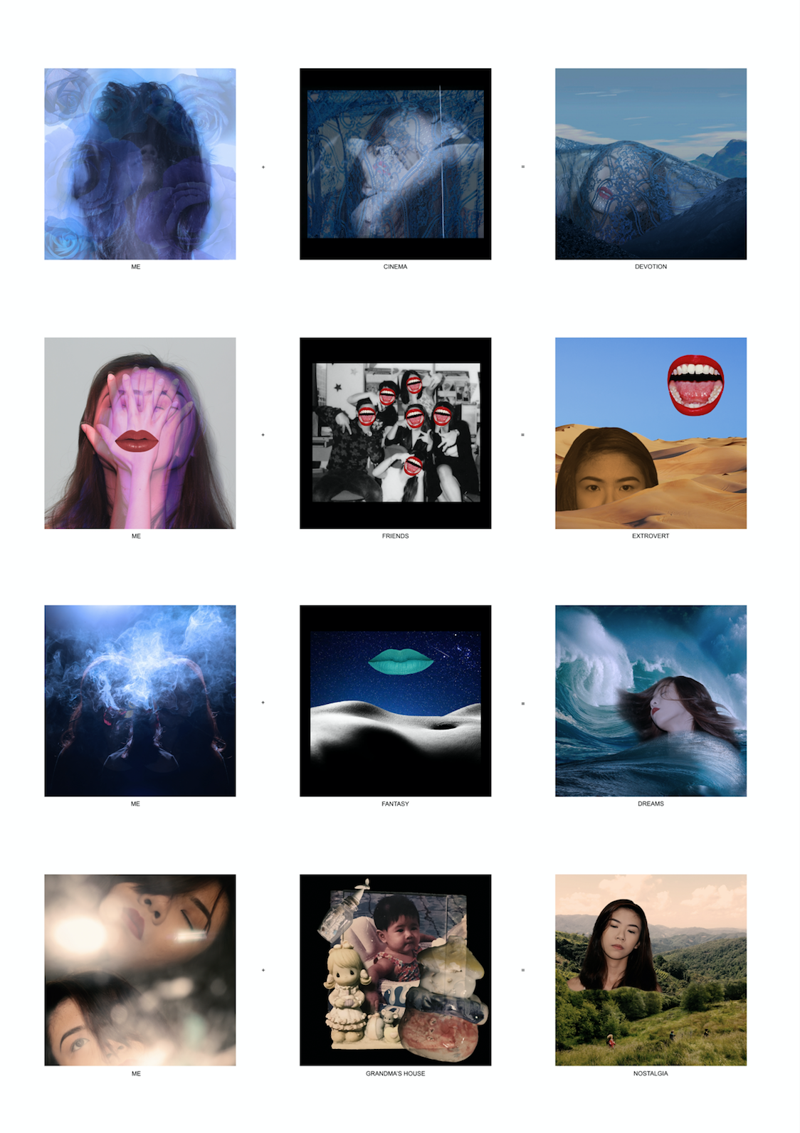
REFLECTIONS
Overall, this has been a particularly challenging project for me. In the beginning, I was very worried that I would not be able to pull it off as I am not an illustrator, and photography is the medium that I am the most comfortable and familiar with. Many of my classmates are well versed in those areas and I was really afraid that I would not match their standards.
Even though I had thought of using illustrations and mixed media to render my designs, I decided to take a risk and stick with what I knew best – photography and digital manipulation. Even so, I knew that I had to really push myself with the digital manipulation and collage factor to show the element of design that this project was all about.
Time was a major issue while doing this project and I honestly struggled to even get any rough ideas out. Even though time was not on my side, I still wanted to have the element of authenticity in my designs, as my themes were very personal and close to my heart. I did so by taking numerous self portraits and photos of some of the real objects that I would be portraying in my designs. I specifically did not want to use found images, especially for the lines me + friends = extrovert and me + grandma’s house = nostalgia as those were intimate and personal settings that I wanted to keep as authentic as possible.
This project has not been easy and I really struggled a lot. Looking back, I feel that I could definitely have improved and grew more in the aspect of design if i had time to get consults on my designs in the process. However, I am glad that I pushed through and kept researching to find a way of digital manipulation that I liked and could work with. I finally found styles that resonated with me and worked off them to develop images that I can proudly call my own.


