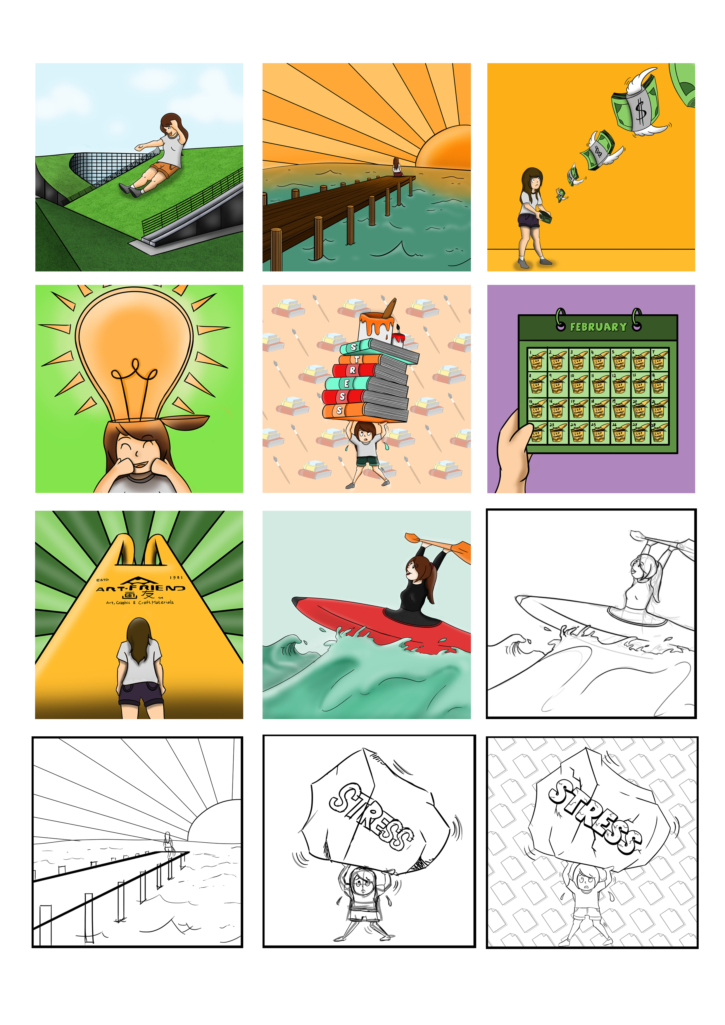
Me, Stressed about school work + Being outdoors = Fun day out kayaking
Being easily anxious and worried, I often stress out due to my school’s workload and trying to balance a work-life balance. Other than being in school, I love being outdoors, especially near the sea. Thus, I always try to make time for kayaking as it is one of my hobbies and just by watching the waves and kayaking at sea really helps to de-stress me a lot!

Me, A creative individual + Studying at NTU ADM = New ideas and inspirations
Since young, I was interested in drawing and crafting. I grew up to enjoy the creative process of making art and studying at NTU ADM was a great chance and opportunity for me to explore new art mediums thus the creation of new ideas and inspirations!

Me, Being broke + A trip to Artfriend to buy school supplies = Eating instant noodles for weeks
Being a full time student, I barely have the time to work on the side thus me being broke on a regular basis. Having to buy art supplies from Artfriend often costs a lot and I would have to resort to eating noodles.

Me, Feeling depressed + Being around my family = Motivation and Strength
Sometimes, when the stress of school becomes too much for me to bear, I would feel depressed but being around my family when I come home from school really helps with cheering me up and thus giving me the motivation and strength to push on for my work.
I’ve enjoyed the process of creating this piece of work as it allowed to explore the use of color schemes and the ability for me to express myself through each of the panels!